It’s tough for newbie creatives to get noticed.
If you aren’t in an agency that produces good work it’s hard to produce good work.
If you don’t produce good work it’s hard to get a job in an agency that does.
One of the ways around this is to find a client that will accept good.
Up and coming copywriters Mike McKenna and Alastair Wood spotted one of these opportunities back in the late eighties; The IPA Society, they held lectures every month and would send out a typed up sheet of paper for all agency pin-boards.
‘They could be posters! They’d be seen by every single agency in London.”
All that was needed was friendly typographers, photographers and printers to donate their time free of charge.
The first one they did got into the D&AD Annual, (a first for each of them).
CUT TO A YEAR LATER: I was now Alastair’s Art Director and we got an opportunity to promote a talk ‘Desert Island Ads’.
A tricky brief because it didn’t have a single focus or reference point.
Eventually we settled on an idea which involved me scribbling glasses and bow ties onto an old an old, cheesy film still.
The first people showed our shiny new proof to was BMP’s Mark Reddy and Richard Grisdale.
Our book was going down pretty well until they got to our IPA poster.  Mark: “Oh no! No…No…No…It’s such a cliché! Silly glasses and bow ties?”
We scuttled back out with our cliché.
(I’d like to point the jury to exhibit A: Mark and Richard around the time the incident took place.)
 Shortly afterwards we got another IPA brief: ‘Christine Barker’s Review of The Year’.
Alastair was on holiday, so he suggested I work on it with his pal, Mike.
How do you sum up a whole year in a single image?
What unifies all agencies?
What do all agencies have?
PENCILS!
 I got my mate with a camera, Malcolm Venvile, to shoot it for the £50 budget the IPA allocated.
We made the pencils ourselves and used the back of a layout pad as the background. It got us into D&AD. Twice. 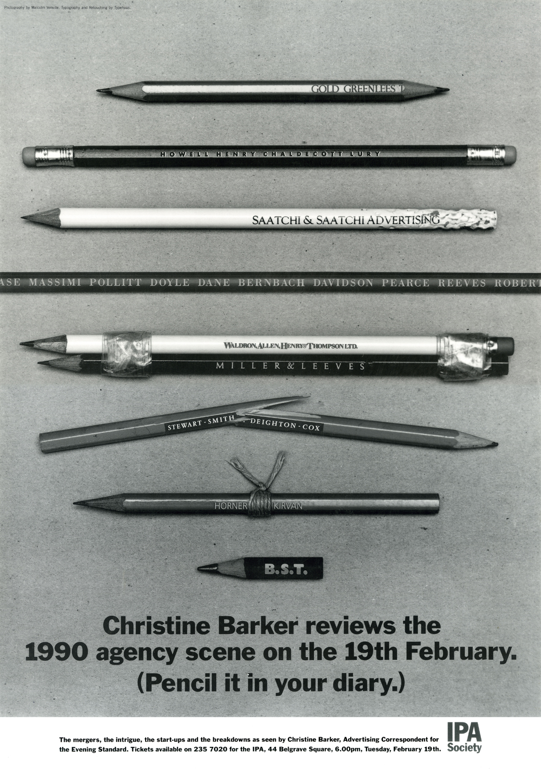 After this successful dry run, Mike and I teamed up and got a job at Publicis.
In our first week we got an opportunity to produce another IPA poster: ‘Advertising under a Labour government’.
Our new Head Of Art, Derrick Hass, insisted he draw Fred, (the little flower grading dude), also insisting he get a name check on the poster.
The following week Campaign carried this story on the font page: ‘HOMEPRIDE FURY AT NEW AGENCY PUBLICIS’.
It’d been brought to Homepride’s attention that their brand spanking new agency had used their character without permission, just to rub salt into the wound innocent little Fred had been used in a political context.
A secretary called to arrange for me and Mike to have tea with C.E.O. Michael Conroy.
DERRICK: “Keep me out…you’re kids, you’ll be fine, but don’t involve me… I didn’t even want to draw the bloody thing!”.
MIKE: “Er…it’s got your name printed on it…you asked us to print your na…”
DERRICK: “WHAT?… SHIT…SHIT…SHIT!”
Mr Conroy was fine, he simply asked us to explain what had happened. 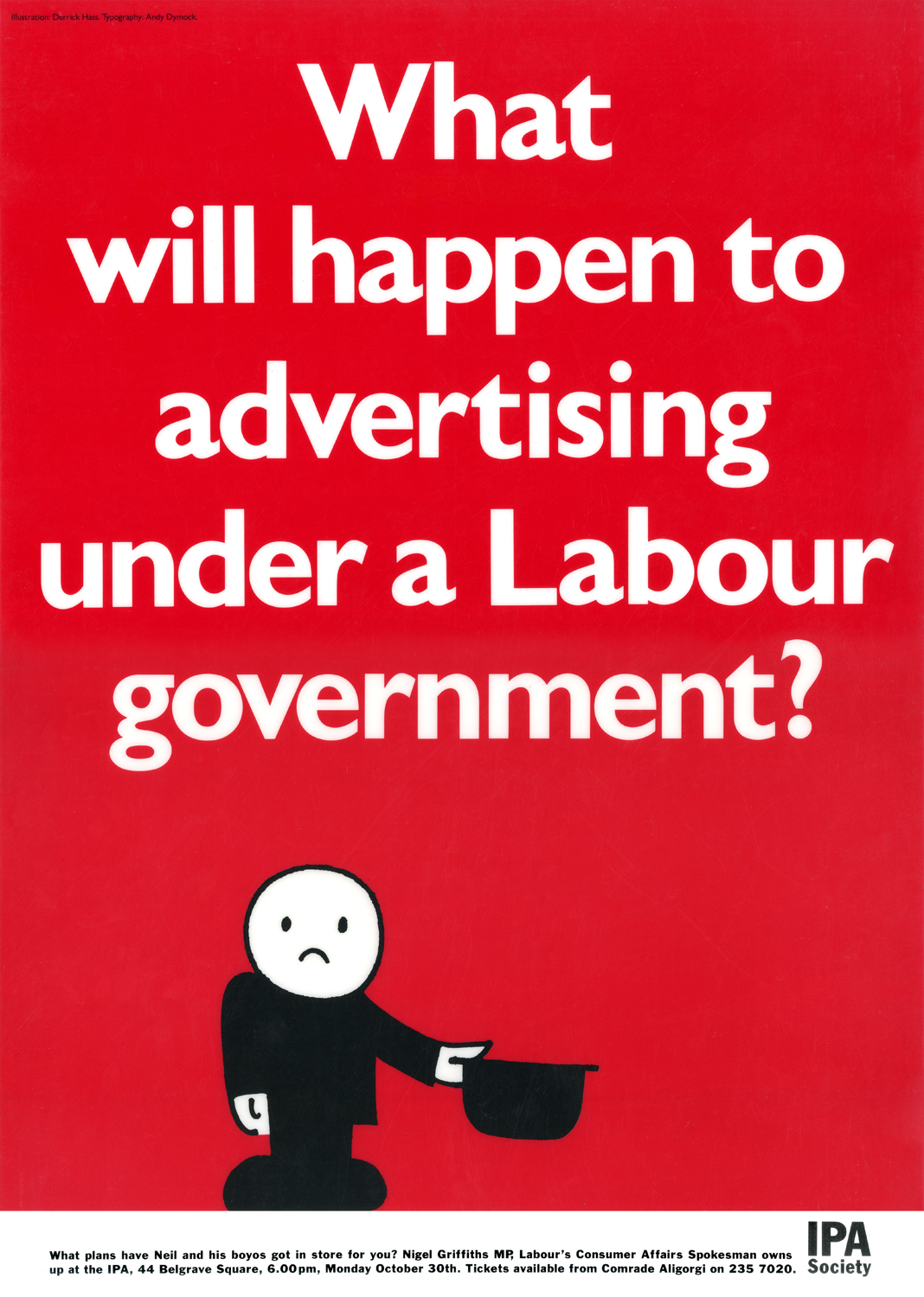 In 1992, at the height of the recession, we got a brief to promote an The IPA Bowling Evening.
At the time, news of redundancies were almost daily, so making the event topical seemed a good way to go.
The delightful illustrator David Holmes agreed to draw the ad for £0.
(This was only after he tried persuading me to use free and easy scribble instead, unfortunately I didn’t have the balls to use my own drawing, I wanted ‘professional’ illustrator.)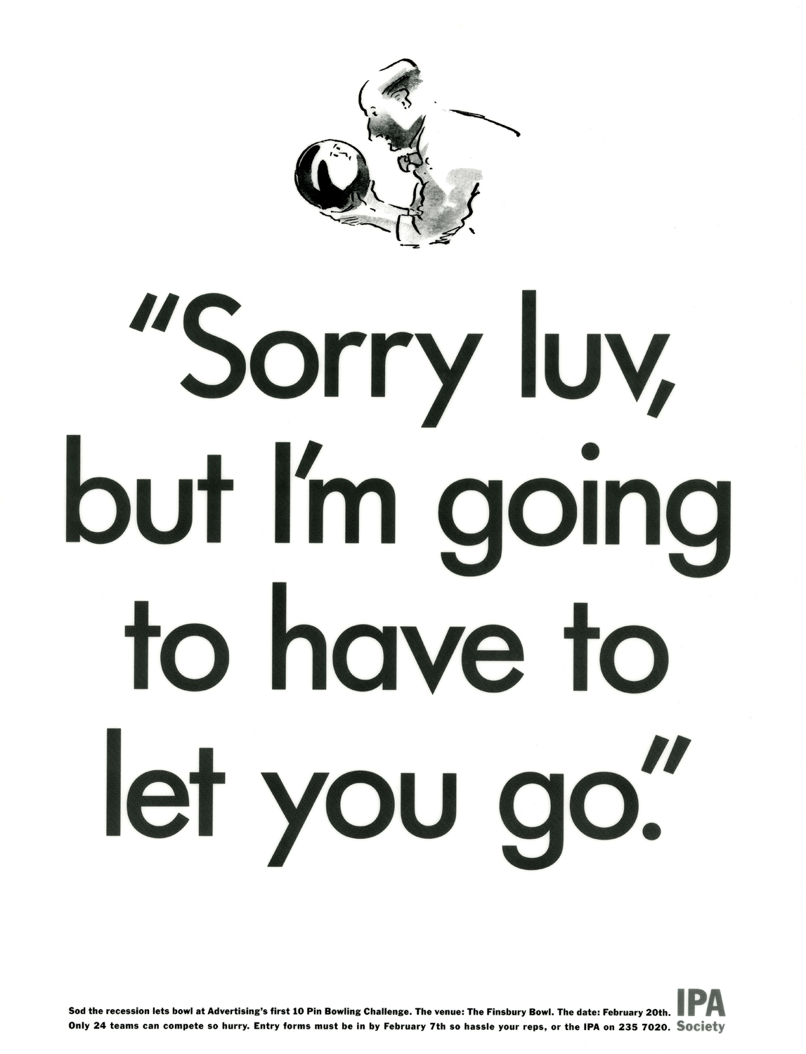 The next brief they gave us was for ‘The repackaging of John Major’.
We thought we’d try to court controversy, like those great George Lois Esquire. 
 Our idea was to show the Prime Minister bum out, socks on.
 It was rejected, being viewed as too controversial.
(The drawing must’ve been a homage to John Lennon’s ‘Two Virgins’ cover.)  Next was a talk by D&AD Chairman Edward Booth-Clibborn on ‘How to win more at D&AD’. (Would love to know what he said?)
The previous year the D&AD Annual looked like this.  So we literally helped the character win more.
 The last brief I worked on was for a talk by Tony Brignull on the glory days of CDP. By this point I was trying to make the layouts less basic, more creative.
I liked this layout, it was very relevant; honouring all the creatives who’d contributed to CDP’s glory days, but picking out the speaker.
The line seemed clever too; Tony was an old boy in that he’d worked there and he was old, he was an old boy.
We just needed Brignull’s sign off.
Excitedly, we took our fancy layout to Marylebone Road and waited, and waited, and waited for him to come down to the cafe in AMV’s reception.
Eventually he came down, weary, not full of the joys of spring.
No small talk, straight in “You have a poster?”
We unfurl our A2 rough with a proud flourish. 
“I hate it”, he got up and walked out.
We looked at each other trying to figure out whether to follow him or slunk out onto Marylebone Road.
We opted for the slunk out.
Twenty years later I did another one.
 Over the years a lot of teams hustled IPA briefs, the results of which can be found in D&AD Annuals.
It’s important not just to rely on your day job.
Hi Dave,
Just wanted to say “thanks” for taking the time and effort to do this Blog.
Some great stories behind some great work.
Hope there’s a lot more stuff in that loft of yours.
Cheers, Rob.
brilliant stuff. you should do a poster of you pissing on Ben Kay’s Christmas tree. Although the cnut of a tree would probably electrocute you. (Both are truly brilliant blogs.)
Stop writing funny blog posts and come and play football
I’ll be back, week after next, sharp as ever.