Agencies and clients generally shack up together after a single blind date, (or a pitch, to give it its technical name.)
As a result, the relationship is a marriage of convenience; ‘‘Do you, Least Bad Agency In The Process, take you, Client Who Needs To Look Like They’re Shaking Things Up?’’
But when an ‘old flame’ comes back the dynamic is different, you feel you have to do everything you can to justify their decision.
Or at least I did when this happened back in 2009.
I got a call from Andy Wood, formerly Adnams Marketing Director, now their C.E.O. and top chap.
He talked fondly of the old ‘Beer From The Coast’ campaign we’d created together six years earlier. Then he told me that their marketing had ‘lost its way a bit in recent times’, research had said people saw them ‘a bit like a Volvo, reliable, trustworthy, but boring’.
He shared some of their most recent ads.


Wow! The only positive I could find was that they consistently featured generously proportioned pictures of a pump clip, which would be lapped up by all those…er… pump clip fans out there.
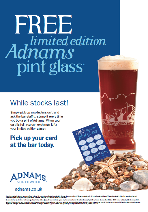
He was reluctant to jump back into producing more Beer From The Coast work, as it felt like a backwards step.
I told him I’d mull the problem over.
What to do?
The ‘Beer From The Coast’ campaign was pretty well-known, so it felt wrong to completely ignore it and reinvent the wheel, maybe we could evolve it?
I remembered back to when we were writing the first campaign; a planner had argued ‘brewing beer next to the sea doesn’t actually make it taste better’.
Technically that may be true, but emotionally it isn’t.
maybe we should lie and say it does make it taste better?
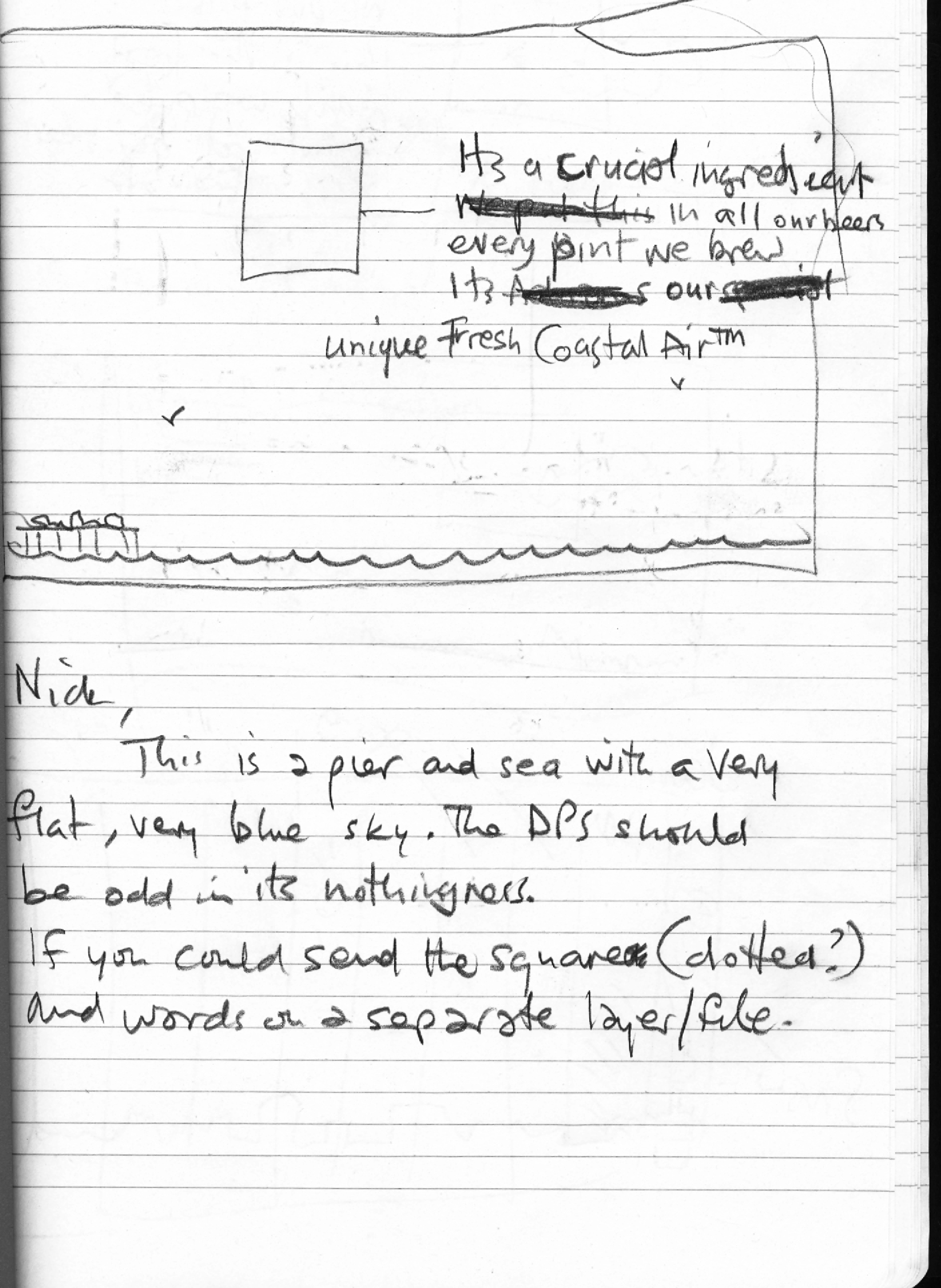
If done in a tongue in cheek way, maybe saying being brewed by the coast DOES make it taste better could be cool?
E.g. ‘Every pint contains special pockets of unique Southwold Sea Air.’
It would be a kind of USP, (that’s ‘Unique Selling Point’ for all you post Compact Disc generation.).
It could give Adnams a bit of attitude, make them more contemporary.
Less Volvo-ey.
I emailed Andy a couple of concepts.


He liked them.
But there was a problem, the idea was too beer focussed.
The Adnams of 2009 was different from the Adnams of 2002, it had diversified, they now distilled Whiskey, had a growing number of stores, hotels, wine departments and all manner of brand extensions.
All these different parts of the business looked different too.
We’d need to unify them.
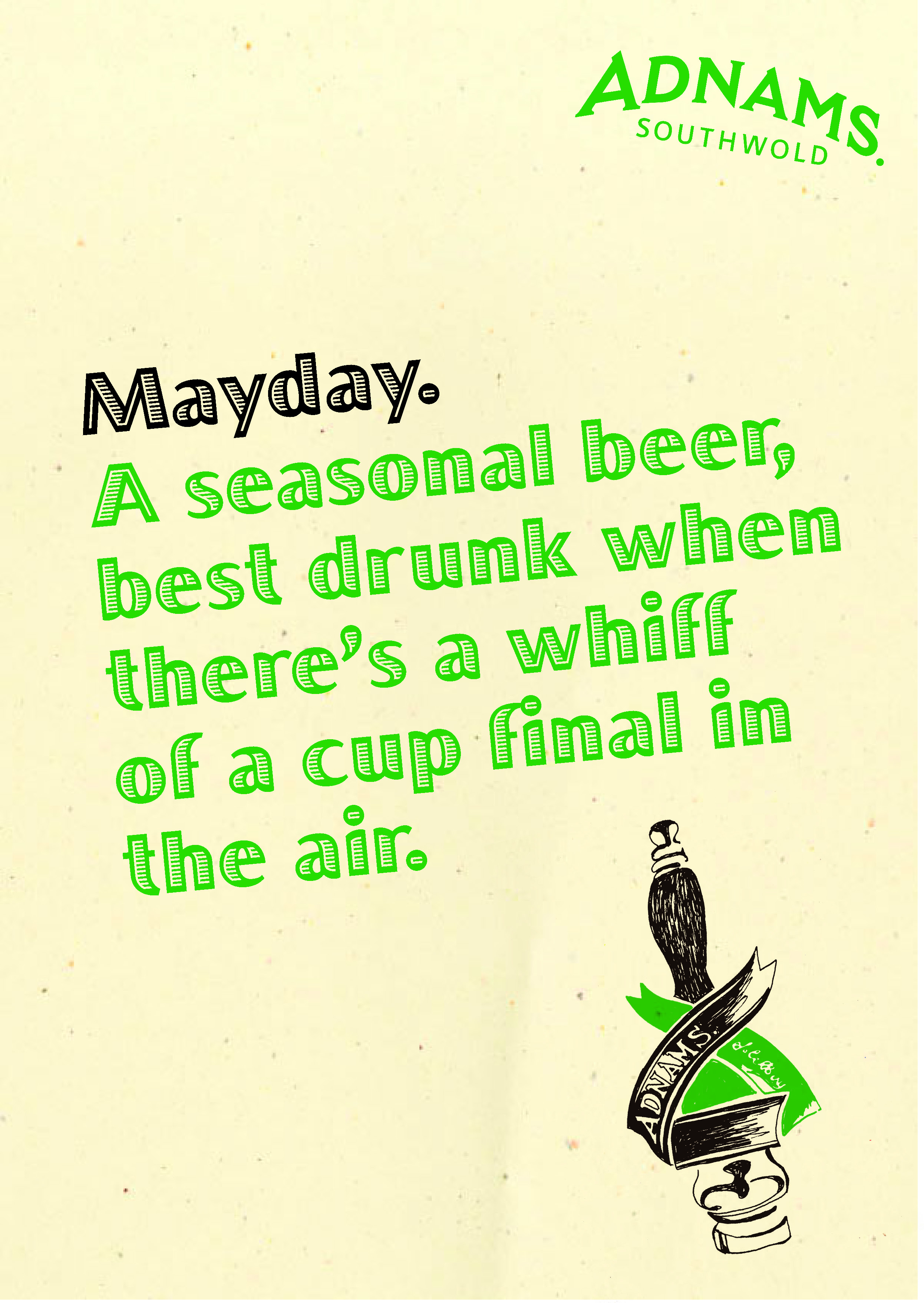
But the messages would be quite diverse, ranging from ‘30% off Rioja’ to ‘Weekend Hotel Breaks’ to ‘New Store opening’ to ‘Mayday Bitter is back’.
Given the range and type of messages we’d need to cover, words seemed to be the only way to go.
We’d need to create a distinctive voice to make it feel like one brand.
The most successful ‘voices’ tend to feel true to the company.
Baked Bean companies that talk like street pimps or Banks that talk like they are your oldest friend don’t tend to hang around for long.
So what truths could be used to build Adnams voice?
We put together a presentation.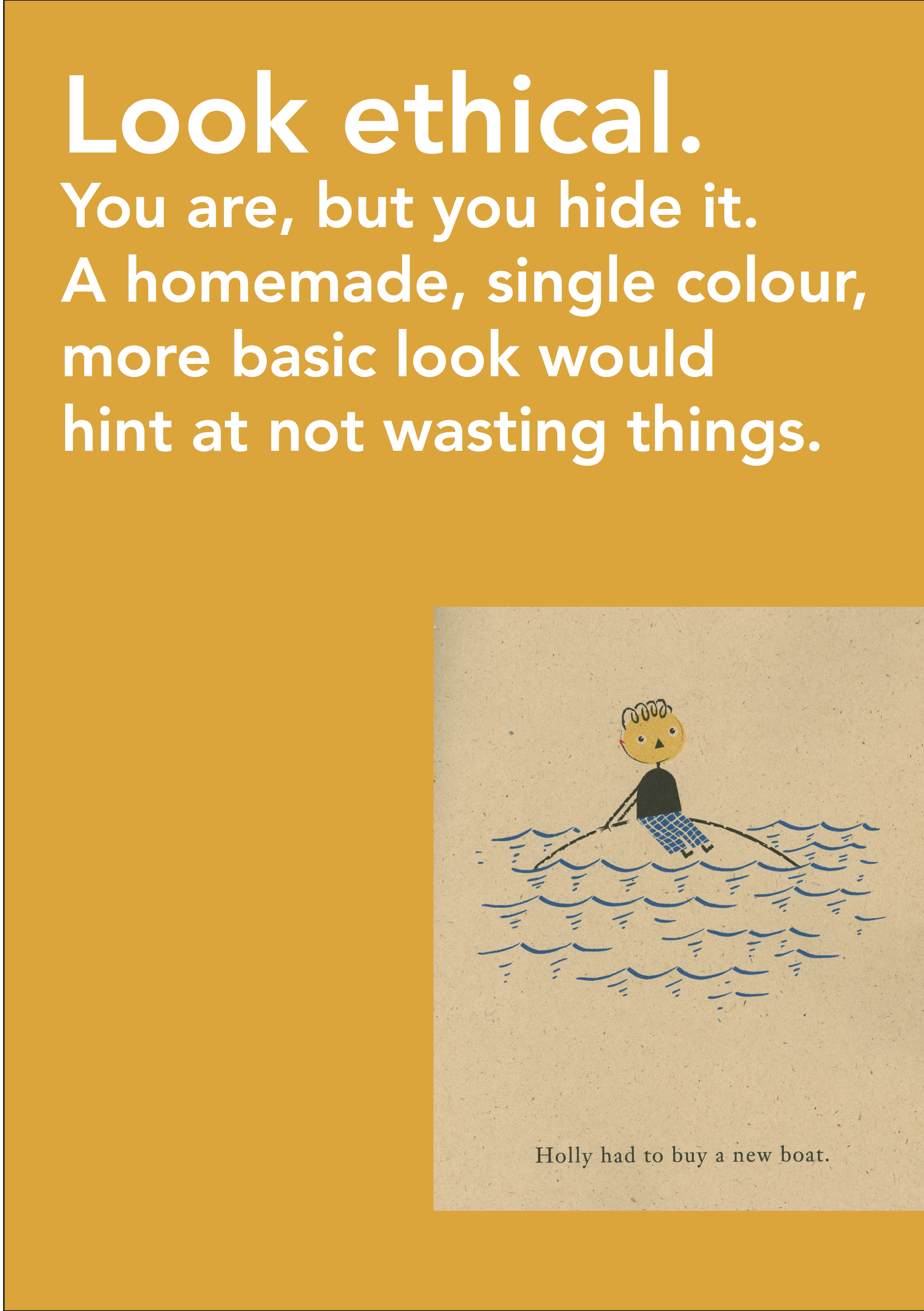


 This theory was bought.
But what did it mean in practice?
How would it look?
I liked the idea of using recycled papers as backgrounds, to look home-made.
I felt photographs of beer would look too corporate.
Photographs of products can look cool, graphic, vibrant and powerful.
But they rarely charm.
We just need to find the right illustrator…ooh, there he is, sitting on the other side of the office; Simon Barna, the dude on placement, he could draw?
But could he draw a pint of beer? 
Yes!
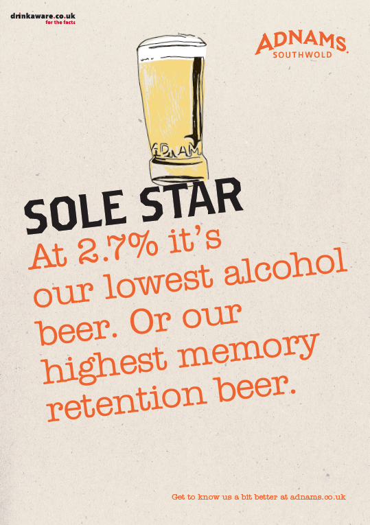
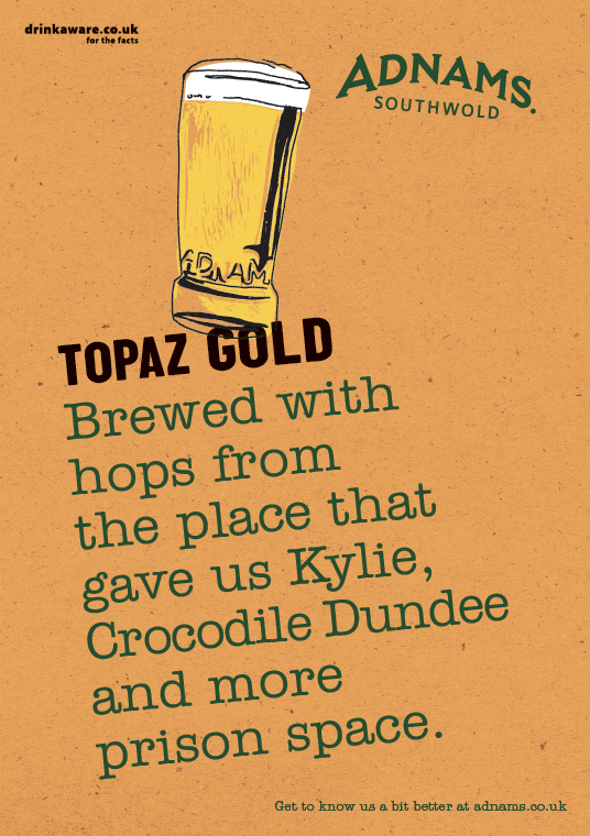
POSTERS.
I tried a single font in the initial roughs.
But I felt it was a bit formal, maybe we needed to be more playful and mix up the fonts?


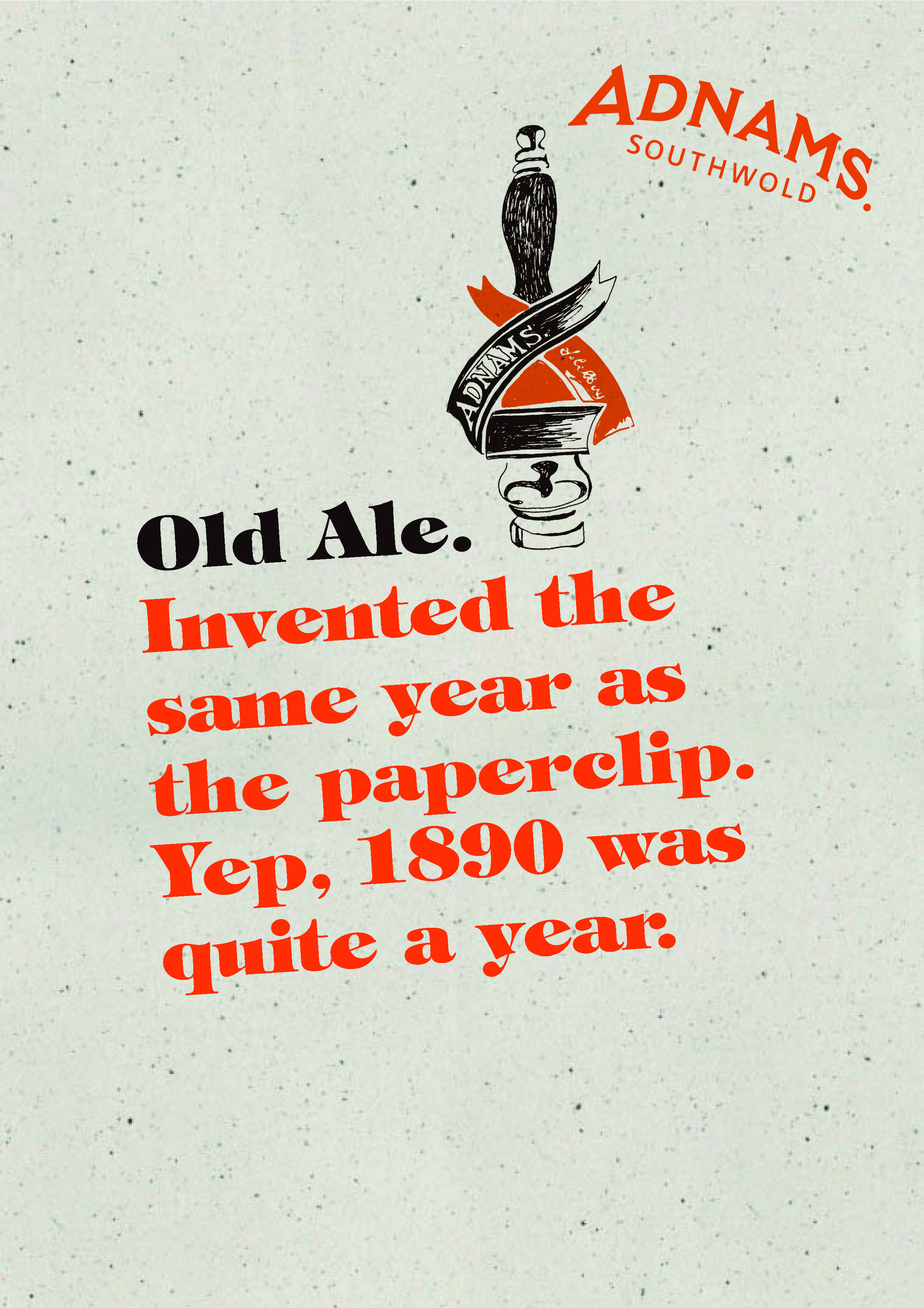


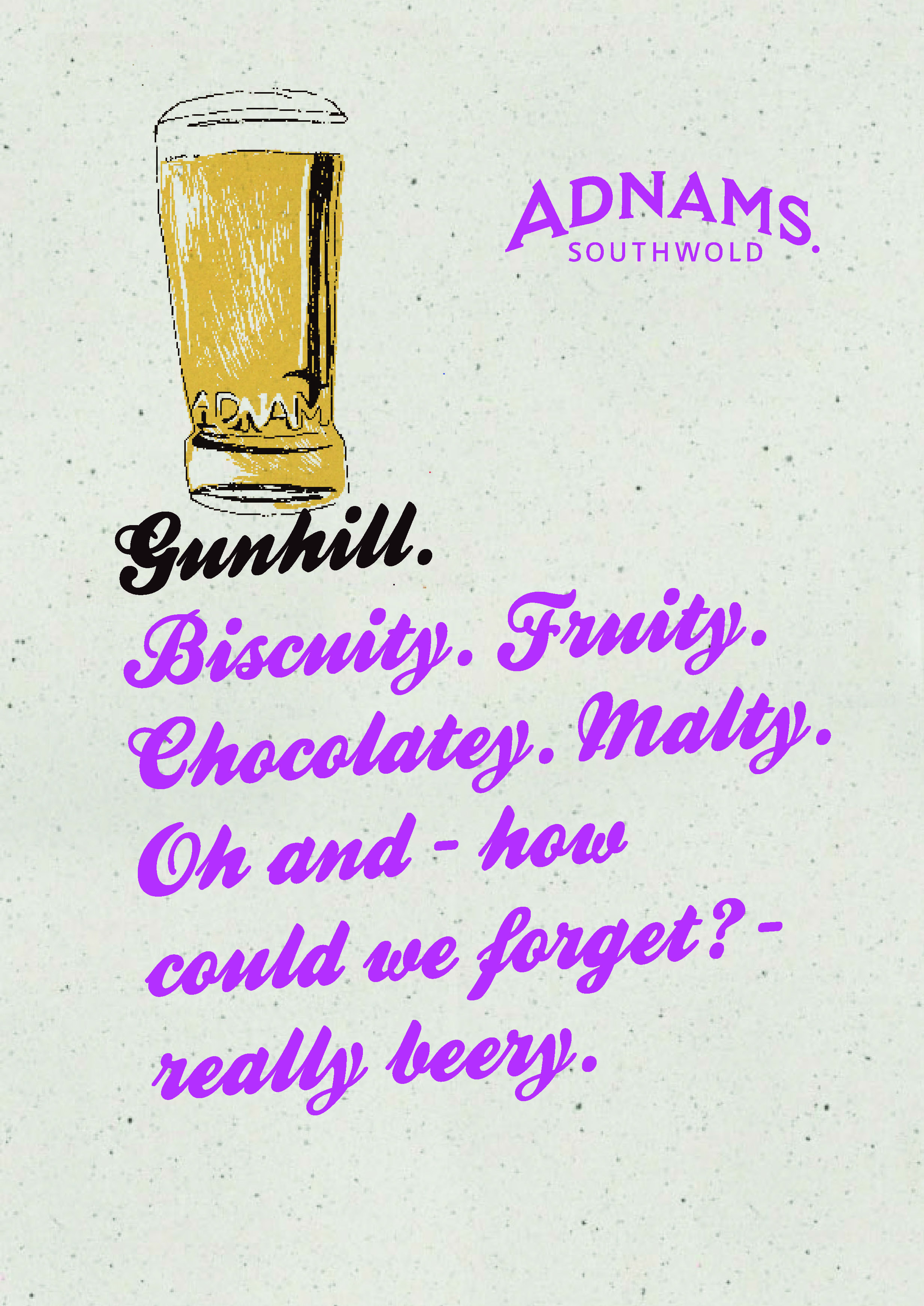


I was happy with the tone of the words.
They weren’t overtly selly, so felt like they were talking to an intelligent, sophisticated audience.
The tone was kind of ‘We know that your too intelligent to trick, so we’re just going to joke around with you about the merits of a particular beer, then you buy what the hell you want to buy. It’s no skin off our nose.”
It made Adnams appear confident.
The various recycled paper backgrounds worked well, giving the ads a homemade, environmentally friendly feel.
Changing the font from beer to beer gave each beer its own flavour, BUT it just made the campaign feel erratic.
We’re supposed to be unifying.
We needed to give ourselves stricter guidelines: Which makes them look like this.
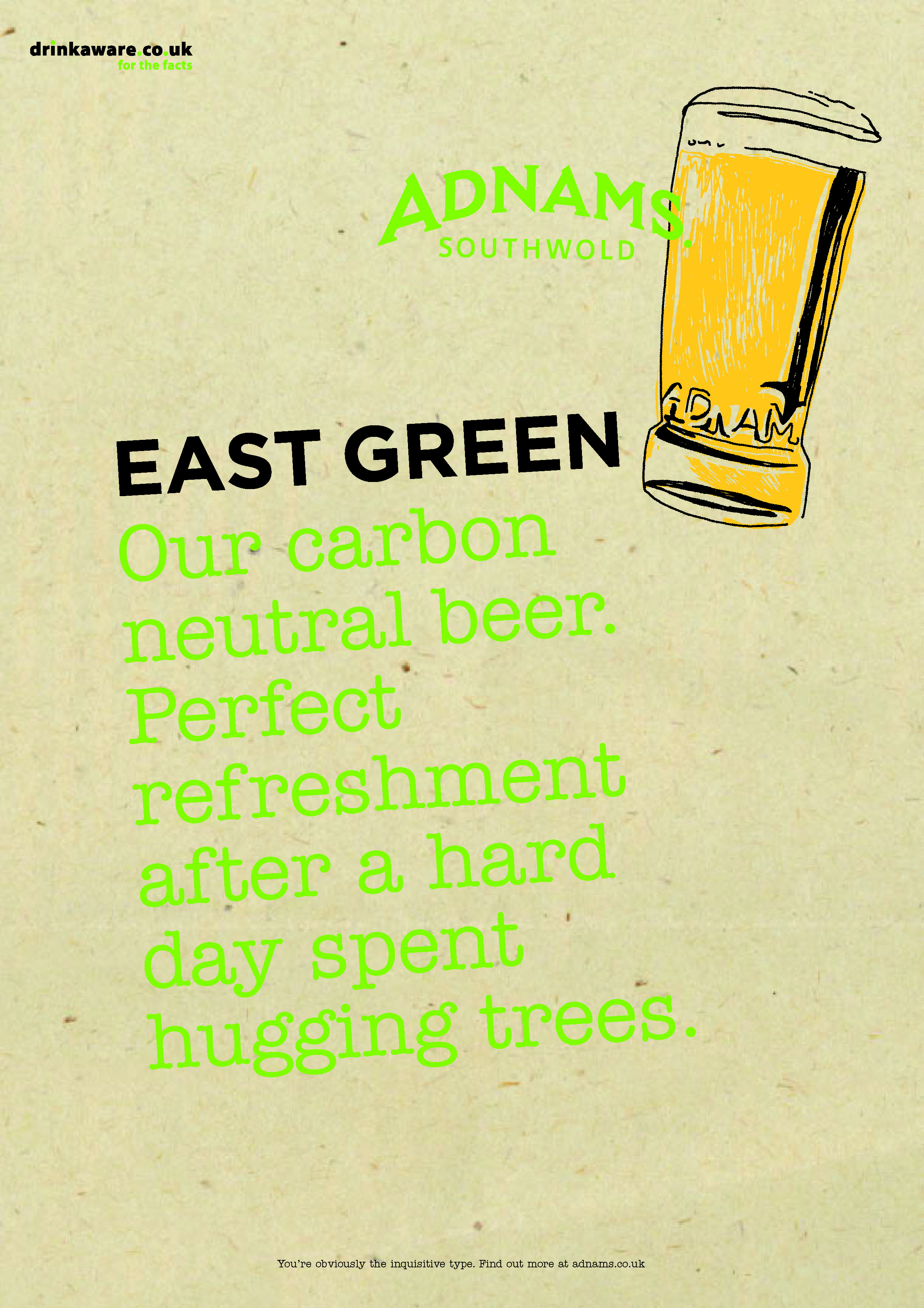


BROCHURE/BOOKLET THINGY.
We needed to get the whole Adnams story out there, their views on the environment, their diverse portfolio, etc, etc.
We could house it on their site, but it would also be good to create something we could put in people’s hands, whether they were trade or consumers.
We set about creating a book.
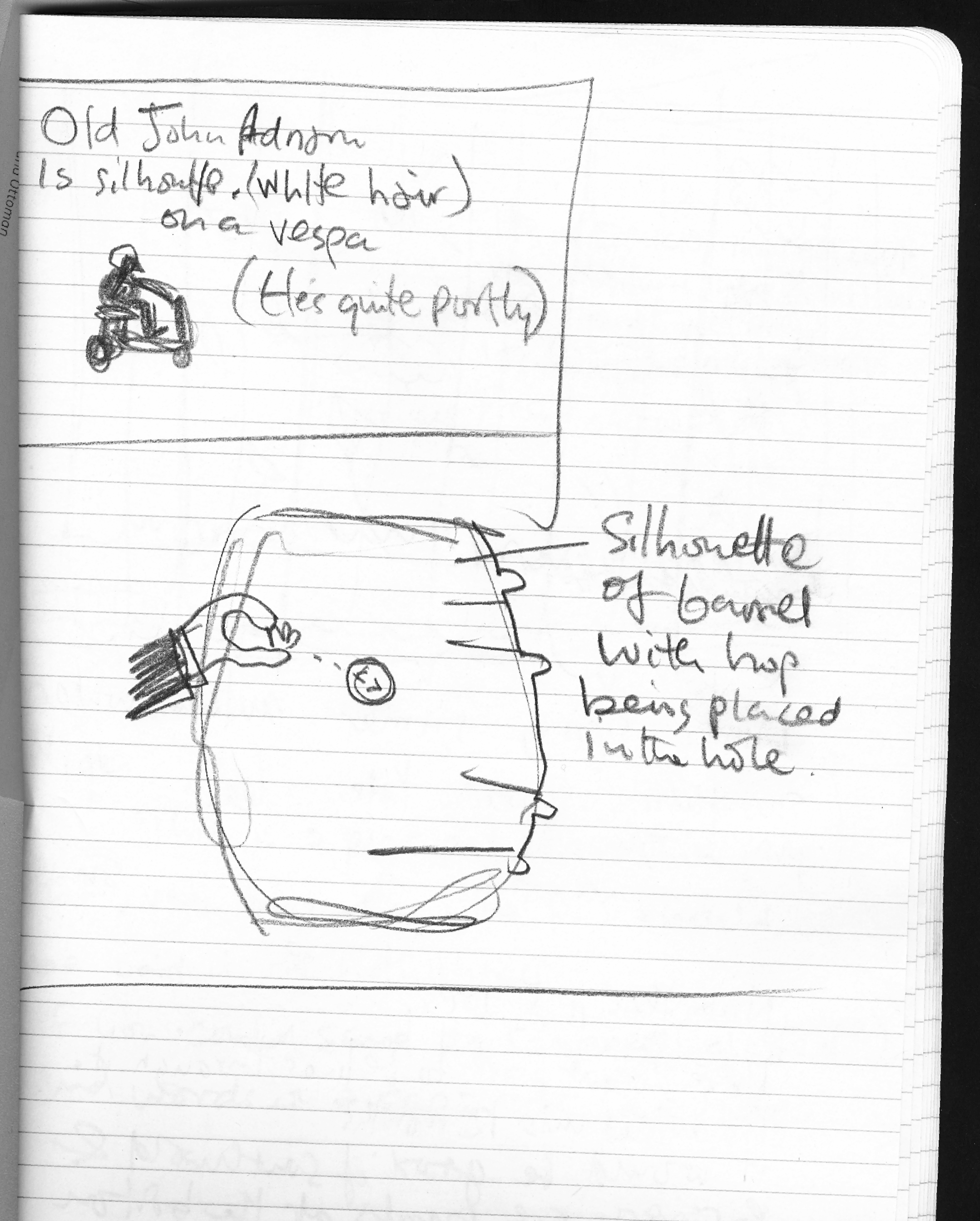
First I needed an illustrator, I wanted someone who was a bit naive…
…fun…
…a bit scribbley…

…positive…

and not too polished…

I chose Nicholas Saunders:
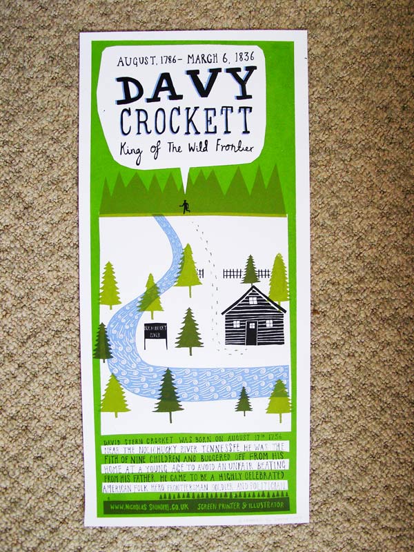

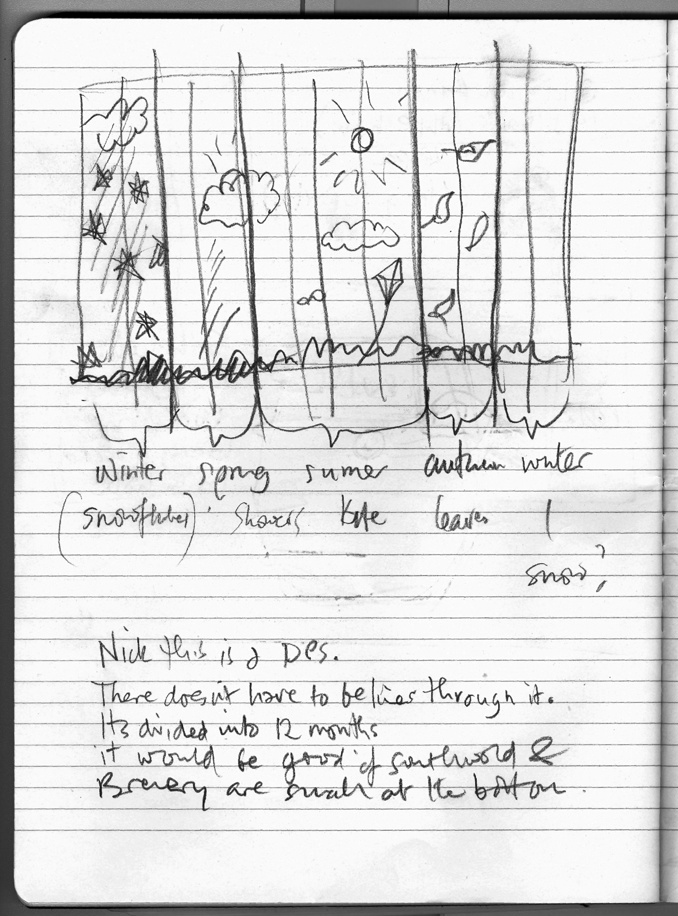
I went to Southwold to make notes and collect ideas for it’s content, then sent them to Nicholas to weave his magic. I wrote a manifesto for the intro page, then Nicholas brought it to life.
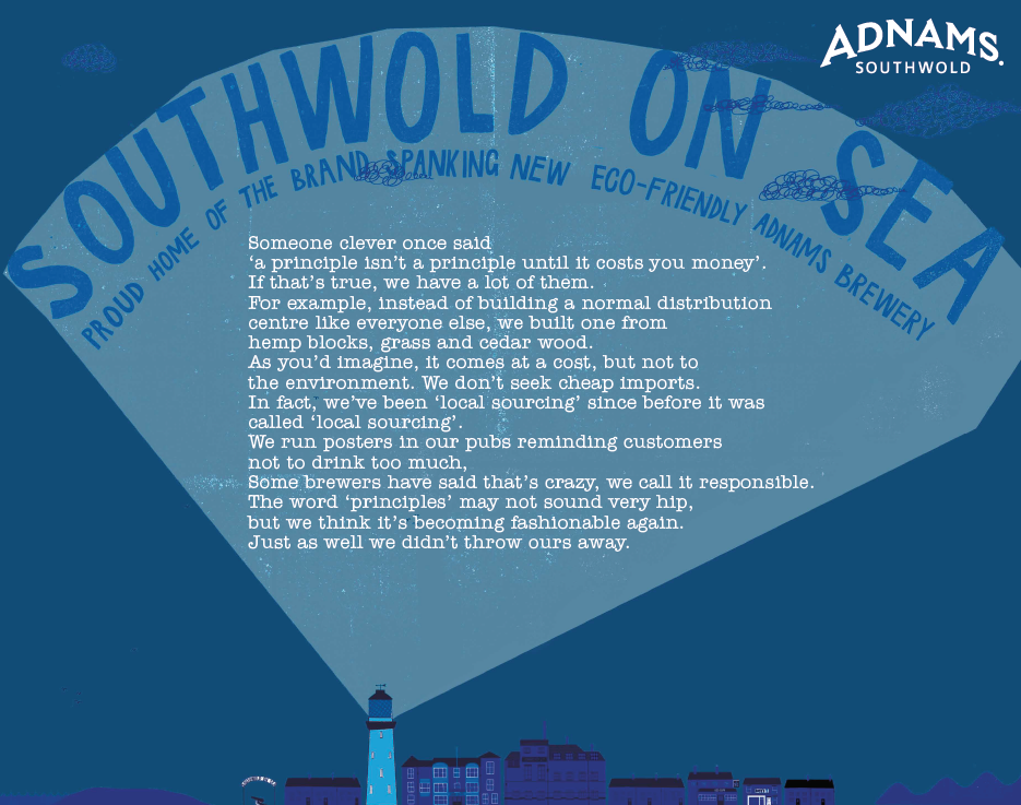


 We needed a section on ordering beer online.
I thought it would be cool to have a picture with bottled beers hidden within it, and titled ‘Where to find our beer?’, a bit like a kids book.
 Nicholas’s first rough looked good.
 But maybe it would look more interesting if it wasn’t confined to a street?


We turned some of the illustrations in the book into ads.


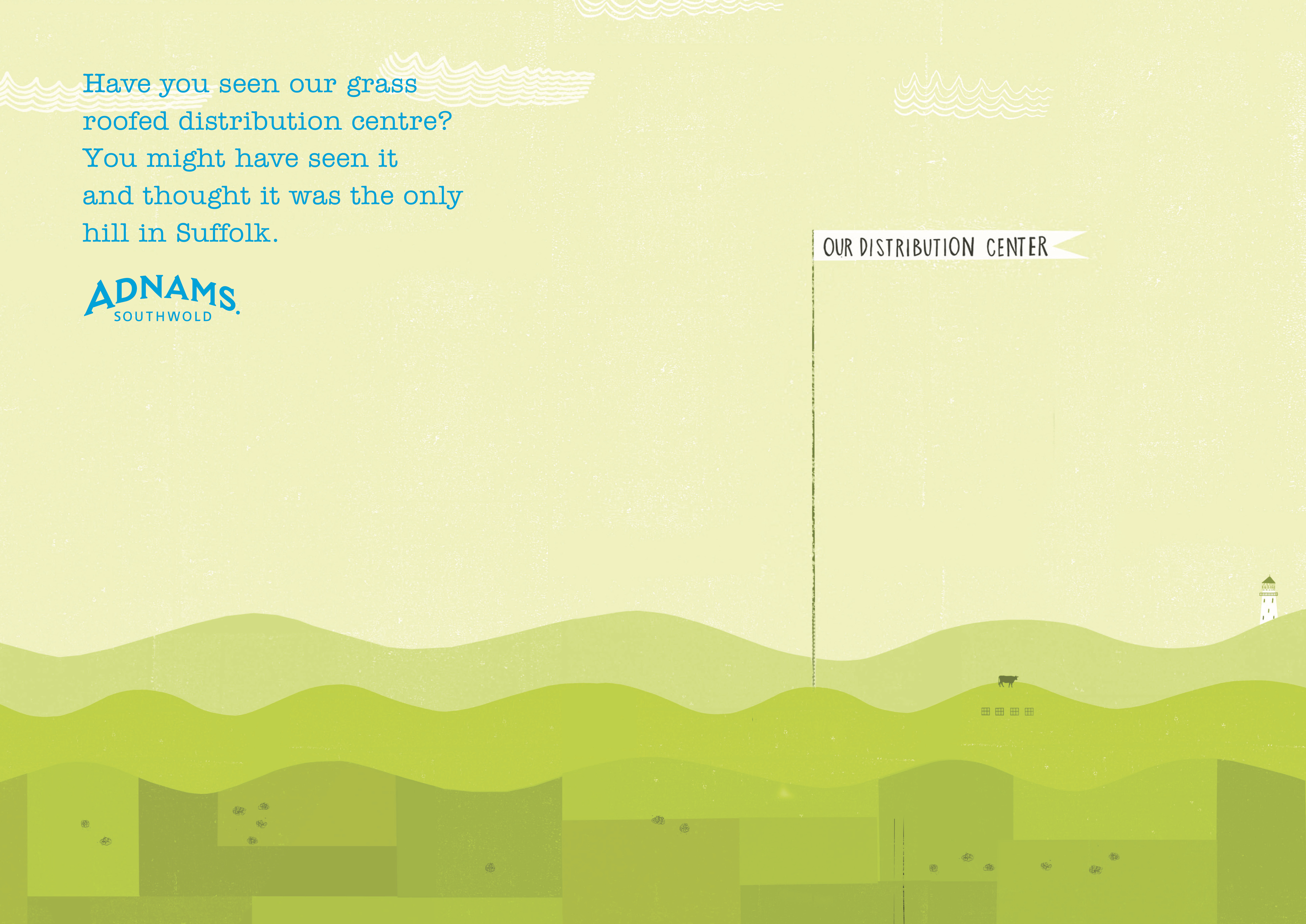
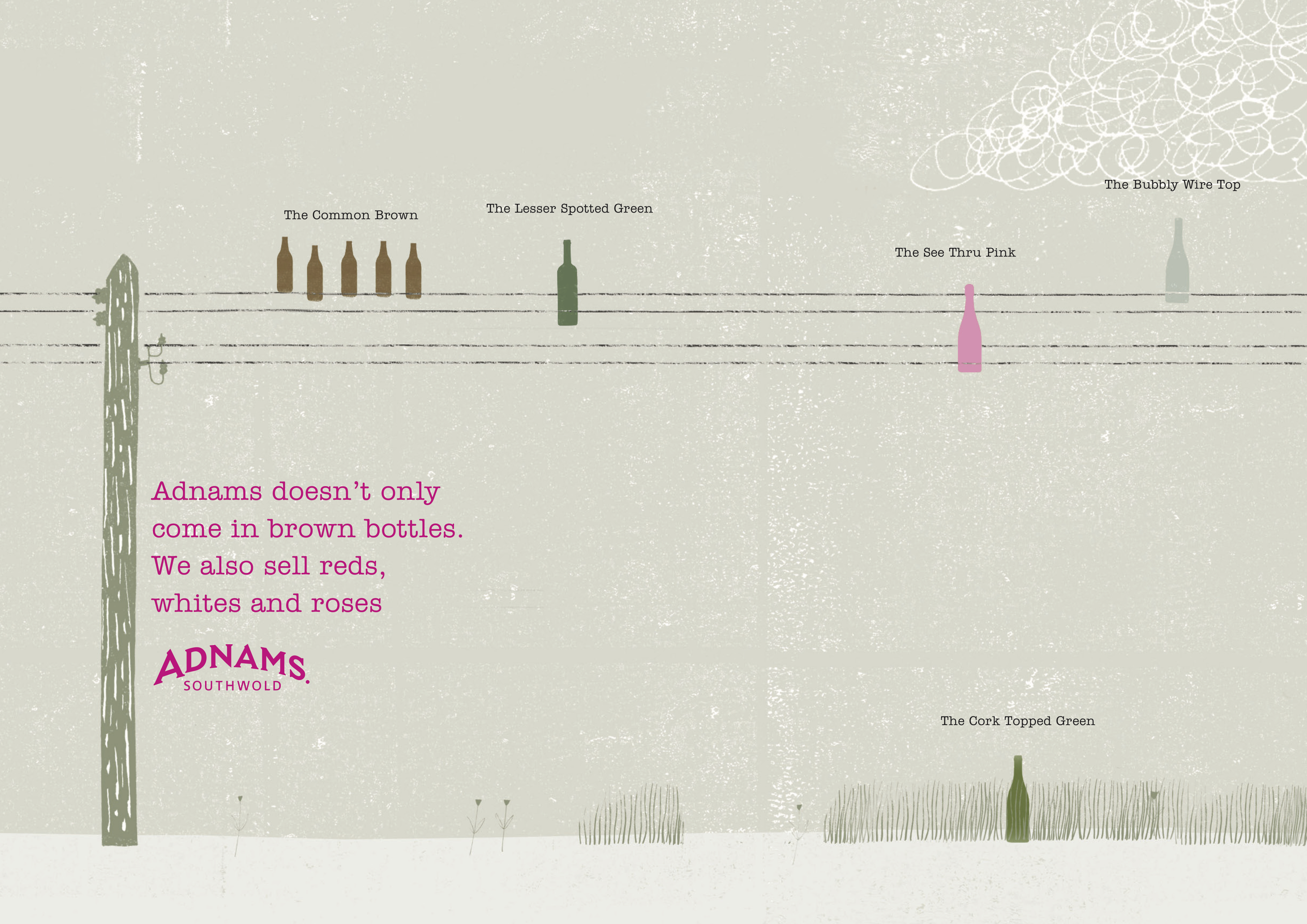
 Also, maybe we could rehash that ‘coastal air’ idea?
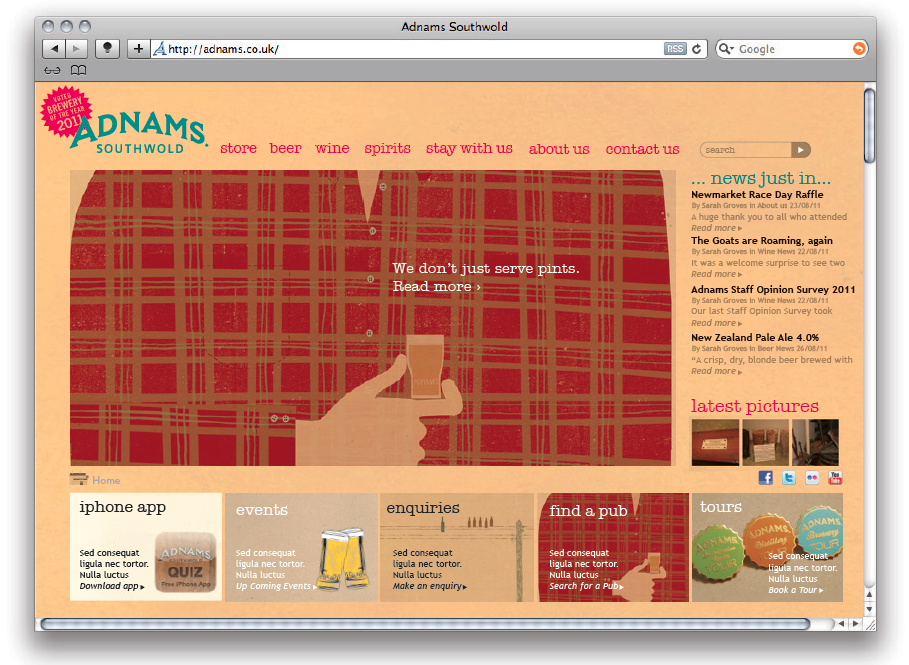
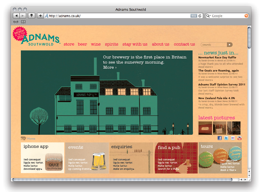
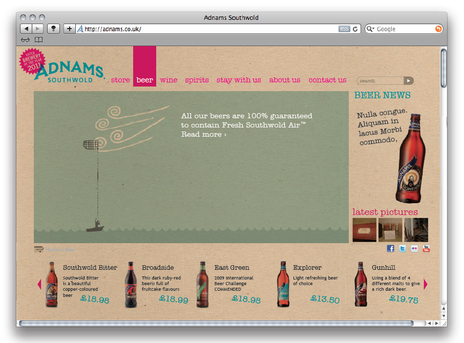
WEBSITE.
We re-skined it, changing it from this…
…to this…


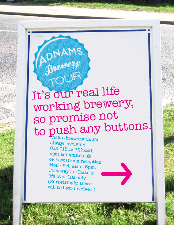
BADGES.
We colour coded the Adnams tours with a range of cool enamel badges.

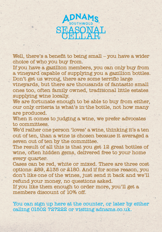
Seasonal Cellar Wine Club.
It didn’t seem to stand for anything in particular, so I tried to coral some facts and views on the world to let people know why they were different.
SOCIAL.
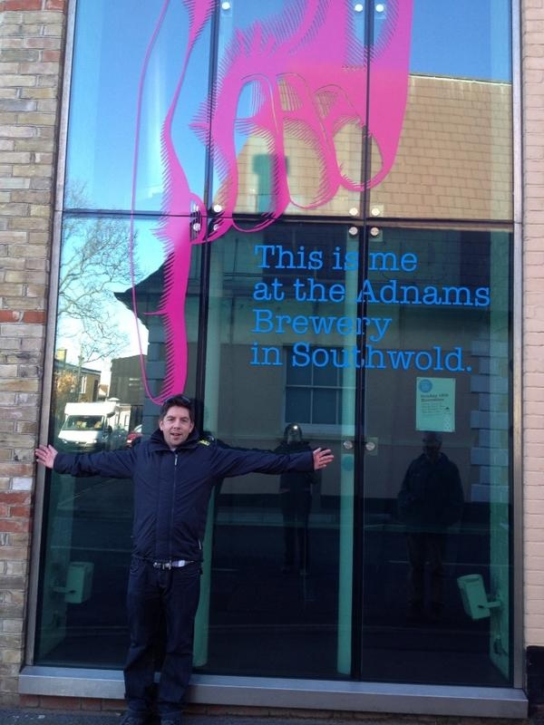
Their brewery is smack bang in the middle of Southwold High Street, so we turned one of their windows into an Instagram/Facebook/Pinterest photo-op.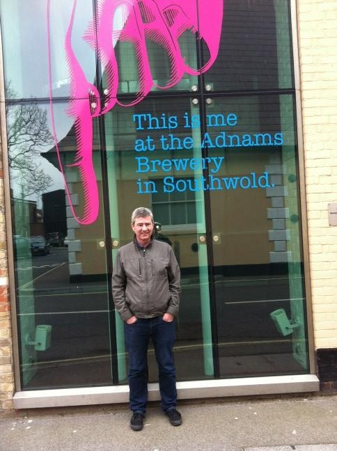

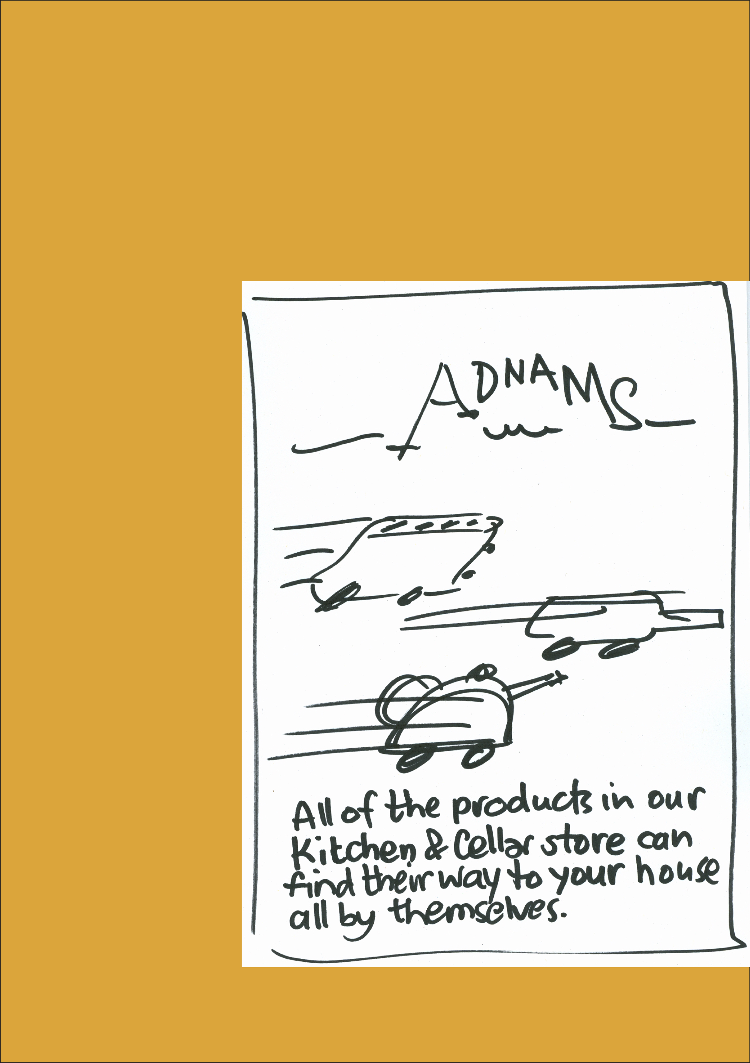
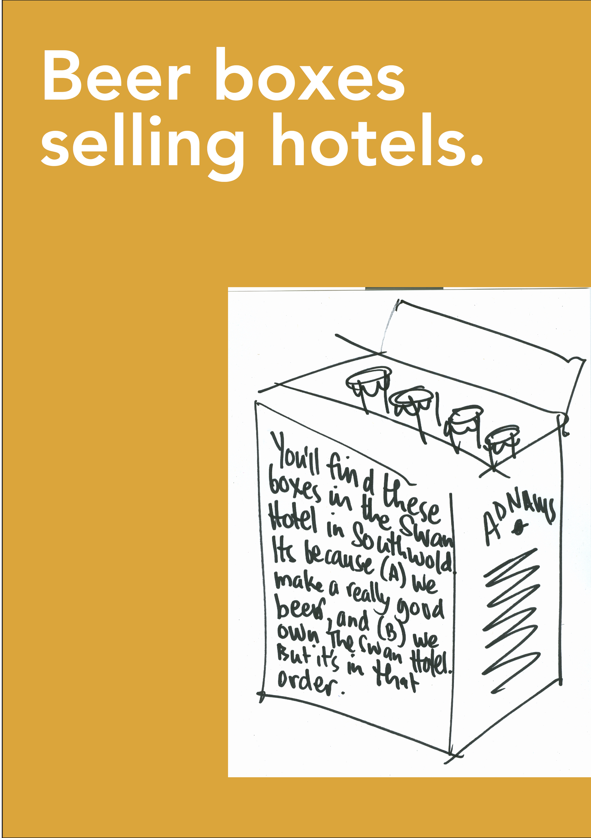
BOXES.
The ultimate free media, most simply print the name of the product and a few functional details, it’s a waste, it’s ‘s a great way to to get your story out. Free.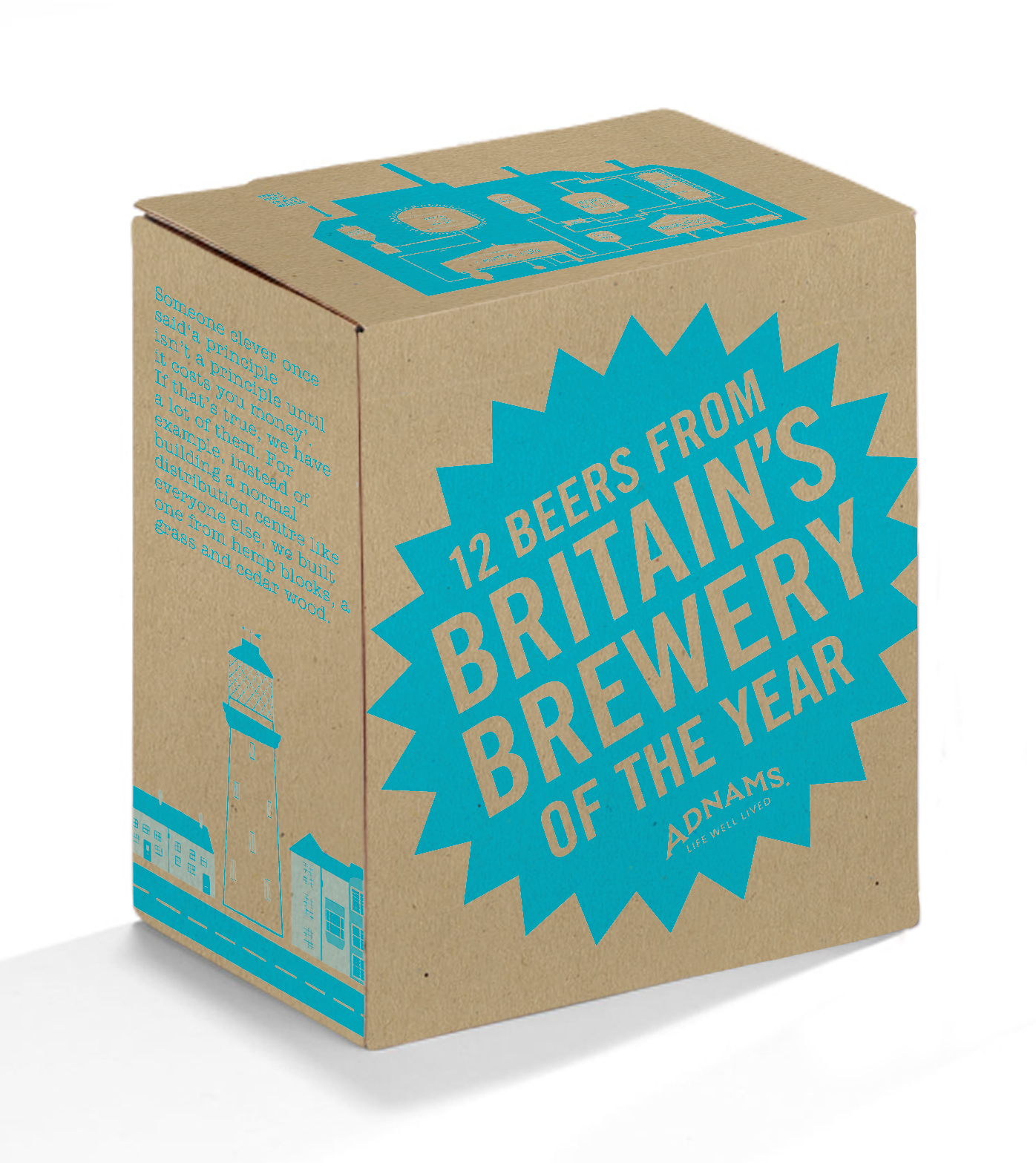
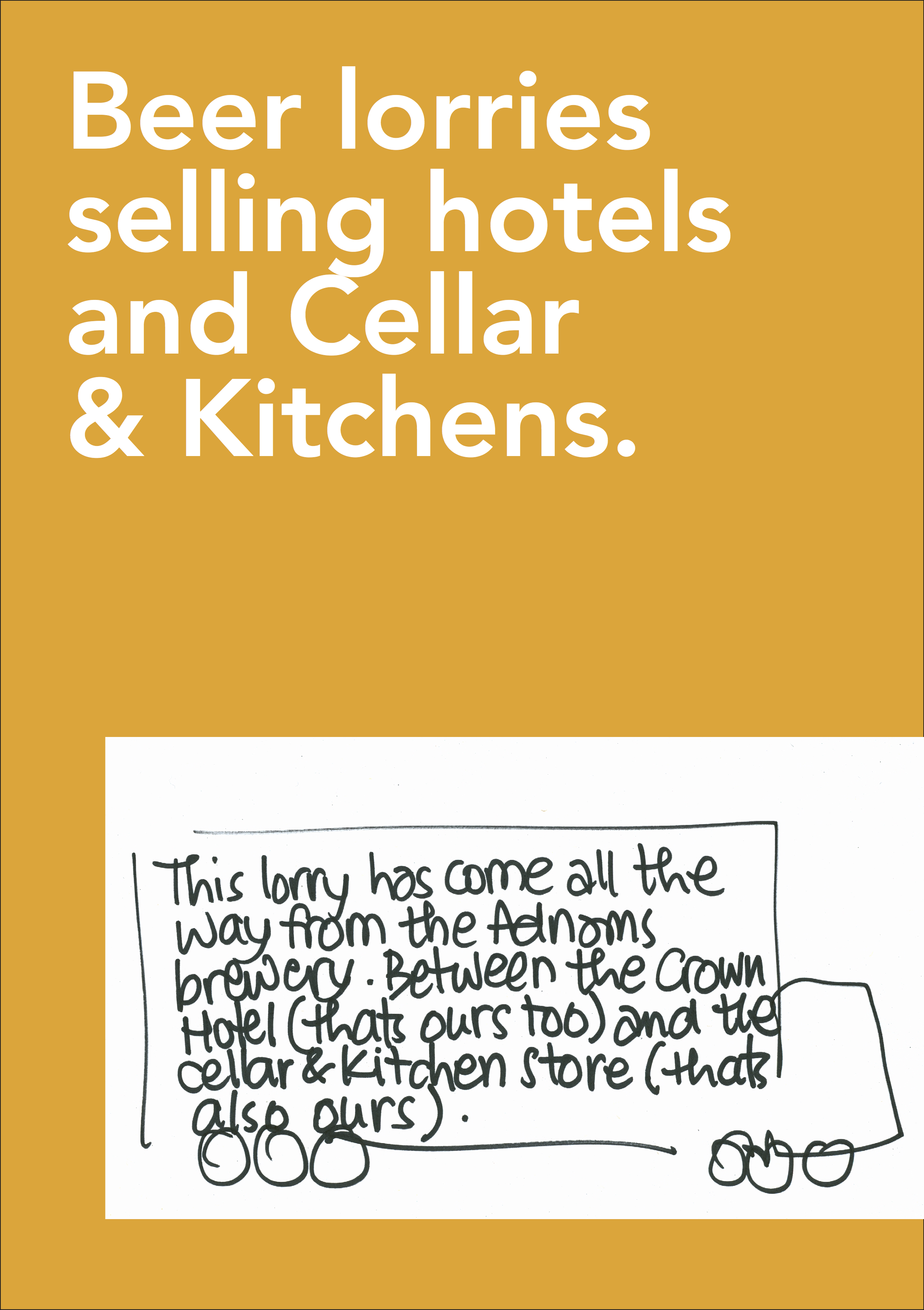
LORRIES & VANS.
We turned them into moving 48 sheets.


CELLAR&KITCHEN STORES.
We took our new voice in store.


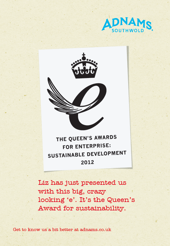
AWARDS.
We let people know about them.


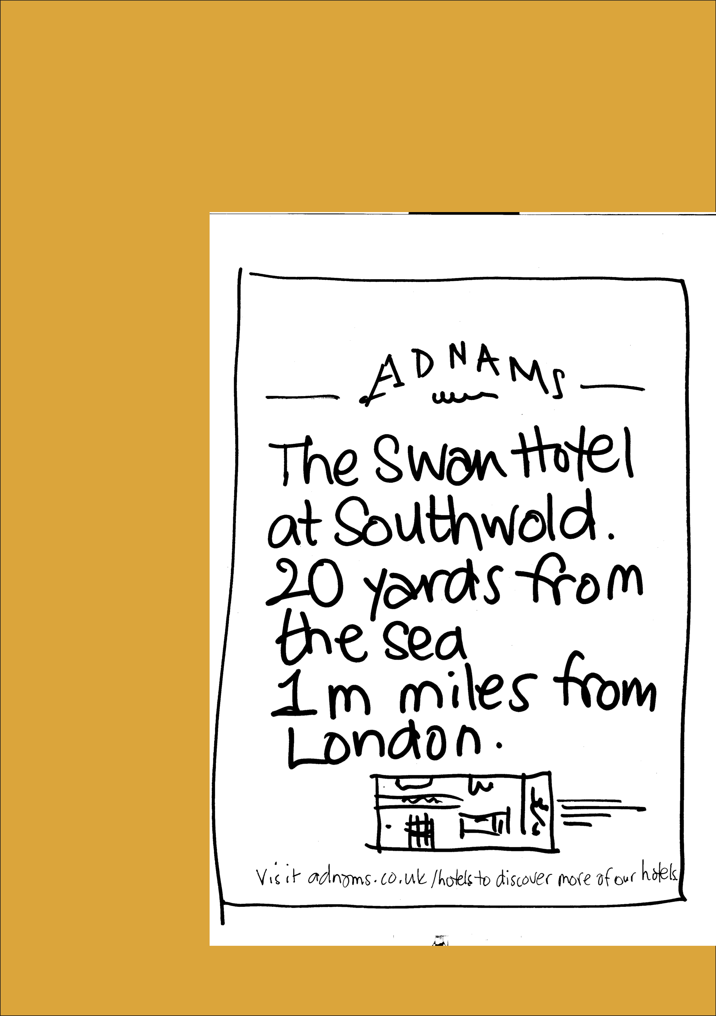
THE LATITUDE FESTIVAL.
It’s very local.

NEWMARKET SPONSORSHIP.
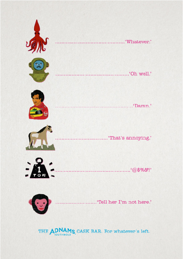
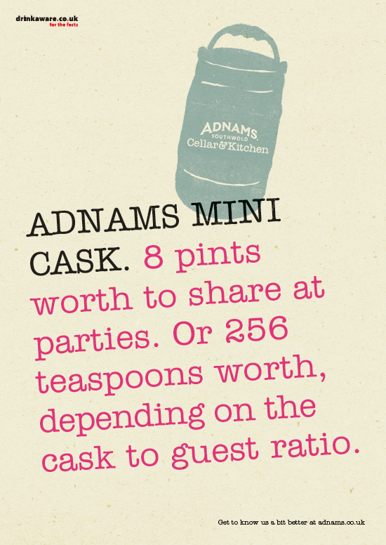
BEERMATS.
One of the least used, most read bits of media; the humble beermat.


JACK BRAND.
We helped create this sub brand.
We wanted to create something authentic, not just Shoreditch cool.
Andy Wood, the Adnams C.E.O. turned up at our offices with just the thing, ye olde Adnams bottle.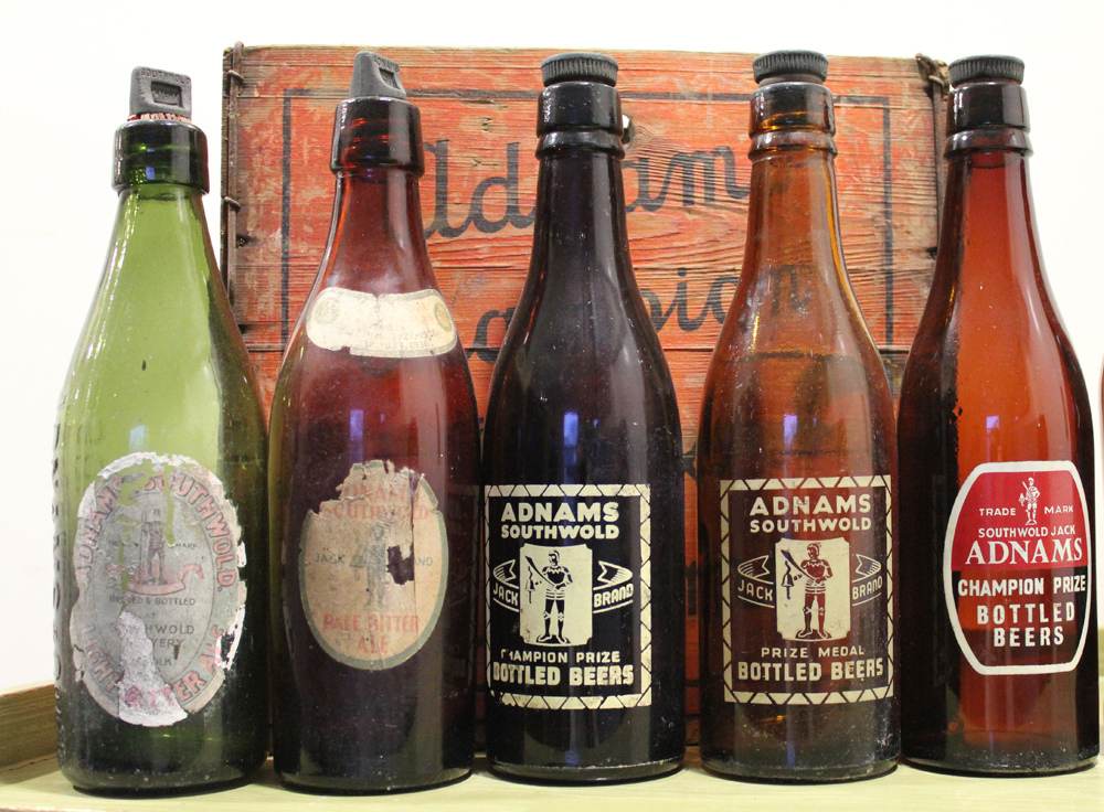
We based our design on it.


THE END.
Three years in Adnams was beginning to be ‘de-Volvo’d’, made cool even.
But, and we should have guessed it given their environmental policies, Adnams decided to source their creative work locally.
It’s understandable from their point of view, they now had a template to copy and agencies in Suffolk are cheaper than those in Soho.
Is it really worth paying writers to find an angle on a new message when we could just say it?
Is it worth paying for Art Directors to Art Direct each execution when we already have a style to copy?
Is it worth debating with an agency about what they want vs what we want?
Is it worth listening to an agency push us to be ballsy when we don’t always want to be?
Is it worth arguing about whether the layout is cleaner without the extra info?
Is it worth having to listen to the agency wang on about which is the wittier execution?
Well, on the evidence of their recent work, below, I’d have to say:
YES!,
YES!,
YES!,
YES!,
YES!
and
ABSO-BLOODY-LUTELY YES!
But then again, I’m horribly biased, you decide.


…don’t you wish you’d made it look a bit more complicated with lots of pretend scientific charts to back it up?
Hey Mark, I guess you mean on the first ‘Southwold Air’ stuff? I didn’t really think of it at the time, but I guess you could go that route, (I know you love a pie chart.)
….what I meant was, if you hadn’t made the whole creative process so easy to understand, the client might not have moved the business. (I’ll try drawing a picture next time).
Oh I see…yeah, you’re right, I’ve come unstuck a few times with that, if you come up with campaigns that are simple and make sense they look like any idiot could do them, so it raises the question ‘If any idiot could do it, let’s get cheaper idiots.’
But in a funny way I think the example is a good ad for our business, because they both ingredients:
1. Recycled backgrounds.
2. American Typewriter Font.
3. The same illustrations.
4. Cyan and Magenta ink.
5. Headlines.
Choose certain words and arrange the elements one way and Adnams appears cool, choose different words and arrange the elements another way and they appear naff.
superb stuff!
you even persuaded them to use illustration not their “real” packaging which can be really hard in FAB category.
btw, is there a typo in Explorer poster? “cholestrol”.
Thanks Alesko,
The cholesterol ad must be an early rough, I’ll look for the final one. Thanks.
FAB? (Funky Alcohol Brands? Fuel And Beer? Flipping Ace Brewery?)
D.
LOL
Food and Beverage.
although yours are way better.
Dave you are amazingly talented. When are you gonna come do one of my IPC talks? Soooooon??
Dave you are amazing. When are you going to come do one of my IPC talks? Soon pleeeease??
12.45am?
4 ‘e’s in please?
Message sent twice?
Been on the Barcardi Breezers again Lisa?
Great Blog Dave. I’ve shared it to all concern in our office in the hope they learn from it.
Thanks John, glad you like it. Best, D.
Can I just say I love this blog? A living, breathing reminder of why I’m in the ad business (apart from the whole “getting paid” thing).
Hey Phil,
Thanks for the comment.
I wanted to put some positive stuff out there, I think there’s lots of andlookatthishitaddonebyidiots@wordpress type blogs out there.
So far the best source I’ve found for learning d and ad. Maybe I’m missing something? Anyways, thanks for taking the time to make them, it’s highly appreciated.
thanks dave. it’s a really good read. i am just wondering whether the beginning of your manifesto is a reference to bill bernbach?
I’m not sure what you mean Gordon, (although it’s possible.) D.
Please bring out a book you big-brained bastard.
wowoweewow!
Hey Janson,
Your English isn’t as good as I remember. What does ‘wowoweewow!’ mean?