Where did you grow up?
The sleepy town of Sawbridgeworth, it’s on the Hertfordshire and Essex border.
When did you take your first picture?
There was no eureka moment, I inherited my grandfather’s Silver Ilford Sportsman. I do remember being intrigued by its beauty; a matt silver finish with shiny brown hinged leather case.
I wore it across my waist in my early teens, but had no idea what I was doing with it.
It felt sophisticated, technical, way beyond anything I’d ever come in to contact with at that age.
It was the act of making that I enjoyed, rather than ever believing that I was making anything important.
I liked the idea of editing a scene through the viewfinder.
Most of the time it wasn’t even loaded, film was too expensive.
It was in a time when a roll of film had to last you the whole summer.
What was your first job?
Express fruit & vegetable delivery man.
A white van man at 17, straight after passing my driving test.
Deliveries at extraordinarily dangerous speeds, I was compelled to drive as fast as I possibly could on every journey.
I went on to be a geologist, mainly because I wanted a job outside in the landscape.
How did you make the jump from white van man to photography bloke?
Was it a wise move? I tussle with this nightly, I might have had my own van by now.
One thing is for sure; we didn’t operate six month credit schemes before you got paid.
It wasn’t such a jump, photography was becoming an everyday activity.
The geology degree was a brilliant insight into the English landscape and how it was made.
I had aromantic vision of a career roaming the World recording and mapping extreme environments, physical and mental challenges.
I ended up in the gold fields of Western Australia, it was an experience, I was very fit then, surviving the elements as well as a very male dominated high testosterone environment.
But it wasn’t for me.
After a year full of the bullshit of travel I returned to the UK and started applying for jobs as an assistant.
Who did you assist?
Steve Rees gave me my first job, he was a good tutor and generous employer.
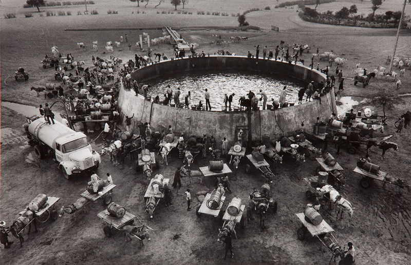
Then Bob Elsdale, he was the first photographer to own a Mac in London.
People would visit just to see it, they’d crowd around, scepticle if it would ever take off.
Both good people who showed me the ropes.

(The work above is Bob’s, not 100% sure whether Giles assisted on this job.)
What was the first image someone paid you to produce?
Rubber Plants for a brochure, a tropical plant rental company paid me 250 quid.
Ludicrous money at the time! I was on £100 a week as a full time assistant.
My first ad job was a series of nudes for a medical insurance company, commissioned by the Marshall brothers at Leagas Delaney.
Just before I started I vomited with fear.
I had gone from table top still life to a full on big production over night.
I didn’t really know what advertising was, I he’d previously only worked in design.
Who were your photography heroes?
Many.
Henri Cartier Bresson; informative social documentary imagery with an exceptional graphic eye and sense of timing.
 Andrez Kertez, he found beauty in the mundane, presenting it in a very simple reductive way.


William Klein for his fearless, confrontational portraits, shot on a 35mm lens.
He clearly had built up a rapport with his subjects and tried to capture people from afar in voyeuristic way.
I also think the ease with which he experimented with other media shows an artistic man way ahead of his time.

 Sebastao Salgado for his social documentary.
The body of work that explored international mining and heavy industry in the developing World is exceptional, highlighting working practices that hadn’t changed since the Industrial Revolution.
Jeff Wall.
One of my favourite images is a ‘Sudden Gust of Wind’.
 It’s based on an Hokusai painting.
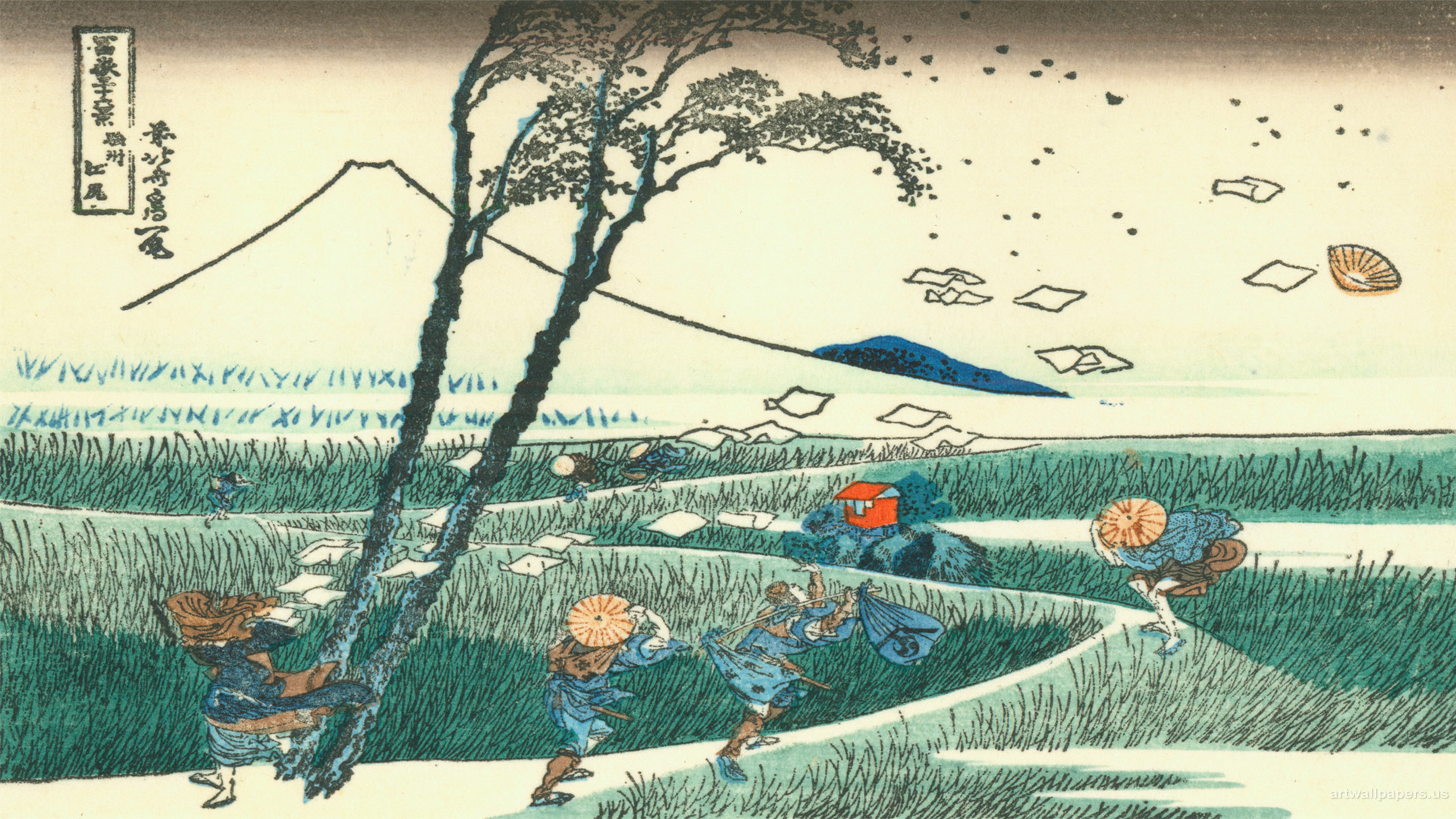 It took months to construct, the airborne papers have all been placed in post production.
I don’t care how long it took, compositionally it’s brilliant.
Karl Blossfelt; a botanist with an artists eye.
He made photographs to catalogue plant specimens.
I’m really interested in the interaction of Art and Science.

The illustrator Haeckal is another example of a body of work born out of a fascination for science.
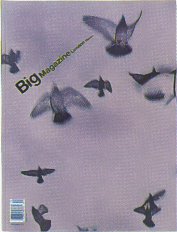
I first became aware of your work via Big magazine, did Vince Frost get you going?Yes. it was a big break.
You come across a handful of people in your working life that are true talents, Vince is one of those.
He is instinctive and trusts in good work, the work comes before the reputation.
We became very good friends and have worked a lot together ever since.
The images were raw, and when combined with letterpress typography made a very bold, confident magazine that everyone wanted to contribute to.
Do you prefer tight or open briefs?
It depends what it is.
Commercially I like to work on the best idea whoever has conceived it.
I’ll always give my view on a campaign, it’s up to the agency whether they listen.
I’m a wasted resource when used just as an art worker, but some jobs are like that. What’s the difference between shooting for an ad agency and a design company?
Advertising employs you for your technical ability or aesthetic, in the States they call you a ‘shooter’, which sums up the role.
All of your energy is focused on executing a collective vision, one an agency team has championed for a brand often weeks or months in advance.
You take on the commission with the commitment as if it were your own.
It’s all about the production of the shoot and building a team, the bulk of the thinking has been done for you.
It is a tried and tested model so who am I to criticise, but it but seems a little outdated.
Stronger ideas result from photographers being involved earlier in the process.
There are some talented photographers out there whose creative abilities are under-utilised, I’ve noticed a generic quality to a lot of recent photographs, probably as a resulting from countless references found on Google images, I know it helps to sell an idea to a client, but it can limit the imagination of the creatives.
Advertising is fixated with being first, building a story around a technique, but being first today is old news tomorrow.
Designers are out of a different mould, the life span of the work tends to be longer.
Budgets are smaller but their ideas are ambitious in a different way, the limitations encourage more thought and imagination.
It’s also a relief not to have to spend two days writing a treatment every job you do, to justify your creative credentials.
The application of images is also more diverse.
I’ve worked on design projects from postage stamps through to huge interior installations.
‘Can you shoot me a face that works upside down as well?’
I can’t think of another photographer I’d ask to do that, or one who’d take on that ludicrous challenge?
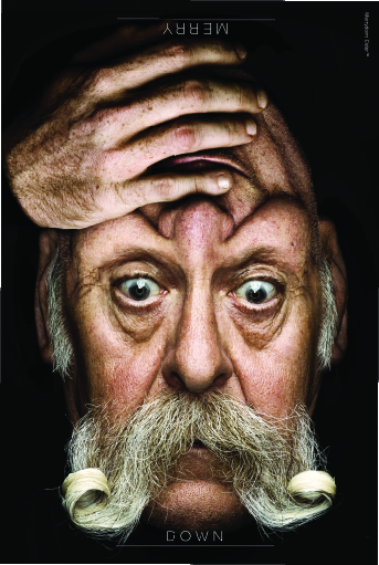
It’s one of the trickiest challenges you’ve ever given me.
But it was such a good idea, all the artists involved in that campaign produced wonderful work.
Your work is more like Art than any commercial photographer I can think of.
Wouldn’t you be far more famous in in that world if you were more pretentious?
Or spelled your name in a more exotic way? Gilles Revelli? Gilmondo Rev-El?
Probably, I think the public warm to an aloof, renegade facade.
You are what you are though.
If you play that role then you have got to sustain it.
I’m hoping that the latest projects will make an impression on the Art world, without having to take on a tempestuous, rockstar persona.
However, I’ve often thought about trying a pseudonym like Sebastian Conti; a new photographic presence in the fashion world.
Try it, but swap that ‘O’ for a ‘U’, it might give you a bit more attitude.

Do you think digital technology has helped photography?
Yes, undoubtedly when used intelligently and creatively.
It has allowed quicker workflow and more possibilities creatively.
The draw-back is that there’s this obsession with sharpness.
‘Hyper-real’ is one of the most annoying terms attached to imagery at the moment.
I’m excited by imagery that takes away and refines .
Half of the images we value today in the galleries around the World are ‘soft’ by modern-day standards.
The speed that images can be made encourages sloppy practice, multiple versions are made to cover all eventualities, then cobbled together in post-production.
The expectation of how much can be achieved in a single day are being pushed so hard now that photographers are having to cut corners.
I’m excited by modern photography, but I am certain that when film was the dominant medium the whole team were sharper, because there was more at stake.
You had to be confident that when you walked off a shoot with just a few polaroids and half a dozen rolls of film that you’d executed the job.
You didn’t have the luxury of cross-referencing every frame.
Commercial imagery seems creatively very static at present.
The platforms on which we view the digital imagery has evolved beyond any of our expectations.

Unlike a lot of commercial photographers, you don’t have a ‘look’ or style?
At first glance I’d agree, but when you look at my work as whole there’s a common thread; the subject matter is revealed minimally, through the use of a line or a plane.
The Port ‘Ten Ten’ cover is a good example, revealing the watch elements through hard shadow and silhouette, the geometry of the plane defined by black.

It was a lesson to myself of making a composition where every corner of the frame needs to be considered, as well as balancing the proportions of black white and grey.
The great Bauhaus influences played a part in this composition.
Also, I’m interested in the content not the gloss.
Different ideas employ different processes, it means the images have a variety of looks rather than always using the camera optics route.
The common characteristic of the work is it’s stripped back with a definite intension.
The commercial world is obsessed with look and feel, it’s an irritating development over the last few years.
I’m always looking for discoveries and new ways of approaching themes.
 You’re always trying new things, lighting with an estate agents digital ruler, taking portraits with a photo finish camera.
Why?
It’s not enough just to point off the shelf lights at objects.


 Are these photographs or illustrations?
One is photography, the other motion capture.
They’re both about an image developing over time.
100 frames is a collaboration with Ben Koppel to create form from movement.
All the red images are made from the body movement of a dancer, the black version from the movement of a British gymnast training on his floor exercise routine.
The idea was developed for a 2012 Olympic Park proposal, the idea was to create life-size sculptures tracking body movements that would be fabricated in resin.


They were printed as 3d sculpture moquettes.
The big red shiny thing, studded with relief, was a commission I made with Matt Painter.
I was asked to make a sculpture of the Manchester United v Barcelona European Cup Final.
I’m not sure I’d choose the aesthetic of this now, but the idea was interesting at the time.
We were given all the data captured as the game unfolded to analyse.
These statistics are used by managers and trainers to assess the performance and tactics of the players,individually and as a team.
Every event, such as a pass, corner, header, shot or goal is logged on a time line, as well as spacially on the pitch.
I decided upon two evolving hoop shapes, representing each 90 minutes that grew over the course of the game.
Each stipple marks an event on the pitch, the largest peaks are the goals. 
 Experimenting is easier today, but I seem to see less of it?
Yes, it’s disappointing and surprising.
Especially in an era where there’s so many opportunities to collaborate using different source material, homogenised though digital formats.
Science / medicine / engineering use incredible methods the gather imagery.
CGI is used widely and is a very powerful tool, but tends to be used in a bland way, as a replication tool mimicking photography and film rather than expressing ideas within its own medium.
Commissioners seem uncomfortable to make imagery from the data and information available to them.
The Man Utd vs Barcelona data sculpture is a good example.
Replication seems dull and needless when there are ways of achieving the real thing through another viewpoint.
Which goes back to my point about style over content.
 They say copying is the highest form of flattery, you must feel great, you’re flattered on a regular basis?
I used to feel that way in the early days.
Plagiarism is the one aspect of the business that’s made me think seriously about a different career.
There is a lack of integrity in the business.
Ideas and methods of working are my professional identity and security.
I can spend months developing a project or idea, to then discover it’s been infused into the work flow of others can be demoralising.
Not to say financially bruising.
Agencies, magazines and photographers are all guilty, it’s a symptom of the speed with which we all have to deliver.
Images are now referenced rather than conceived.
Consequently, new projects need to be kept under wraps until a suitably scaled, appropriate project surfaces, or better still, released as an exhibition, which would mark the date and occasion to the work.
Without such launches images are copied wherever they are seen and the origin is lost or hijacked. It’d be very easy to slip into a rant at this point, it may sound like sour grapes, but I crave a workplace surrounded by genuinely talented people.
What makes up a good picture?
I read an article a decade or so ago that crudely broke it down into four ingredients;
1. Image needs to be flawlessly beautiful, regardless of message.
2. Image should be shocking, controversial or taboo.
3. Image should be either informative, telling us something we don’t know or show us something we thought we knew, but with a new perspective.
4. Image should have an extraordinary narrative or back story.
In 20 years I’ve come close on a couple of occasions where I’ve made something that I’m still happy to look at ten years later.
But it’s rare that you achieve more than one of these in any image, when you do, interesting work is made.
What image are you most proud of?
I guess my finest moments would be The Insect Techtonic Project, also known as the ‘Fabulous Beasts Show’.
It was the summer show at the Natural History Museum and is now in their and the V&A’s permanent collections.

 Also, the recent Battlefield Poppies stamp. It was part of the Royal Mail WW1 Centenary series, it’s out now.

 What the hell are these stripes things?
It’s a bouquet that’s broken down into petals, then distributed over time.
Oh yeah!
 How did you start your collaborations with Matt Willey?
We met when he was running the Frost London office, he was designing the magazine Zembla with Vince Frost and Dan Crowe.
Dan and Matt went on to set up Port magazine, followed a couple of years ago by Avaunt.
We used to The King’s Head in Clerkenwell regularly, a special pub, for our enthusiastic conversations about topics we wanted to explore, ‘At This Rate’ was the first project we did together, it came out of those conversations.

The idea was to produce a booklet and poster illustrating the rapid destruction of the rainforests.
It was a simple set of timings from every second, every minute, every hour, every day, every month, every year with corresponding area of loss in that time.
They are an alarming set of statistics; every year we lose an area three times the size of Sri Lanka.
We produced and sold them to raise funds for the Rainforest Action Network Organisation. The Photofit Project was was another that came from those King’s Head conversations, very rewarding.
It was about identity and how you see yourself, most of us observe ourselves everyday for at least two minutes.
We were curious about how people would make an image of themselves from memory, without using a mirror.
Making drawings of oneself alienates those that are not artistic, so we decided to democratise the process by using a police photofit kit.
These were used in the 1970s in criminal cases to build a picture of a suspect for posters and newspapers.
Each kit is extremely tactile, made up of 100 or so printed strips of images of eye, mouth, nose, hair and face shapes to select from.
That finally came together as a photographic montage in a perspex frame. 
A broad demographic were gathered with each participant taking around 45 mins to make their portrait, accompanied by an interview.
The results were fascinating.
The physiological comparison was immediate, yet some of the participants revealed a more emotional response than they’d revealed in their interview.
Some picked a more youthful version of themselves, when they were at their physical peak.
Some had suffered trauma and were dealing with their new lives, others had clearly spent a lot more than two minutes in front of the mirror every day, marking every mole or line with pin point accuracy.
 I think the project was successful because we had designed a democratic framework for the participants to express their own vision of themselves, without any intervention or bias.
It was published in the Guardian, we also repeated the project in Canada for the Walrus magazine.
Matt’s a great talent, he’s in America now, designing the New York Times Magazine.

What photographers do you admire today?
I don’t tend to follow photography closely.
Having said that, I was blown away by the William Klein show at the Tate last year.
Photography meeting design and film and social documentary.


Also, Tim Hethrington, who lost his life in Libya in 2011.
He was an special man, regardless of the photographs that he took.
He left an incredible body work from conflict zones, not only the wars, but the aftermath, which few photographers would cover, most would move on to the next conflict.
A couple of years ago I watched an astonishing BBC4 documentary about his life and achievements, it reduced me to tears. 

 I love your new Shots front cover, any retouching involved?

This image is part of a large body of work that is about breaking down form and concentrating on colour alone.
How it’s made isn’t important as long as it’s engaging.
Each block of colour is accurate, sample by hand and accurate to the original flower.
The leaves are similar in that they attempt to look at the palette of a specific Acer tree in the Royal Botanic Gardens at Kew.
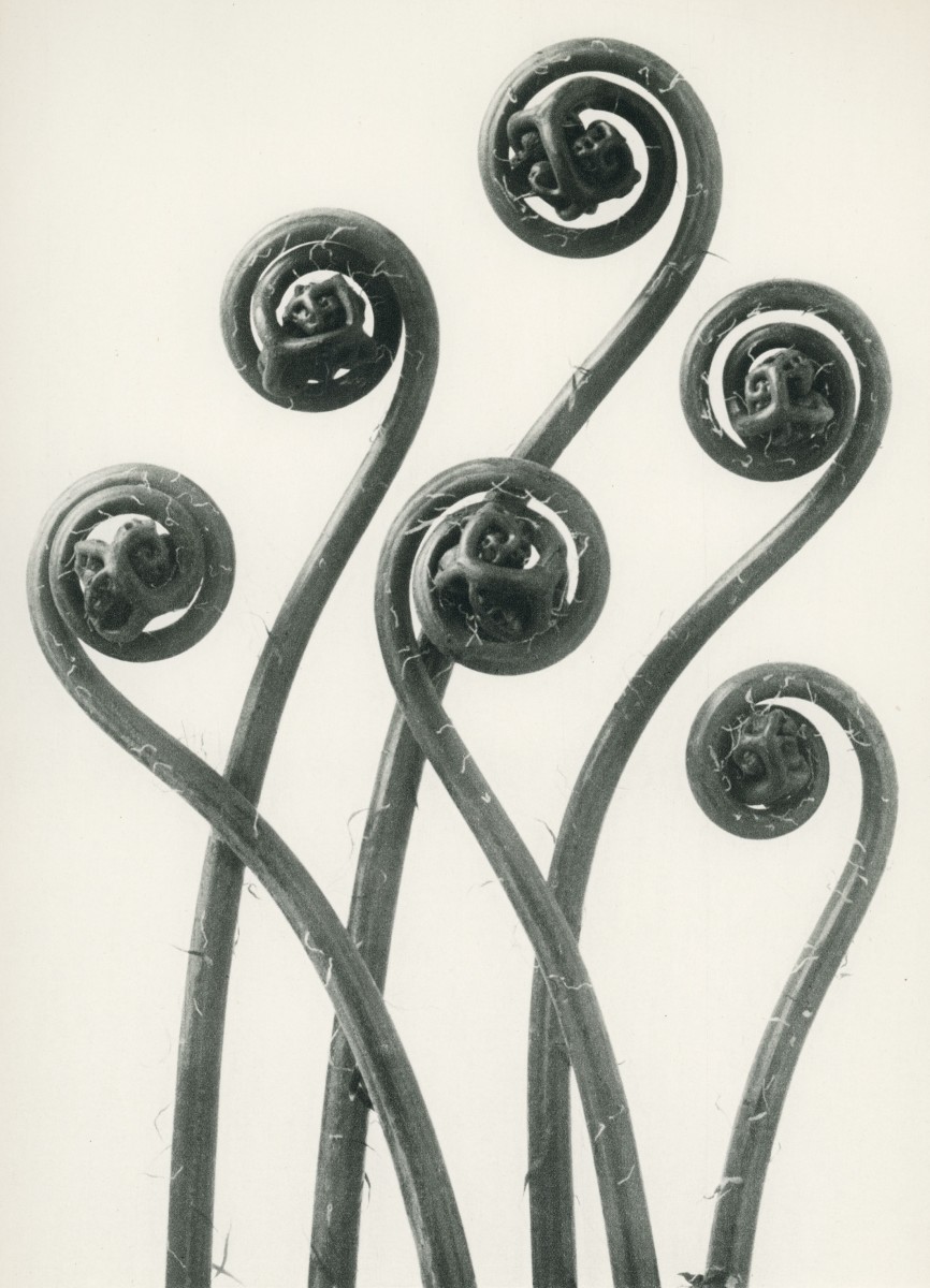
The black and white accompanying image of a Lily and Helibora were made with the opposite intension; to look at form alone.


Thanks Giles, by the way, love the new tests.
Thanks, the work is becoming more minimal over the years often, crossing over into graphics.

Strong imagery. Refreshing viewpoints
I used to be his assistant. He is a great guy to work for and his attention to detail and commitment is unmatched.
Thank-you for a brilliant interview so many true words said about photography and the industry as whole.
I remember seeing the Photo Fit portraits for the first time and getting that insane jealousy which accompanies an idea so good you wish you’d done it… Followed by the deep depression that you hadn’t done it.. So much brilliant work.
O… M… G…