These ads from 1960’s copies of The New Yorker are weird.
They’re just so, well, New Yorker ads from the sixties.
As evocative of their era as a Blockbuster membership cards and the sound of fax machines were of theirs.
That’s not a criticism, some are great.
But it’s striking just how different they feel.
So different that it got me thinking why and what unifies them?
1: $’s.
Look at the ads and you’ll notice that they have all the corners; none have been cut.
In the sixties, millions of people bought the New Yorker every week, so it would cost a King’s ransom to buy a single page.
As a rule of thumb, 15% of the media cost is allocated for production of the ad that will fill it.
So if your media costs a King’s Ransom you’ll have a Prince’s Ransom to produce your idea.
Some will say ‘A good idea can cost nothing’, and that’s true, you could produce a dozen Economist posters for the price of a small cappuccino.
But having a wider range of options, not just red ink, will always improve your chances of creating something good.
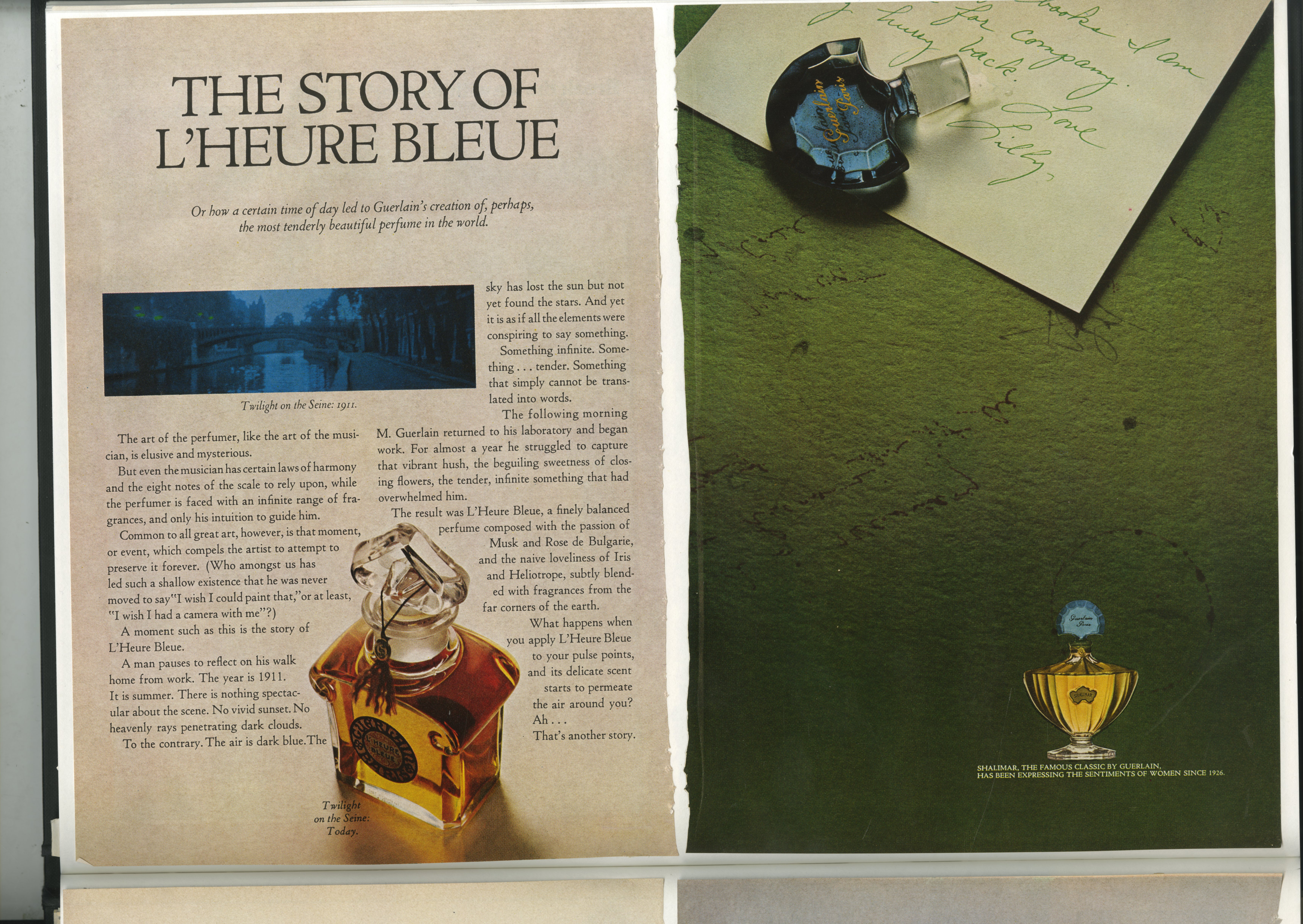
The options here include commissioning Avedon, Penn or Warhol for an image of Streisand, Hepburn or Fonda.
Handy when you’re trying to interest people.
2: ‘THE NEW PAGE.’
It was the talk of Madison Avenue at the time.
VW had done it, Avis had done it, art directors were desperately trying to find new ways dividing up their pages, so that people would recognise the page as theirs before spotting their logo.
As a consequence, these layouts seem particularly varied.
3: TIME.
We can now produce ads hundreds of times faster than these ads were produced.
Unfortunately, the human brain hasn’t kept pace with technology.
The speed we have to work today can have benefits, it can stop us over thinking, gets our adrenalin flowing and those things can give our output a certain energy.
But generally, if you have time to reflect, rewrite and rethink, the work will be better for it.
4. INTELLIGENCE.
Probably the thing that ties these ads together most is their tone; thoughtful and witty.
It makes total sense; they’re from the New Yorker, a thoughtful, witty magazine.
But as a subscriber to the New Yorker, I can tell you that those pages aren’t used that way by advertisers today.
Which is a shame.
It’s nice to feel that others think you’re intelligent and have a good sense of humour.
Rather than a schmuck.
5. WORDS.
Boy, there’s a lot of them.
We’ve got used to the idea that a good press ad is a poster; big visual, as few words as possible.
That’s not the case here, the creatives know they’re talking to readers, people who aren’t scared of words, so they try to engage them with what they like; words.
It makes total sense, it’s for the New Yorker reader.
The 1960s New Yorker reader.
Today’s New Yorker ads don’t appear to use the same tactic, I checked, although there were so few of them in the latest issue it’s difficult to be sure.
Maybe the two things are linked?


Dave, as a huge fan, I was thrilled shitless to see that you featured two of my campaigns from my Mad Man days of the sixties… Hasselblad and the Irish Tourist Board, both done when I was “Copy Chief” at DeGarmo, New York. (Remember when agencies had copy chiefs) Not necessary now that no one writes copy. Never forget that Howard Gossage was a huge fan of the New Yorker, writing ads that finished in mid sentence, to be continued next week. At DeGarmo, we also had the Bolex account. We did the first TV commercial shot in Super 8. Probably the last. Keep up the good work.
Cheers/George “AdScam” Parker
nice.
Dave! Carl from the University of Gloucestershire here again – you dropped me an email saying to talk over the phone, only just saw it last night as it landed in my junk email box and seems to have deleted itself overnight – can you send it again to carlhalford@hotmail.com? I’ll make sure it lands in my inbox this time and call as soon as I get it. Cheers, and apologies!
Dave, well done. Superb stuff. Proper stuff. Stylish stuff. And proof of the global regression. Thank you. Stuart Kendall
Great stuff. Intelligence is right.
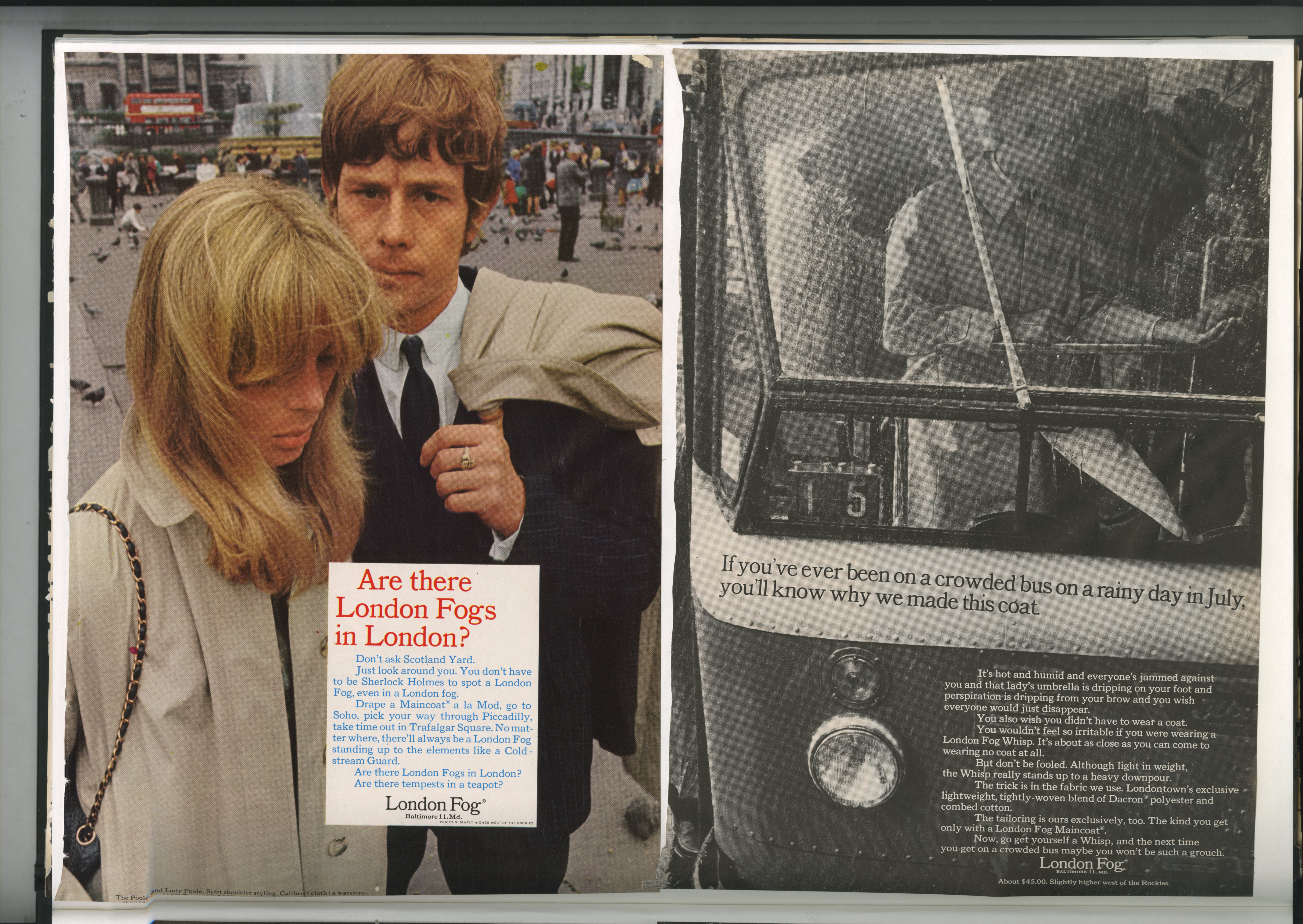
Love the London Fog and the Hasselblad ‘And so on.’
And at least Jack Daniels still seem to have faith in the written word.
The current ads on the underground aren’t radically different from the ones here.
Thanks for posting,
Tim