Played at 78rpm, one side of a 12’’ shellac disc could play up to five minutes of music.
In 1948, Columbia Records came up with an alternative; a PVC disc with finer grooves that, played at 33rpm, could play up to 22 minutes a side.
It not only changed the way we listen to music, it change the music we listened to.
First, these ‘Long Players’ were seen as ideal for theatre musicals and film soundtracks.
Consequently, one group dominated the album charts in the fifties; Original Broadway Cast.
Their album ‘My Fair Lady’ was not only the best selling album of 1957, but ’58 too.
Even in the sixties, the decade ‘belonging to The Beatles and Stones, they released the biggest selling albums in three separate years, a feat matched by their big rivals; Original Soundtrack.
But by 1970, the biggest selling albums were altogether more personal, an artists thoughts and personality committed to vinyl.
Album sales were exploding; Simon & Garfunkel’s ‘Bridge over Troubled Water’ and Carole King’s ‘Tapestry’ each selling over 40 million copies.
Record companies had never seen so much cash.
Hit singles were still fine, but artists who could put out album after album, year after year, that’s where the real money was.
To put it another way, instead of creating short-term tactical ads, they started building long-term brand campaigns.
Artists, like products, were distilled down to their essence, that essence was turned into imagery and graphics.
No more shape-shifting to follow the latest fad, instead, a consistent visual personality.
Helpful when you’re selling albums, because you want to remind people that they’d enjoyed spending time with these people before.
Plus, in a crowded market, (or ‘record stores’ as they are known in the business), being recognised from the other side of the room is useful.
Record companies began putting out long-term campaigns that used all the tricks and learnings of ad agencies.
1. ‘WE NEED TO GET OUR PRODUCT NAME OUT THERE’.
Basic, but crucial for any artist.
Or product. (It used to be popular with P&G, particularly with soap powders.)
If your campaign is built around the your brand name there’s less chance of your product being mistaken for someone else’s.
Plus, it needn’t be dumb, it’s possible to make it sophisticated and enjoyable, like this campaign for by designer John Berg.


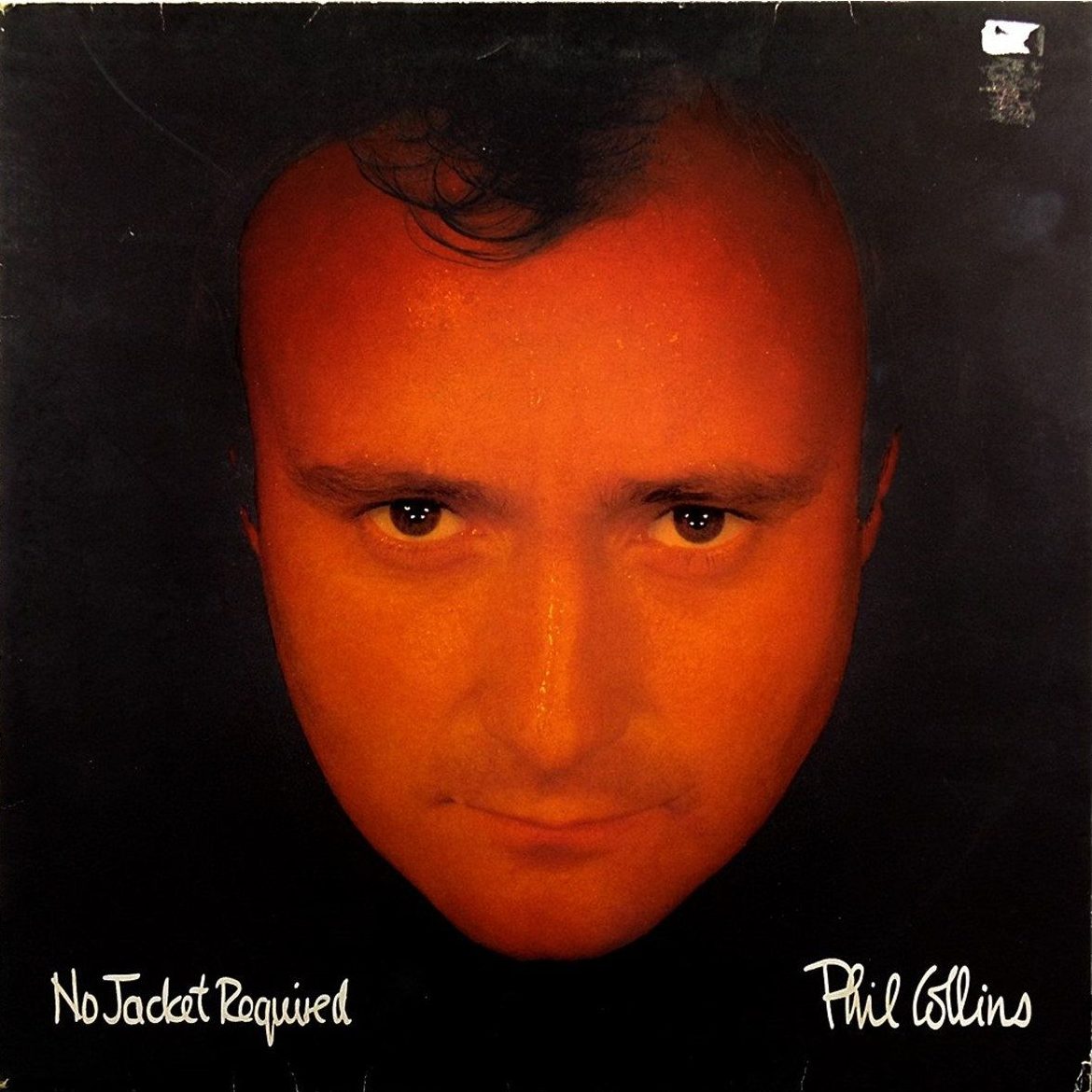
2. ‘LET’S JUST SHOW THE PRODUCT…HUGE.’
Another popular route, but few use such big a product shots as Phil Collins.
No locations, environments, torsos, spectacles or facial hair, nothing in the photo that’s non-Phil
Simple, small text and a huge product.
A bit like the Apple approach outdoor.
Doesn’t seem to have done them any harm?


3. ‘WE NEED AN ICON.’
When your band looks like the teachers band at the end of term disco, create an icon.
Not only will it unify everything, it’ll never lose its hair or get wrinkles.
It’s also useful for companies without a tangible visual product, like insurance, hence Direct Line’s use of the red phone icon.


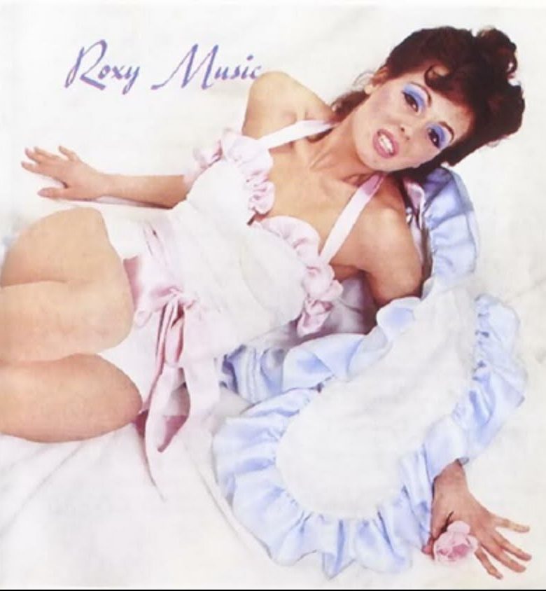
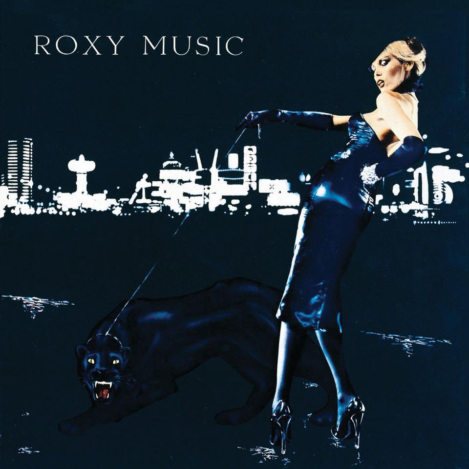
4. ‘LET’S USE BEAUTIFUL MODELS.’
Not a fantastically original idea, but like all ideas, it depends on how you do it.
When Roxy Music started they looked similar to the rest of the groups wearing spandex and glitter, so they, or should I say Bryan, decided to put their dreams and aspirations on their covers.
Updating the models each year to whoever was the new flavour of the month.
Not unusual in the wider world, more unusual in record store racks.
Burberry, Prada, Tom Ford, virtually every fashion campaign out there does the same thing.


5. ‘WE NEED SOME DISTINCTIVE GRAPHICS.’
Graphic treatments can be a great way of being recognised.
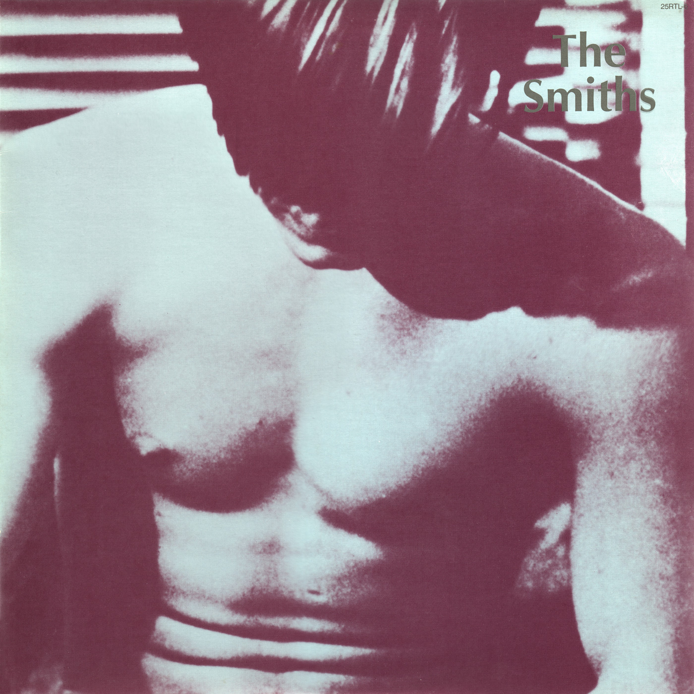
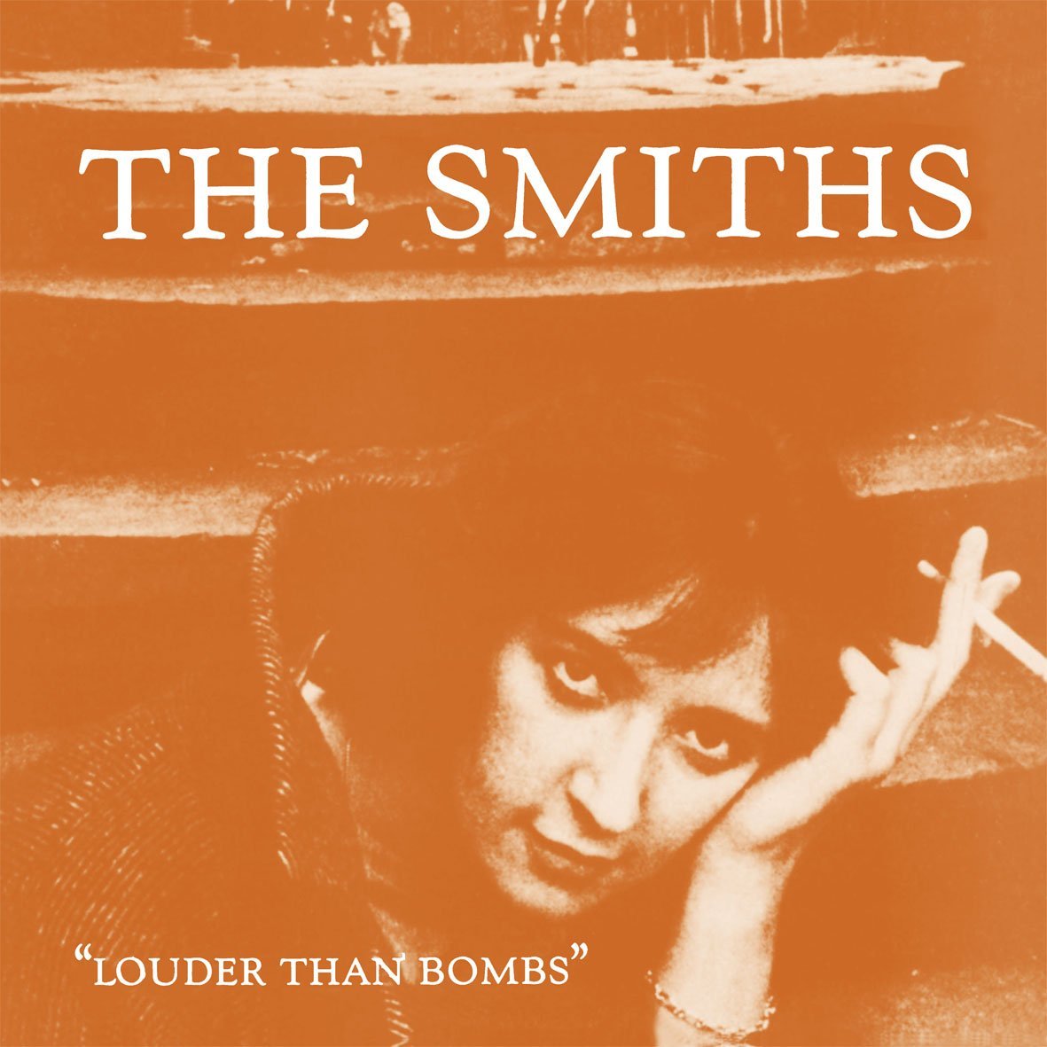
Take The Smiths, same ingredients every time;
An old black and white photograph, (ideally from the 1950s).
Turned into a duotone.
(Be sure to use two of the most downbeat, muddy colours known to man.)
Make the picture as big as possible.
Put your name* on it.
*Be careful not to make it too bright a colour, it’ll stand out.
I used a similar technique on an Adidas campaign, I was trying to capture an that insular running vibe.


6. ‘WHAT’S OUR OWN-ABLE PHOTOGRAPHY STYLE?’
Sometimes the record label is as important as the artist, it becomes like an endorsement to the artist.
In this case, Tappan Zee needed a style that would be seen as theirs but also accommodate a wide variety of artists, titles and subjects.
This problem was solved simply; extreme close ups.
It doesn’t sound like a ‘big idea’, but it was surprisingly effective.
Again, how you do it is everything.
Or, who does it is as important as what they do, these were done by the great Paula Scher, so not surprisingly, they’re excellent.
In advertising terms, this is Sainsbury’s, John Lewis and virtually every supermarket going.
A style that allowing them to promote a huge variety of disparate brands but under one, recognisable roof.


7. ‘WE NEED TO CAPTURE OUR VIBE.’
There’s a cliched old advertising phrase that says ‘don’t sell your lawn seeds, sell their lawn’.
Yes, you are buying an artists music, but often, you are buying a mood.
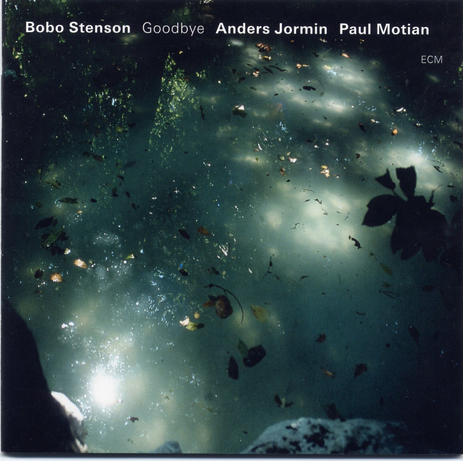
ECM sold a mood.
A new agey/jazz/ambient type mood.
The ECM logo becomes a bit like the Intel Inside logo; offering reassurance that it’ll deliver what’s expected.
What’s expected is visualised using storms, rain, blurs, shadows mixed in with a dollop of melancholy.
Davidoff, Chanel and all manner of perfume brands do a similar thing; not being able to let you smell their perfumes they give you weird, abstract mood pieces to give you a vibe.


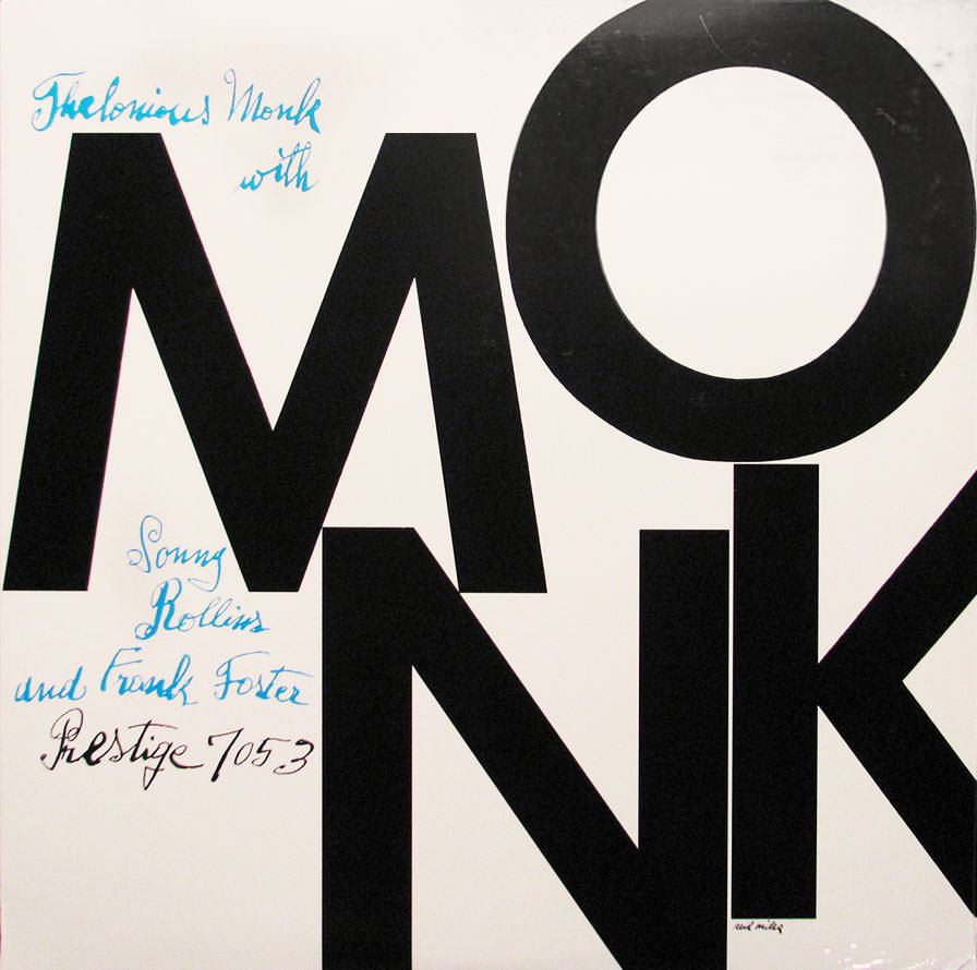
8. ‘WE HAVEN’T GOT MUICH CASH…CAN’T WE DO SOMETHING WITH TYPE?’
If you’re putting out hundreds of albums a year commissioning photography is a big expense.
But albums with just a name and title printed on them look cheap, hardly an endorsement from the label.
Blue Note, and Reid Miles in particular, turned this on its head.
Simply using an alphabet, some coloured inks and an exceptional eye, he created album covers that not only jumped out and felt like a family.
Ironically, their aesthetic made them feel more special than their expensive cousins.
A bit like The Economist campaign, it beat up all those expensively produced ads with nothing more than red ink, white words and a bit of grey matter.


9. ‘WE NEED TO GET OCER OUR AESTHETICS.’
It’s always right to do the opposite of your surroundings.
So, if you’re surrounded by crass, complicated imagery, sophisticated, minimal aesthetics will really jump out.
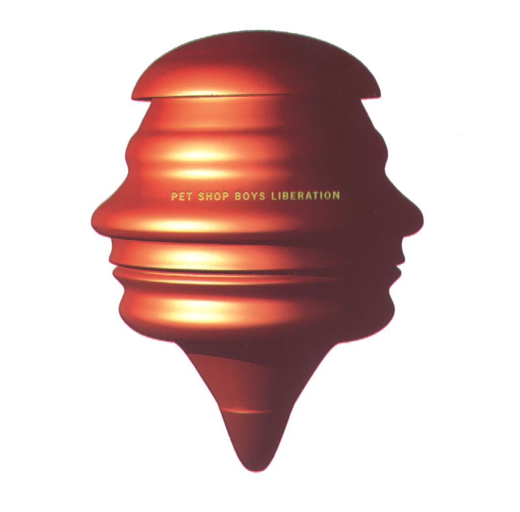
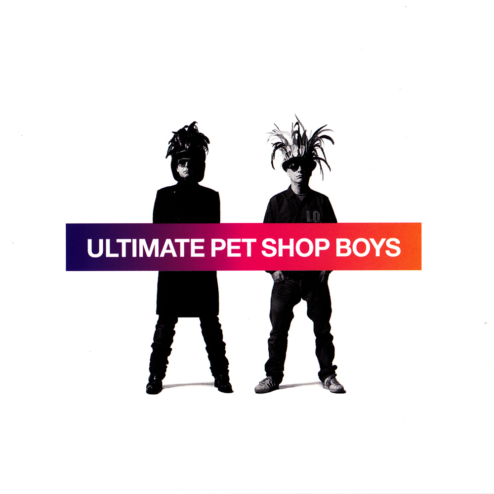
The stripped back, considered graphics that Mark Farrow has created year after year for the Pet Shop Boys, not only hold together visually, they say scream intelligence and style.
Weirdly perhaps, this puts me in mind of the Lurpak, frankly, a a chunk of yellow fat, but the aesthetics of their advertising; the cinematography, sound design and metronomic editing is so pleasing, you can’t help but liking and admiring that particular chunk of yellow fat.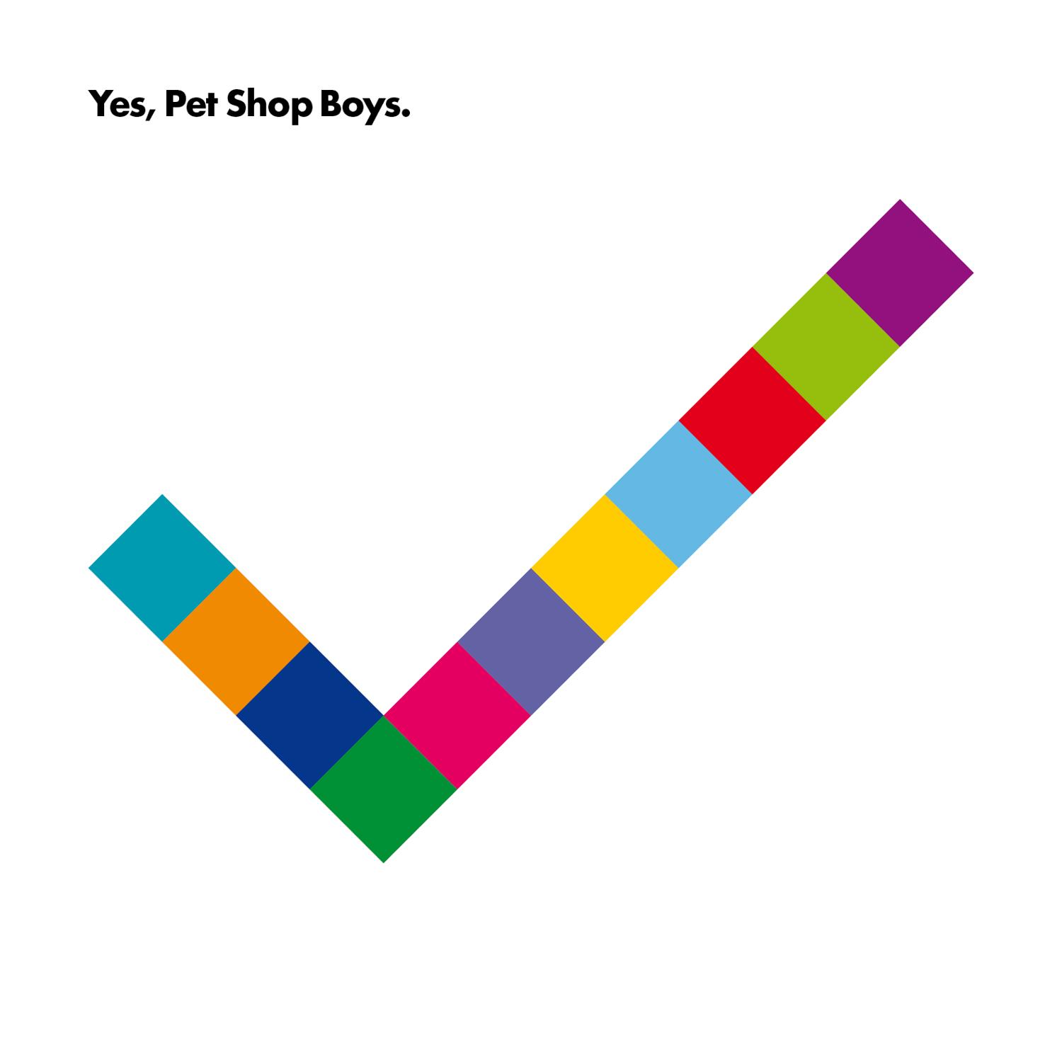


10. ‘WHY NOT USE SEX….PEOPLE LIKE SEX.’
The oldest strategy in the book.
But one that’s always difficult to ignore.
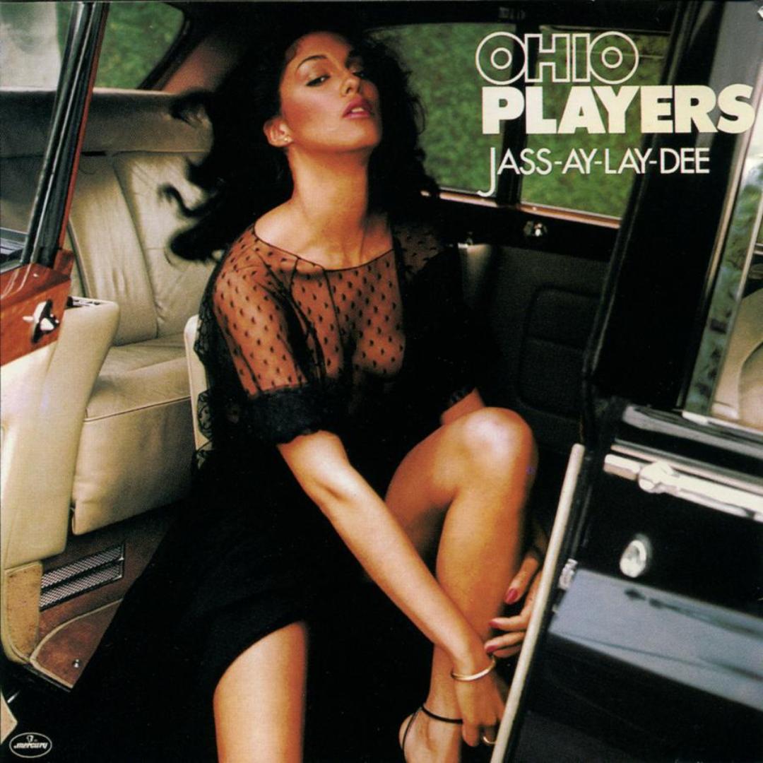
The Ohio Players used it and their logo throughout the seventies, I’d put money on the fact that more people knew the Ohio Players for their covers than their music.
BBH used a similar strategy to great effect with their Haagen Dasz campaign back in the day.


Visual consistency helped place artists in the heads and hearts of millions of people.
Selling millions of albums along the way.
The instant measurability digitisation has bought us has lead to our industry to focus on the short-term.
Consistency has been replaced with flip-flopping, done under the illusion that we’re being ‘nimble’ or ‘reactive’.
But the people we’re talking to don’t care.
They either recognise a company or they don’t.
They won’t recognise a new personality over night, it takes time for them to connect our dots.
It’s an investment.
One that will be rewarded when a brand can be picked out from the crowd.
As an industry, we need to stop flooding the market with singles, hoping to luck out with the next ‘Gangnam Style’, we need to be plotting out the careers of the next The Pet Shop Boys, Roxy Music or, dare I say it; Phil Collins.
Nice piece Dave. Could I suggest one more analogy? ‘NOW THAT’S WHAT I CALL MUSIC’ : Crass, shouty, why bother with an idea? – just show the product!
Hey Paul, good point. Dx
Fascinating. What a left field/unexpected way to make a great point. And those Blue Note covers are heaven itself. Thanks for another dose of great inspiration.
You’re welcome Graham, always loved those Blue Note covers. Dx
Genius. and not ashamed to admit you’ve got Phil Collins entire catalogue.
True, but I’ve scanned them all now, so you can have them back Dave. Dx
Really enjoyed reading this Dave. On a side note, because of services like iTunes it is now profitable and easy to put out one monster global hit than a thoughtful album. I hope I am wrong on this, but I highly doubt we would be seeing a ‘Dark side of the moon’ type album anytime soon.
Thanks Bharath, I think you’re right, singles have risen again.
I think it’s also no coincidence that album covers have lost their cultural significance.
Paula Scher, who designed some of the best album covers of the seventies stopped the minute CDs came along, she didn’t like the new, small format.
Digital has diminished the covers even more.
Although iTunes and Spotify have other advantages.
Dx
brilliant post, as usual. I’ll borrow the “careers v jingles” analogy.
Great to read see and directly compare your examples…. Always been a big fan of Reid Miles at Blue Note, since many years ago I was a typographer! Love the blue note stuff, the ECM covers are great too, almost like a fine-art visual feast…the style or use of b/w photo image (it’s choice of subject matter) it’s treatment vying with clean-cut typography…..hits the nail at least for me…
Thanks for Very interesting read….and viewing!