Pictures are great.
As everyone knows, they’re worth a 1000 words, but they offer so much more; emotion, drama, humour, shock, surprise, information, style, etc, etc.
So what do you do if you can’t use one?
If you’re an art director it’s especially tough, because your job is to make people engage against their will.
So the temptation is to overcompensate with graphics.
But it’s a risk, as Bill Bernbach warned ‘Merely to let your imagination run riot, to dream unrelated dreams, to indulge in graphic and verbal gymnastics is NOT being creative.’
The very process of pushing words around, changing fonts, colours and sizes can distract you from what you set out to do; deliver a message.
It’s surprising how quickly people in our business move on from the message.
Particularly on awards juries.
Sit on an awards jury and the chances are you’ll hear someone championing an cool looking campaign with language like ‘this is what our industry should be doing, leading not following culture, ripping up the rule book’.
If you ask them what their favourite line or idea was, you often get responses like ‘Err…the blue one’, ‘The one where the words go up the side’ or ‘The one with the coloured squares’.
Basically, they can’t recall any of the messages in the ads.
To be fair, awards juries are looking for fresh, new and unusual, so the feel becomes disproportionately more important than message.
But, if you’re in the business of communicating, it’s worth checking in every so often to make sure you’re communicating what you set out to communicate.
When limited to graphics only, I often lapse into this process:
STEP 1: Try to convey message simply and appropriately.
STEP 2: Get distracted by trying to do something cool.
STEP 3: Get back to trying to convey message simply and appropriately.
It made me want to post a couple of examples.
Part one is a bit weird.
A few years ago, a guy from India got in touch saying he liked my work and would I create a poster for his company.
He wanted me to use the text from Apple’s ‘Here’s to the Crazy Ones’.
I love that ad.
Whilst mulling over whether to do it or not, I ended up doing it.
I couldn’t resist.
THE VOMIT DRAFT.
That’s what screen writers call it, just put it down, don’t over worry about it, get something down so that you have something to judge.
Let’s use Baskerville, that’s a nice, readable font. Looks dull, maybe we can increase the size of the words?
We’ll have to break some of the longer lines. Looks like some old poem.
Maybe it should be reversed out of black?
 Maybe that font is too old-fashioned?
It is Apple after all.
Maybe we use Avant Garde; not new, but cool.
 A bit bland, and kind of retro, too 70’s.
What’s a bit more distinctive?
Pensyvannia? (Dave Wakefield used that, so it must be good.)
 Better, but a bit hard to read.
Maybe we should break to help people take in the sections? That’s better, much easier to take in the thoughts.
Looks a bit doomy though, yet the text is vey positive an upbeat.
Maybe we replace the black with grey…it’s probably more Apple?
 Better. But a bit nothingy…a bit bland looking.
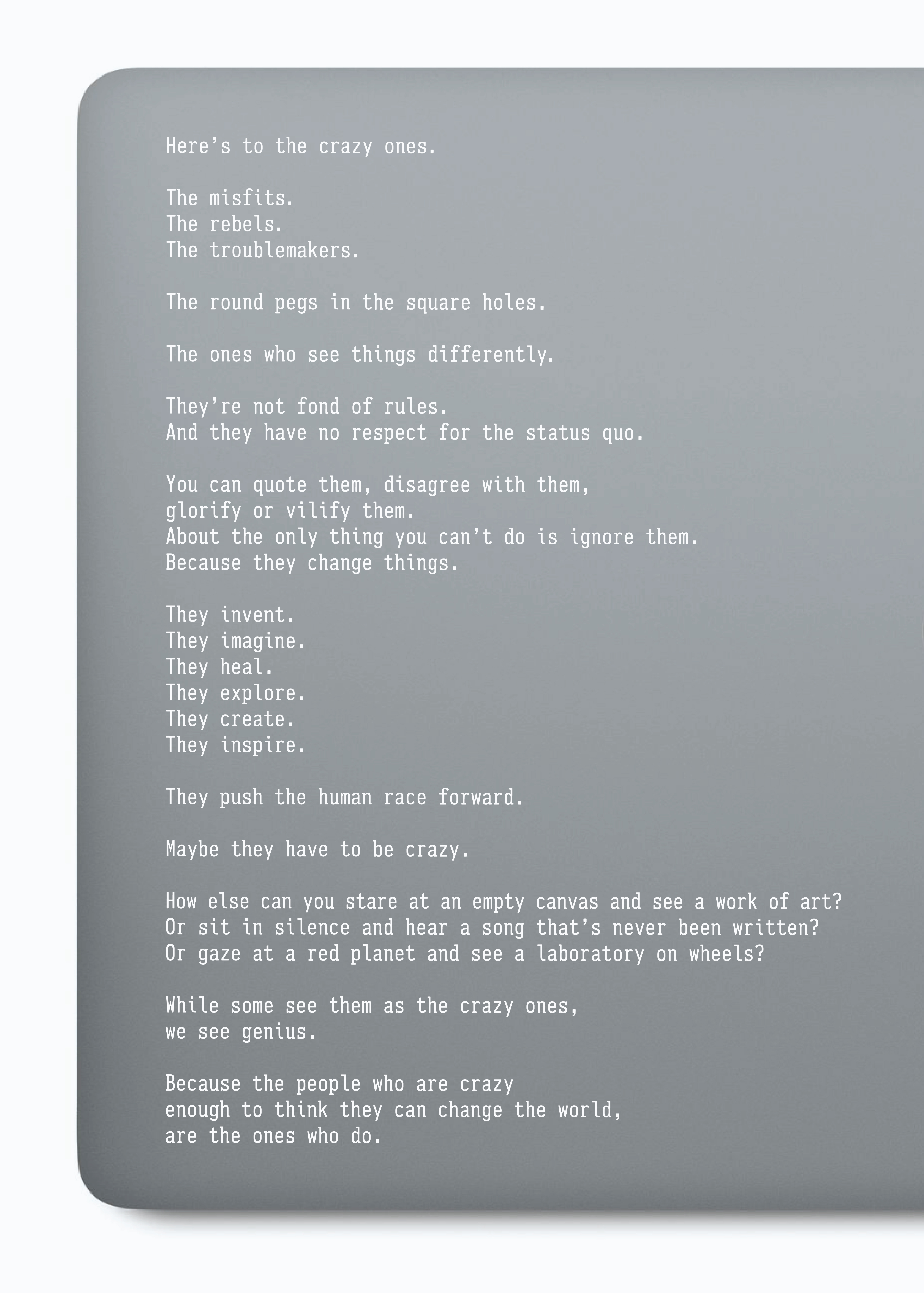
Maybe we pull in a texture, something related to Apple?
 Shouldn’t we use the Apple font? It is for Apple?
What’s the Apple font? Mythiad? Ok.
 I like it, but maybe it feels a bit too Apple?
A bit like an Apple ad.
That therefore makes the text look like ad copy.
I love the words, they’re more than ‘ad copy’.
Maybe we keep the text as it is and break up the sections with bars?
 Too blocky.
It’s the first thing I think when I look at it.
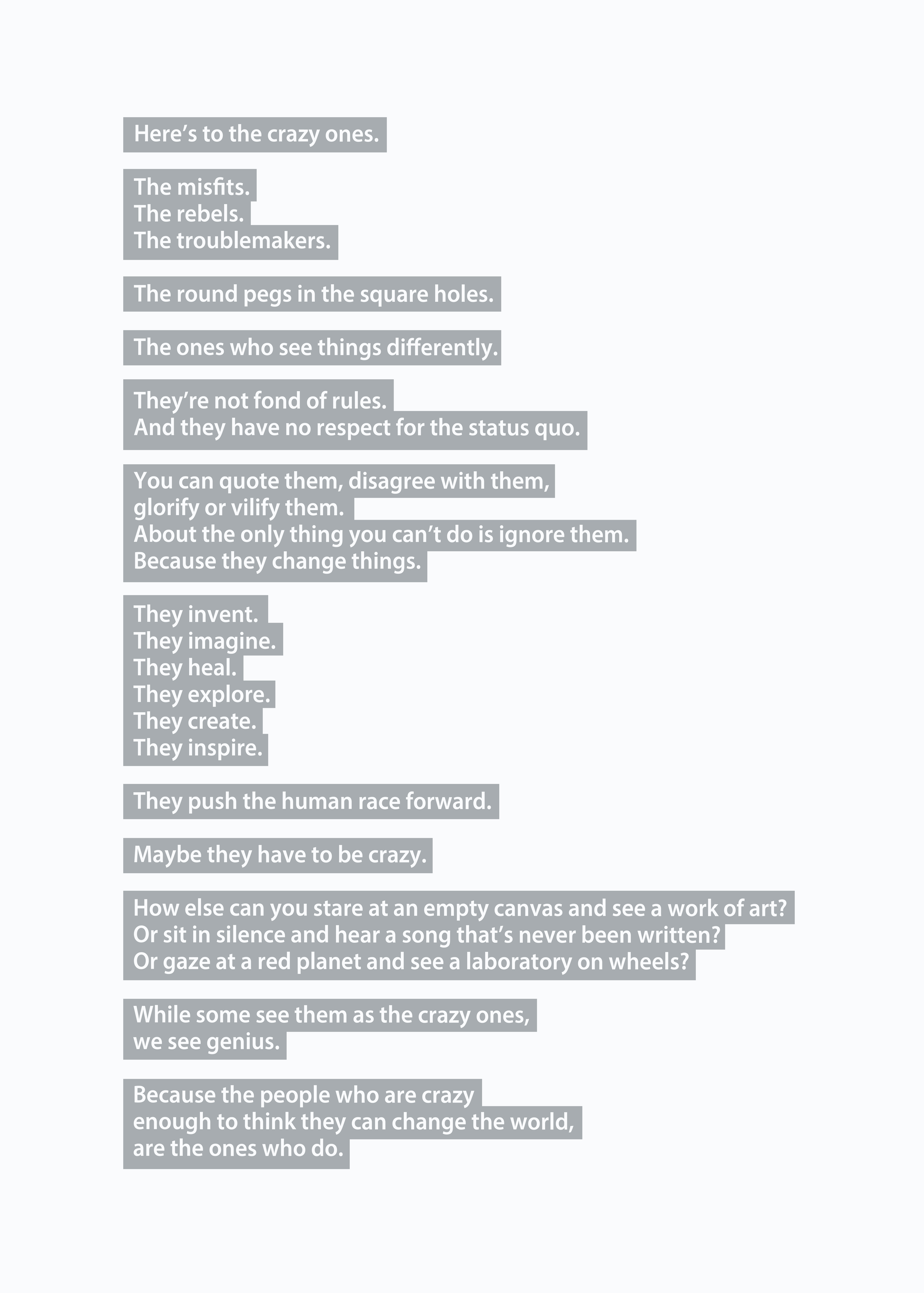
Maybe it would look cooler to highlight the words in blocks like a Word document?
 I like the fact that it looks a little odd, off-centre and random.
Maybe we should we break up the blocks with colour?

Does it now look a bit too fiddly?
Too complicated?
Maybe we should go back to simpler blocks? Mmm…colours are a bit…colourful.
Looks like a tube map.
Maybe we use more sophisticated colours, less brash and cheap?
 Maybe each line should have it’s own colour?
We could group sections in a similar tone when they run on.
And maybe we try to emphasise the ideas within each line with some typograhical device?

Looks cool.
Hang on…would the takeaway be ‘that cool-looking colourful stripey poster’.
Probably.
It’s not really doing Craig Tanimoto’s words justice.
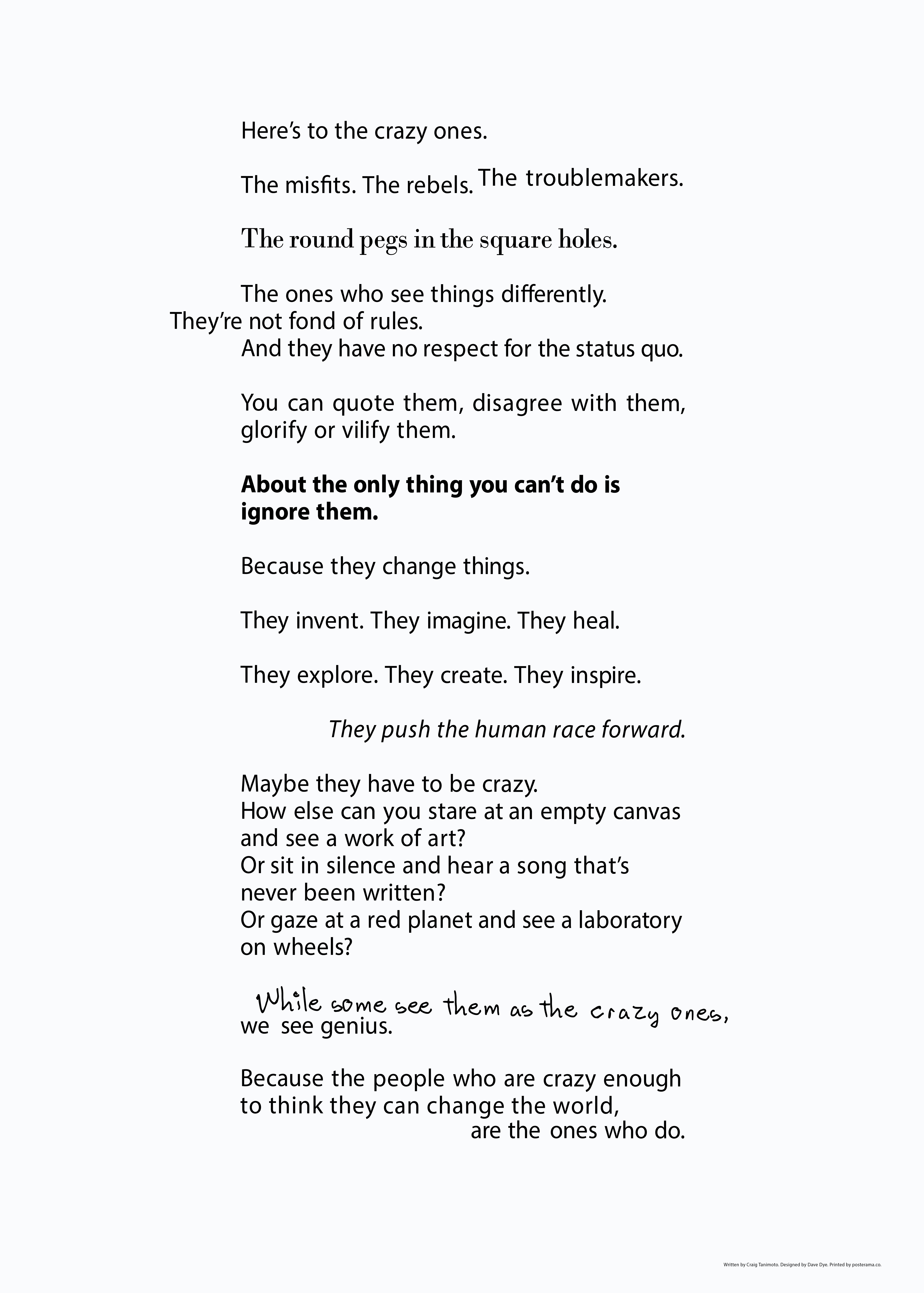
Maybe we make the words the hero and relegate the graphics?
Use an ocassional typographic idea, just not like a punchline every few seconds.
 Better.
Maybe it still messes with the reading too much?
Dare I say we use black type?
Maybe grey type is a little addy, a bit contrived?

Perfect.
What? You like the colourful stripey one?
Did you read the words?
Thanks for that brilliant post Dave. I’m pushing the words around this week, not helped by client feedback. I’ll share this post with them. Best J
this post should be taught in every ad school in the world.
Sebastian…. it probably will be, but not by the guy -this guy- that wrote it !
Excellent post. I love to see an art director championing copy. However, (and no matter how necessary, it often feels pedantic or superior to say this), it needed a copywriter to proof-read it. Just a few grammatical gremlins. A couple of missing words; a semi-colon that wanted to be a colon or a long dash; nothing too heinous. But maybe it reinforces the point that copy so often fails to get the attention it deserves.
PS I’d be happy to proof-read your posts for you, should you feel it beneficial.