It’s what you hit when you run a marathon.
A sudden loss of energy followed by your body telling you ‘I’m done, it’s all over’.
But keep putting one foot in front of the other and pretty soon you’re through to the other side, with renewed energy.
I was teaching students at the SCA2 last Friday, and was reminded that as creatives we also face a walls, (not physical ones, obviously, they were torn down years ago to make room for ping pong tables and cappuccino machines).
Our walls are in our heads, mental blocks that appear impossible overcome.
Never is this more apparent than when you’re starting out, searching for solutions is a bit like trying to make your way through a jungle; if one pathway is blocked you turn around and look for an unblocked one.
But when you’ve been doing this thing for a while, you expect to hit a wall, it’s not a glitch in the process, it is the process.
So you don’t panic, turn back or give up, because the best solution may well be on the other side.
You also know that things change.
The same brief on a different day can create a different outcome.
Sometimes you can force a change, swapping rooms, locations, music even pens can have an effect on your thinking.
They can mean you look at the problem, or wall, from a slightly different angle.
It’s where the old cliché ‘ideas in the bath’ comes from, it’s not the water or soap, it’s the giving up worrying about it, you relax, so your brain leaks out a solution.
The key point is that when you face a wall, embrace it.
Don’t take no for an answer.
Keep chipping away, it, suddenly you’ll see a chink of light, then before you know you’re through to the other side.
What can look seem impossible today can be obvious in the morning.
Who knows why? The brain is one weird organ.
But have faith, it’ll happen.
I tried to give the students an example of where I’d gone through a wall.
This was the first wall that sprang to mind.
I remember it seeming impossible. (Or impenetrable if we’re going to keep using wall-speak.)
Back in the ’90s I sat on the D&AD committee, we’d meet once month to debate the major issues of the day; should we change ‘The Design & Art Direction’ to ‘The British Design & Art Direction’? Do tv ads need a whole page each in the annual or could we squeeze two on a page? Or whether copywriter A or B should replace copywriter C on the Copy jury.
It was gruelling.
One month I turned up to hear that was facing a big problem.
It sounded ominous.
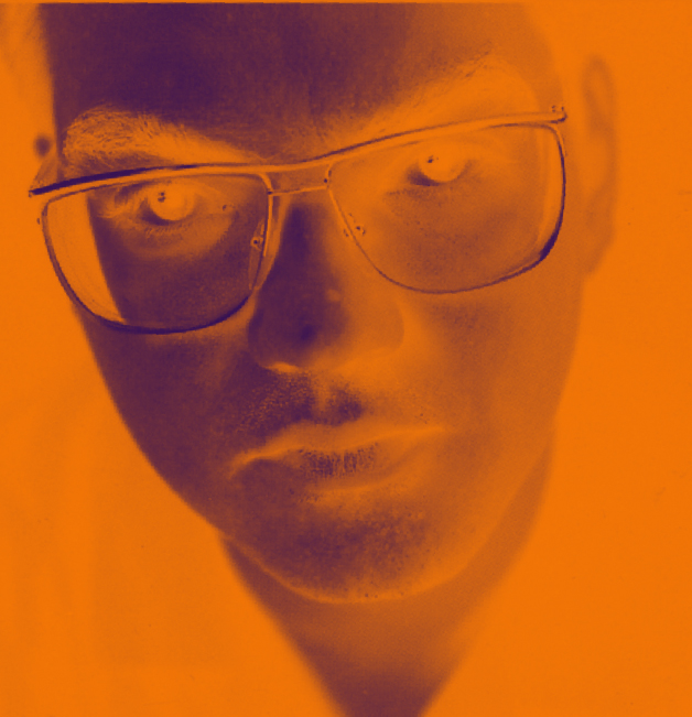
‘The jury pictures we’ve had taken this year are rubbish.’
Not as big as I’d imagined, I continued listening.
‘They’re just…well……everyone looks weird.’
Ok, what does that mean? A reshoot?
‘We’d never get the jurors together again.’
How bad can they be?
Whoa!
There was a mix of gasps and giggles as we went through the pictures.
Everyone just looked… weird.
Either awkward…

bemused..

stoned…
 supercilious…
drunk…

sneery…
anxious…
or like they wanted to murder your family.
Only my old mate Sean Doyle came away unscathed.
 What the hell had happened?
‘We need to do something…it’s very awkward.’ said the lady from D&AD.
I don’t know whether it was because I was the only art director on the committee or I was feeling a bit cocky, but I said I’d take the problem on.
I took all the evidence back to BMP with me.
Right, let’s have another look.
Wow!
What the hell had happened?
Did the photographer think it would be interesting to shoot all these slick, superficial marketing types in the grungiest way possible?
Or did he think advertising is evil, so tried to capture that vibe in the shots?
Was it just his style? (In which case why was deemed appropriate?)
Maybe we all being a bit sensitive about a few portraits?
Maybe they look like that in the flesh?
I compared the jurors in our pictures to their portraits in the previous annual.

 Jeez! That’s one year, if they’d been shot 20 years apart, it’d be understandable.
I set off.
1st IDEA:
We give them to an illustrator as reference to illustrate them, BOOM!
‘We don’t have any money, there are hundreds needed.’
2nd IDEA:
What’s the exact problem? Maybe it’s the universally yellow skin?
Maybe we can colour correct them?

Maybe less pasty?

Mmm, no, too much. Plus, it’s not just the skin tones.
3rd IDEA:
Maybe there’s some kind of graphic, paintbox* technique, to blur our detail? (*Computer the size of a wardrobe, back in the day.)

Too cheesy.

Quattro Fromaggio.
This is the D&AD Annual, it should be sans cheese.
4thIDEA:
Maybe we can do something with film grain, like that photographer David Fairman?
We had a go.

Garbage!
You either need to do it in camera, be David Fairman or both.
We couldn’t and I’m not.
5th IDEA:
Maybe black & white would be more forgiving?
It’ll sort out the yellow and weird blemishes and patches too.
Might look a bit more sophisticated too?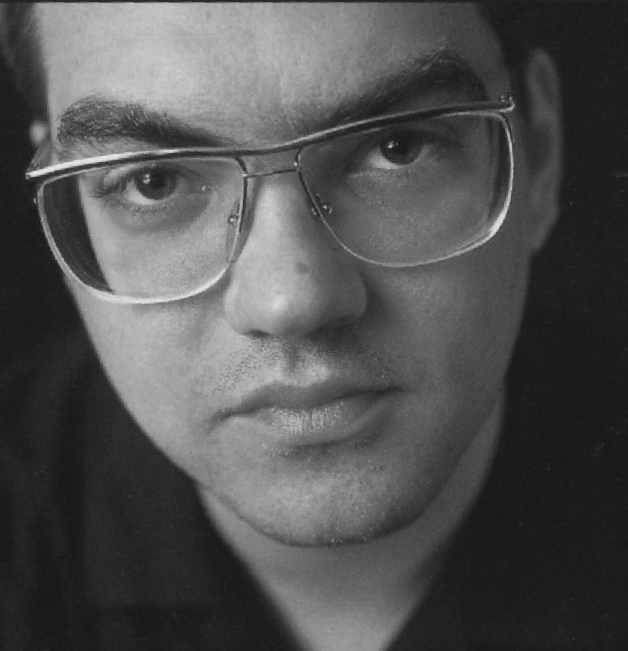
A bit.
But it’s not just a colour issue, it’s the weird angles and shot choices.
6th IDEA:
Maybe we blow out all the detail by making them graphic and contrasty?
(Who needs detail? Readers don’t need to pick them out from a police line-up.)

Too crude, this is D&AD, not a local, badly printed newspaper.
7th IDEA:
Maybe a duotone would look cool?
It’d look like a style choice, not a fix.
But why? It looks like we’re doing it for a reason and we’re not.
8th IDEA:
Stuck, I flipped through some old annuals to see how they used to treat the jury sections.
One year, 1974, they had statements and signatures, instead of photos.
I liked it, it was interesting to see the signatures of the likes of David Abbott and John Webster.
Maybe we use signatures instead of photos? It’s still personal.

‘No, we need to use the pictures, we’ve paid for them.’
BUT. YOU. HATE. THE. FUCKING. PICTURES!
Jesus!
Ok, so let’s recap:
We can’t reshoot because we can’t get the jurors again.
We can’t turn them into illustrations because we don’t have any money and there are hundreds.
Black & White makes little difference.
Techniques either look cheesy or render the person unrecognisable.
We can’t use signatures because they aren’t the photos.
The photos we all hate.
But have to use.
So, there’s the wall.
A big, granite, electrified, immoveable wall.
Ok, let’s have another go.
So, let’s get this straight; we have to use the pictures that we don’t like but I need to make them more likeable…without changing them.
Ok.
Tricky.
Ok, nothing is impossible, as the kids around at Saatchi’s say, so, we have to use the pictures that we don’t like but I need to make them more likeable…without changing them.
Ok.
Got it.
Why the hell do we need to use pictures anyhow?
Who cares about the faces?
Why do we need to see what the people looked at the work look like anyhow?
Oh, hang on, the people who looked at the work?
Eyes.
Maybe we crop the shots so tight that we only see their eyes?
That’s what they judge with?
Cool, there’s a reason for doing it.
Oh, hang on, are all the juries things you look at?
I check last years annual.
DAMN! Radio.
What to do?
What to do?
BINGO! We just reshoot their ears!
DAMN!
The Chairman’s Statement?
What to do?
What to do?
MOUTH!

Love it!
It’s actually better with the mouth and ear additions.
I go down to Vauxhall.
I turn up at D&AD headquarters feeling pretty-fucking-clever.
Can’t wait to see their faces.
I smashed that wall to bits.
Think it can’t be done? Think AGAIN.
I present my solution.
‘Oh, you can’t see their faces?’
“Exactly! Clever huh?’.
‘Oh?’
‘And on Radio; Ears! Chairman’s Statement – Mouth!’
‘Oh no, we have to use the photographer’s shots, we’ve paid him for them.’
But you don’t like them?
‘Yeah, but it’ll be a bit awkward if we don’t use them, he did them cheap.’
OH FUCK OFF THEN!
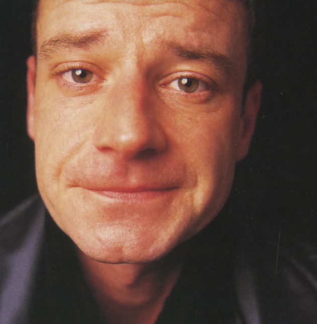
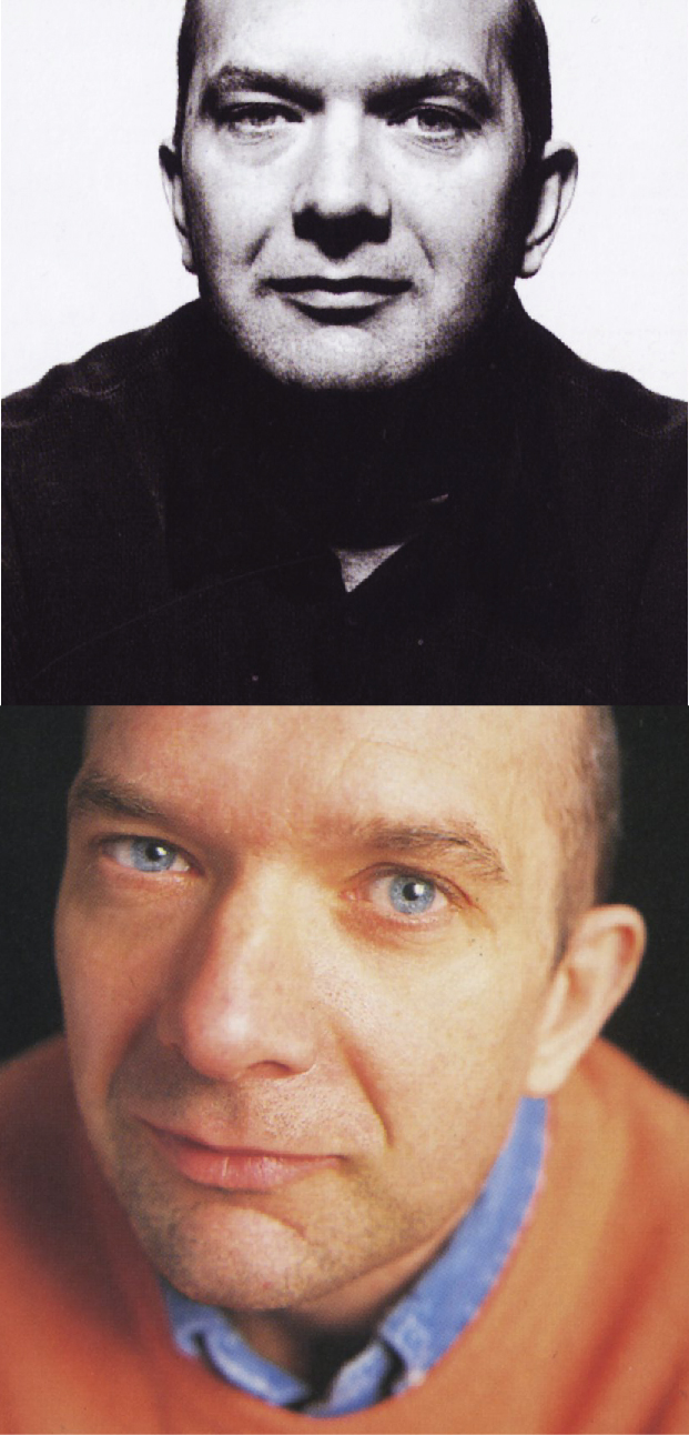
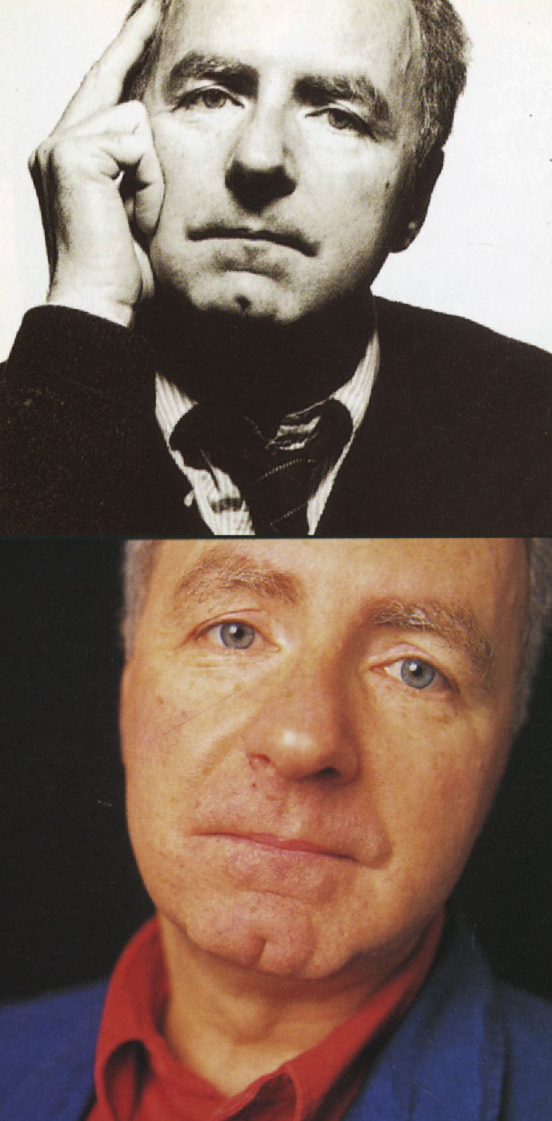
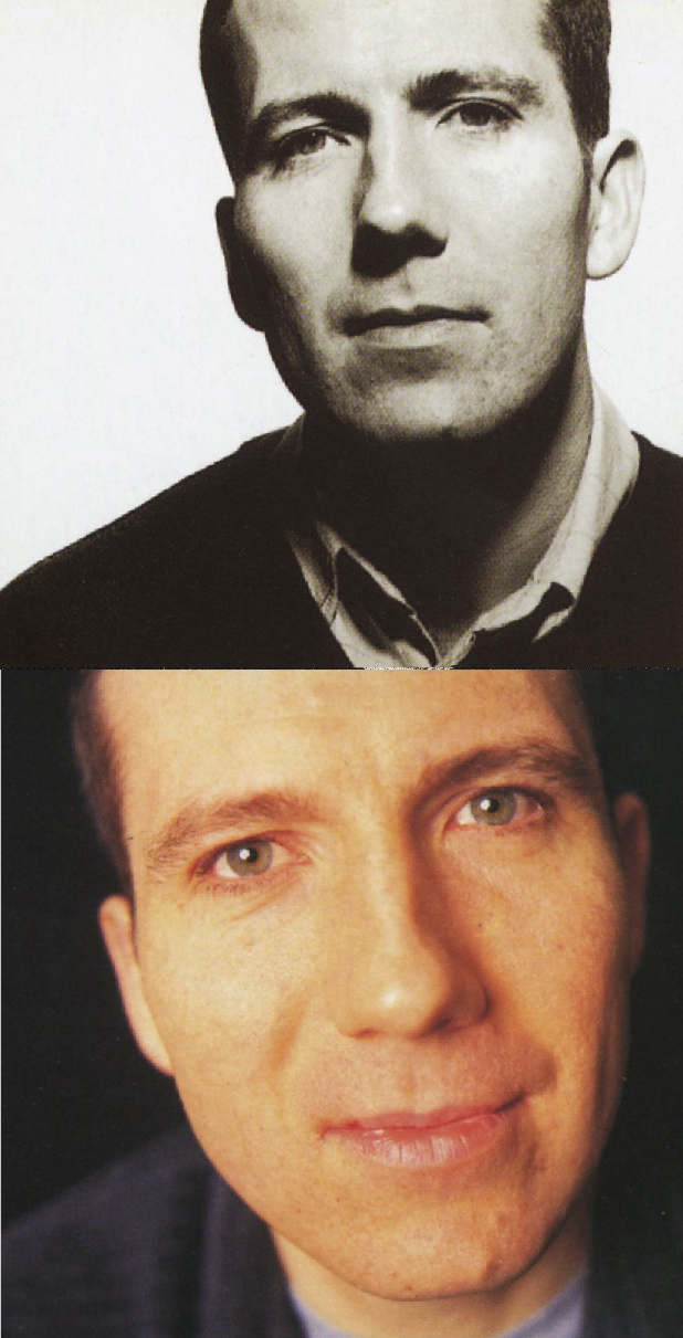
E.g. A page from the 1998 D&AD Annual.

Must be the cropping. Or the bins. Mr Mellors looks like a certain bean-counter.
Fuck me. What a mistake – Great idea about the eyes. Bloody clients!