I worked with Sean Doyle for roughly 12 years.
One morning, about six years in, Sean threw a scruffy ball of paper over to my side of the desk – ‘I did us a logo’.
It was like a miracle; Our names fit together perfectly, symmetrically, what were the chances?
It was worth putting it together even if just to enter for awards.
I turned the scribble into type.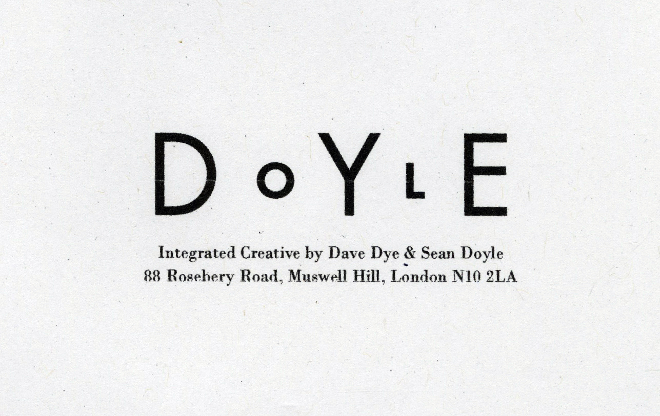 That wasn’t how Sean had imagined it.
DYE was too dominant.
He suggested we separate the names not by size of font, but by weight.
I mocked it up.
I thought it looked too basic.
Also, DOYLE looked too dominant.
We couldn’t agree, so the letterheads were never printed.
(Shame, as it was nailed on for a bronze at the Eurobest Awards.)
But the big question was why had we never noticed it before?
We’d been linked for over two thousand consecutive days, why hadn’t we spotted the link in our names?
At least Sean spotted it eventually, I never spotted it at all.
Surely the most important thing when brands run an ad is that people remember it was THEIR ad.
No matter how beautiful, disruptive or exciting your ad is, if people can’t recall whether it was for Nissan, Volvo or Davidoff, it won’t sell your cupcakes.
Ensuring that people remember that your ad was for YOUR company is crucial.
‘Branding’ I think the ad boffins call it.
Branding discussions in most agencies tend to get reduced to two areas a) logo size and b) Do we need to say the brand’s name in the voiceover if we’re already showing it in the end-frame?
Clients and agencies take their positions and off they go.
Here’s an example from last Tuesday, this happened in Shoreditch…

But rather than assuming that our ad is so awesome that the public will simply hang in there and try to figure out who ran it, shouldn’t we try to make it easier for them to recall it?
Maybe give them tools like Teachers give Students to aid memory?
Getting people to recall the name of your company used to be all the rage.
Try as I might, I can’t see ‘For mash get ……….’, ‘Do the ….. … … and bring the freshness back’, or ‘………an on, and on’ without mentally filling in those gaps, decades after some of them stopped running ads.
Jingles were a great way to aid name recognition, but seem to have been cancelled.
Another way is to create a distinctive asset, something unique and own-able by that brand.
The bullseye for these kind of ideas is the brand name.
To create one you have to resist getting distracted by all the cool (irrelevant) stuff on the horizon and focus on what’s right under your nose.
Here’s my diagram, hope it’s not too technical. (Les Binet, you can have this if you want?)

When first unearthed these ideas tend to appear almost boringly obvious.
But with a bit of work they start to look like a miracle.
The benefit is that they leave a trail of breadcrumbs between your message to your brand name.
Done well, they can get you to an idea that can’t be separated from your brand.
To start, here’s a few logos that fit this rule.
Richard Russell worked in advertising for 30 years before he spotted this.
It’s so perfect you that if you didn’t know him you’d think he came up with the logo first then changed his name by deed poll to make the logo work.
Or this one, designer Gary Gray’s logo.
He can never replace this logo, ever, it will only be worse.
(The wavy line means ‘swap’ for all you non typographers and designers out there.)
What about this one for Joe Biden?
Fortunately, every human being on the planet knows that Joe Biden is running against DONald Trump for the Presidency of the United States in a few months, otherwise you’d assume it’s a scam logo from some designer looking to win an award.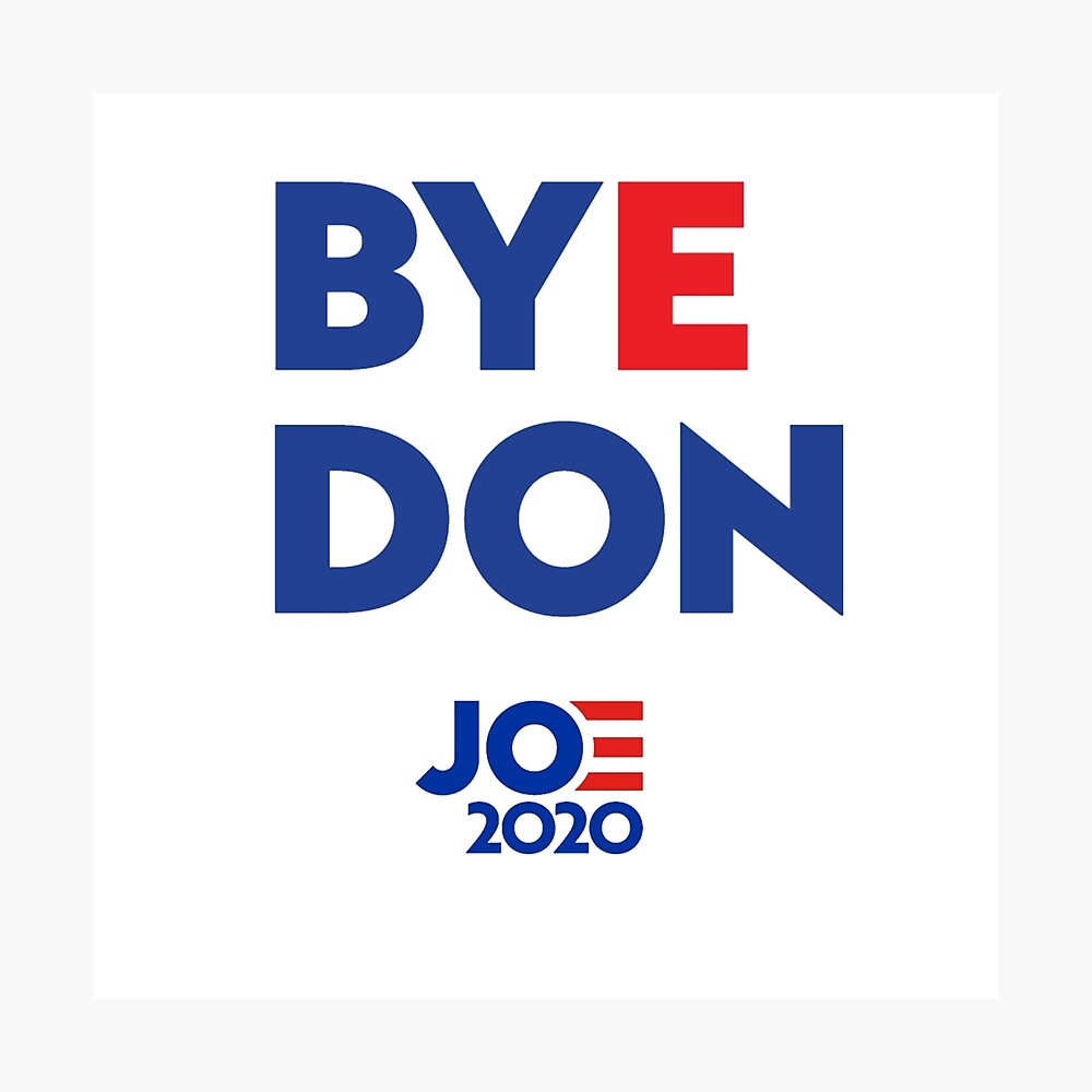
Who knew Manchester United had ‘NHS’ smack-bang in the middle of their name.
In the right order.
With an identical gaps between each letter.
(The placement of those three guys reading and saluting it isn’t bad either.)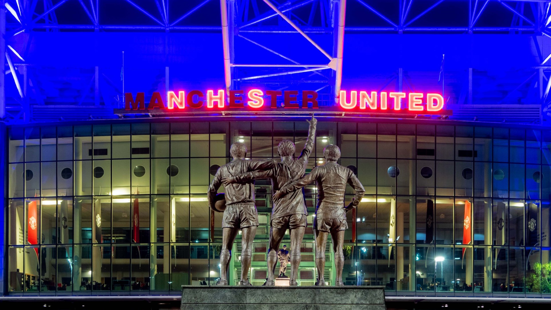
Another for the NHS.
My guess, based on no evidence whatsoever, was that someone said ‘Let’s brand our line by using the letters N, H and S’.
A focussed brief, but very restrictive.
After getting in some lines that felt a bit too contrived (another complete guess, I’m making this stuff up), they’ve rejected the likes of ‘Now Hibernate Sweetie’ or ‘Need Humanity Shutdown’ and the like to regroup.
Then someone, risking sounding like an idiot spoke up ‘Those letters work upside down…they spell SHN’.
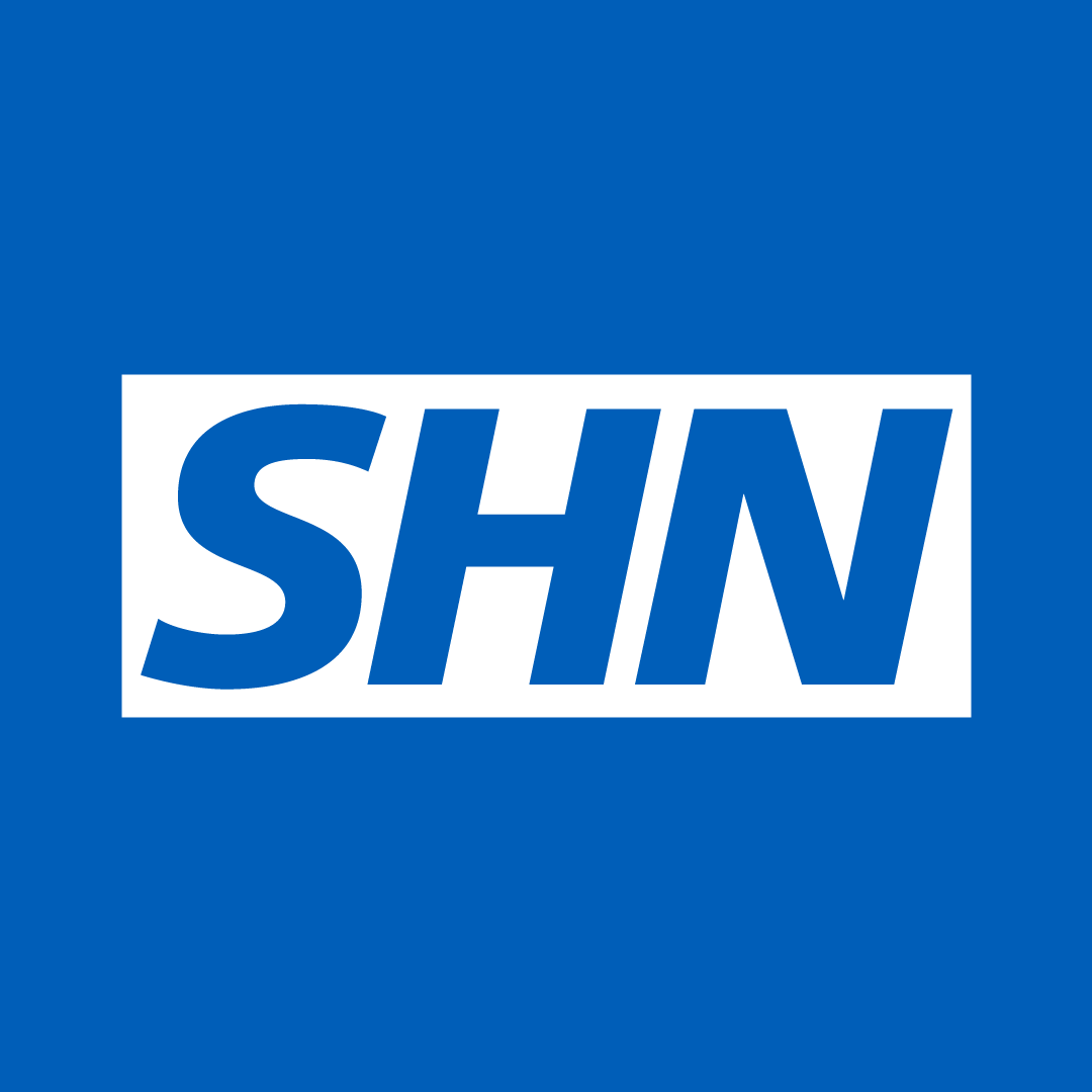
So they go again.
They get to ‘Stay Home Now’.
Perfect.
Exactly what you want to say in an effortless, obvious sounding way.
It became the centre of a very focussed, well branded NHS campaign.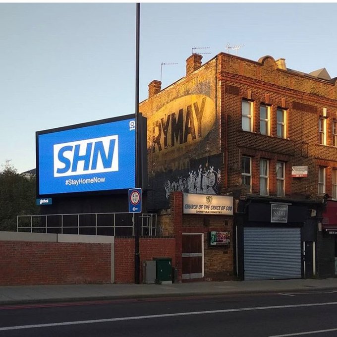
I can no longer see anything relating to ‘Friends’ without thinking of this ad.
(That’s a pretty good return on their investment in a half page ad in the Evening Standard back in 2004.)
To spirits companies, Christmas is their biggest opportunity of the year, so they all advertise.
Standing out amongst the Santas, Christmas jumpers and snow is hard.
How do J&B Rare say we they are more Christmas than the others?
Bingo!
You’re Nike, Arsenal go a whole season without losing.
It’s never been done before.
As their sponsor you have to congratulate them, but what do you say?
How do you fit all those superlatives in a single headline?
Awesomenal?
Fortunately not, someone, (could’ve been Tony sitting at his desk, could’ve Guy sitting under his), someone spotted that Arsenal has an ‘L’ in it.
Why is this important? ‘L’ is the abbreviation used in the premier league tables to denote to ‘Loss’, which they hadn’t done.
‘W’ is used for a win, ‘D’ for a draw.
So restrained, so cool.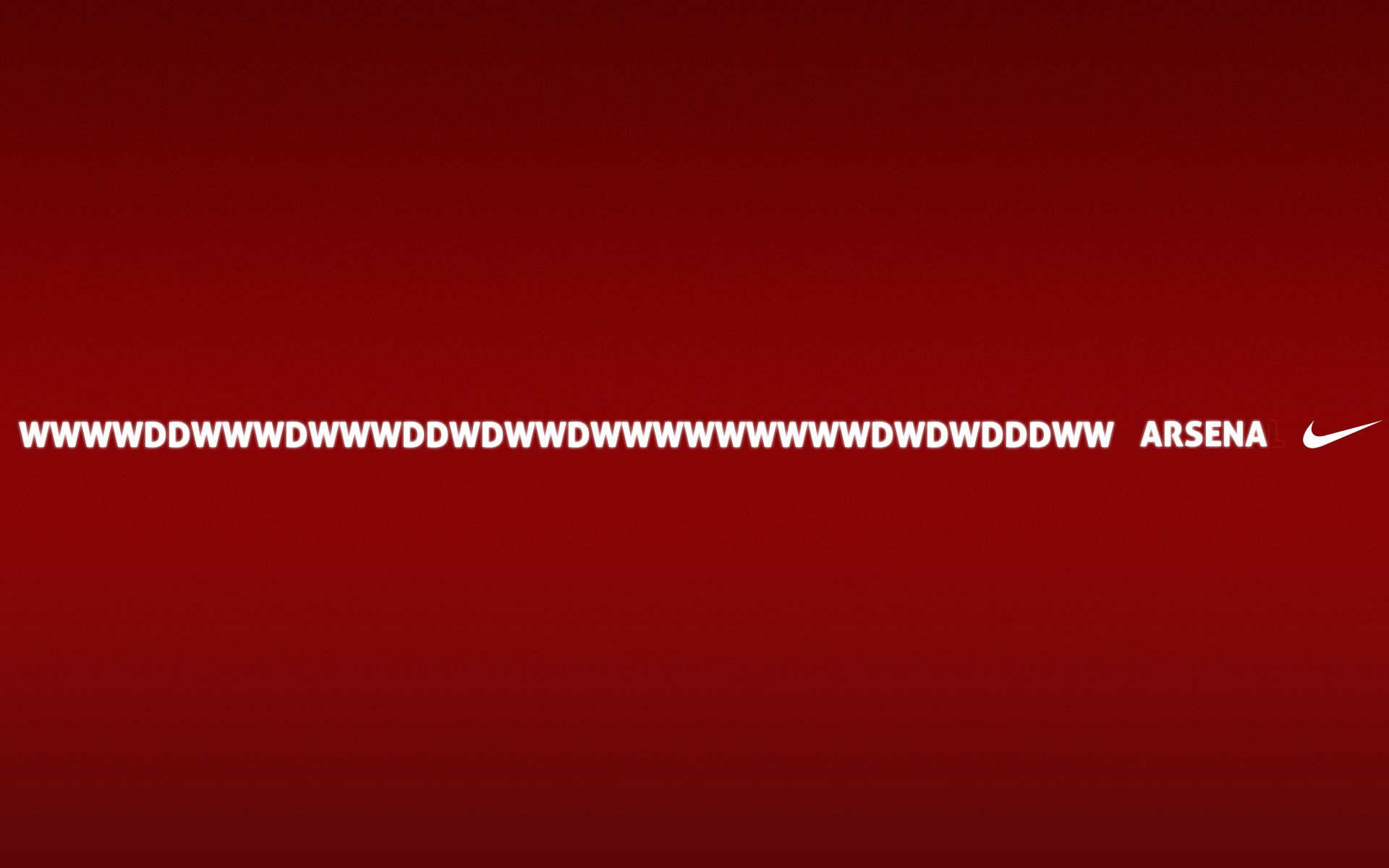
You are in power and you want to remind people that your rival party have no experience governing.
Simple, replace the ‘L’ in Labour with an ‘L-Plate’.
Conversely, if you’re Labour and you want to brand the Conservative Party as untruthful.
Pull out the first three letters from Conservative.

Or what about this one; The deadline for entering D&AD is looming, we need to remind people that if their work isn’t entered it may as well not exist.
It’s basically dead.
Swap that & for an E.
Couldn’t be for anyone else.
Job done.
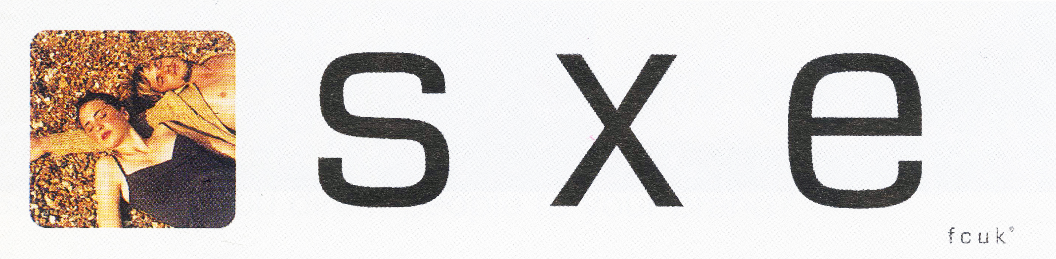
This one starts, as legend has it with a fax. (It was like an email but made of paper.)
The story goes that Trevor (Beattie) spotted one coming out of the fax machine at the French Connection offices.
Because it was an internal communication, instead of being headed ‘French Connection United Kingdom’, it was simply abbreviated to ‘FCUK’.
![]()
“Ooh! Looks like that well known swear word’ I’m presuming Trevor thought.
Bingo! An unbelievably famous campaign that ran for 10 years and totally transformed French Connection’s business.
Good spot Trev.


Ironically, Regal cigarettes were the least regal cigarette brand in the U.K.
They were very working class.
But in this category, you weren’t allowed to talk about anything to do with product, so how on earth do you begin to create a campaign?
You start by splitting that brand name in two.
You two names; Reg and Al.
Make them working class guys who spout their opinions on the issues of the day and you’ve got yourself a campaign.


I’d been aware of VW since I was a child, but I’d never considered that those letters were next to each other in the alphabet.
Until Tony and Kim pointed it out.
We were all at Leagas Delaney and had been put on a pitch for VW Germany.
Tony had drawn an alphabet and replaced the V and W with the VW logo.
I loved it.
But what was it?
Tony & Kim didn’t know, nor did Sean and I, but we all liked it.
While we were musing on whether this was a doodle or the start of a campaign, Tony and Kim flew off somewhere exotic for a shoot.
Sean and I said we’d babysit their idea for them, try to turn it into some ads.
What we do with it?
You needed to see the alphabet for the idea to work, I liked the idea of running ads that looked like a type specimen sheets.

They’d look cool, attention-grabbing and, as the kids say ‘disruptive’.
But they wouldn’t say much?
Maybe we could find ideas in the alphabet, like those word puzzles?
I put together a blank.
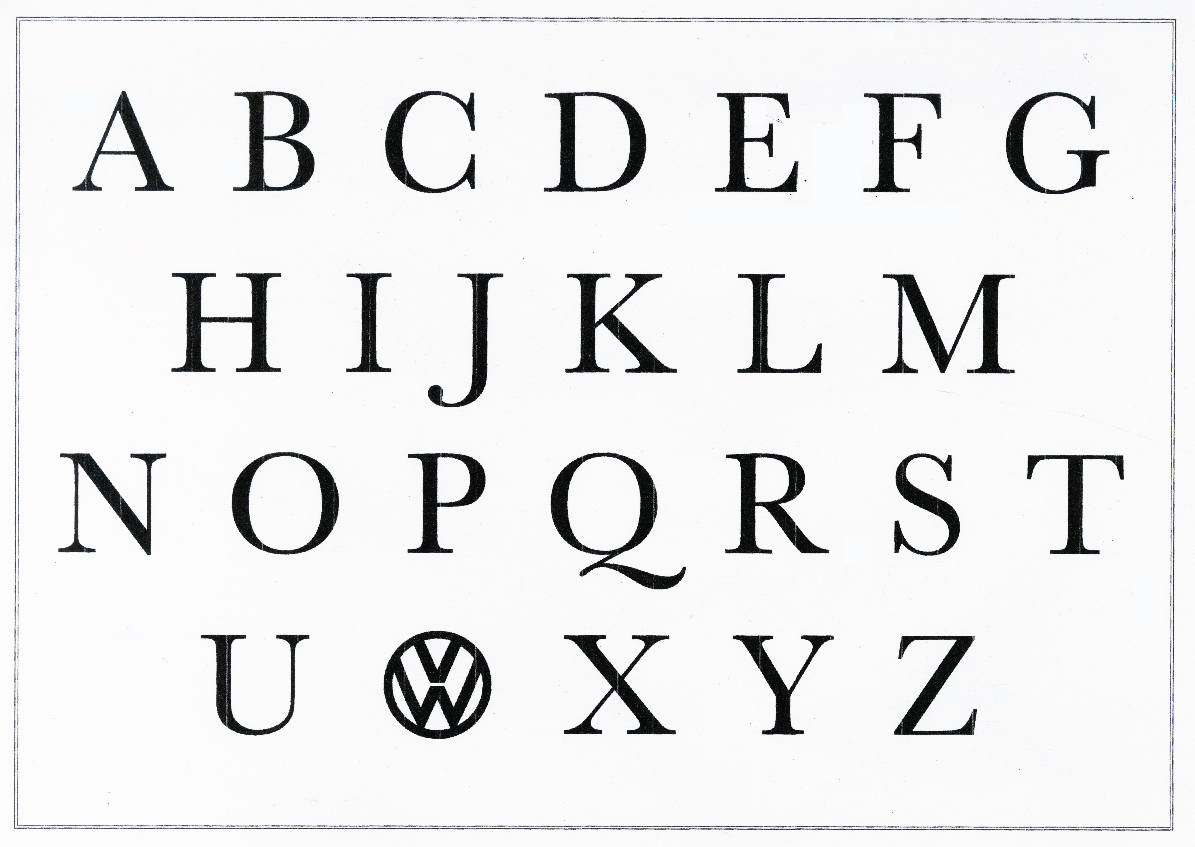
After reading the briefs supporting points, we both stared at our alphabets.
Gradually, we started spotting ideas.
This was my favourite.


I think we squeezed about 20 out.
I can’t remember whether these were what was presented or whether we ended up putting a car in the corner.
Looking at them now, they look pretty radical.
VW Germany presumably agreed, we didn’t win.
This last one took minutes to spot.
After being briefed I jotted down ‘MERRY (Happy), DOWN (sad)’ and drew a face that worked both ways up.
Again, I thought it was neat, but wasn’t sure what it was.
It’s not an ad campaign because…well, it doesn’t tell you anything about the product.
So I pinned it on my wall and ignored it for a couple of weeks, while I tried to come up with something more…meaningful.
So what can we say about the product?
Made from apples?
Made in Dorset?
100 years old?
Alcoholic?
Who gives a shit!
Everything seemed so boring and generic.
So after a couple of weeks, I thought sod it, let’s just brand the ads and make it fun.
I then wondered how we could make them more relevant to cider.
Maybe the Merry way up a hand is holding a full glass (happy), and the Down way up the hand is holding an empty glass (sad)?


It turned out that other people disagreed with me, they thought it was an ad campaign.
It won a ton of awards.
Ran for 5 years, across 50 posters, 5 films and about half a dozen pack designs.
Re-energising and transformed Merrydown’s business.
That little doodle.
Who’d have thought?
It used to annoy me that I didn’t have a big bottom drawer like other creatives.
They’d dip into it theirs, pull out one rejected idea after the next saying ‘Let’s just swap that logo for this one’.
I mean, I keep more stuff than most, I should have a huge bottom drawer.
After a while, I realised it was good thing, it reflected the kind of work I wanted to do.
Bespoke.
Try repurposing any of the ideas in this stream for another company.
Maybe a clothing brand could turn their initials into a swear word?
Perhaps an alcohol brand could split their name into two conflicting moods?
Or maybe a creative team could integrate their names into one, it looks really cool.
They can’t.
But they may well have their own branded ideas within their name or logo waiting to be found.
The tough thing is spotting them.
Even when they’re right under your nose.
Love this!
Love the Guy under the desk reference Dave 😂 On the Arsena ad, we always wanted to run it as a poster the length of Highbury and Islington station after the final game of that season with a D, W or even L on the last sheet to be pasted up on the final whistle. In the outside chance of a loss we even had the line in reserve ‘There’s only one L in Arsenal’. Alas we never got to do it as a poster. Love this article mate. Such clever stuff from some real clever bastards 👍
That sounds excellent Tony, why didn’t they make that tube station happen?
Dx
(You realise you’re heaping praise on yourself there in the last line?)
I remember seeing the Arsena ad being put together, Tony, and being SOOO jealous. Even your reserve headline is brilliant!
another brilliant post. But I’m sure you’d wirtten it for another subject and pulled it from your bottom drawer.
Thanks Seba, you’re right, this article has been sitting around for ages, it was originally written about the origins of Cow Gum, I just had to change a few words here and there. Dx
Really enjoyed that, a lot of memories
Top post Dave.
Do your history. The Arse were not the first club to go a whole season without getting beat.
Annoyed of Preston.
Be fair Mick, that was before the Gutenberg Press, it’s hard to track down information like that. Dx (Are Preston still going?)
Hi Dave
When I ‘had’ to leave the permanent employ of an agency one day and start freelancing for them the next, I had to come up with a company name that didn’t have (for legal reasons) my name in it. So (hopefully you’ll agree) I did the next best thing, I tried to describe what I did.I called the company Thinking and Inking ltd (as that what was I was okay at). The logo was simply the word Thinking Ltd. But the dot on the letter ‘i’ was an ampersand in bold, as were the letters ‘inking’. You’d have made it look lovely…
That sounds excellent Stuart, you should attach a copy. Dx
i had a similar ecstatic experience when working on US snack staple WHEAT THINS. The brand name contains the phrase _ _EAT THI_S Too good to be true. we had to do this. https://www.youtube.com/watch?v=LBoDTiArcbE
Great spot* Vinny, like a miracle.
Dx
*The English spot – noticing something, neat spot American-wise too though.
Great anthology. Your posts, like your creative work, are always such good examples of detail, finesse and hard work. Thank you.
Thanks Eoghan, very kind. Hope you’re good over there. Dx
“They’d…pull out one rejected idea after the next saying ‘Let’s just swap that logo for this one.’”
I had senior creative partners who did the same thing.
I always felt sorry for the unsuspecting clients.
True.
But sometimes, when things get panicky, I get envious David.
Dx
Mr. Dye, sorry for the delayed reply.
Always loved that Merrydown work, Dave. Still looks fresh today.
Of course, it looks like a total gift. Merry. Down. Bingo.
But as you say, the trick is in the spotting.