It doesn’t have to be a ribbon.
Could be anything really – a pattern, shape, lemon, hedgehog, just something visual associated with your brand.
It’s beyond a logo.
It should run through your communications like the name of a seaside town through a stick of rock.
Not appearing alongside it, but informing what ‘it’ is.
Why?
It increases your chances of your messages being remembered as yours.
The boffins at the Ehrenburg Institute call them ‘Distinctive Assets’.
The bottle says Absolut, those checks announce it’s Burberry’s and that white line twisting through a red background tells you it’s Coke.
All before you’ve read a word.
You can invent them, like Aleksandr, that Russian vermin who fronts the Compare The Market ads, but generally they’re more resonant if they’re excavated from the company.
More likely to be relevant, unique and have a bit of integrity.
They may have a bit of awareness already built in.
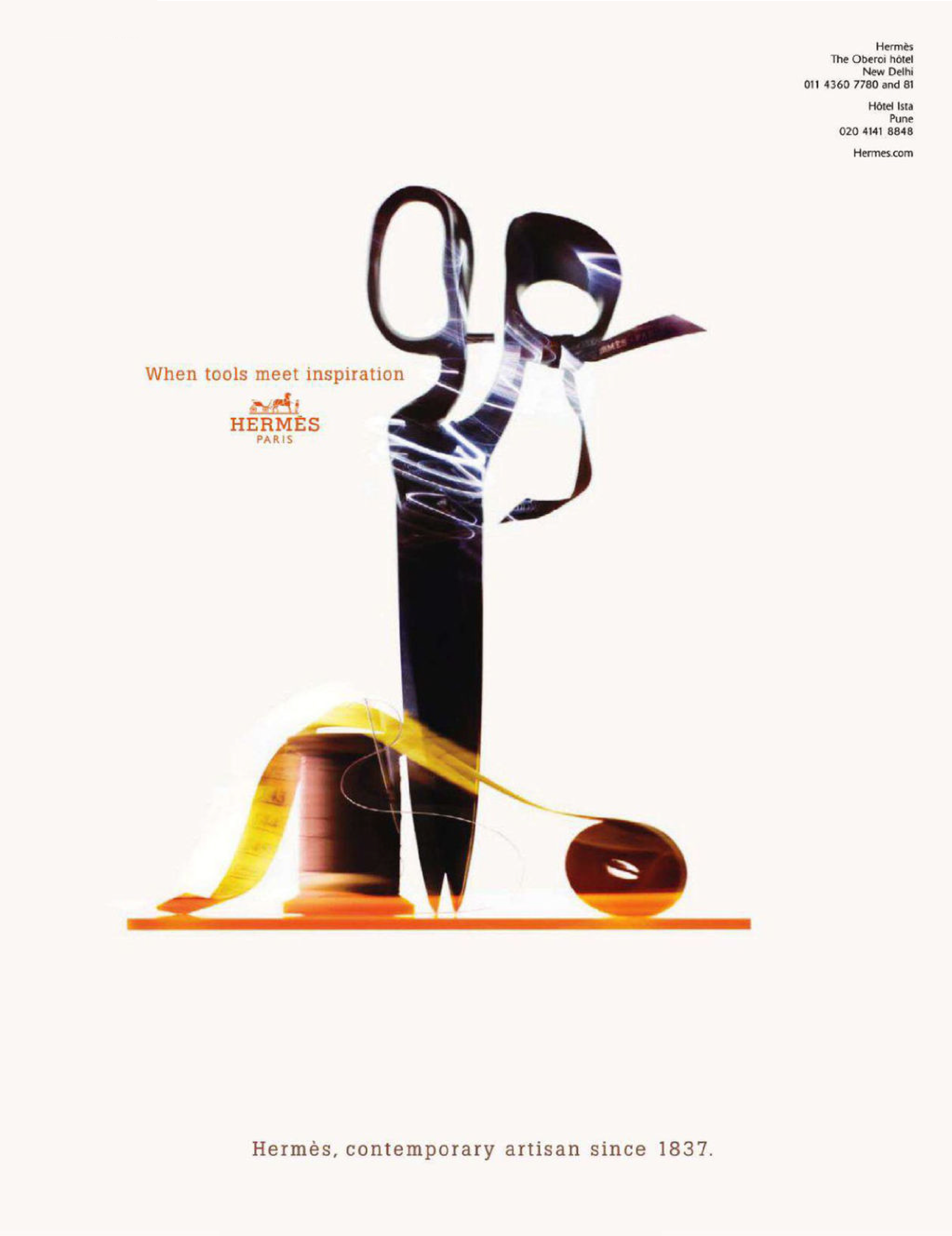
Take Hermes, they operate in a category where being distinctive is crucial; fashion.
Fashion houses follow similar trends, use similar materials and run ads featuring similar looking human beings.
Sometimes the exact same human beings.
(Yes I’m talking to you Ms. Moss.)
Their ads never feature words, so there’s no differentiation there.
They rarely use what we stumbling around Adland call a ‘big idea’.
So making YOUR picture of Kate Moss different from THEIR picture of Kate Moss is everything.
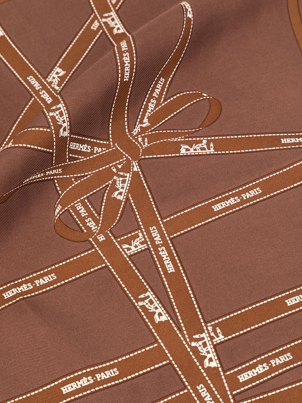
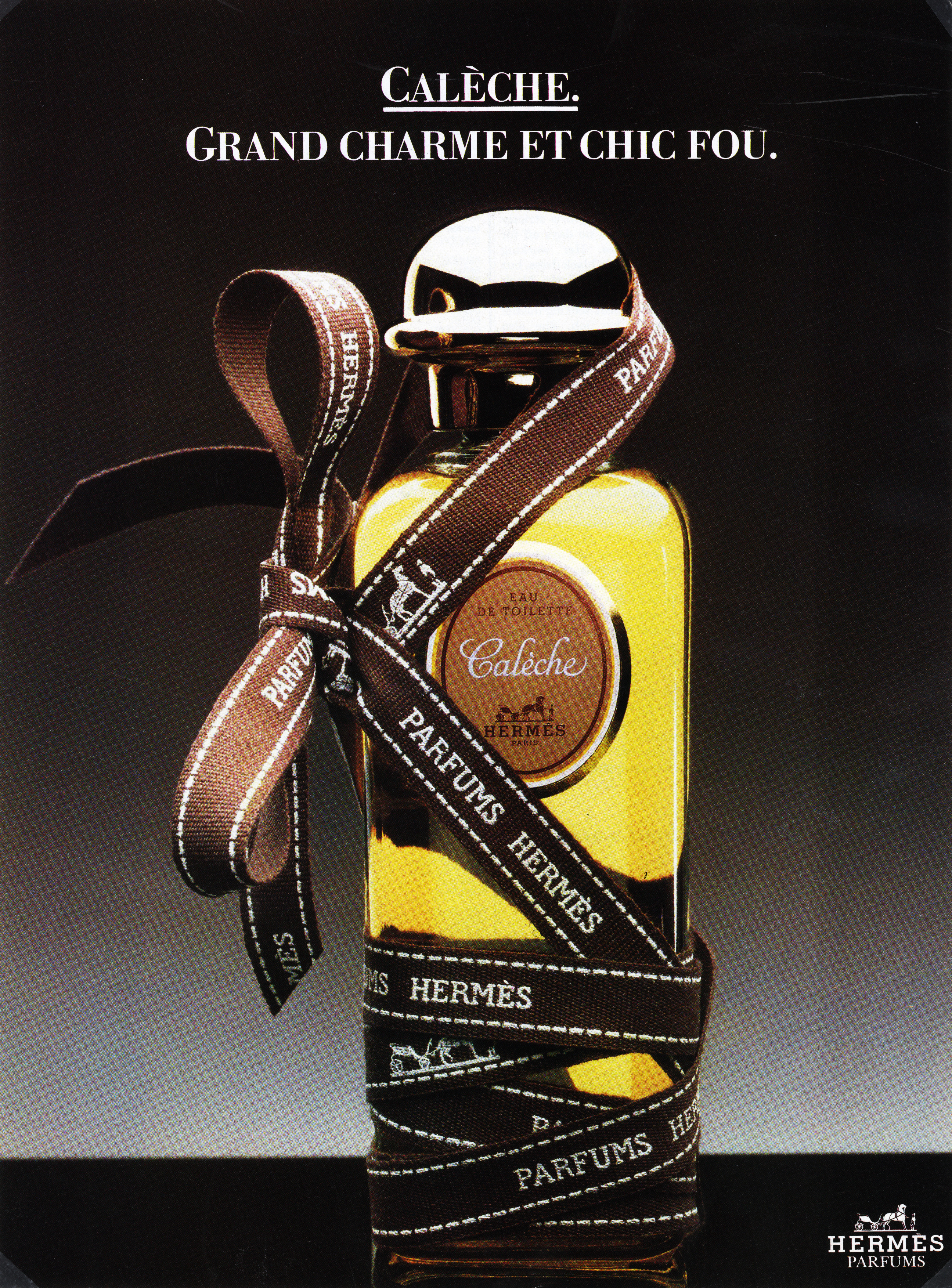
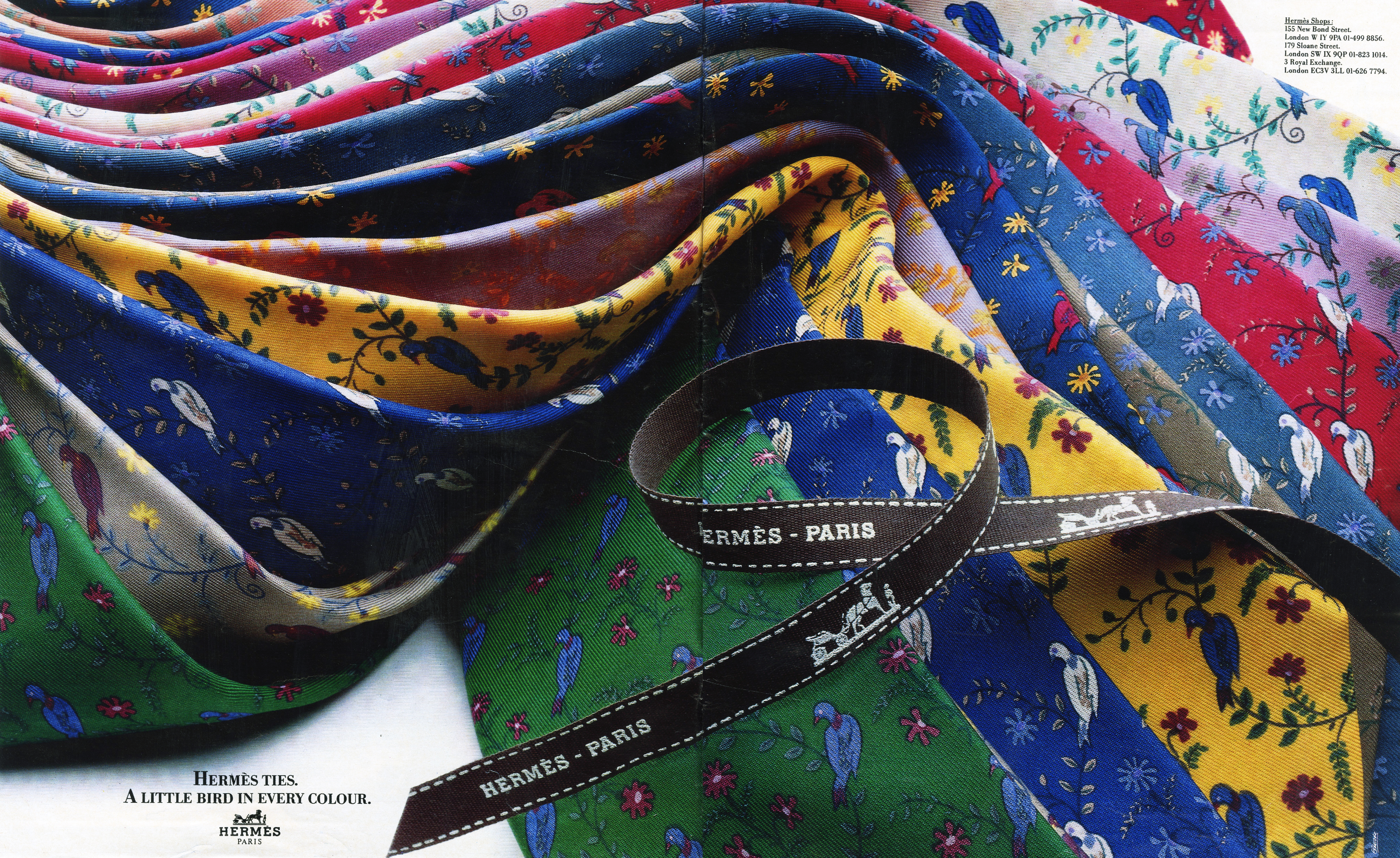
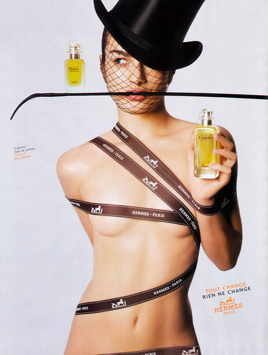
In the early 80’s, someone at Hermes had the idea to feature their ribbons in their ads.
I doubt this idea was greeted with whoops and high-fives around the office.
It wasn’t a big idea.
It just made the pictures feel a bit more… Hermes.
But ribbons have connotations.
They make things special.
They suggest a courtesy from bygone age.
They remind you of presents.
They indicate that a little extra effort has been made.
Extra effort that only a shop with few customers could afford to make.
An expensive shop.
(At the time of writing, Aldi and Lidl are still not using ribbons.)
But like all these distinctive assets, their power doesn’t come from the brilliance of the idea, it comes from the consistency of use.
Sticking with them year after year.
Ignoring the requests for ‘blue sky’ from the creatives come into contact with the brand for short periods of time.
The Marketing Directors, Creatives and Photographers eventually move on to another brand demand ‘Blue Sky’.
Blue sky is easy, reinventing what a brand stands for is hard.
The ads below show how Hermes evolve their distinctive asset from the straighter than straight product shots at the beginning, to the cooler than cool Nick Knight shots.
You can see the ribbon twist and turn its way through the decades, constantly being refreshed.
Like the umbilical cord.


![]()
![]()
 Net result: That ribbon became associated with luxury.
Exhibit A:
Ribbons?…I never noticed that before. And I’m in advertising, I’d like to believe I’ve got a bit of an eye and I’m a regular customer at Hermes (the Missus likes the scarves, and the towels, and the soap, and a few other things too).
Of course I’ve noticed the ribbons on the packaging itself, I know their colour is Orange and there’s a cart horse thing going on as well.
But ribbons in the adverts? No, it’s never occurred to me (did I mention that I used to be an avid consumer of fashion mags? …That means that for quite a few decades I’d be leafing past the ads on a regular basis).
So I’m questioning whether they would have been better off with a big idea (I think I know the answer to that one)…