


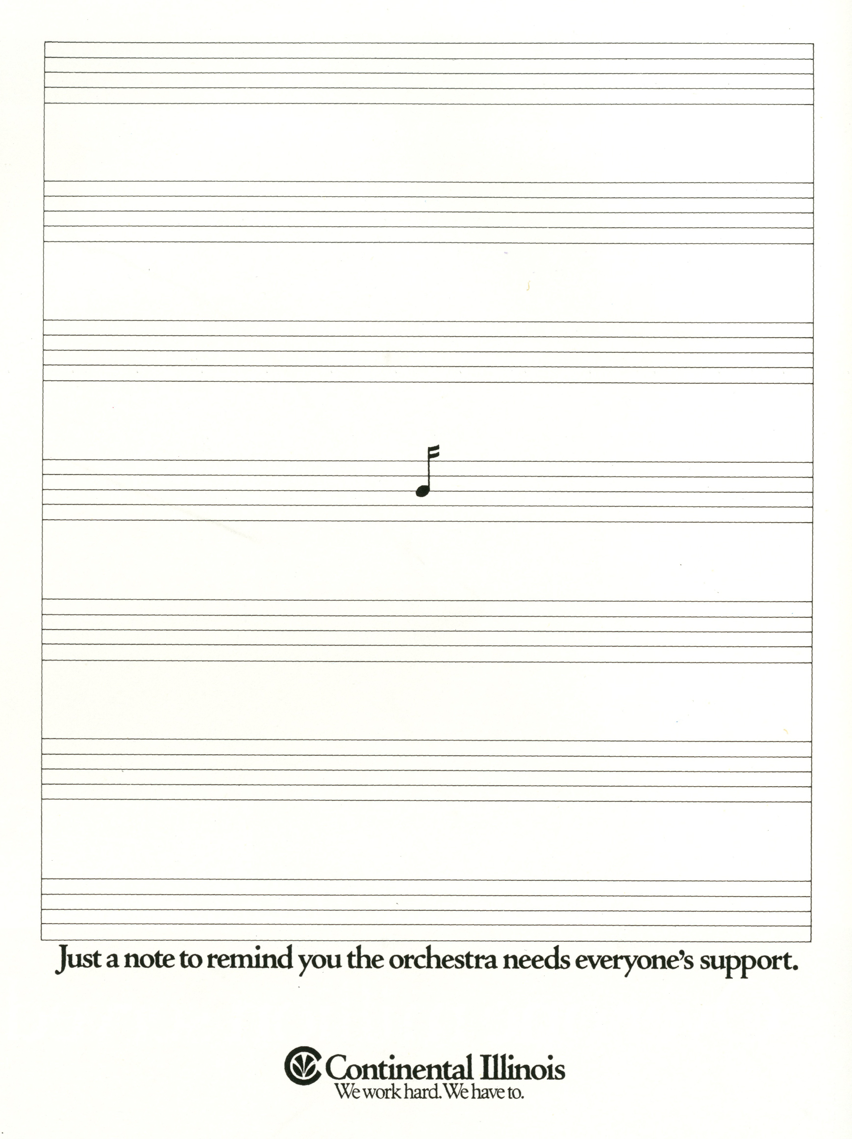
It’s crazy, he should be better known.
He ushered in a new, sassier way of talking.
His work felt like it was written by a very smart lawyer with a wicked sense of humour.
He influenced a generation.
But there’s almost no evidence of his existence on the internet.
In a Stalinesque style purge, Lurzer’s Archive have retouched the Fallon McElligott work to read Fallon.
Even the publishers of Luke Sullivan’s great book ‘Hey Whipple’ seem not to know him:
I can’t find a lot of information on him out there, so it’s difficult to offer up too much. I certainly can’t vouch for the chronology of the work below, but I’ll have a first stab and update it if complaints come in.
So here’s what I know:
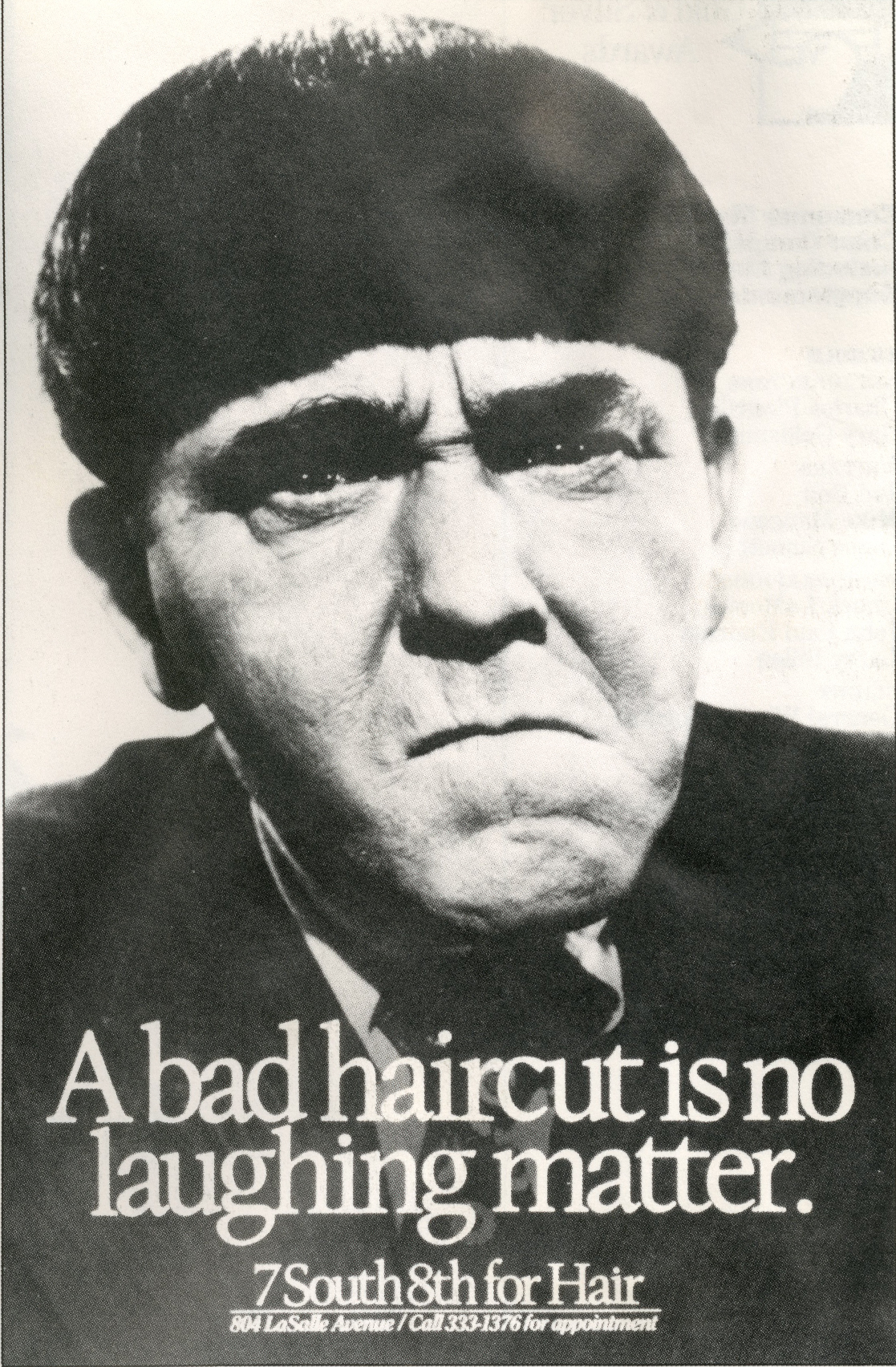
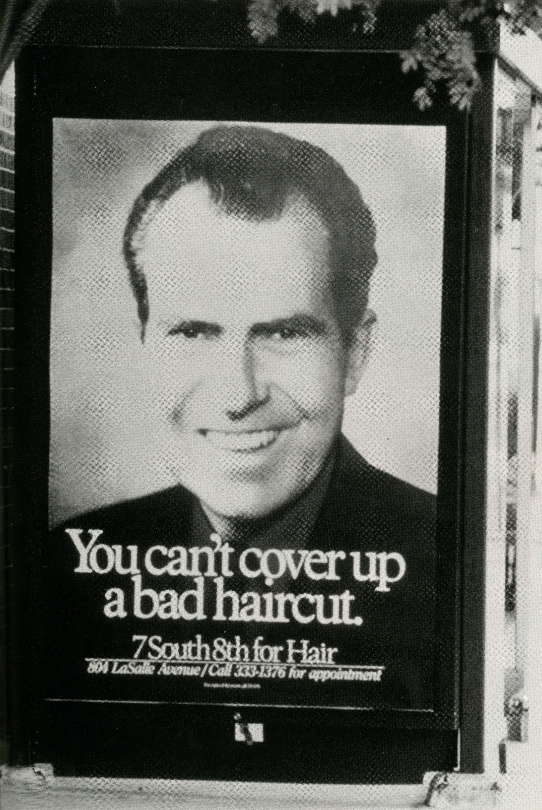
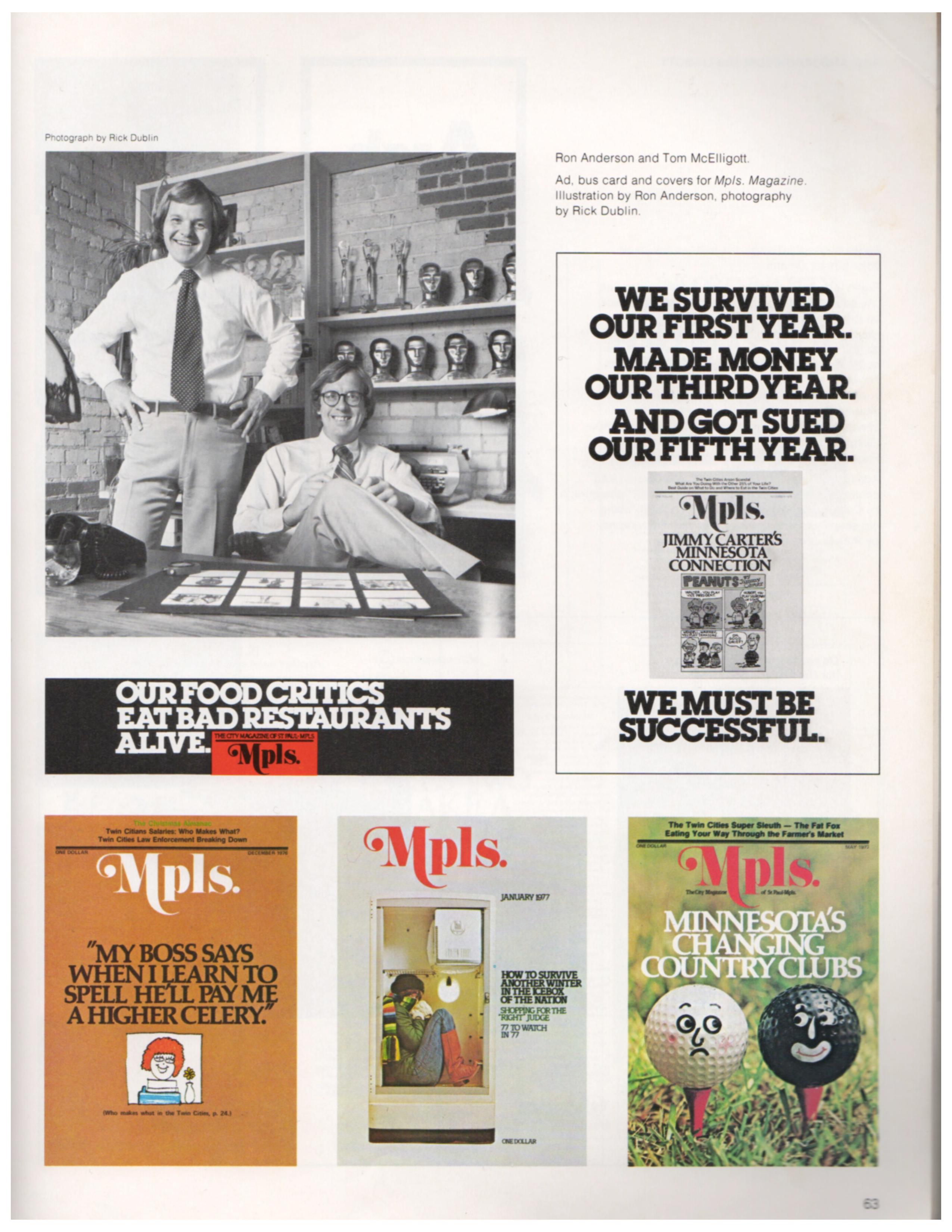
Minneapolis legend Ron Anderson hired Tom to work with him at Bozell’s.
They did some very good, very Fallon McElligott style work together:


They called it Lunch Hour Ltd.


By 1981, they were getting so busy that they quit their day jobs, setting up an ad agency along with Art Director Nancy Rice.
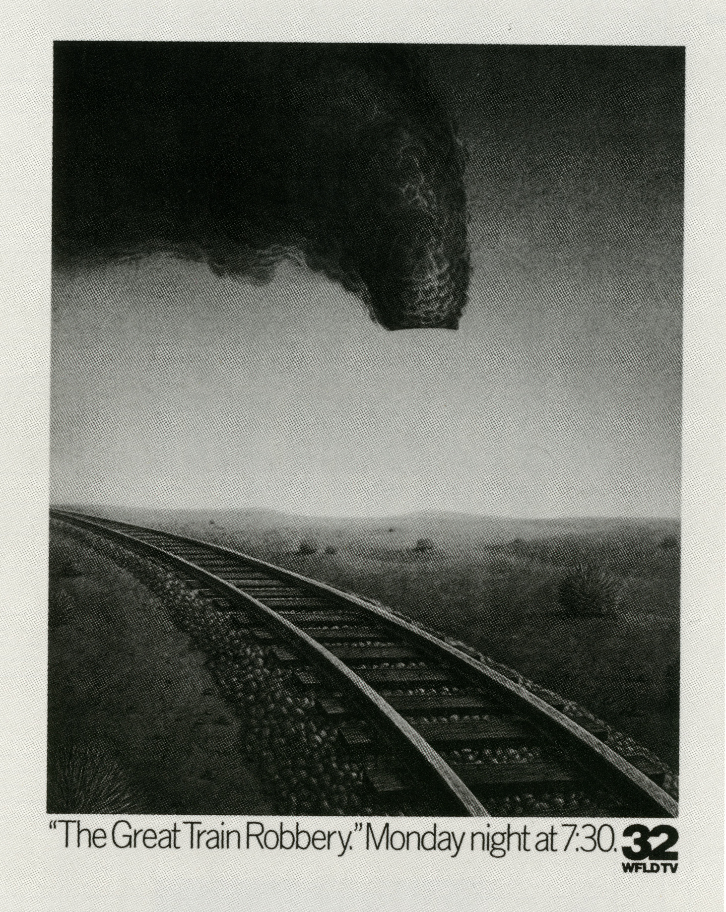
This is their first ad. (August 3rd 1981, Minneapolis Star and Minneapolis Tribune.)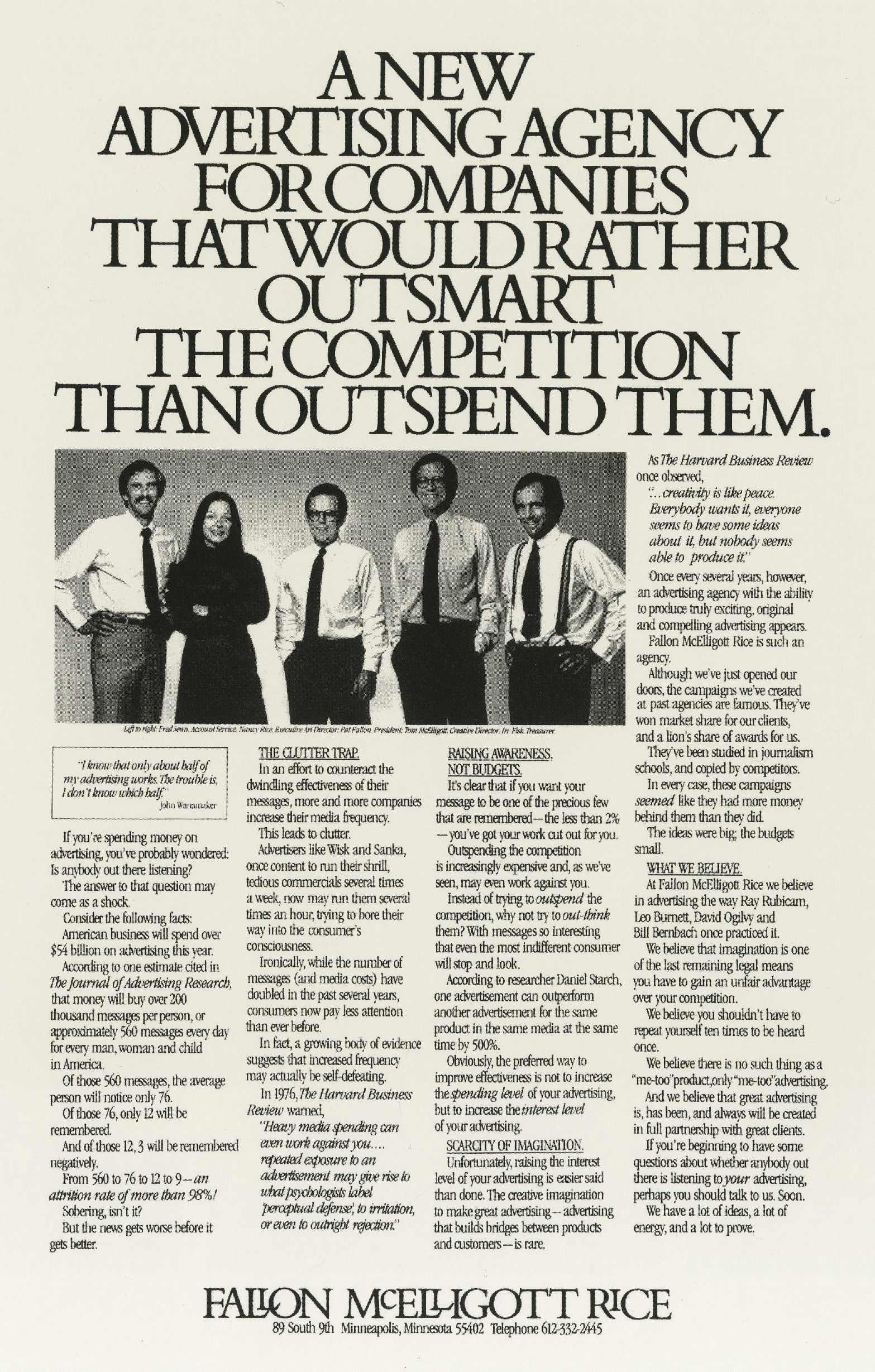
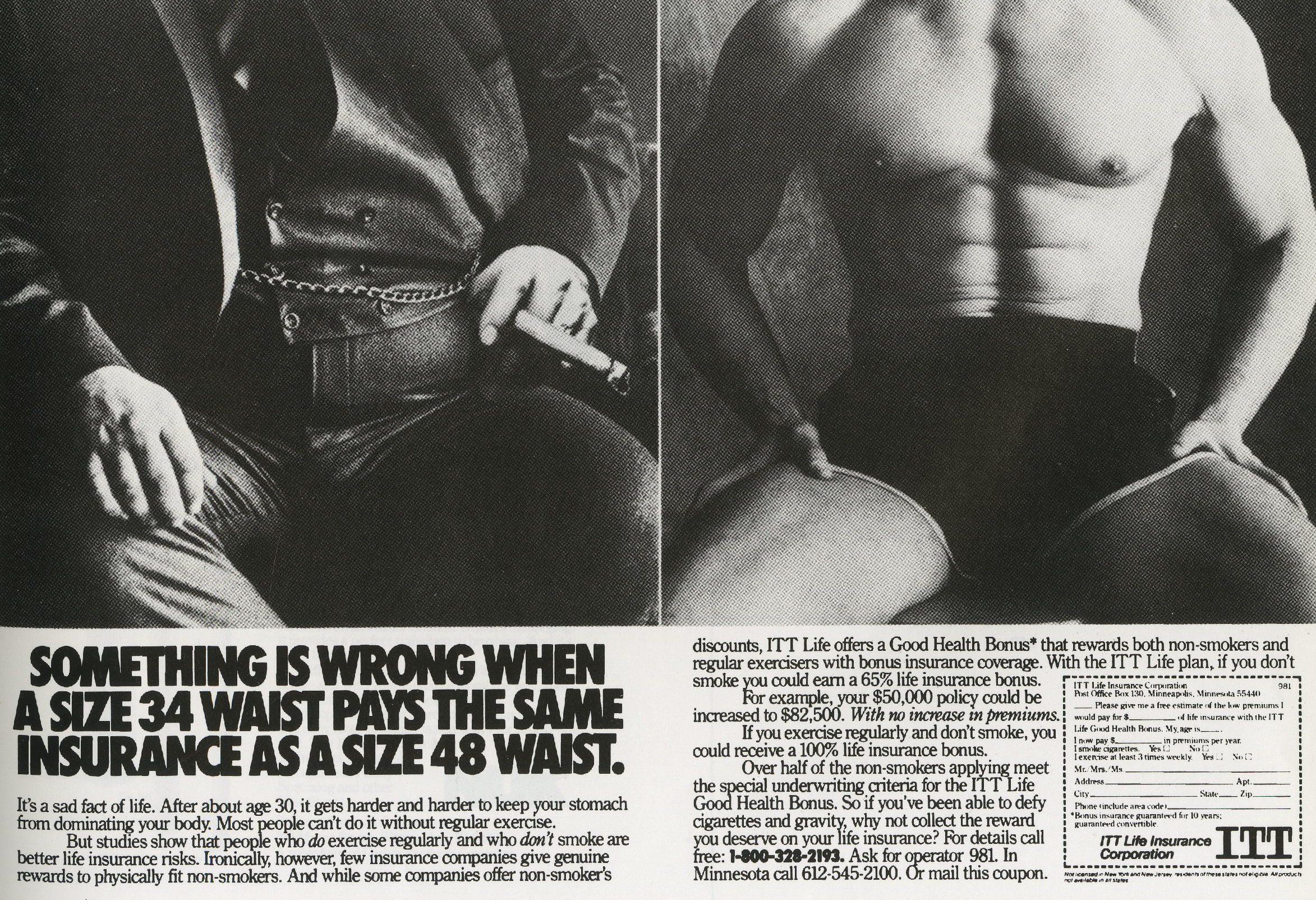
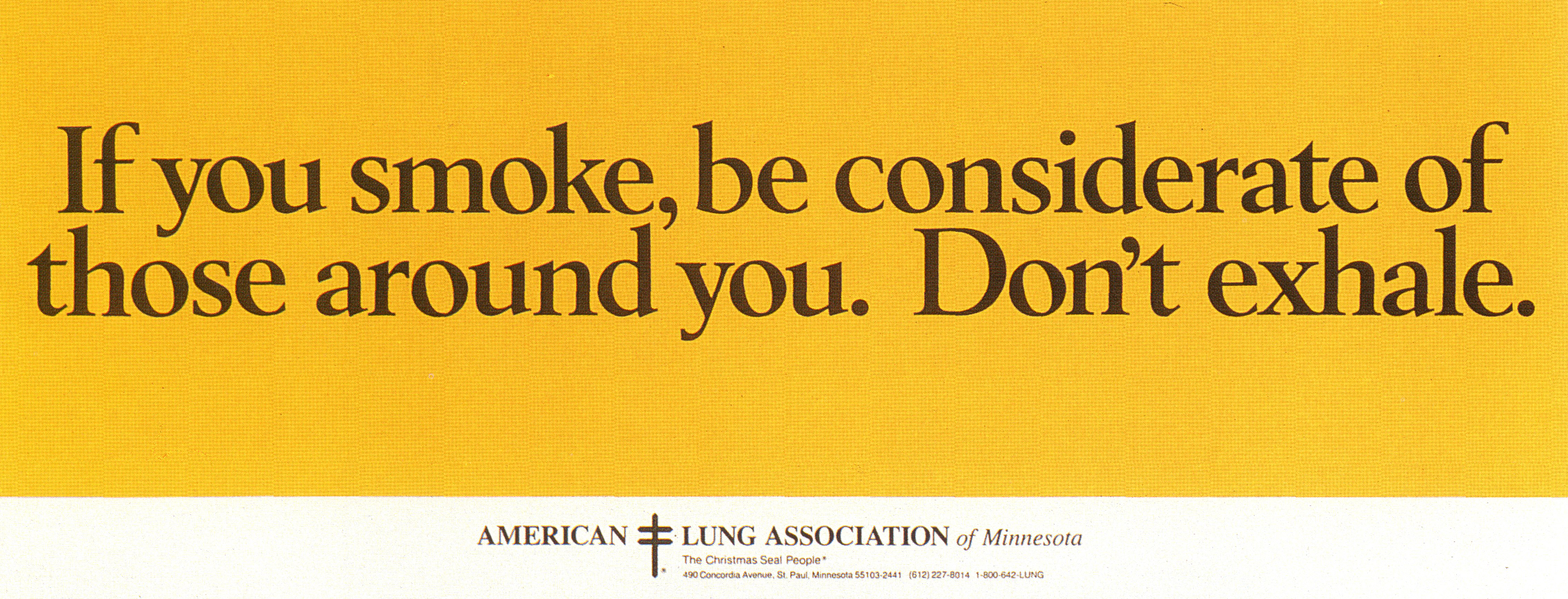
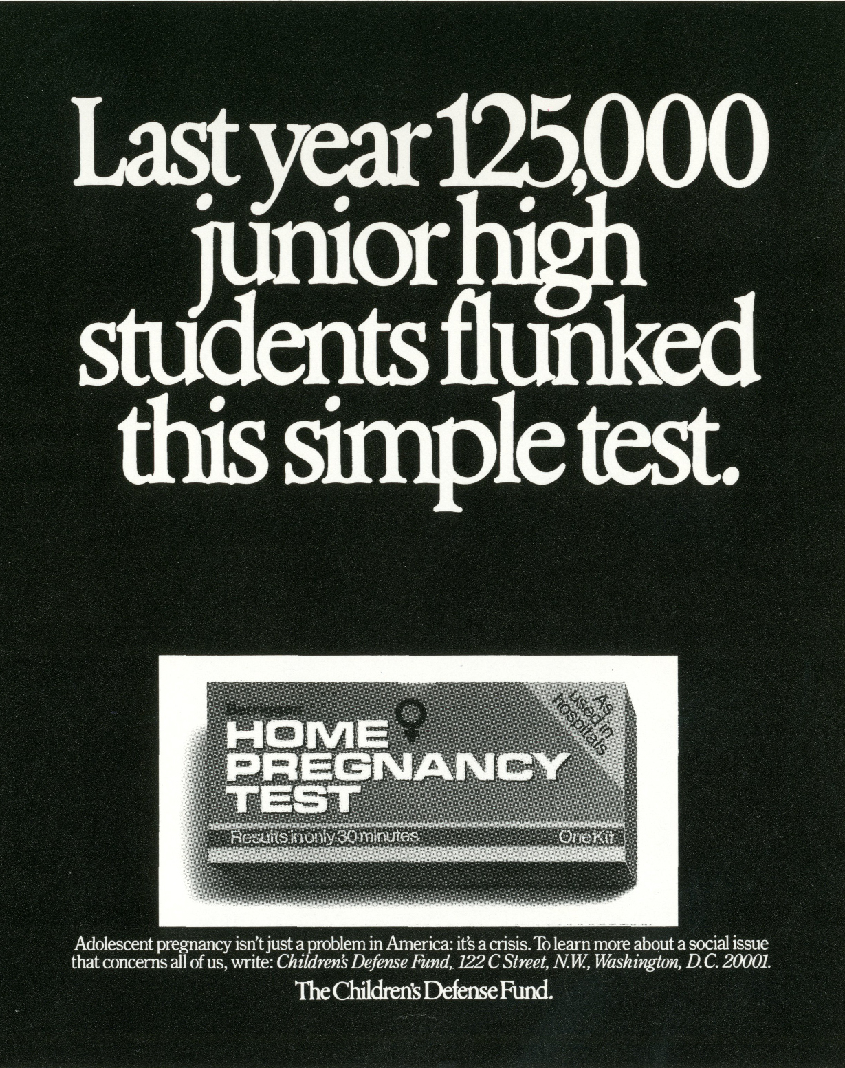
was having trouble finding an ad agency that could ‘make the big insurance companies look like shit’.
Fallon McElligott Rice were given the account and Tom started making the big insurance companies look like shit. 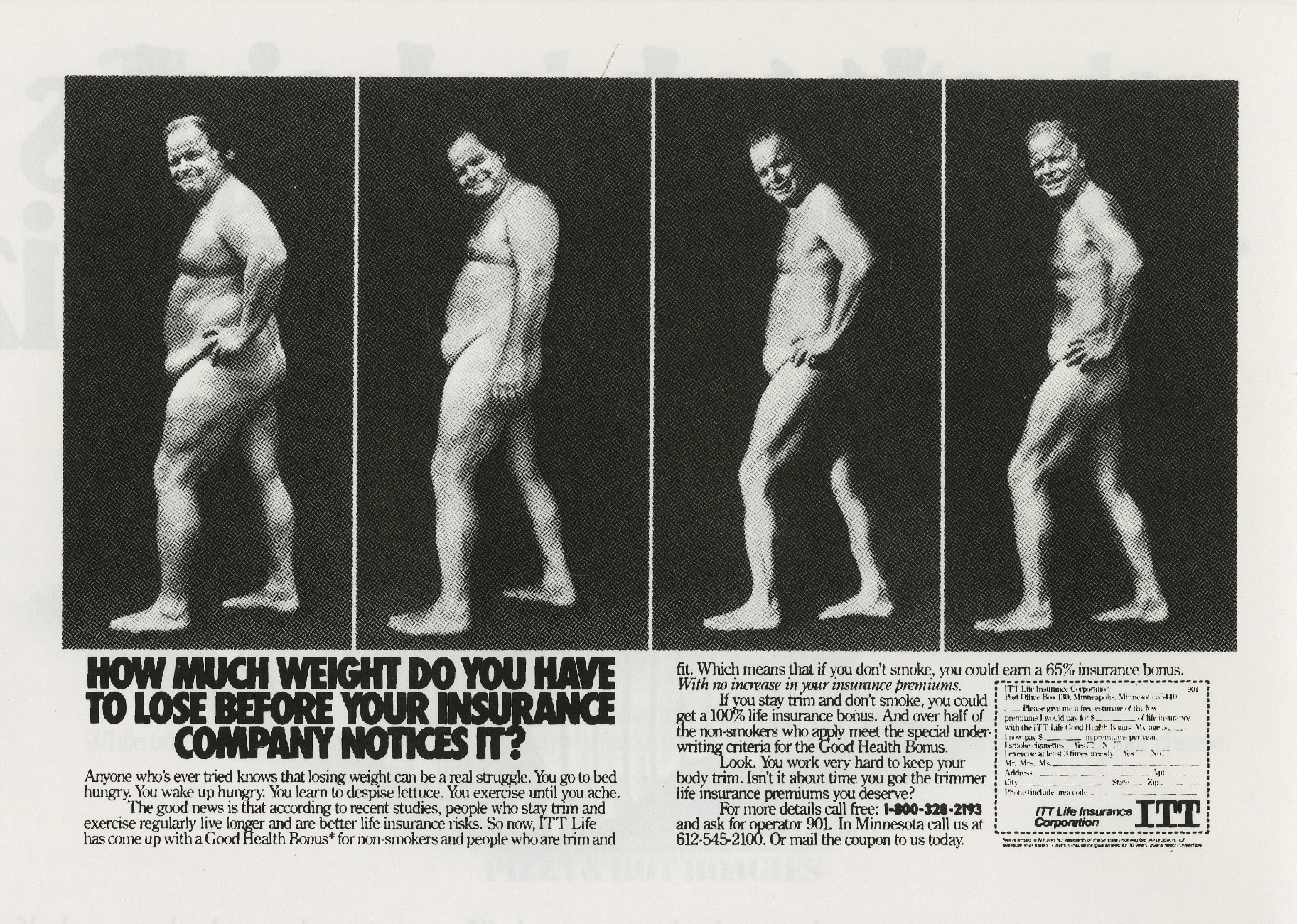


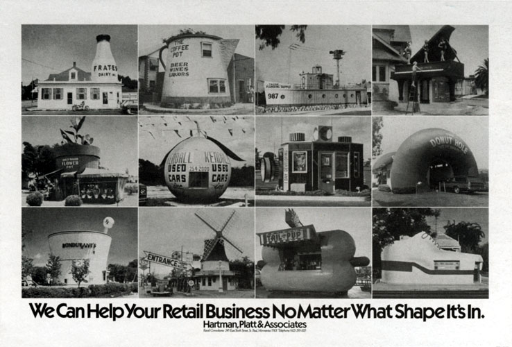
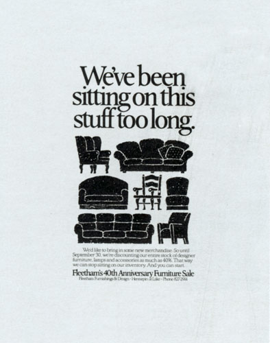
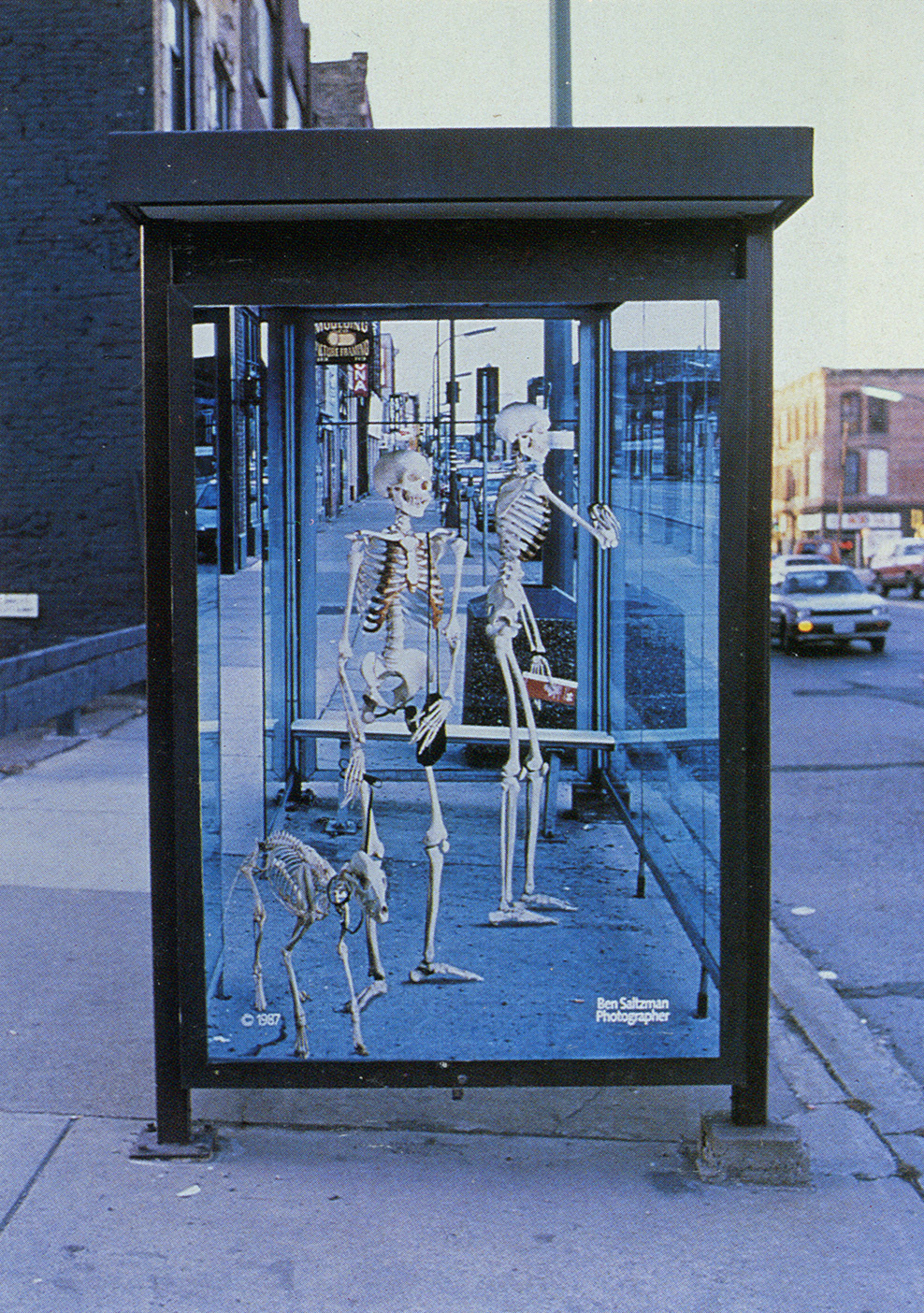
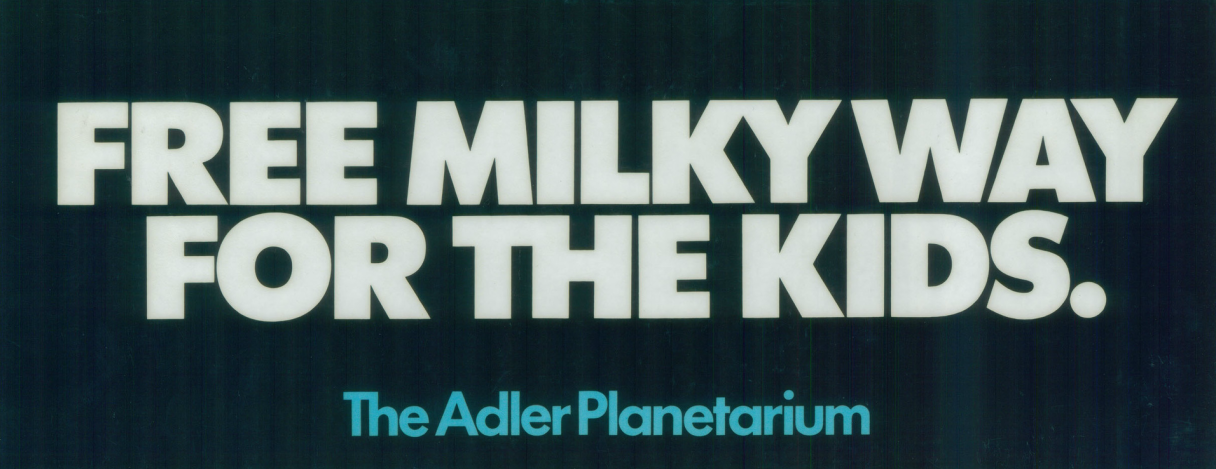
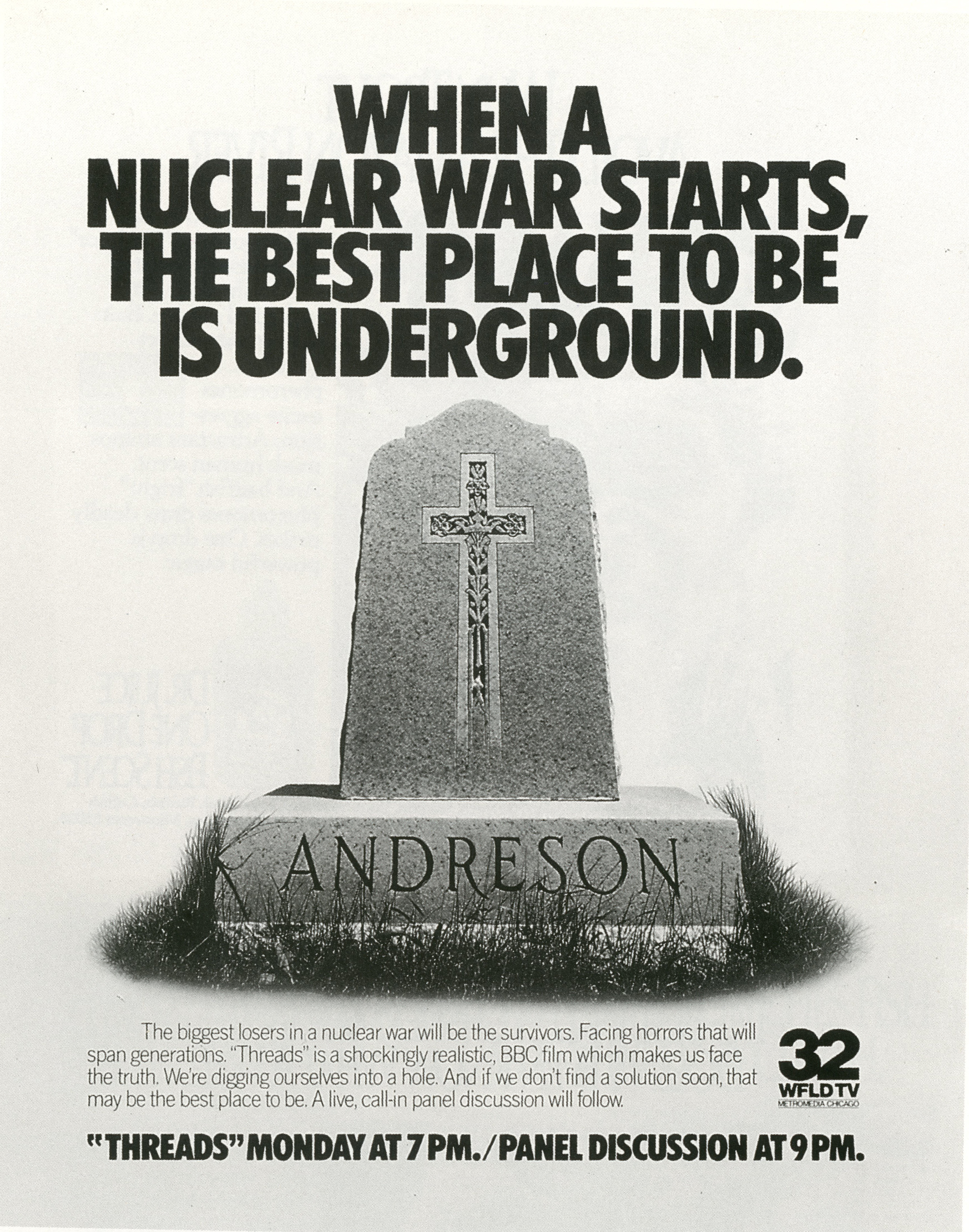
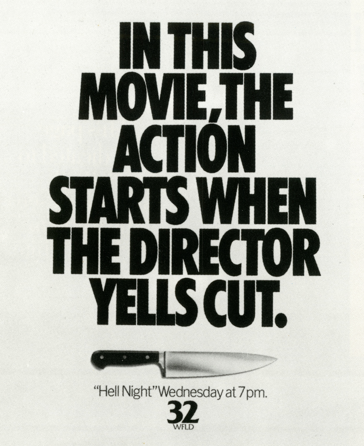
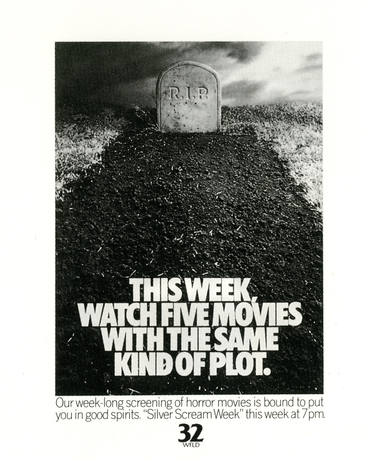
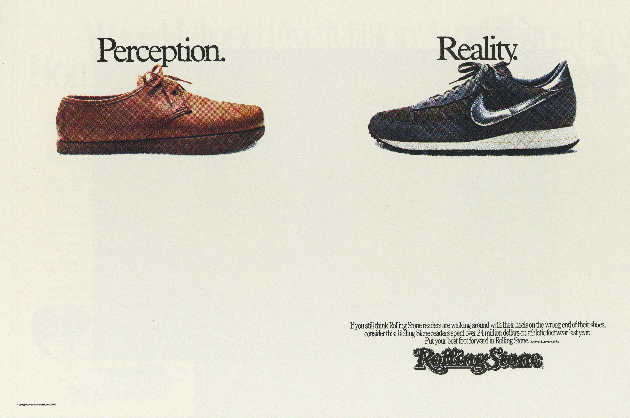
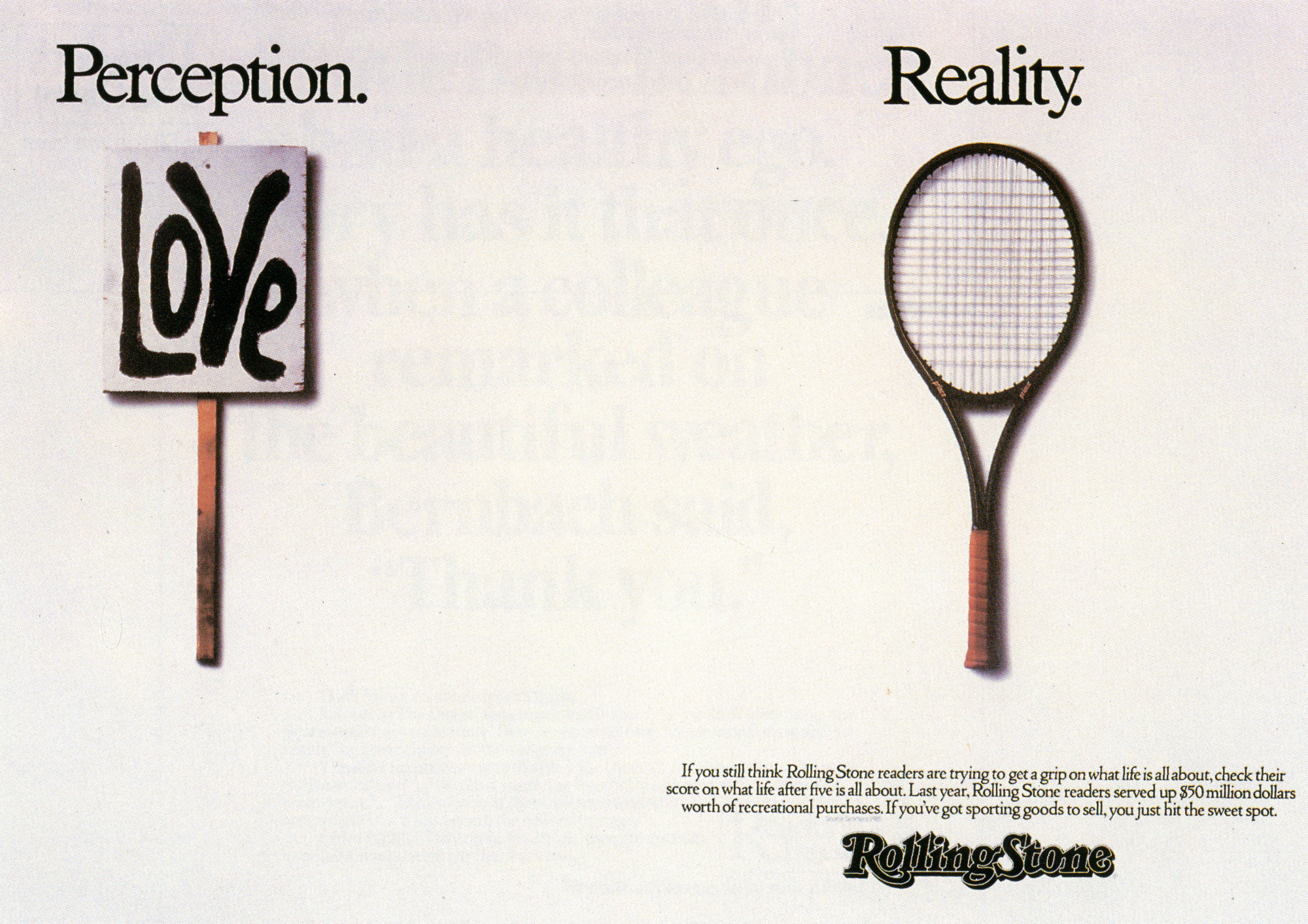
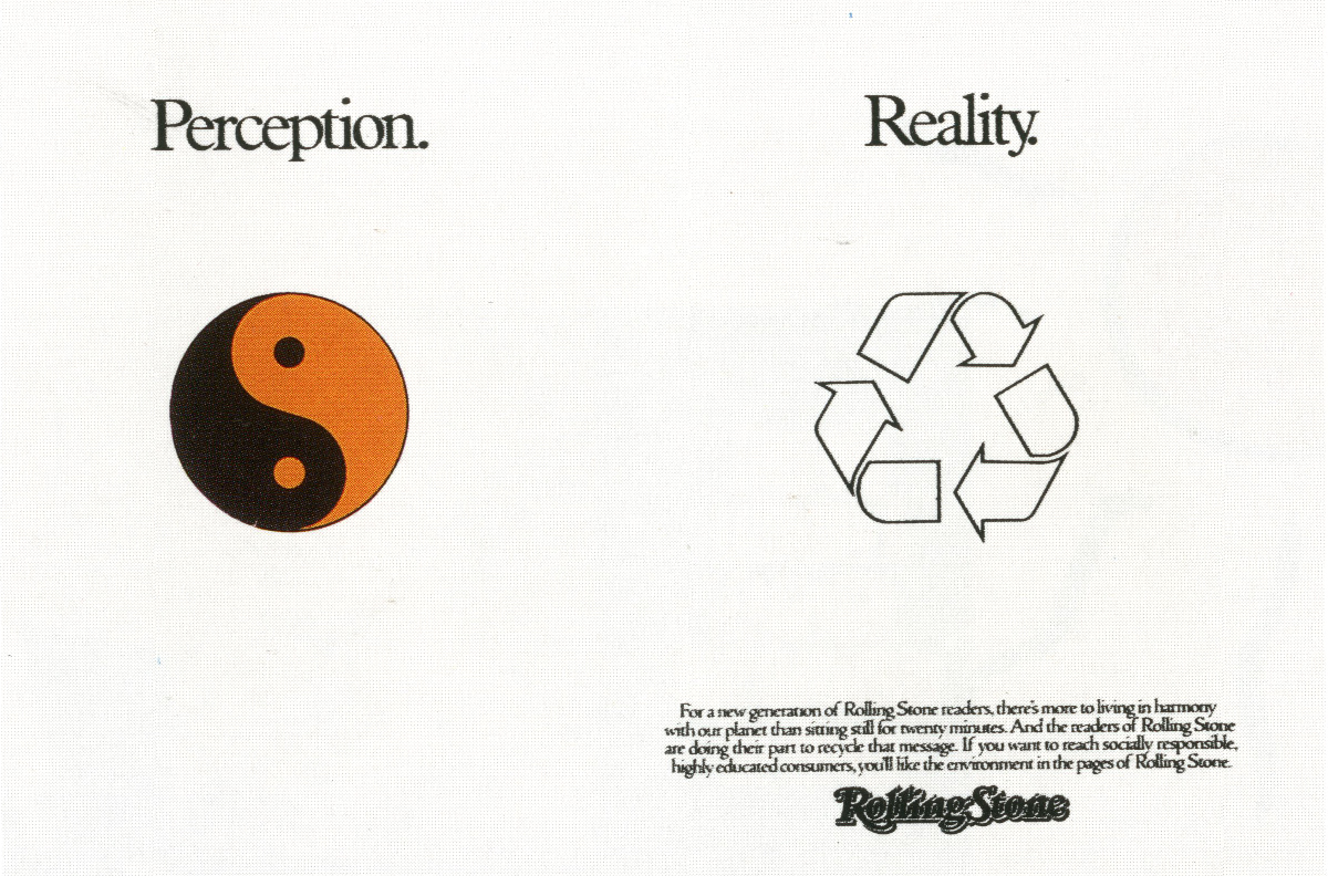
Another way to look at it, and my guess is it’s nearer the truth; no opportunity to create, however small the budget, was turned away.


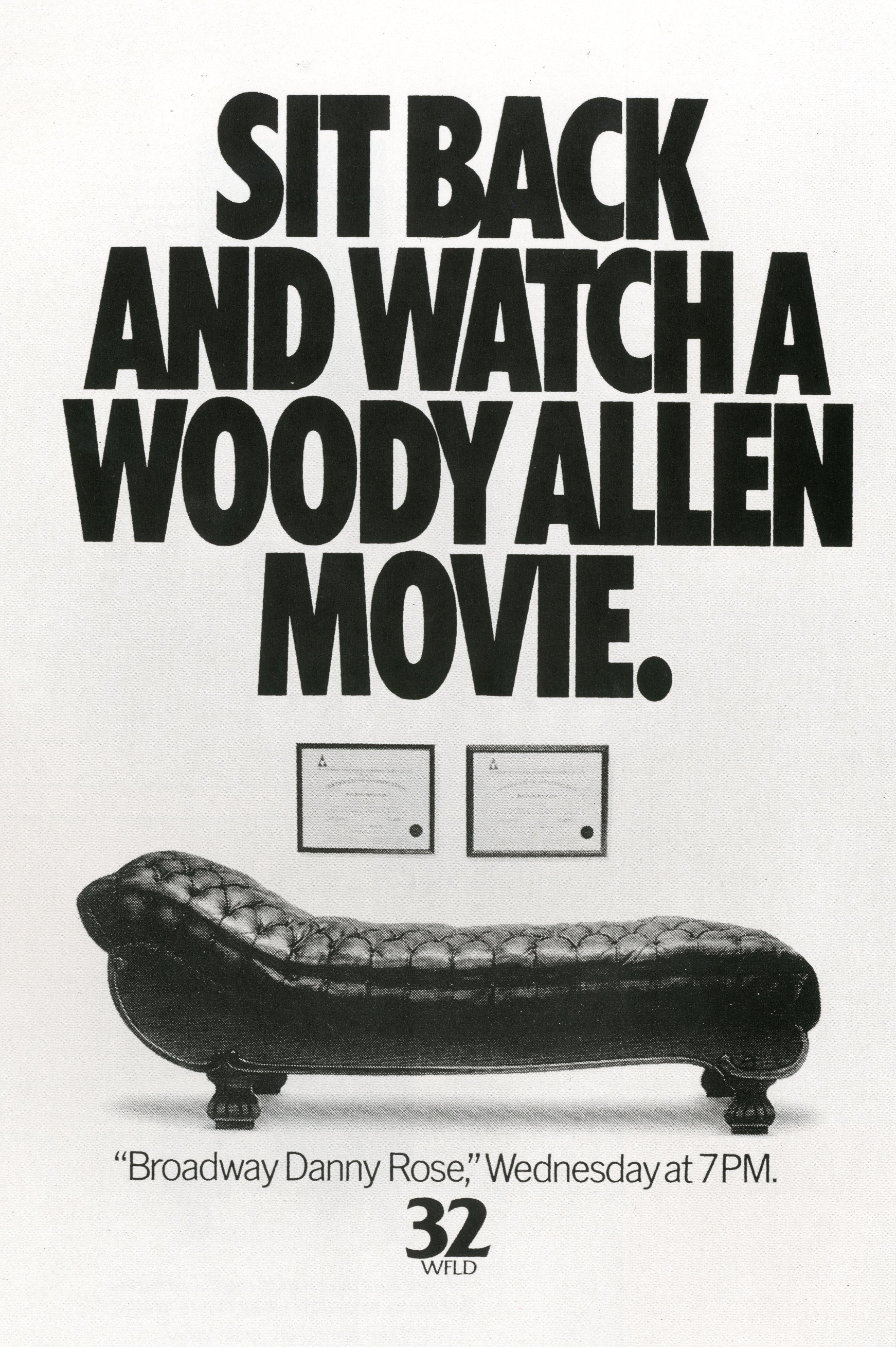

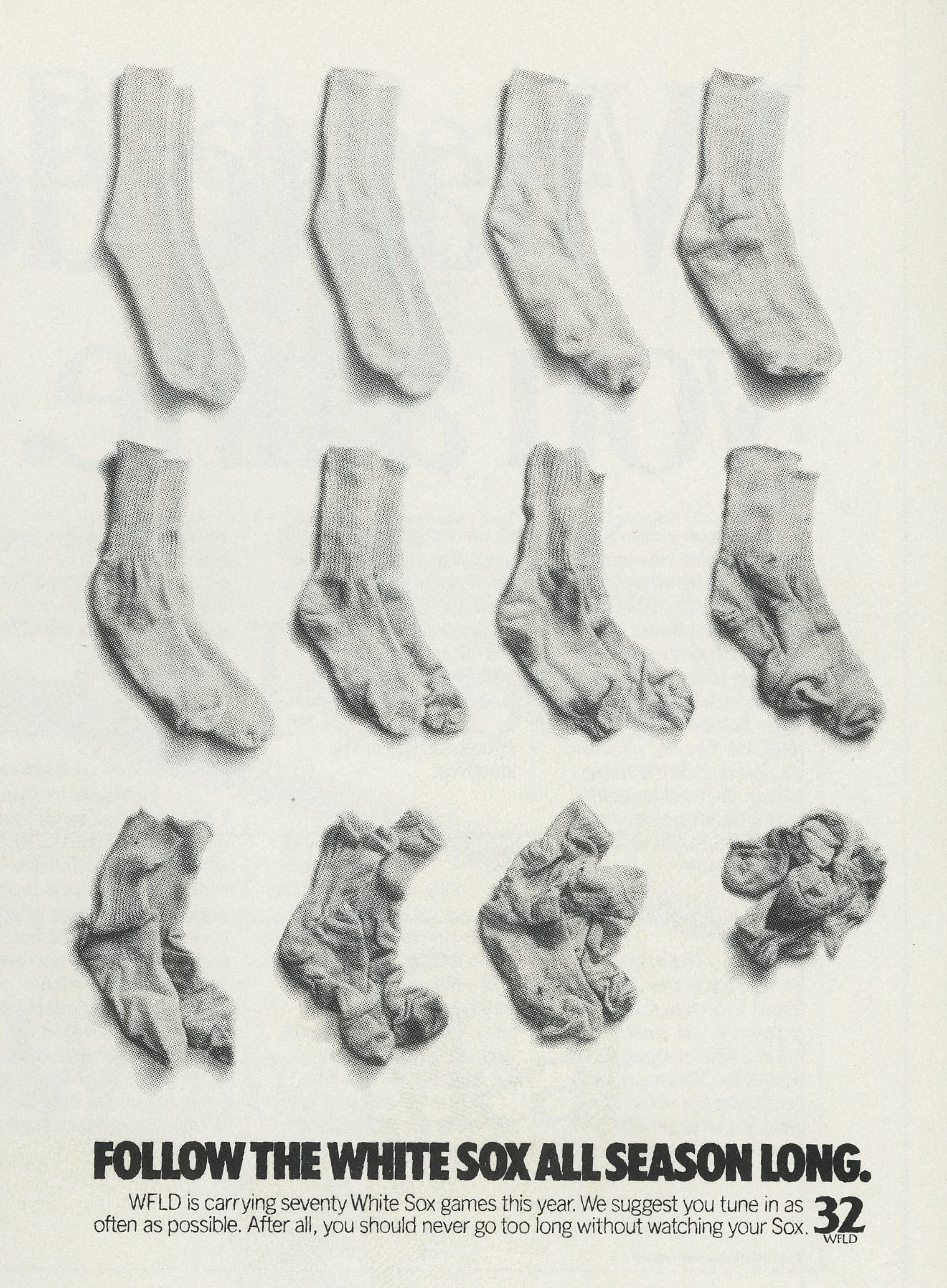


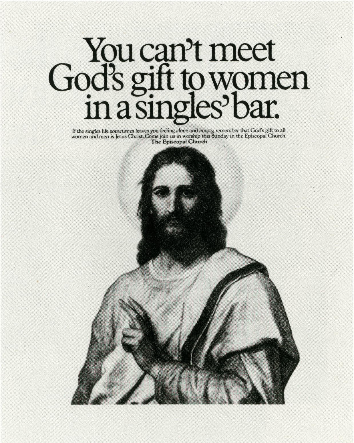
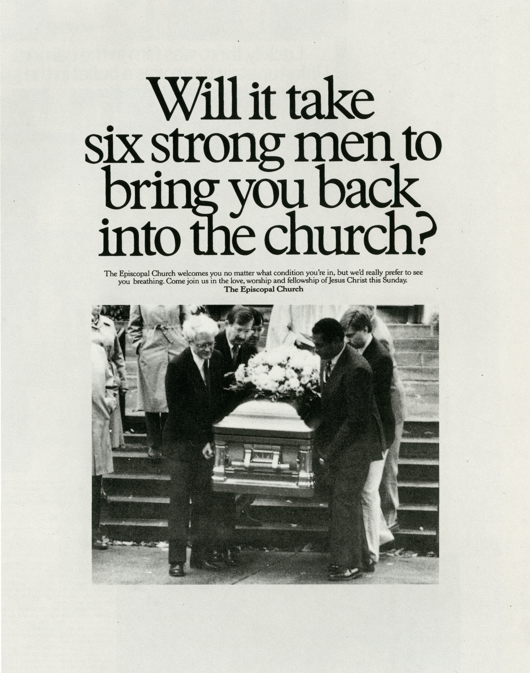
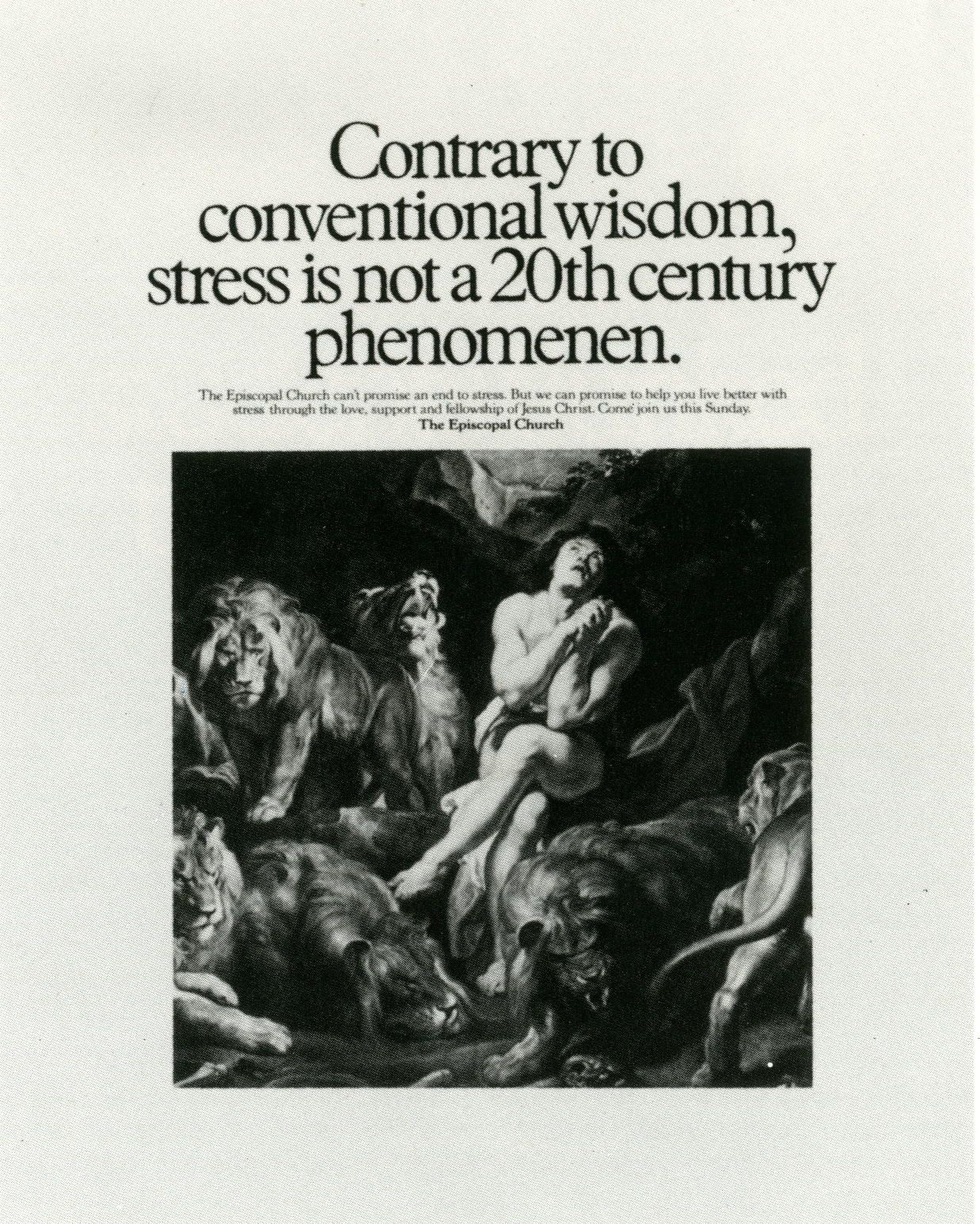
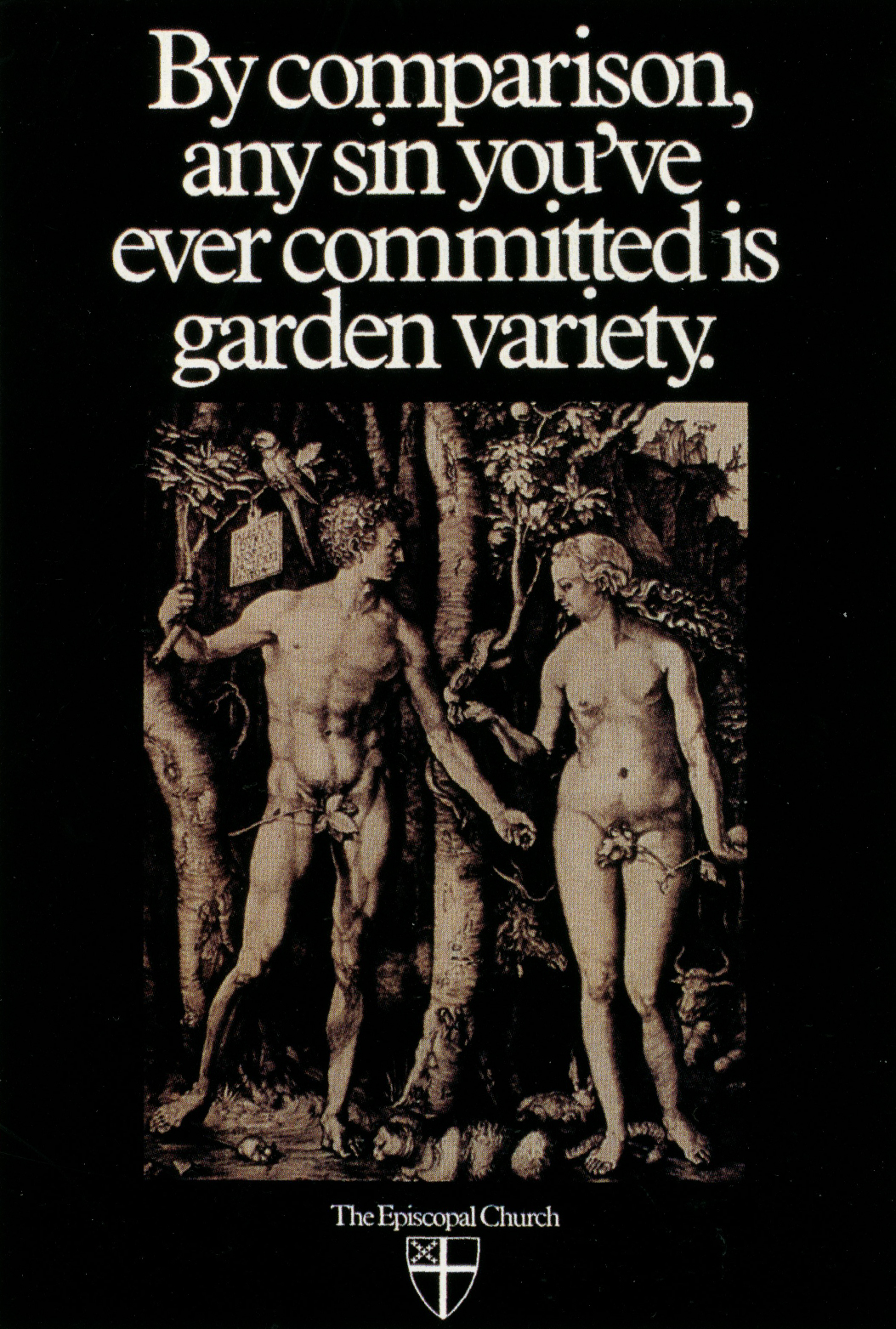
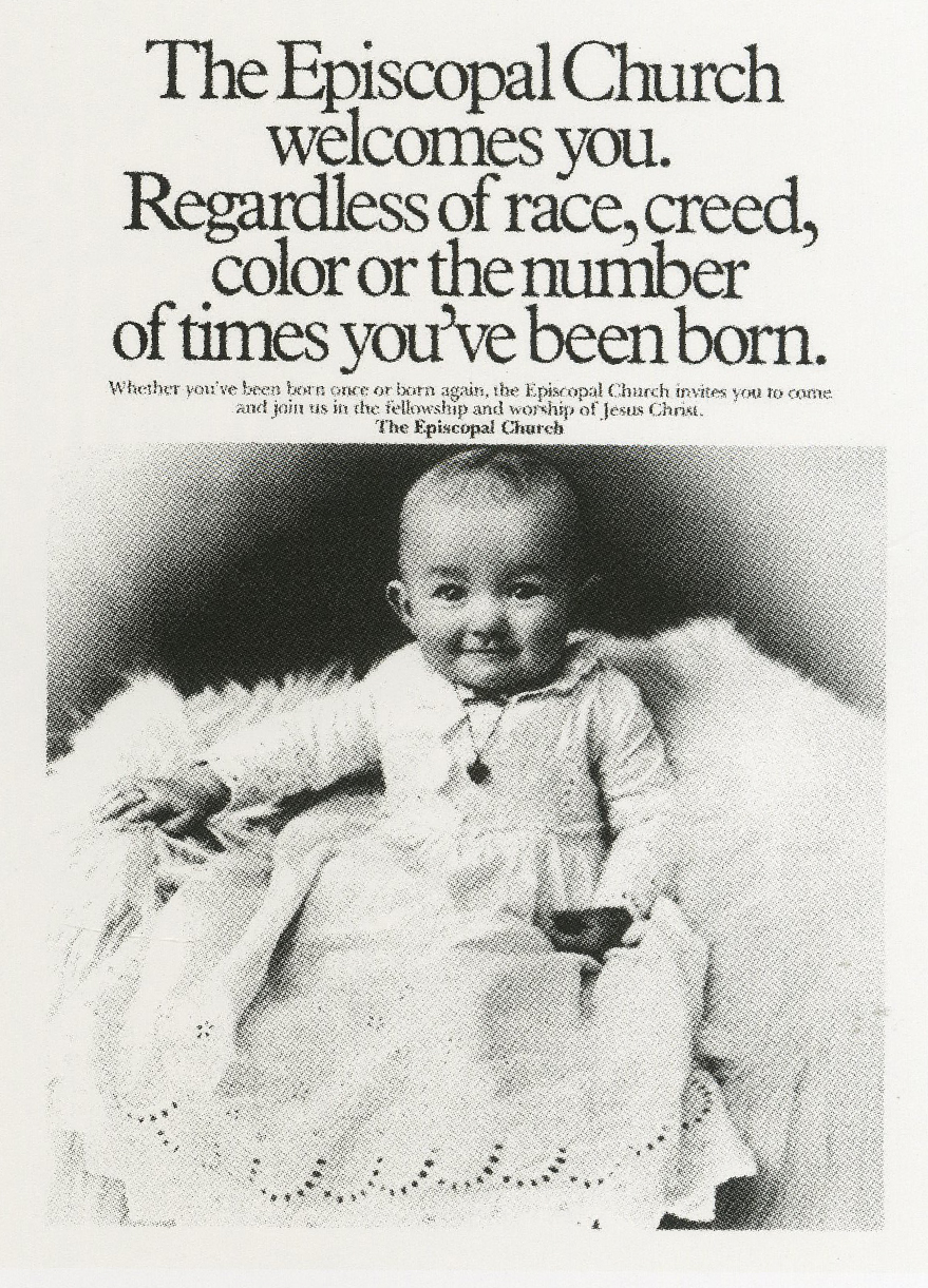
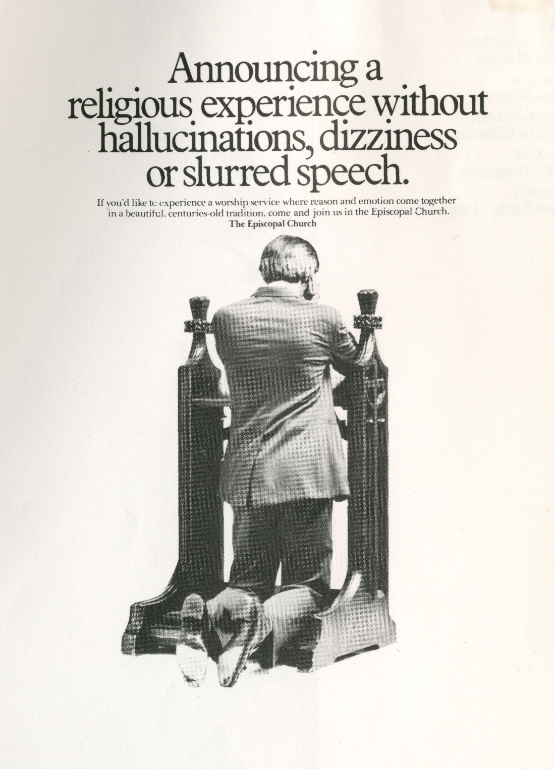
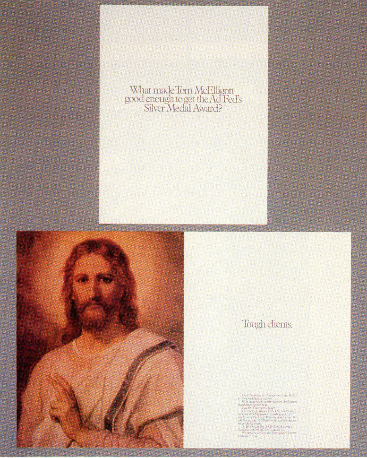
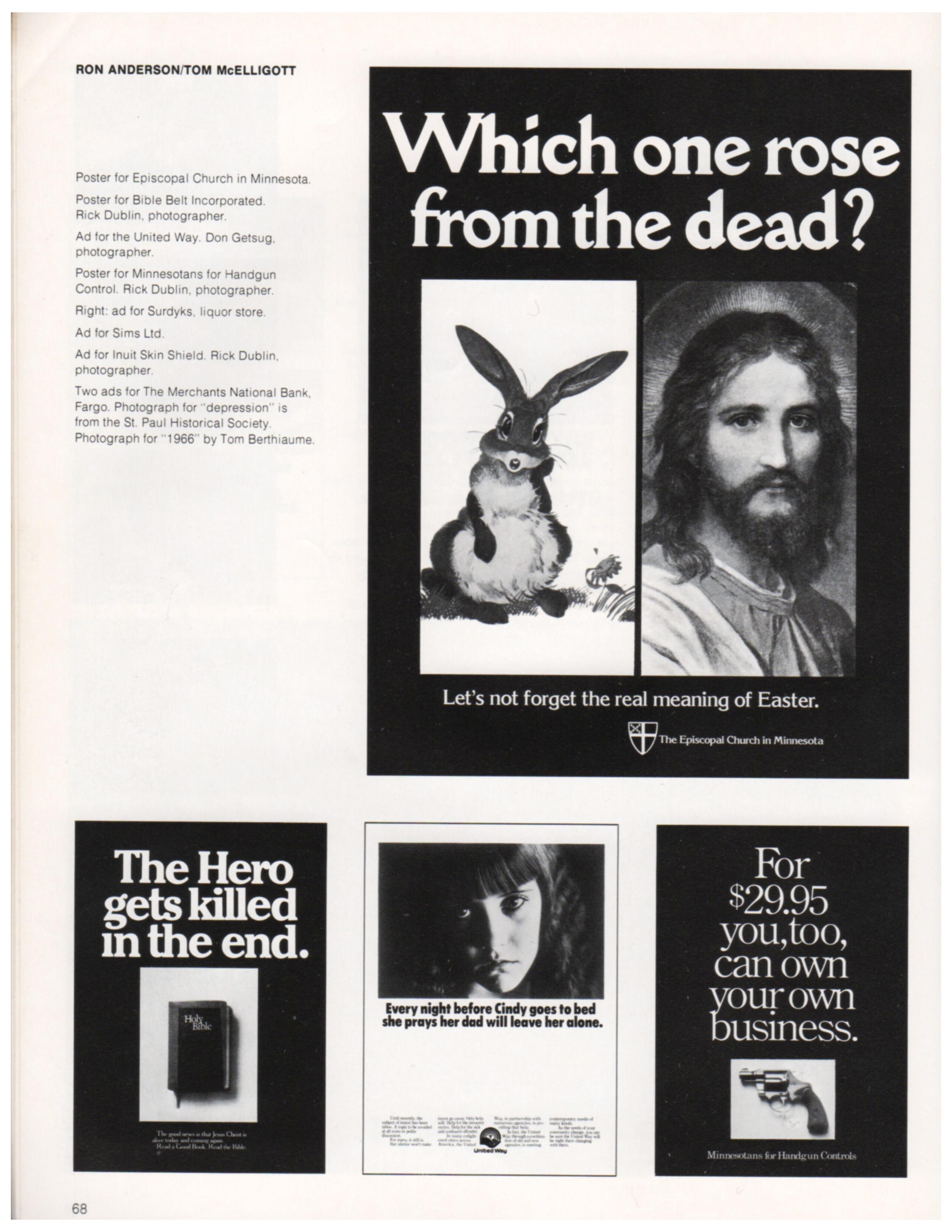
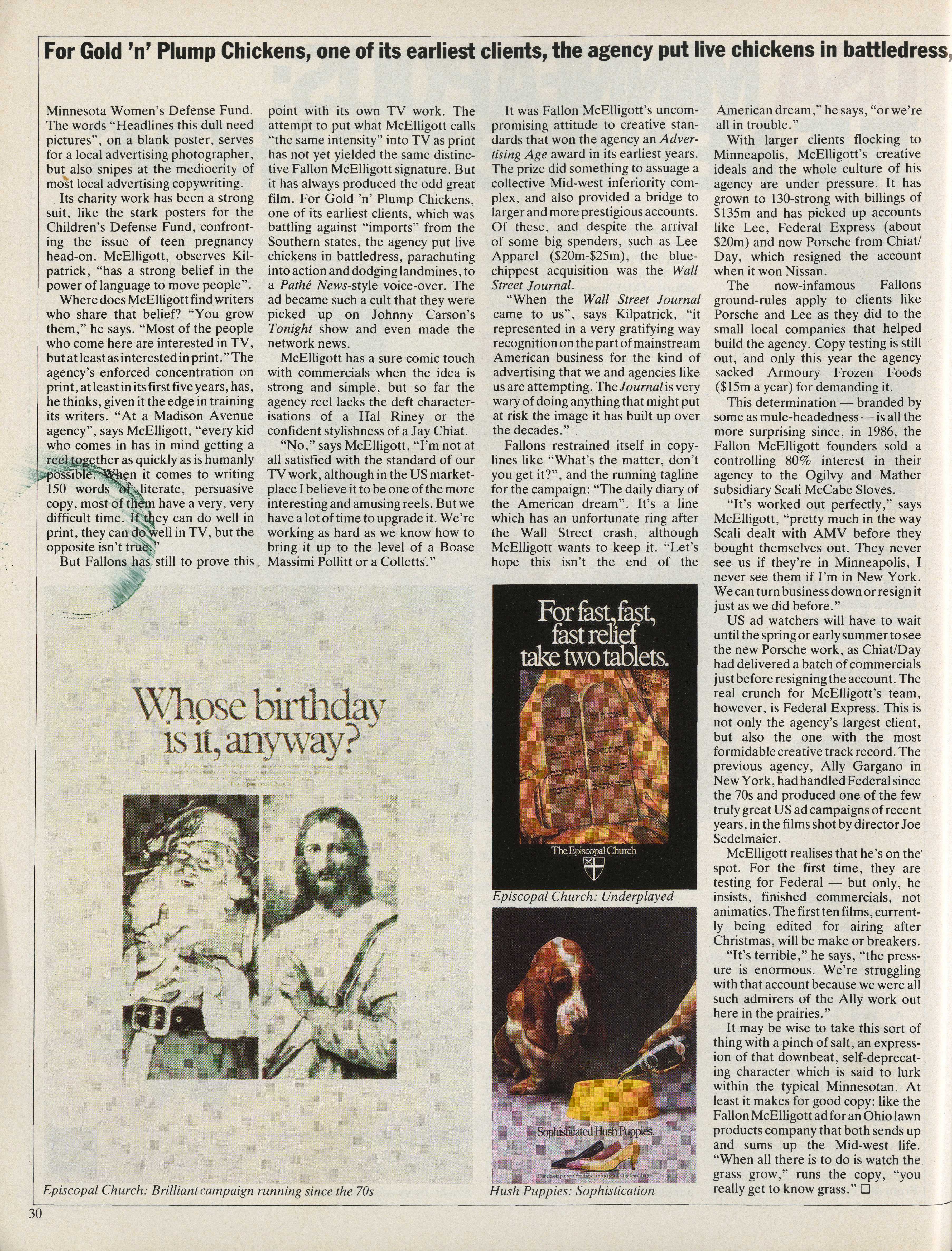
They’d be bold for a beer brand, but for a religion? (Also, who knew The Episcopal Church guys were such a fun bunch, maybe I should sign up?)


One of them was Ed McCabe.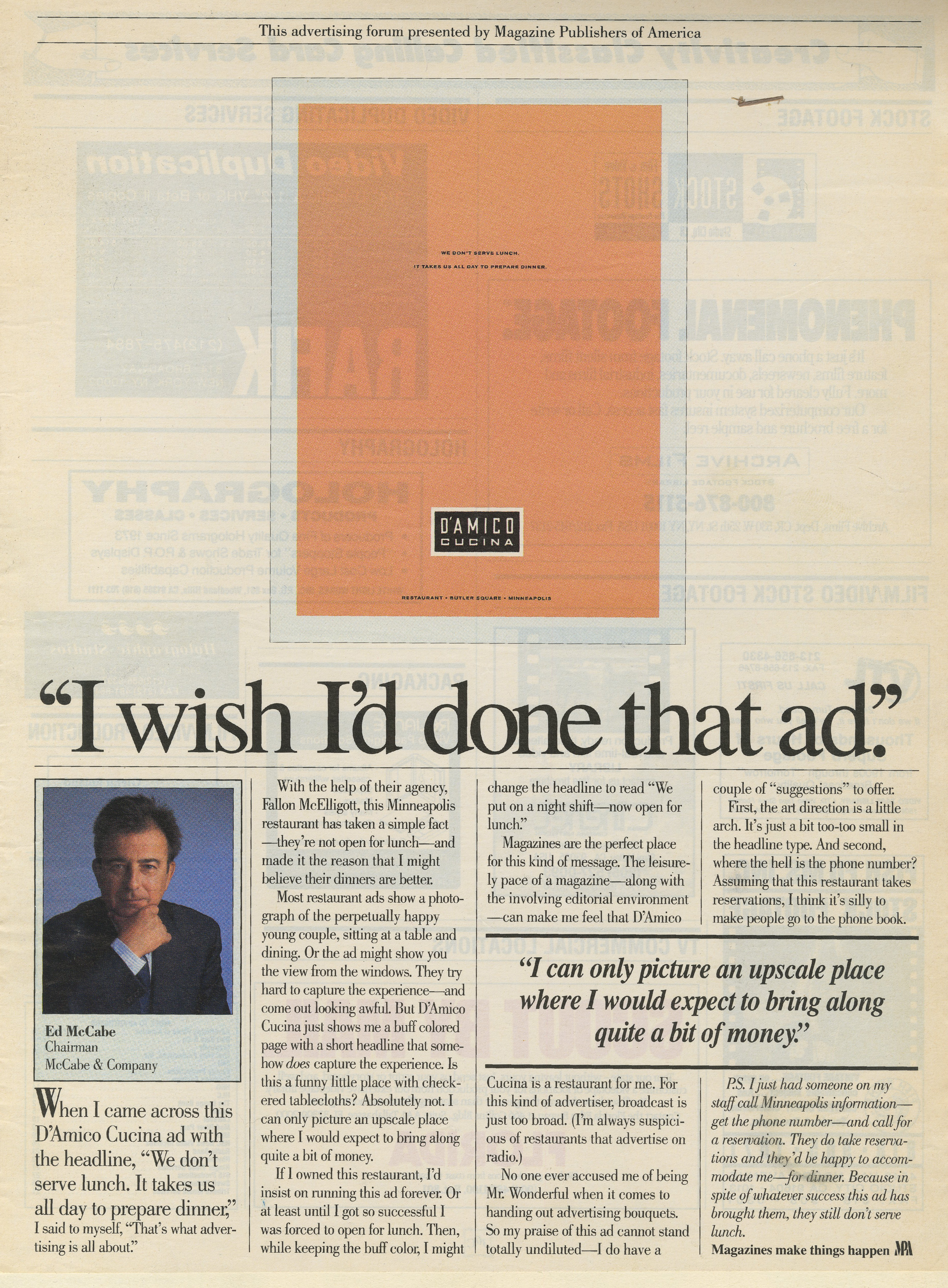

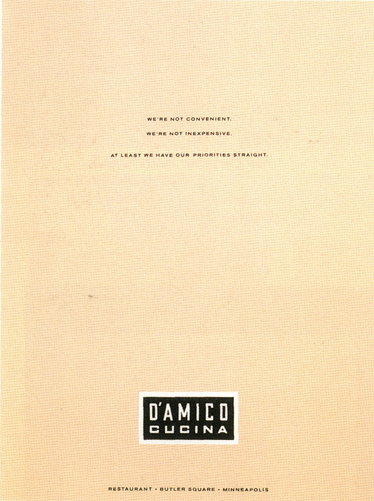

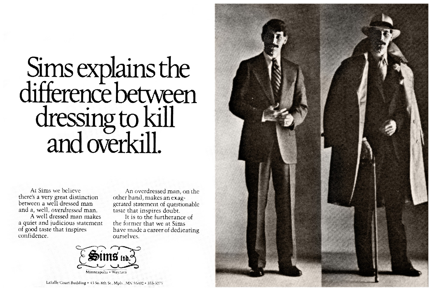
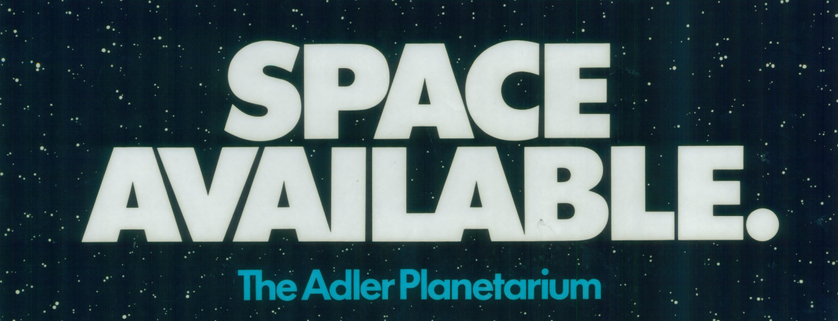
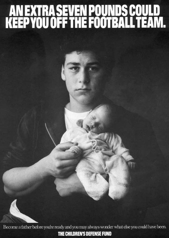
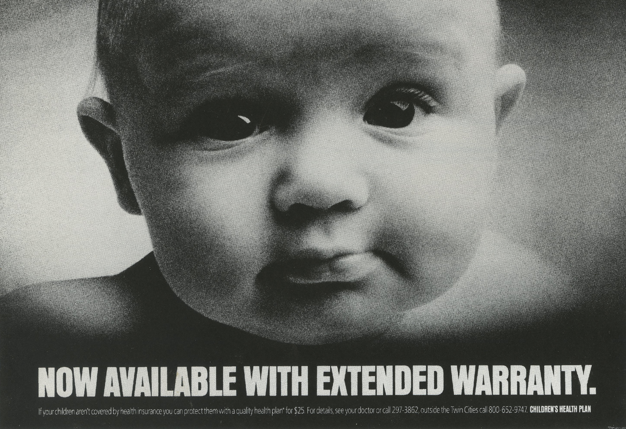
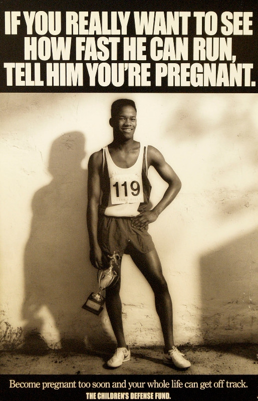
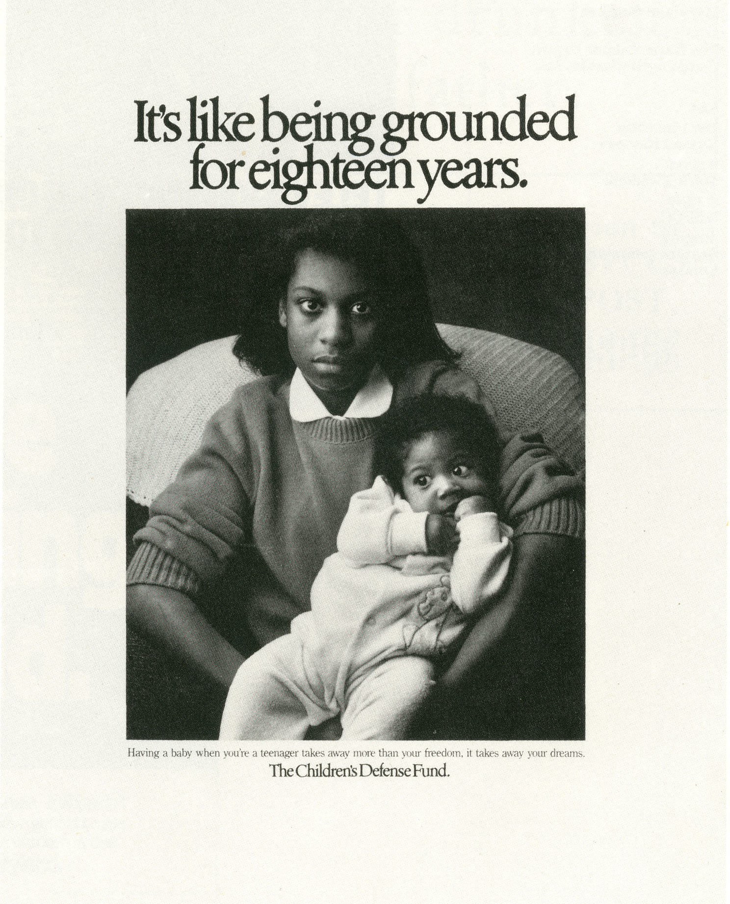
This ad for the Art Centre seemed to sum up the Fallon McElligott attitude.


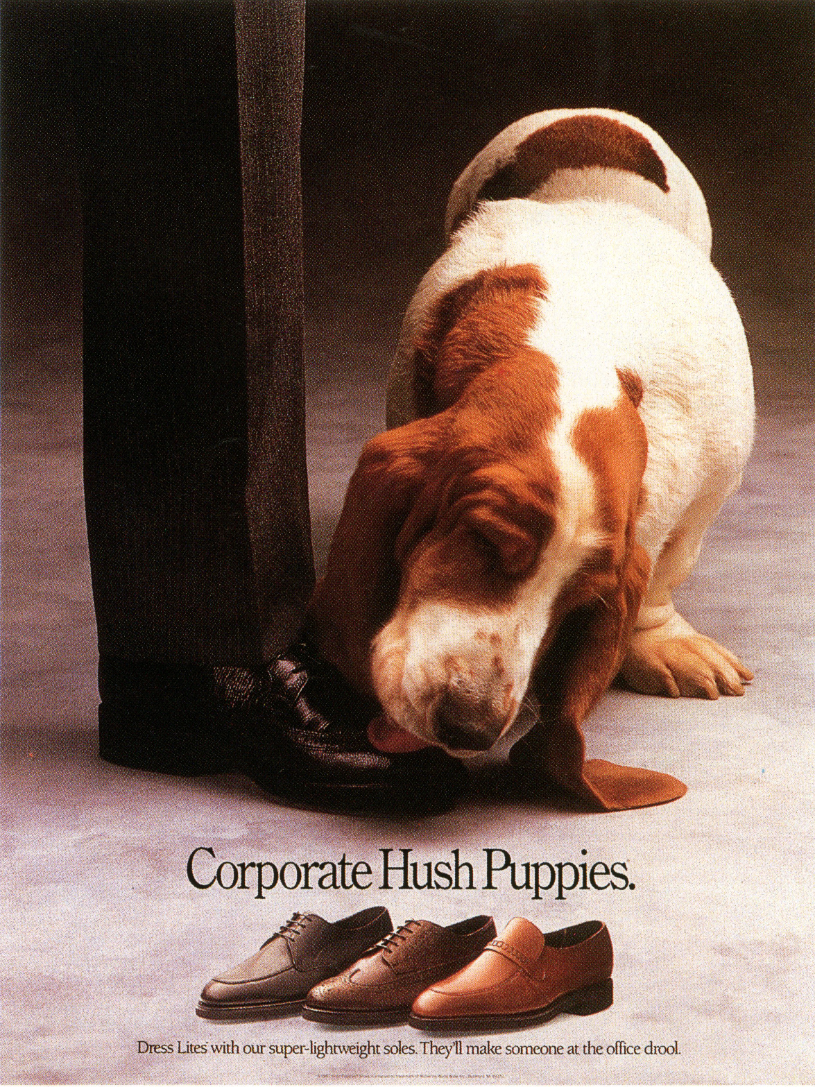
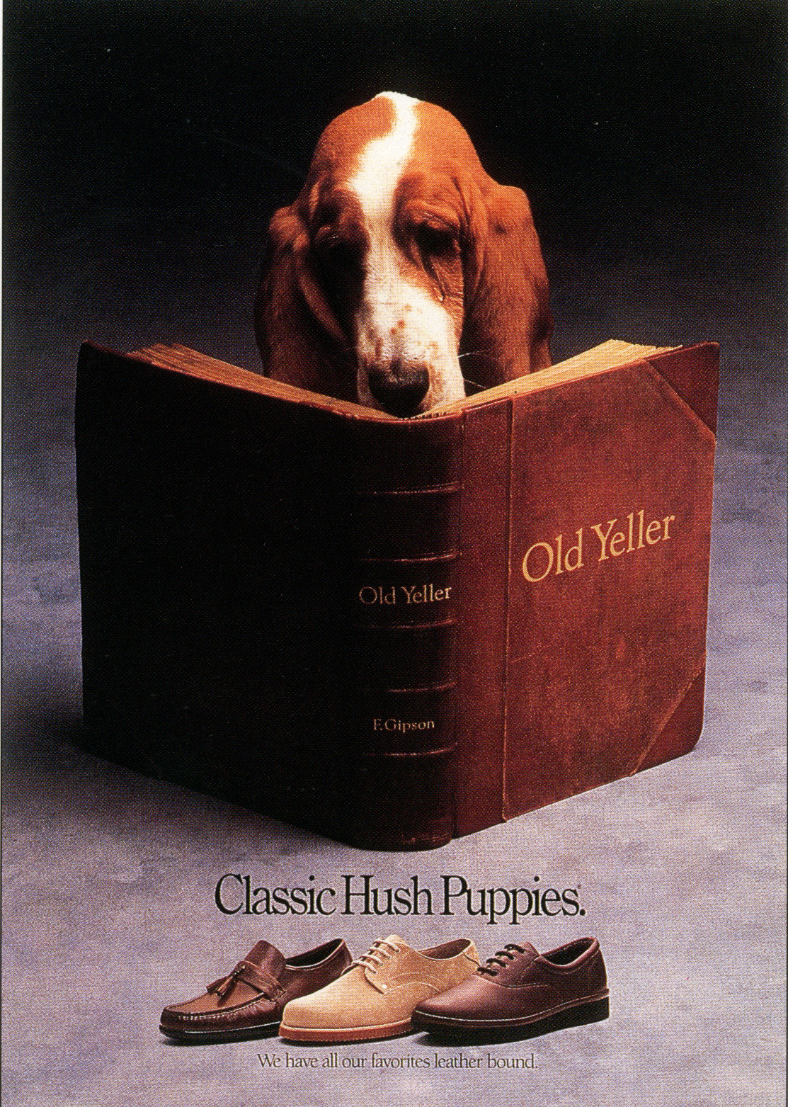
This Hush Puppies campaign was incredibly influential at the time.


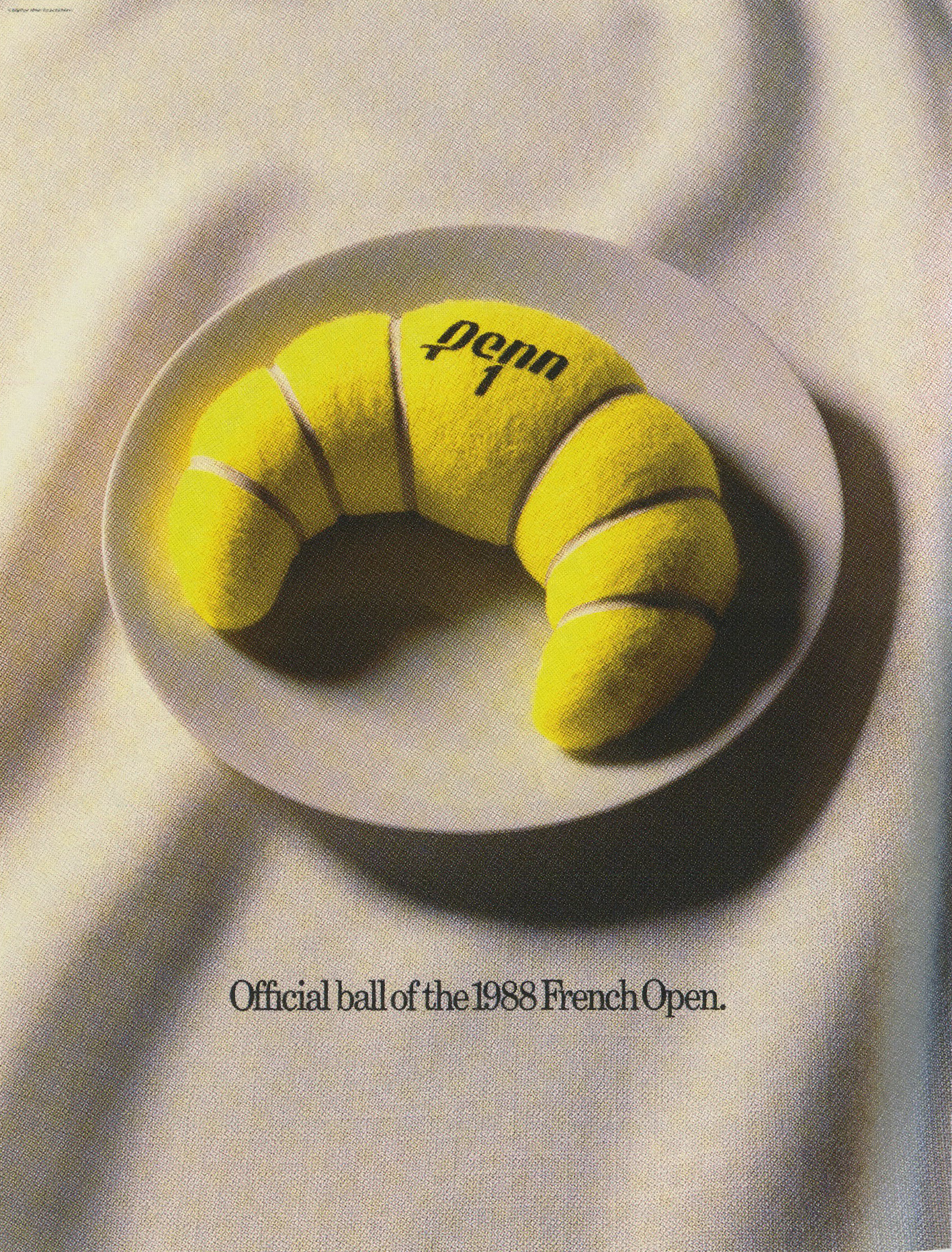
I remember drooling over this Penn croissant ad.


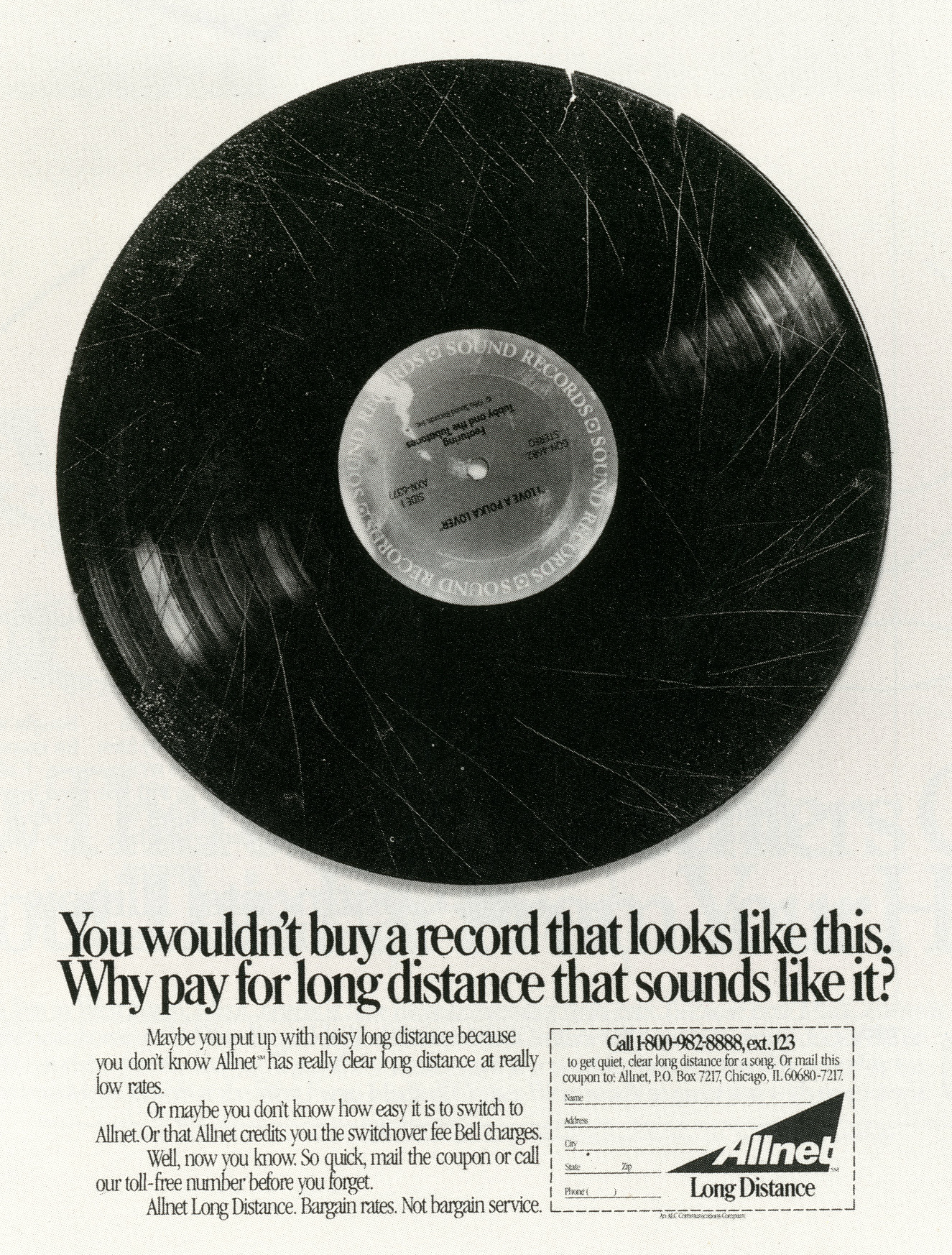
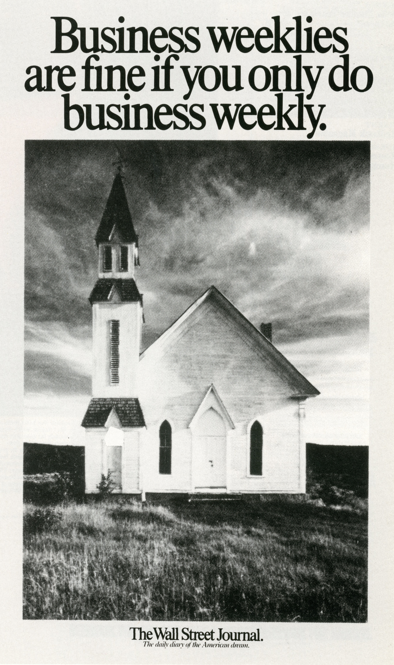
The Wall Street Journal came first, it must’ve influenced The Economist campaign.


(It wasn’t true.)
Consequently media companies would rarely recommend it.
The solution was so simple, smart and unlike any other ads at the time.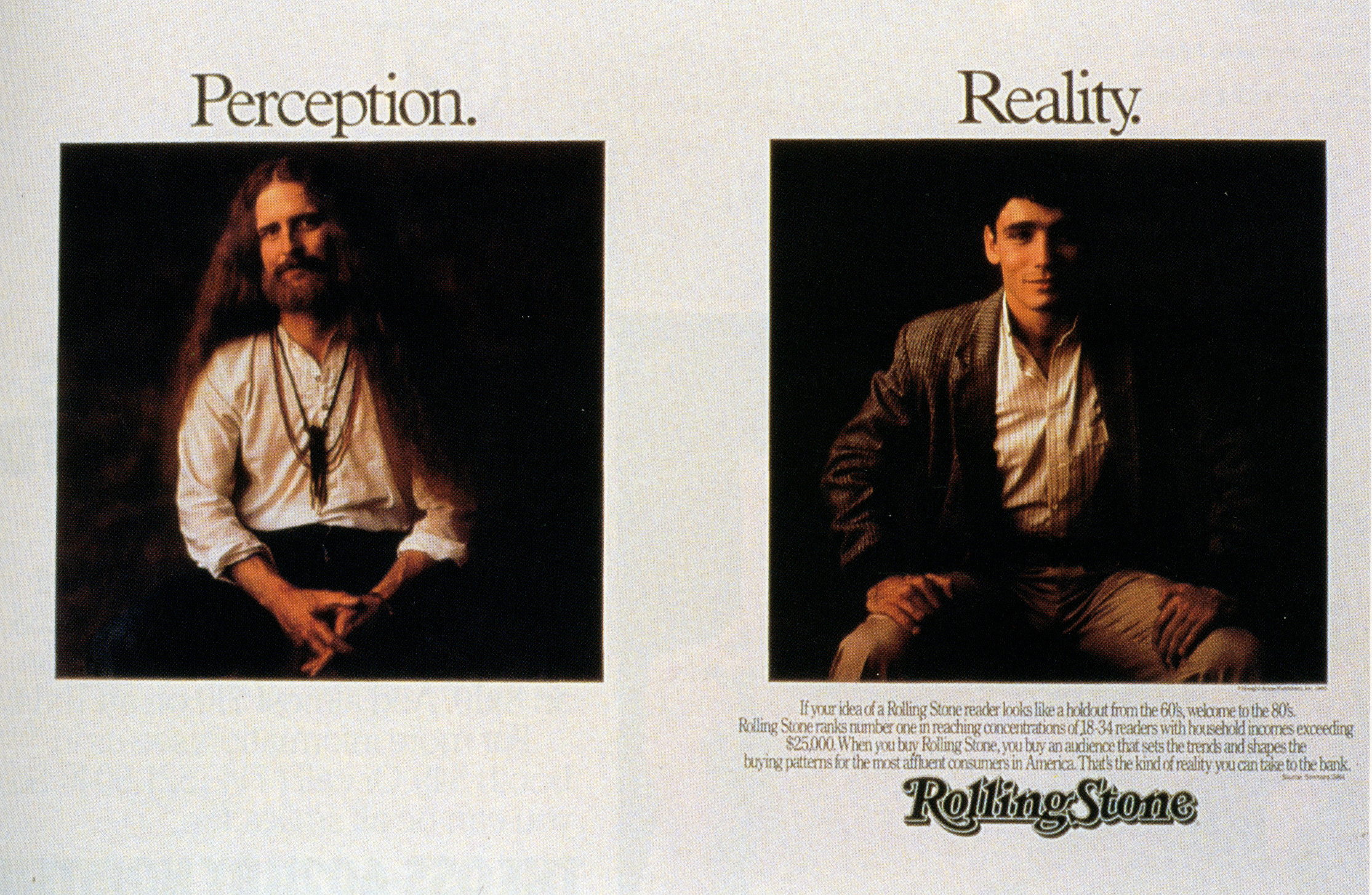


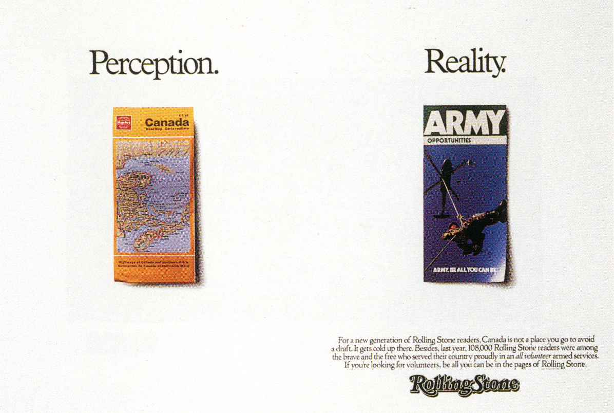

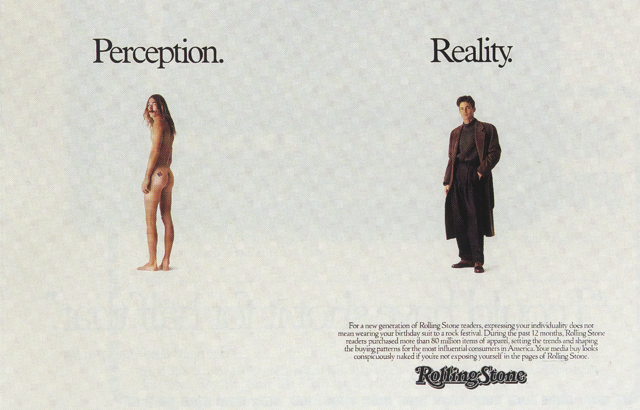
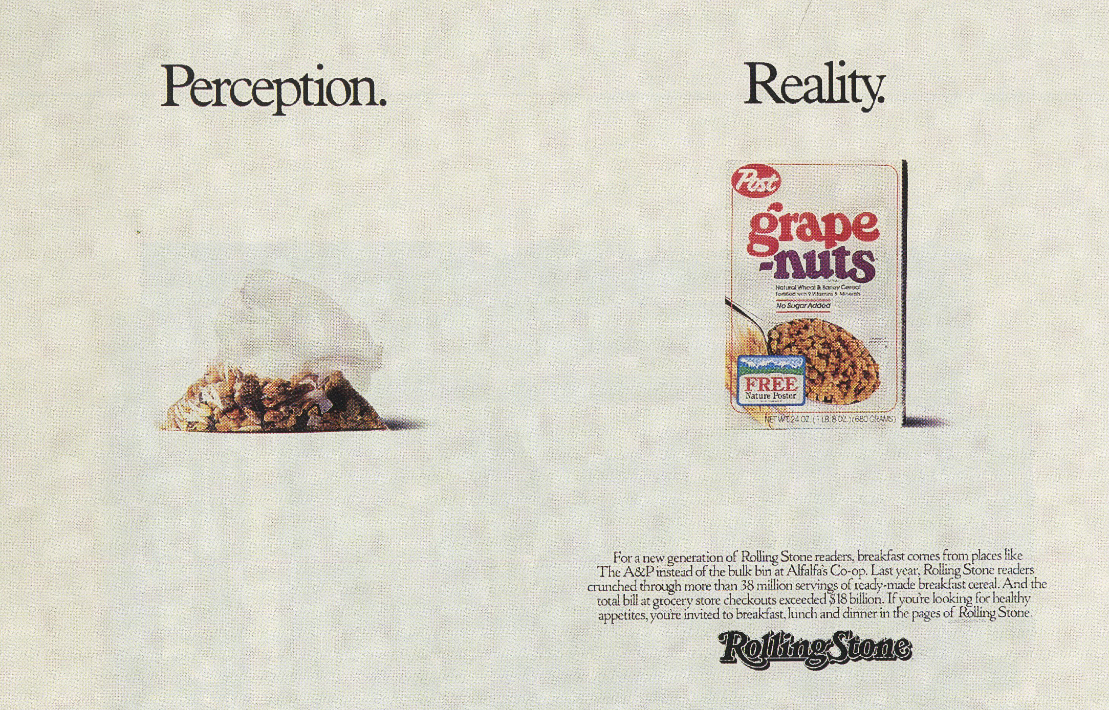


It felt new, neither headline or visual lead, it had its own structure.
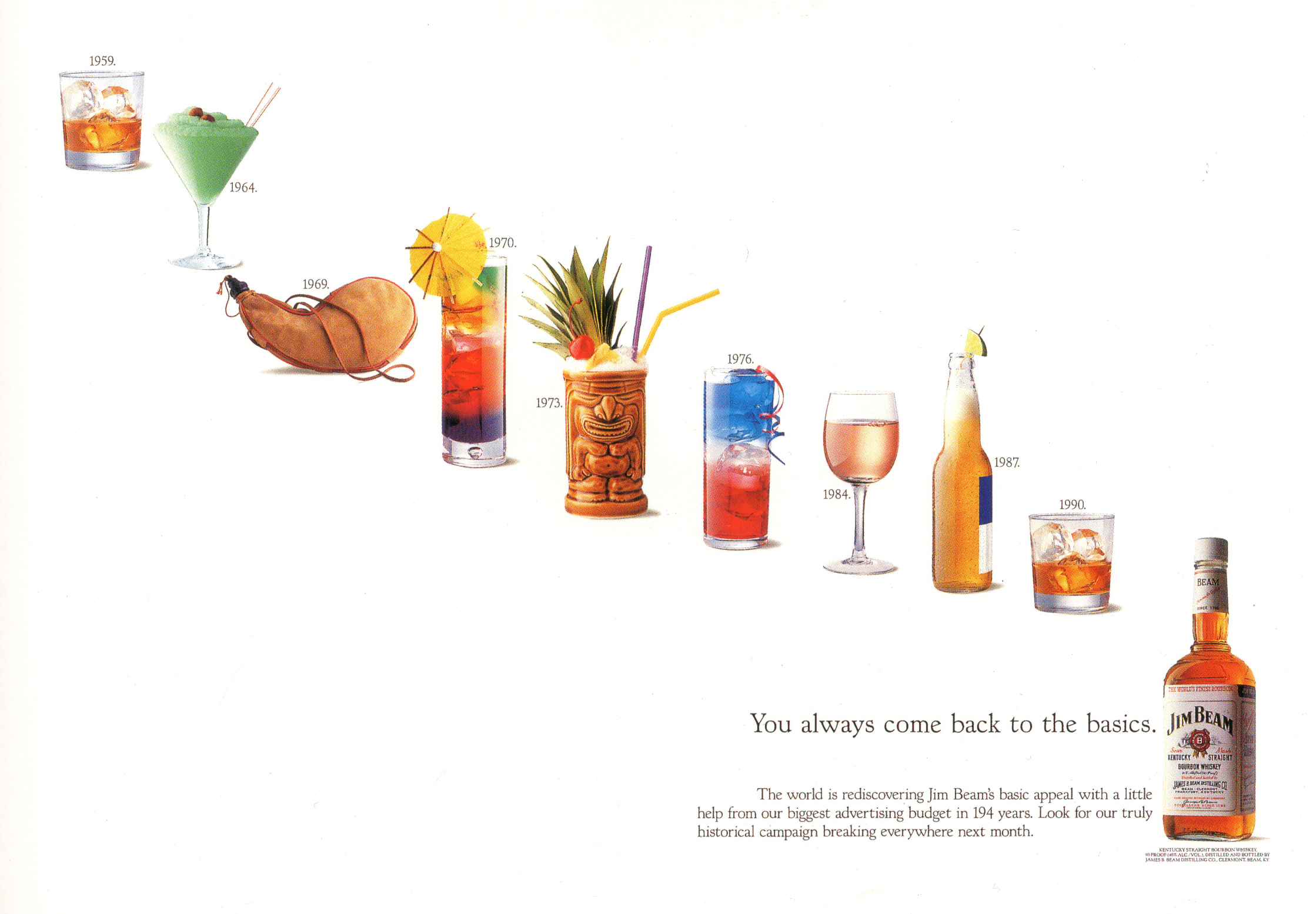
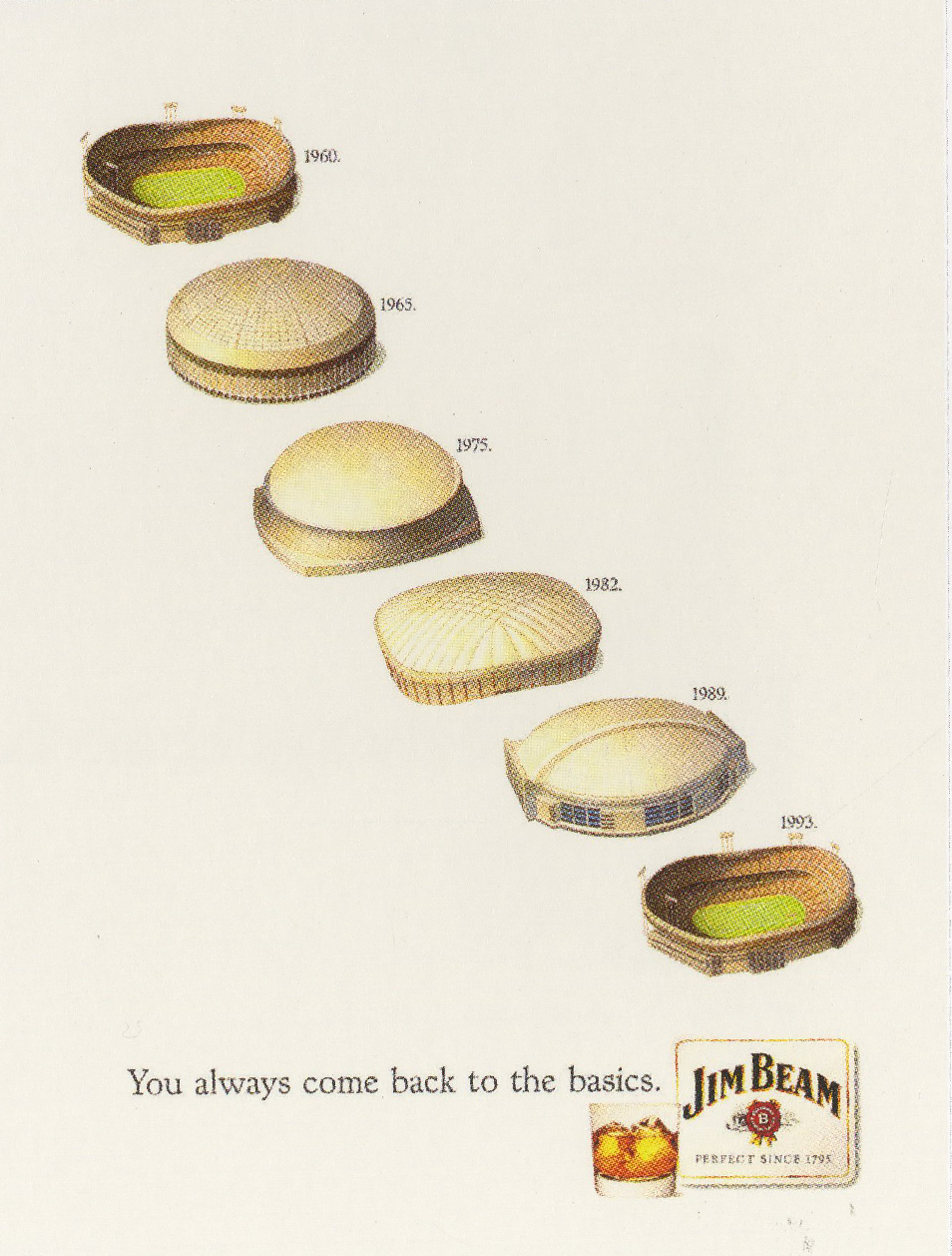
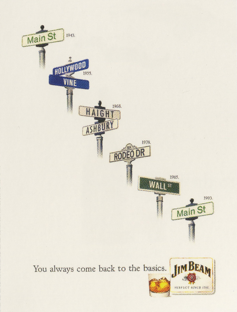
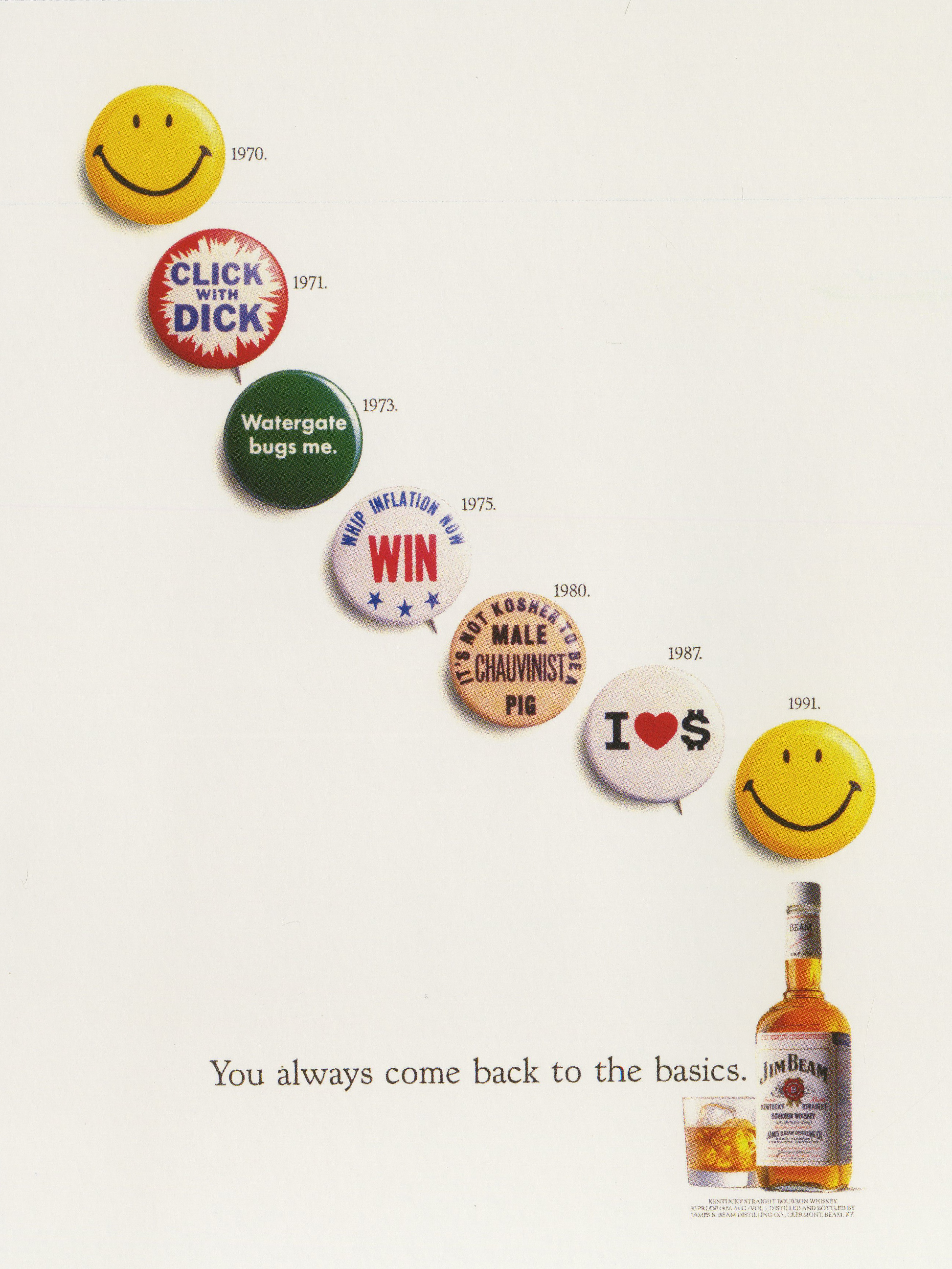
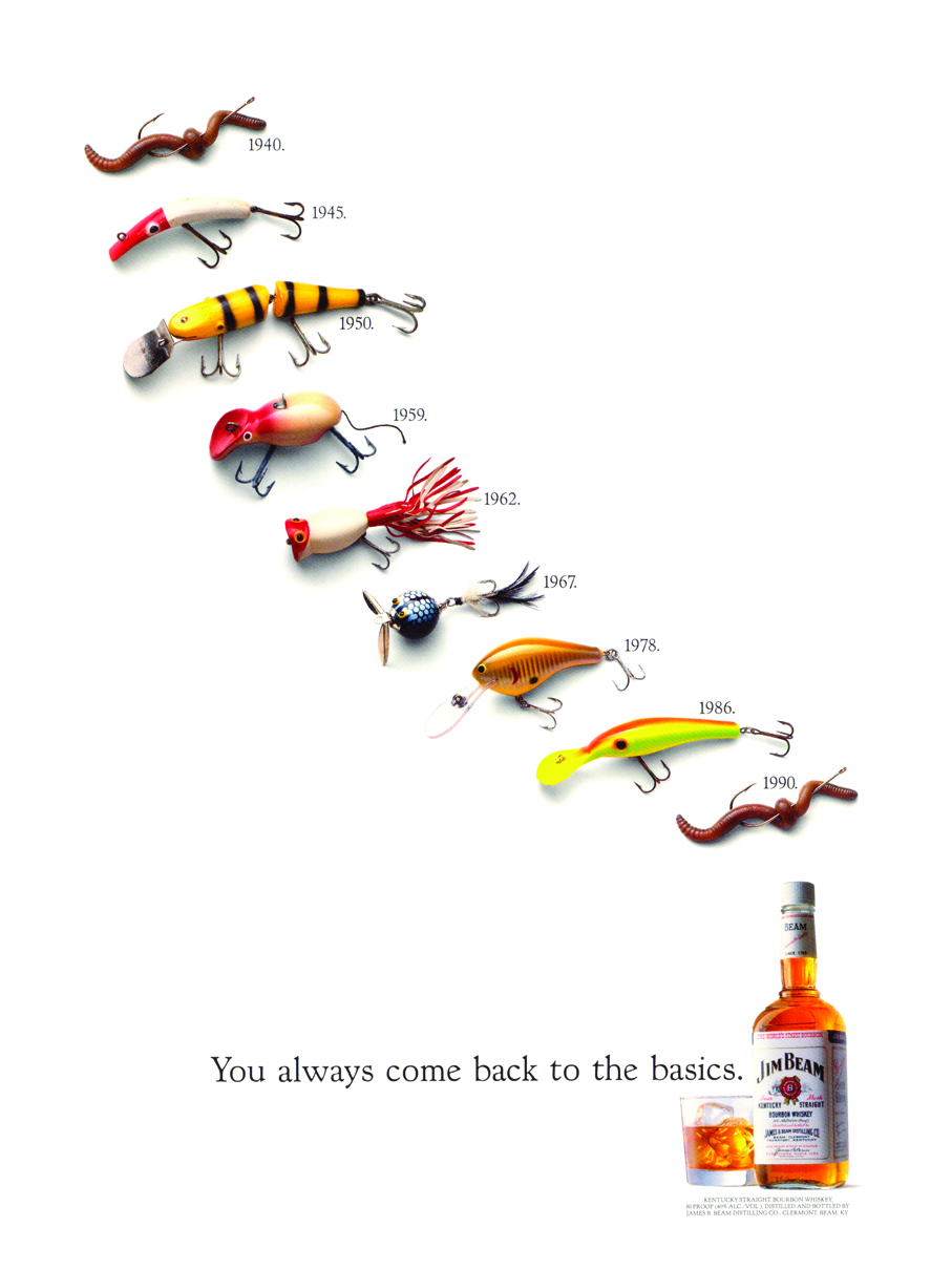
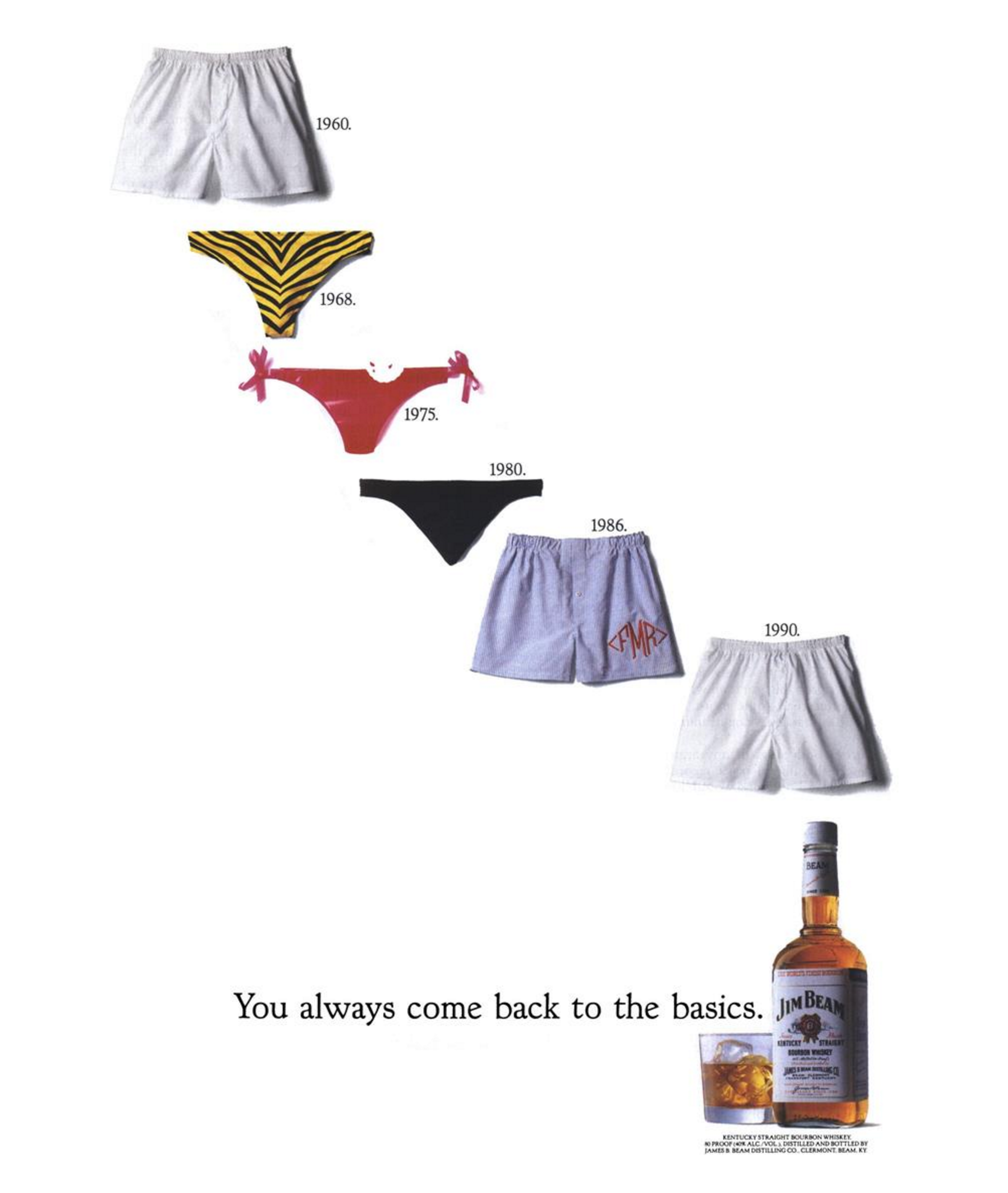
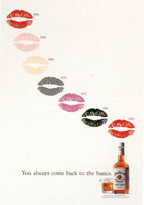
As did the Jim Beam campaign.
I’d not seen a campaign like this before; just a list of dates and ephemera.
As much social commentary as advertising.
But it was great advertising, re-positioning Jim Beam as the classic.
Not only was it incredibly distinctive, it engaged and made you think.
It’s the kind of work that could give advertising a good name.
It wasn’t done by hucksters, it was done by smart guys having fun.
I presume this was the first one. It’s neat.


…but who’d have thought it would’ve lead to all these?


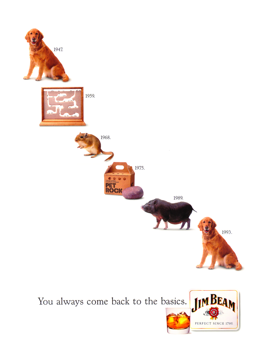


They also produced Christmas versions.


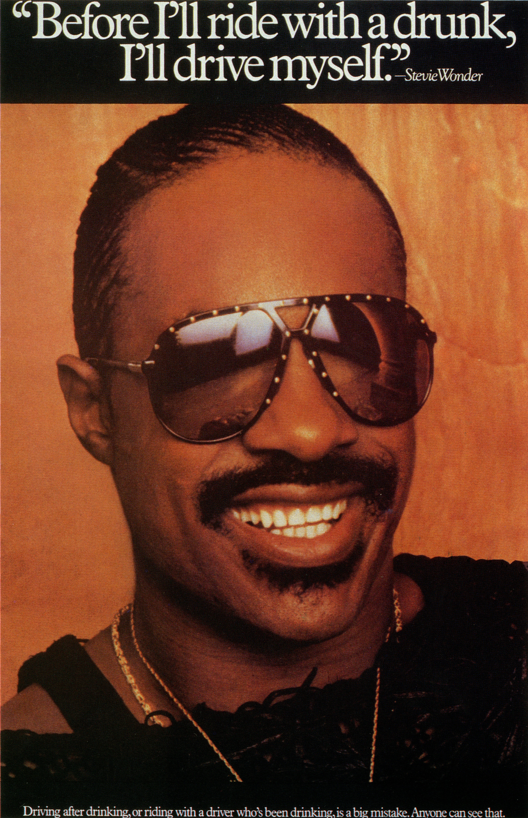
perfectly capturing the emotion of that first drink of the evening.


The way this Lee campaign is written looks familiar now, it wasn’t at the time.


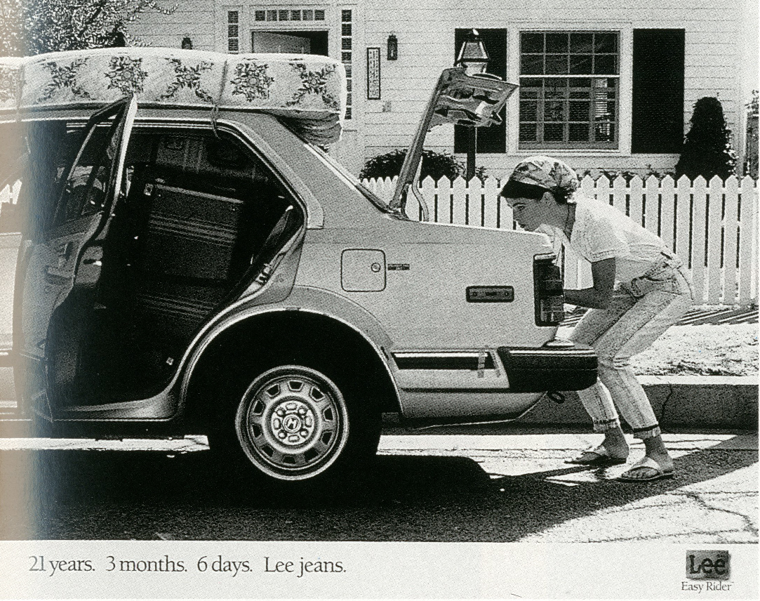
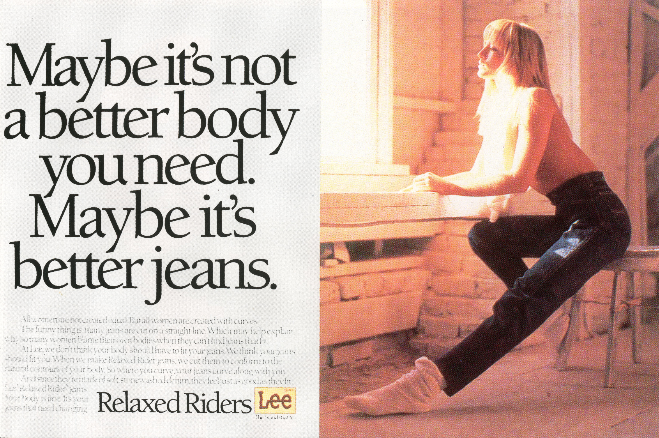
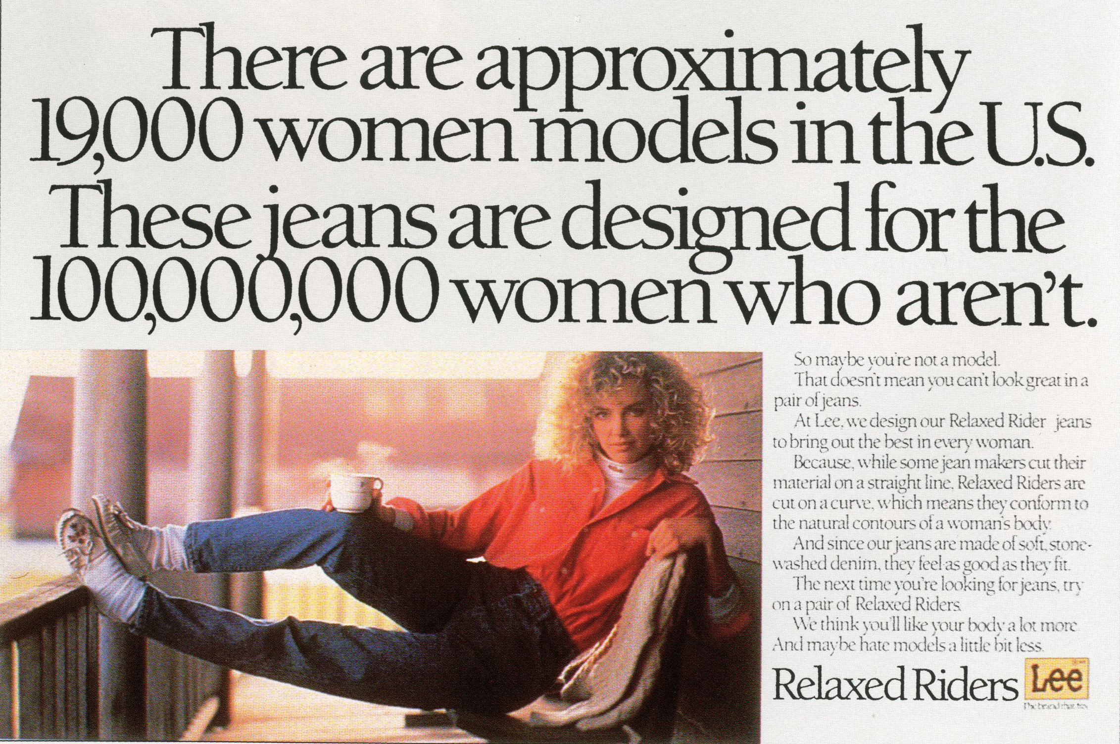
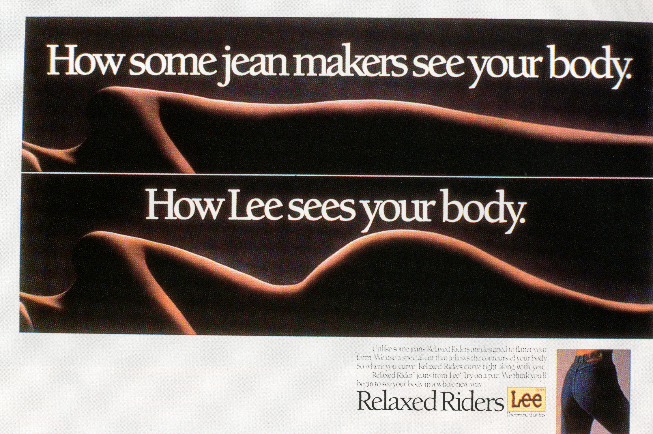


Very ballsy.


The clients they attracted got bigger, but the way they treated them stayed the same; ‘We don’t research creative work.’
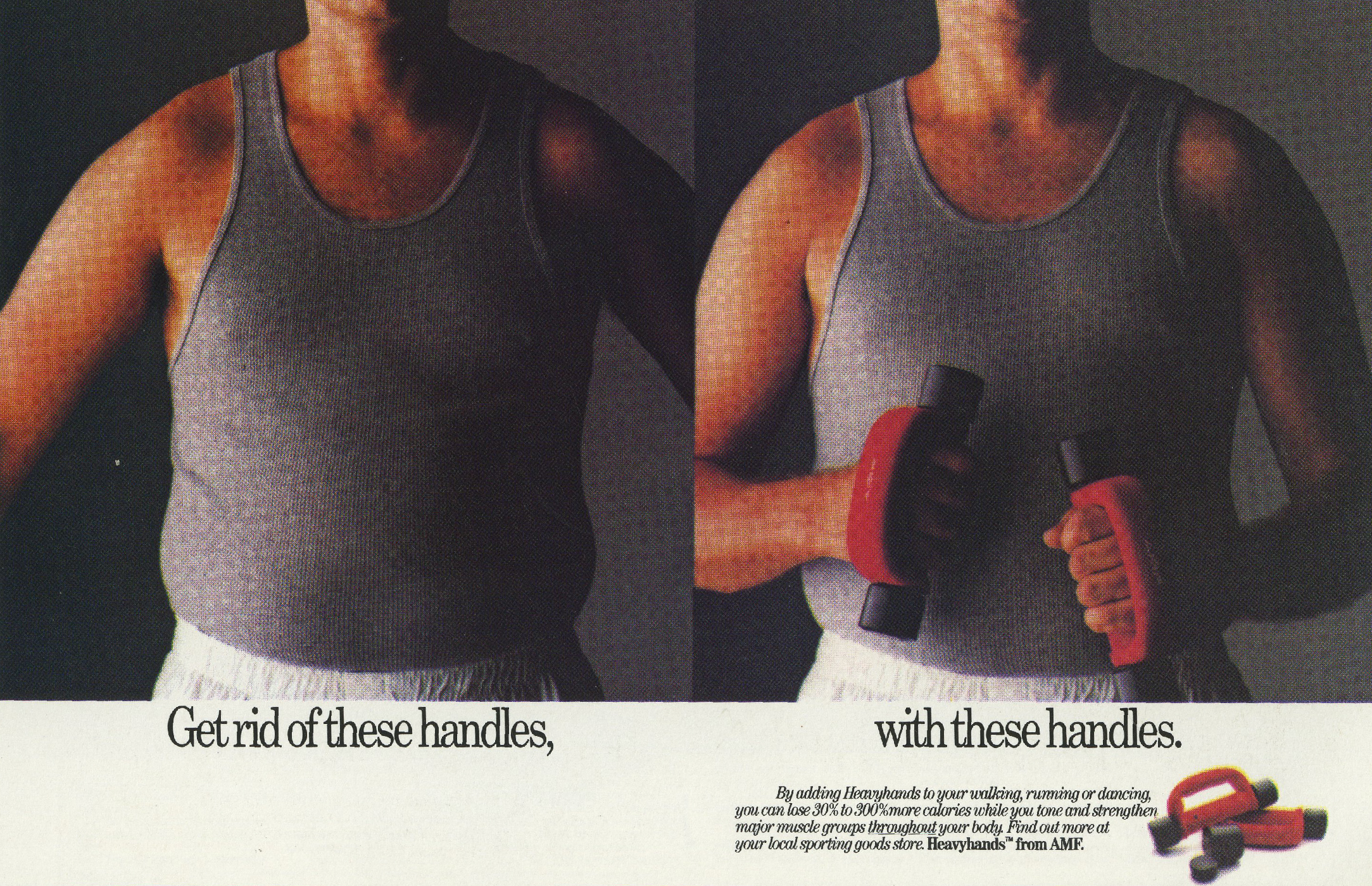
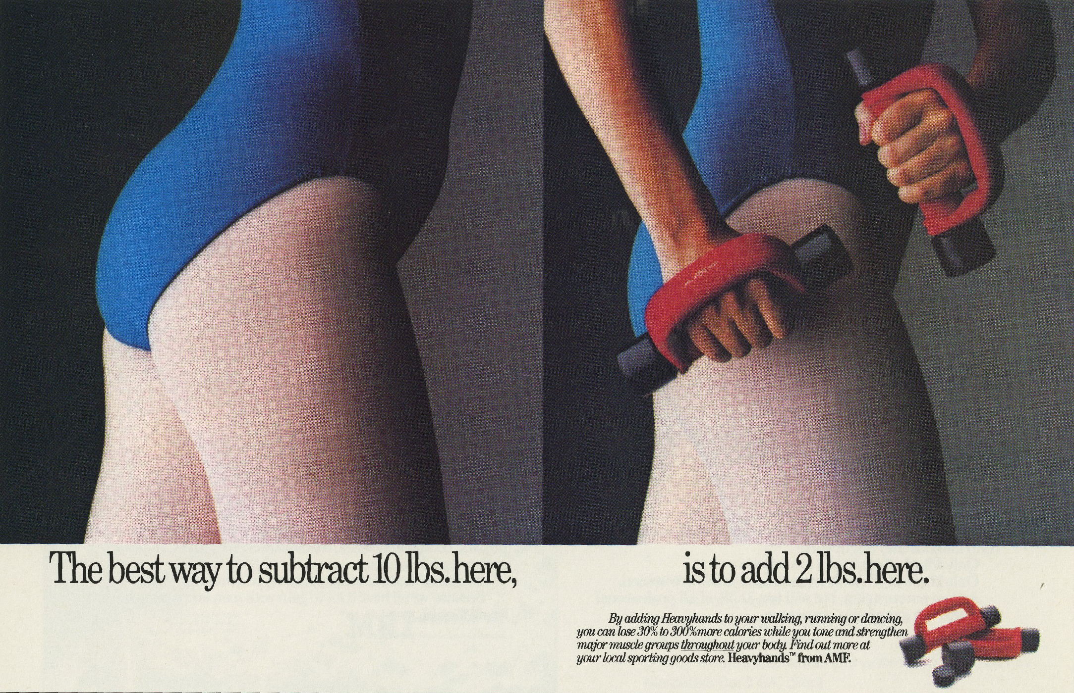
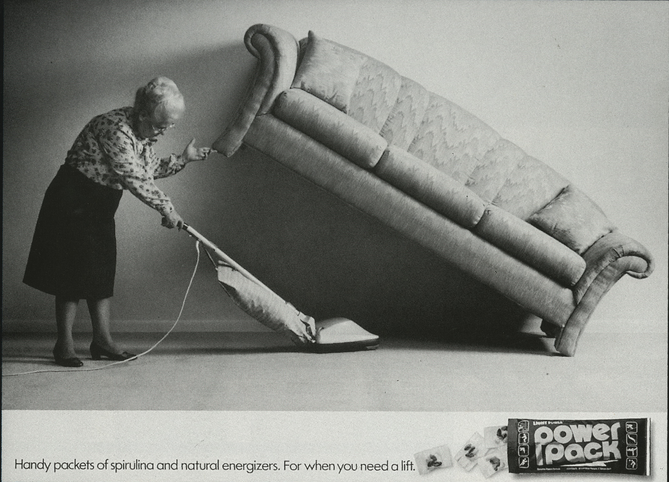
They won Penn tennis balls and produced this.
http://youtu.be/ZU375bFUHHg


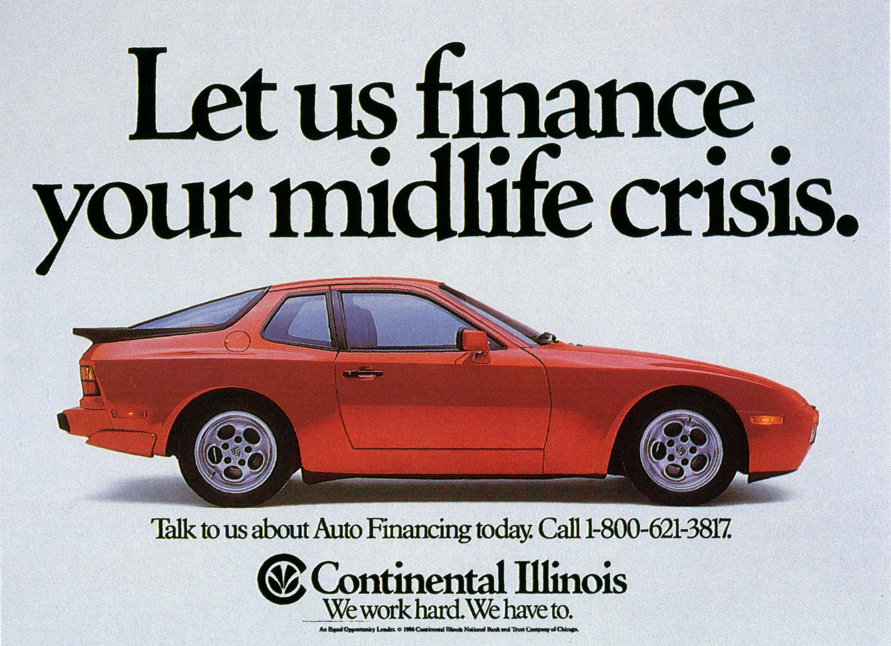
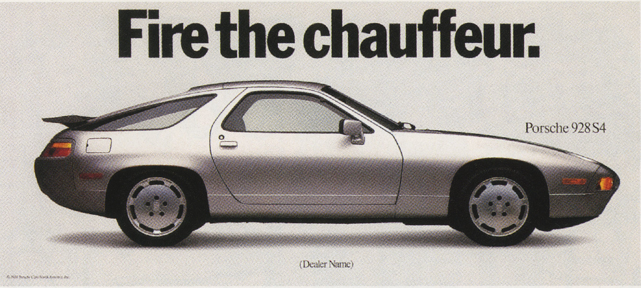
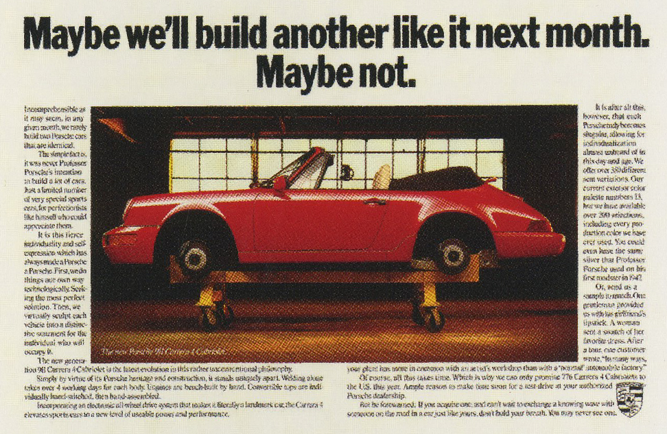
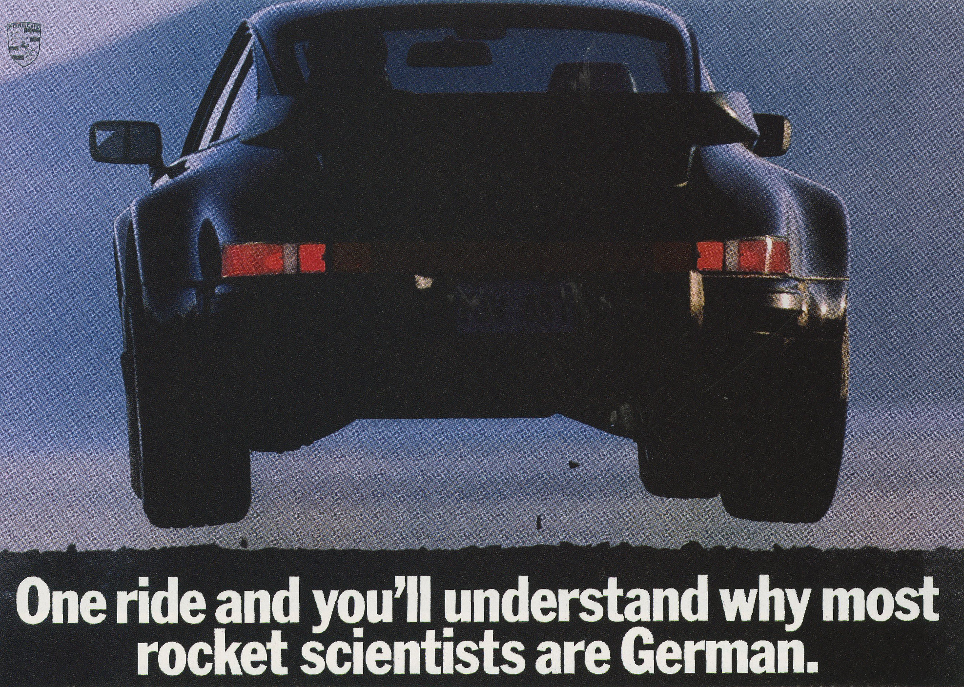
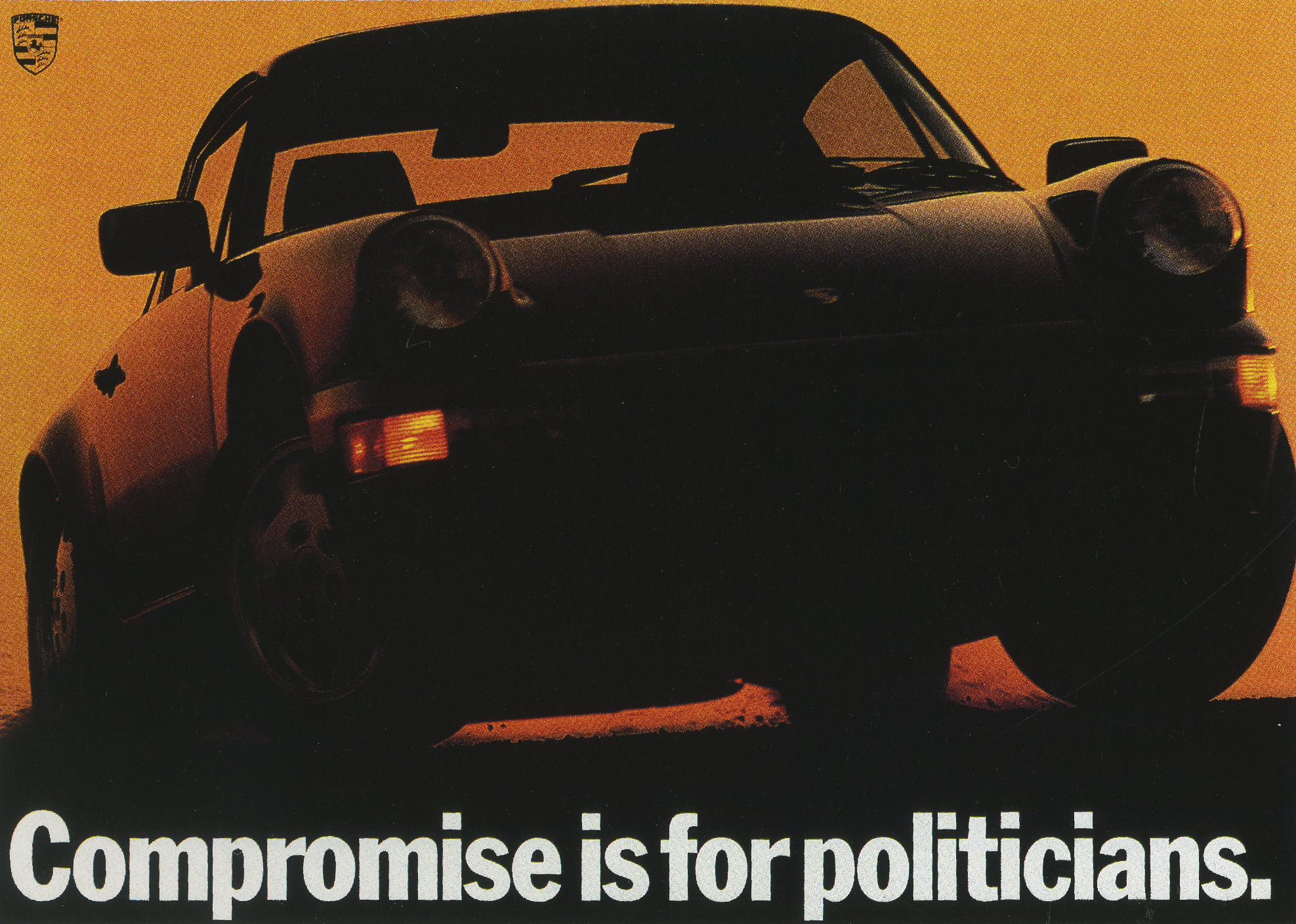
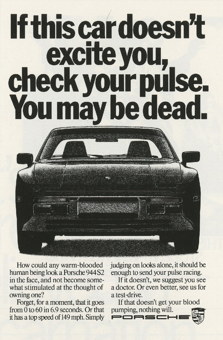
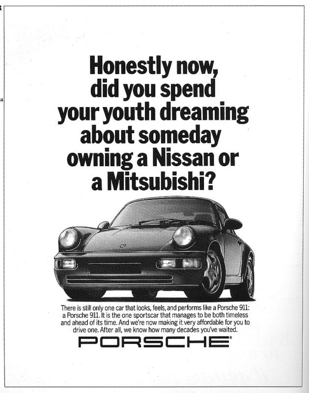
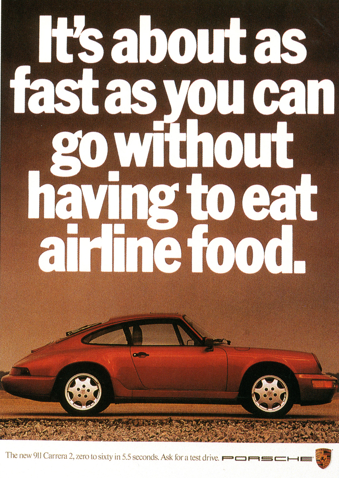
They won Porsche, and with a few black letters and a pack shot, gave it attitude.
(If you’ve never tried writing three word headlines, try it, it’s really hard.)


INTERLUDE: Fallon were absolutely dominating the creative awards at this time, One Show annuals of the period look like house brochures.
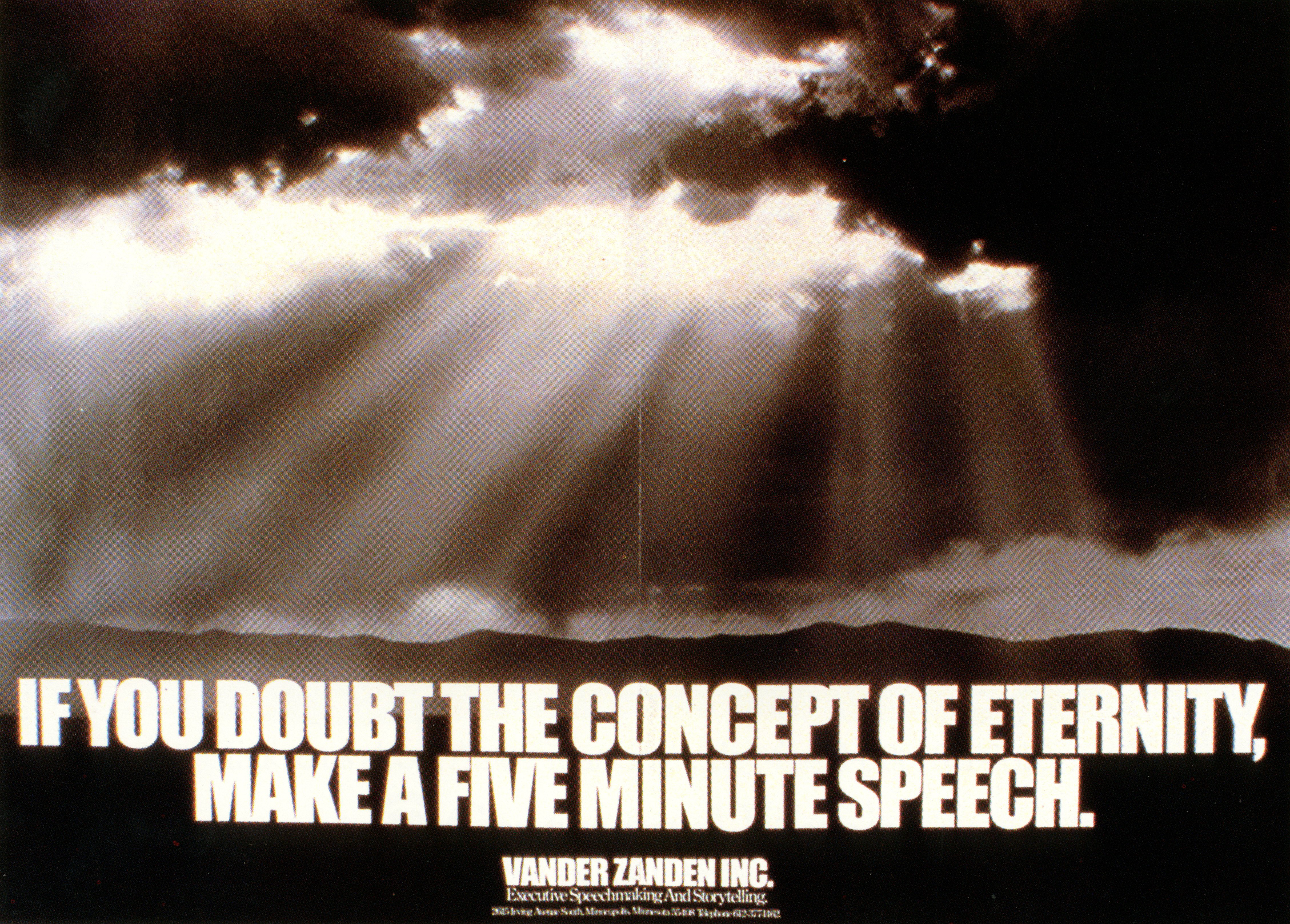
Here’s a mailer for a talk Tom gave around this time:


They needed to hire to deal with all their new business. Having exhausted the local supply of talented ad folk they’d have to attract talented people from the East and West Coast too. But why would they go to Minneapolis ?


It’s possible that Tom had just left by the time these ads ran, but they seem very him.

An awards show ran this ad when it was announced that Tom was leaving Fallon McElligott.

In 1987, this ad ran. Cheeky, but relatively harmless right?
WRONG! It was shown at a lecture on P.R. given by Fallon McElligott’s design arm, Duffy & Partners, a member of the audience was offended, Dr. Neala Schleuning, so she sent Duffy & Partners a letter expressing her outrage.
In return, she received the letter and photo below.
It’s signed by Duffy & Partners’ Charles S. Anderson, but its widely believed to be the work of Tom McElligott.


Dr. Schleuning started showing the letter around to friends, then to the women’s consortium and they had contacts.
It snowballed, getting more and more exposure.
It became known as the “Dinka incident.”
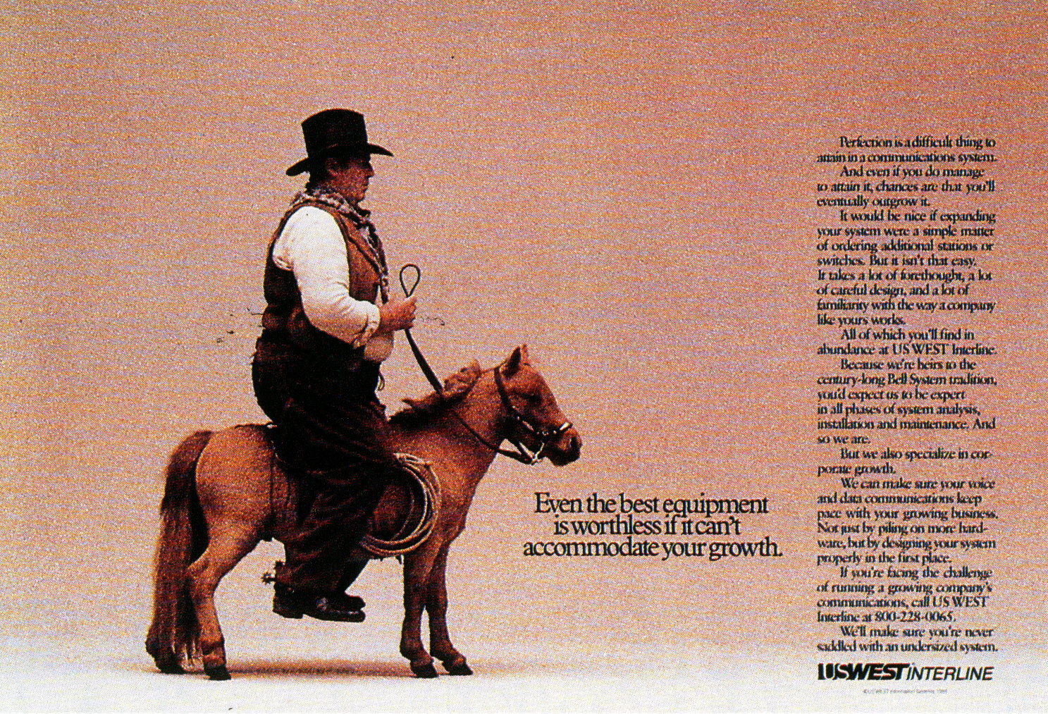
First, US WEST, a client with a big and active women’s union pulled their account.
The Wall Street Journal followed, then FedEx.
It was a very expensive mistake, colleagues say it affected Tom very deeply.
He started to spend more time away from the agency and miss meetings.
Within a couple of years he quit.
UPDATE: Since writing this post I’ve tracked Tom down and recorded a two and a half hour podcast with him, I posted it in January 2017.
n.b. A bit more reading:
1. Tom & Ron Anderson get quizzed by Communication Arts back in ’76.


2. An interview with Inc. magazine from 1986: http://www.inc.com/magazine/19860701/1527.
3. Introducing Tom and his gang to us Brits. (Direction magazine.)


4. Catching up after he left Fallon McElligott. (Also Direction magazine.)


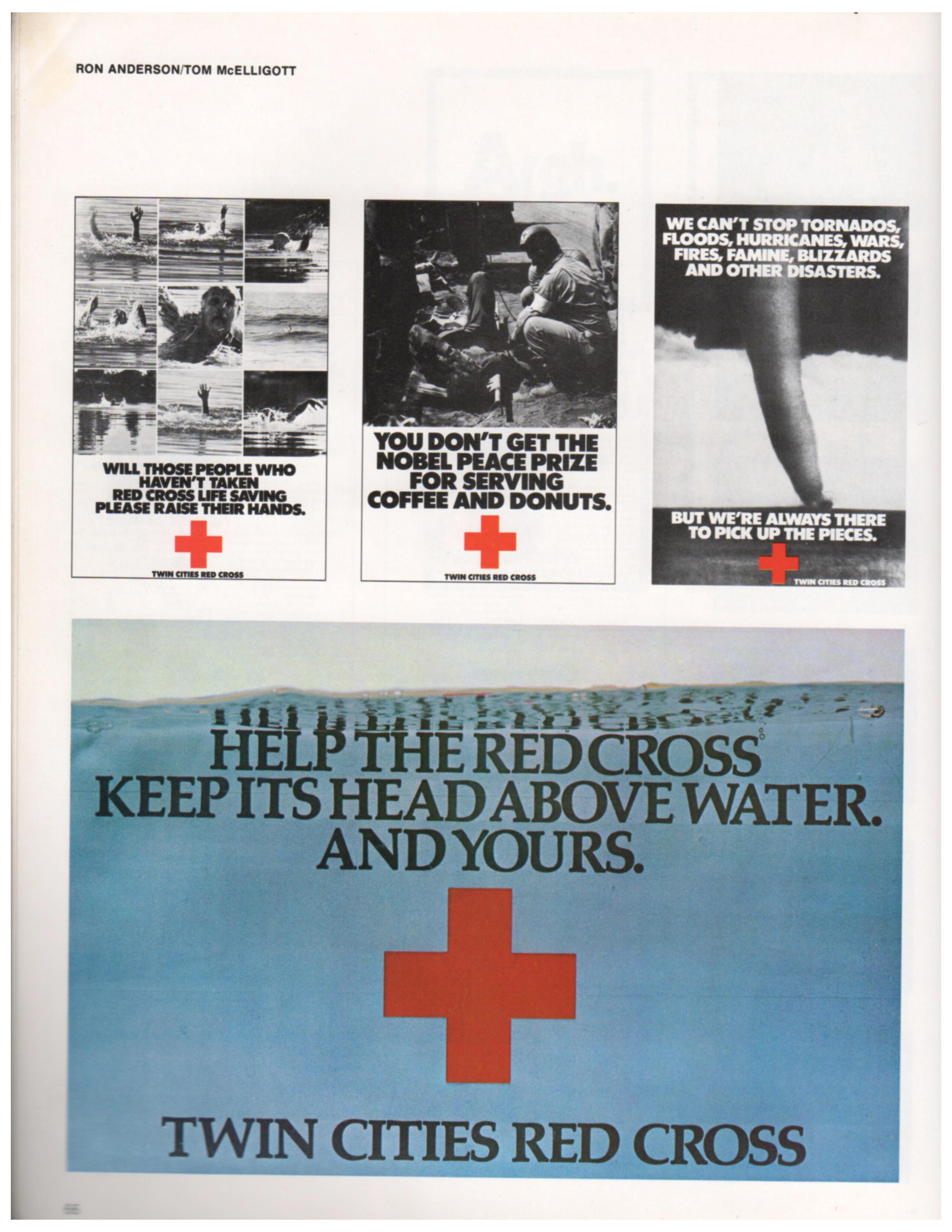
5. A profile of Fallon McElligott Art Director Dean Hanson.
Dean worked very closely with Tom in the early years and created a lot of the great work in this post.

