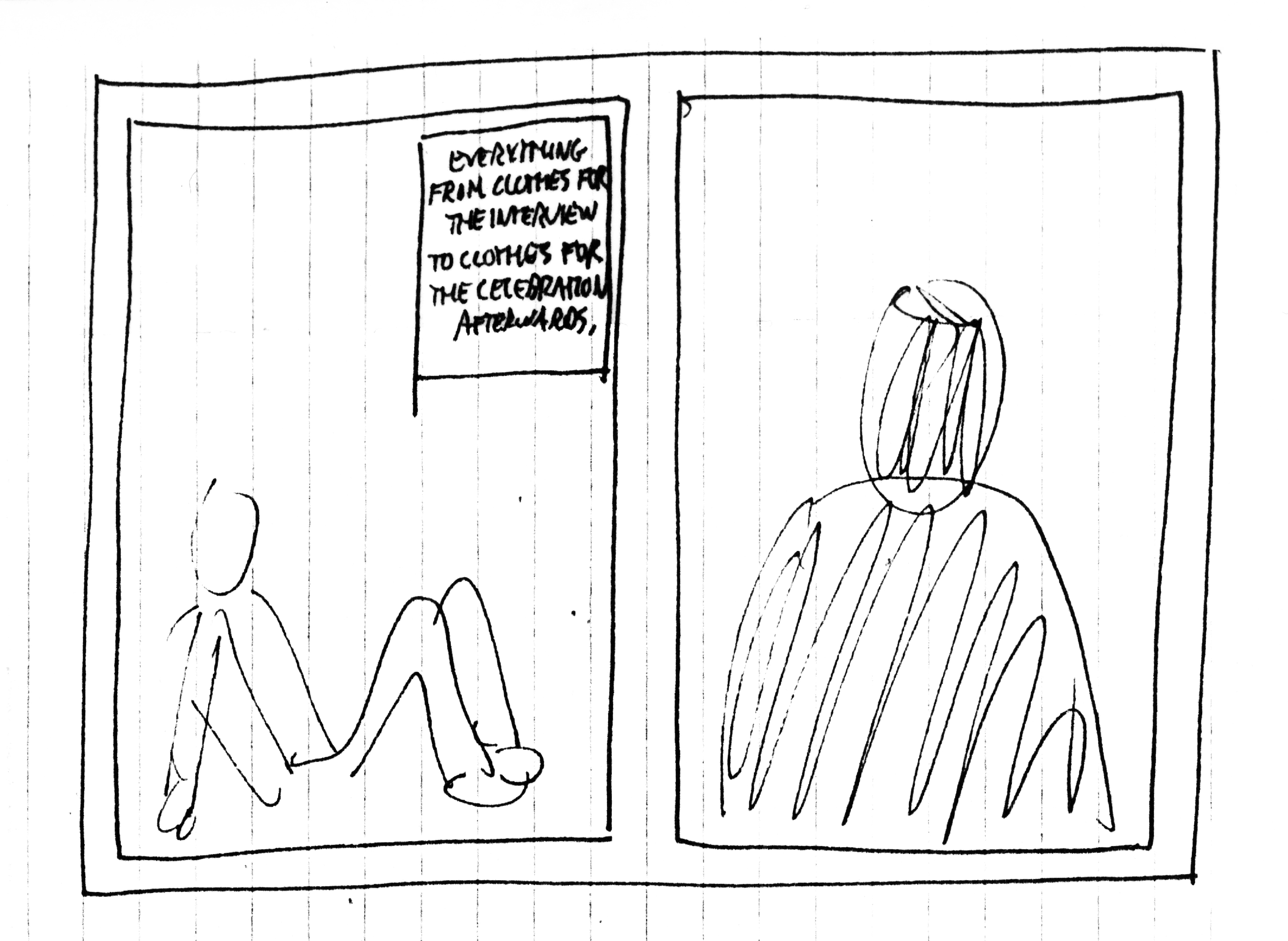
Halfway through this post, I considered abandoning it.
It was referencing things that seemed so detached from today.
Like I was recounting tales of life in the court of Louis XIV.
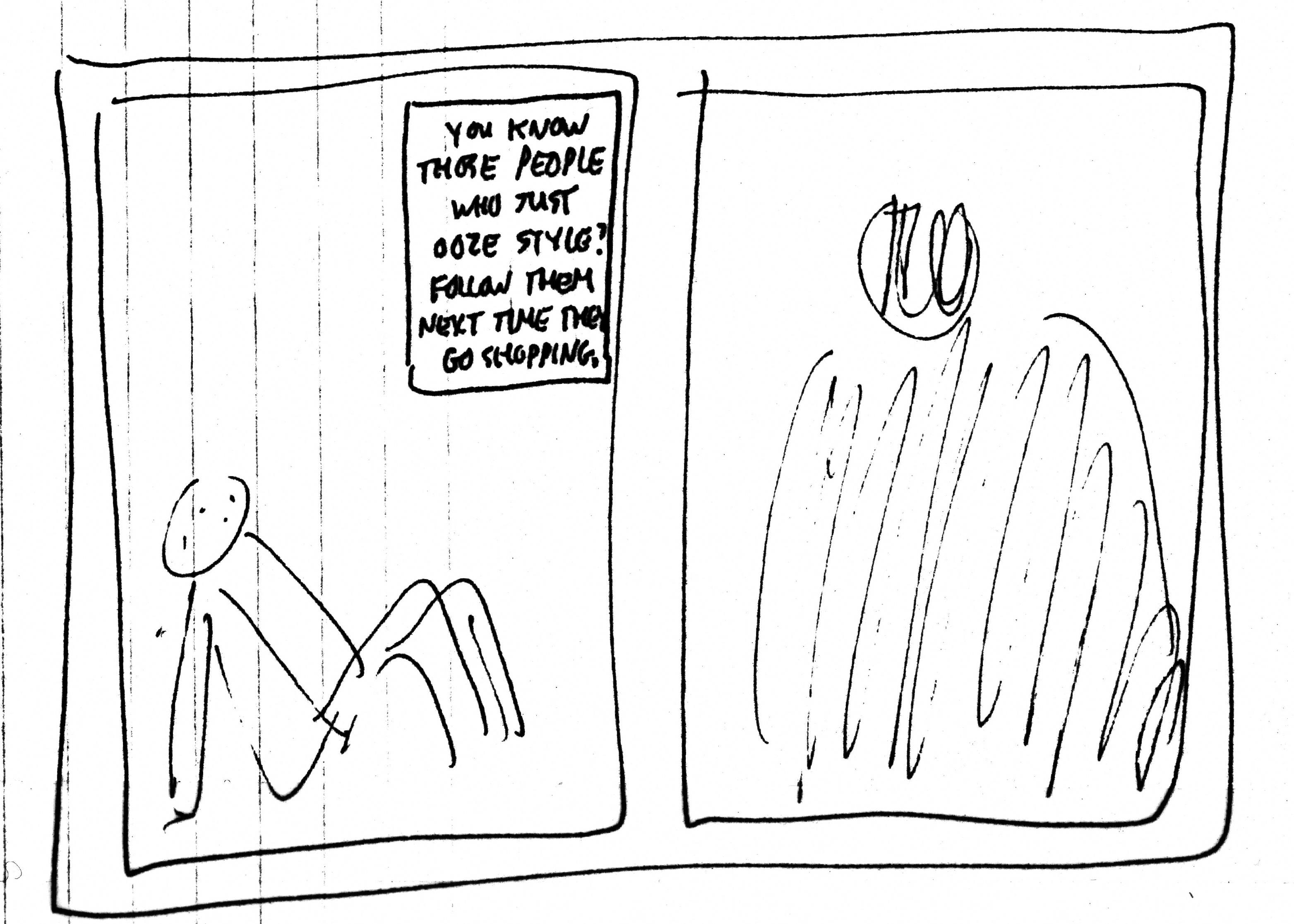
The time, energy and hard cash given to creating a single press ad looks so excessive.
Obviously times have changed, digital has eaten their lunch, breakfast and dinner.
Smaller audiences mean smaller budgets.
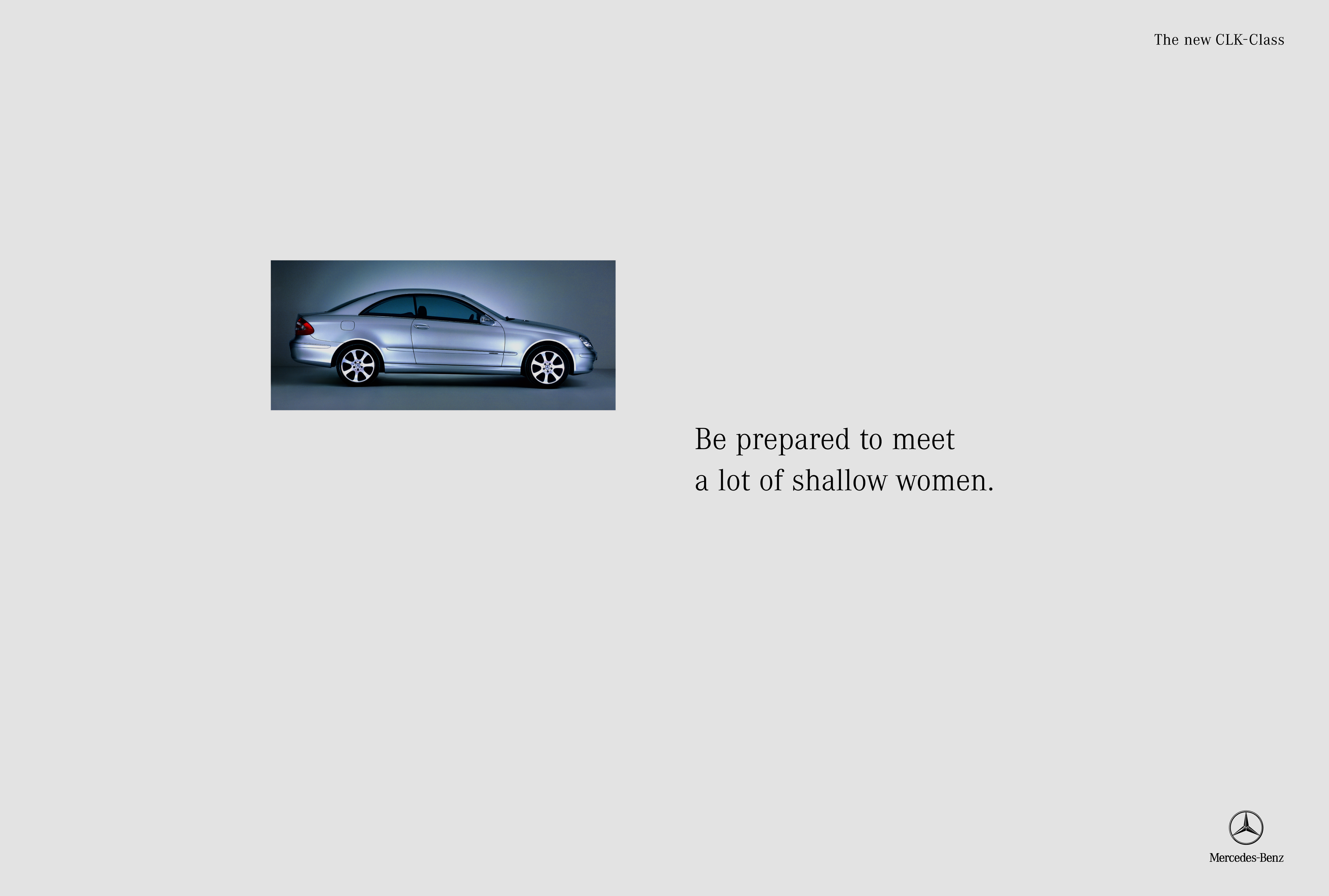
Some of ads below went into The Sunday Times Magazine in 1996, at that time, in 1996, they would’ve been seen by 1.2m people.
Today it’s 290,000.
75% less.
So the budget you have to think them up today will be, as a rule of thumb, will be 75% less than I had back then.
So let’s say that if Sean Doyle and I had four days to write each ad, you now have one.
If we had £20k to make each ad, you now have £5k.
So although technology has made creating imagery much cheaper, it’s pointless dreaming up ideas needing celebrities, locations or set builds.
It is possible to do a great ad on a tiny budget, but not on a regular basis.
You can see the consequences of the reduction in magazine readership in this week’s – very few ads.
For very small brands.
That feel like the clients have made them themselves. (Maybe they did? Due to the smaller budgets?)
No seductive photography, charming illustrations, just big, bland words on a designated brand colour.
People don’t seek out advertising, they try to avoid it.
If you don’t bother spending time and money to lull people into engaging with your brand, why bother to do it at all?
Save your money.
Saying that, this Sunday you have the opportunity to get your product in from of 290,000 people who have enough disposable income to waste it on The Sunday Times newspaper.
290,000!
Imagine five emirates stadiums, full of people looking at your ad.
Why not their improve perception of your product?
Your agency?
Or your ability as a creative?
Your standards shouldn’t move up and down according to audience numbers.
If I’m doing stickers…

product trays…

or book launch invites…

I try to do something I’m proud of.
Anyhow, this campaign is from the 1.2m readership days of The Sunday Times.
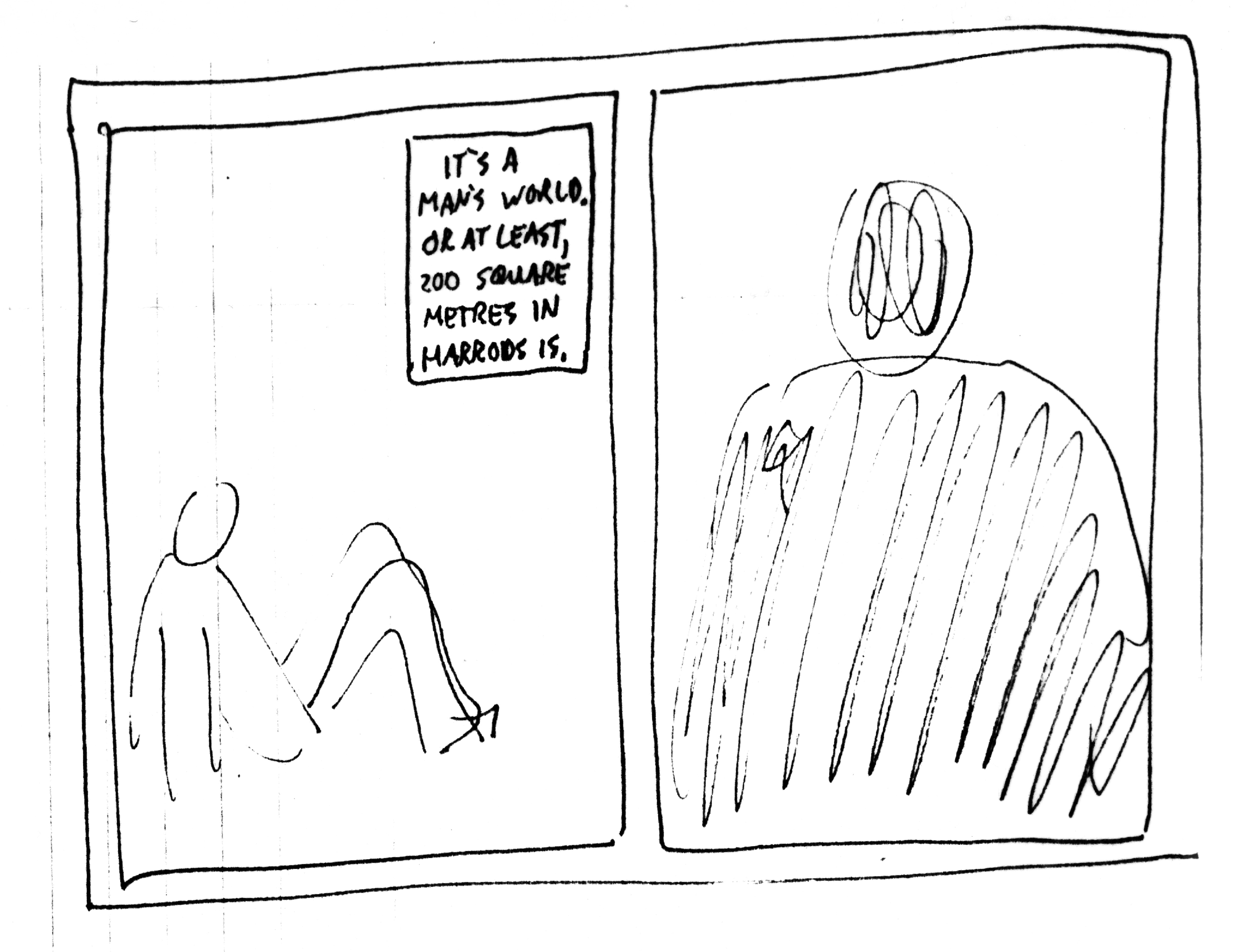
Being young, 31, and probably a bit insecure, when I was made Head of Art at Leagas Delaney I took it very seriously.
I worried that should anything come out of the agency that looked bad, I’d be blamed.
I should clarify, I don’t think art direction is about making things look ‘good’, it’s about thinking.
Is the idea coming through clearly enough?
Does the ad look appropriate for the client?
Does it look different from the ads around it?
That kind of thing.
But ‘bad’ will do as a shorthand, and the Harrods campaign that had just starting running, looked bad.


It felt cheap and old-fashioned.
More Debenhams than Harrods.
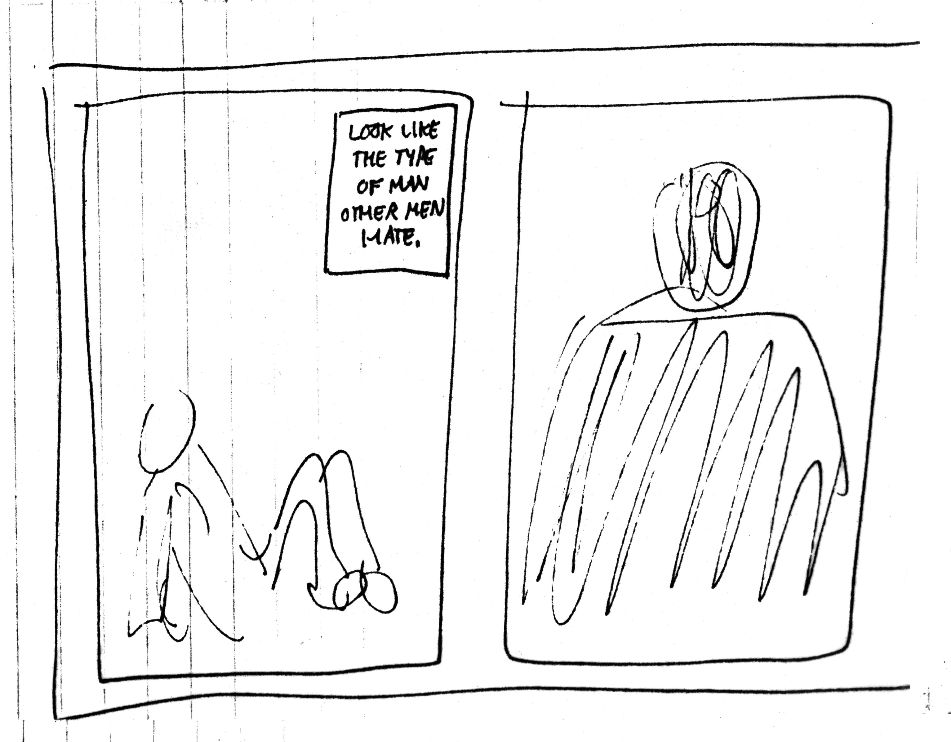
The campaign that proceeded it looked classier.

The one that proceeded that, was even classier still.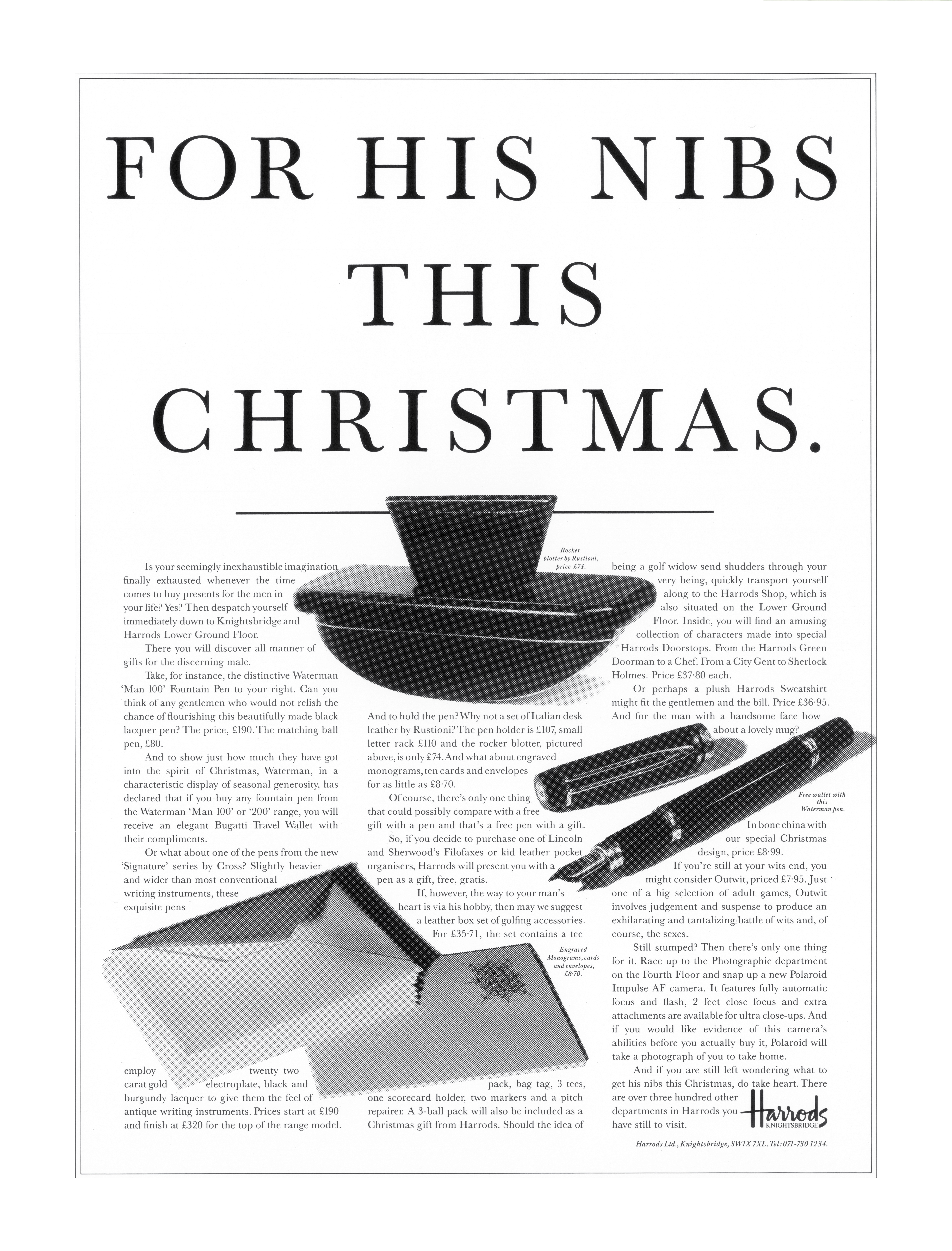
Partly because the big headlines showed off the beautiful font. (The font is an unusual cut of Baskerville that I’ve never been able to find since. It has ‘ink-squash’ and hasn’t been digitised.)
The point is, it felt like Harrods advertising was going backwards, looking more down market with each new iteration.
And the latest iteration was on my watch.
The ads looked like poor imitations of Leagas Delaney ads.
I hassled Tim to let me take it over the account, he agreed.
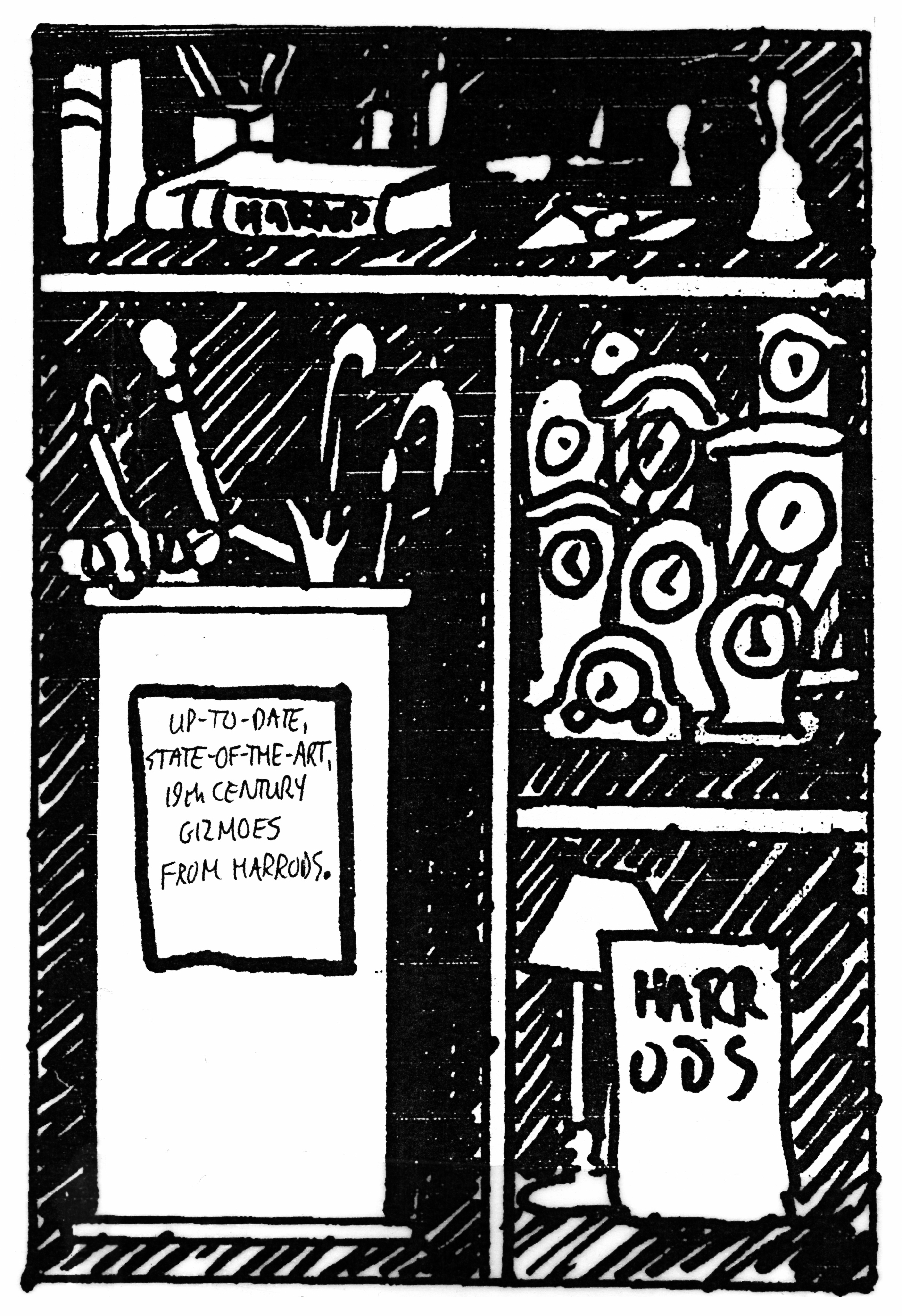
The brief, or process of creating the ads hadn’t changed for years – Harrods give you bunch of related (sometimes unrelated) objects we’d like to feature, the agency turns that into a headline and then into a finished ad.
So the writing of the ads wouldn’t change, Sean and I continue to write in that witty, sophisticated voice Harrods ads always had.
But the look of them will be rebuilt, from scratch.
We needed a format.
One that could house a wide variety of changing products.
Although it may feature food one month and dresses the next, they needed to relate visually, be recognised as Harrods ads.
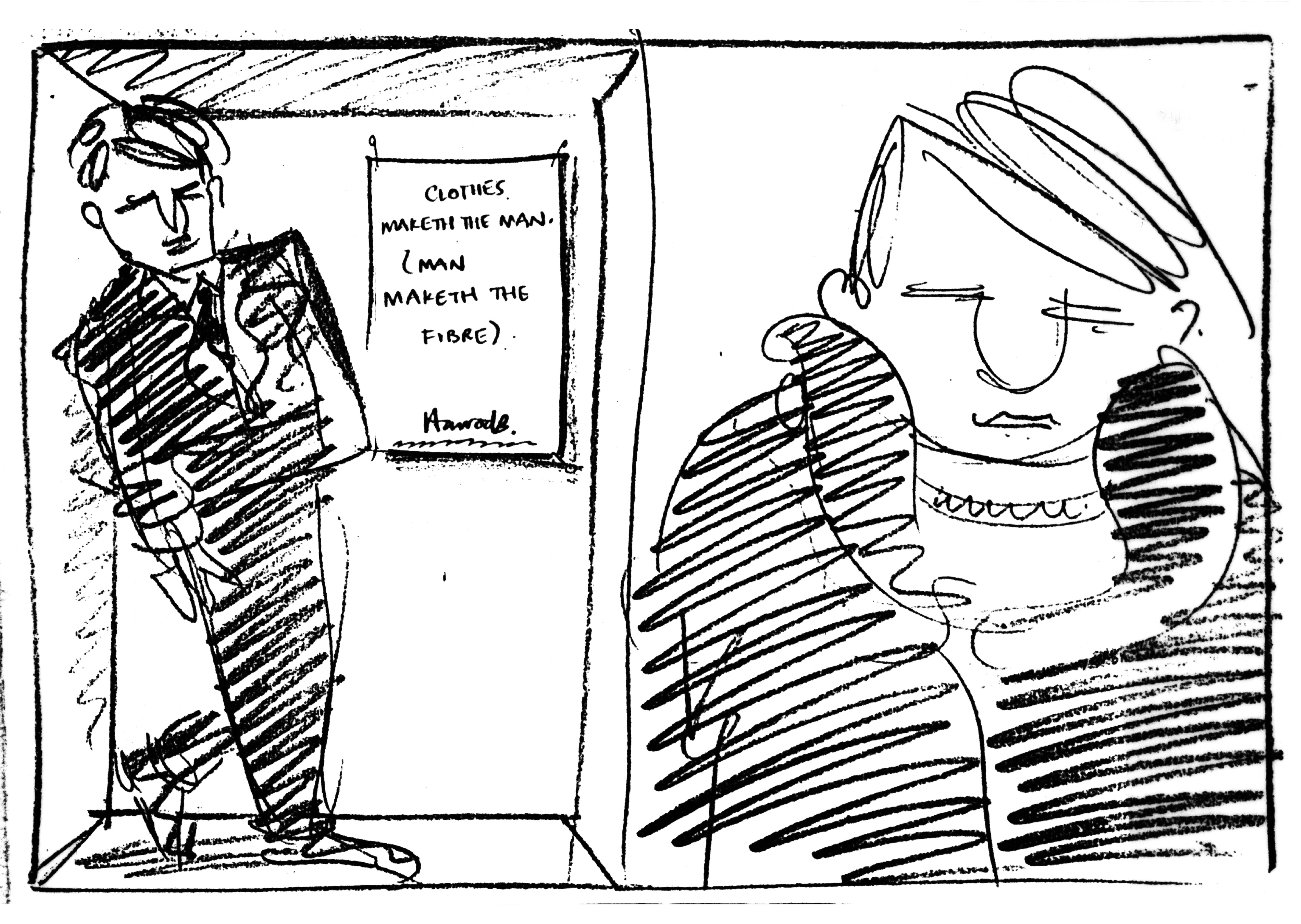
TYPE:
As I said, I loved the font, so that was a keeper.
But what about every other inch of the page?
It was hard to make a big leap from where they’d been.
I liked the look of having lots of copy, it looked sophisticated, budget stores generally just show the products and don’t ‘talk’ much, so doing the opposite for a store that was the opposite made sense.
Plus, the thinking at Leagas Delaney was always that even if people didn’t read the thousand words of copy on your Timberland ad, they’d think ‘If they can write that much about a boot, it must be well made.’
But, I hadn’t read all the Harrods ads, and it made them feel a bit dated.
Also, some poor fucker, Sean in this case, would be tasked with writing it and would have to schlep to Tim’s office a dozen times to have it shredded.
No long copy.
PRODUCTS:
Cut outs look a bit cheap, but the scale is so varied it makes it impossible to shoot them in a single, classier shot.
(Imagine a golf bag next to a golf tee – you wouldn’t be able to see tee.)
I’m start to discover just how much flexibility cut outs offer, if I was more confident I may have suggested going back to that old, big font layout.
But no, I’d opened my big mouth, criticising the work and confidently telling Tim I’d improve it.
How the hell do I come up with a format that can accommodate any sized object that Harrods may throw at us?
That looks cooler?
More contemporary?
And more sophisticated?
Without cutting them all out?
What could hold them together?
A box!
A bunch of boxes to be precise.
With different things in each box.
A bit like this…

And this.

We could shoot one overall image of boxes, then shoot objects separately, dropping them into the main shot.
It would allow us to play with scale.
I.e. Placing a small woman in one box next to a big diamond ring in another.
PHOTOGRAPHER:
Often, when looking for a photographer, director or illustrator, you can’t help look for evidence they’d done something similar before.
An art director at BMP/DDB once bought me a photographers book for a VW shot of an egg, his rationale for choosing him was ‘he’s shot an egg before’.
It’s crazy.
But, when thinking which photographer could shoot our boxes campaign, I thought of this image.
Like it was too risky to go with someone without ‘box experience’.
In fairness, it was by a photographer I liked; Cindy Palmano.
I’d always love her fashion work – cool, stylish, but not too stiff.
It had a nice, relaxed, daylight feel to it.
She shot people well…

And objects…

Cindy felt like a more contemporary take on Harrods.
I checked her out with a mate who’d just shot with her, Tom Carty, he couldn’t have been more positive.
I headed to her Clerkenwell studio.
She showed me even more evidence of her ‘box experience’.
This lady sure knew how to shoot a box.
I gave her the job.
PROCESS:
Alfred Hitchcock once said ‘If I cast my actors properly, I don’t need to direct them.’
Love that.
I prefer to hire experts and let them do what they do, not micromanage them.
If I’m moving objects, changing lighting or poses, I’ve either hired the wrong photographer or should shot it myself.
So with this job, I’d got the merchandise sent directly to Cindy and got her to sort out what and how we shoot it.
Sometimes Polaroids would be biked over to me, occasionally I’d make a suggestion, mostly I’d say ‘great’.
A small white board with a logo on would be placed in the shot for us to drop the headline onto post shoot.
WORDS:
At any other agency the headline would be printed on those boards in the shot.
But not with Tim.
He’d have us writing and rewriting headlines right up until the eleventh hour.
We’d draw a layout, leave a box for us to write the headlines in, then photocopy it endlessly.
I guess it saved drawing up time?
Night after night, thirty or forty headlines in, thinking ‘What the fuck else can we say about the fucking colour brown?’
Looking at some of the ones he approved today, I’m not exactly sure why?
Most rejects ended up in the bin, below are the ones we kept.
Unfortunately, I don’t have all the finished ads to go with roughs, or the roughs to go with the finished ads.
But I guess it’s a miracle I have any.
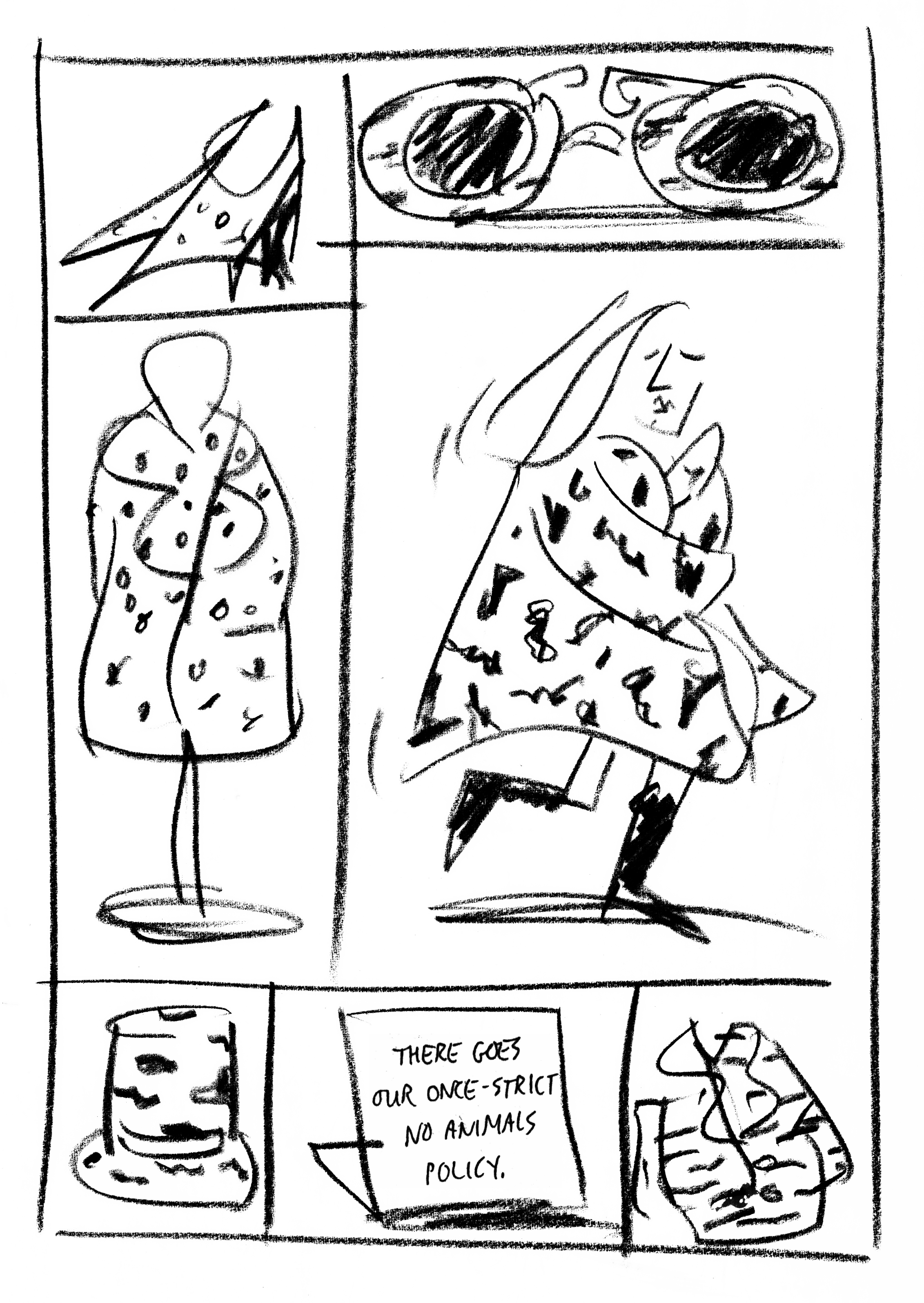
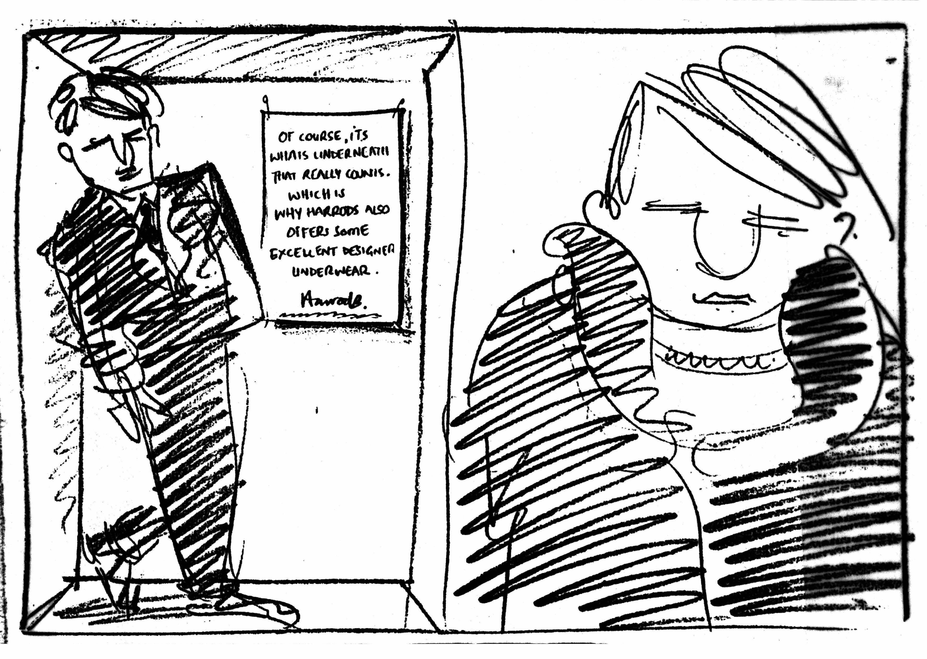
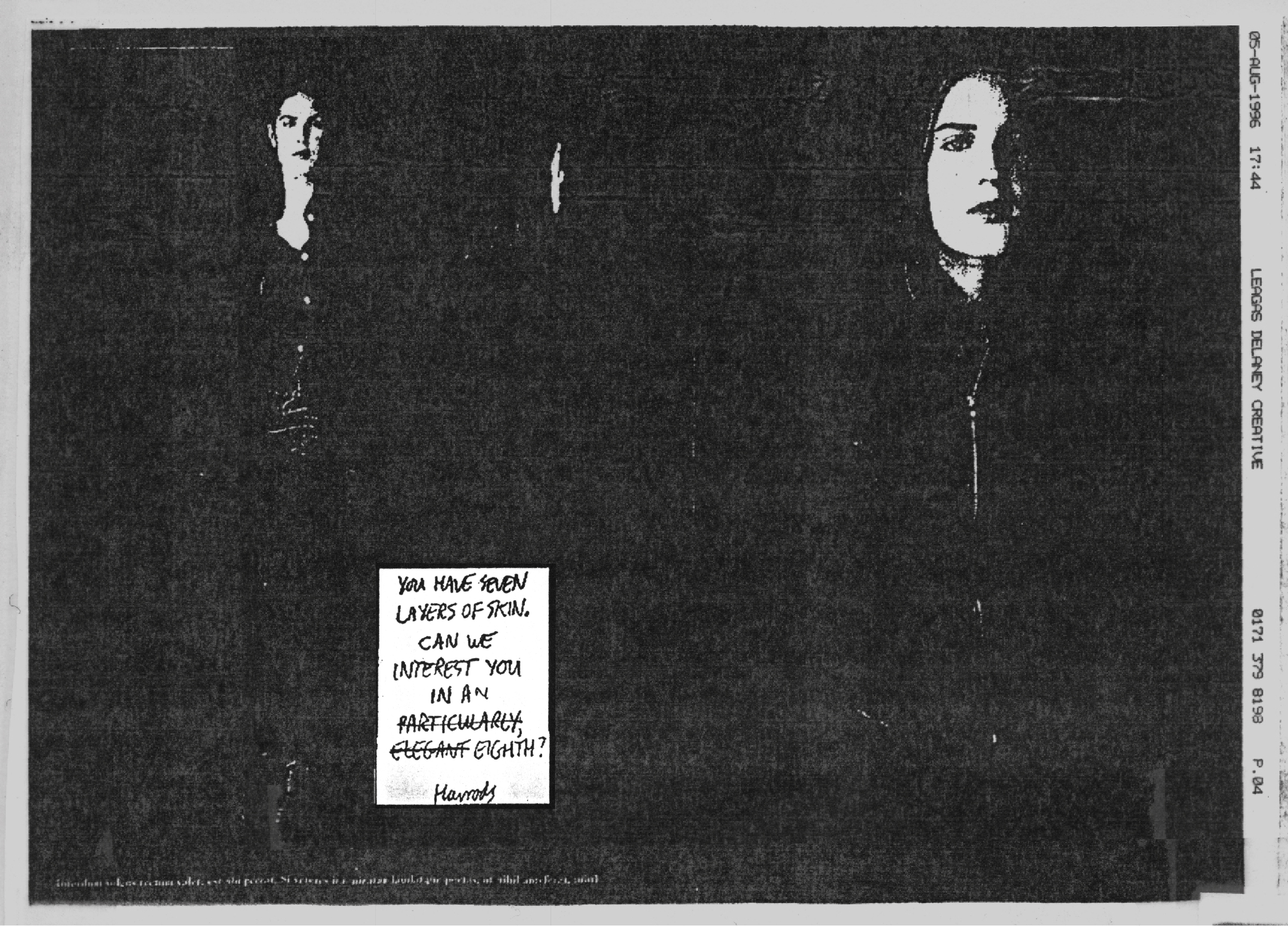
1. BROWN THINGS.
OUR FIRST BRIEF: Connect a bunch of ‘bitter chocolate’ coloured objects, as the Harrods fashionistas put it.
I think this was just two shots, left box and right box.
The foil wrapper and dripping spoon on the hat were neat touches Cindy came up with.
WAY IN DEPARTMENT.
BRIEF: The sixties is in fashionable. The Way In department was launched in the sixties.


Cindy managed to build on the layout Sean had drawn.
I don’t know why the objects on the left are floating?
The moon landing?
Who knows, but it looks great.
(In retrospect we should’ve styled it more Sixties-style.)
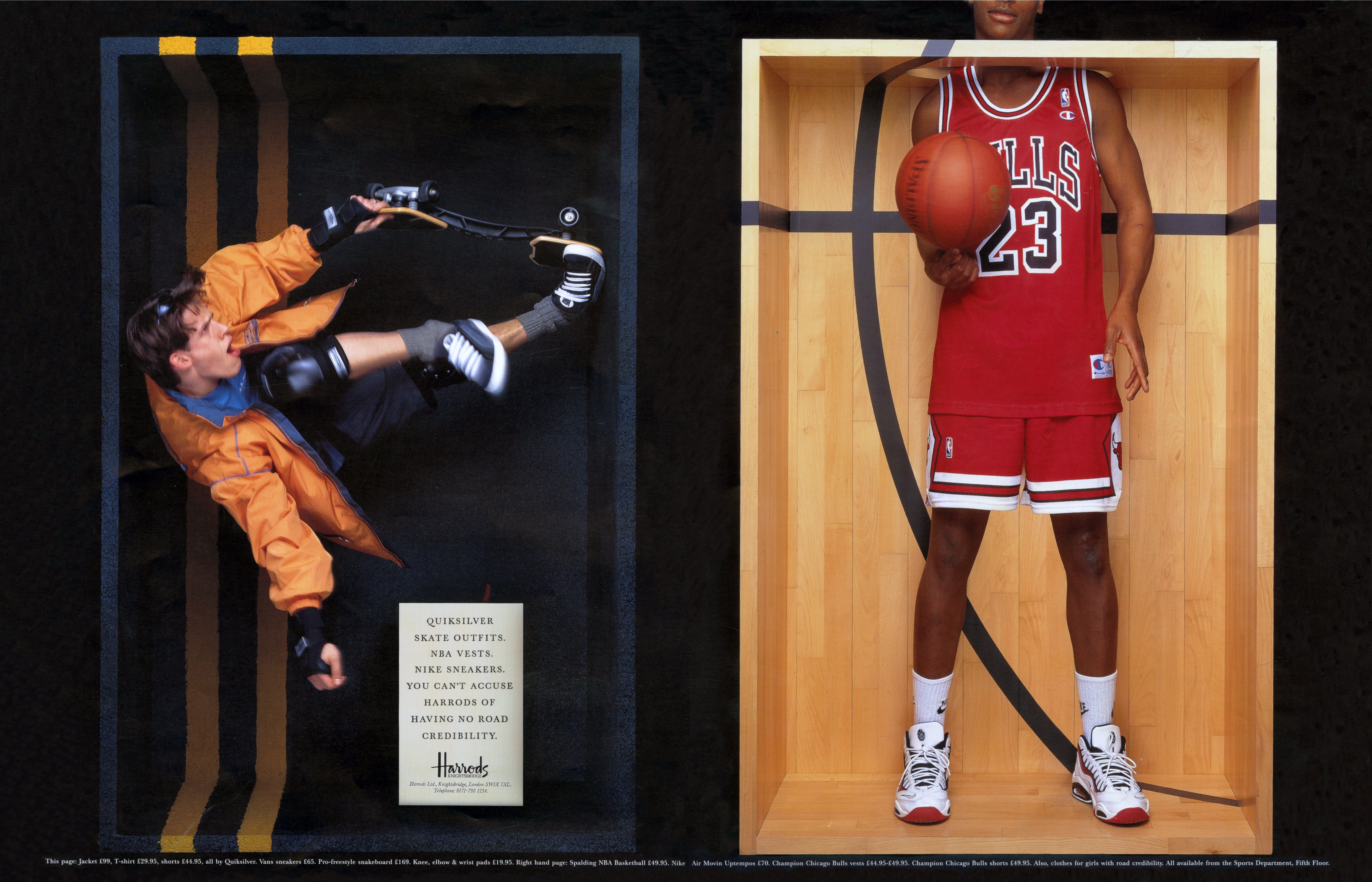
SPORTS DEPARTMENT.
BRIEF: Our sports department is full of unusual, American sports stuff.
Aside from stocking what you’d expect, what separates Harrods from regular department stores is the stuff you don’t expect.
Like hip American skateboard gear and basketball outfits.
Who knows what Tim made us throw in the bin beforehand, but this is such a self-deprecating joke, I suspect many didn’t get it.
‘We are so stiff and posh that we’ve misremembered the term ‘Street cred’.
Very Sean.
The boxes look great.
The movement in the skateboard shot is cool.
The hole in the top of the basketball box is neat.
Cindy.
Cindy.
Cindy.
CANDLES.
BRIEF: We have all manner of fancy, expensive candles.
The red and blue marks are scrawled by me and Sean.
Looks like I’m the red.
We’d go through our pile of ideas and ticking our favourites.
The double ticks were our favourites, a line through were our least favourite.
Tim would then reject all of them.
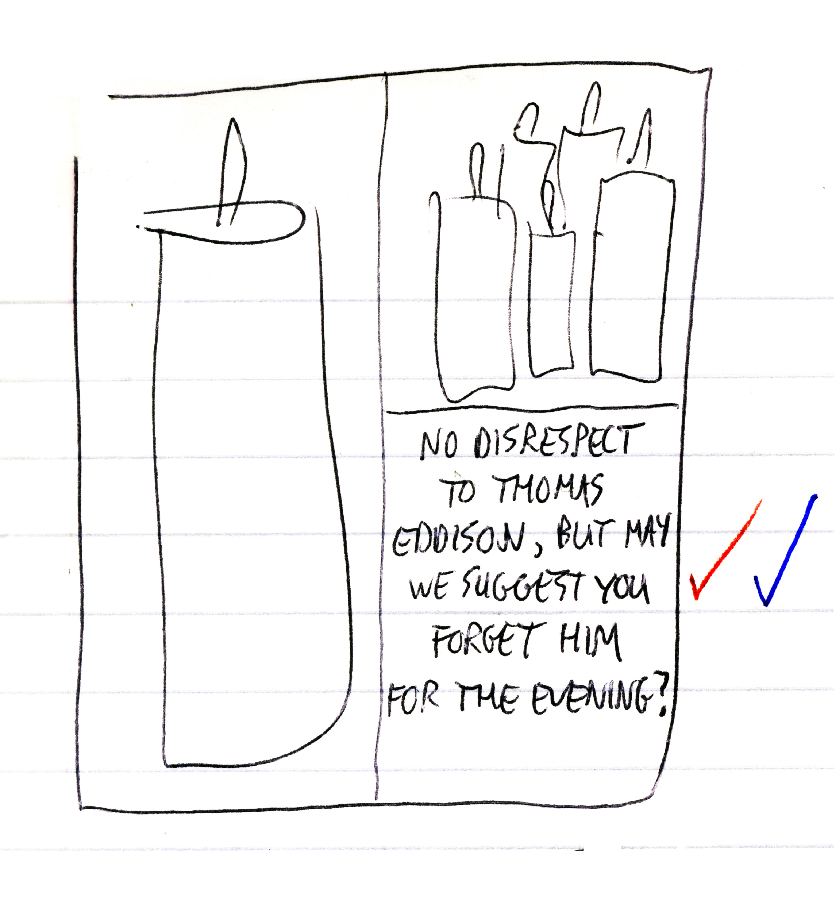

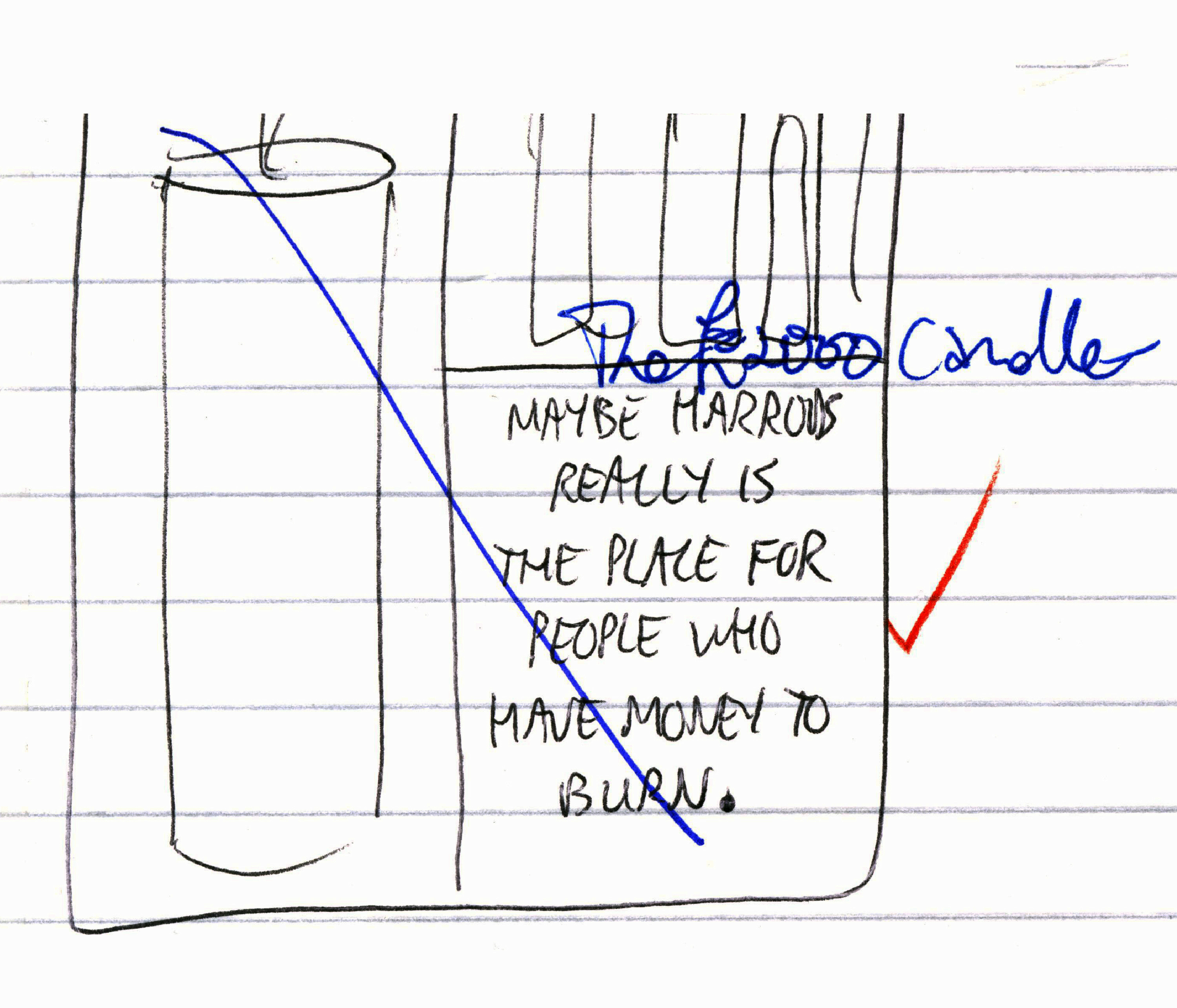

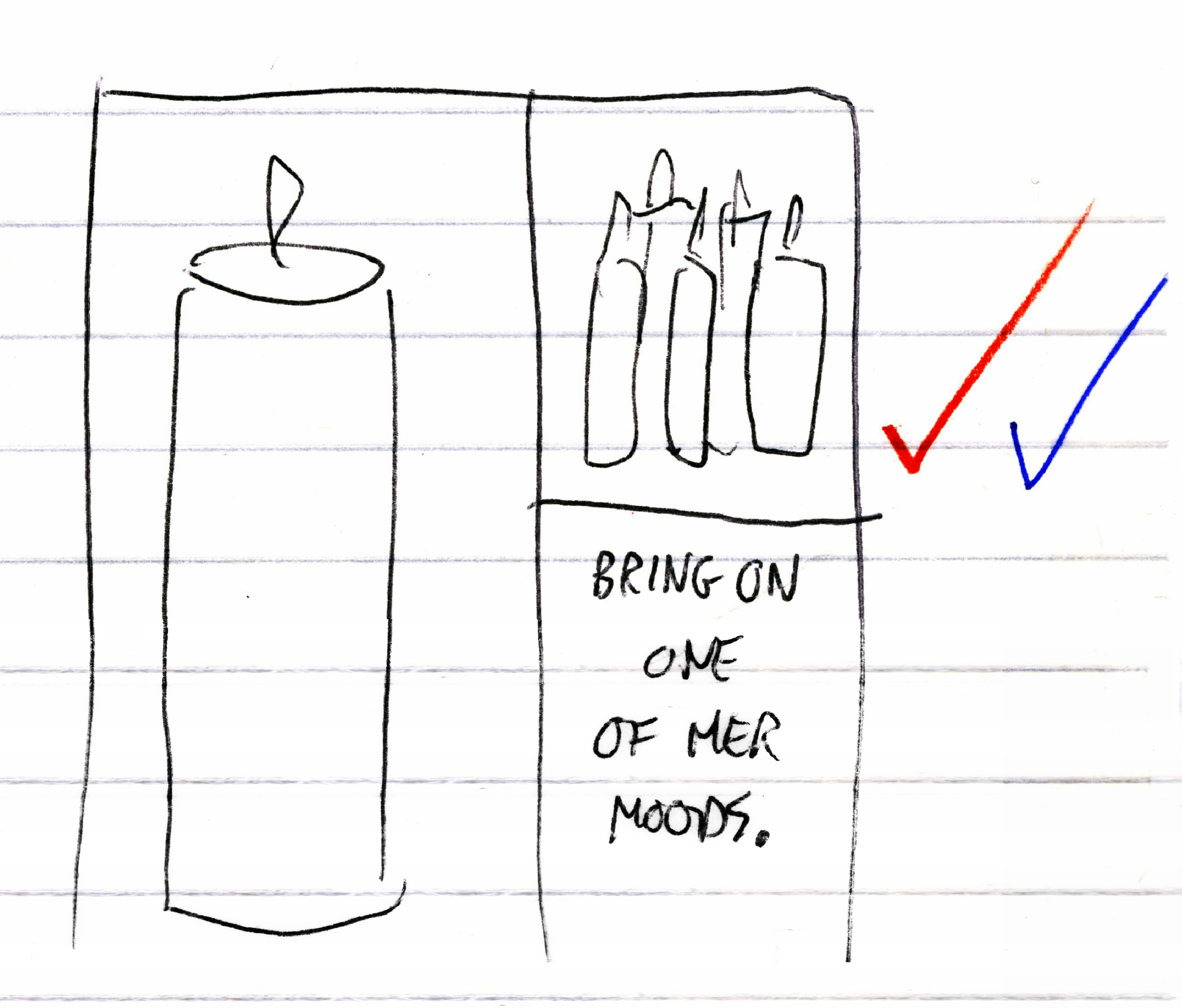

My guess would be Tim picked the ad above, then rewrote it, poshed it up a bit.
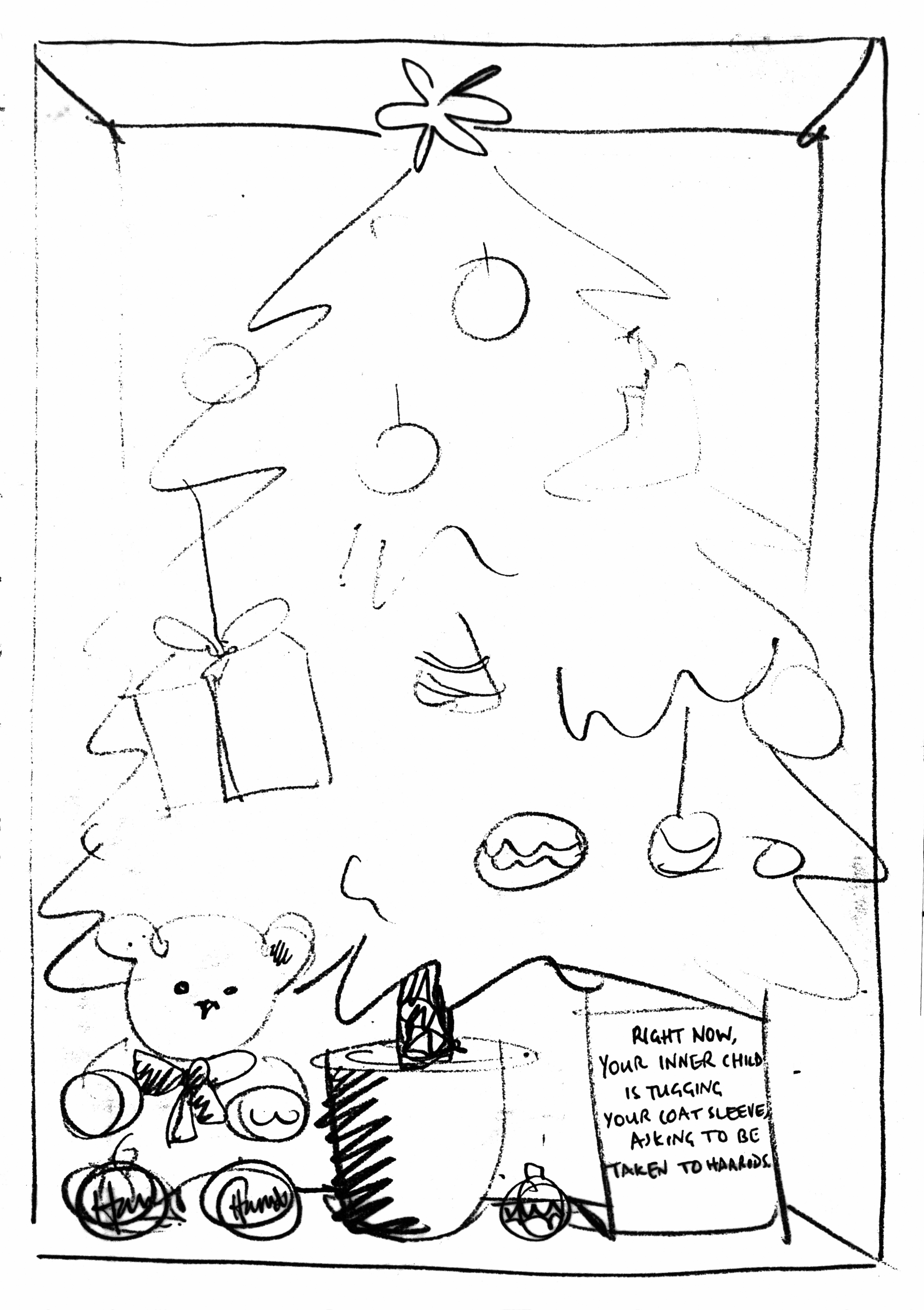
CHRISTMAS #1.
BRIEF: Buy your Christmas presents at Harrods.
The boxes could’ve been a bit more special.
(I prefer the version of the line on the rough.)

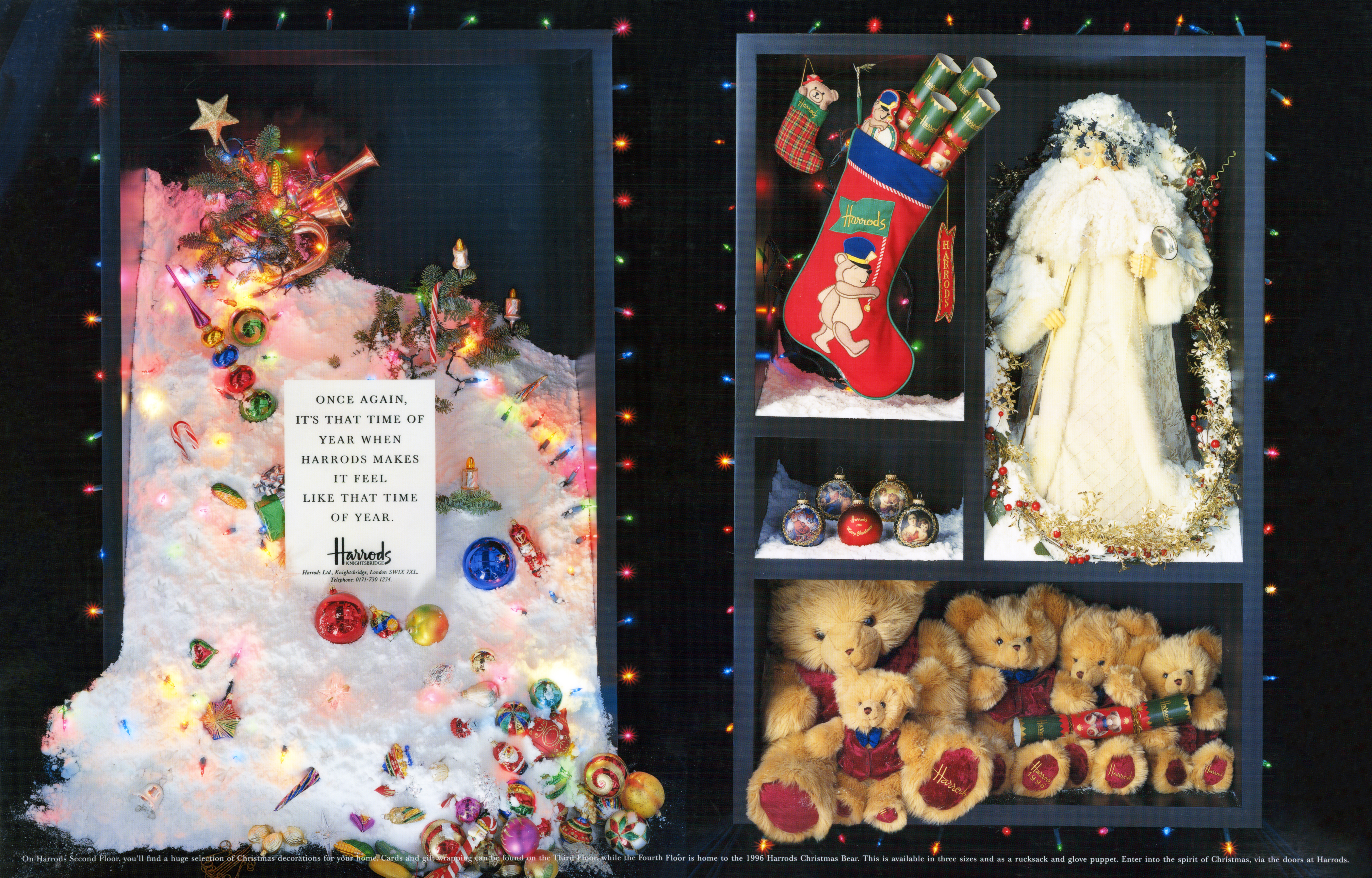
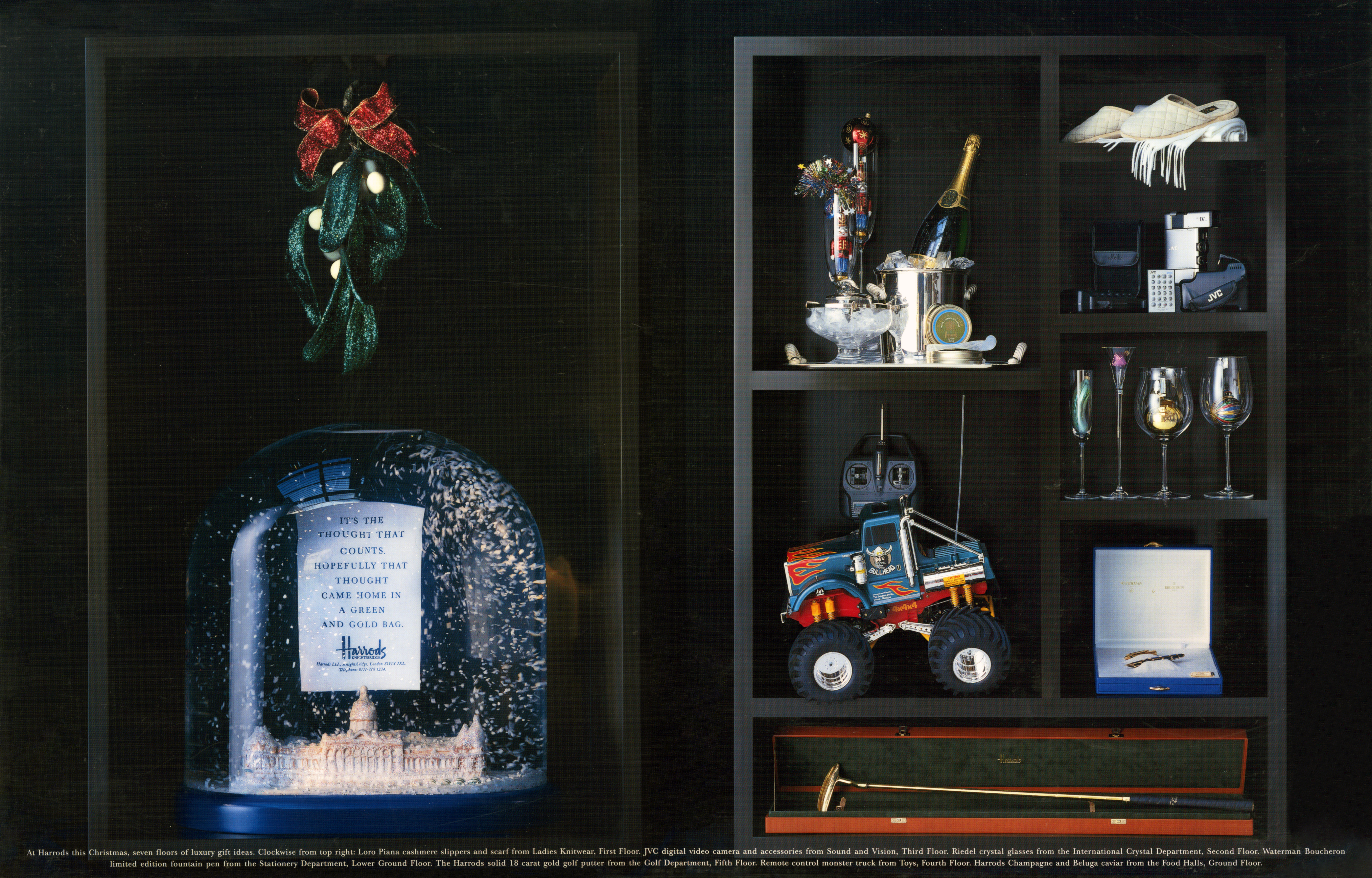
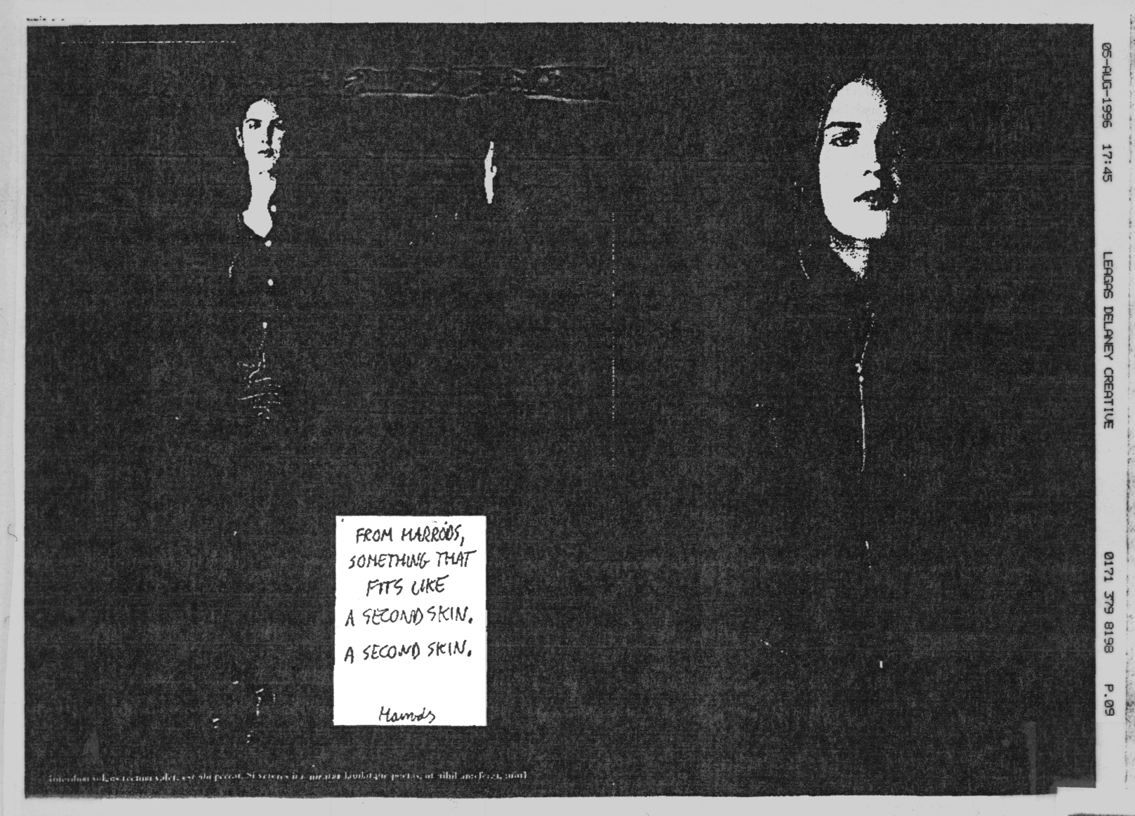
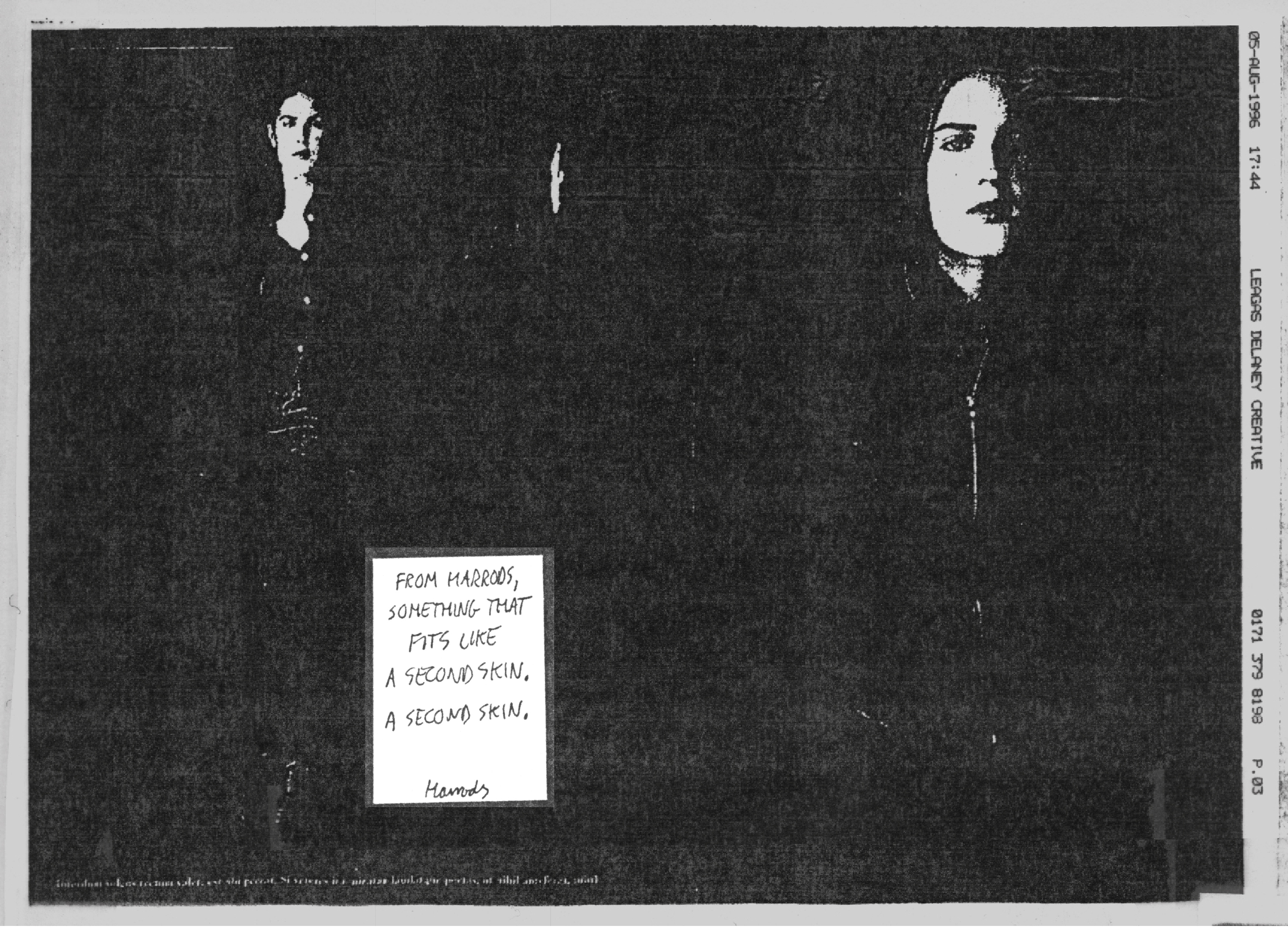
CHRISTMAS #2.
BRIEF: Harrods Christmas presents feel more special.
Wit every ad, we started to realise that putting our headlines on those little cards had its restrictions.
Short looked better, even as scribbles.


The one below seems nice.

As does this one.
The one below was given the green light.
The headline looks too long.
And the image could’ve been more Christmassy.
More celebratory.
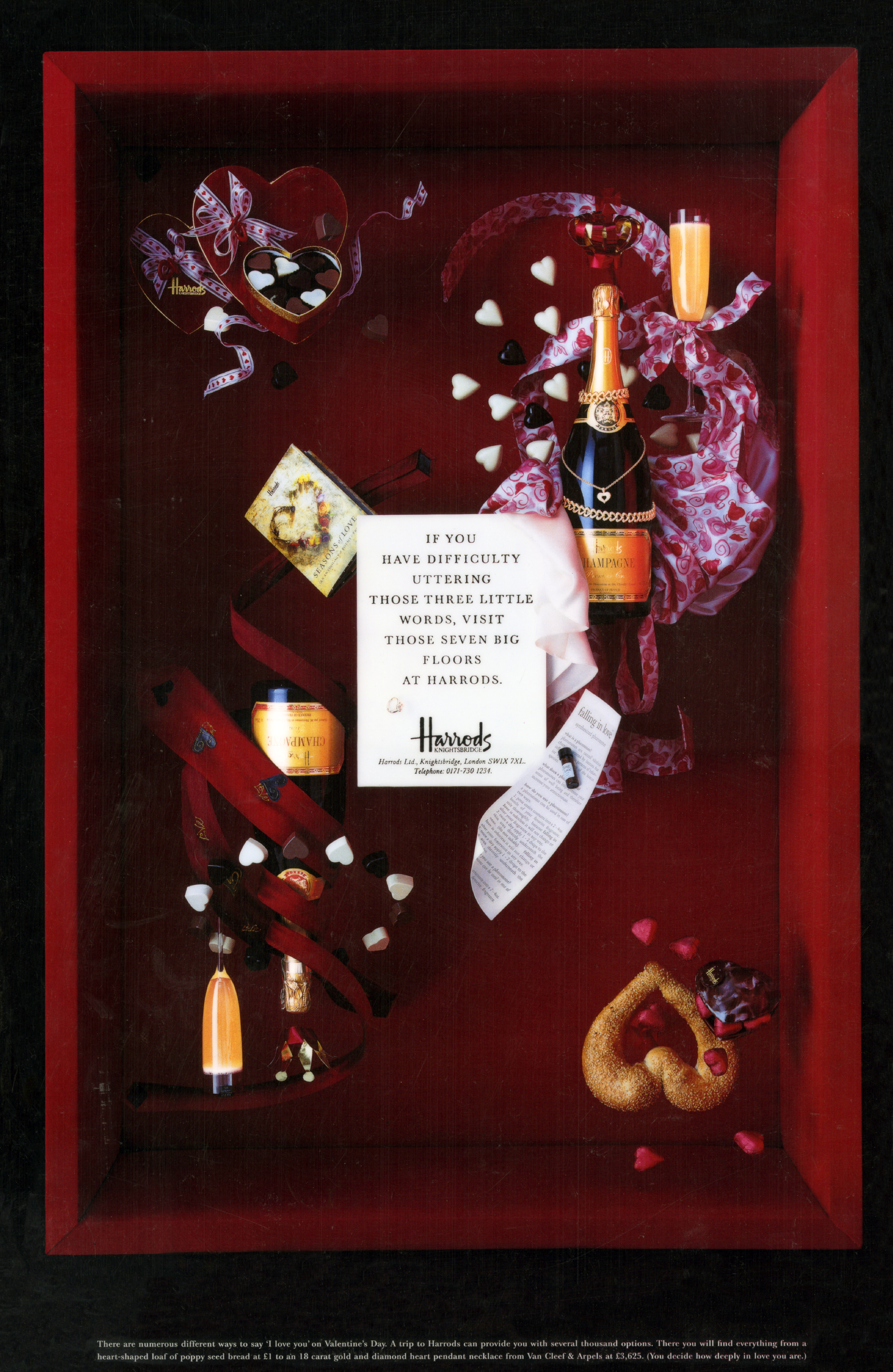
VALENTINES DAY.
BRIEF: Roll up, roll up, get your Valentines gifts at Harrods.
Looks nice.
The hearts top right and bottom left are based on playing cards, subtle, but clever.
Headlines a bit ropey, we must’ve written better?
EASTER.
BRIEF: Buy your kids and Easter egg and a new outfit at Harrods.
Sean and I desperately tried to tie kids clothing to Easter eggs.
It’s like a high wire act.
The image is cool.
Nice to break away from the black boxes too.
CLOCKS.
BRIEF: We sell old-fashioned style clocks, umbrellas and candles.
They are all from another time.


(Don’t have or remember what ad ran.)
GOLF.
BRIEF: Harrods sell a wide range of Golfing equipment.


This was the chosen one.
I think this is a Polaroid.
It says “Harrods. Possibly the only place that could tear you away from the golf course this weekend.”
CAT PRINT PRODUCTS.
BRIEF: We have a whole bunch of products with cat prints on them.
Short headlines are cool.


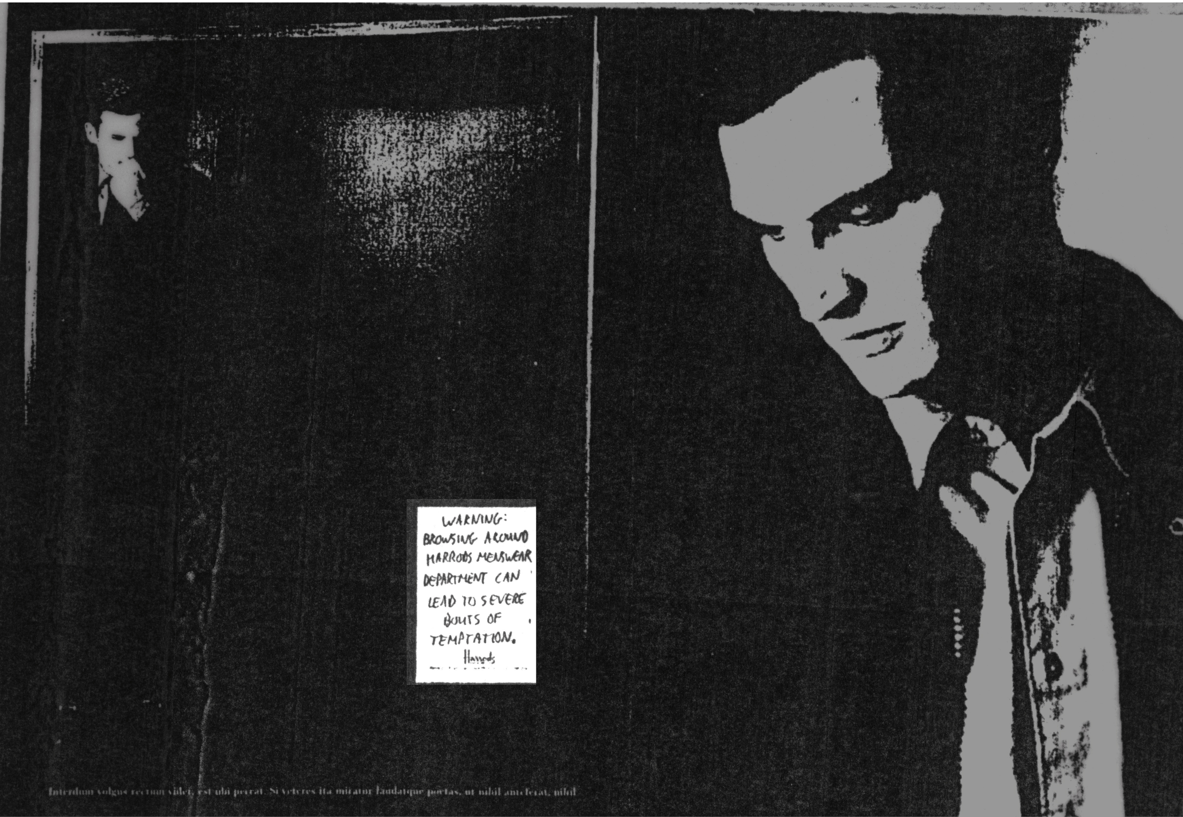
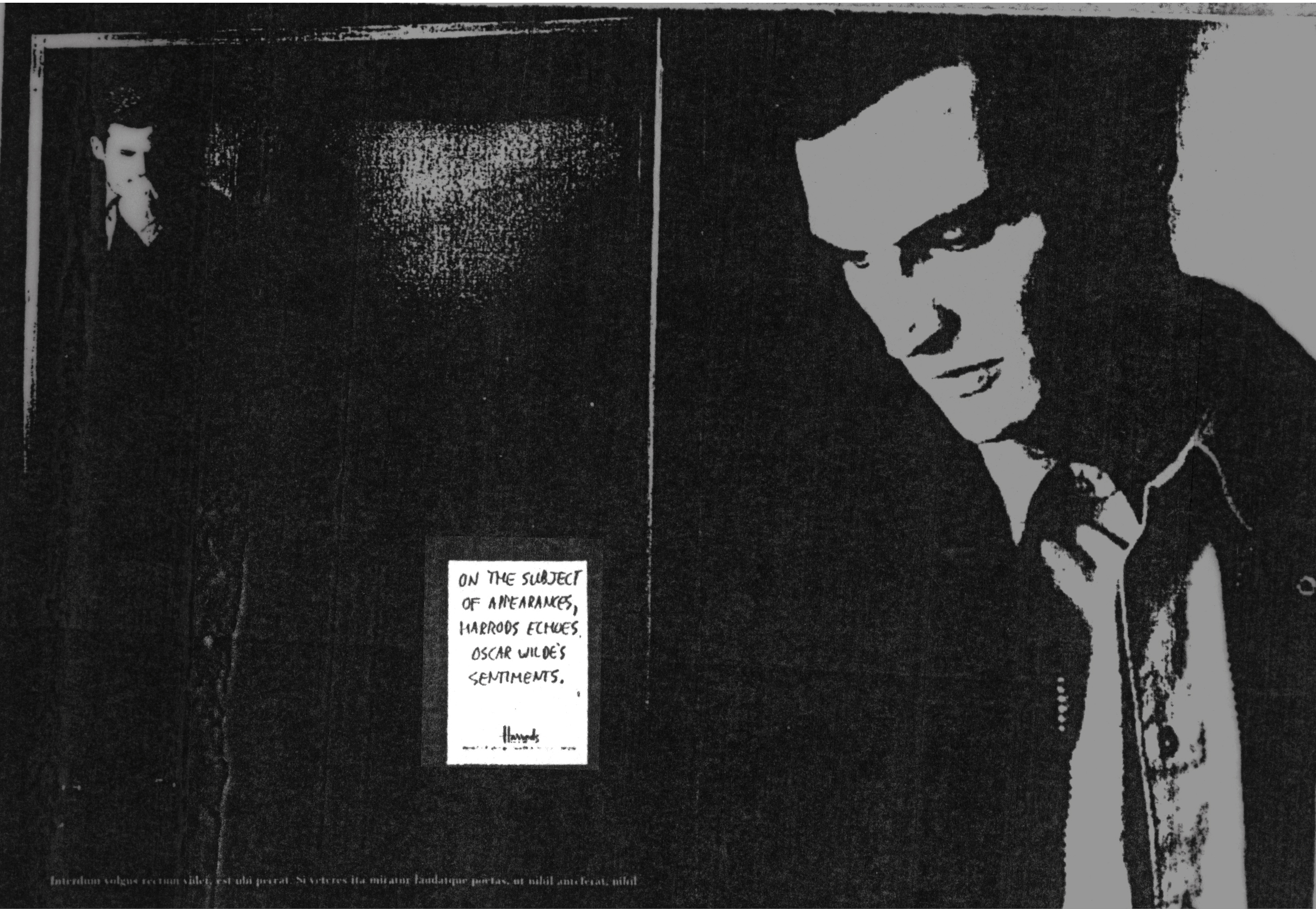
 MENSWEAR.
BRIEF: Harrods sell cool, summer clothing for mens.
We have to show two complete outfits, so we have to show two full figures – a box each.
Not as playful as before, but visually it still links to the previous ads.


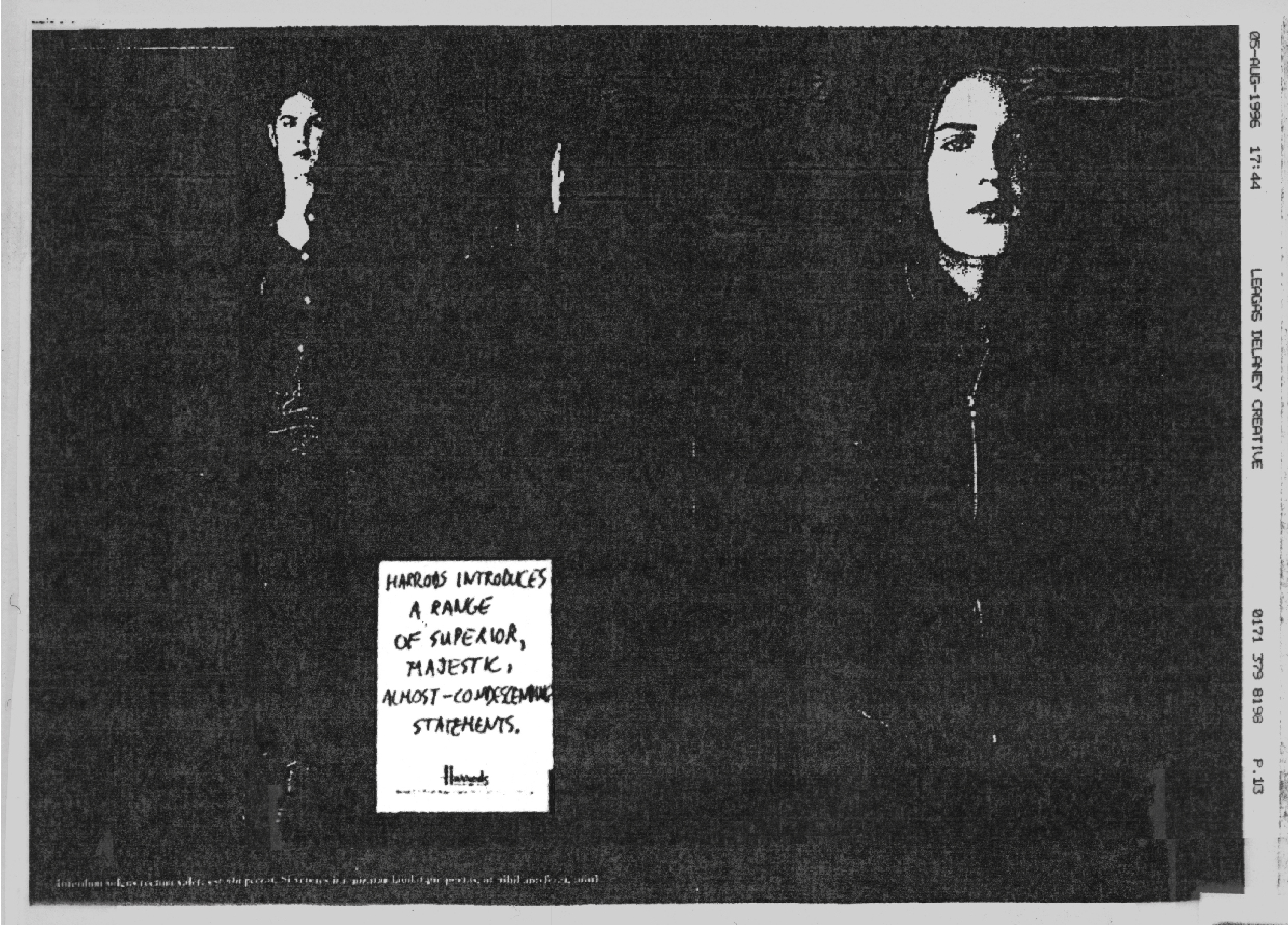
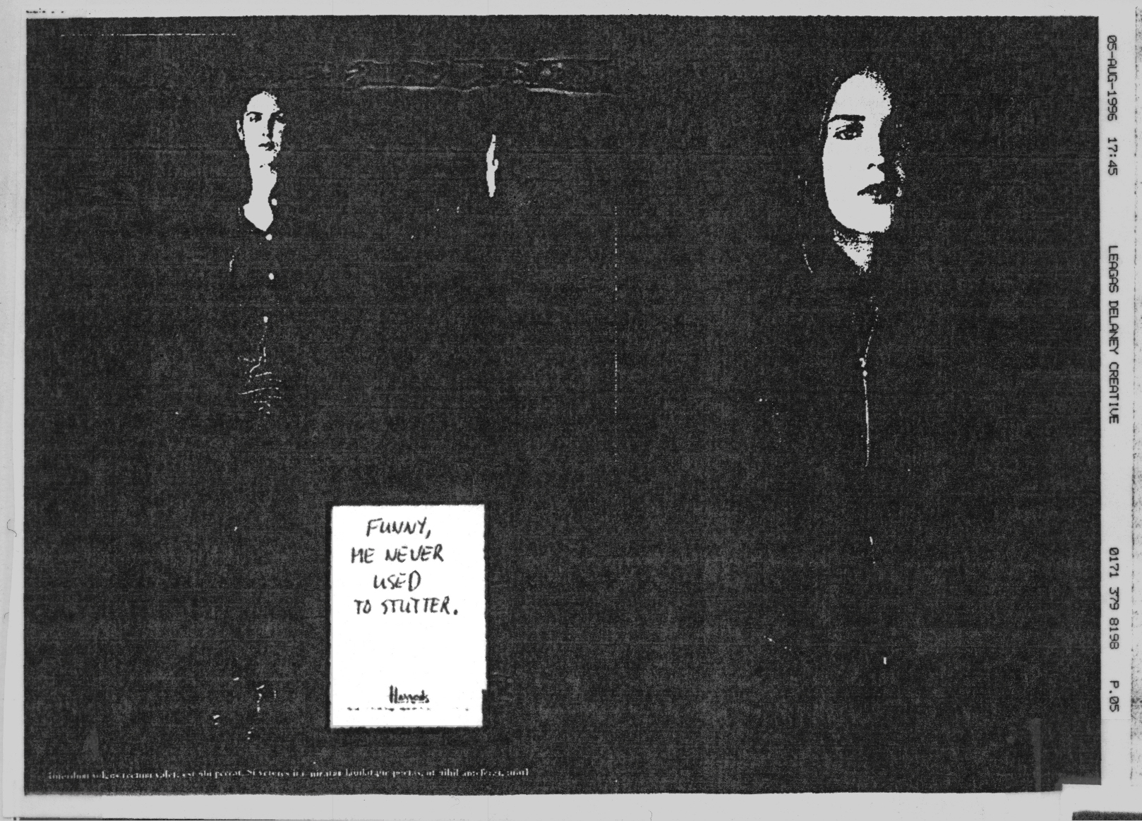
WOMENSWEAR.
BRIEF: Harrods sell cool womenswear.
As before – two full figures.

(Later repurposed for Mercedes.)


MENSWEAR.
BRIEF: Harrods offer stylish clothing.
(My roughs.)


Test shot roughs.
The box is starting to be less important, which is a shame.


(Don’t know and can’t find the ad that ran.)
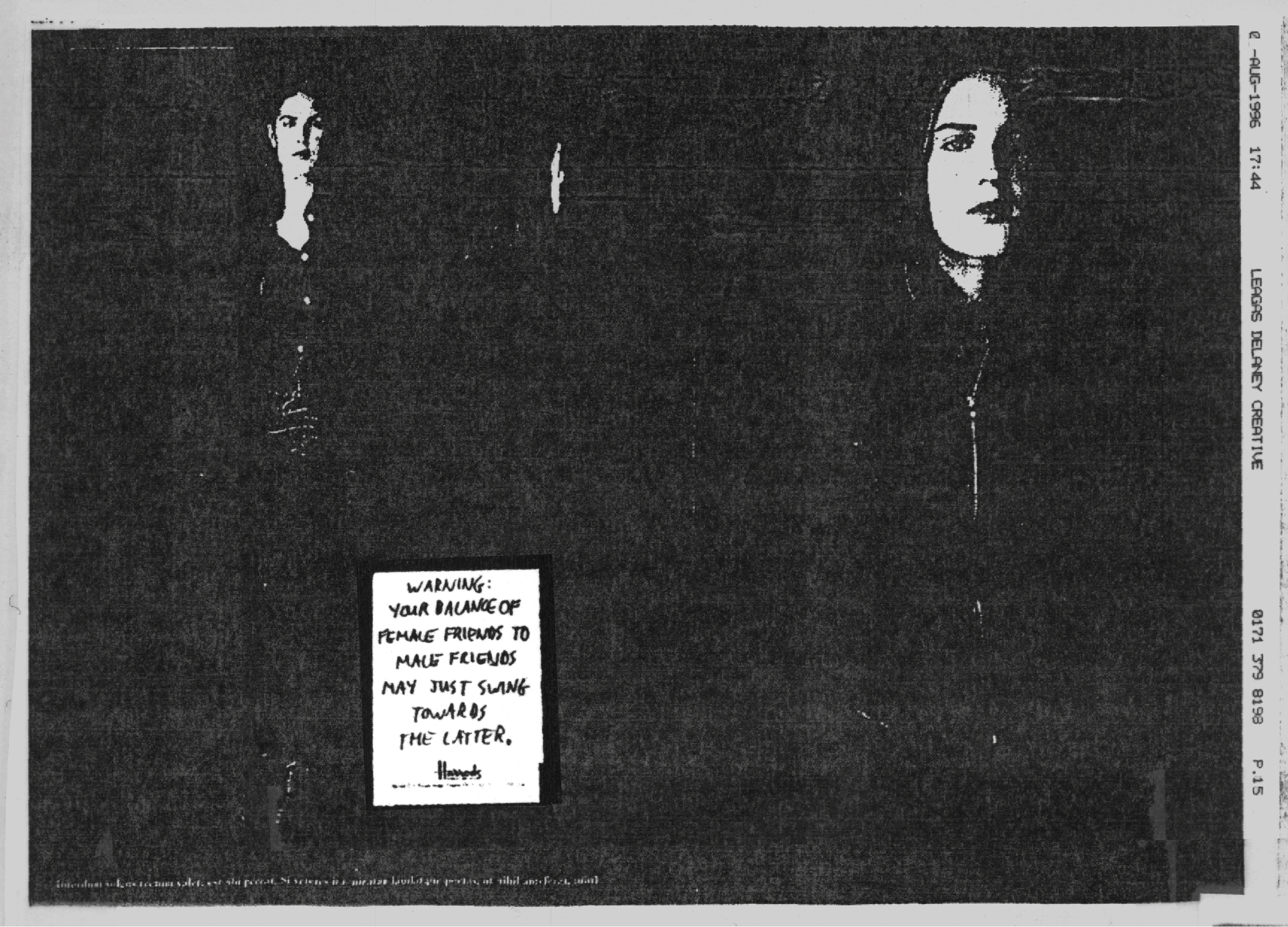
LEATHER JACKETS.
BRIEF: Harrods now have a range of sexy leather jackets for women.
The numbers and words on the right hand side of the image are because the are faxes.
Probably because we sent them to Tim Delaney for approval.


MILITARY COATS.
BRIEF: Harrods stock those cool, military coats that are now all the rage.
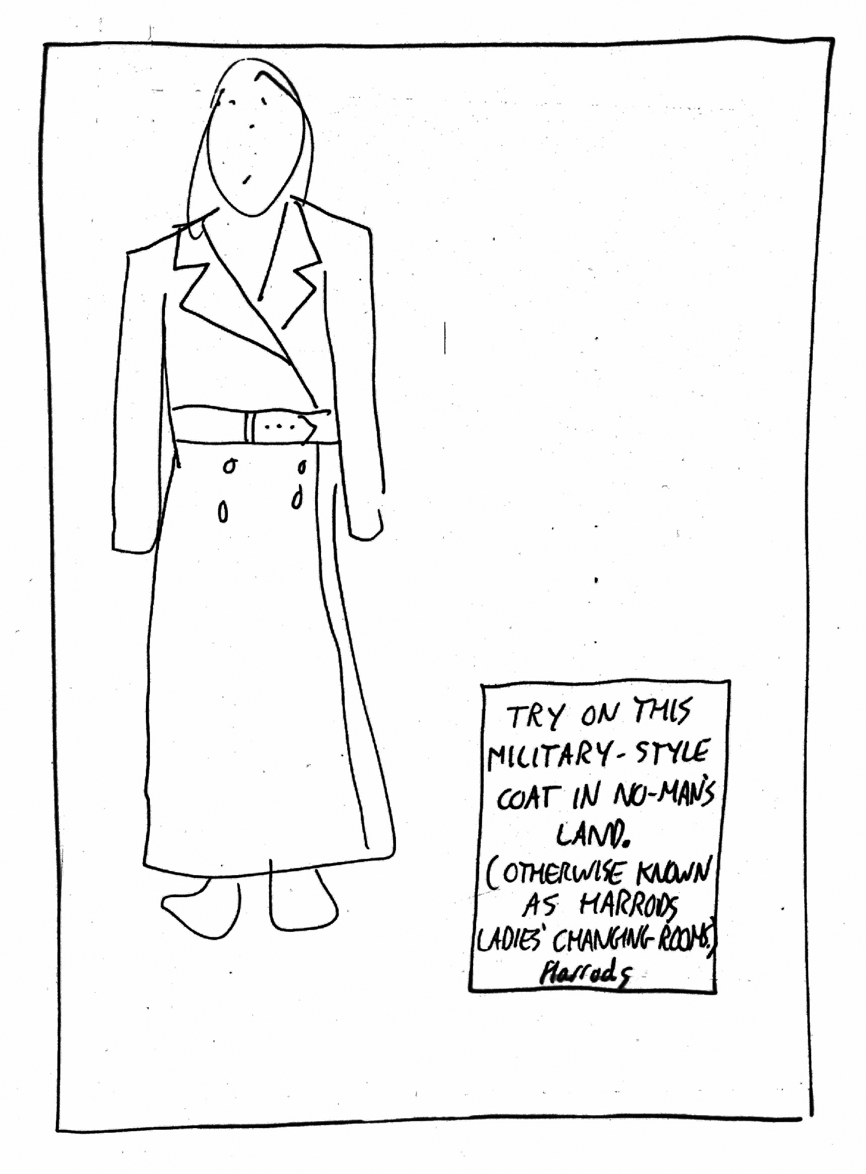
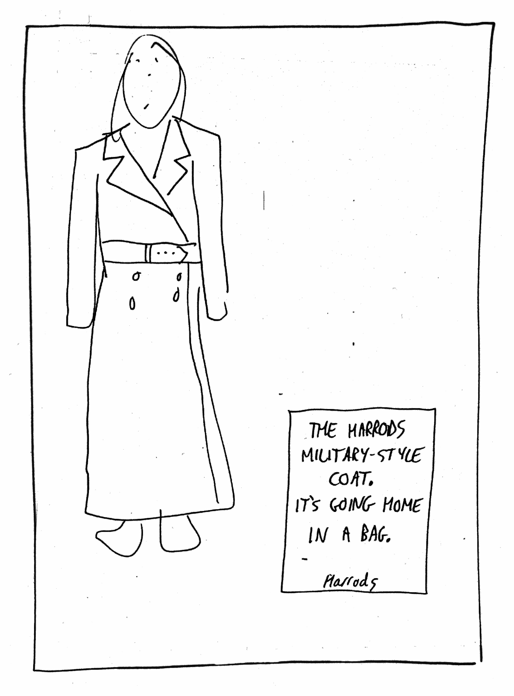

Again, I’ve no idea what ra.
Love the last two though.
(‘Looks like Daphne’s bought it’ is the only rejected ad Sean can remember us doing.)
Is it wrong for fancy department stores to make jokes about being killed?
That’s it.
No more boxes.
For some reason, the next Harrods ad IO did looked like this.


Looking back at these today, the thing that stands out is just how much energy went into that little box containing the words compared to the other 97% of the page.
I’d more or less outsourced the 97% to Cindy and her gang.
Sometimes it paid off, sometimes it didn’t.
And how important are those little words?
They’re not selling or imparting any information, they just offer up a clever tone.
Maybe that’s important?
Or perhaps, as Paul Feldwick said in our podcast – ‘An ad is just a bit weird if it doesn’t have an idea’?
It’d be so easy to make them today – all photoshop.
But would they feel better for it?
Or would the images have that fake, cheesey sheen that photoshop seems to bring?
I also wonder why I kept all these roughs?
What’s the chance I that I’d need some headlines for a posh shop selling women’s military coats sometime in the future?
Perhaps we just liked them?
Or maybe I suspected blogging would be invented decades later?
That’s a belter Dave. Thank you v much.
Your box idea – very objet d’ye
Thanks for caring and sharing so much, Dave.
Thanks Jordi, you’re welcome. Dx
As a veteran of writing Harrods ads while at PKL, I love the box campaign, it reminds me of Helmut krone’s ability to create distinctive pages.
Hey Mike, thanks.
You’re right, trying to create an ownable page was something I tried to do with every campaign.
I should’ve mentioned it.
Or maybe that’s another post?
Best,
Dx
A brilliant reminder of how much work goes into finding “the right line”. Thanks for sharing.
Thanks Mark.
It seems weird in retrospect; who judges whether it’s right?
Tim in this instance, but are some of the rejected wrong? Or the approved right?
Dx
Nice trip down memory lane, Dave. Not those ads, I was probably still in school and not in this country yet. Even if I was, definitely not posh enough to buy Sunday papers. 😬
But the rigour, the thinking, the diligence (and pain) that goes into writing the headlines. I missed that!
For me – as just a production girl back then, this blog takes me right back. Thanks for taking the time to put this together, super impressed you’ve kept your scamps (and your rejects!)
Hey Jenny, my wife is less impressed that I kept all that stuff. Dx
What a wonderful read. Dave. The effort and wit that went into all those headlines is still truly inspiring. And the shots and layouts are simply stunning – you chose so well with Cindy. I can remember desperately trying to write as intelligently as this (I think it was this morning). As you say, tone is so important. It’s something I’ve observed from both Harrods and Harvey Nichols: it tends only to be the upmarket brands that have the confidence to be humorous and trust their audience to get it. Many clients would file under ‘too clever’, which I’ve always found the dullest feedback of the dullest dullard.
So true Graham, seems like clever has gone out of fashion.
Too elitist?
Dx
If it is, I’m all for elitism
This is another masterclass, as usual.
Thanks for the sharing, Dave!
No worries Juan, thanks. Dx
A masterclass
I was bought a white tie from Way In when I was about 10 (1973). I promptly spilled something down it. I got another one. Did the same thing. Never got anything else from Way In.
Those fuckers! Dx