


“It’s Simon Loftus on the phone, he says he’s a chum of John Hegarty.”
It turned out that he needed some advertising for his family’s brewery.
BBH had a conflict (Boddington’s) so John had given him our phone number.
Simon was not only the Chairman of Adnams, he was a totally inspirational, lovely guy.
I had a cottage in Suffolk, so I knew of Adnams, although they were pretty small, I thought they were quite classy.
Not all ‘spit and sawdust’ like a lot of brewers.
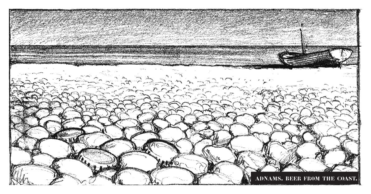
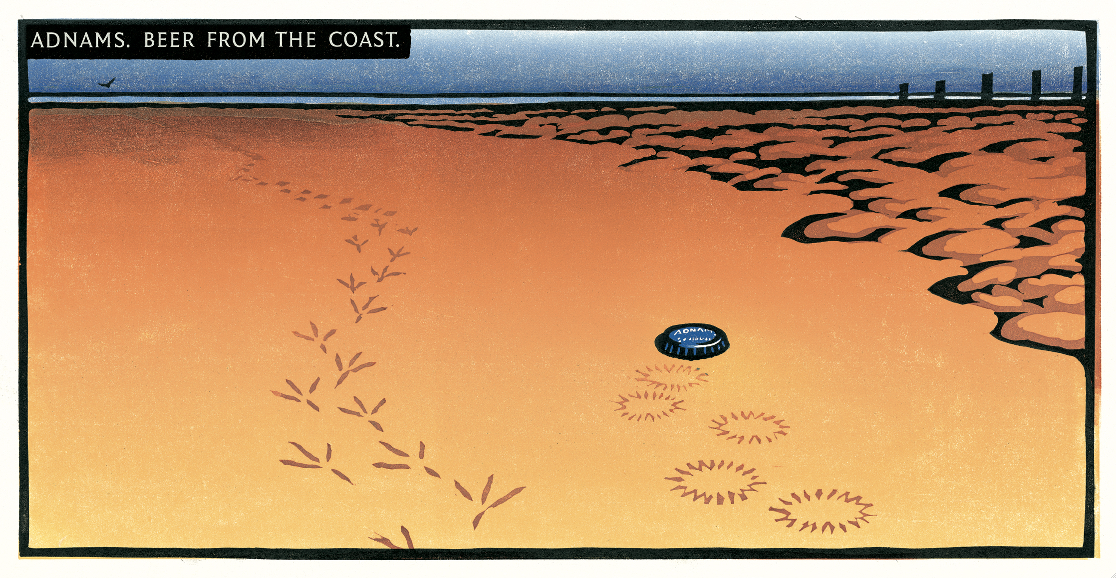
The agency trekked up to Southwold for the traditional pre-pitch brewery tour, to find the ‘silver bullet’, that special part of the brewing process that makes their beer great.
We were told about the unusual hops, the quirky layout of the building even the “special cat” that takes care of the mice.
Who cares?
Next time I see a bottle of Adnams in Sainsbury’s I won’t be thinking ‘Oh, that’s the one with the quirky brewery layout’.
It was all so fiddly and small.
About 90ft behind the brewery was the North Sea.
“That’s got to be unusual, hasn’t it? Is there another brewery by the Sea?’
Planner; ‘It doesn’t affect the taste of the beer’.
True, but if I was looking at a whole stack of weirdly named beers in the beer aisle I might remember that Adnams was from the Seaside?
It’s better than the alternative – ‘Kevin The Mouse Catching Cat?’.
Strategy agreed, what about media?
They had about a million quid media spend, so not enough in production to come over as premium on tv (rookie directors and short time lengths).
But spend it outdoors and they could be the most premium posters around.
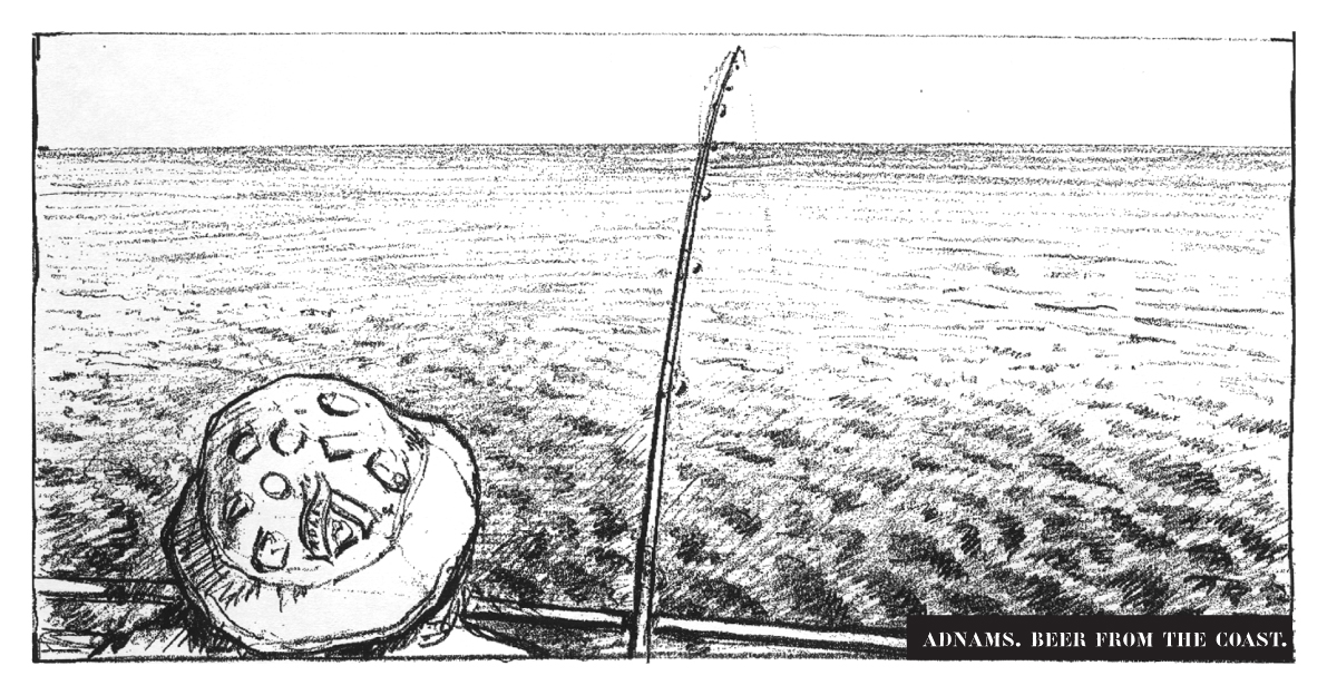
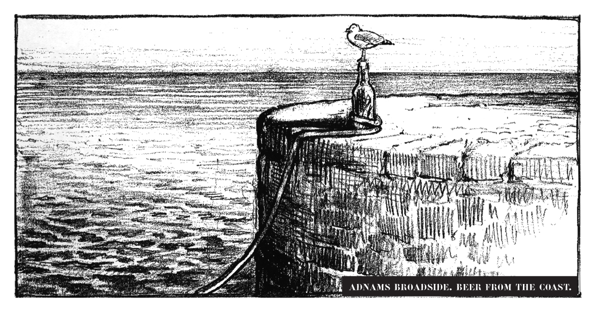
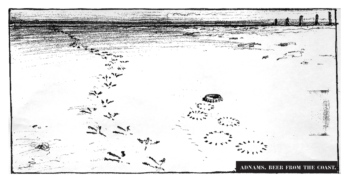
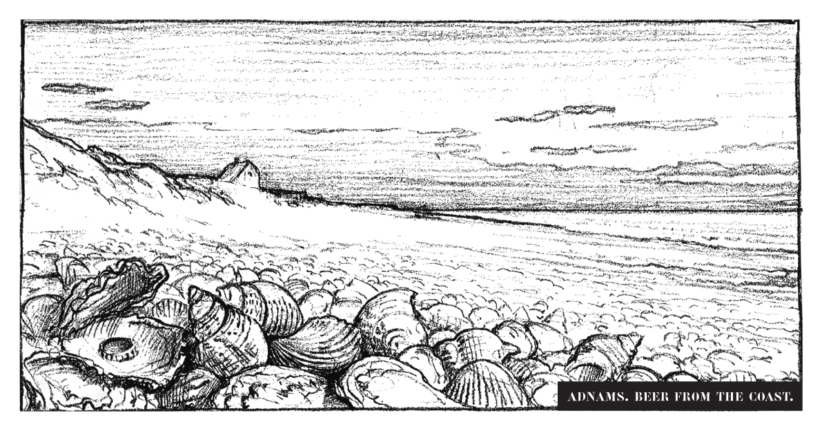
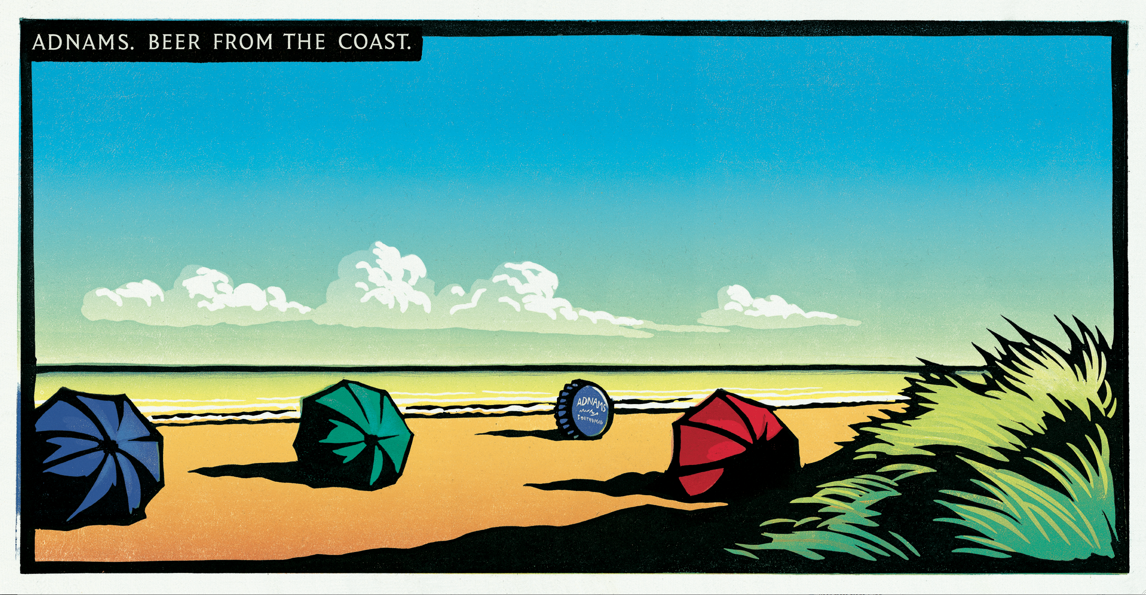
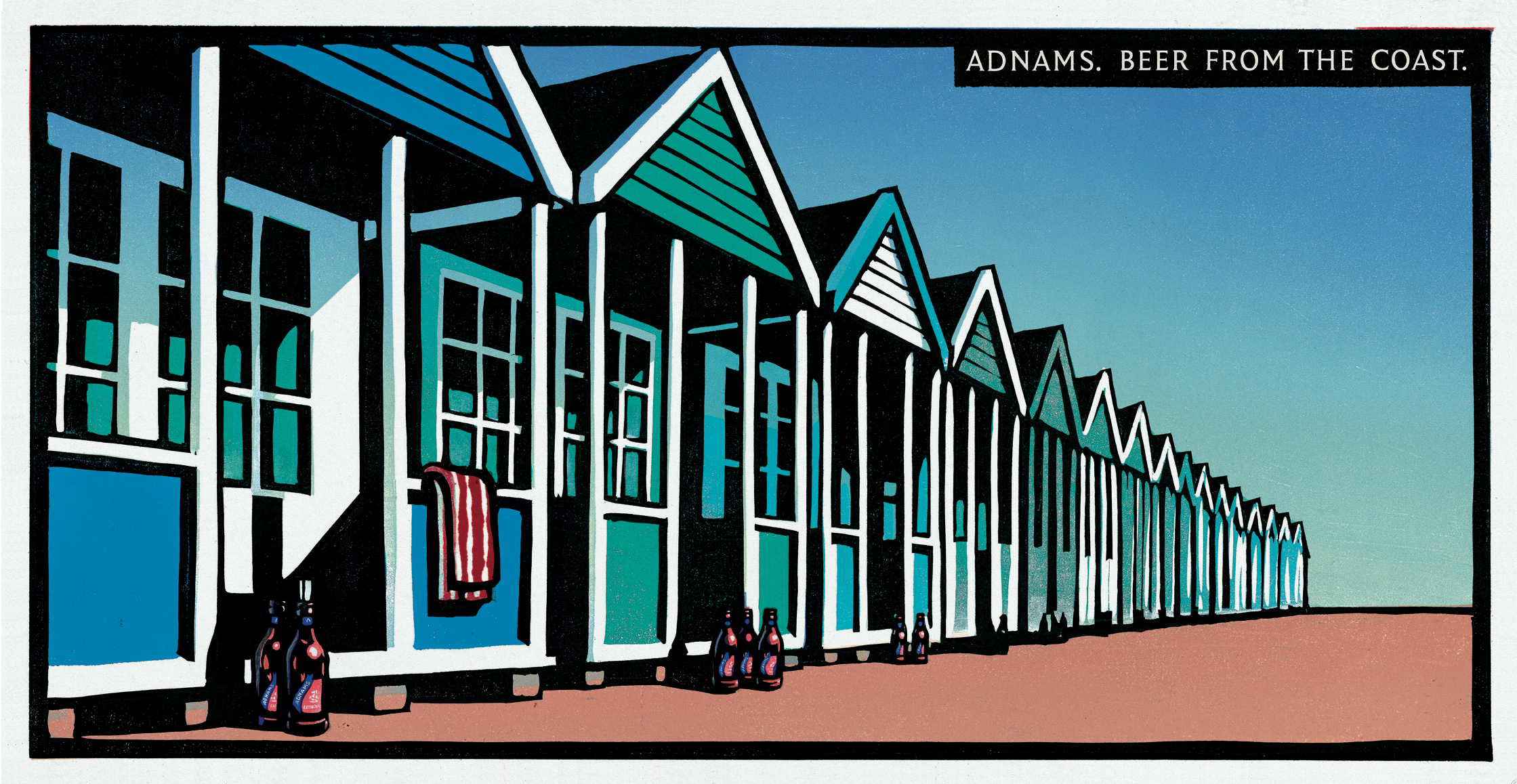
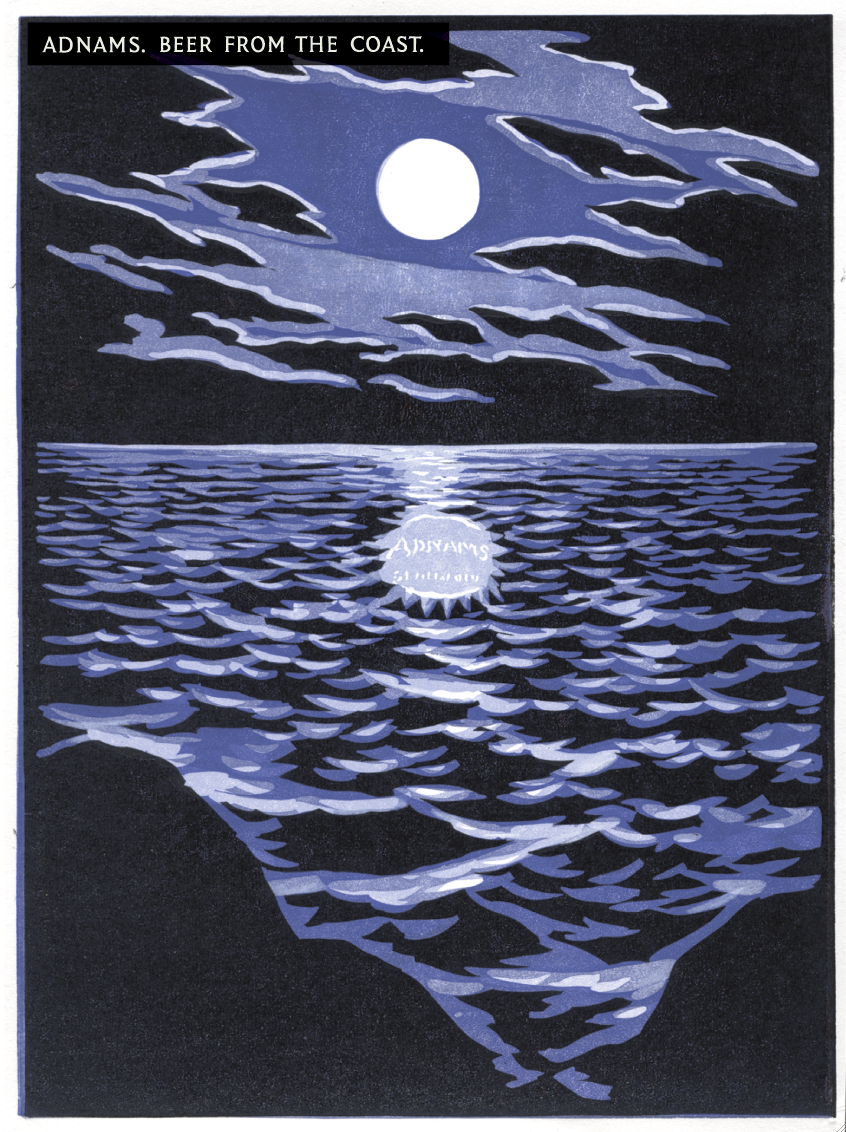
We set about linking beer and sea for an outdoor campaign.

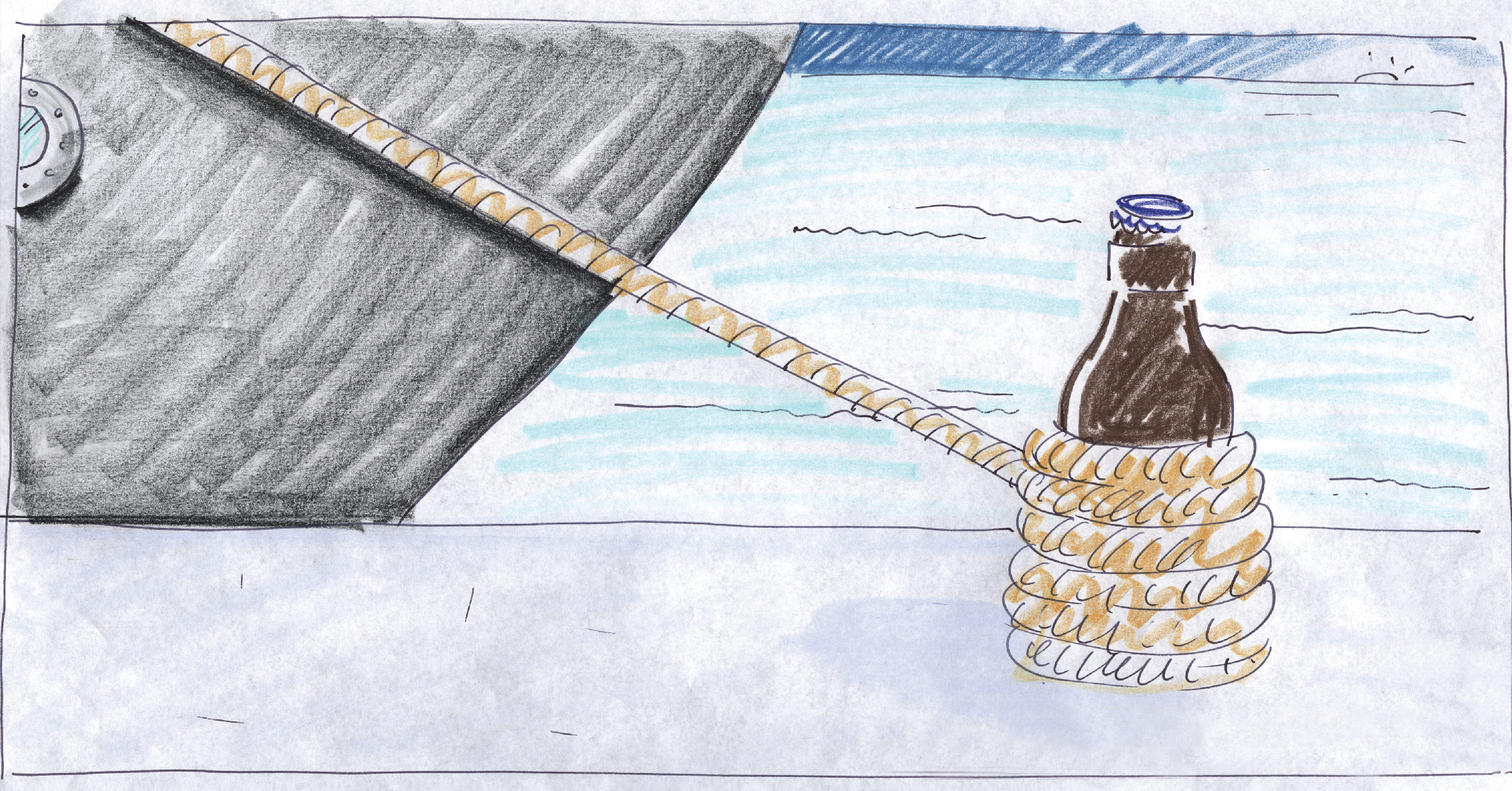


‘From the brewery by the sea’ was replaced with ‘The beer from the coast’, it just sounded posher.

But they also needed to look sophisticated.
Classy, evocative of the British coast – that idealistic view of the Britain of the past.
But without going all retro.
And distinctive, in a style Adnams could make their own.
I looked at the old railway posters from the thirties, the ones promoting trips to the seaside.
(To be precise, in the style of Frank Newbould. If you’re quite geeky, I’ve got a board on him: http://www.pinterest.com/davedye/frank-newbould/)

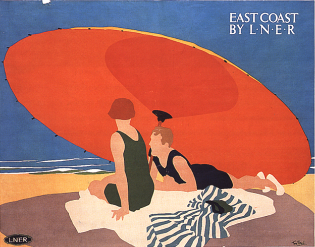


Some kind of mash-up of the two seemed to be the way to go.
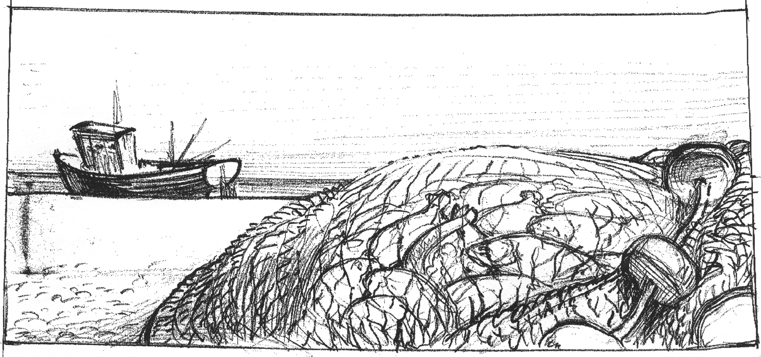
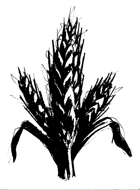
Wood/lino cuts made sense, which meant Christopher Wormell or Andrew Davidson.
Both amazing illustrators.
In the end, I went Wormell, he just seemed more coasty.
We got him to do some test to show the client that the images could look sophisticated (not scrappy little cartoons like my drawings).


They looked great, but a bit serious, maybe he could do a coloured drawing?
He did one, in pastels.
To the trained eye it looked absolutely, well… shit.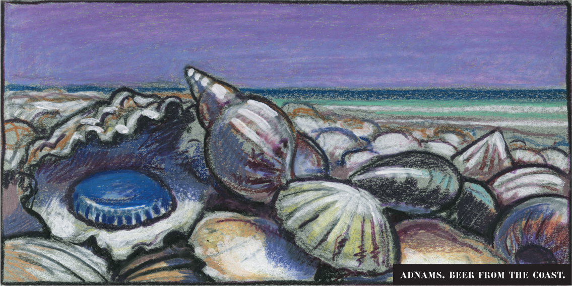


Maybe I’m just not a pastels kind of guy?
To get that premium feel he’ll have to cut one, a finished image.
He agreed to do a test for £500.

Wow! Amazing!

We pitched.
They loved it.
All twelve Adnamites clapped at the end of the pitch.
Not because they thought it was good creatively, but because it felt like it accurately represented them.
Previously, their advertising had tried to make them something they weren’t – Jack The Lad beer boys.
They’d been told ‘that’s what you have to do if you want to appeal to the public…it’s advertising’.
We won.
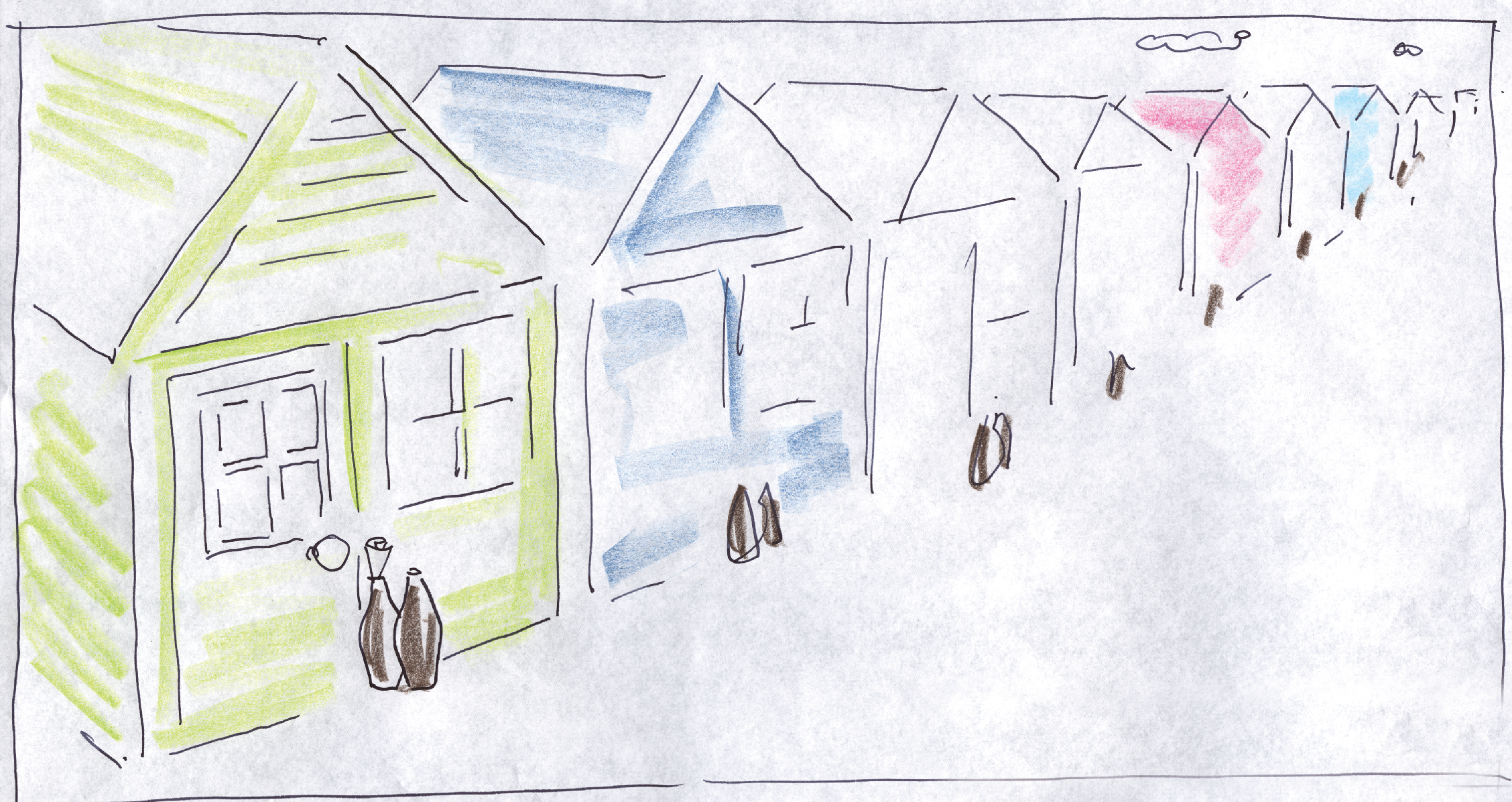
First job; illustrating the other nine 48 sheets.
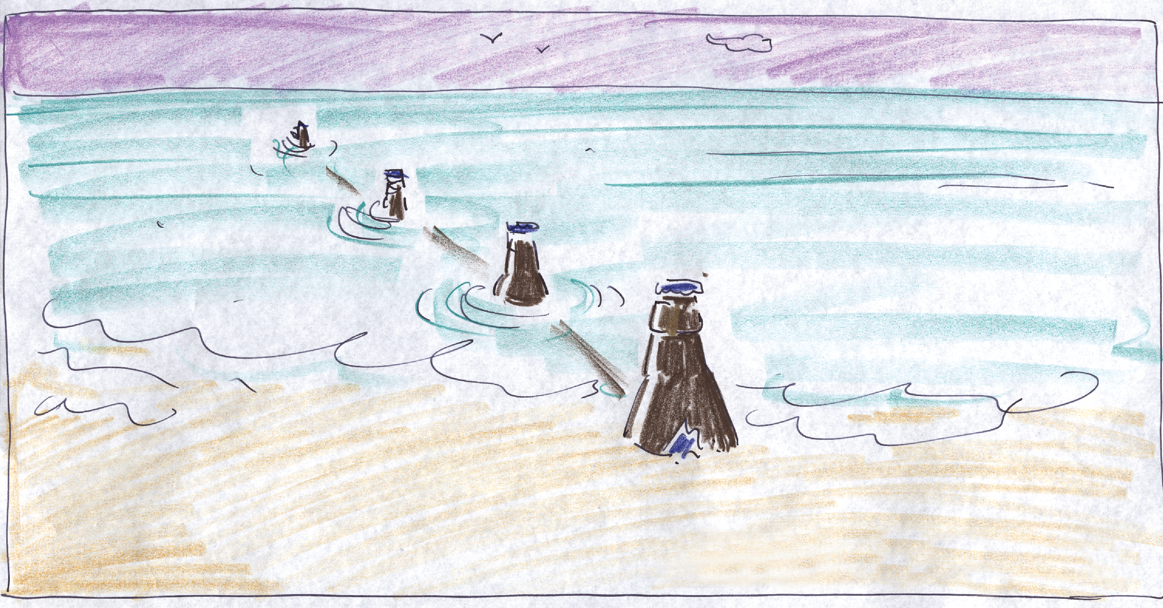
The bottle caps worked well, they felt effortless and iconic.


The bottles were ok, a bit more addy, a bit less stylish.


The pump clips felt more contrived.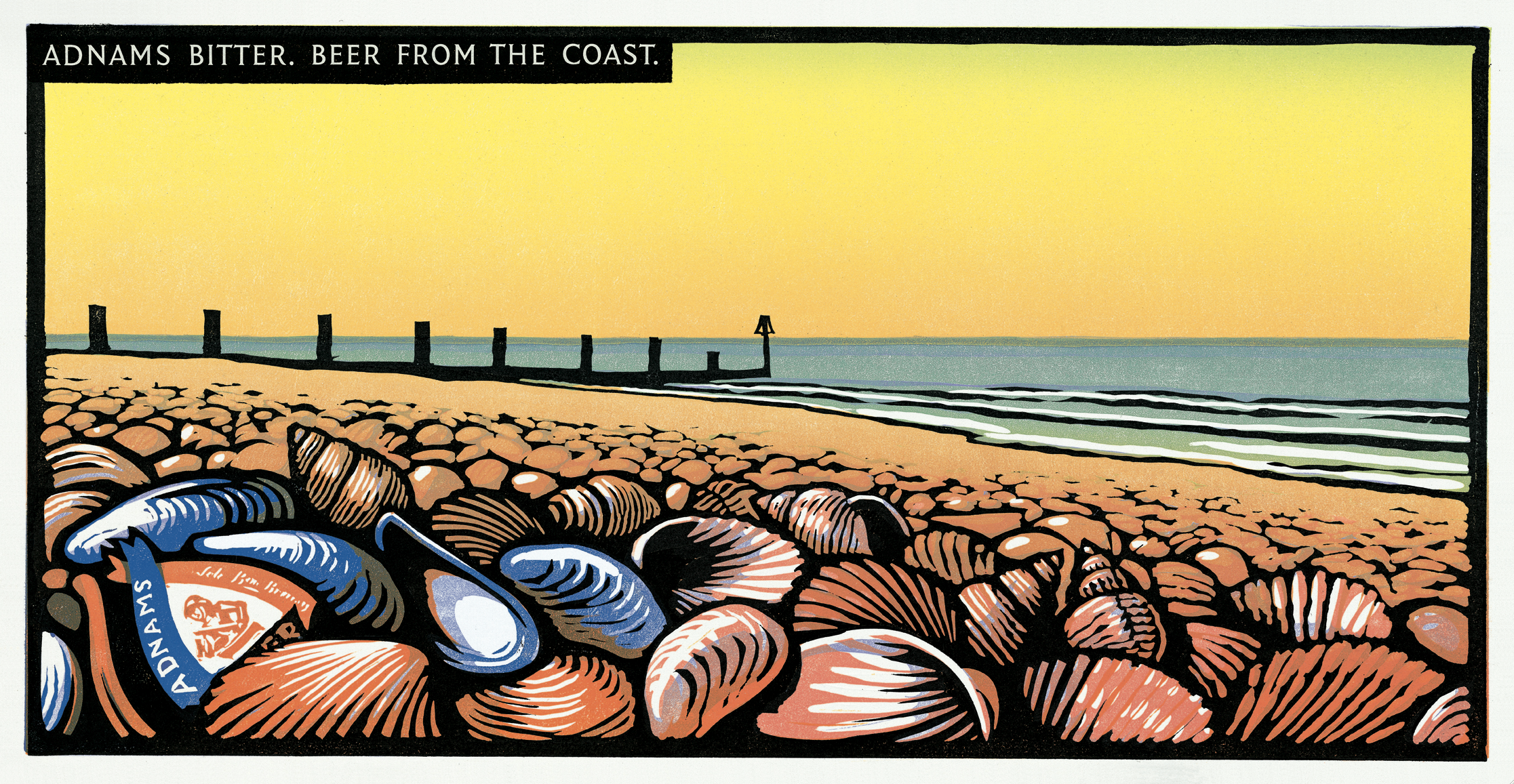


We then set about transforming everything they produced into our new style.
Trade ads.


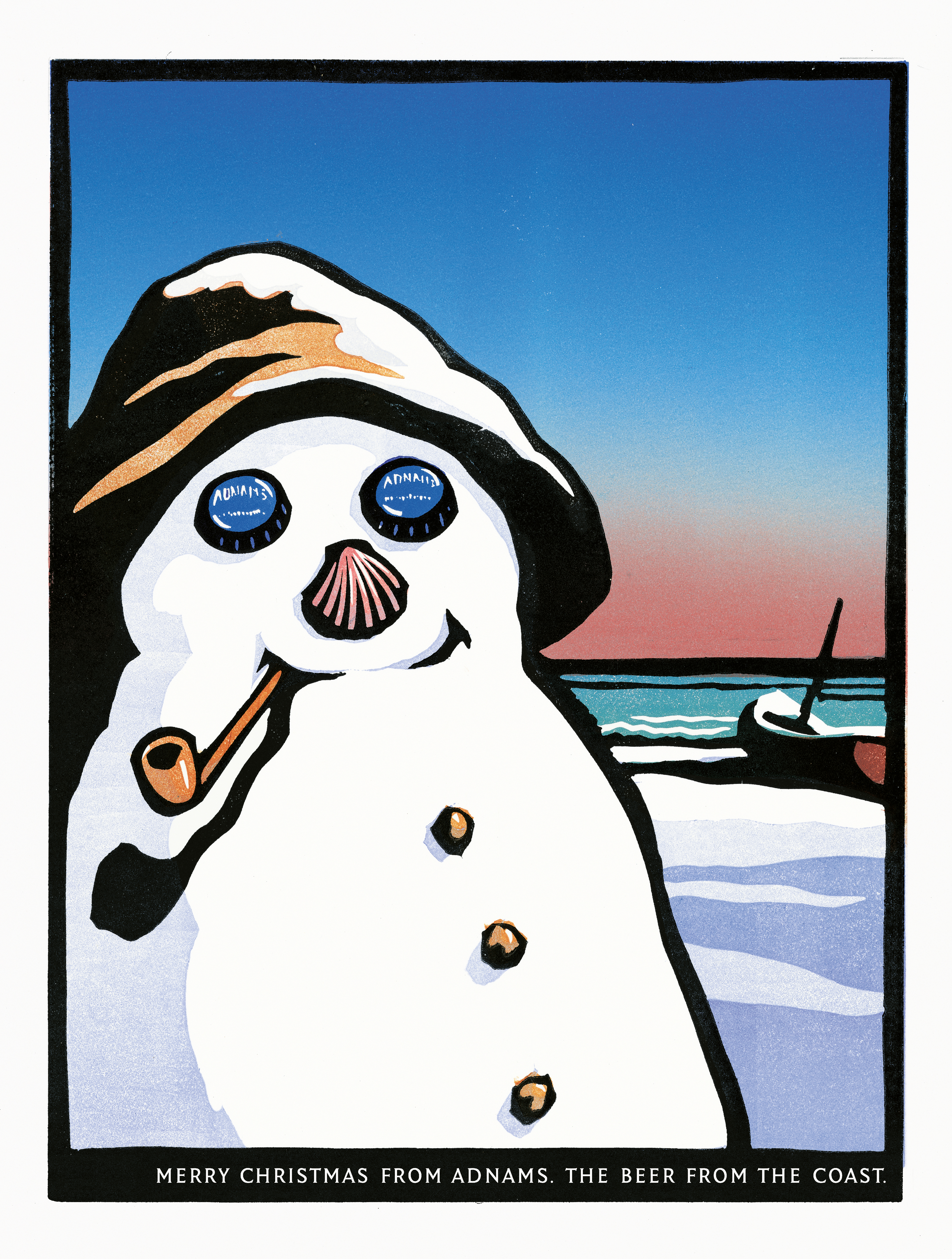
A Christmas ad and card.


Pump clips.
Here’s my rough.

Here’s Chris’s.


Here’s the finished pump clip.

Another one
.

Beer mats.
Turning 48 sheet posters into square beer mats was a problem.
48 sheets are effectively two squares side by side.
I couldn’t crop any of the posters within a square.
I’d either crop out the main bit of the drawing or the bit relating to Adnams, the cap, bottle or pump clip.
They just didn’t work.
Then, like most problems, the problem is the solution – break them in two, front and back, and people could match them up like a little game.
(Ok, it’s no FIFA 14, but it’s a little bit of engagement.)


Then…nothing.
I think the feeling up Southwold was that they’ve done their marketing, maybe review the situation in a decade or so.
We advised them to invest in an ongoing dialogue, to build on the awareness and goodwill the campaign had generated in the first year.
I tried to hustle up more ideas.
It was tough, because I’d think ‘What haven’t we used from the coast? (NOT seaside), we’ve done pebbles, boats, groynes, fishing nets, shells, beach huts, harbour bollard things…whatever the hell they’re called – what’s left?’
Nothing.
I’d imagine wandering up and down the coast trying to think what I’d find – ‘Sea – done it…Sky – not coasty enough…Pebbles – done it…Grass…not coasty enough…Seagulls…not bottle or cap shaped…er…sea again…’
But gradually you eek out a few thoughts.
Here are some from my notebook.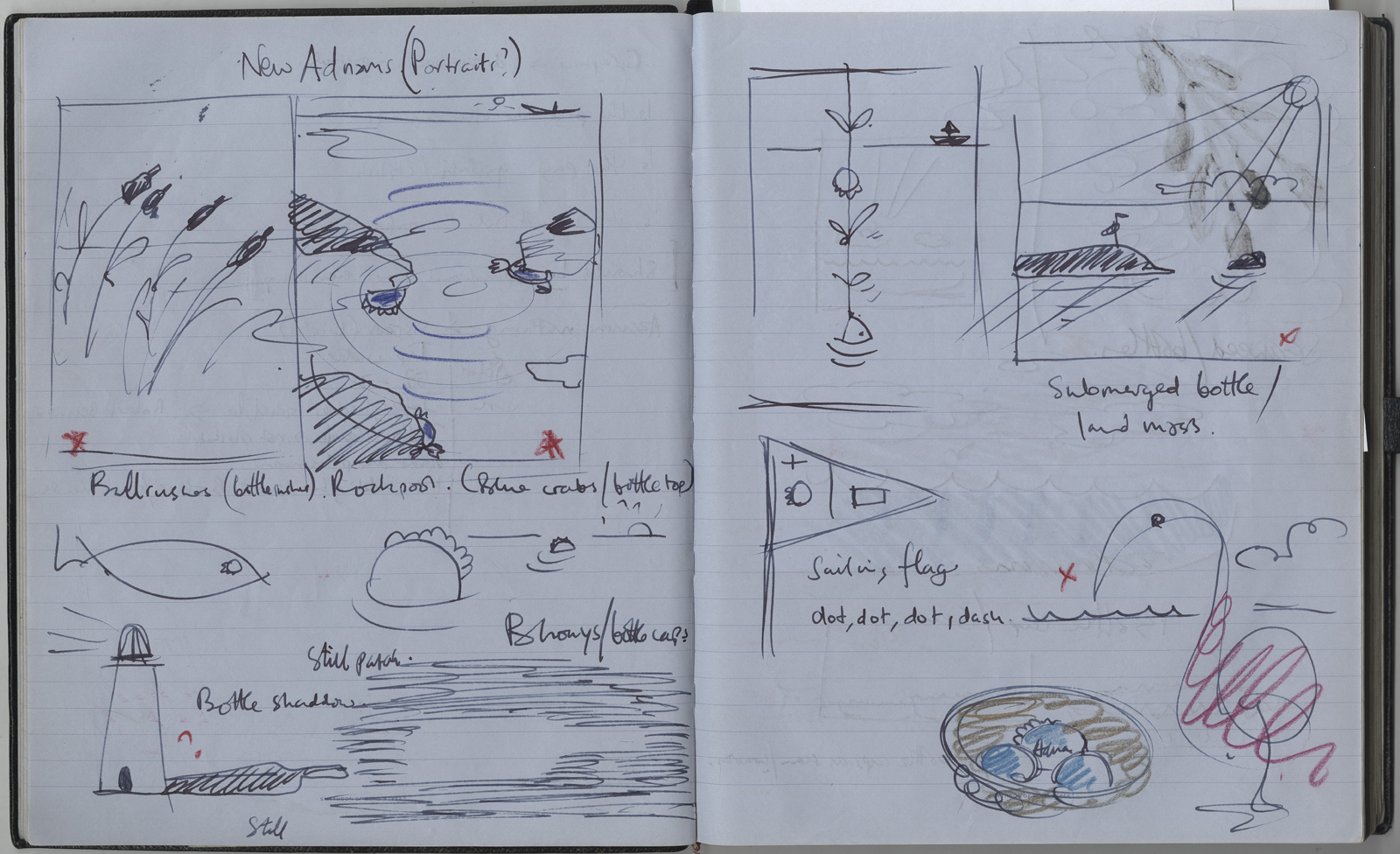
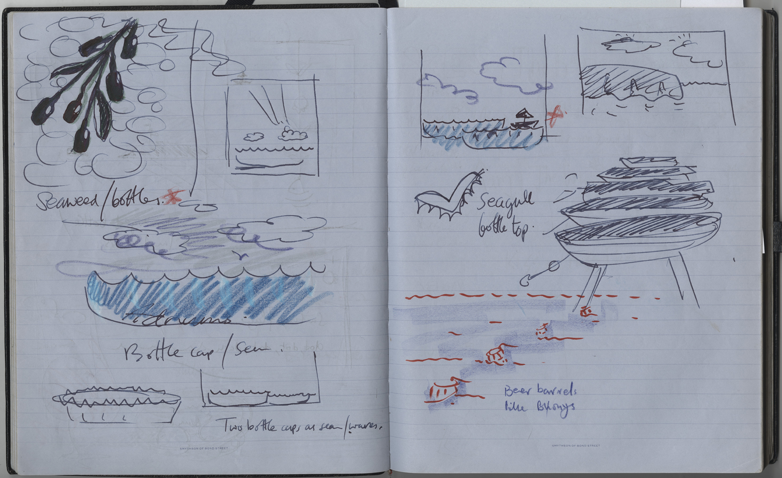


I picked out my favourites and presented them to Adnams.


I’d found out that they were making more money per month selling our ads on tea towels, mugs and all manner of merchandise than they were paying us fees.
So my angle was ‘let’s at least get a small batch of illustrations together, which could be t-shirts, tea towels, tea cosies, press ads, posters or whatever. It’s content you can use’.
They agreed.


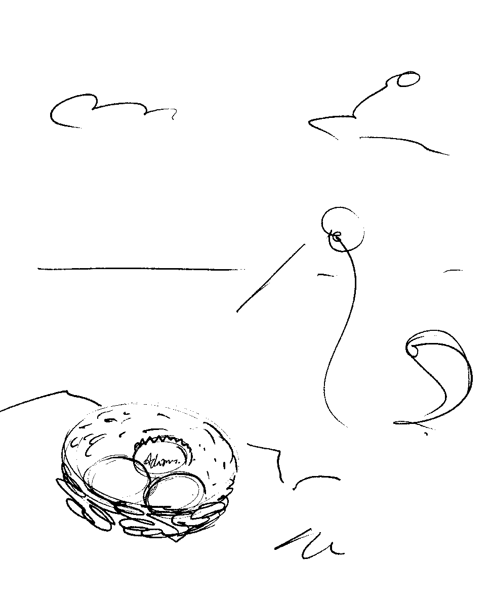
My favourite was this one, I liked that you had to discover the idea.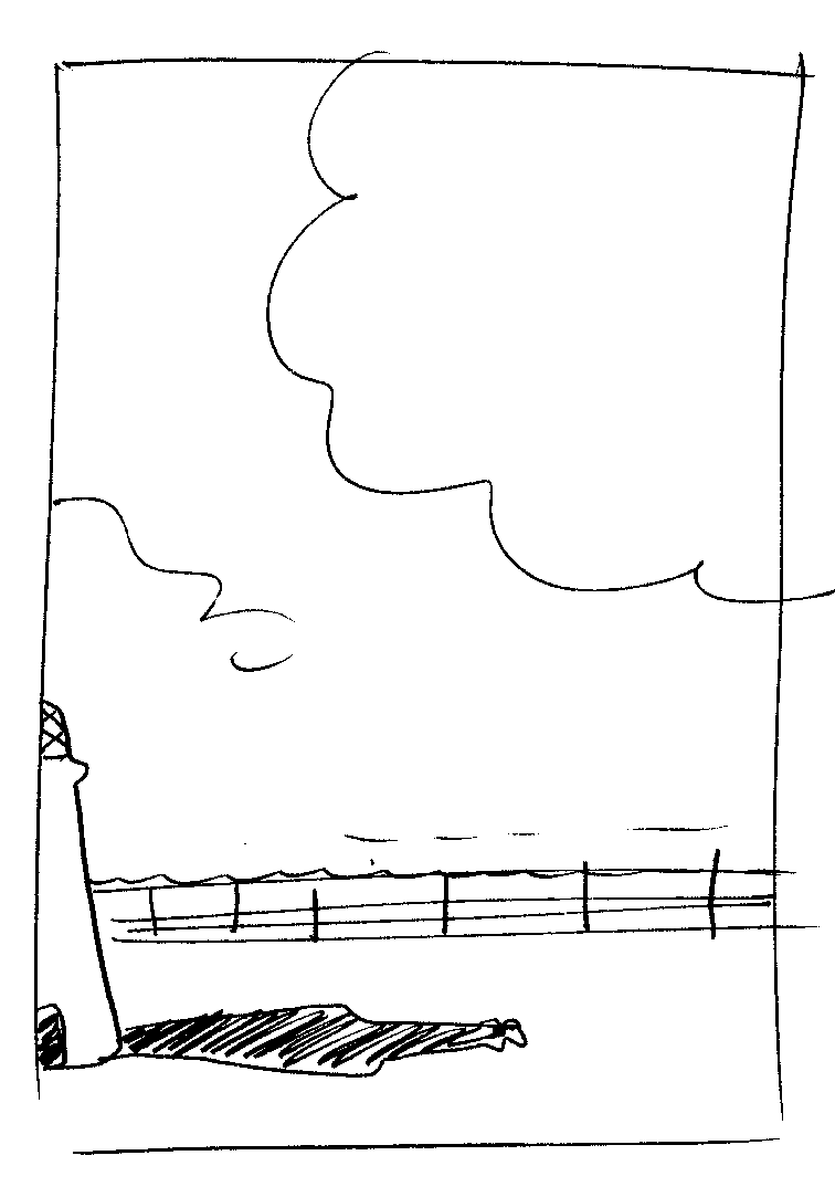

The first print looked…weird, more like a printing error than a sunset.


We never ran the one below.
I always thought it had the potential to be really strong, but the first print didn’t work at all – the sea was too choppy, the idea look contrived.
In retrospect, a still sea with no waves would’ve worked. (Damn it! Ten years too late.)


They ran a bit as press ads, but didn’t get used much.
Adnams then went into hibernation for a bit, until I worked with them again a few years later.
But that’s a whole different post; ‘ADNAMS Part 2: Words’, will follow…at some point.