I once pitched for Vertu (I’d never heard of it either).
It turned out to be a luxury mobile phone brand and when I say luxury, I mean luxury, some phones were a hundred grand a pop.
Ironically, given some of their products were made of solid gold and had diamonds stuck on them, the brief was “to take the bling out of the brand”.
Their previous advertising had desperately tried to justify the price – ‘thousands of hours of this, precious stones that, polished with Unicorn’s jizz’, etc, etc.
True luxury brands don’t have to justify their existence.
They have swagger, bordering arrogance.
Their vibe is “If you don’t like our stuff you can fuck right off.”
We thought they should stop apologising and trying to justify their existence, in advertising terms, their problem wasn’t that they were too blingy, the problem was they weren’t blingy enough.
WE MADE SOME RULES FOR OURSELVES:
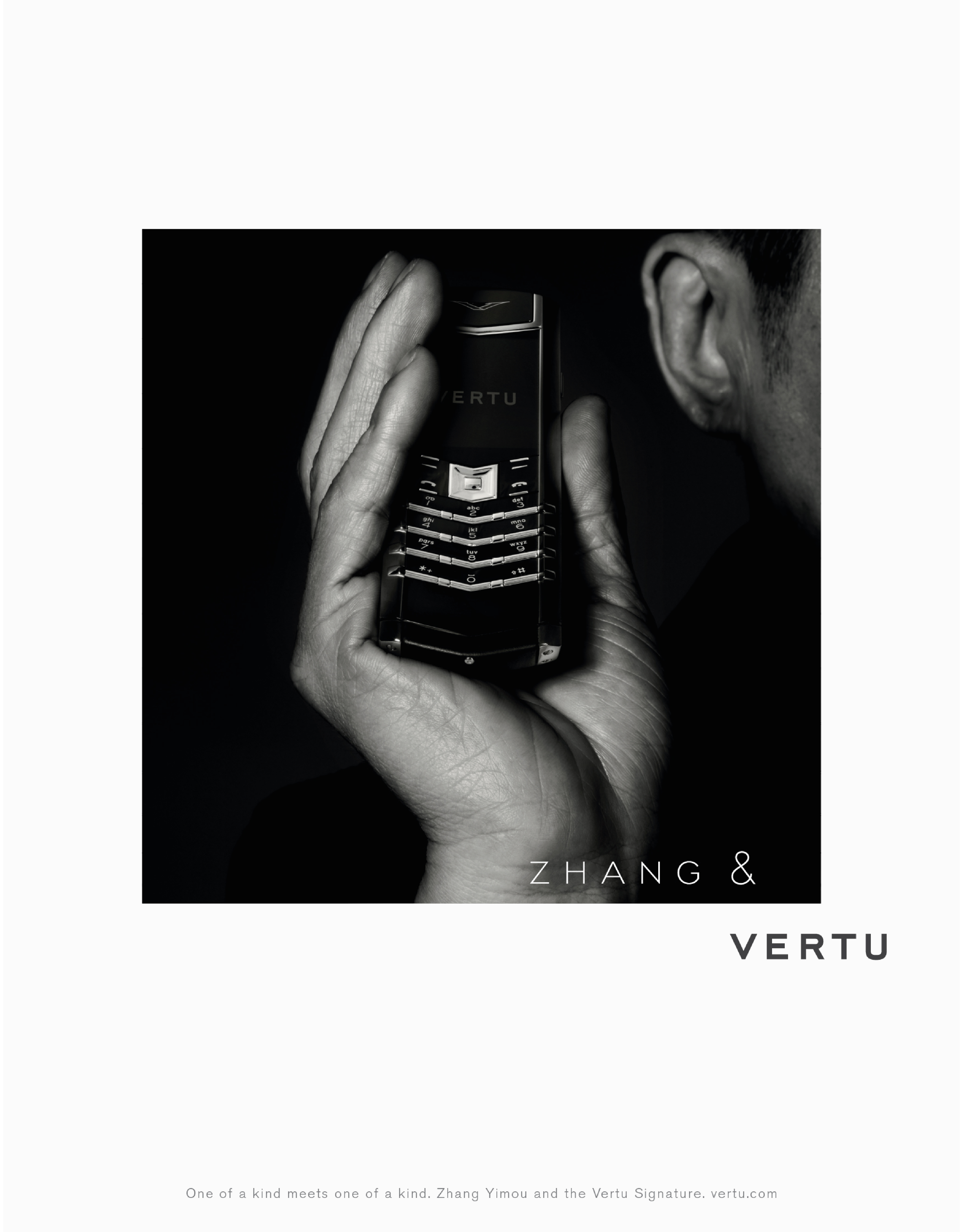
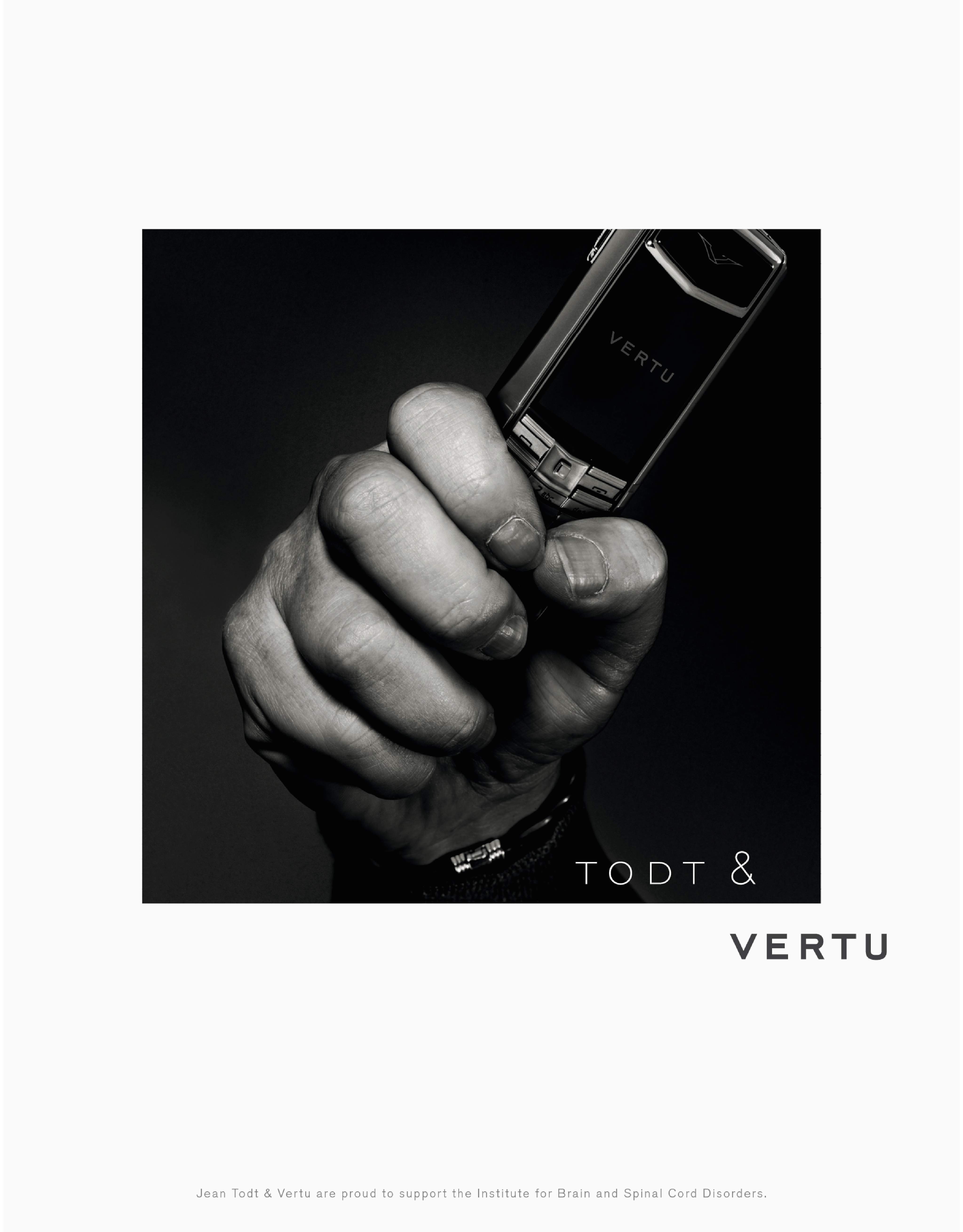
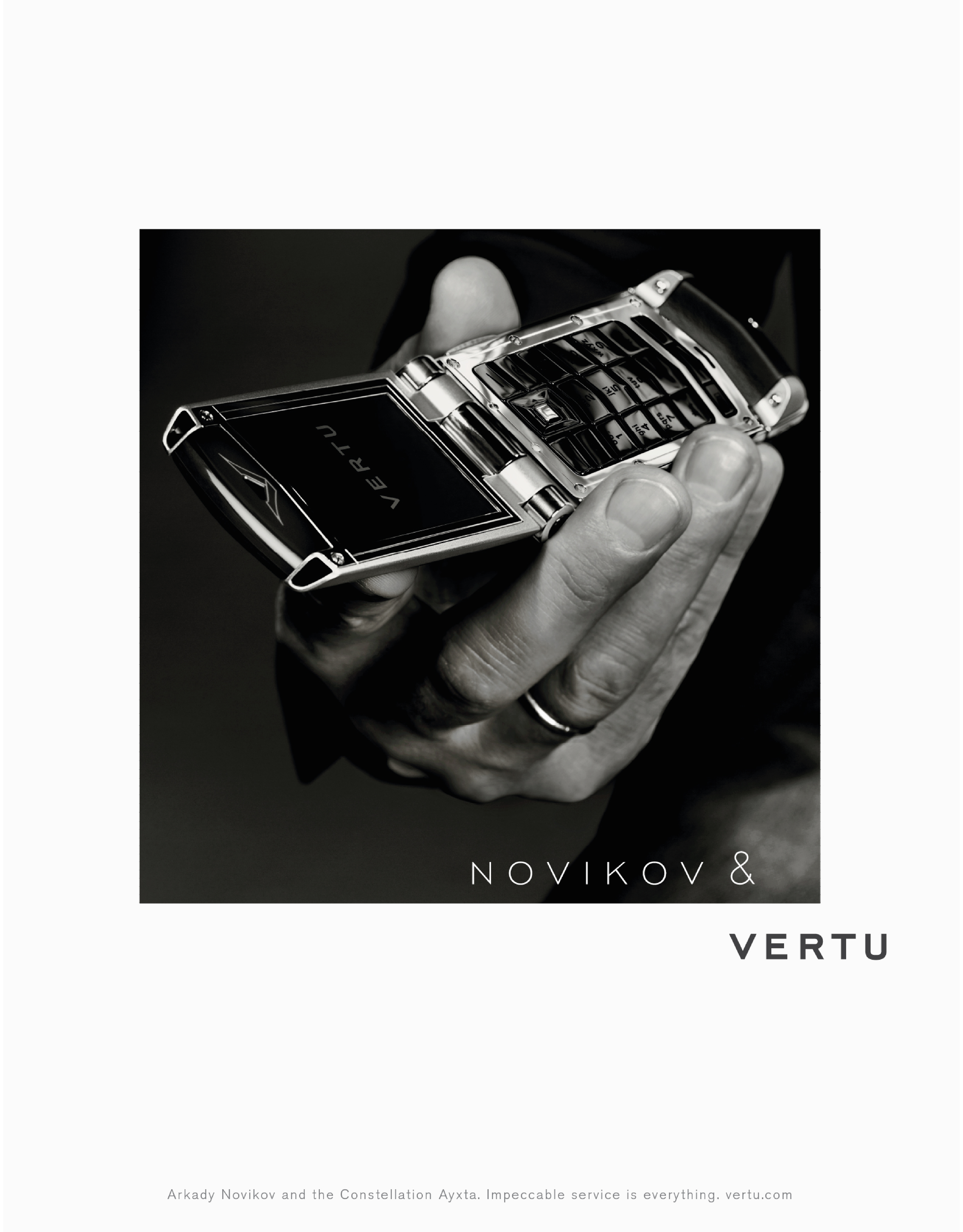
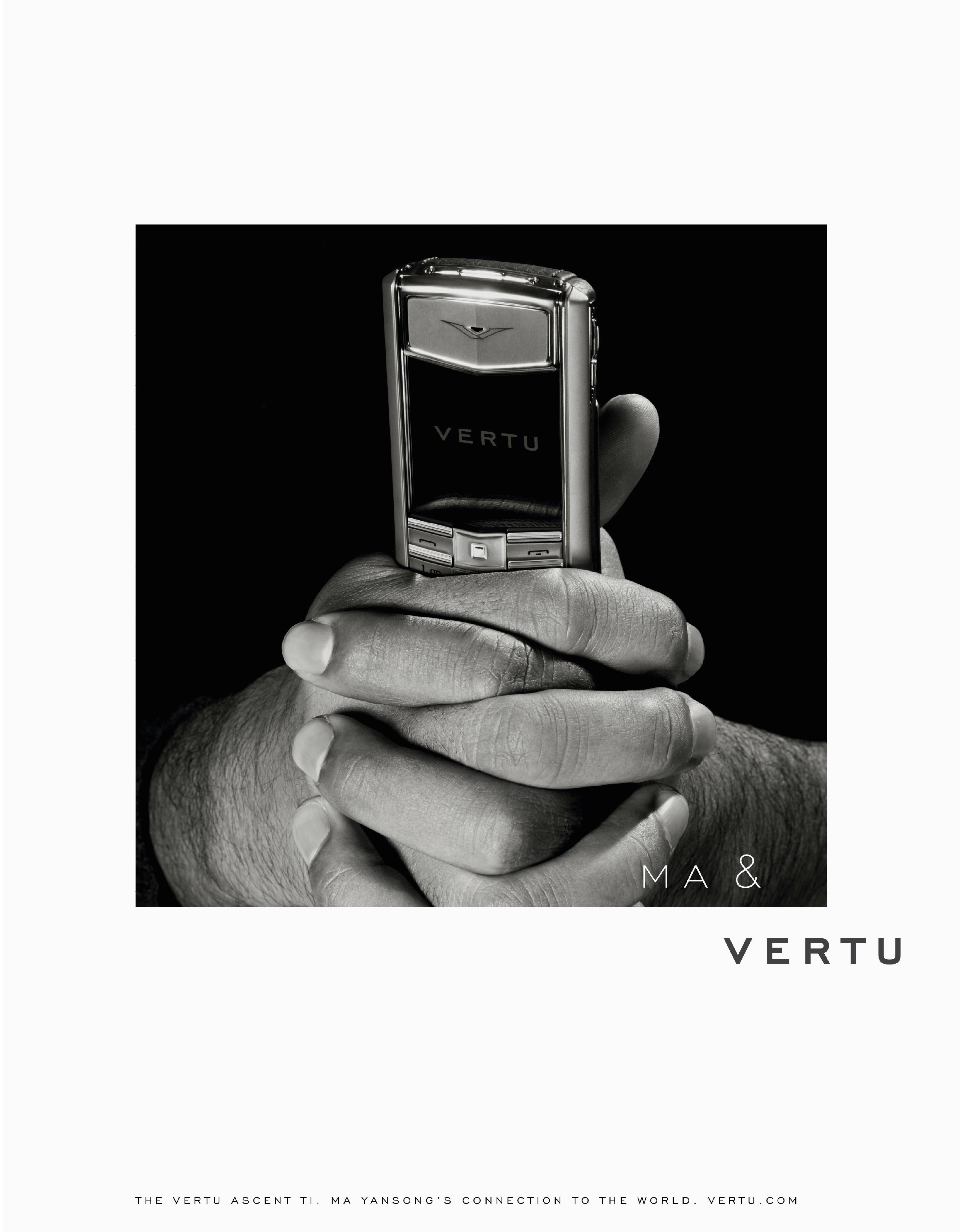
1. Show the phone being used by people with gravitas (not celebrities, people with jobs).
2. Don’t say much, just be, look supremely confident.
3. Store staff had told us that if they could get a phone in the hands of a customer, they increased their chances of a sale.
Because the phones were very tactile and weighty, so we wanted to try and capture that in the photographs.
PROBLEMS:
1. Showing someone famous AND a product is tough when the product is so small, it’ll be swamped by the famous person.
Show David Beckham driving a car and you’ll recognise him AND see all the details of the car.
Alternatively, show him using a phone and the phone will vanish.
2. How do our ads stand out when famous person + product is a very familiar ad construct?
ANSWER: We just show famous people’s hands – creating a distinctive, own-able visual style AND allowing the premium product to be seen in all its blingy glory.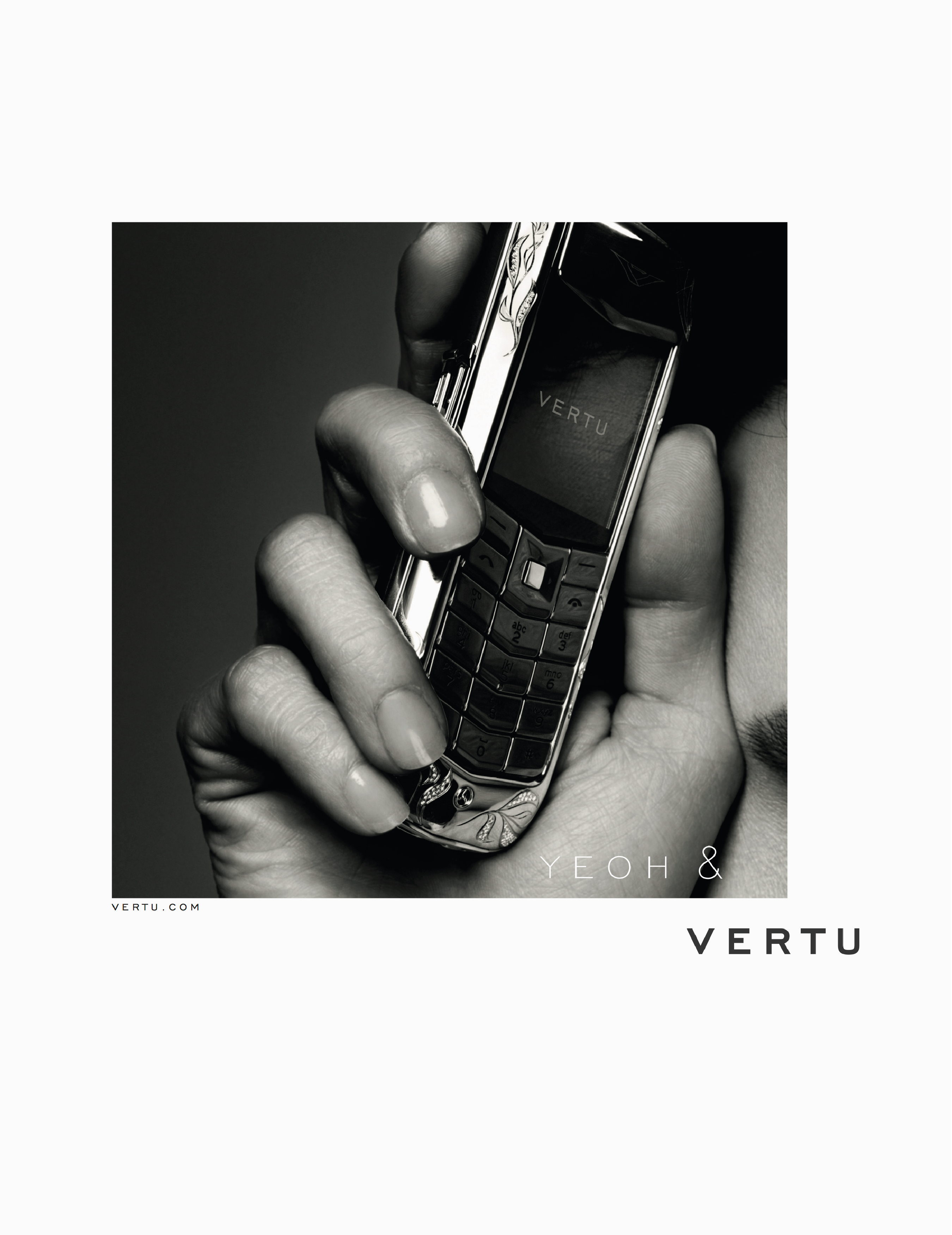 We found out we were the only agency not to offer up a way de-blinging their diamond encrusted phones. So we won.
The ads look simple enough now, but often the process in making them complicates them.
Stuff gets added, sentences get lengthened, nothing is left to the public’s imagination.
Often, very intelligent, well meaning comments can kill a brand, particularly a luxury brand.
THIS IS HOW IT COULD HAVE GONE:
“I LOVE IT! Just one thing, would it be possible to pick a shot where we could see Michelle’s face?
We’ve paid all that money to use her after all.”
“That’s better. I wonder whether we should put ‘Michelle’ in front of ‘Yeoh’ just to be on the safe side?”

“Excellent! Excellent! Whoa!… Hang on, the phone’s a bit hard to see – perhaps we should put a pack shot at the bottom of the ad, elegantly done, of course.

“People are used to seeing Michelle in colour, could we look at using a colour photo?”
 “Fantastic! Love it! Oh… hang on, what if someone likes the look of that phone and wants to buy one?
Shouldn’t we show them where they can be bought? Let the dog see the bone, so to speak?” “This might not work, but a friend, who’s by no means a marketing expert, made an interesting suggestion – swap the ampersand symbol for a love symbol? It’s more of an endorsement…She… ‘Loves it’.
Could we just look at it?” “Ooh no, looks tacky. Let’s just say it with words: ‘Michelle loves her Vertu’.
Much classier than that trashy symbol.”

“Better. Much better. But it now begs the question ‘why does Michelle Yeoh love her Vertu phone?
Could we just add a smidge of copy?”
 “Oh. My. God! You know what you’ve done don’t you? You’ve only gone and created a frickin’ masterpiece!
Thank you. Thank you sooo much.”
Fortunately, that wasn’t how it went.
This is how the campaign ran across the world for the next five years.