In 2004 Nick Bell became President of D&AD, one of his first duties was to choose the designer for the next annual.
He chose me, or CDD to be more precise.
Back in 2004, the D&AD Annual was one of the few places you could get a concentrated hit of good advertising and design, consequently they were collected.
Getting the chance to design one was a great honour.
1st IDEA: If a thought is printed in the D&AD Annual it’s considered out of circulation.
From then on Creative Departments take joy in killing ideas with a casual ‘Been done!’
So the idea was to print the annual on overtly recycled, browny papers with a warning sign on the front saying ‘DO NOT RECYCLE’.
I liked the cognitive dissonance this would create, it looks ethical but it’s anti-recycling?
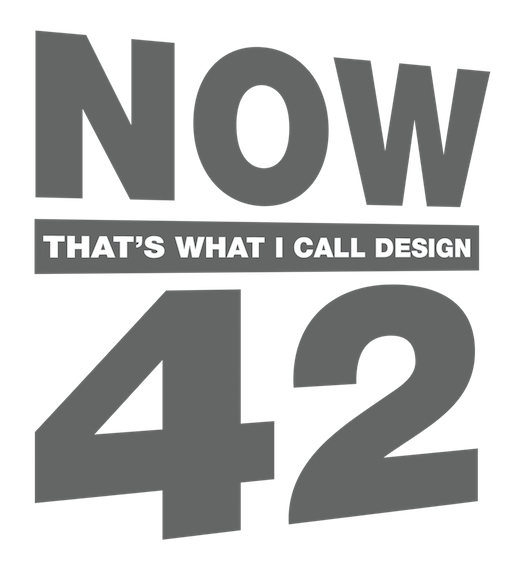
2nd IDEA: Spoof the ‘Now That’s What I Call Music’ albums.
Less rational, but it would be cool for D&AD to be a bit cheesy and kitsch, possibly a reaction to some of the previous annuals that took themselves so seriously.
I also thought there’d be a lot of mileage in the music angle, in parodying music ephemera.
3rd IDEA: A pencil makes you immortal.
A pretty straight forward idea based on the thought that if you win a pencil you and your work will live forever, being admired by generations, or civilisations.
The visual was three D&AD pencils shot against a goldy, dusky sky to look like the Pyramids. A bit like that old Benson & Hedges poster.

The 2nd idea was bought.
Ok, so how do we flesh it out?
Maybe the category dividing pages could be designed like album covers?
The the jurors could look like a rock group?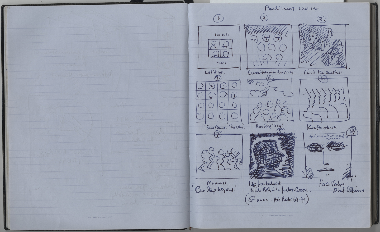
We could put all the guff about who they are, where they work and what they on the other page.
Hang on, the book is square…a spread would be two squares…we should have the front AND back of an album.
The jurors names could be arranged like song titles, the numbers work; albums tend to have about the same amount of tracks as juries had jurors, eight.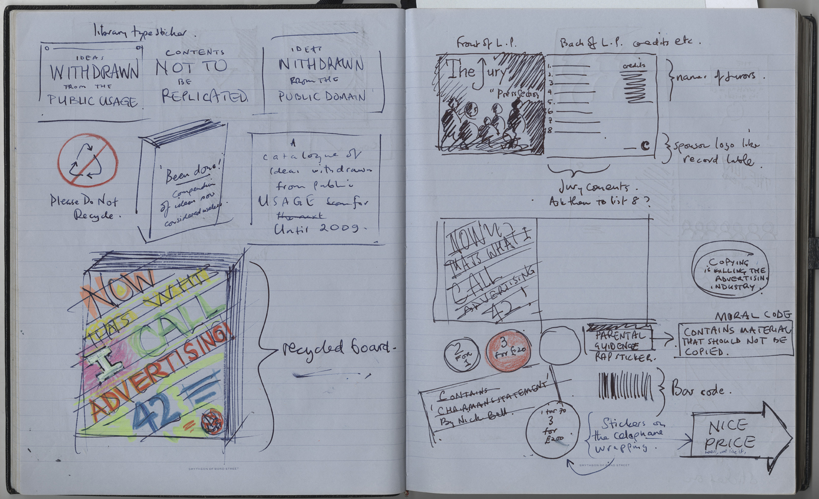 Jeez! Forty odd spreads, that’s a lot of work in a little time.
Maybe I could ask my favourite Designers and Art Directors from around the world to design one?
I started drawing up a list, it was a great, I’d just look at my bookshelves and copy the names: Paula Scher, Vaughn Oliver, David Carson, Fabien Baron, etc, etc. I spoke to Mark Farrow, one of my absolute favourite album designers.
He said no, completely impervious to my arm-twisting and emotional blackmailing.
(To be fair, it’s fun to spoof an album cover design when your day job is advertising, perhaps less so when your day job is designing album covers.)
I tried reaching Fabien Baron, another big hero of mine, but I couldn’t breach his security wall.
I got in touch with Lee Clow, he was a maybe, but seemed to disappear.
John C. Jay was simply too busy running the Weiden Kennedy creative department.
Apart from that, I got my dream team.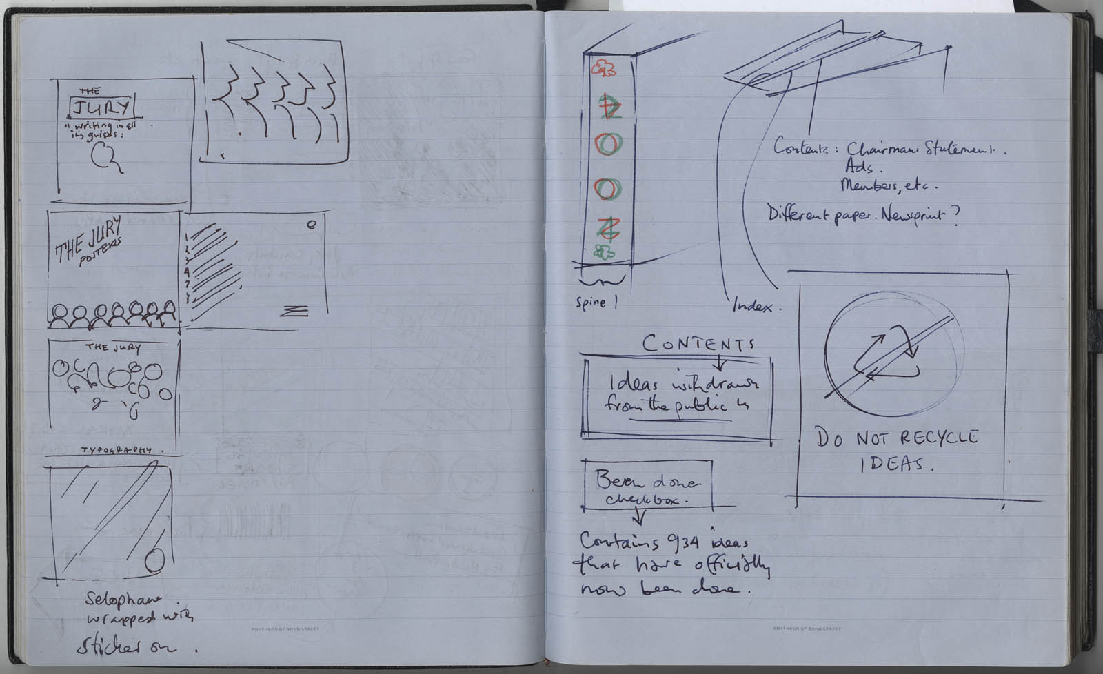
PHOTOGRAPHY: I thought I better work out a shot list for Paul Tozer, (the D&AD photographer), to ensure each shot mimicked clichéd album covers, so he could recreate them with
To avoid the jury photos looking like jury photos, I thought I’d give Paul a start point on each, and arrangement or lighting idea based on rock groups.
I mocked up the front cover…
…and a back cover.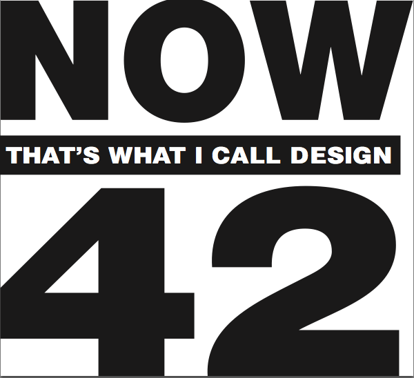
Looks very flat, in both senses, it needs more ‘jump out the cake’ dynamism.
Angle it.
Better, but maybe more angled?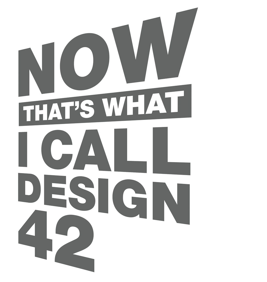
1st PROBLEM:
Who goes on the front; advertising or design?
One cover will read the right way up, (the same as the content of the book), the other cover will effectively be upside down.
Who gets the premium side?
The rival factions fought, would conceding prime spot, ‘Now that’s what I call design & advertising 42’ was suggested, it seemed a bit of a cop-out, like an album called ‘Now that’s what I call music & dance 42’. Just less good,
It was starting to look like this issue is going to kill the idea.
How on earth do you give each equal billing?
Lenticular! We could have both names on the front, each being seen on their own from certain angles.
Also, because it’s plastic it may be like a nod to a C.D. cover, which would make it more unusual and feel special.
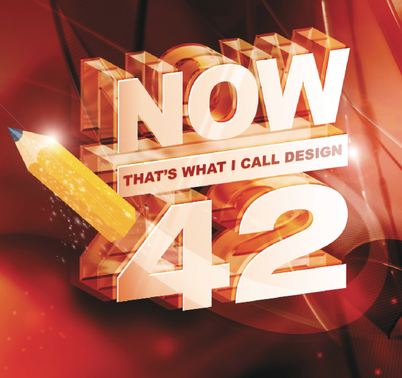
ILLUSTRATION:
I gave Me Company, (a very cool design and illustration collective), the very basic mock-up I’d done to fancy up, make it look 3D, glitzy and spacey, spoofing those over-the-top albums that think they’re it.
1st ME COMPANY ROUGH:
It looked weird.
I couldn’t decide whether it was so cheesy it was funny, or whether it just rubbish.
I decided it was nearer the latter, what to do?
A change of brief: Yes a spoof, but a cool looking one, it’s the D&AD Annual after all.
Also, let’s ditch the red and concentrate on yellow, that’s D&AD’s colour.
2nd ME COMPANY ROUGH:

Much better!
We then had to figure out how the design would break into the eight pieces needed to made up the lenticular.

2nd PROBLEM: D&AD’s lawyers advise us that we can’t spoof an EMI property without their permission.
We ask, inevitably they say no.
We ask again, after a lot of negotiating, they say they’ll let us spoof their property providing a) we say on page one that they gave us permission,
and b) we give them a free ad in the annual.
Done.
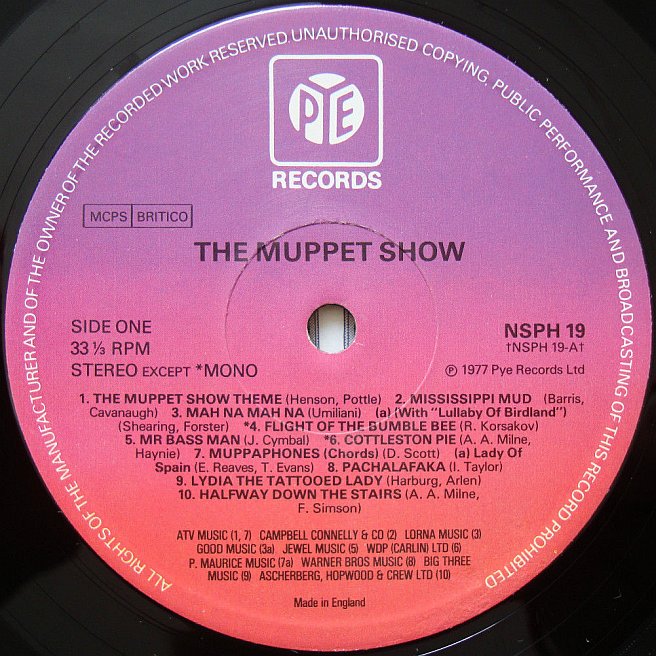
END-PAPERS:
The patterny bit at the beginning and end of fancy books, sometimes, in old ones it will be swirly marbling.
Maybe they could look like the albums paper inner sleeves, the Warner Bros ones had a repeating pattern of their logo printed on them, maybe we could echo that?
Also, it would be a good place to bury our permission from EMI.
We scanned an old paper sleeve and started ‘echoing’.

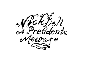
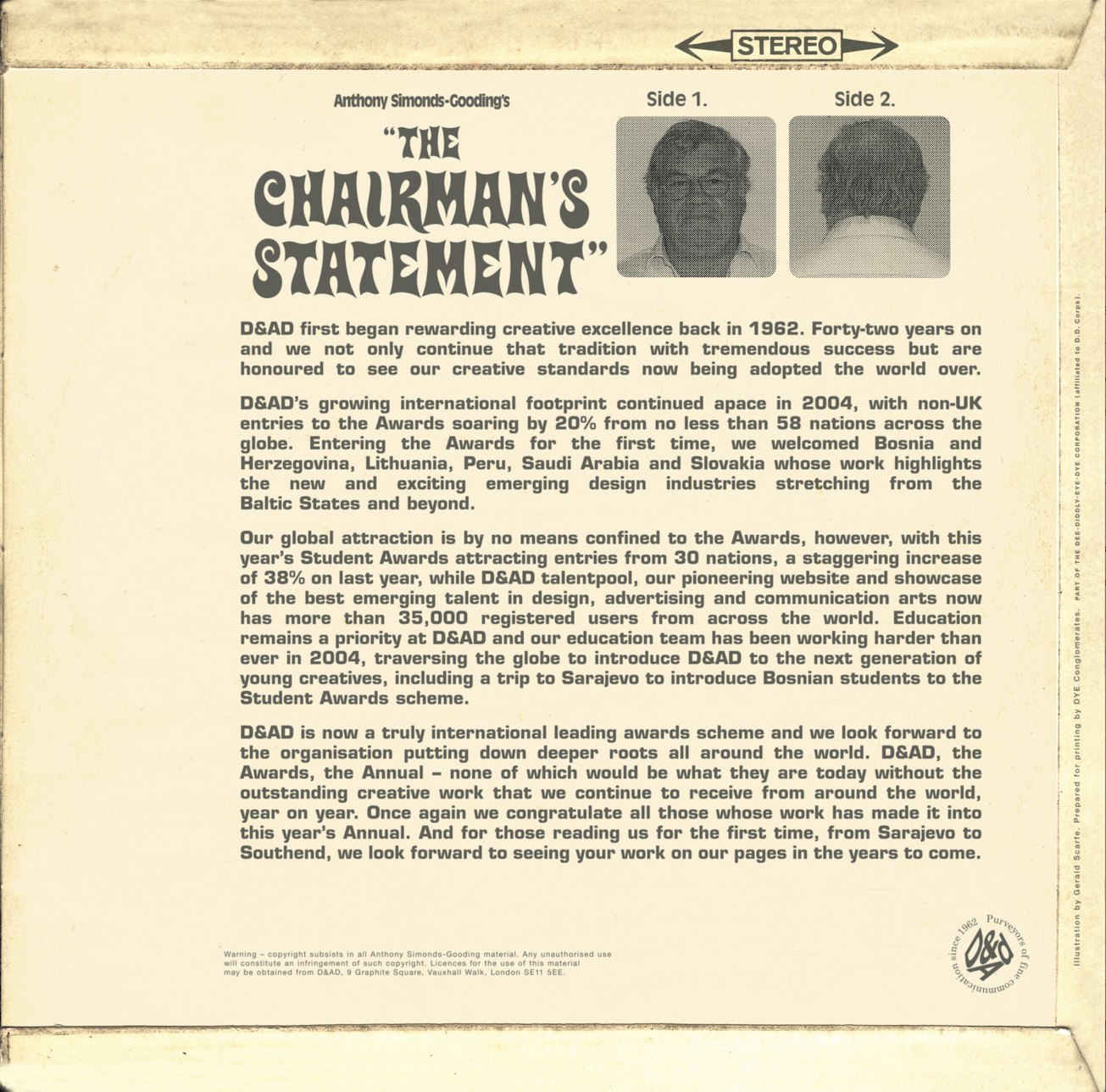
NICK BELL ALBUM COVER:
Before I briefed the designers on their dividing spreads I chose one to design myself , I chose ‘The President’s Message’, as President Bell was responsible for giving me the brief in the first place, it seemed appropriate.
I gave the photographer this reference for Nick’s image:
Bob sent through his shots, I picked out this one.
It seemed moody and self-important, like an album cover.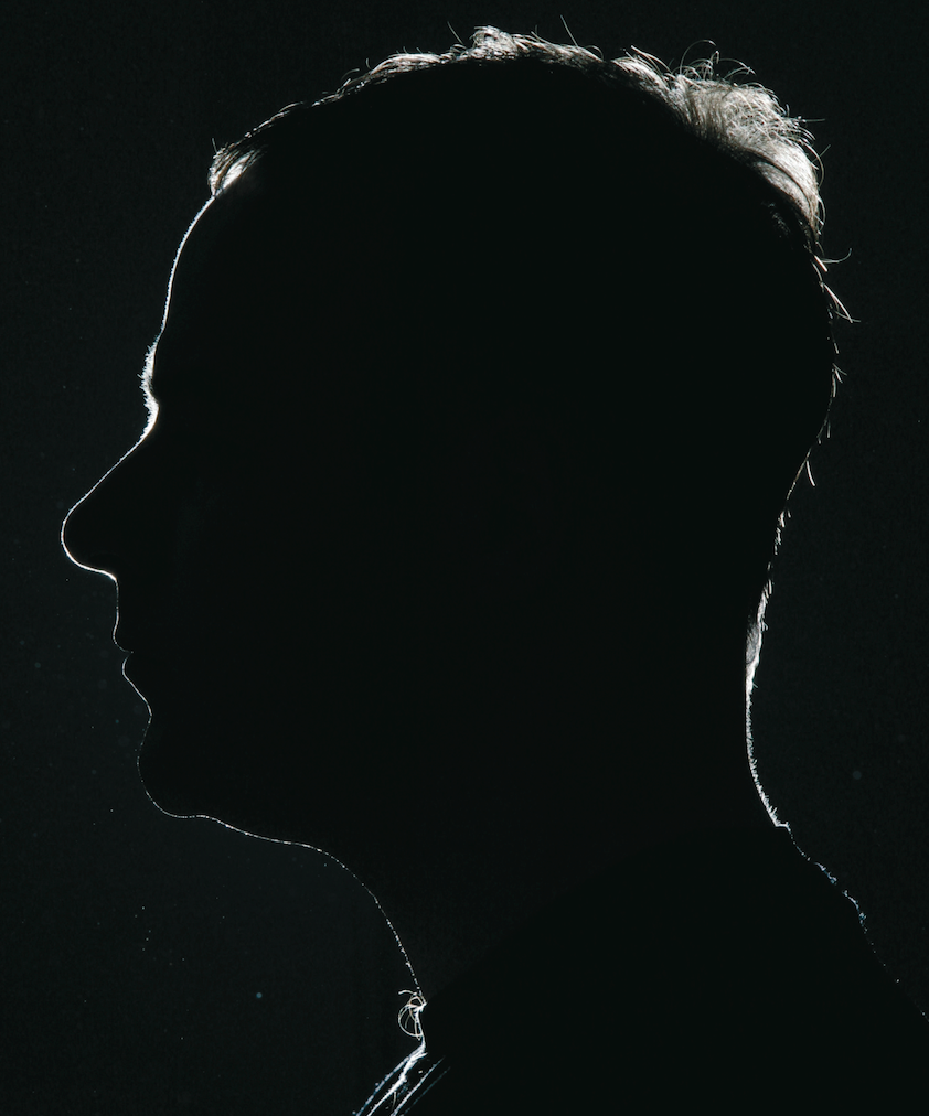
I tried to turn it into an album cover, I wanted the type to be very minimal so as not to detract from the shot. I thought it looked too cool but felt I needed to spoon in some cheese, it looked too serious.
Maybe we could use that Westerny style lettering country rock groups like The Eagles were so fond of?
Or maybe we should make it look a bit psychedelic?
We could solarised the image.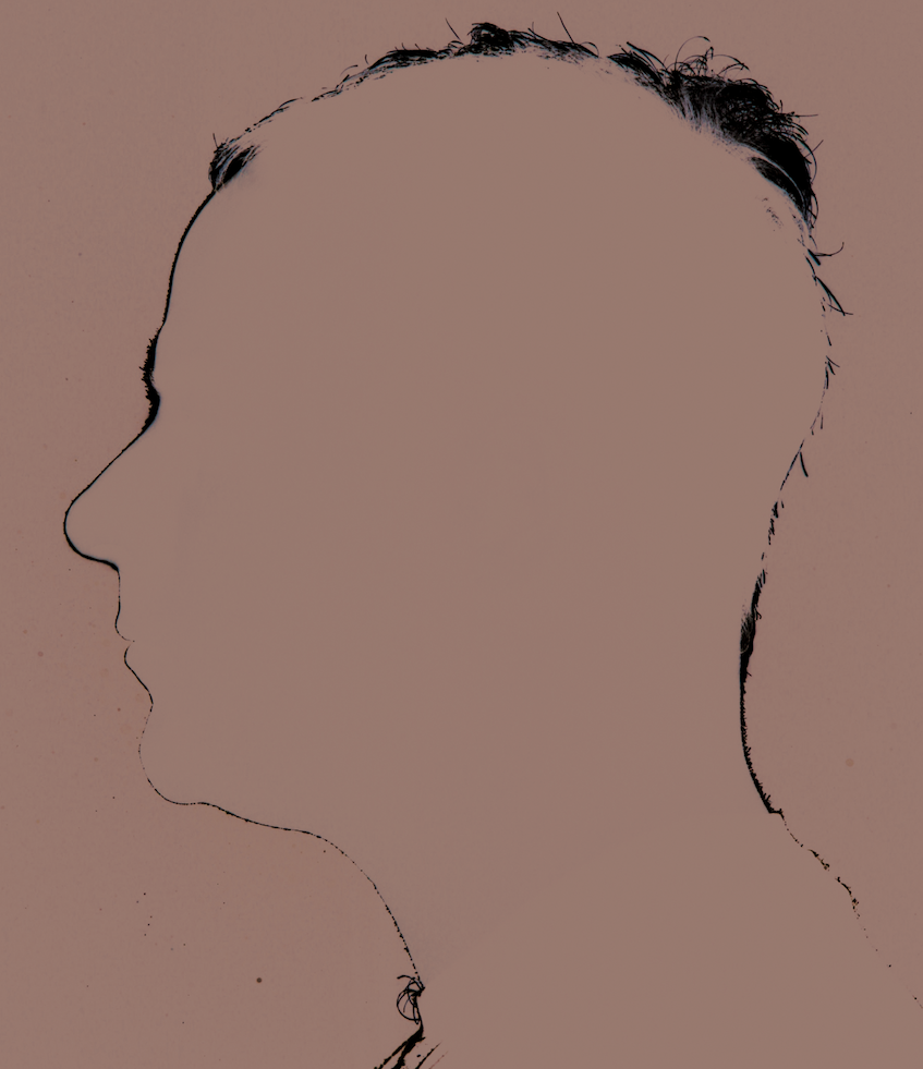
Perhaps we could do a duotone, with bold sixties style colours, like this.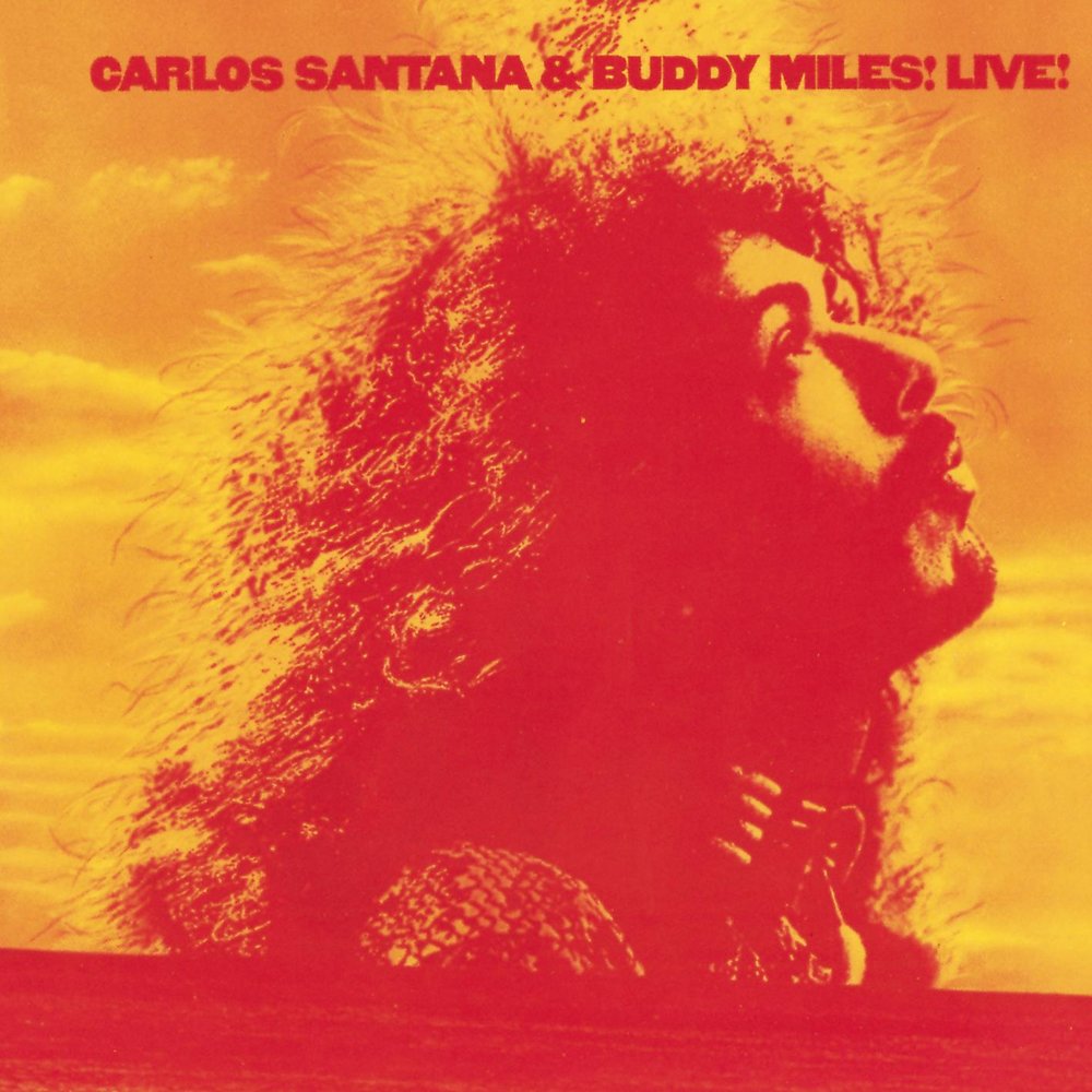 I wanted the type to look pretentious, overly self-important, so I picked the type style used on the Trajan columns in Rome, in 113AD, it’s called Trajan, (obvs), then reversed it out of the image, it made it look very self-important, in a spoofy, good way.
The back.
I need a logo to help it look like a real album.
What label is this album on?
I looked through record labels.
I had a vague memory of Gary Glitter being on the Bell Record label.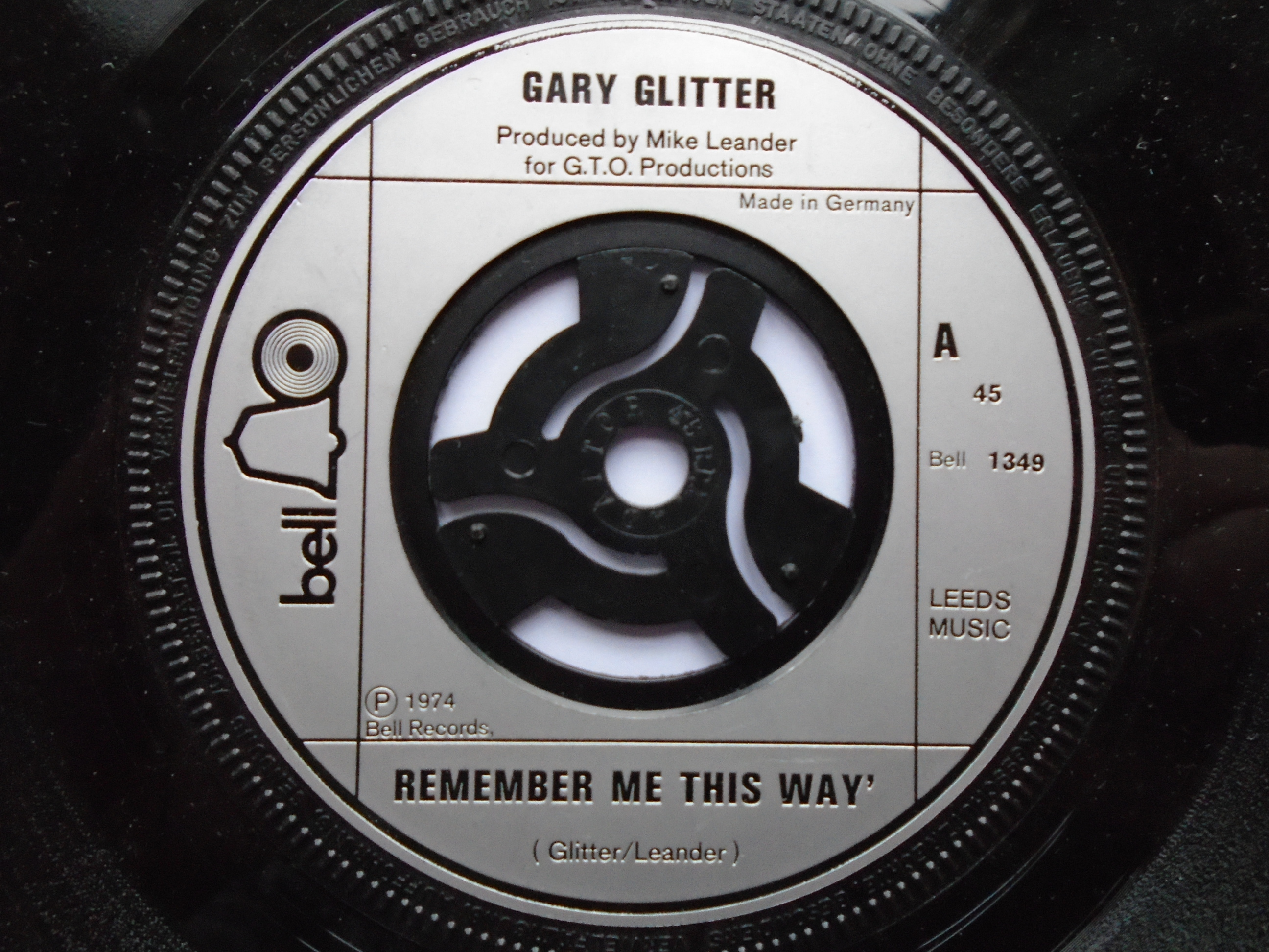
Perfect in one way, but it seemed weird to have the name of the artist and the record label the identical, also, what would I do? just cut it out and stick it on.
It didn’t feel very spoofy, it would be better to add a twist to something than simply take it wholesale.
PYE! It’s a gift.
Then we just needed some ephemeral text, again to make it feel authentic.
What do album credits look like?
Produced by? His parents Malcolm & Rose.
Written by? Obviously Nick.
Arranged by? I guess that’s me, (bung a ‘J’ i to look poncy).
Featuring? Whoever’s in his text.
It would be good to have some numbers in there, like track numbers, let’s pull out the subject matter from the text and put numbers in front of it, like a subhead.
The designs start to come in.
Geoff Halpin.
 Mark Denton’s.
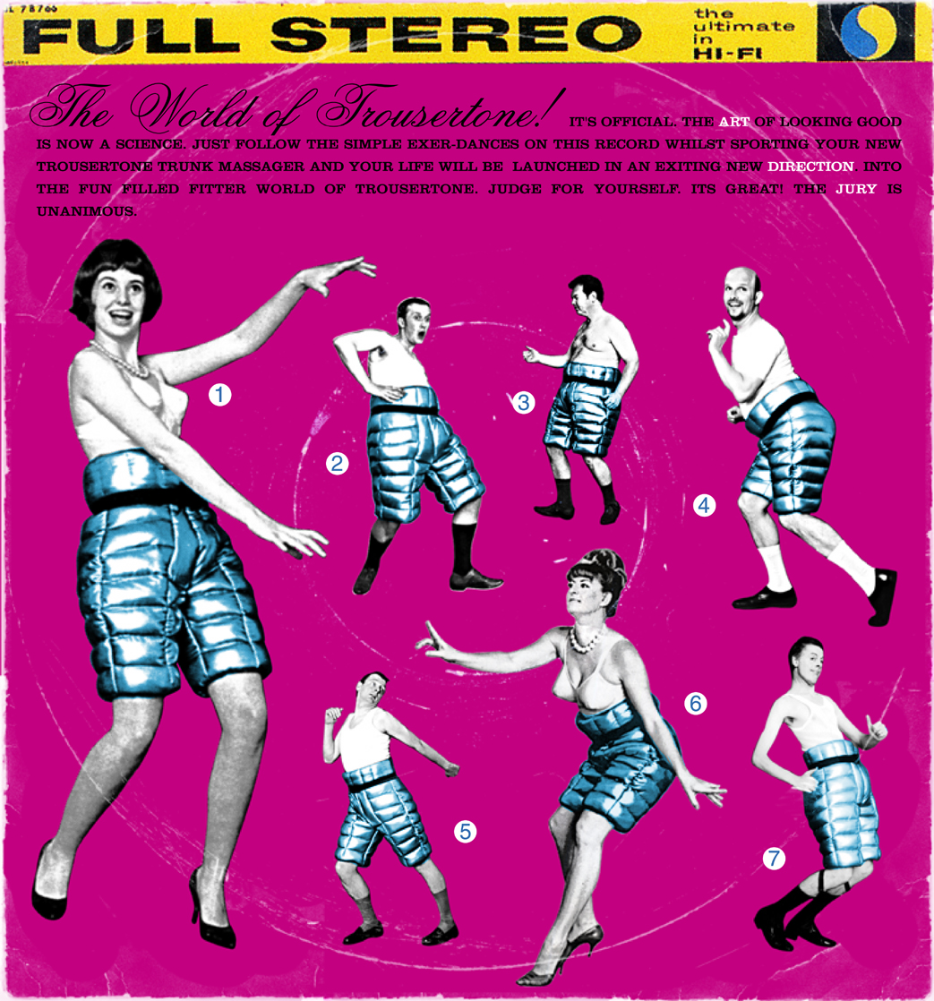 (I was one of the idiots he got to dance in front of about a dozen people at the photography shoot. Cheers Mark!)
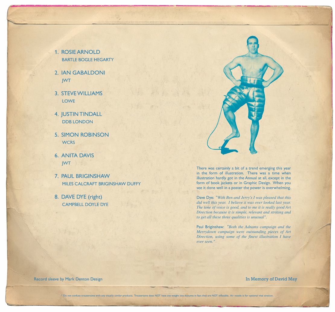 Cabell Harris.
Alan Kitching. Tom Hingston.
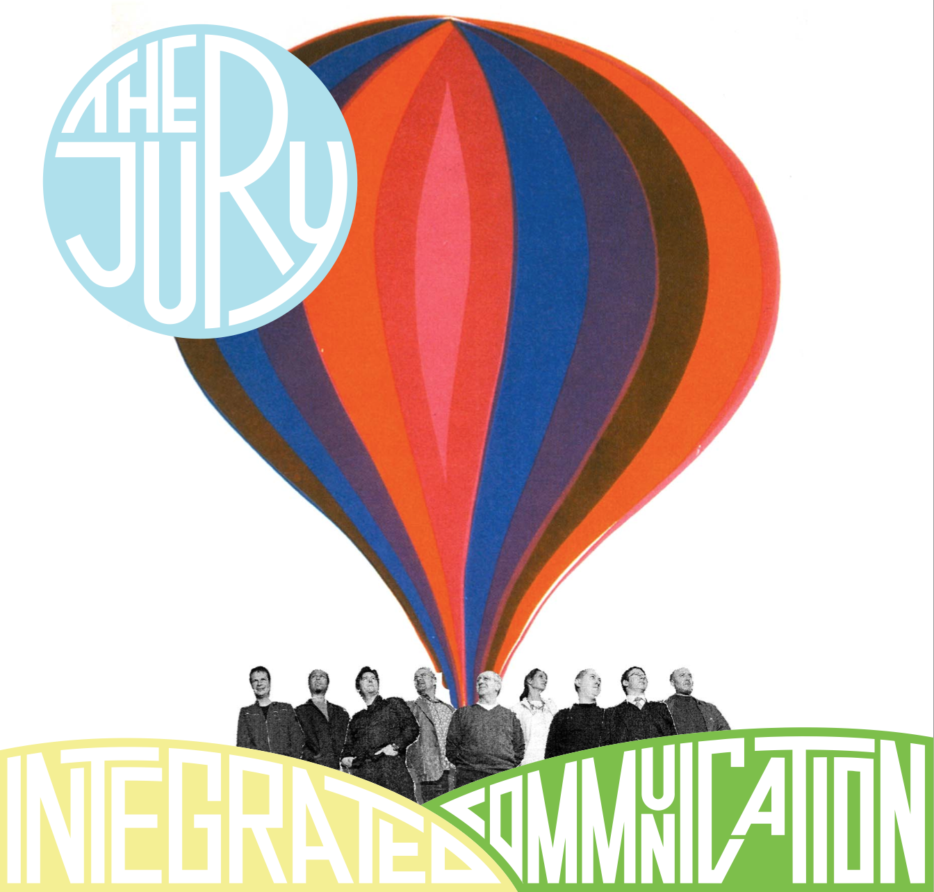 Stylorouge.
 Paula Scher.
(After she’d completed her artwork D&AD informed me that the text she’d been given had been changed, I think someone had edited sections out.
It looked like a problem to me as shed beautifully fitted the text to the odd shade space in between the pictures.
I told Paula, she simply rubbed it out, leaving a massive, weird hole in the text.
A shame, but I guess she had bigger fish to fry.) St Lukes.
3rd PROBLEM: Gerald Scarfe.
“Tuesday.”
“Next Wednesday.”
“Monday, definitely monday.”
I waited for Gerald’s design right up to the day before we went to print.
I hung in there because, well, he’s Gerald Scarfe and I wanted one of his great, angry- looking bits of design amongst the other more considered pieces.
A very small parcel turned up.
‘Weird, I thought he’d work bigger than that?’
Still, very exciting.
I wonder how he’s handled the type?
Has he satirised the Chairman aspect?
Will he have made the super lovely Anthony Simmonds-Gooding look aggressive?
Is it going to look really gloomy?
Out plops the artwork.
This is almost actual size.
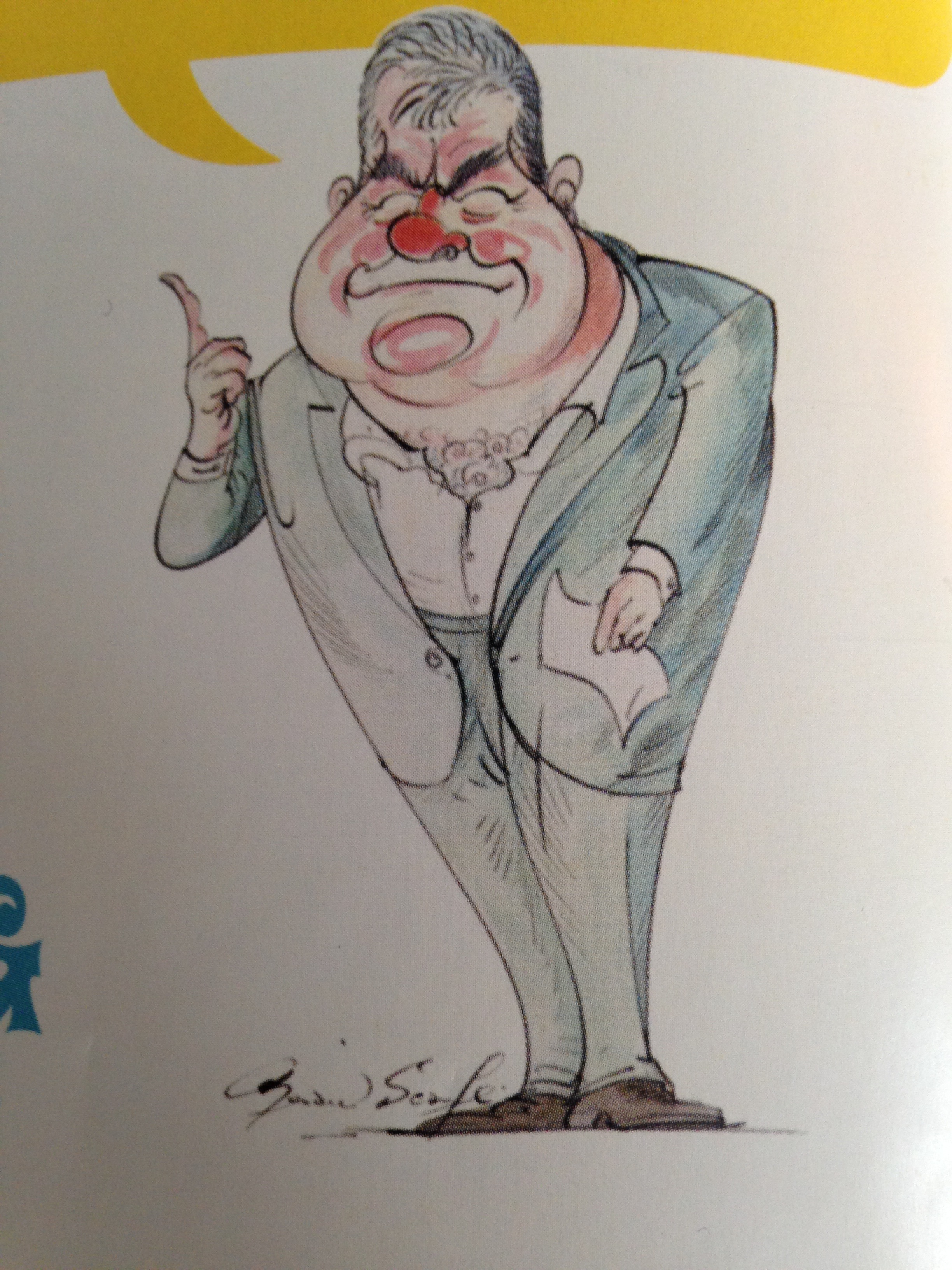
I peer back into the envelope to look for the other bits.
That’s it? That’s what I’ve waited eight weeks for? Where’s the words, the design the front cover, the back cover?
Flip.
I now have a blank spread in the 2004 D&AD Annual with just this one little cartoon, the style was nearer that of a cheeky seaside postcard than the angry, punky ‘Fear And Loathing In Los Angeles’ front cover.
I can’t bin it, he’s done it for free.
I’ll have to build a cover idea around it.
In 24 hours.
“Right…er…he looks jolly…er, music hall, show tunes, Hello Dolly, Fiddler on the roof.”
To make it look like those kind of albums I needed lots of slugs of words, any half joke I could think of went in – Side 1 – his face, side 2 – back of his head…er? Sod it done, next.’’
It turned out to be quite a pivotal moment for me, because I had no time to think about it, it was almost like a stream of consciousness.
There are all kinds of odd little bits of small print that I thought ‘Yeah, fuck it, that’ll do’ rather than analize it.
4th PROBLEM: “Bit of an error, D&AD-side, I’m afraid, we’ve forgotten the sponsors spread!
So given the utterly bonkers timing let’s just list the names on one of the spreads, we don’t have time to do all that album design malarkey.”
Flip!
Well, let’s at least set it in an interesting font.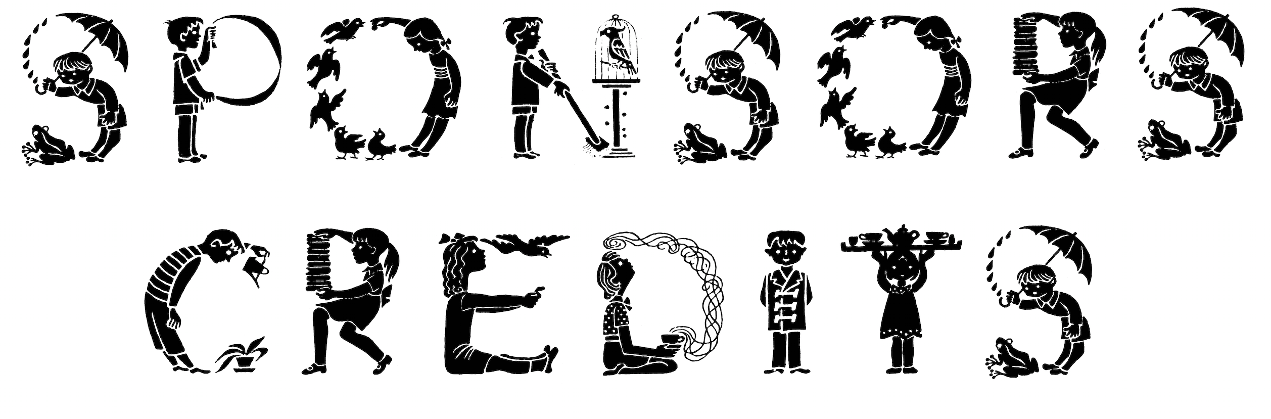
No, we can’t do that, it’s such a cop-out, it’d be the only spread in the book that isn’t an album design.
We have literally hours until we have to send it to print…what to do? What to do?…What’s that record over there?

That’ll do! Let’s spoof it, or as the lawyers would say create an homage to it.
I took the ‘Six-Five Special’ cover as my ‘inspiration’.

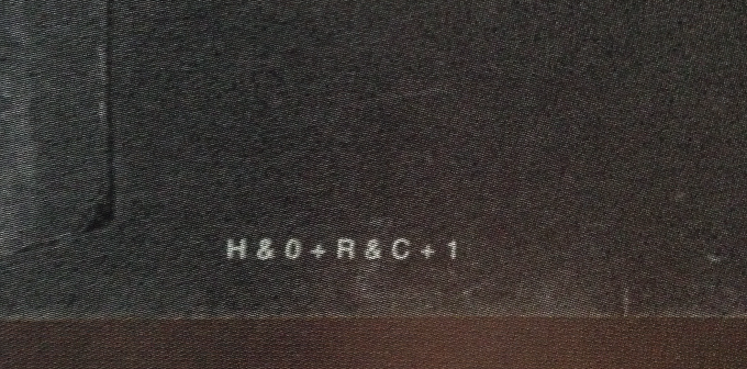
(If you look carefully in the bottom right corner, there’s a code: H&O + R&C + 1.
It stands for: H&O = Harry & Olivia, my children, Roman & Charlie, my step-children, +1 = an unnamed baby on the way, now called Louis.)
Remembering the annual was shrink-wrapped, like albums used to be, I thought it would be good to put stickers on that cellophane, also like albums used to have.


THE FINAL RESULT: I sneaked one of my rejected annual ideas onto the back cover.
Waste not, want not.

TICKET FOR THE LAUNCH:
You could pick any one, but you were only allowed in if you were wearing one of these stickers.
(In retrospect it was like sending out 23 tickets to every person, gate crashing must’ve been rife.)
From brief to book took eight months, a helluva lot of hours were poured into it.
Once the annual was printed I’d remembered D&AD’s print producer mentioning that the books cost roughly £13 an item to make, so I called him to ask if he could get me a batch, maybe fifty, to give to CDD clients.
He said he couldn’t see a problem, he’ll clear it with the higher-ups and get back to me.
He doesn’t.
I buttonhole him at the launch night, he’s awkward, sweaty even, “The Chairman says..well, erm…He says we can sell them to you for…the wholesale price…£33… which, to be fair is still £27 less than it should be…so…”
So I have worked eight months for free and they want to sell them to me at a profit?
I gave the producer a message for the Chairman, a suggestion on where he could store his annuals.
Two weeks later a lorry turned up at CDD, someone wheeled in ten boxes containing fifty annuals. No charge.
As we’d had a accepted or awarded that year, we printed up these stickers and sent the annual out to our clients.

NB. Six weeks after the annual was printed, a huge envelope showed up at the office.
Inside was Lee Clow’s album design.
As he’d stopped communicating and hadn’t given me a clear yes, I’d replaced him.
Annoyingly, it was better than the one we’d used.
It was for the Packaging section and was a spoof of The Beatle’s ‘White’ album.
So, from memory, was no design for packaging design.
Very, very cool. Very, very late.
You’ve used the wrong Art Director’s album cover Dave. On closer inspection you might notice that Rosie Arnold looks surprisingly like my 16 year old step daughter Saskia.
…For anyone who’s interested, here’s the actual Art Director’s album cover in my blogpost ‘Big Pants’: http://coy-com.com/blog/