“We have a bit of an image problem with Merrydown, its main constituency appears to be students and street tramps.” Chris Carr, Merrydown Chairman.
These were the only Merrydown ads we could remember seeing. (Written by Chris Wilkins.)
 Six sheets and fly posters were booked, so posh, long copy ads like those were out.
The creative department came up with various routes, some good, some less so.

Who’d have time to look at a picture, read the explanation below, then check out who it’s for below that, as they drive past our poster?
I felt we needed something simpler, more like graffiti than advertising.
Like the Milton Glaser ‘I love New York’ poster.![]()
You couldn’t avoid taking in something that simple as you drove past.
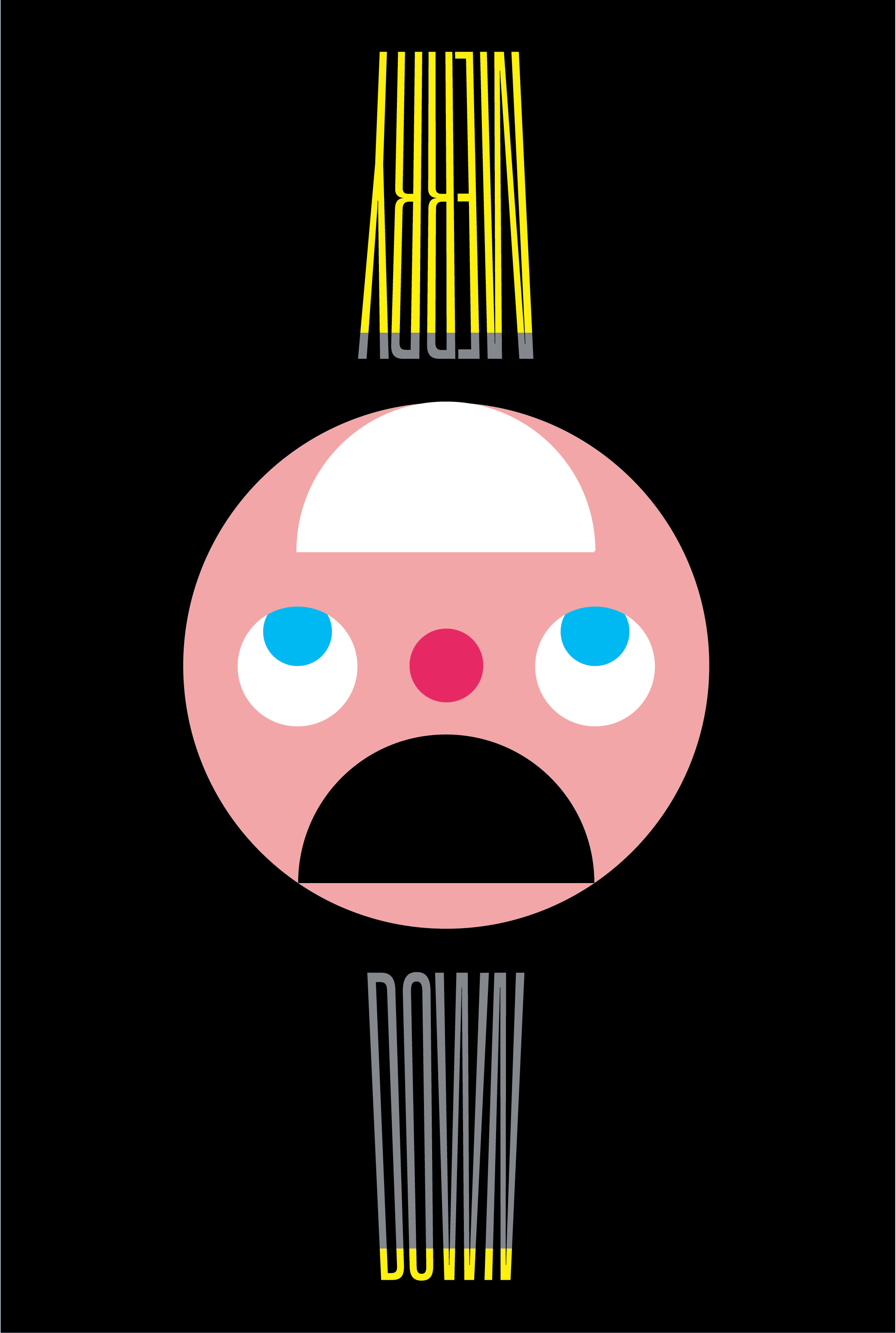
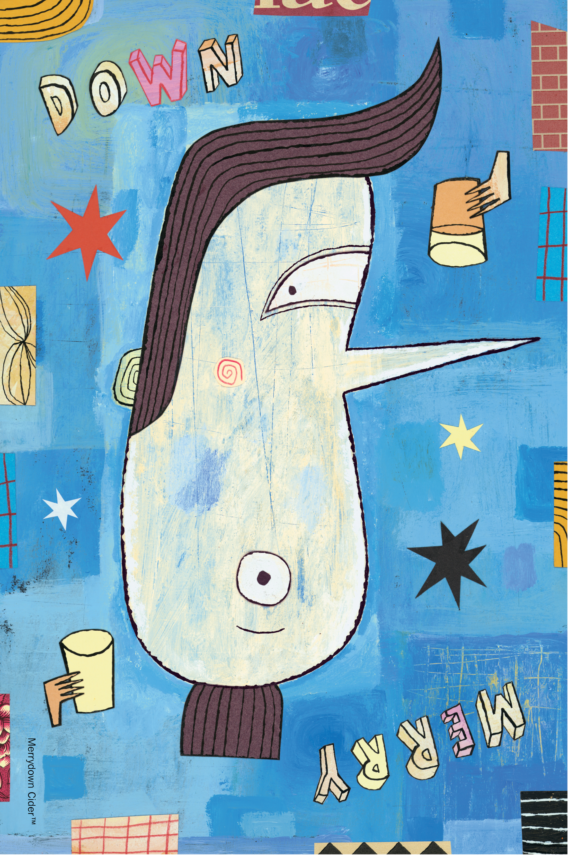
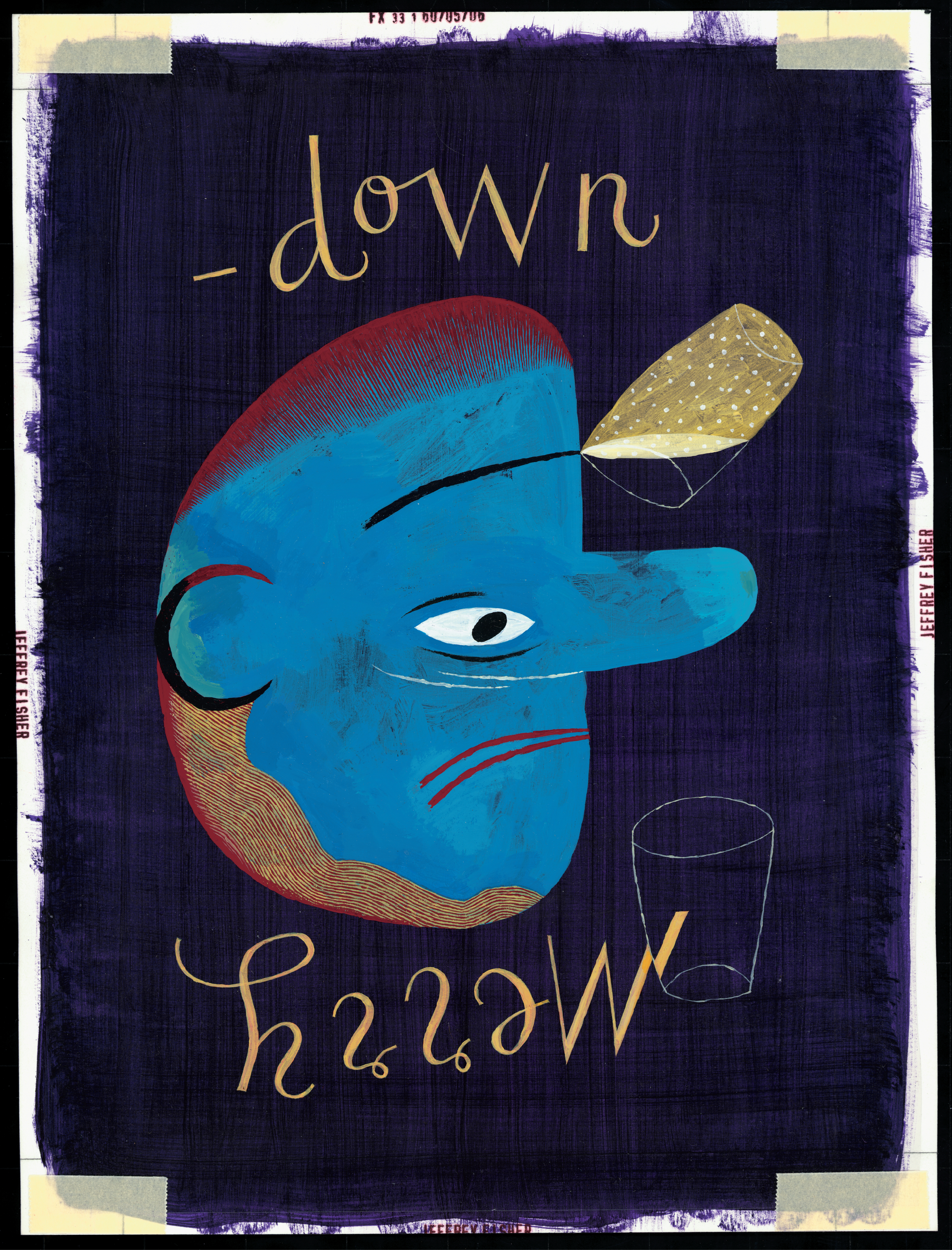
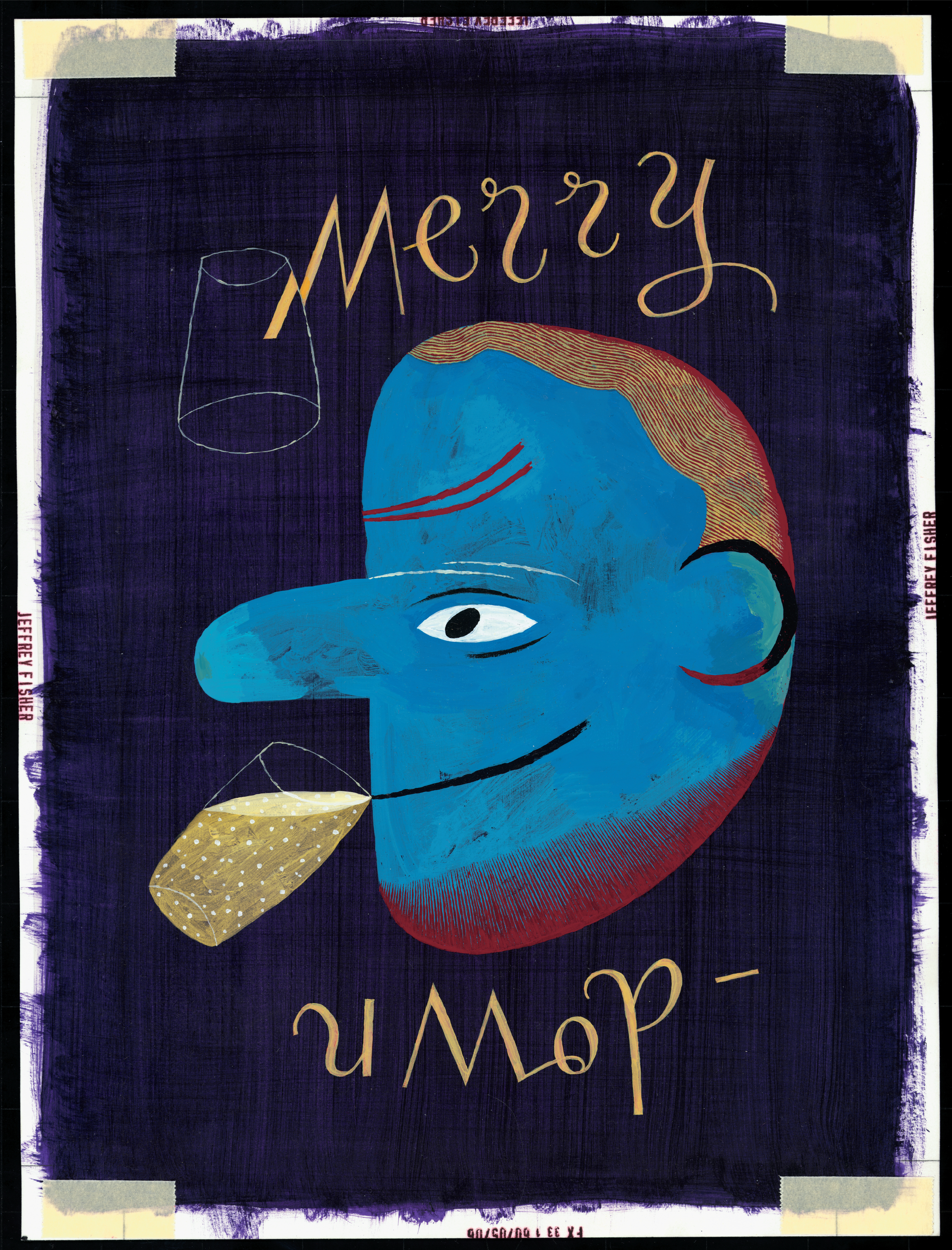
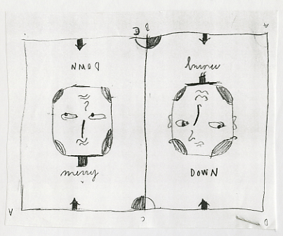
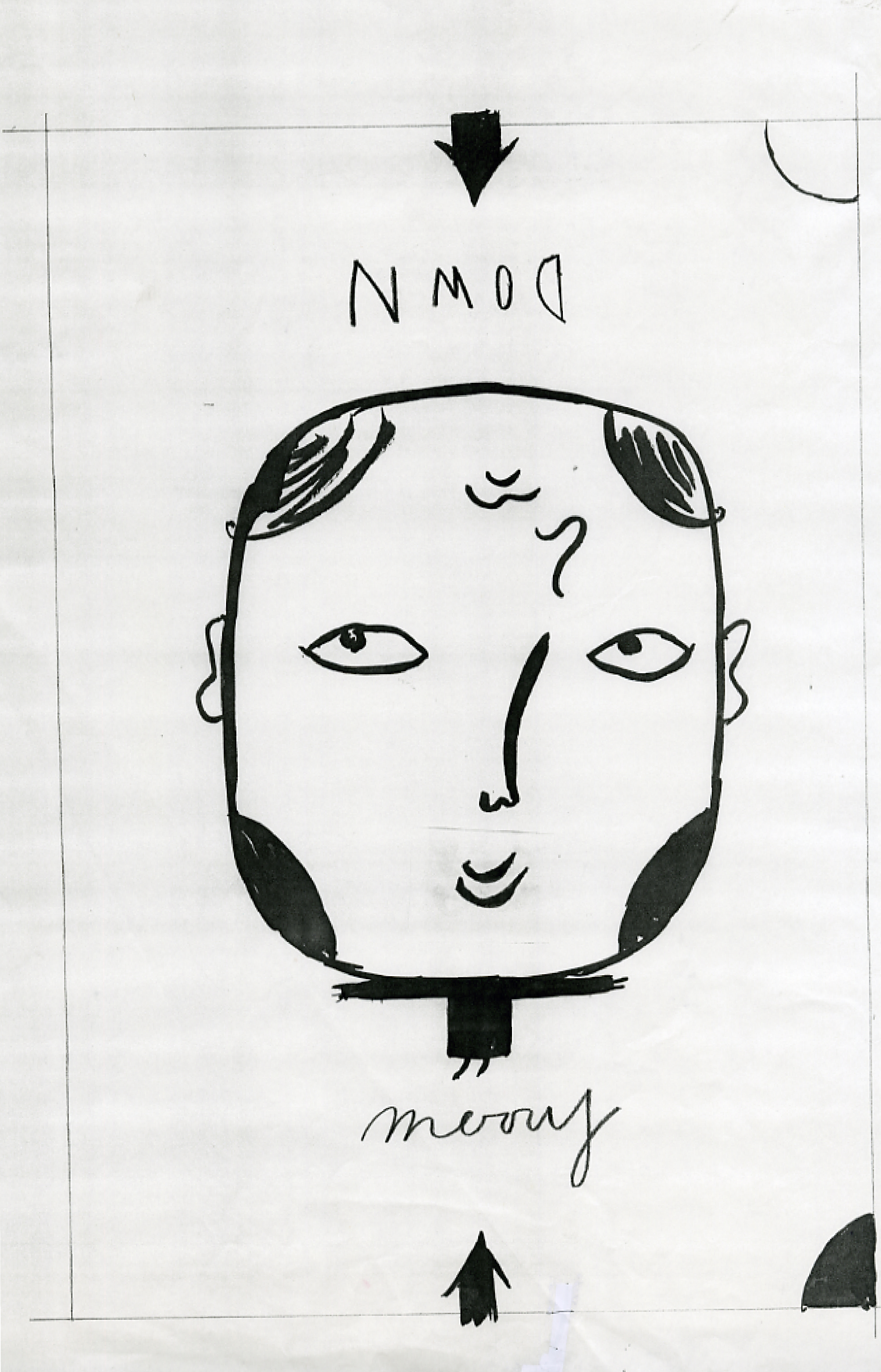
I’d doodled something shortly after meeting the client, it wasn’t really an ad or idea, I’d simply split the brand name in two.
“Happy and sad in the same name, how weird?”
I quite liked it, but dismissed it as it didn’t seem to be an ad.
But, it was simple, like the Milton Glaser poster, and very branded.
I tried to think about how to give it meaning.
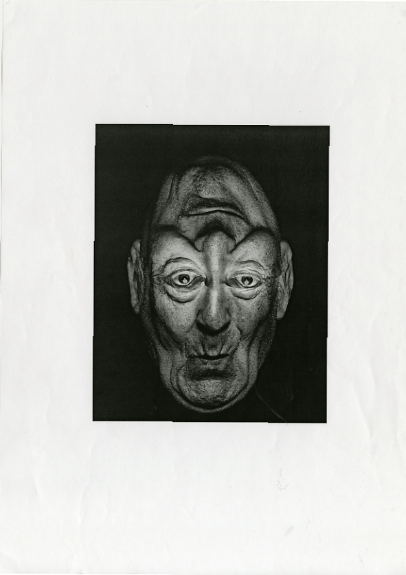
I remembered those Victorian illustrations of faces that worked both ways up.

 One way up could show a full glass of Merrydown and a smiling face; MERRY, the other way up could show an empty glass and a sad face; Down.
I mocked them up, picking very contrasting illustration styles to show breadth.

 Merrydown were dire straits, so instead of over analysing the meaning, branding and whether they needed logos and photographic pack-shots, their reaction was ‘Yeah…fuck it…what have we got to lose?’.
Right! Illustrators…erm? There are thousands of great illustrators out there, I was finding it difficult to narrow it down to five.
Sod it, instead of getting five illustrators for a £1000 a pop, why not get ten for £500 each? It’s a good brief, I could give them complete freedom to compensate for the little fee, what the hell, they can only say no.
Michael Johnson, the cool, bespectacled designer stopped by to update me on the progress of our agency book he was designing.
He spotted the Merrydown idea on my wall, he liked it.
I asked him if he’d worked with any good illustrators lately, he said he’d have a think and get back to me.
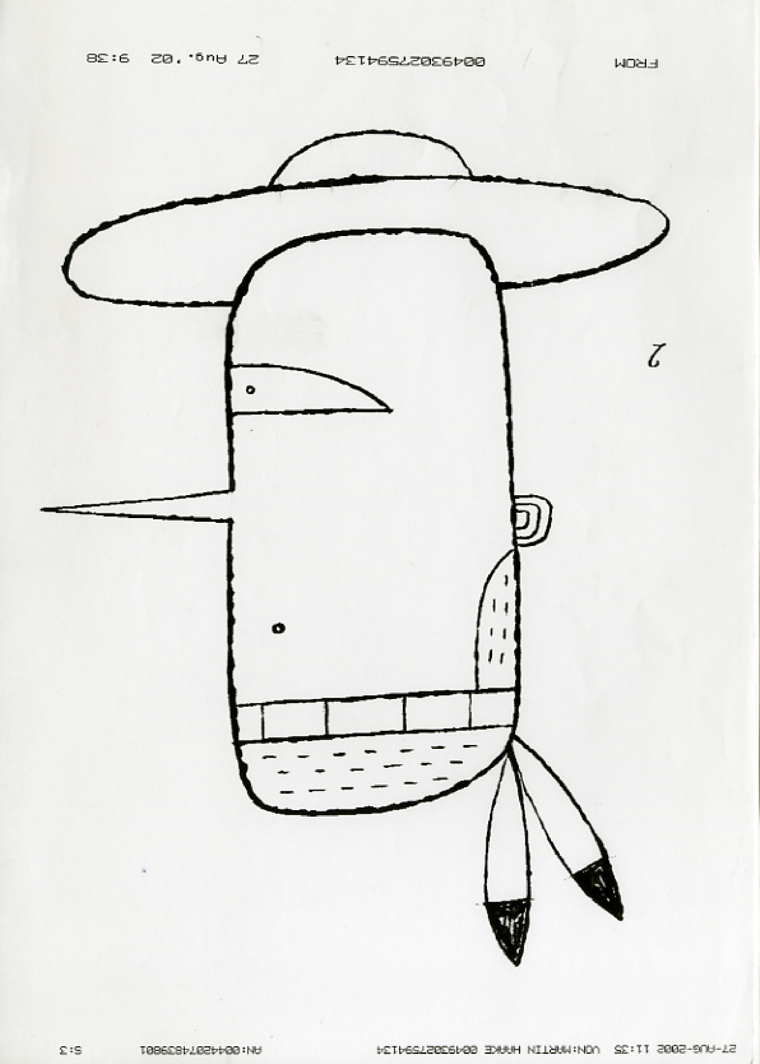
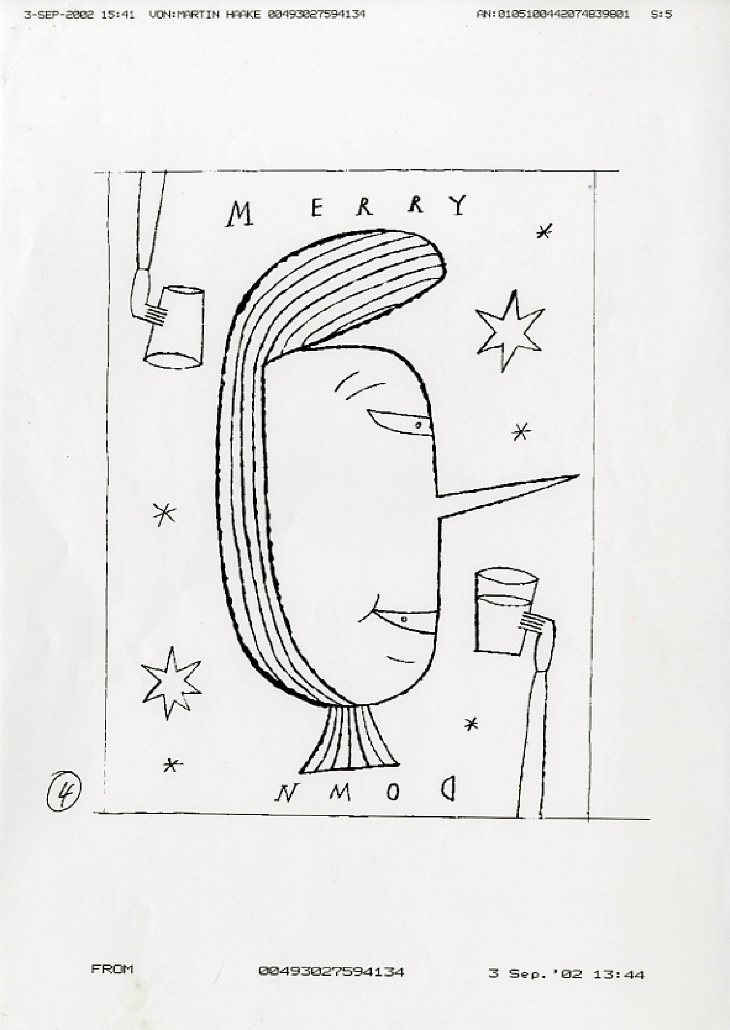
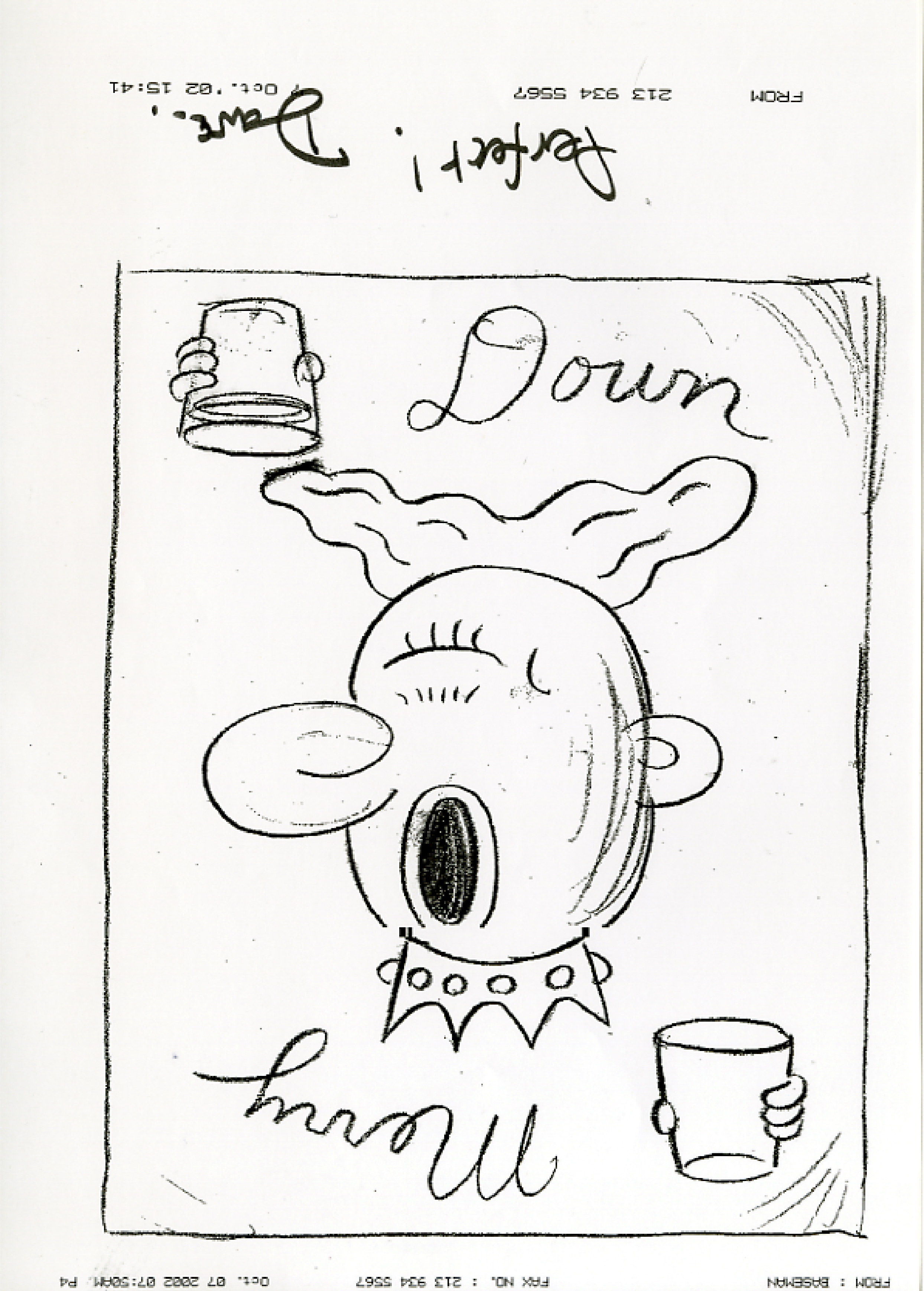
Two days later he got back to me, instead of passing on illustrator’s names he passed over some rough sketches.

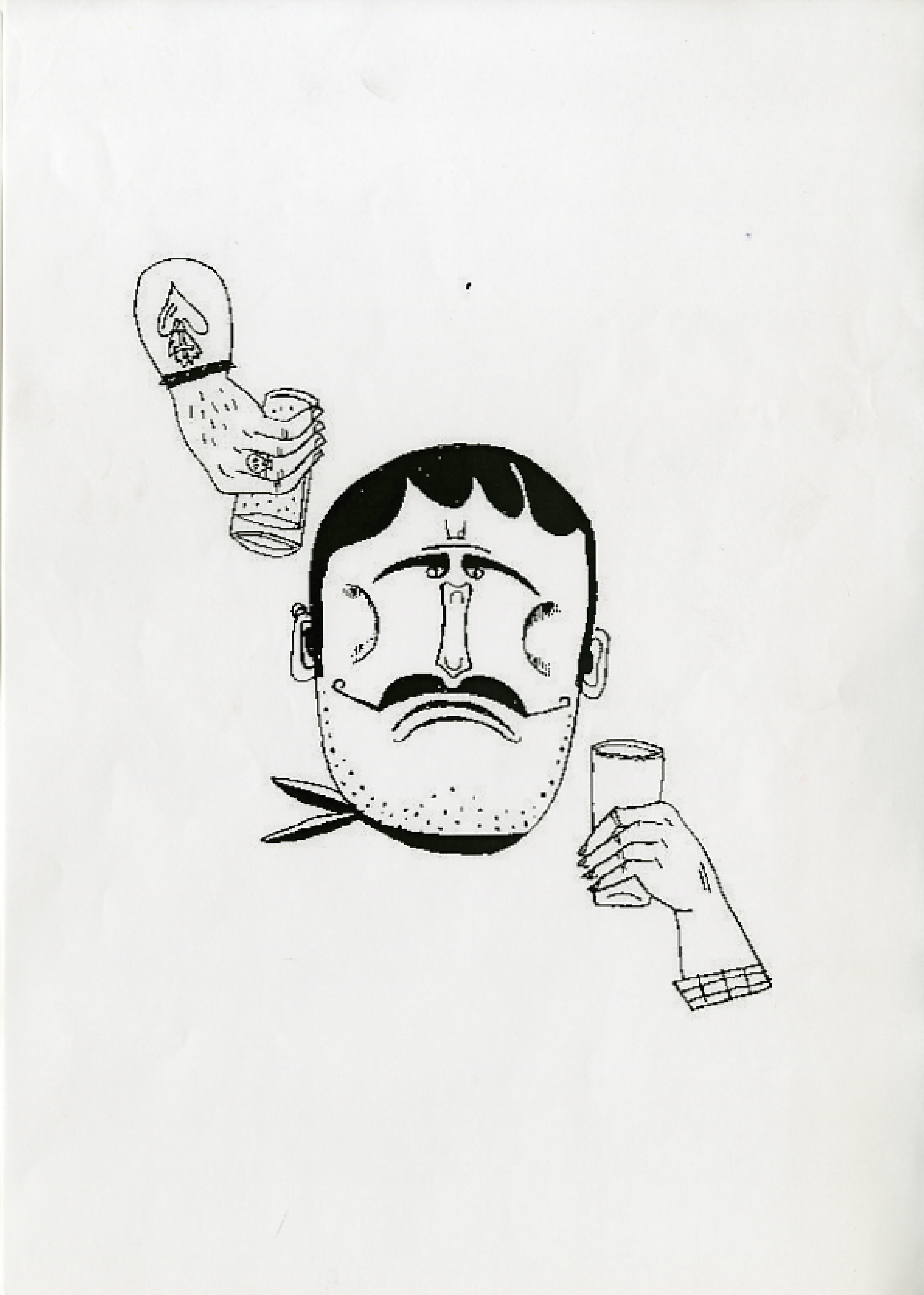
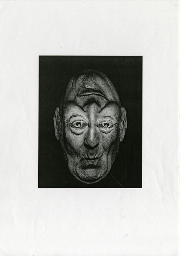
I bought this one. (I say bought, we didn’t pay him a penny.)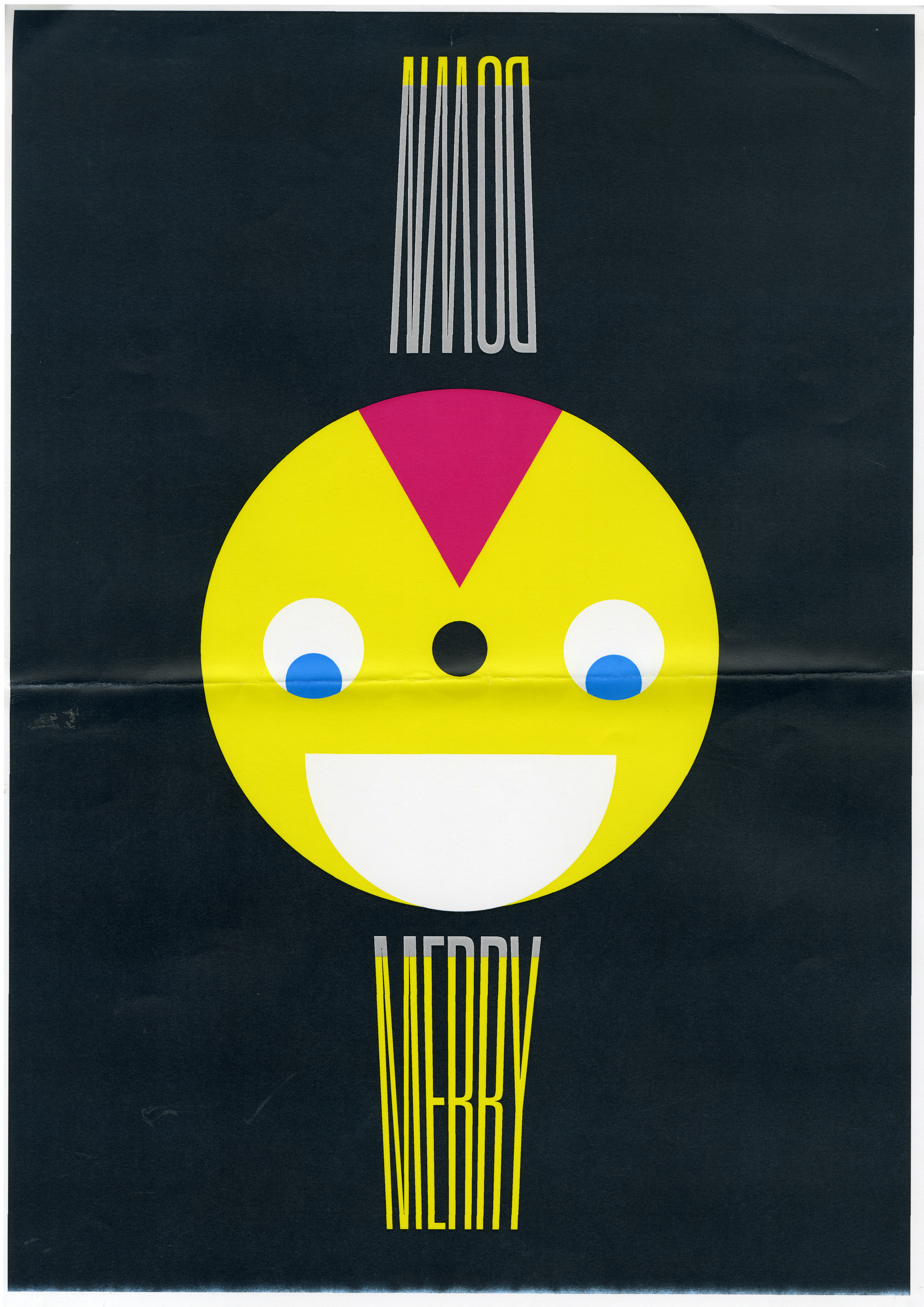 I thought he looked a bit ill, like he’d had a bit too much to drink, could we make him look a bit healthier?
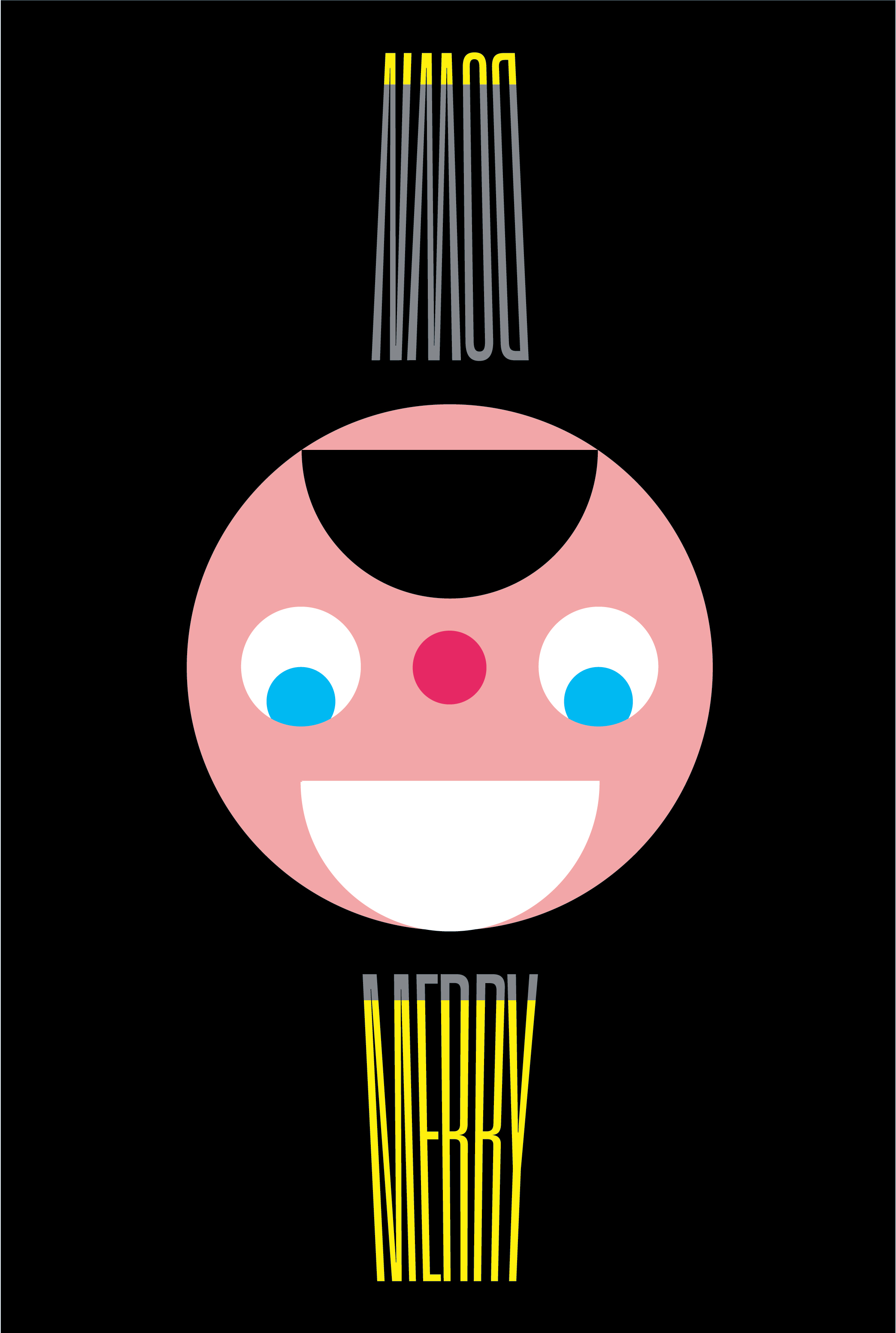
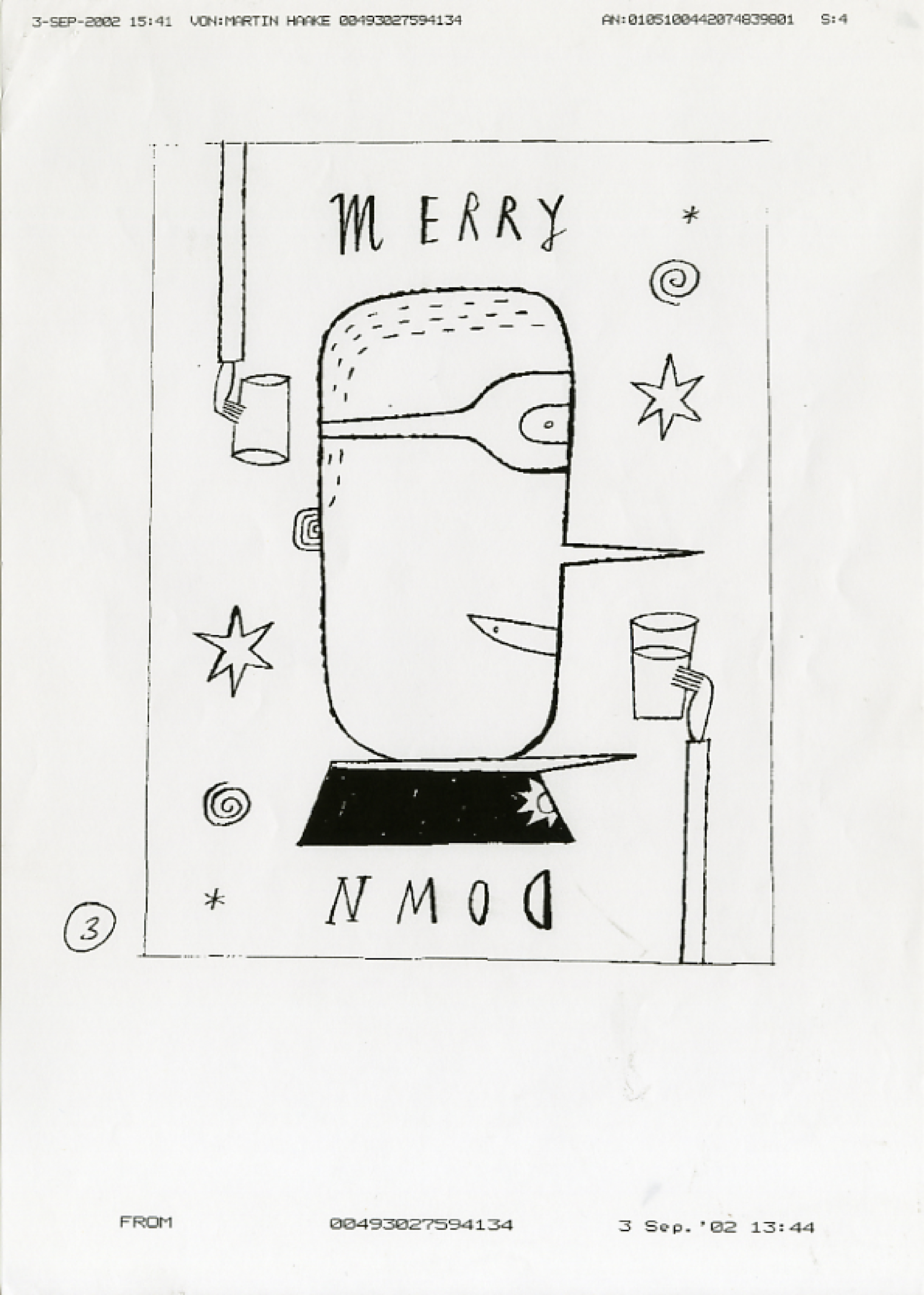
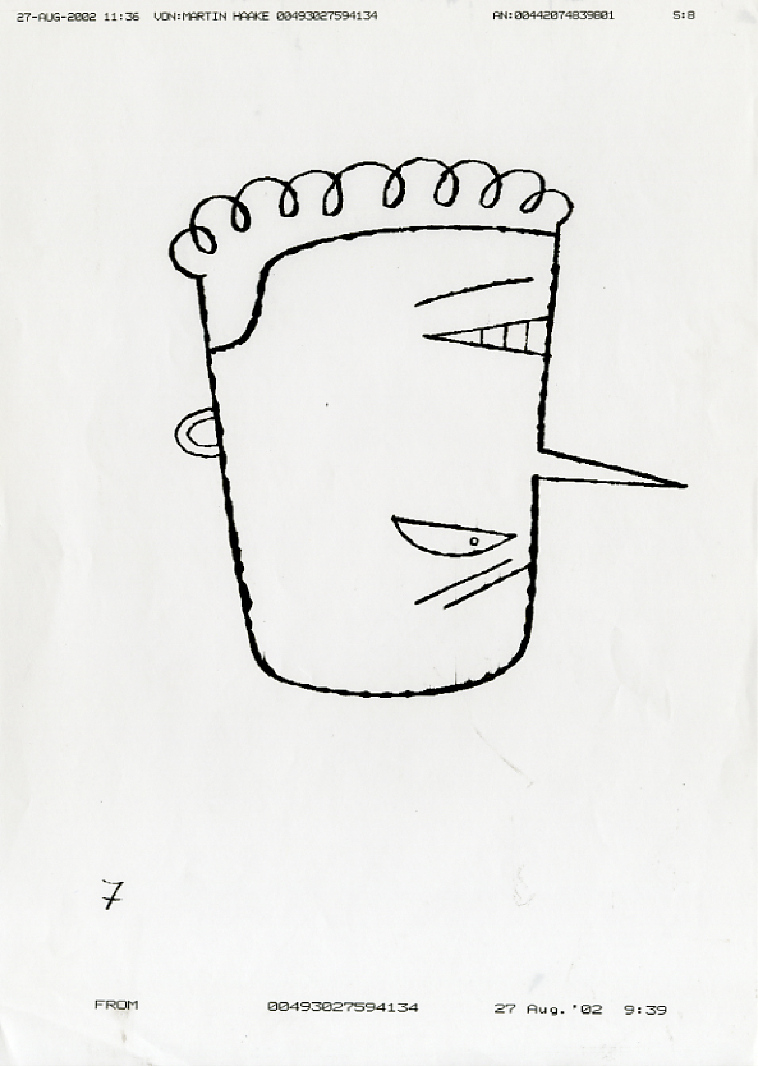
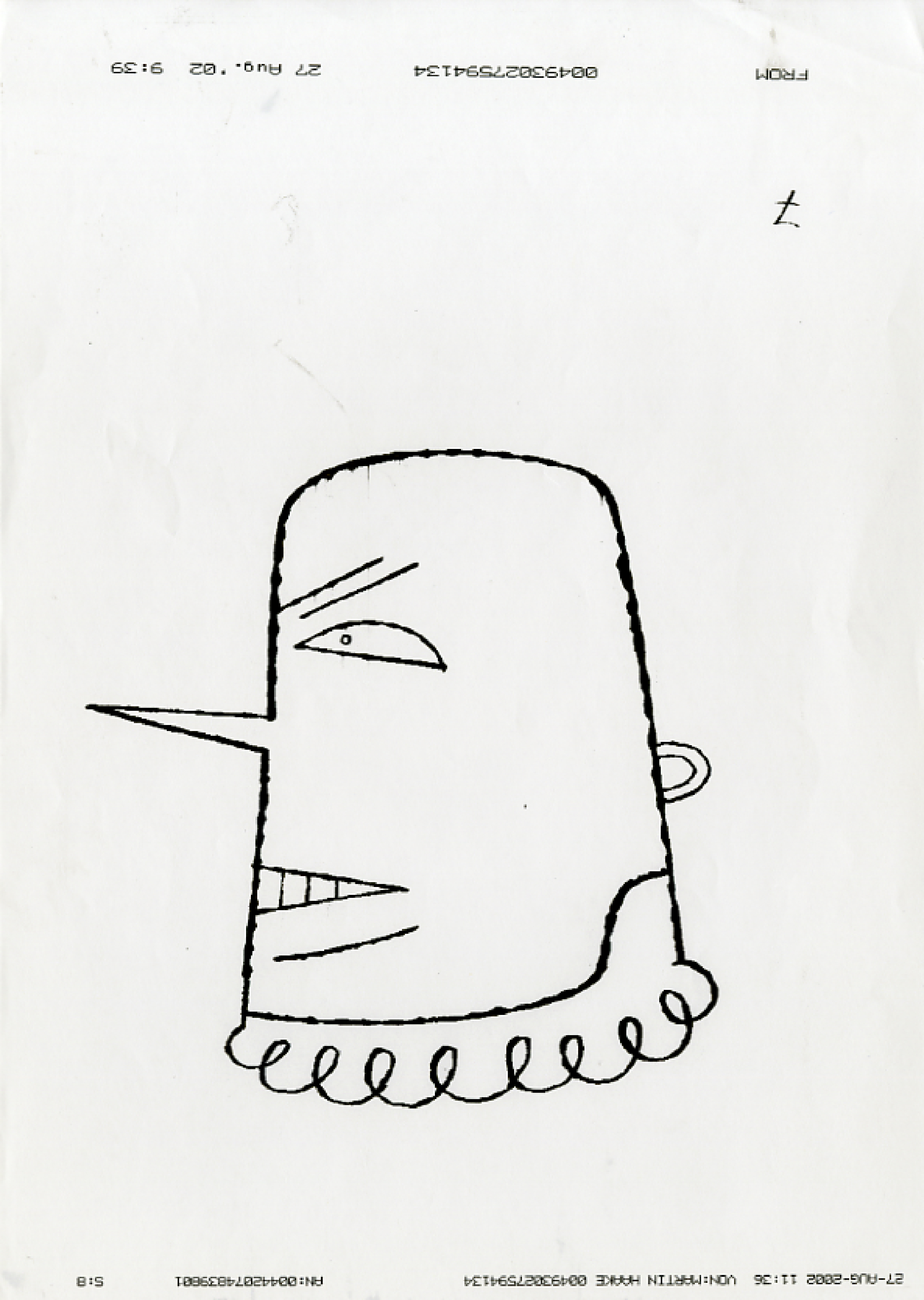
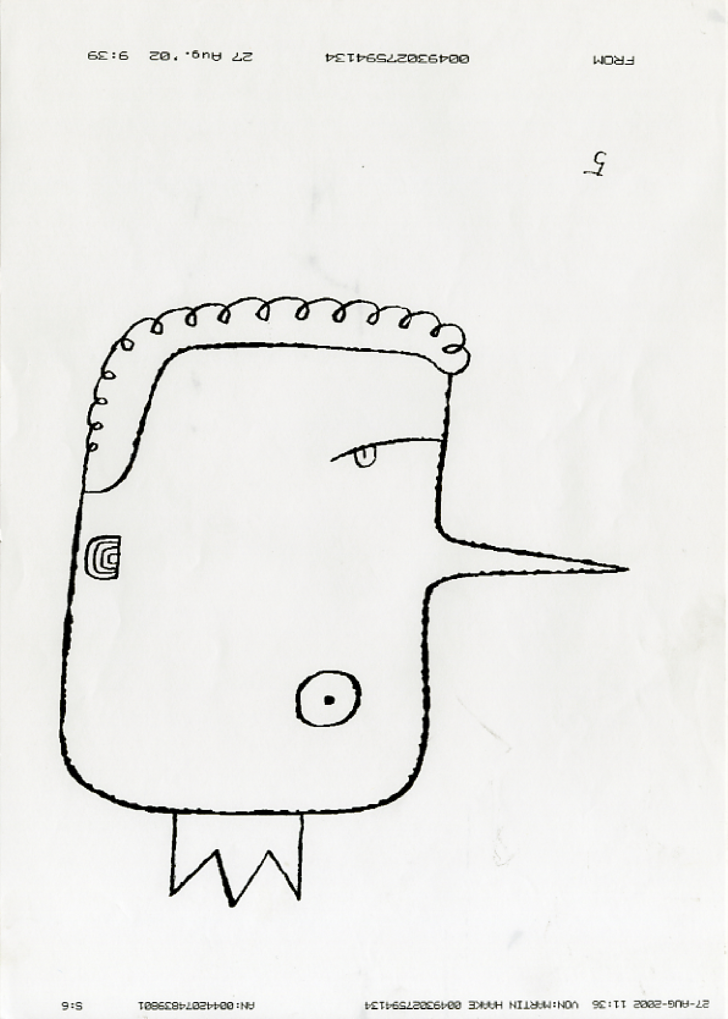
Martin Haake faxed over a long stream of ideas, all good.
I loved the cowboy/Indian and cop/robber ideas, but worried their occupations may get in the way of the idea. (In retrospect, I was probably too sensible in my choice, some of the rejected ideas are just more fun.)


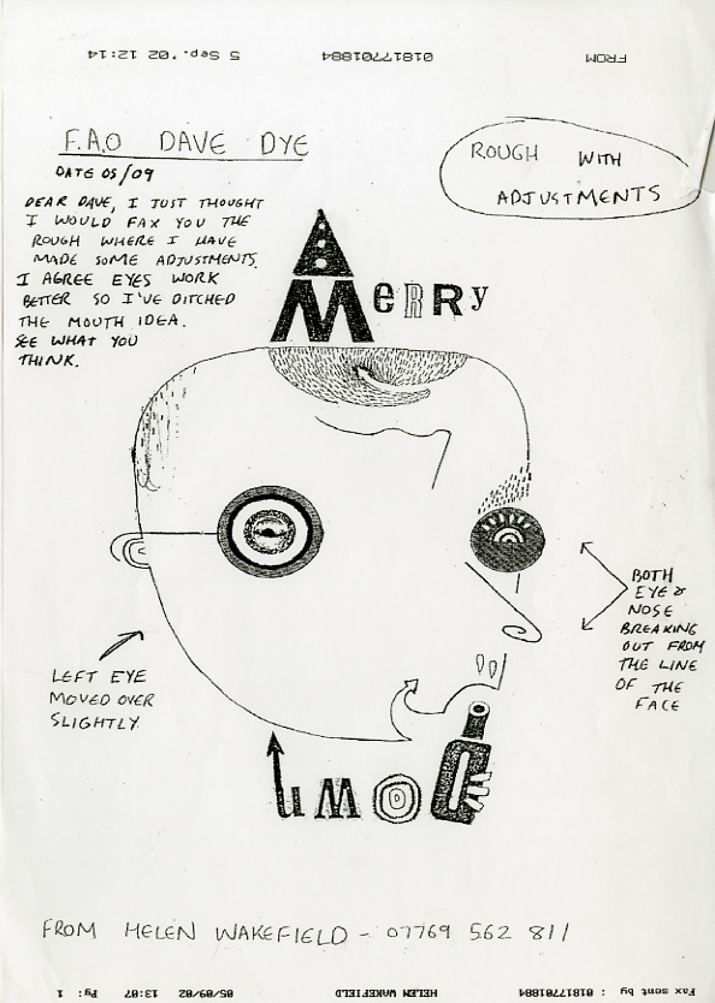
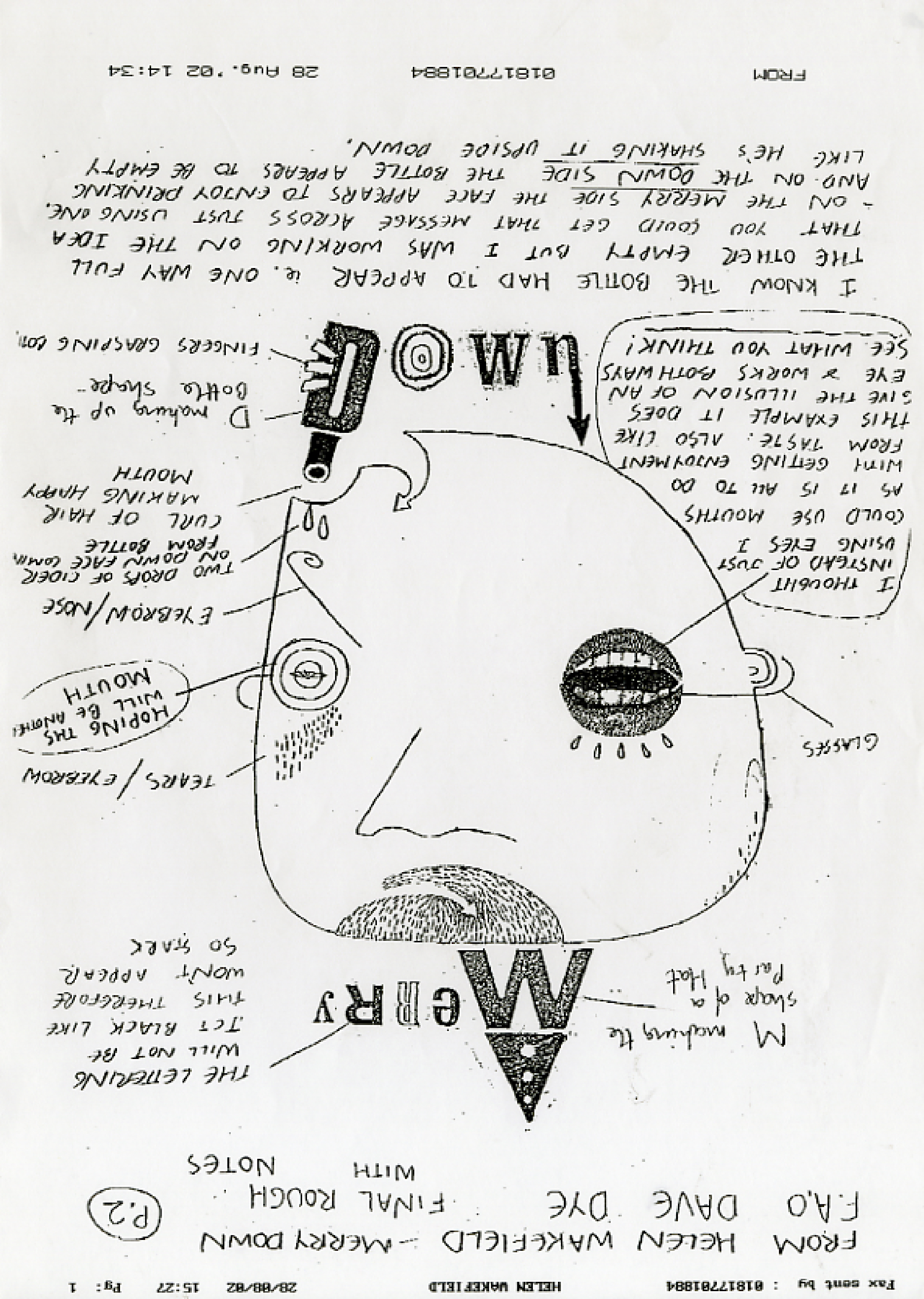
I wanted to give someone a chance straight out of college, I chose Helen Wakefield,
I liked her idiosyncratic way of looking at the world, as you can see from her roughs.


Olaf Hayek sent in his scribble, it looked good.


Jeff Fisher sent this in, it didn’t look great, but Jeff is a class act, so I thought it’ll probably turn out well.

Brian Cronin, one of the cleverest illustrators in the world, sent in a final illustration, no rough.
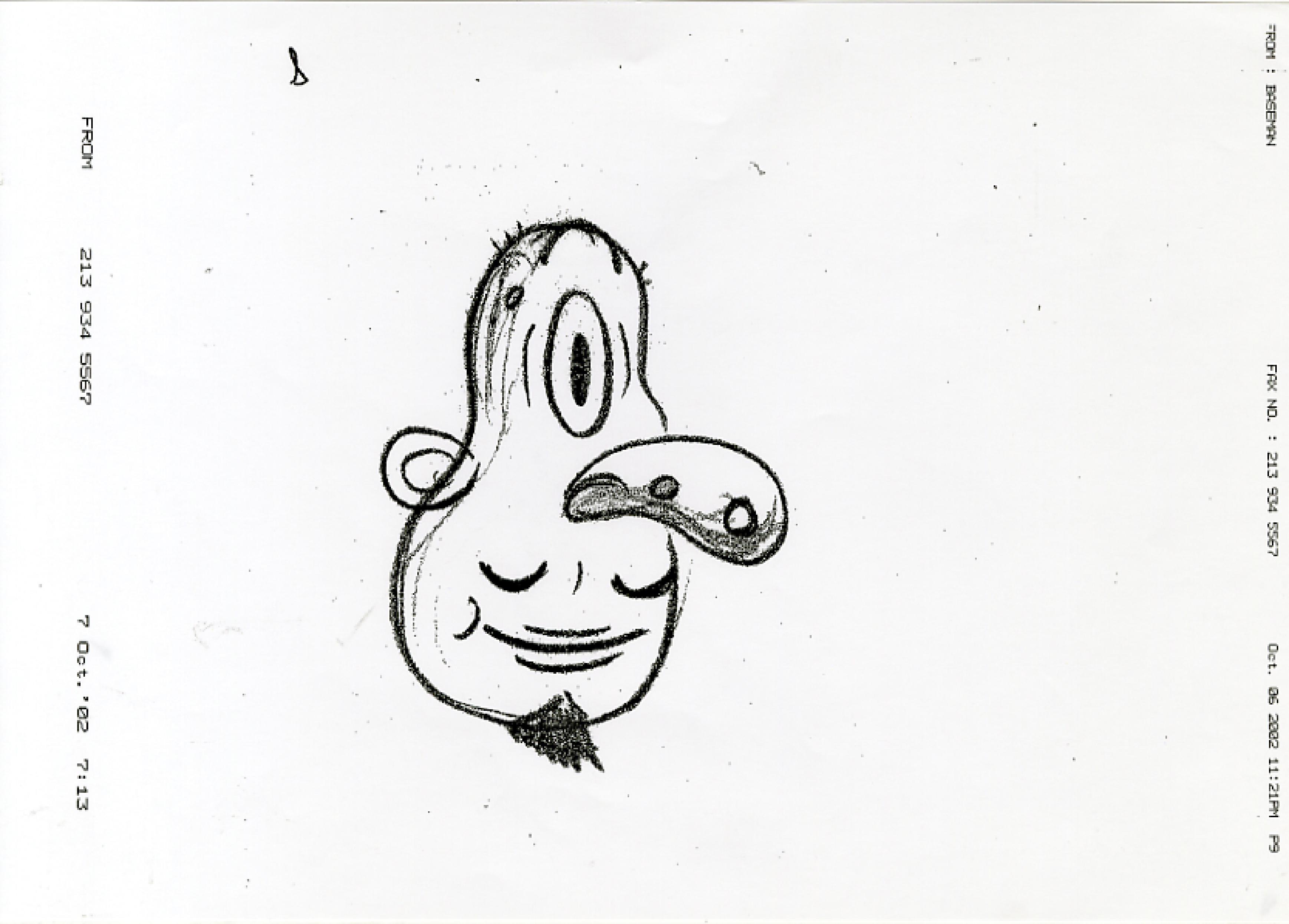
The usually uber expensive Gary Baseman agreed to draw for lunch money.
Top illustrator, top bloke.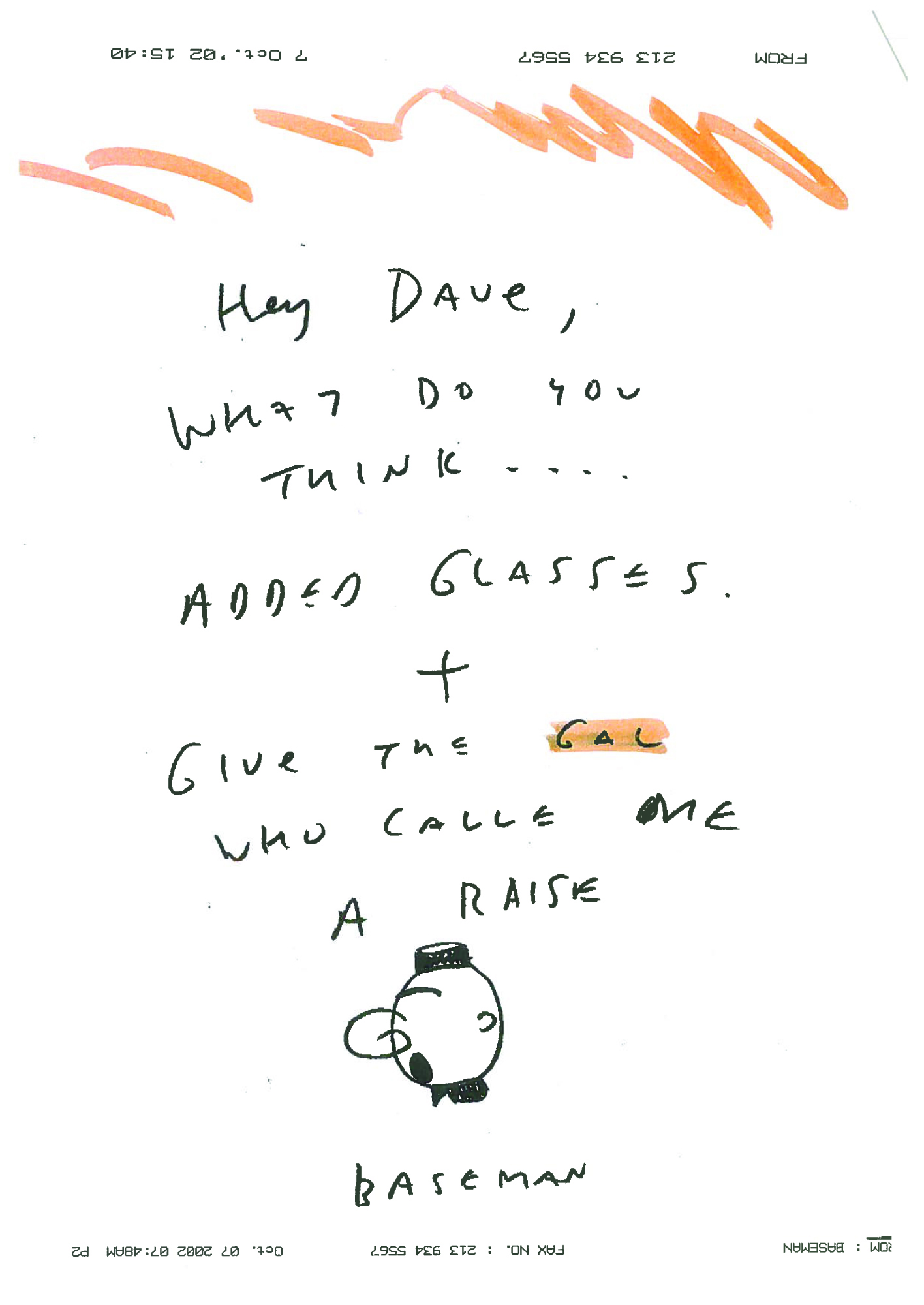


 They all looked great, but this one made me smile widest.
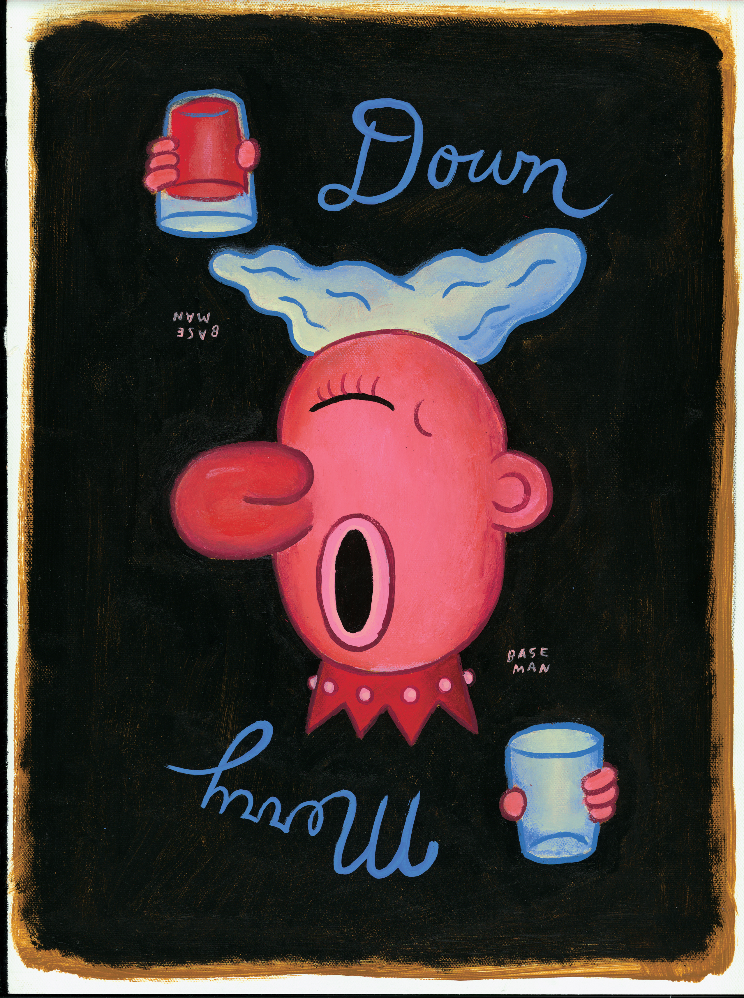

Without thinking it through, I asked my mate and CDD in-house photographer, Giles Revell, if he’d shoot one.
What a ridiculous request, how was that going to work then?
But, Giles being Giles, said “Yeah…I’ll give it a go”.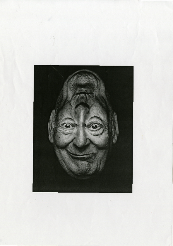


A college tutor at the time, Mick Marston, did this one, which has a younger, funkier vibe.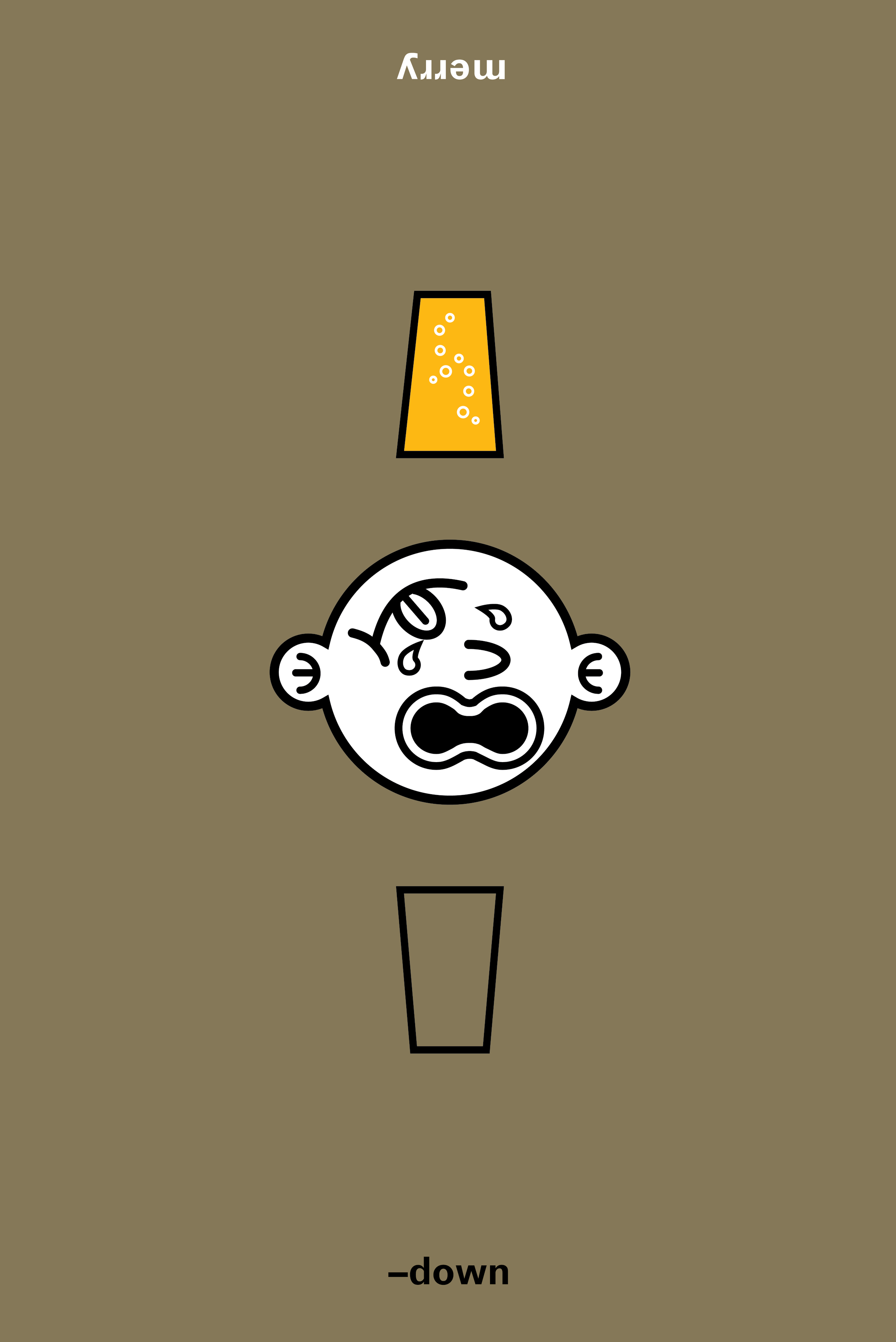

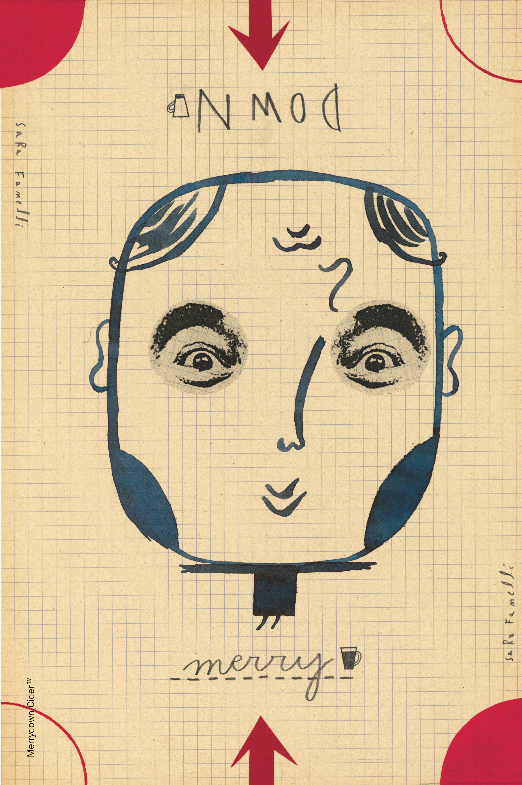
I’d always loved Sara Fanelli’s work, a stylish mixture of collage and inks.

Too oniony.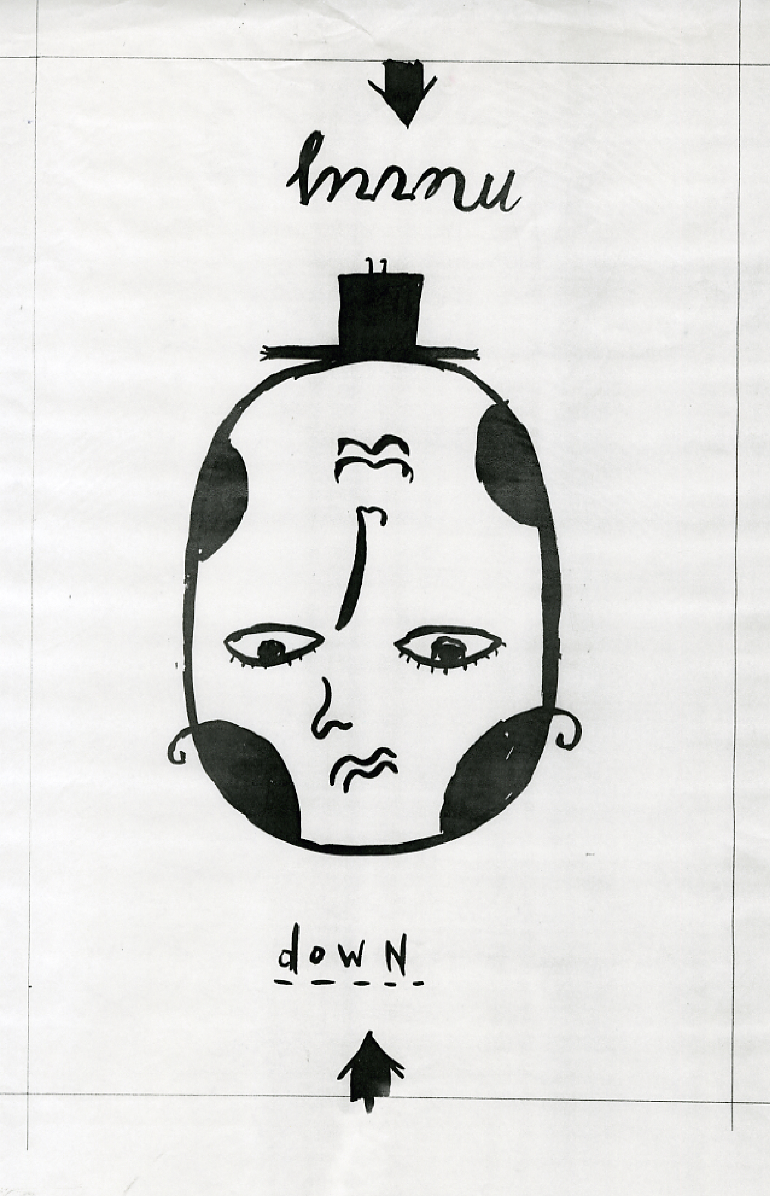

Less oniony, quite like the tiny hat.


I thought the illustrations could do well at the awards, they didn’t.
But the idea, that wasn’t really an idea, just a kind of Happy/Sad branding thingy, it did very well, winning D&AD silvers for Best Poster Campaign and Best Press Campaign.
So I guess the moral of the story is; don’t go looking for awards, go where the brief takes you. Awards may follow.
The media was booked before the idea had been conceived? Good thing or bad thing in your opinion? Love the idea by the way.
Hey John – Bad. I don’t understand why media and creative aren’t closer together?
How can someone think “I’ve got a hunch ads about this size will work, no idea what’s in them yet, but it’s a good shape for achieving our goal”
This has to be the best illustration campaign in the history of advertising Dave! always loved it )
You’ve always had good taste Daniel. Dx