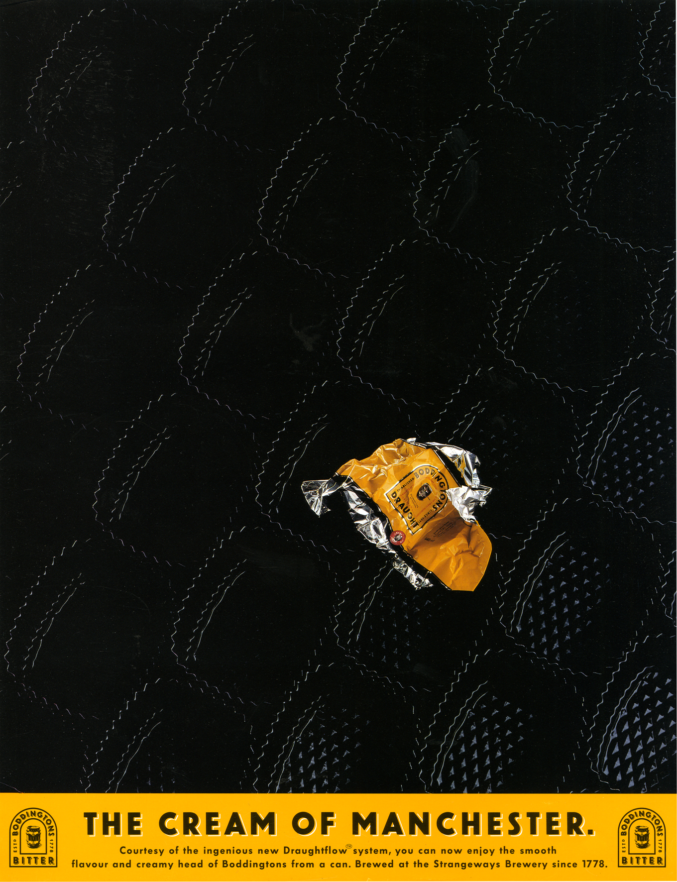
‘There is a possibility that ad agency Bartle Bogle Hegarty’s Cream of Manchester ad campaign, which ran from 1991 until 1999, is responsible for the transformation of that city’. – Stuart Jeffries, The Guardian, 2019.
I know, it sounds ludicrous?
Who knows whether it’s true, but one thing is unarguable; they took a little-known bitter from the North of England and created a campaign that made it famous.
Even beyond our shores.
Here it is being referenced in Friends.
I loved that campaign, so thought I’d look into it and grill those responsible.
CREATIVE DIRECTOR: John Hegarty
WRITER & CO-CONCEPT CREATOR: Tom Hudson
WRITER: Tim Riley
MODELMAKER: Gavin Lindsay
PHOTOGRAPHER: Tif Hunter
THE ART DIRECTOR & CO-CREATOR WAS MIKE WELLS. (I tried to track down, but had no luck, apparently he’s an antique dealer, somewhere.
Mike, if you ever read this, get in touch and I’ll add your comments too.)
What was the initial Boddingtons brief?
JOHN: I seem to recall it being about the creamy head.
Controversial at the time, because, although they liked a creamy head up North, in the South it was seen as froth taking up valuable beer space. A bit of a con.
Also, as usual, research told us it was a mistake too, saying ‘Don’t mention the head!’.
But we thought, well, Boddingtons does have a creamy head, people are going to find out sooner or later, so let’s celebrate it!
It was different.
As the team, did you see this brief as a big opportunity?
TOM: They gave it to a junior team to play with, because Boddingtons came into the agency as a bit of wild card.
Whitbread, an existing client, had just bought the brand which until then had just been a much loved local session pint in Manchester.
They were going to experiment with rolling it out nationally, they’d never advertised nationally before.
What came first; the poster-like ideas
or the media idea – back pages were like posters?
JOHN: The media idea.
Kev Brown had a view that we should use back pages because they were like posters.
He said that often people turn over a magazine once they’ve read it, then it sat there, ad up, like a poster.
The same on the tube, people are often looking at a row of back pages.
He also said they were undervalued as most people didn’t want the back pages.
Did you have any other ideas before ‘Cream?’
TOM: The initial brief was ‘the ultimate smooth drinking pint’.
A very familiar brief at BBH at the time – Levi’s were the ‘ultimate jeans’.
A few campaigns went up on the wall…there was one route featuring great things that came from Manchester, one of the executions featured the Bee Gees.
So the ‘cream’ idea was off-brief?
TOM: More radical than cream was being brave enough to talk about a pint of bitter from Manchester.
Until then, Yorkshire was the only reputable place bitter to originate from.
What was the first idea?
TOM: The milk bottle.
It was where the whole idea was born – let’s put a pint of beer in a milk bottle!
Make it a pint of gold top and that’ll do the whole creamy thing. Bingo.
And it looked fucking cool.
We put the line on it and off we went.

How did John Hegarty first react to them?
TOM: He loved them.
He used to reference Lady Diana – the most famous woman in the world on the strength of her image alone – at that stage she was so shy she’d barely said a word to the world’s media, but her image defined an era.
We wanted work that had the same visual power.
Most food and drink clients don’t like you ‘playing around with their product’, was it a tough sell?
JOHN: No, Whitbread were a terrific client, they knew we needed to do something different, they bought it straight away.
Were you excited about the possibility of the photographs when the layouts chugged through the fax machine?
TIF: Totally. This was the first time that I’d been considered for a whole campaign rather than just a single ad.
And it was BBH.
So, no pressure!

The ads looked very distinctive at the time?
TOM: The look was inspired by a fashion editorial in The Face, all shot out of black.
I loved it and wanted it on every campaign we did.
TIF: Mike and Tom were very clear about the overall look of the ads.
I spent a few days testing to come up with a look and feel that fitted their idea – backlighting the beer with very tight masking, using black velvet card close to the subject, combined with black masks close to the camera lens.
Once the lighting “formula” was worked out for solid and transparent subject, each shot took about two days.
For me, still life advertising photography meant shooting large format 10×8 film, where as far as possible everything was created in camera, with limited involvement of post production.

Did the fact that your models were going to be shot against black affect how you made them?
GAVIN: All the models were transparent, three dimensional objects, so they were affected by what was behind them as much as what was in front of them.
Each one was mounted in front of a light-box and lit from behind, with some front fill.
Black card was placed around the edge, slightly behind the centreline of each model to mask the stray light and help cutting out for the final image.
But it also had to avoid refracting through the real beer that was used in each case.
Was the angle of the shots set before the models were made or were they found with the camera?
GAVIN: The angles were pretty much taken from Mike Wells’ and Tom Hudson’s original layouts.
Although we had to ensure that the back of each model was featureless and didn’t refract through the front design and confuse the form.
TIF: Although we could shoot the finished models from various angles, their position in the ad’s composition was pretty much figured out before they arrived on set.
One of the rules we made early on was that the beer was always the beer – so the head that you see in the pictures was always the genuine Boddingtons head.
We got through a lot of beer.
We poured many pints just to use a few spoonfuls from creamy head.
Gavin came up with brilliant ways of creating the heads on the shots, for instance in ‘Quiff’, ‘Cone’ and ‘Scoop’ – he made fine, sharply sculpted forms to fit in to the top of the glass, which we dipped in bowls full of Boddingtons head, just before taking the shot.
It allowed the natural texture of beers head to be captured in camera.

How many ideas did you come up with in that first year?
TOM: Once we’d shot the first couple, we had enough ideas on the wall to last 5 years.


Were the images cut out and dropped onto back backgrounds or shot in camera?
TIF: The black background was always part of the brief and was there on every transparency that I shot.
To get the light to flow around each element of the composition we used very small plinths for subjects to sit on.
They were always complicated sets, lots of clamps, clips, cut card wrapped in black velvet, etc.

Were the models scaled up?
GAVIN: They were all made actual size, there wasn’t a creative need for any of them to be scaled.
It was always my preference to work at life size, unless the end result dictated otherwise.
There were several reasons we chose life size in this instance, all to do with using the real Boddingtons product for authenticity.
Each of the objects we made were conveniently a similar size to a pint glass, so that kept the models a consistent scale.
Working 1:1 also helped when applying the beer head ‘foam’ to the inside face of each ‘glass’.
We’d developed a technique to give the appearance of tiny bubbles in the head pressing against the inside surface.
The texture was then sprayed over with a cream coloured paint.
Working with real beer meant a working in very small windows of time and opening of hundreds of cans of Boddingtons.

Which was the trickiest to shoot?
TIF: The Cone.
Supporting it without seeing the support and having it full of beer was an engineering nightmare.
A special rig that came out of the back of the cone, then up to a supporting truss – all covered in black velvet.
That finally did the trick.

Which was your favourite execution?
TOM: Cone is the crème de la cream.
But milk bottle is still the one for me .. because it was the idea and the layout that unlocked everything and I can still remember bullying Mike to colour it in the way I wanted it.
He wasn’t happy about it.
But being Mike he still did it with a smile.
He was a great partner.
GAVIN: It has to be the ice cream cone – it wasn’t the one that started the campaign off but it certainly established itself as an advertising icon.
JOHN: The Ice cream cone, everything came together – the idea, the execution, the look, it just looked iconic.
TIF: The cone. The final image became the most iconic of the campaign, in my opinion, and graced the reception of BBH for many years.


Which was the most difficult model to make?
GAVIN: Hands. It was the only one we decided not to use liquid in a hollow sculpture.
Taking reference from religious iconography, I decided to pose the hand in a position that meant there was very little space to create a void to then fill with beer.
Instead we sculpted the internal hand shape, then cast it as a solid beer form, that was then coated in lacquer before casting a second layer of clear resin over the surface, creating the final form.
It required several models that fitted one inside another, ‘Russian doll’ style, with a uniform wall thickness to represent the glass.
The coating of lacquer acted as a disrupter in the refraction between the two cast elements, giving the appearance of liquid inside a glass hand.
Did you coordinate the angle of the shot with Tif before you made the model?
GAVIN: The angles were pretty much taken from Mike and Tom’s original layouts.
Although we had to ensure that the back of each model was featureless and didn’t refract through the front design and confuse the form.


That wasn’t how bitter advertised itself back at the time?
TOM: No, it was all serious men with their hops and their mash tuns .. and lots of long copy (often run around the hops) explaining the craft and the flavour.

(A couple of years in, Tim Riley takes over the copywriters seat.)
BBH in the 90s, working on Boddingtons; good gig?
TIM: When John offered me a job there, working with Mike Wells, I thought: “It doesn’t get any better than this”.
But it did.
Because the first thing I got to work on was the Boddington’s campaign that Mike had created with Tom Hudson a couple of years earlier.
All the hard work had been done for me. Mike and Tom had come up the big idea.
All I had to do was suggest more executions that they hadn’t already thought of.


Was it a campaign you admired before you worked on it?
TIM: Oh yes. It’s hard to overstate just how radical it was at the time.
I don’t think beer had ever been sold that way before – with striking visual metaphors.
All the Guinness work with puns on the pint owes a huge debt to Boddington’s, I think.
I do have a very dark and guilty secret, though.
Several years earlier, when I was working at BMP, we had the John Smiths Bitter account. John Webster had created this loveable Yorkshire character called Arkwright, who was obsessed with his pint of John Smiths.
Anyway, one day a young team, Sean and Jim, came into my office with a script they’d written.
It described Arkwright’s wife dipping her fingers in a pint, then putting it behind her ears – like perfume.
I’m ashamed to say I thought it was a bit off-putting.
Beer? Behind your ears? Naah… Of course, it was pretty much the same idea that Boddies would later do in their first, ground-breaking TV campaign.
So, if you’re reading this, Sean and Jim, I can only apologise.
Did you try to bring your own take to the campaign – Rileyfy it, if you will?
TIM: I really liked the way Richard Foster and John Horton moved The Economist campaign on when they took it over from Ron Brown and David Abbott.
By that stage, the campaign was well-known enough for them to play with the conventions a bit.
They did things like an all-green newspaper ad (‘The Economist is full of surprises’) and a 96 sheet that was red and blue (‘Two thirds of the world is covered by water. The rest is covered by The Economist’).
So, when I got the Boddington’s brief, I tried to think of ways to do the ads slightly differently.
Was your cunning scheme to bring words to the party?
TIM: Calling it a scheme is being a bit generous, but yes.
Up to that point, the line was always the same – as I guess it had to be when you were establishing the campaign.
I just thought the work was well-known enough by that stage for us to be able to stretch things a bit.
So when we got the brief for the new print campaign, I just wrote down all the different kinds of cream I could think of, then we thought of visuals that could go with them.We did one ad that didn’t show the beer at all – just a black panel. The headline said: Vanishing Cream.

A technical question, on ‘Vanishing’, were you flipping through the thesaurus looking for words to link to cream or did you think ‘it’d be great to do a blank one’, then made that work?
(People imagine it’s the former, but I find it’s more often the latter.)
TIM: Yes, that’s exactly right.
The campaign had such a distinctive look, I thought: What’s the most extreme thing you could do in an execution that would still work as an ad?
Could you take the product out completely? That might look interesting.
Then I thought: Hang on, if you made the line ‘Vanishing Cream’ that would work.
There wasn’t actually a brief for new print work at that point.
I think it was my first week or so at BBH and I was keen to get some work out quickly and make a good impression.
Also, I wanted to make sure we did them before somebody else did. It was a very talented department!
Same with The Man Utd pint ads, they were both spec ads too.
As I’m sure everyone will remember, 1993 was the year Man United won their first league title since 1967 – so Mike and I wrote an ad where the pint was red and white, with the line: The Cream of Manchester.
But there was a concern within the agency that this might alienate City fans, so it wasn’t presented.
Then, the following year, United won the league again, and this time we were allowed to present the ad to the client. Not only did they buy it, they asked us for another ad the following week when United won the FA Cup. So this time the ad showed two red pints with the line: Double Cream.


I presume it was one of those campaigns, a bit like The Economist, where it’s easy to come up with lots of ideas but hard to come up with a good one.
JOHN: True. It’d be the same on Levi’s, we’d write 25 or so scripts before we landed on a good one.
With Boddingtons, maybe the ratio was ten to one?
TIM: Whether I came up with any good ones is really for others to judge. But in all honesty, it was one of the easiest briefs I ever worked on. It was such a brilliant creative leap by Mike and Tom in the first place, you really couldn’t miss.
From memory, every ad we presented to the client was bought. And they all got into D&AD. I felt like a bit of a fraud, really.
This brilliant opportunity just fell into my lap. Thank you, Mike and Tom.
Were there any good ones that didn’t sell?
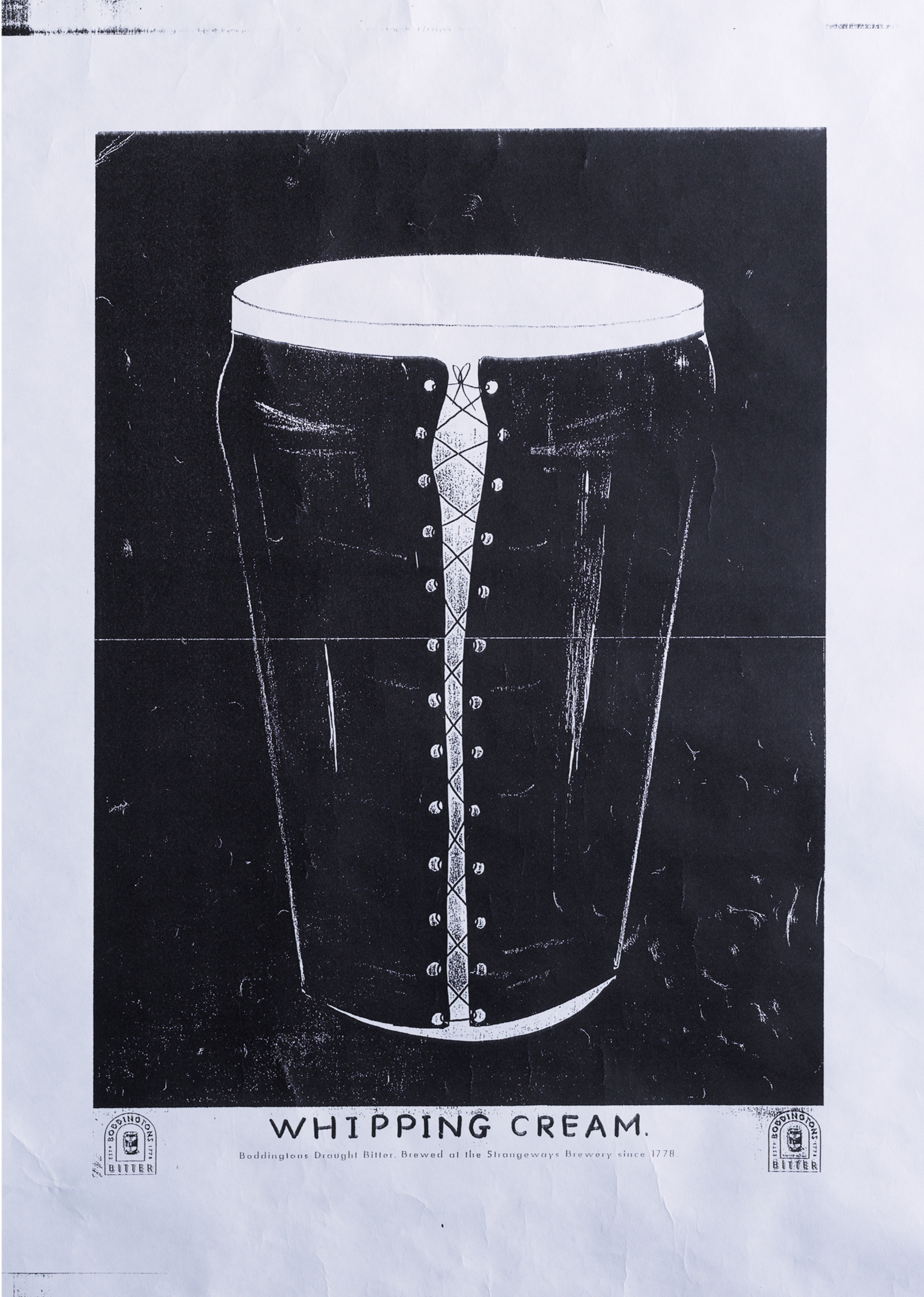
I can’t remember if the client didn’t buy it, or the powers-that-be wouldn’t present it, but Mike came up with bondage-style execution that showed the pint in a lace-up leather basque with a bullwhip beside it. The headline was: Whipping Cream.
It was up on the office wall for about a year.
But our strike rate was so good, you couldn’t really complain.
A couple of years later, Bruce Crouch and Graham Watson got the TV brief and managed to get a ‘whipping cream’ idea away.


Was John very involved?
TIM: Very.


Today, these images would be created using CGI. Would that make them better or worse?
GAVIN: In the right hands CGI is an amazingly creative tool.
I can’t see why it would lose anything, there are few talented artists using it as a medium who’ve come from a traditional sculpting background.
It would allow greater expression in the sculpting of the models, we were limited by casting techniques and the inevitable unforeseen problems that would occur when creating the ‘prototype’ objects.
Why do the images still look fresh today?
TIF: I think they engage with a gentle visual humour, as well as their use of a visual language.
Also, the imagery didn’t rely on post production gimmicks or slickness.
They look real because they are real.
And I think the human eye and brain enjoys that.
Plus, a year or two in there was real enjoyment for the audience to work out what the visual pun was this time.
Keeping a campaign interesting and cool, for 6 years, without changing the brief, is very rare.
I’ve told people in recently about how different the process was back in the 90’s, from conception to execution.
I never used to meet the client.
The only agency meetings I went to then were with the creatives, in their office over a cup of tea.
I never wrote a treatment.
On Boddingtons, Mike came to the studio for part of every shoot, but watching three men spoon beer head from a bowl its’t super exciting, so he wouldn’t hang around.
The process of creativity was allowed to flourish by allowing specialists to do what they do best, without interference.
It was a very iconic poster and press campaign, why switch to tv?
JOHN: Good question. I asked the account guy that, that when he first told me they were going on tv.
I said ‘Let’s just buy more posters’.
But I guess it was a reach issue?
The temptation must’ve been to not stray too far from the print?
TOM: Yes, we did initially have a look at a black and orange animation route, but found our feet with some northern humour and still not a hop in sight.
JOHN: A script was sold in that I didn’t like, it was taking the print campaign too literally, I felt we needed to take the essence, the idea, not copy the print.
So I had to go up to the client and unsell the scripts.
We ended up doing ‘Face Cream’ instead, which was my favourite, as it broke the ground.
Was there a huge pile of rejected scripts before John approved one?
TOM: Yeah, I still have some.
Bear in mind that life was different then – you could still write scripts with women in bikinis and not get cancelled or condemned.
Luckily, some of the early scripts never got made!


TOM: Here’s the original memo (printed out and dropped on your desk by hand) concerning the ‘communications check’ after the first ad ‘Face Cream’ aired.

TIM: One of the other things I lucked into when I joined BBH was a fully approved script for the second TV spot.
It was a parody of a famous Cornetto ice cream ad set on the Grand Canal in Venice. 

TIM: I think it was the first TV appearance for Anna Chancellor, who became world famous a year later as Duckface in Four Weddings and a Funeral.
I remember her getting on well with the camera operator on the shoot, Nigel Willoughby. So well, in fact, that they ended up getting married.
In a classic creative team move, we told John we thought we should go to Venice to shoot the ad.
John was having none of it. The idea is they’re in Manchester, he said, so that’s where you have to shoot it. He was right, of course.
He also insisted that we use an old recording of Enrico Caruso singing O Sole Mio as the soundtrack. Mike and I weren’t sure at first, but, once again, John was right.
The producer, Kate O’Mulloy, had the brilliant idea of sending the script to Jeff Stark, who had just started directing.
Not only did he make the ad look great, he also added a couple of lines of funny dialogue that lifted the whole thing.
How did you turn Manchester into Venice?
JEFF: We had to use lots of lights as it wasn’t sunny, we also shot really tight at first so that the bridges looked Venetian – or just about.
When then we pull back in the ad to reveal it’s not Venice but Manchester, you see factories and smoke stacks and there’s some bloke fishing and a couple walking along the towpath, one pushing a shopping trolley, which is something that you won’t see in La Serenissima. Of course, Manchester’s very different now.
We also used a scratchy recording of O Sole Mio to spoof the Cornetto ad that was popular at the time.
What was improvised on the day?
JEFF: I told Anna to drink the beer like a man and then wipe the froth from her mouth as she sat in the gondola. When she did, the lipstick smeared up her cheek. The makeup woman rushed over and said: ‘You can’t do that!’ But I said: ‘Hang on! That’s really funny.’
Why did the campaign stop?
JOHN: It got sold.
Whitbread sold it to some lot who just didn’t care, they under invested and let it rot.
It’s a real shame, this country isn’t very good at looking after its brands.
The brewery is a car park today.
N.b.
As proof to how smitten I was with the campaign at the time, here’s a spoof of it I did with Tony Barry on behalf of The Guardian whilst at Leagas Delaney.

Whatever happened to comedy? The dialogue in the TV ads is still genuinely laugh out loud funny (and I’m trying to watch them quietly when I’m meant to be working). While the press ads are simple, brave and achingly clever. This is the cream alright.
°°°°° !!!
I’m assuming that’s a good response Marten? Dx
Love these! It’s a masterclass of what can happen when you go off brief.
When advertising was fun, entertaining and engaging.
I wouldn’t for one moment disagree that the campaign was magnificent but Stuart Jeffries is wrong.
This man did more than anyone to transform the city of Manchester in the latter part of the 20th Century.:
https://www.youtube.com/watch?v=3cYNI8s_vo4
BBH tapped into that but no one would have taken it seriously without Joy Division, The Hacienda, The Mondays, ACR, Erasmus, Gretton, Saville, Blue Monday, Dr John Cooper Clarke, Vini, and the genius that was Hannett.
I went to see the Strokes two or three years ago at Victoria Park. (You know how big the strokes are.)
I subliminally clocked the t-shirts worn by the crowd. I reckon Unknown Pleasures outnumbered those of The Strokes.
Unknown Pleasures was released in 1979.
j
P.S. I didn’t see any Boddington’s t-shirts.
I think the ads probably helped.
They were very pro Manchester at a time when few were.
And were seen by millions.
I think you’d challenge the rigour of your t-shirt test if you were in your day job?
Dx
Back to my day job…
Blue Monday was the biggest selling 12″ single ever. It’s had around 350m views/listens online.
If you type ‘Unknown Pleasures t-shirt buy’ into Google, you get 3.2m results
Everything’s Gone Green inspired techno.
The Mondays inspired a dance movement and The Stone Roses, not to mention a drug culture.
Factory inspired a movie – you know it.
Factory inspired a documentary – Shadowplayers.
Factory inspired at least 17 books – including ‘Shadowplayers. The rise and fall of Factory Records’ by James Nice which is both forensic and hilarious. I recommend it.
Back to the unscientific anecdotes – I know at least 20 people who chose to go to Manchester University because of the music scene and the Hacienda.
I could go on but I think Factory was the biggest thing that happened to Manchester since the Industrial Revolution.
It pains me to say this on, account of my football allegiance, but…
There was a beer from Leeds that had an equally creamy head – Tetley’s – to my mind a far finer brew.
If someone had come up with this: ‘Tetley’s. The Cream of Leeds’, people would have laughed it out of court. (Much the same way as you – Dave – are probably laughing us out of the Premier League.)
I loved the Boddington’s campaign, I just believe that my ‘day job’ suggests Stuart Jeffries is wrong.
j
It took 33 years but the long awaited apology finally came.No worries Tim, it’s happened to just about everyone at some point in their careers. But I do vividly remember seeing the Boddingtons ad on TV and Jim and myself saying that’s exactly the script we wrote for John Smiths. That bloody Tim Riley! No hard feelings.Thanks for remembering us. It brought a smile to my face still working in an agency today in Hobart Tasmania.
The Cream of Advertising. Thanks for writing it up.
‘Blue Monday was the biggest selling 12″ single ever. It’s had around 350m views/listens online.’ – DOESN’T MENTION MANCHESTER.
‘If you type ‘Unknown Pleasures t-shirt buy’ into Google, you get 3.2m results’
– DOESN’T REFERENCE MANCHESTER.
Everything’s Gone Green inspired techno.
– DOESN’T MENTION MANCHESTER.
The Mondays inspired a dance movement and The Stone Roses, not to mention a drug culture.
– DID PEOPLE MOVE TO LIVERPOOL BECAUSE THAT’S WHERE THE BEATLES WERE FROM?
Factory inspired a movie – you know it.
– SO DID EVITA?
Factory inspired a documentary – Shadowplayers.
– SO DID MOTOWN, DID ANYONE MOVE TO DETROIT BECAUSE OF IT?
Factory inspired at least 17 books – including ‘Shadowplayers. The rise and fall of Factory Records’ by James Nice which is both forensic and hilarious. I recommend it.
– SO DID NICK DRAKE, DID ANYONE MOVE TO TAMWORTH IN ARDEN BECAUSE OF IT?
Back to the unscientific anecdotes – I know at least 20 people who chose to go to Manchester University because of the music scene and the Hacienda.
– GREAT, THAT’S 20…
I could go on but I think Factory was the biggest thing that happened to Manchester since the Industrial Revolution.
– COOL, I LIKE FACTORY TOO.
I DON”T KNOW WHAT THE TIPPING POINT WAS, BUT I SUSPECT A NATIONAL CAMPAIGN, OVER 7/8 YEARS BEING SO VOCAL AND PROUD TO COME FROM MANCHESTER WAS HELPFUL.
WAS IT 2%, 12%, 32% I DON’T KNOW?
BUT THAT’S STILL PRETTY AMAZING FOR AN AD CAMPAIGN, THEY RARELY SELL THE PRODUCT, LET ALONE THE CITY IT’S FROM?
SO TAKE IT UP WITH STUART @stuartljeffries
Dx
(THE CAPS ARE TO DIFFERENTIATE FROM YOUR UPOPER & LOWER CASE, NOT BECAUSE I’M SHOUTING)
It pains me to say this on, account of my football allegiance, but…
There was a beer from Leeds that had an equally creamy head – Tetley’s – to my mind a far finer brew.
If someone had come up with this: ‘Tetley’s. The Cream of Leeds’, people would have laughed it out of court. (Much the same way as you – Dave – are probably laughing us out of the Premier League.)
I loved the Boddington’s campaign, I just believe that my ‘day job’ suggests Stuart Jeffries is wrong.
It reads a lot like shouting. If I may whisper… people knew Factory and all the bands were from Manchester. They didn’t need to shout it. 😉
ONLY THE COOL KIDS JOHN.
NOT THE POPULATION OF BRITAIN.
(That was shouting.)
Dx
So Tim, the dark and guilty secret you’ve held for 33 years has finally been revealed. Along with the long awaited apology to myself and Jim for rejecting the John Smith’s perfume script we presented to you at BMP. No worries mate. It’s happened to us all at some point in our careers. No lasting scars. But I do remember watching the Boddington’s ad and thinking “that bloody Tim Riley”. Anyway, I’m still producing lots of TV ads today working on the other side of the world in Hobart Tasmania. Thanks for the memory.
I’d always thought you were quite cool Dave.
Now, what with all the shouting, I’m starting to think you’re a bit hot (under the collar).
j
Finally, you admit it – it’s all about being cool, isn’t it John? You Planners, Jesus! Dx
I took a group of Mitsubishi truck engineers and designers to the (in Yokohama) legendary British pub, The Tavern. All six of them had never had British food or beer before, and they were very hesitant to try but they did. The fish and dhips with Sarson’s vinegar went down very well with them, so did the shepherd’s pie, and they were delighted with the canned Boddington’s Export, which is stronger ABV than the domestic Boddies. One of the guys said very firmly after he had downed half a glass: “Now THAT’S a beer”.
Don’t think he moved from Shin Kawasaki to Manchester though.
Hi Dave. Great piece. I just stumbled across it this week after retrieving my collection of adverts from the attic! I avidly collected these as a teenager and had an entire bedroom wall covered in them. I have all of the ones pictured here bar the FACE one and the two United ones, I recall seeing that Double one back in the 90s but never got a copy.
I’d love to know if the guys you spoke to from the campaign have an archive or digitized versions of everything? I have a couple of other random “Manchester” related adverts that pay homage to the campaign as well (Hacienda & Insprial Carperts). Anyway like I say a great read, cheers
Hey Matt,
Glad you liked it.
What others campaigns do you have?
(All Manchester based?)
Dx
Hi again Dave, sorry it’s taken me two years to see you replied!
My email address is provided with the post, if you drop me an email I’ll happily send you what I have, ta