
 These were the first Adidas ads I did.
Loud, aggressive and very yellow.
I wasn’t a big fan of the look that had been created at the time, I felt it killed the images and came over like Nike, only less sophisticated.
(To be fair, they stand up surprisingly well today.)
I got the chance to break away from this style with some running ads Tim Delaney had written.
It helped that he’d written ads that were tonally very different from the previous work, instead of the testosterone-fueled attitude and swagger we’d all got used to writing, he’d written much more introspective lines, essentially runners’ thoughts on running.
Whereas the brash ads were fine for sports like football or even tennis, it didn’t fit sports that were more introspective, like running.
As a runner, I’d always thought that Wieden Kennedy Portland’s ads really got runners.
Like the one below, probably my favourite running image, shot by Joel Meyerowitz.(http://www.pinterest.com/davedye/joel-meyerowitz/)

I love that ad.
I love its quiet power.
I love the tiny little runner, even though he’s dwarfed by sky scrapers your eye goes straight to him.
I love the idea of celebrating the anonymous hero who puts in the miles day in day out, that is running.
I love that the runner is a silhouette, he’s unrecognisable so you put yourself in his shoes.
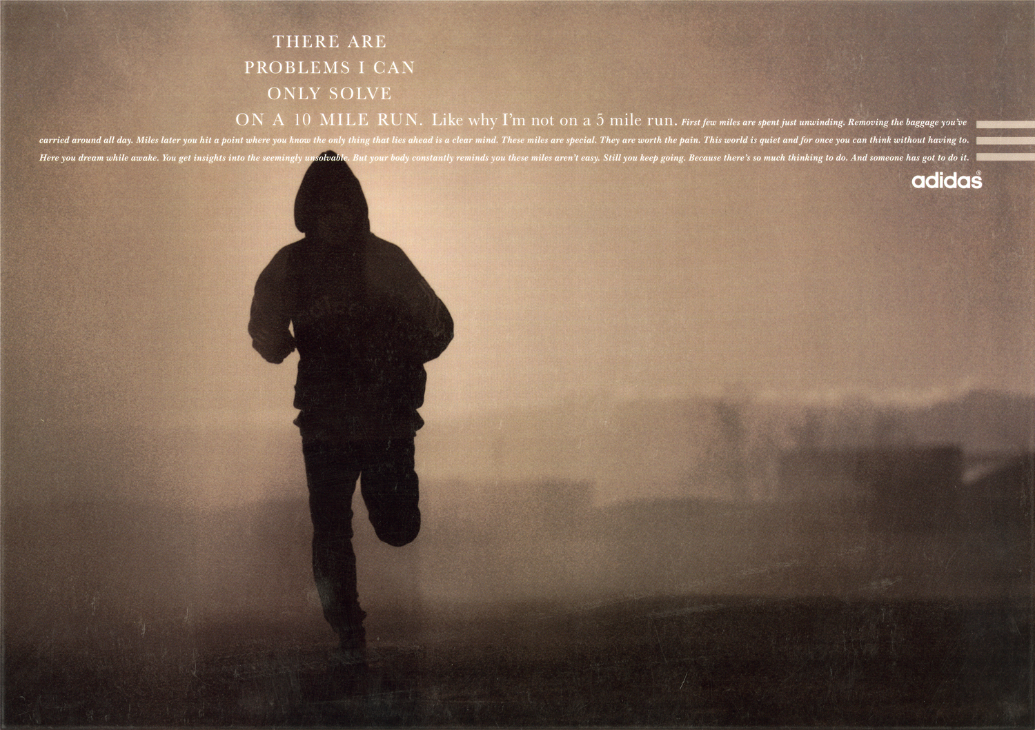
I thought our running ads could feel more sensitive, it would fit these new, more sensitive lines that Tim had written.
Tim’s mantra at the time was that we needed thoughts that runners would recognise.
My writer at the time, Tony Barry, put it like “Tim wants lines that are good for runners and bad for your book”.
I tried to make them look 180 degrees the opposite of what Nike were doing at the time.
I HAD THREE IDEAS FOR ‘LOOK’.
1. Put the words/thoughts in the heads.
2. Use montages to suggest the runners are thinking.
3. Use three lines of copy to echo the adidas three stripe branding.

BUT THERE WERE PROBLEMS.
1. Putting headlines in heads only worked if the head was big.
2. The montages worked well on faces but not on running shots.
3. On it’s own, the three lines of copy idea was too subtle, (I added bars).

I didn’t want the layout to be a fixed, cookie-cutter style, I wanted the thoughts to be positioned wherever the runner is.
So the layout was based on two sliding scales:
a) Headlines could slide along horizontally, minimising or extending the length of the first line of copy, to be positioned by the runner.
b) The block of type could slide up or down to be positioned by the runner.


 These two didn’t run.

 I did the next batch with the writer Dave Hieatt of Howies, Hiut Denim and ‘The Do Lectures’ fame.

 Dave left.
I wrote a couple myself. They didn’t run.

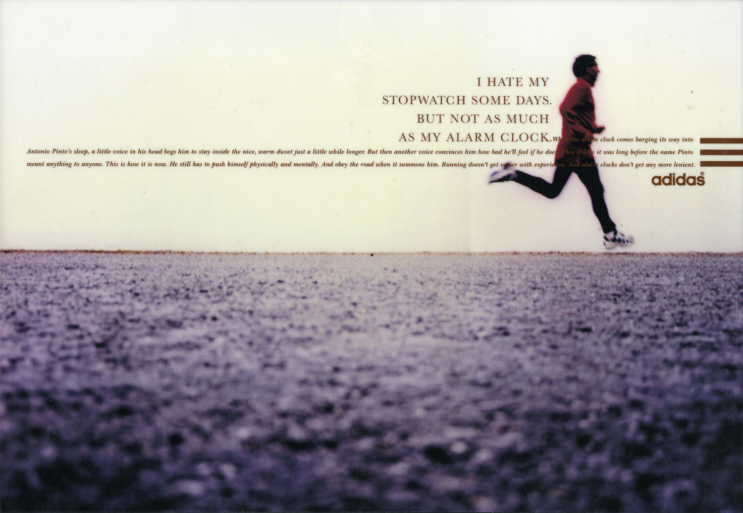
 Then, I had an idea for a one that was more personal, not a word play or a clever headline.
In fact, it’s not really a headline at all, it was just an idea relaying what I went through when I ran around Regents Park with my mate Mike McKenna.
We’d run drag ourselves around by agreeing we’d stop when we got to the gate. When we got to the gate we’d say we’ll stop when we got to hut.
Kind of tricking ourselves around the park.
I showed Tim: “No…runners don’t do that”.
To be fair, Tim probably saw a hundred ideas a day, also, look at the state of the rough I showed him:
We always showed the roughest, scuzziest of scamps at Leagas, it was almost showing respect; we know you’re not going to be fooled by fancy drawing and neat writing.
I wrote some more ideas but came back to the Regents Park idea, surely other people must do that too?
I checked with a couple of other people in the Creative Department “Ever do that thing when you’re running where you say to yourself you’re going to stop at a certain point, then keep going point, then to another point?”
Most said yes.
I went through the draw of Douglas Brothers prints in the basement, looking for a shot I could use to mock-up the Regents Park idea.
I found one that kind of worked if I retouched out the cars.
I rarely argued with Tim, I figured he’s the boss, if I don’t like what he says I should work somewhere else.
This time I started winding myself up, “I run, he does’t run. Also, I’m Head of Art, can’t he take my fucking word on one poxy ad? I’ve art directed all his ones about poetry and dreaming, what’s the point of being here if he’s not going to listen to a word I say?”.
I queued up outside his office, he always had a queue.
By the time I got to his office I was ready for a fight.
“Tim, Yeah…it’s about this ad…I think we should run it…”
Tim: “Ok.”
“Because if you’re not even…”
I left furious, like a tightly wound spring that hadn’t been unwound.
But the ad had gone through.
The problem was that when I made the words smaller as they trailed off into the distance it really helped the idea, but didn’t look like the rest of the campaign.
Also, the three lines of copy, it didn’t need any, what would you talk about?
Ignoring the campaign style I’d created seemed a cop-out, like failing.
It would also be breaking from a very successful campaign, the ten previous ads had all got into D&AD.
BUT…this idea didn’t work in that format.
Sod it! I broke away from the format, you have to be lead by the idea.
I changed the colour from the previous muted, pastelly colours to bright, flaming red. To make it look hot and sweaty.
At the last-minute I put a very heavy vignette around the image to focus the eye down the street, as if the runner was purely focussed on the point they were trying to get to.

The others I did seemed a bit ady by comparison.


COLOUR.
The client demanded it. 
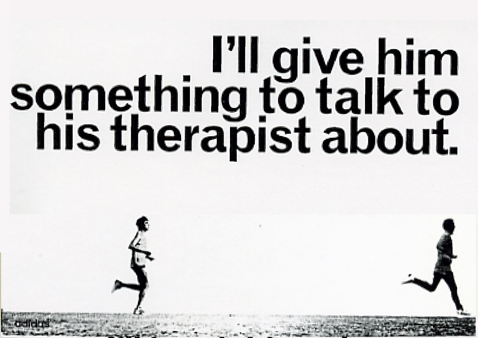
I also began trying to get into that runner’s mindset with my brand new, non-running, writer; Sean Doyle.

We liked this one.
Then a later in the magazine it appeared again.
“Runners don’t watch films like that”.
We went back to our office to imagine what films Tim thought runners were watching: ‘Marathon Man’? ‘Chariots Of Fire’? ‘Cool Runnings’? ‘Midnight Run’? ‘The Loneliness Of The Long Distance Runner’? 


 We made this one twice, this version for the countries considered sophisticated.
 And this one for the less sophisticated parts of the globe.
This idea…

…ended up looking like this.

We had a few goes at the headline on this one too.


Getting a bit cocky, I gave an outdoor moving shot to an indoor still life guy; Mark Mattock.
Rather shooting the runner running, he posed him in action pose, like a still life.
The results were horrific, contact sheet after contact sheet showed a guy who looked liked he’d been asked to stand in that position.
Fortunately, there was one frame that worked, the only one.

U.S. RUNNING.
The last running ads I did was for the U.S.

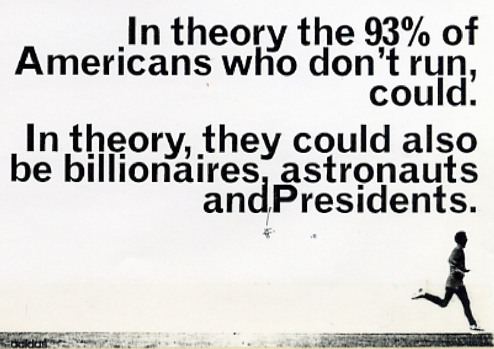


 The look started out like this.
 By the time they ran they looked like this.
 , It felt almost full circle, we’d gone back to a more aggressive headlines, (maybe we thought Americans aspired to that?).
We’d also gone back to big, brutal sans serif headlines, making them more like the original yellow and green campaign.
Just not as yellow and green.
I do that run to a certain point, then the next one and the next one. And I know that feeling too – of winding yourself up into a frenzy over an ad too. This post made me feel a bit better for it. Love your blog, great to learn from. Thanks Dave.
You’re welcome.
Thanks Luca.
Best,
D.
Brilliant, thanks I can remember a lot of the Douglas Brother ads and this is a great insight to great work. Interesting comment about the way the still lifer worked too.
Thanks.
‘Just to’ — Still one of my all time favourite ads.
And definately a runners truth.
Don’t suppose you’ve got any spare runouts kicking around, or did you bin them all?
D
I might have a proof kicking around if you want one?
D.
Love one.
Still Brilliant
I remembered this famous ad of yours today, randomly, and a search brought me here. What a story, your legacy lives on!
Thanks Mike, very kind. Dx
Hi Dave – my research brought me to your site! I am trying to ascertain what period your Adidas ‘If I really wanted Equality….” ad ran? As part of my undergrad studies (UK based) I am analysing marketing materials using sociological theory to explain how social and personal identities are depicted and how this relates to habitus cultures in sport and physical activity! It would be great to have confirmation of the approx dates the advert ran if you can recall? Many thanks – HD
Hey Harry,
It ran 96/97 in the U.S.
Dx
Great, many thanks