Not long after setting up DHM, we got a call from Media Guru and all round clever clogs Mark Palmer, he asked whether I could help The Economist out with a presentation.
Of course I could, they’re The Economist.
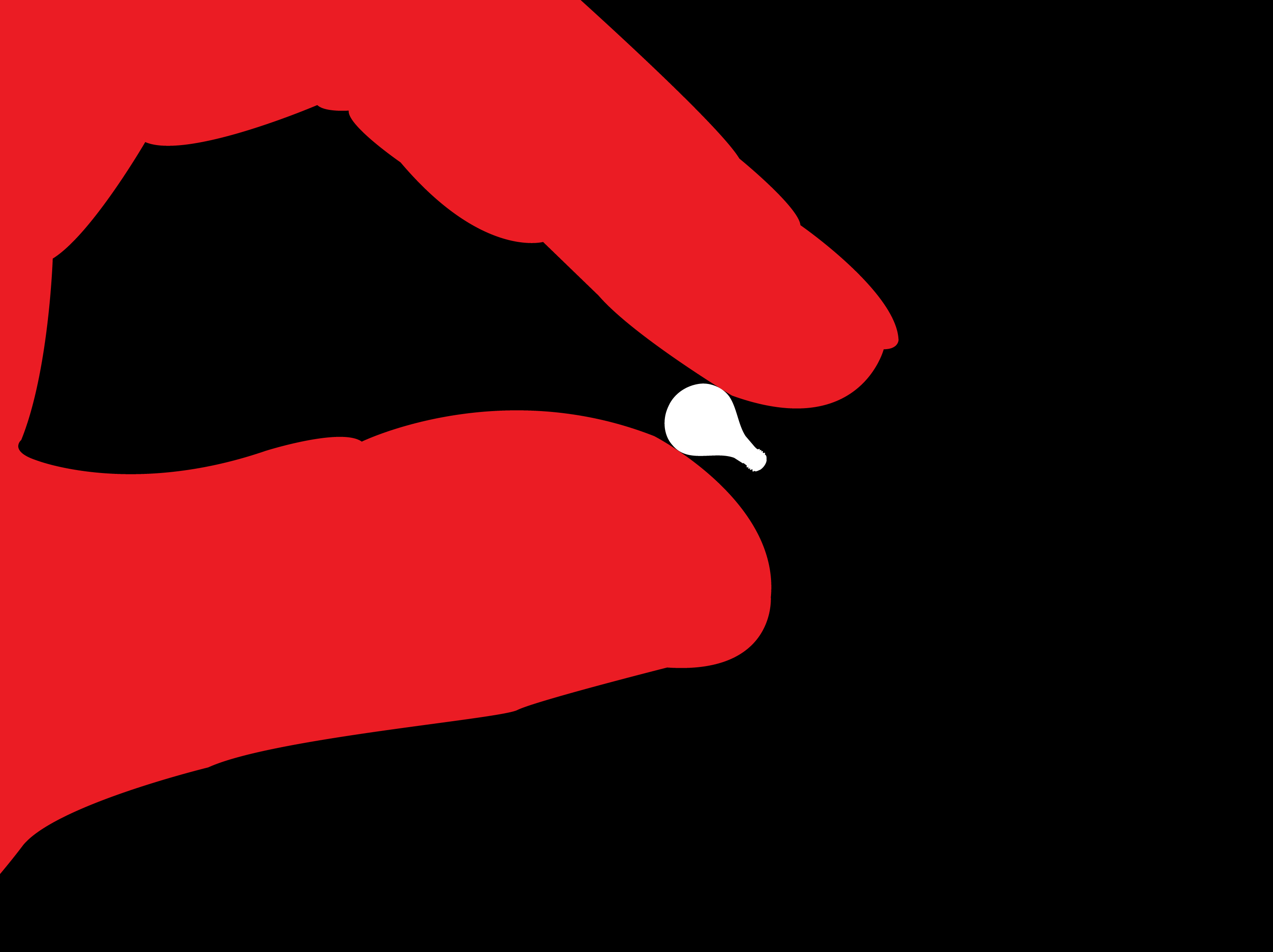
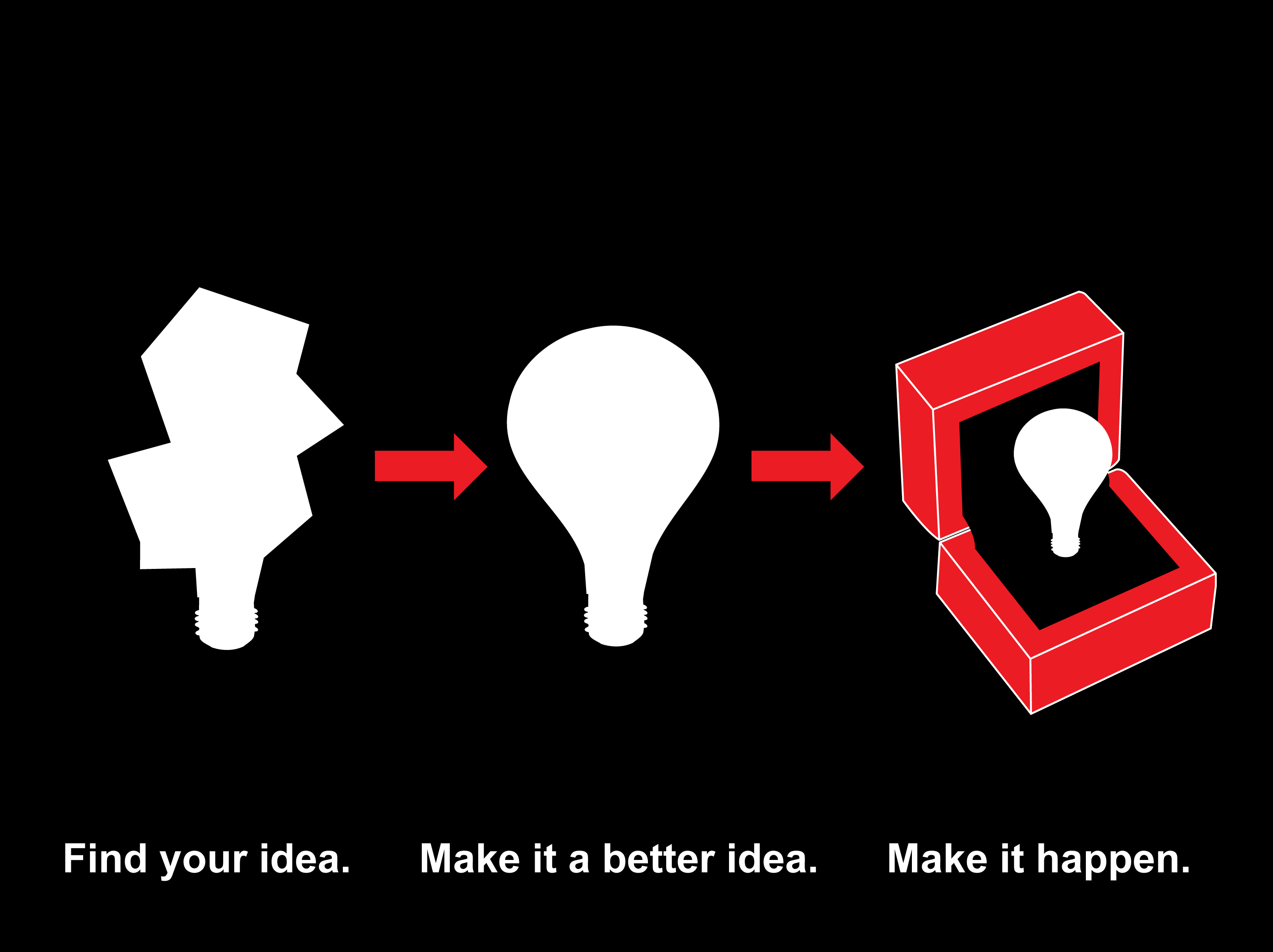
Essentially, I put together a fancy looking PowerPoint presentation for them to take around the world.
Titled ‘The Ideas People’, it set out the argument that The Economist wasn’t a dry, factual business publication, it was stimulus for creative minds to generate ideas.
I used the universal, possibly clichéd, symbol for an idea; the lightbulb.
It helped unify the presentation, and turned complicated wordy charts into simple, charming visual ideas.
Here are some of the slides:

 We waved goodbye and they went off happily to share their presentation around the globe.
Six months later they call up ‘That presentation went down great, could you do us some ads on the same subject?’
Of course, you’re The Economist.
At the time, the famous old red style was being replaced by a brand new shiny black style.
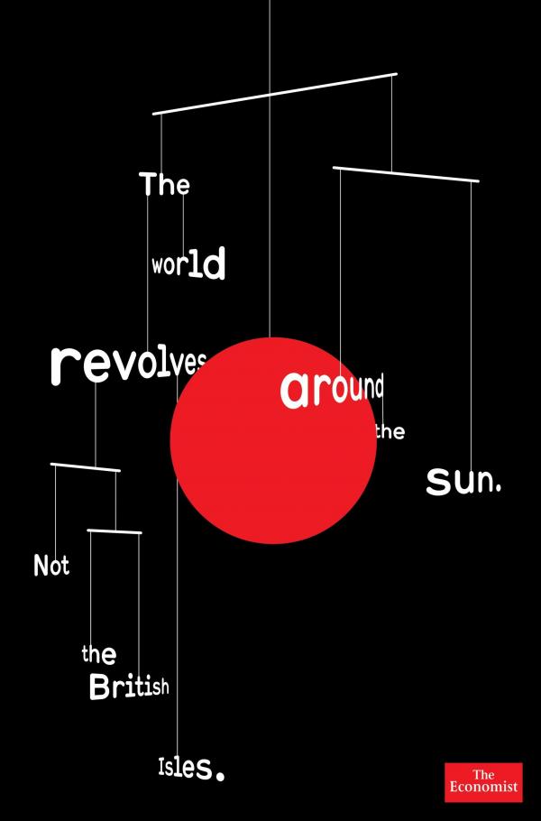
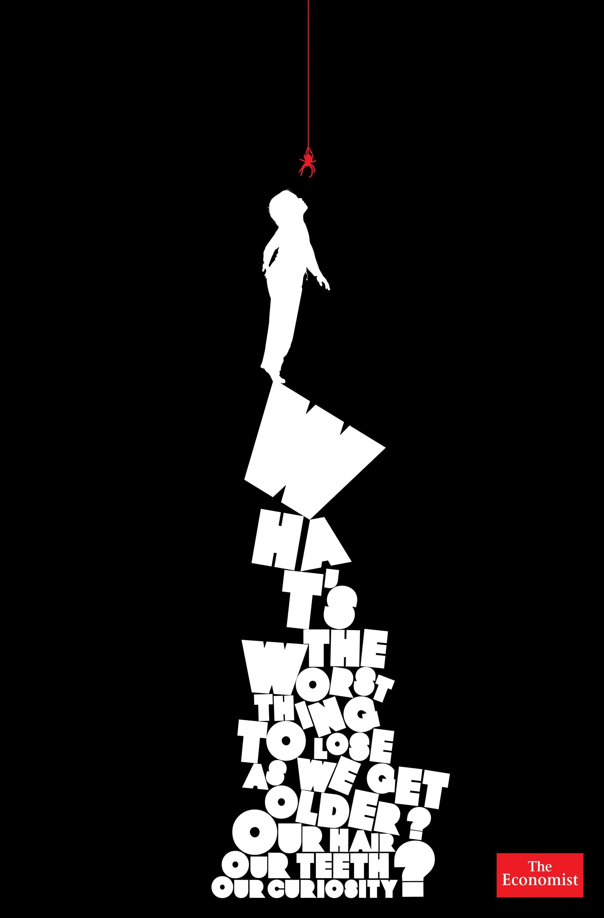

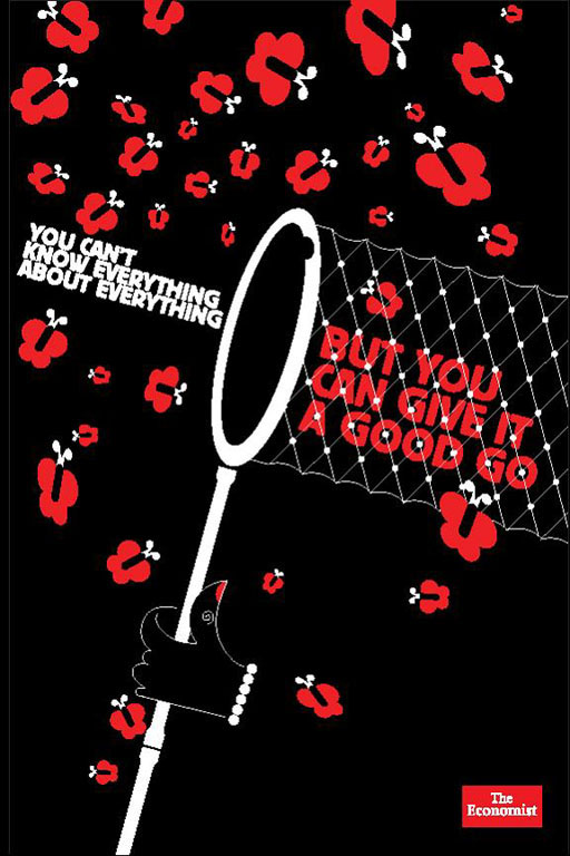

Reluctantly, I thought that whatever we came up should be in this new black style rather than the previous, more famous red.
It’s bloody tough to replace a famous campaign, and at first glance this new campaign looked clever, cool and modern.
I tried to figure out how it worked, but I found it was neither fish nor fowl.
It didn’t have big powerful headlines like the famous red ads, and it didn’t have visual ideas.
I’d had a spell creative directing the previous campaign, and these lines felt like the writers were writing for the red campaign, only to discover later that their words had been given to some beardy Hoxton types who’d added some funky black pictures.
The result was that the pictures took up all the real estate but didn’t actually communicate anything, they were like a whimsical accompaniment to the headlines.
Or worse, just making the words difficult to get at.
We couldn’t ditch the funky visuals because it wouldn’t feel like the new campaign, but I wanted it simpler.
I briefed the creatives: ‘I want you to draw pictures that say ‘‘The Economist helps you have ideas’’. No words allowed.’
The beauty of having such a focussed brief is that you get a lot of ideas back.
REJECTED:


I said no words.
APPROVED.
I like to give illustrators, photographers and directors freedom to interpret.
I’m buying into their world.
Sometimes I don’t even give them layouts, I just describe the idea, that way they can imagine the idea it their way.
Alfred Hitchcock said ‘If you cast well, you don’t have to direct actor.’
The down-side is that sometimes I get back results that I don’t like.
And to avoid finances and timings spiralling out of control I have to switch from ‘do it completely your way’ to ‘thanks for imagining your way, it doesn’t work, now I want you to now do it exactly like I say.’
(a). (Agency rough.) 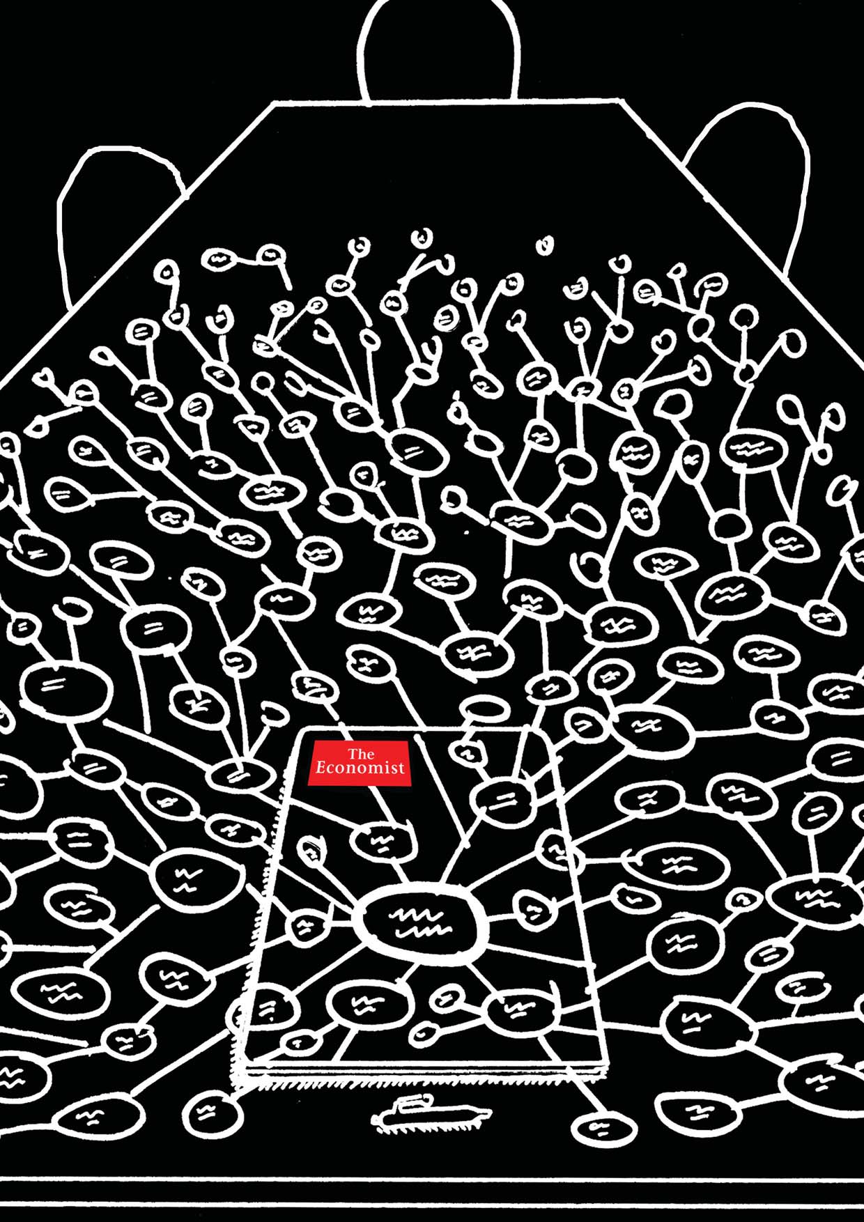 ILLUSTRATOR’S 1st ROUGH:
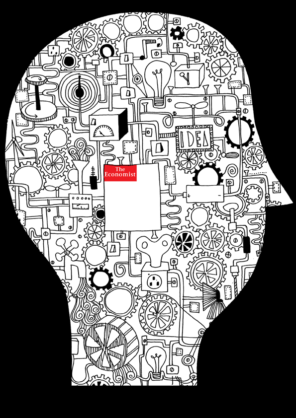 Oops, the illustration looks cool, but the idea has been lost.
ILLUSTRATOR’S 2nd ROUGH: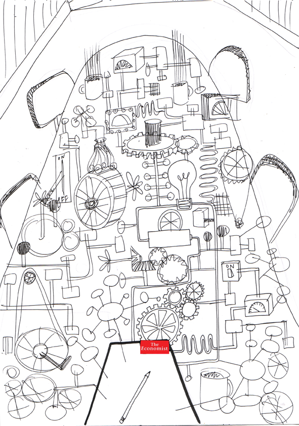
Better, but the idea still isn’t coming through clearly enough.
Because the mind map has become 3D, so didn’t look like a mind map.
Plus, the ideas didn’t feel as though they were coming from The Economist.
ILLUSTRATOR’S 3rd ROUGH:
 Much better, weird table though? Maybe we should cut a chunk out of that big blank bit at the end?
ILLUSTRATOR’S 4th ROUGH:
That’s it, colour it in!
FINAL AD:
(b) (Agency rough.)
ILLUSTRATOR’S FIRST ROUGH: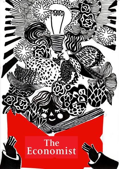
Boy, that’s been ‘re-interpreted’.
The idea has been discarded.
Also, it didn’t feel very ‘Economisty’.
A DIFFERENT ILLUSTRATOR’S 1st ROUGH: . She ignored the idea too, in an identical way. Spooky.
We got yet another illustrator; Noma Bar,
He sent in pdf full of ideas.
They were all good, but they weren’t conveying our idea.
Take this one, it’s probably better looking than the final one we used, but do you get the idea from it?
1:
 Same with this one, it’s a bloody clever twist; the bulb being the head, but I don’t think anyone would get the idea.
2:
 This one was nearer.
Again, I thought it was clever, but worried the face would distract from our simple idea: ‘You’ll think of ideas when you read The Economist?’
FINAL AD.:

(c) (Agency rough.) ILLUSTRATOR’S 1st ROUGH:
Looked good but didn’t feel switchy enough. Too oblong. (Perhaps that’s the shape of the switches this illustrator’s country?)
ILLUSTRATOR’S 2nd ROUGH: Better, but the actual switch, button bit, looks too small.
Also, aside from whether it’s technically accurate, this would make the logo really small, let’s make it bigger.
FINAL AD:

(d) (Agency rough.) ILLUSTRATOR’S 1st ROUGH:
 Looked cool, very graphic, but shouldn’t we zoom in to the idea bit?
And isn’t that spark a bit big…for a spark?
FINAL AD:
(e) (Agency rough.)
 ILLUSTRATOR’S 1st ROUGH:
Cool, much better than ours, who needs a hand taking up all that space? What does it look like in black?
ILLUSTRATOR’S 2nd ROUGH: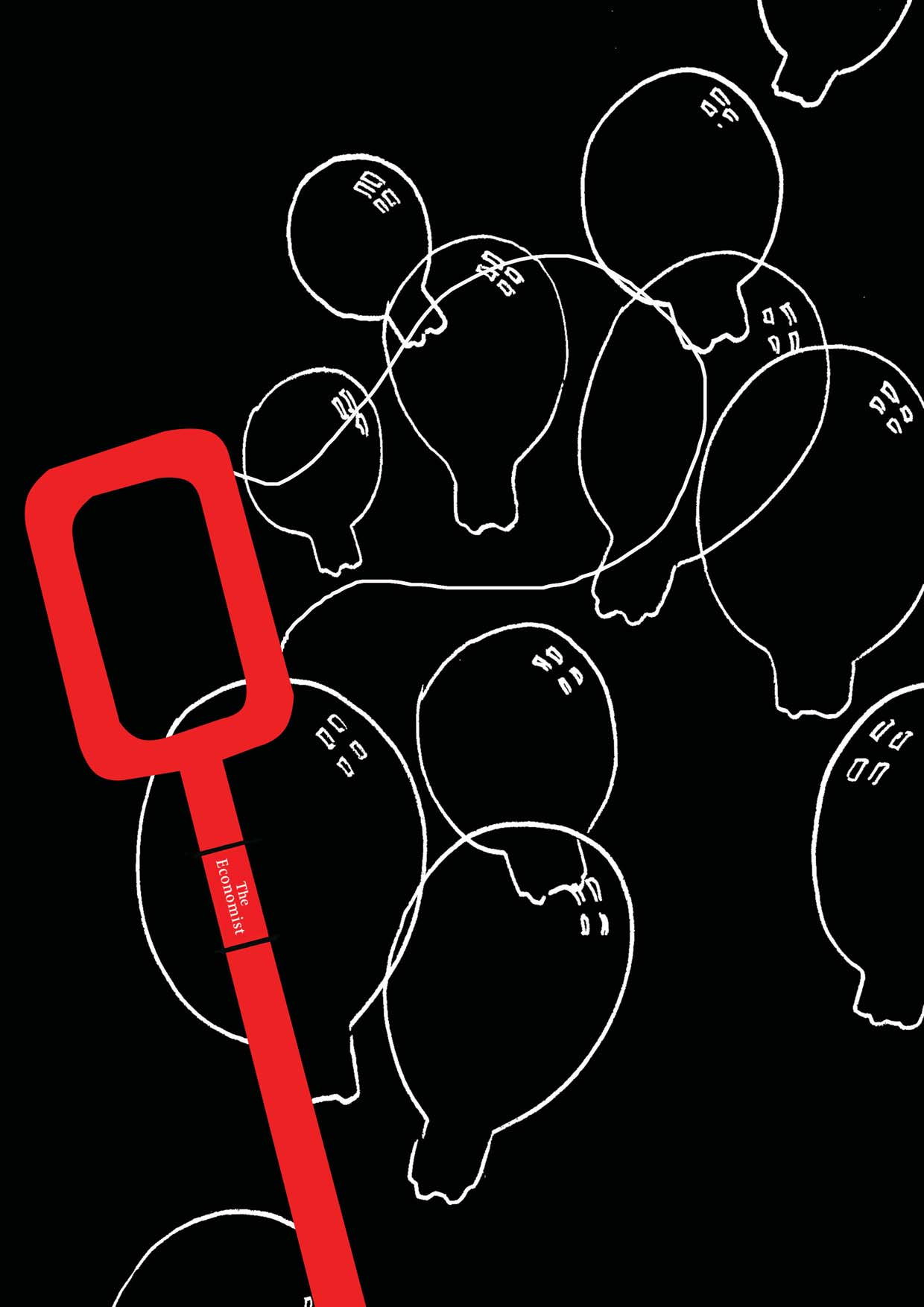
Looks good, maybe we should simplify those bubbles; too many and too much overlapping.
FINAL AD:
(f) (Agency rough.)
LOTS OF INTERESTING, GRAPHIC INTERPRETATIONS OF OUR IDEA CAME IN:
In the end we plumped for the curvy, rainbow like one, it felt more upbeat and dynamic.
FINAL AD:
(g) (Agency rough.)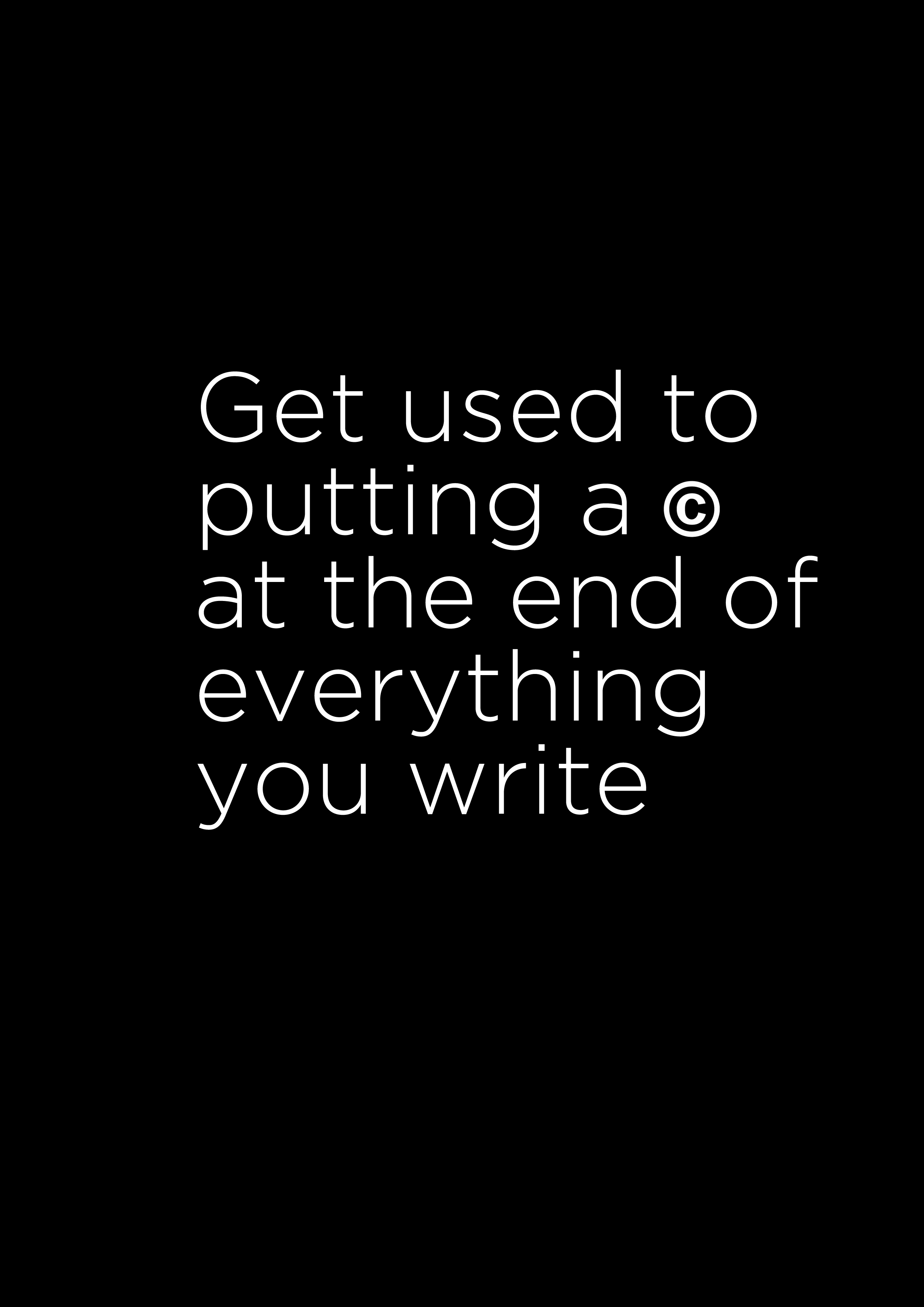 Although it was all words, there was an interesting thought there.
How do we make it visual?  ILLUSTRATOR’S FIRST ROUGH:
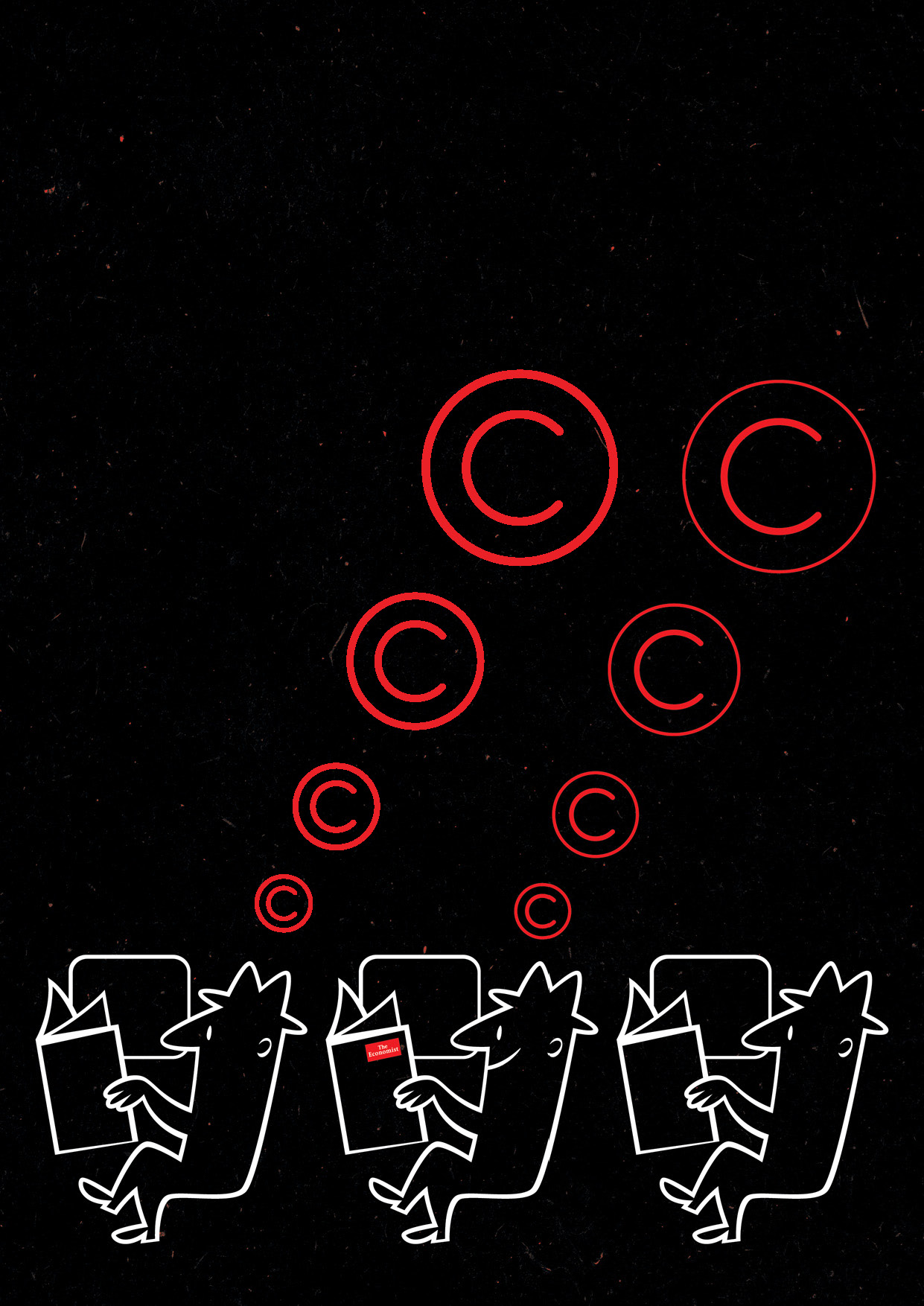
Great, like the addition of extra men like they’re on a train.
But perhaps only one should be thinking copyright bubbles, to make him appear special.
FINAL AD:
(h) (Agency rough.)

ILLUSTRATOR’S 1st ROUGH:
Simple, but the bulbs aren’t fish-like enough, they should swoop like a shoal, not hover.
FINAL AD:
(i) (Agency rough.)

ILLUSTRATOR’S 1st ROUGH: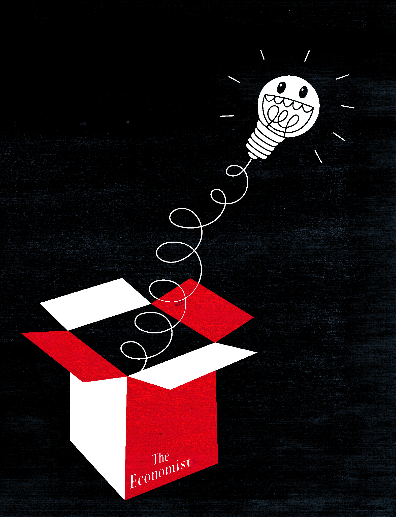
Why is the bulb grinning insanely? More to the point, why has he, I mean it, got a face?
It doesn’t look like an idea bulb with a face on it. Rub it out.
FINAL AD: (j) (Agency rough.)
ILLUSTRATORS 1st ROUGH: For some reason, the mad-cap illustrator drew the pencil being held by a little brain, cloud or marshmallow?
We decide to keep Marshmallow Boy, he was just so cute, but insist on the dot to dot drawing being on paper.
FINAL AD:
(k) (Agency rough.)
I like it but question whether it’s about idea generation. It’s not, but we do it anyway.
NO ILLUSTRATOR REQUIRED, WE USE OUR ROUGH:

(l) (Agency rough.)
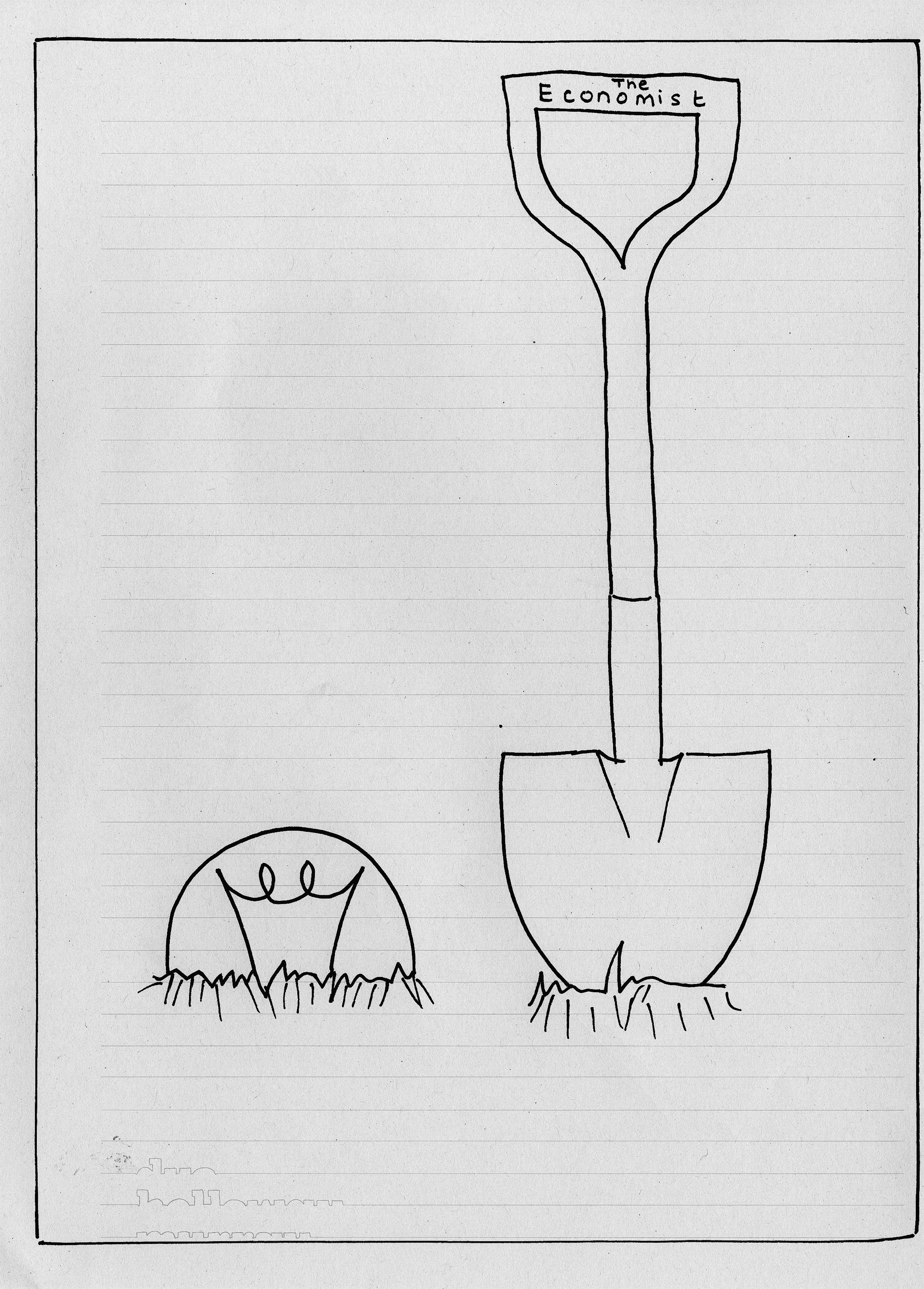
ILLUSTRATOR’S 1st ROUGH:
Bit realistic isn’t it? The bulbs look like they are made of glass?
This is an analogy, metaphor…it’s not real life.
ILLUSTRATOR’S 2nd ROUGH:
 Still way too real!
ILLUSTRATOR’S 3rd ROUGH: The pot and dibber thing are there, which is good, but make it more diagrammatic.
ILLUSTRATOR’S 4th ROUGH: Better, but go even simpler…like a diagram – flat colour, simple.
We switch to a more graphic illustrator.
NEW ILLUSTRATOR’S 1st ROUGH: Much better, nice bee! Maybe we should lose the currency symbols and make the pot 2D, like a diagram.
FINAL AD:

Putting this stuff together is a good reminder that however cool an illustrator is, you have to constantly check they don’t stray off your idea and into just creating a cool picture.
These posts are fantastic-the details and visual ideas are a great inside look at great work rarely seen
Hey Dave, this is great – fascinating to see the process. Your light bulb reminded me of this great video: http://youtu.be/NugRZGDbPFU
M.
Cheers Ming,
I’d not come across that before.
D.
sweet process tips. the light switch and fishing ones come out on top for me. they’re nice to look at and leave a few subtle dots left for the viewer to connect. tks