The Economist was an open brief at AMV.
It meant that everyone in the creative department worked lunch hours, weekends and in downtime on posters for The Economist.
This had been going on for about ten years.
I turned up as Creative Director on the account, about ten years into the ‘Red Campaign’.
I’d estimate that on average I’d approve one out of every fifteen ads I was shown.
We’d need a campaign of ten posters to run every three months.
So, at a fifteen to one ratio, over ten years, that means that the amount of ‘Red’ ideas thought up by the twenty or so creative teams by the time I’d got there was…a lot.
About 6,000.
But I was worried that ten years in the campaign was becoming a little too familiar, it’d lost an element of freshness.
Awards were certainly down, which is sadly the case once a campaign wins awards and starts to become overly familiar.
So initially, we pumped out yet more red ads.
![]()


But whilst driving home one day I spotted a big red poster in the distance, I couldn’t tell whether it was one that Sean and I had done, but I knew it was for The Economist.
It got me thinking, the format is unbelievably well branded, but ten years on, are the public approaching the campaign like me; ‘Oh…there’s one of those red Economist posters, I’m sure it’s saying something witty about intelligence, but I can’t be arsed to read it.’
In a nutshell: Were they getting too predictable?
I thought the colour and font were so distinctive we produce a mini campaign every quarter that had a slightly different graphic look.
I spotted a venn diagram in Vanity Fair, a red circle overlapping a blue circle, a bit like this one.

I thought it’d be a great variant on the red look, and different, but a clever structure to write to.
I had a go at writing some.

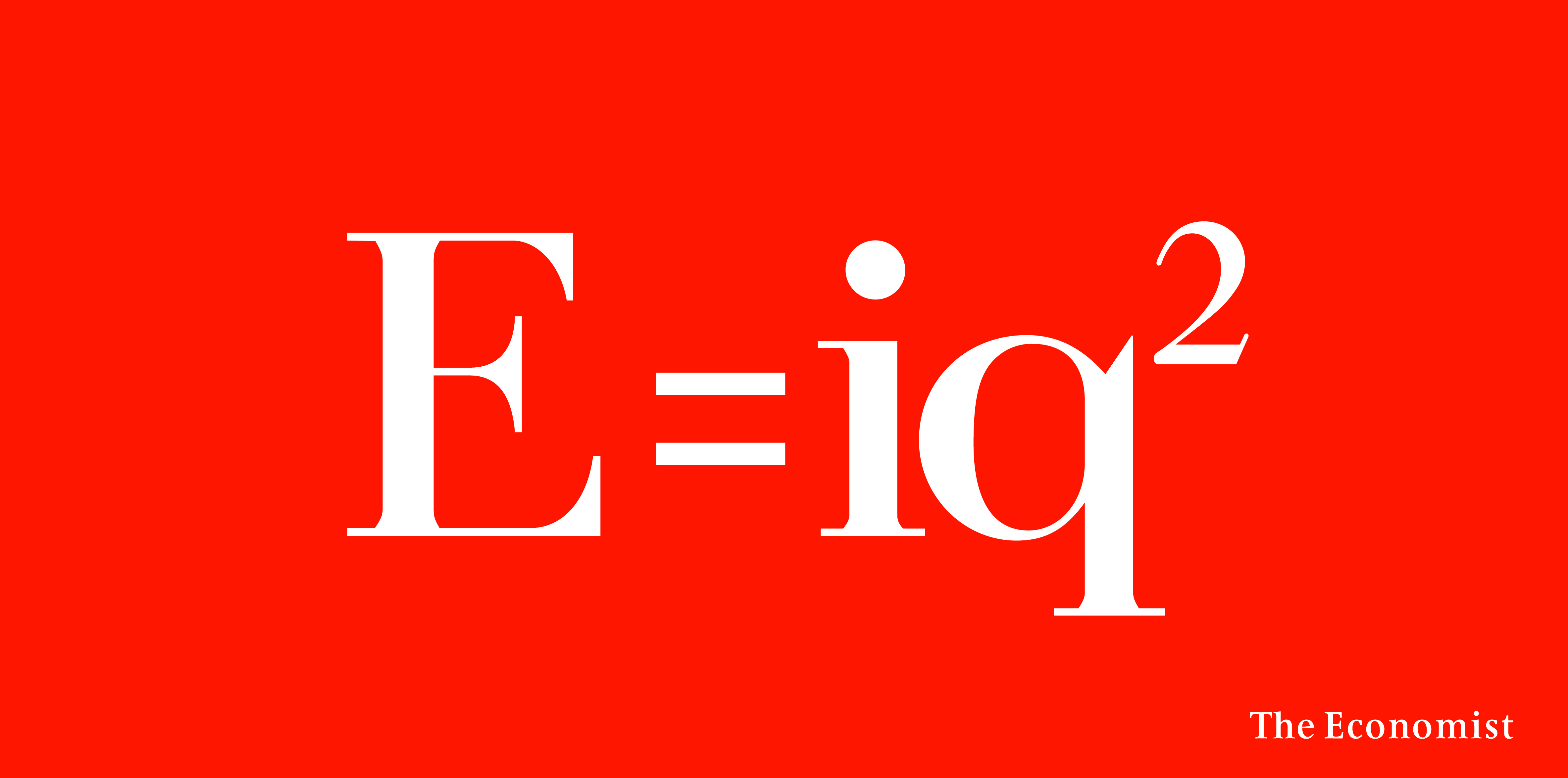
But it was a like a Mensa Test: One circle is red and says: “Reads The Economist”,
the blue circle says something else that’s clever, and the bit at the bottom says
something that is the summation of this that is both clever AND funny.
I couldn’t do it.
I just couldn’t unlock the formula.
I explained it to Sean.
He rattled off a load:
Once he’d unlocked the formula, I started start writing them too.

We loosened up a bit and started swearing.
(But as the scamp below indicates, these were pre- spell-check days, at least for me.)
We took these scribbley little ideas above and turned them into ads.
I’m consequently surprised how much this process changes the tone of the idea.
What seemed funny as a scribble can look bland as a finished ad, what looked like a ridiculous, daft idea the client would never buy in a million years scribble can suddenly feel buyable once in a clients ‘clothing’.
Sean and I looked at them in their new clothing and made some decisions.
THE REJECTED.
Bit boring.
Funny, but probably a gag looking for a brief.
I guess we may also be sued by Carly Simon, Warren Beatty, Mick Jagger or whoever the song is actually referring to.
This was actually bought by the client and pulled at the eleventh hour.
Just as well, it probably wasn’t what David Abbott had in mind when he set up the campaign.

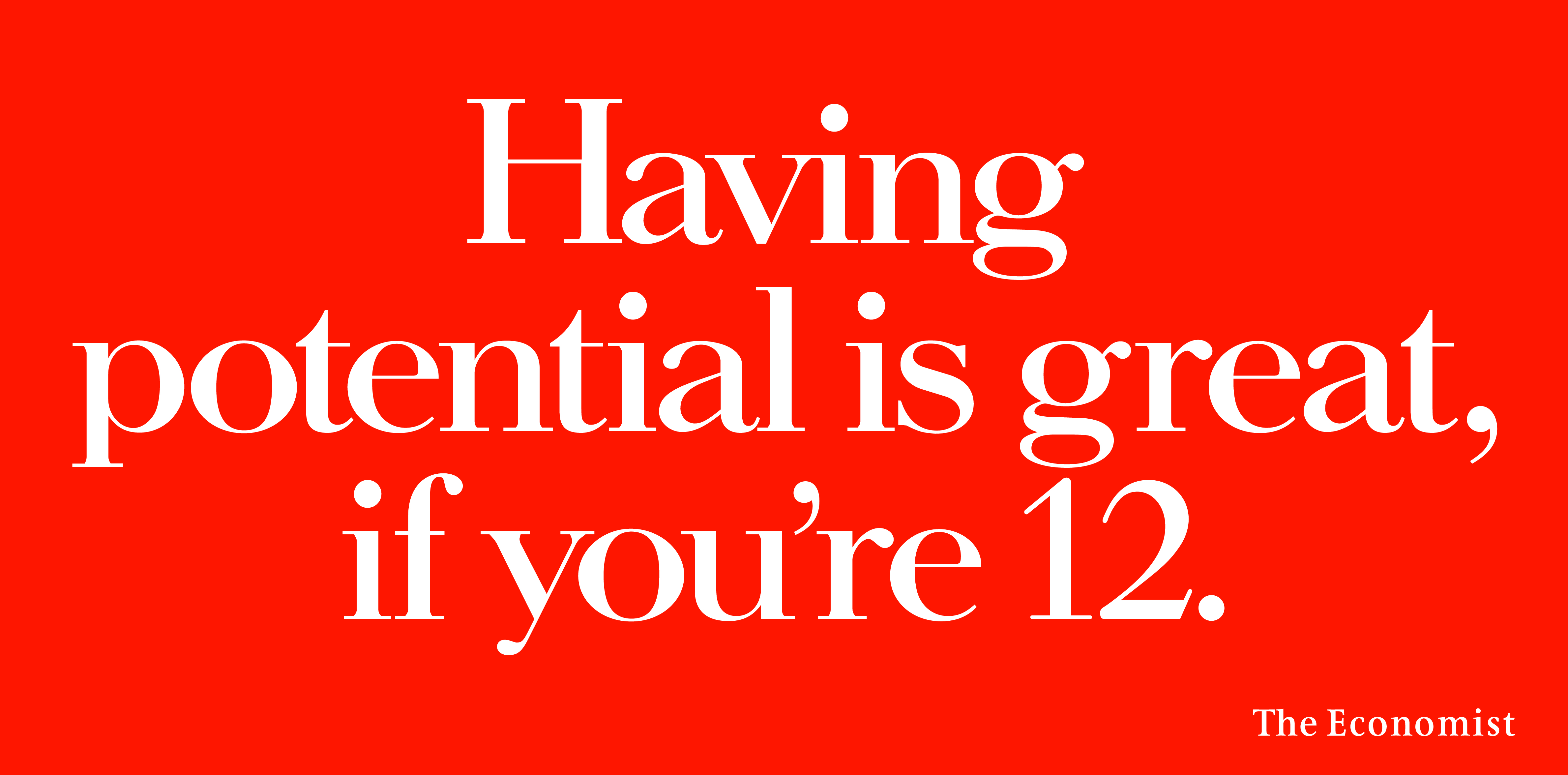
So-so.
Bit basic.

There was another religion based idea we preferred.
Client considered it intelligible, which was kind of the point. A shame, it was one of our favourites.

Didn’t feel on brand, too chatty.

Knob gags did seem right for The Economist.
Quite liked it, wondered whether dill pickles were a bit down-market.
Damien Hirst said no.

Too flashy, too Eighties.
 Too many words, also, it’s bit childish, although it does use a lot of long words.
 Why risk offending Jezza?
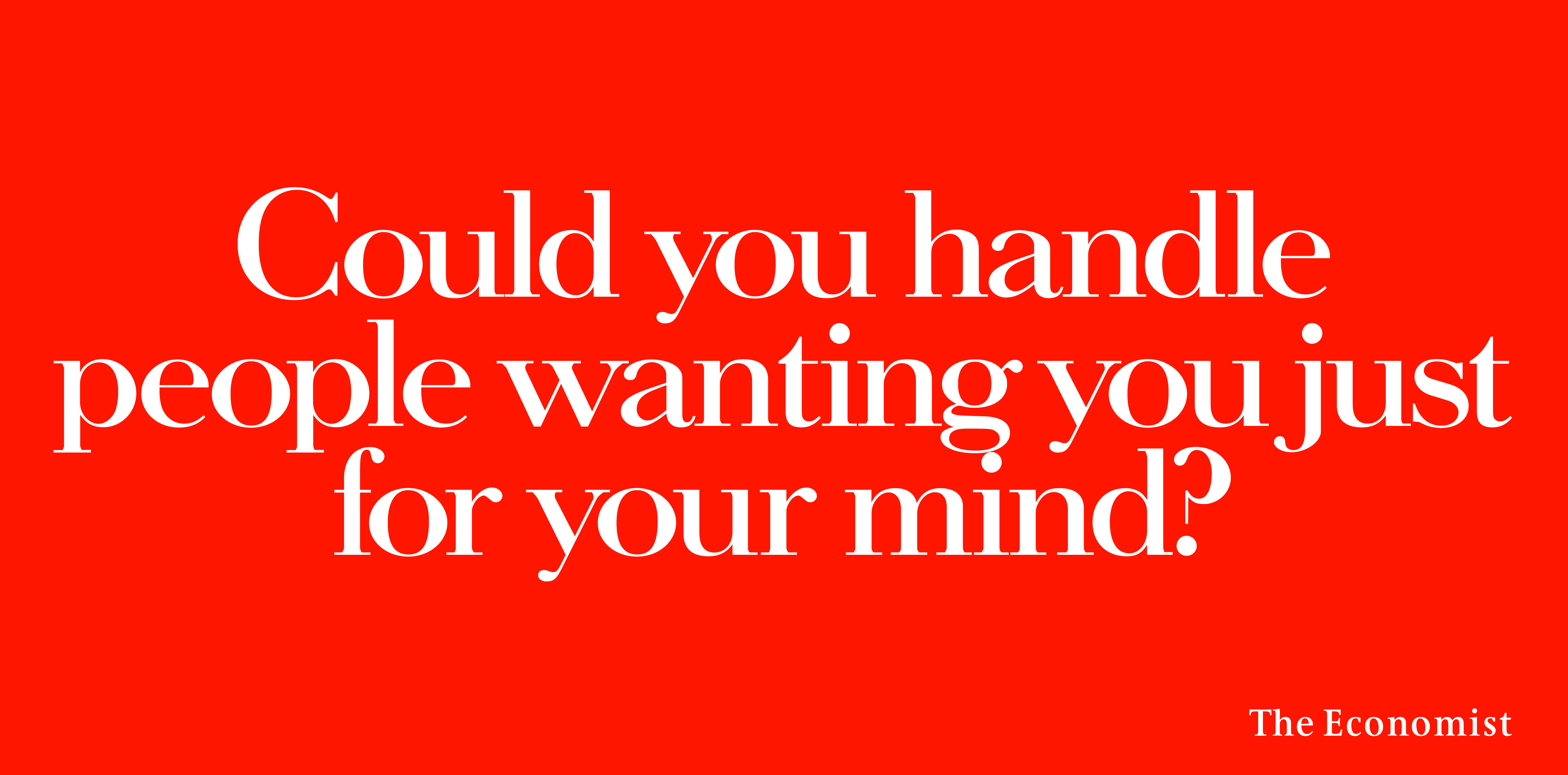
THE CHOSEN.


The client rejected this one saying it was ‘unintelligible’
Which was kind of the point, a shame as it was one of our favourites.
The client got cold feet and pulled this one at the eleventh hour.
Just as well, it probably wasn’t what David Abbott had in mind when he set up the campaign.
Then, C.E.O Andrew Robertson came in: “I can’t do it, we have to stick with the Red Campaign,
it was David’s gift to the agency.”
Flip!
It was decided we should run our campaign alongside the familiar red ads.
They ran as tube cards and giant cross-track posters.
They worked well as cross-tracks – people could get the structure, then see how it played out whilst waiting for their delayed train.
The following year I was Creative Director on a whole bunch of ‘Red Posters’ that were deemed sufficiently fresh to win a D&AD pencil and Campaign of the Yea at Campaign posters.
So maybe Andrew was right, maybe it was David’s gift to the agency?
I am regular visitor, how are you everybody? This article posted at this site is genuinely
fastidious.
Excellent site. Plenty of helpful info here. I’m
sending it to several pals ans also sharing in delicious.
And of course, thanks on your effort!
This design is spectacular! You obviously know how to keep a reader entertained.
Between your wit and your videos, I was almost moved to start my own blog (well, almost…HaHa!) Great job.
I really enjoyed what you had to say, and more
than that, how you presented it. Too cool!
Sincères remerciements! De la bonne info.