‘Can you do me an ad for Rushes Short Film Festival? it’s to go in my Gongs magazine, it’s an opportunity!’ – Mark Denton.

DISSOLVE TO THE FOLLOWING YEAR.
‘Can you do me a campaign for my Short Film Festival? it’s to go in my Gongs magazine, it’s an opportunity!’ – Mark Denton.
(The Therapy Short Film Festival was one of a number of ideas Mark has had over the years to redistribute money he’s built up in his savings account.)
Looking back on my previous short film effort, it was simple, dead clear, mildly humorous, BUT…it just reeked of ‘average’.
I decided it was because it was a bit small and addy.
It wasn’t aspirational, it didn’t celebrate the world of film.
Afterall, the people who enter short film competitions dream of one day entering long film competitions, like The Oscars.
Linking our little festival to the big, glamorous world of cinema would be a good start.
So how could we say they’re the same but much, much smaller?
Change the names of films that mention time to a smaller amount of time, e.g. ‘Groundhog Hour’.
Typed they just looked like half ideas, but maybe if we turned them into film titles they might feel more substantial.
I started looking at film titles to understand how they used images.
Patterns started to emerge.
I started to turn the doodles into film titles with typographer Andy Dymock.
We noticed images are often used to capture the mood of a film.
They may take a key icon to link to the title.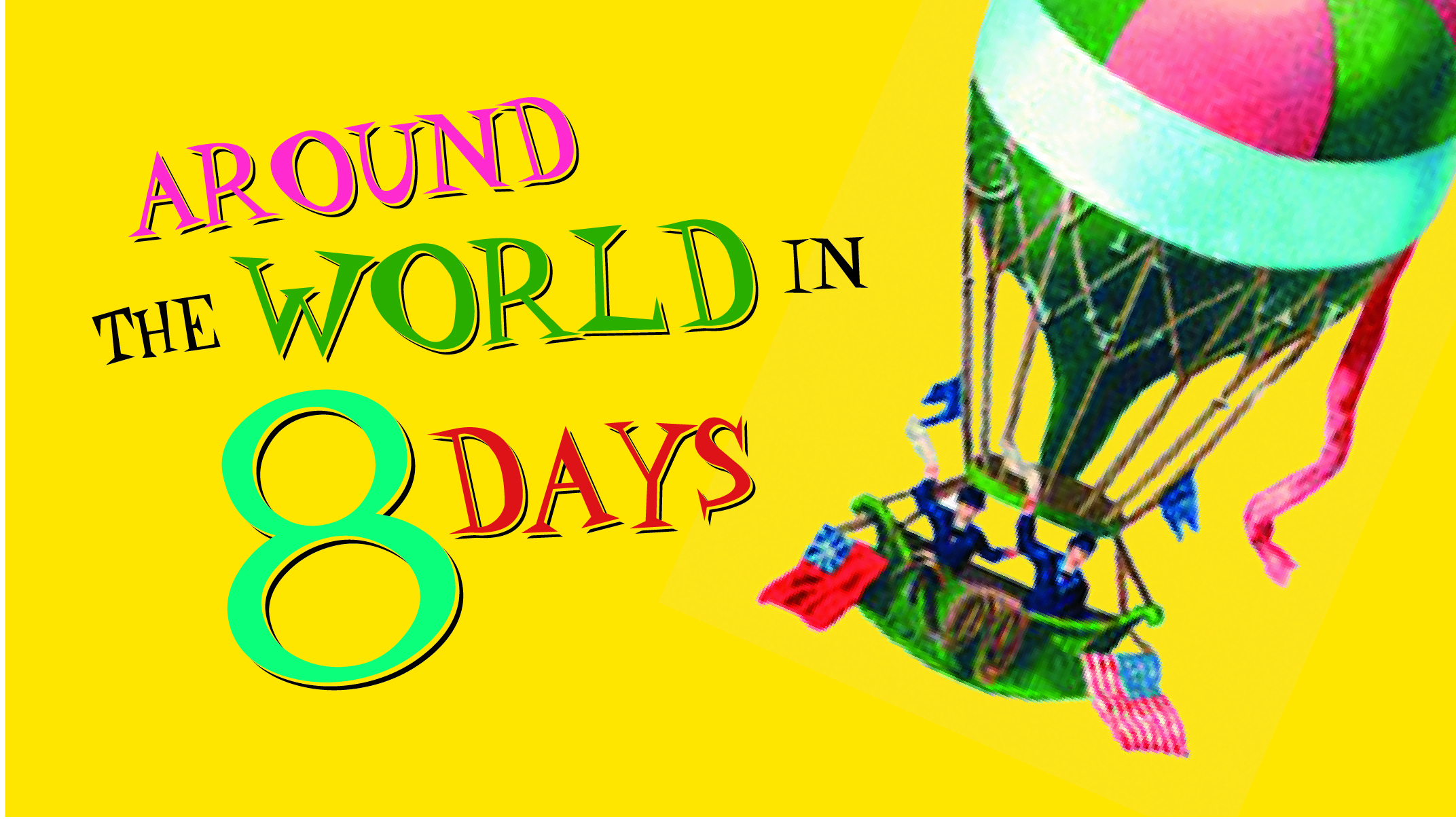
Sometimes the opening credits will travel around a film’s location.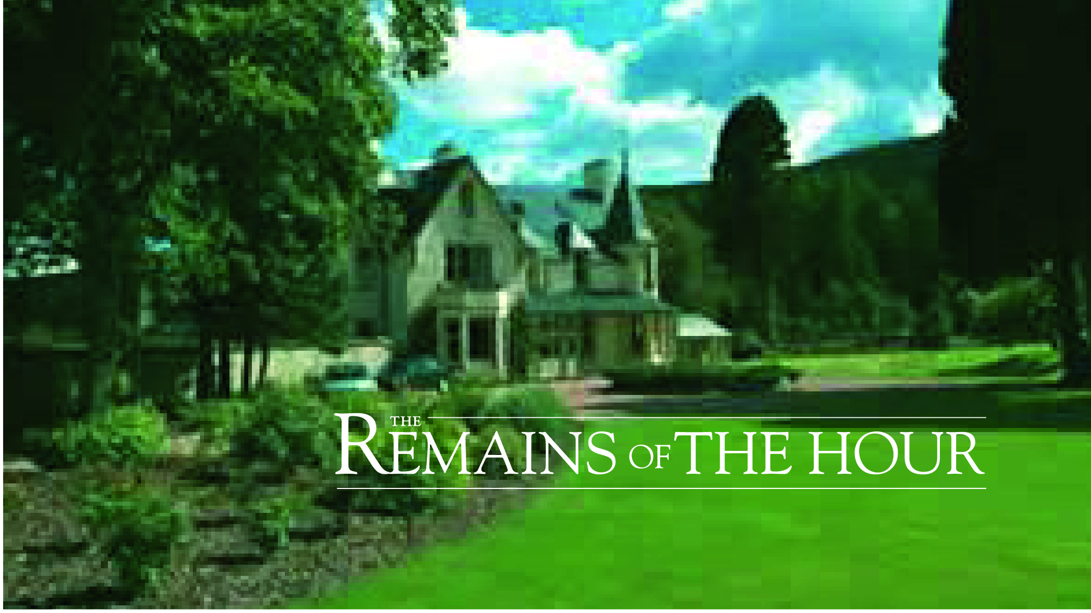
Mocked up, they appeared funnier.
It’s the clash of serious, almost pompous visuals with silly, almost childish words.
But I wondered whether sticking to time related films was a bit too literal, all we needed to do was suggest this film wasn’t very long.

We mocked up a few more.
Retouching Boy Wonder, Oli Carver, took my crisp, shiny Mac layouts and started making them look ropy. By degrading the pictures, putting noise and a whole load of other layers on top of the image, it knitted all the elements together.
It made it look like a piece of old film.
It looked better, but the type didn’t feel cheesy enough for a Hollywood blockbuster.

Mark Denton showed me a whole scrapbook of his full of old film titles using shadow against a two-dimensional background, they were very evocative, but this was the deal closer; dirt cheap to shoot.
I wasn’t sure of the ‘Mr Smith Goes To Wash’ idea, I loved that by simply cutting off the last few letters of the film’s name it suggested a smaller film.
But my worry was it might suggest a ‘sillier’ rather than ‘smaller’. The next strand we looked at was smaller versions, e.g. instead of ‘Jungle Book’ it could be ‘Jungle Pamphlet’ or ‘Jungle Booklet’.
 A cheap shot of a few palm leaves and some anaglypta wallpaper.
De-focussing it made it feel more believable.
‘The Green Inch’ looked good, it scored well on greenness, but felt a bit small for the big screen.
We turned to God.
We used one of his best sky arrangements to give the film scale and a sense of mysticism.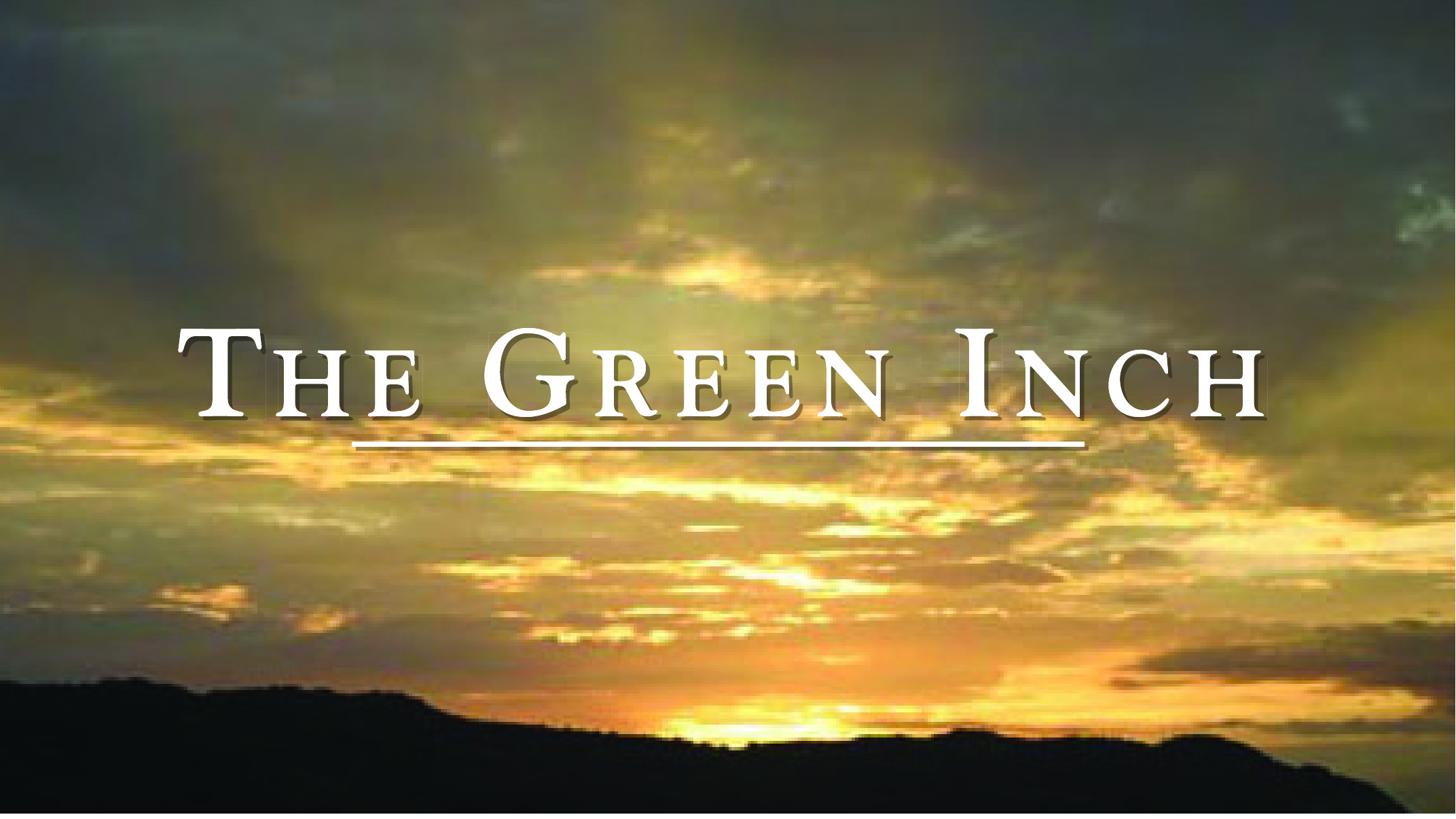 We went all graphic with the ‘Half Monty’.
Another area for ideas could be ‘less’, literally suggest less things in the film, that could imply less time in a different way.
In terms of style, it’s always better with an idea like this to visually show variety, old-fashioned and modern, black & white and colour, animation and film.
So ‘Oceans 3’ was a chance to look contemporary. ‘1 Angry Man’ was an opportunity to get all fifties-ish.
 Snow White was Hollywood Technicolor, 40’s style.
 And ‘Thelma’ was pure, brash ’80’s.
Although the first version felt like it was hot off an Apple Mac.
Pumping up all the colours made it feel more Technicolour.  Putting all the client bits into a title seemed like a good way to tidy the layout up.
Together, they looked like this on film:
http://vimeo.com/82296398
Unfortunately, I got a bit arty, so they ended up looking like this in print.


To be fair, Helmut Krone was as much to blame as me.
All that ‘Create a new page’ stuff he used to bang on about.
Yes, it’s great to create an unusual striking looking page, but not at the expense of the content.
Why, in this case, go minimal?
Having spent ages crafting lots of little gags and pastiches, why bury them in a big black space? And why make the pictures so small.
I should’ve just got out-of-the-way of the ideas.
Witnessing your train of thought is usually Bliss
Just enjoying rummaging through many of the hidden delights on your blog, Dave, and this one reminds me of a print campaign my partner and I wrote whilst on placement at Saatchi’s back in the 90s. It was for Toshiba (I think) wide-screen tellys. The line was ‘A film loses it’s edge when it’s not on Toshiba widescreen’. Only one execution, ‘Conan the Librarian’, springs to mind, though, of course, there were probably dozens.
PS Bloody brilliant blog. Enlightening, educative, inspiring. Started reading it the other week and I literally cannot put it down. Pictures ain’t bad, either..
Thanks Gav,
Toshiba stuff sounds cool.
D.