
After twenty top ten hits ’58 and ’62, Neil Sedaka’s hits dried up.
His publisher gave him one last shot.
Neil, anxious, sweaty, his weave starting to unravel, decided to order in every No. 1 record from around the globe.
He played them over and over, analysing every detail.
He then borrowed, or as we say in Advertising ‘was inspired by’ the melody from one, the hook from another a guitar sound from another and so on and so on.
Essentially, creating a mash-up before the term existed.
BINGO! No.1 record. (Can’t remember which one, if anyone knows let me know, I promise I won’t out you.)
True, it’s not the way Nick Drake made music, but it’s probably a better way of creating for our business than Nick’s, Joni’s or Neil’s.
We can’t wait for the muse to strike.
We can’t experiment because we want to grow as individuals.
We can’t put stuff out there because it means a lot to us.
We’re expected to make something happen.
Random isn’t helpful, reference points are.
If you know what’s out there you can decide whether it’s of any use for the brief you’re currently working on.
The more reference points you can draw on, the more appropriate your work can be.
As the cliché goes; If your only tool is a hammer, every problem looks like a nail.
Knowing history doesn’t sound as cool as knowing what’s happening today, but often what’s happening today is often a corruption of what happened yesterday anyway.
Coco Chanel puts it better: ‘Anyone who thinks their work is original just hasn’t got a good memory’.
It’s only in retrospect are you reminded of all the reference points you’ve used.
PENHALIGON’S.
They came to us a few years back with the familiar problem: ‘Who are we?’
They were a very old company, (pre-Sedaka), yet run by young, cool people who doing surprisingly contemporary things, e.g. fragrance launch was themed like an illegal Speakeasy held in an NCP car park.
Not the quite the Granny brand their marketing might lead you to believe.


So how do we position them?
Are they old or new?
Well the most accurate answer would be ‘yes’.
Traditionally, that’s not a brief, it’s schizophrenia.
But it’s differentiating, and more to the point; true.
So how do we straddle these two opposites?
STRATEGY.
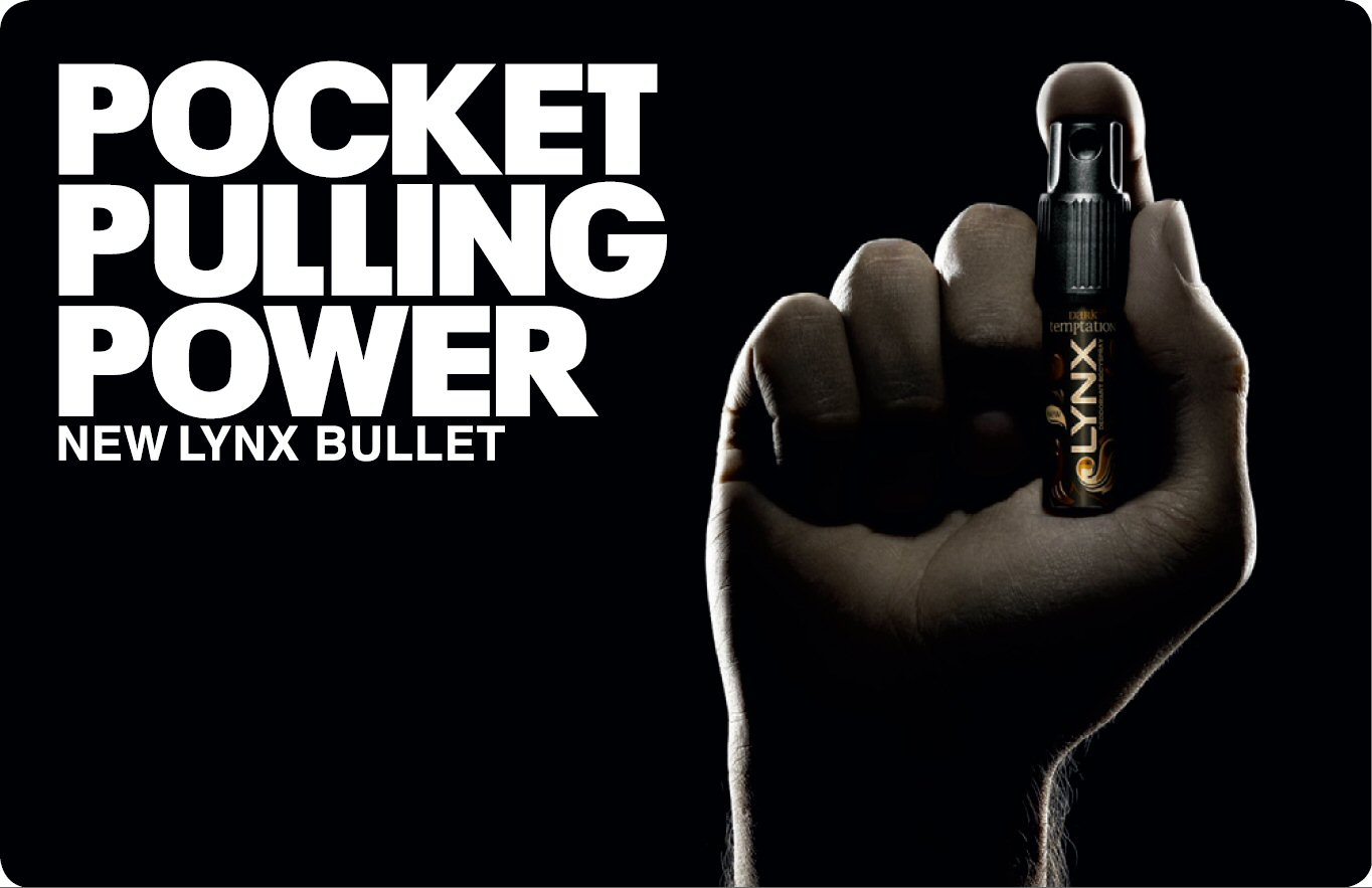
Attract the opposite sex.
(Lynx, in other words, or virtually every other fragrance brand out there. Except Penhaligon’s, ironically.)
‘Attract the opposite sex’ translated into a Victoriana becomes:
TONE.
How can we do sex Penhaligon’s style? Well, Victorian style?
The Victorians were prudish and sexually repressed, so let’s use innuendo.
Which is very British, and that is a very important ingredient in Penhaligon’s appeal around the world.
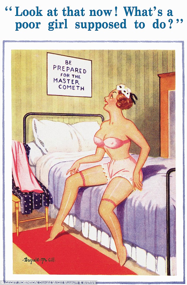
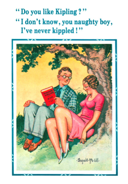
We could use innuendo like the illustrator Donald McGill did in his saucy seaside postcards.
Or maybe like Sid James and the gang in the Carry On films.

LOOK: Even though ‘sex’ is quite racy for a company like Penhaligon’s to talk about, there’s still a danger it could come across as old-fashioned.
We need to inject a bit of energy, irreverence and anarchy.
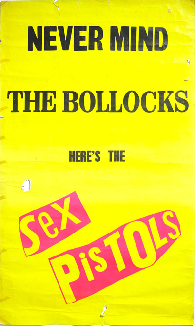
Jamie Reid’s unstructured work could be useful, random fonts, clashing colours, things ripped out.

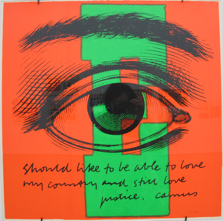
Also, the found art and neon colours used in the posters of Sister Corita Kent.
One of my top 5 poster designing Nuns.

FONTS.
Maybe we should use some exotic looking wood fonts?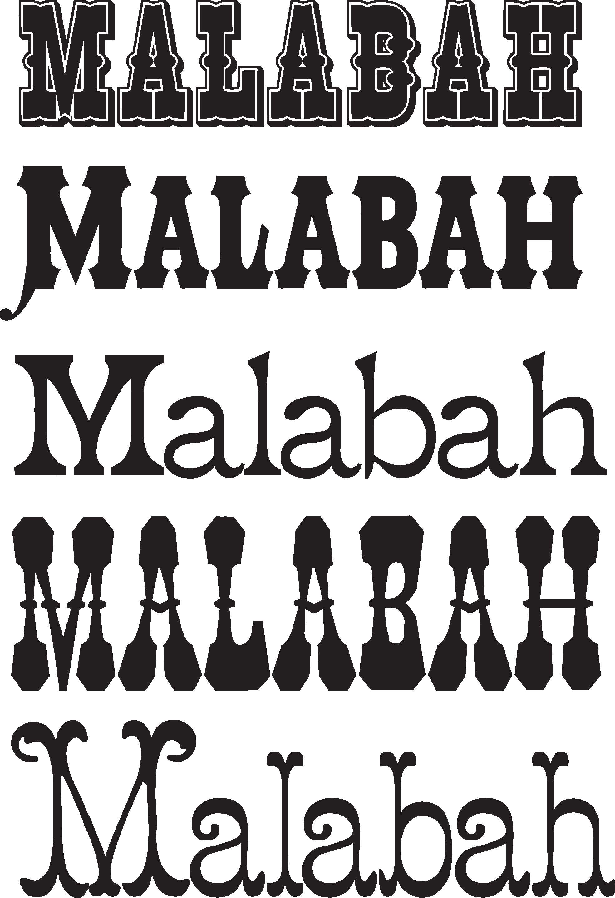
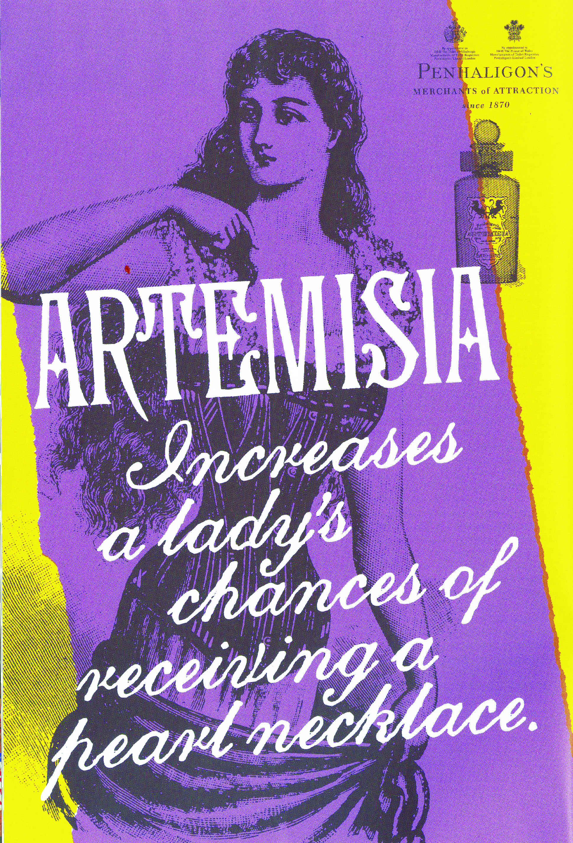
SO, HERE’S OUR INGREDIENTS:
1. ‘Merchants of Attraction’ end line.
2. A bucket of neon inks.
3. Random scraps of torn out paper.
4. A big box of stylish but distressed Victorian fonts.
5. A large bunch of funny, repressed ways of saying ‘get laid’.
6. A handful of inexpensive Victorian etchings.
Swirl them around a mixing bowl and they look like this:


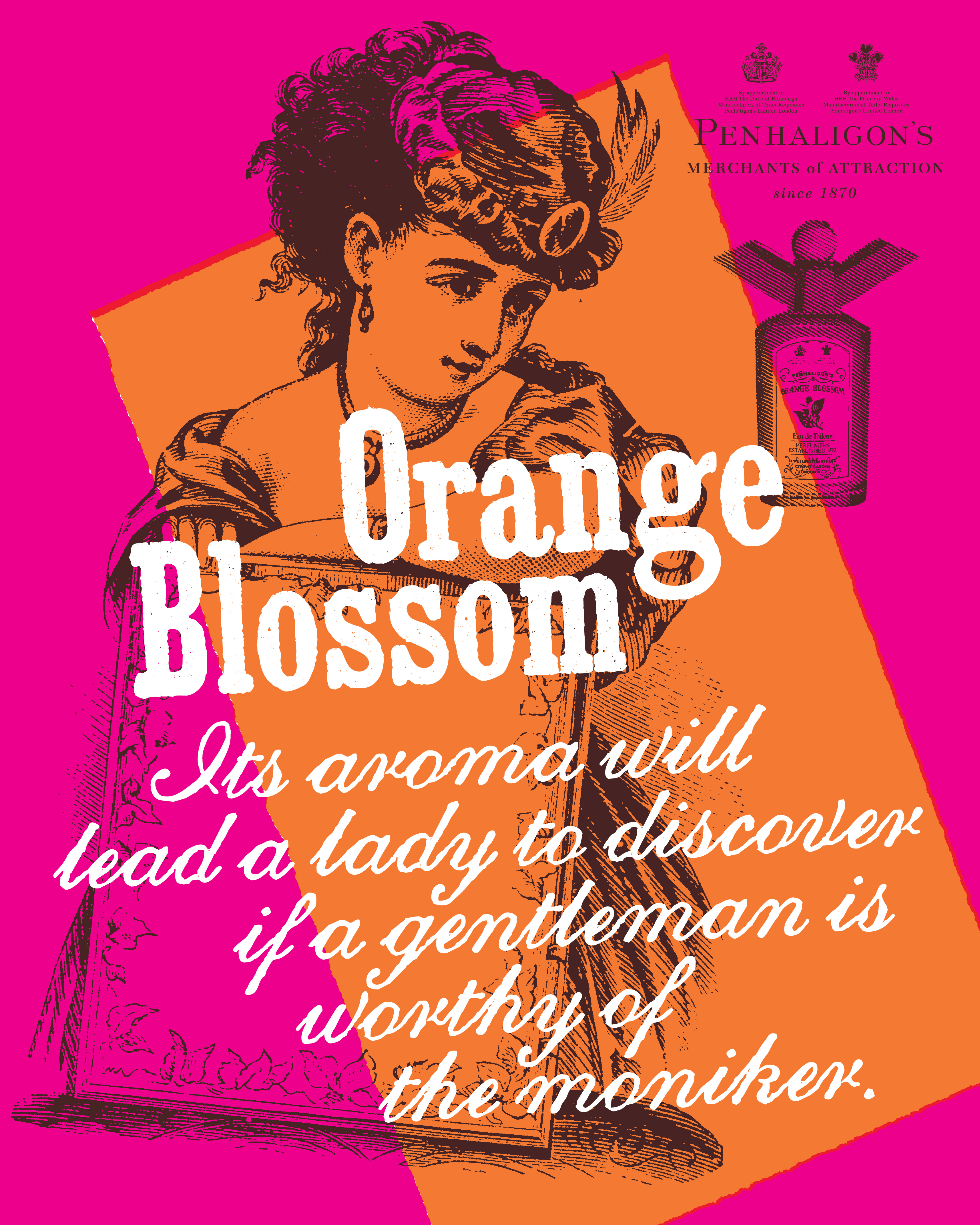

This one was rejected for being excessively cheeky, but ended up finding its way into the ‘Sex Cells’ programme.
The harsh graphic treatment worked particularly well on ‘Store opening’ hoardings, which were starting to be needed more and more regularly.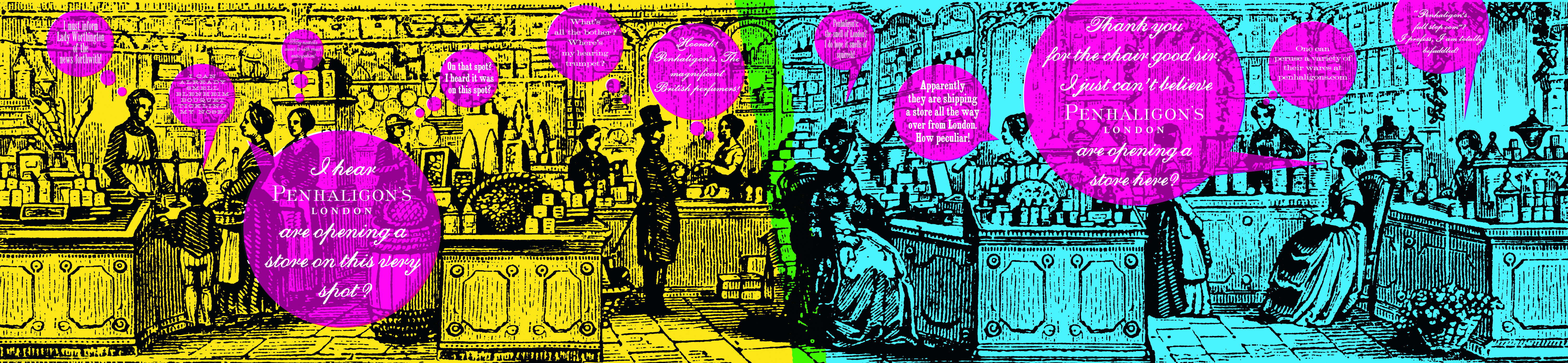
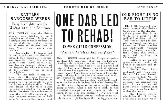
We then had a new fragrance to launch; Juniper Sling.
As it was inspired by gin and the Jazz Age, it would make sense to swap periods, out went Victorian in came the roaring twenties .
The first requirement was a piece of content-cinema ad-website-film thing.
An old and new film thing?
Zelig! The Woody Allen film made up it’s own version of history, but did so in a serious, believable documentary style.

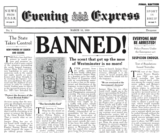
We wrote up a fictitious history Juniper Sling in the twenties; The bob haircut was created to allow Juniper Sling to waft more freely, the flapper dance craze began after girls would flap their arms to around to waft the fragrance towards a guy, it was outlawed due to its aphrodisiac qualities, etc.
Mark Denton came on board to help us create and make this bit of old news footage.
Here’s his storyboard: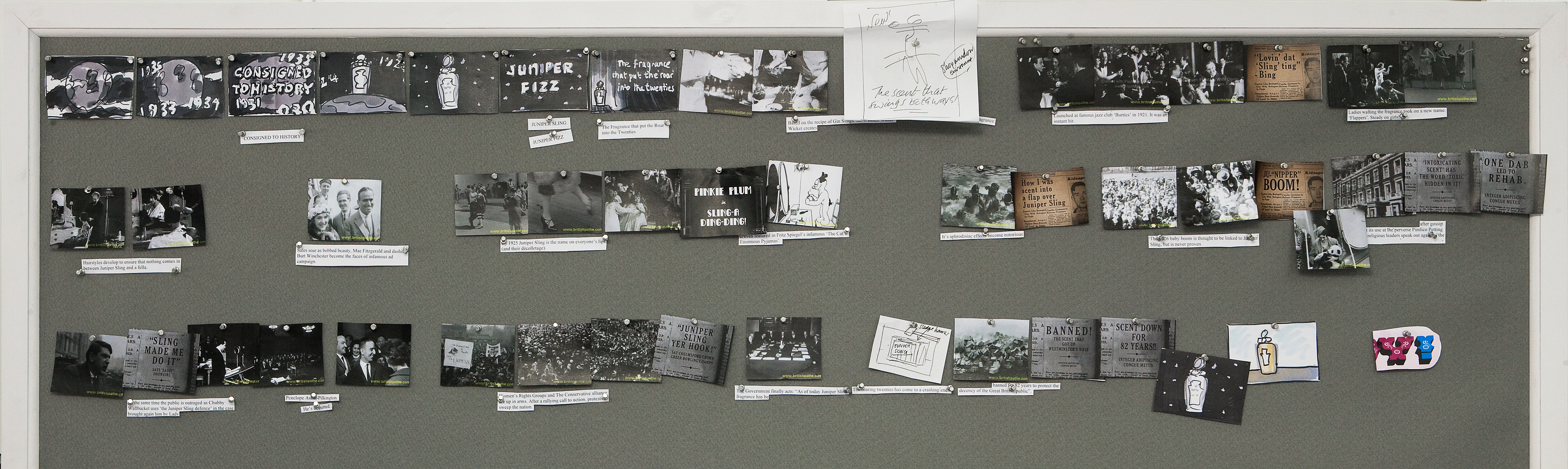
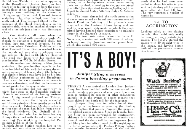
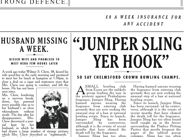
We wrote a lot of lies.
Then used them in mock-ups of old newspaper pages.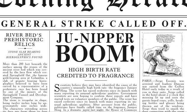
In terms of the posters, the debate was how far do we move from the style we’d created, Victorian, to 1920’s style?
We tried a few twenties tests.


But in the end we linked back visually to the first campaign.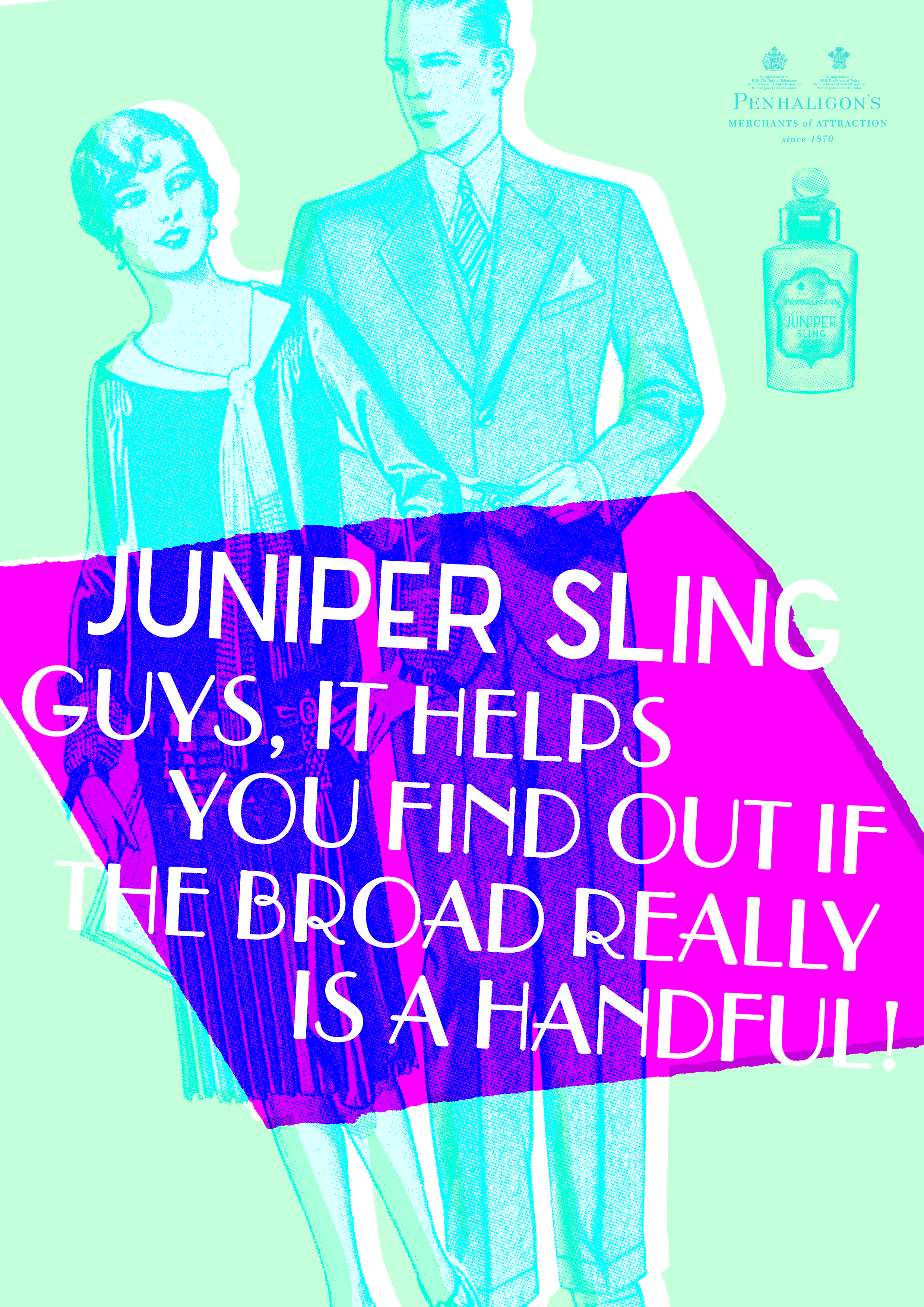
 At Christmas we got a chap, like the late great Stanley Green to patrol Regent Street.
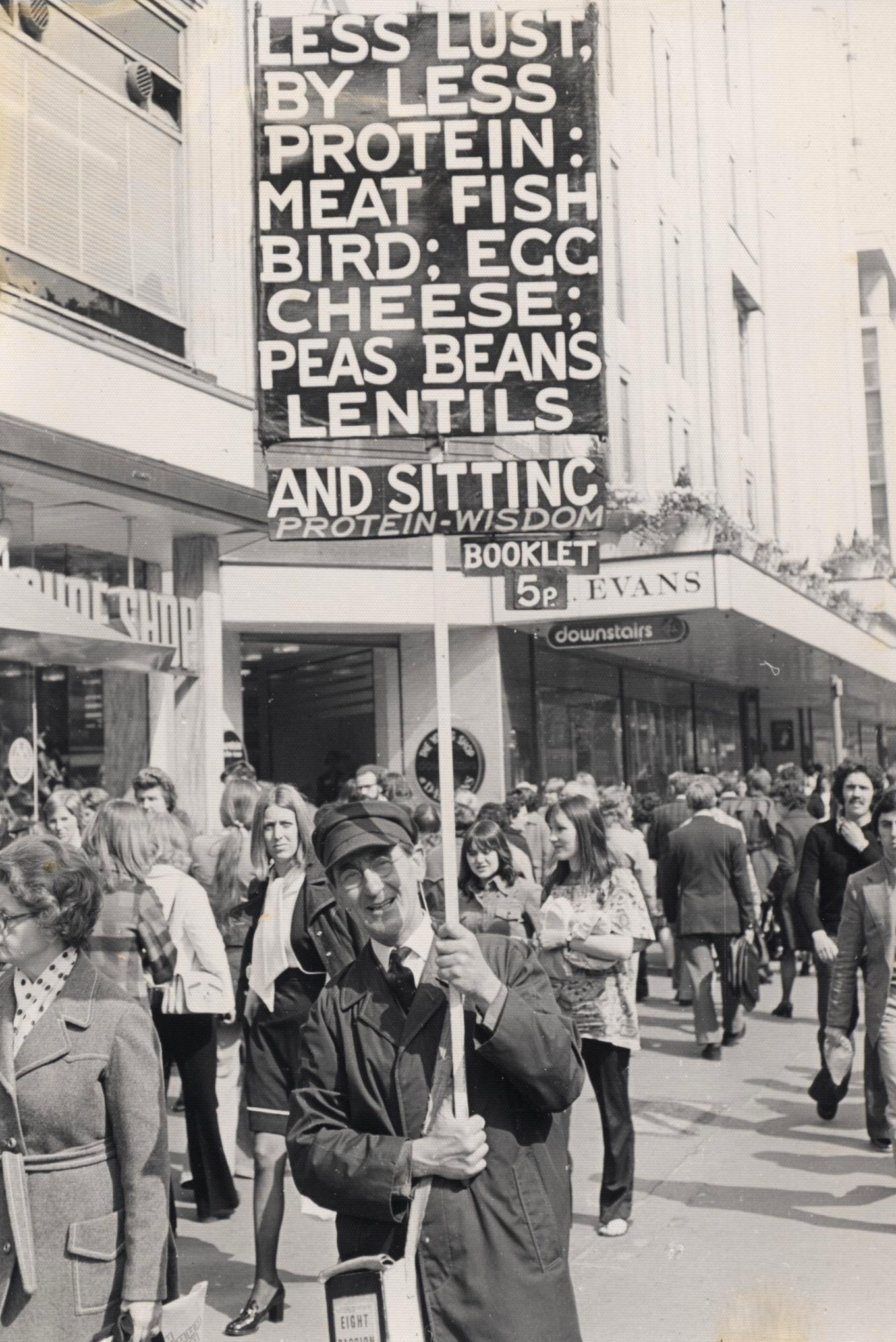
 We made discount vouchers look like old bank notes.
 We made self deprecating posters mocking Penhaligon’s posh heritage.
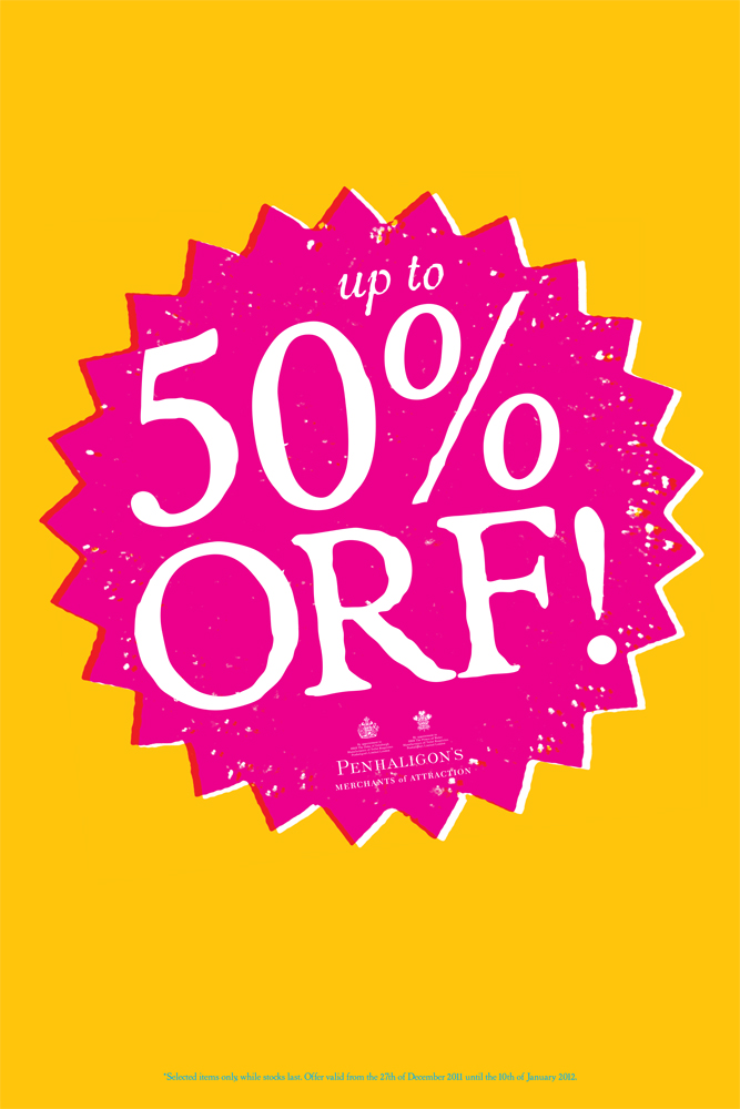
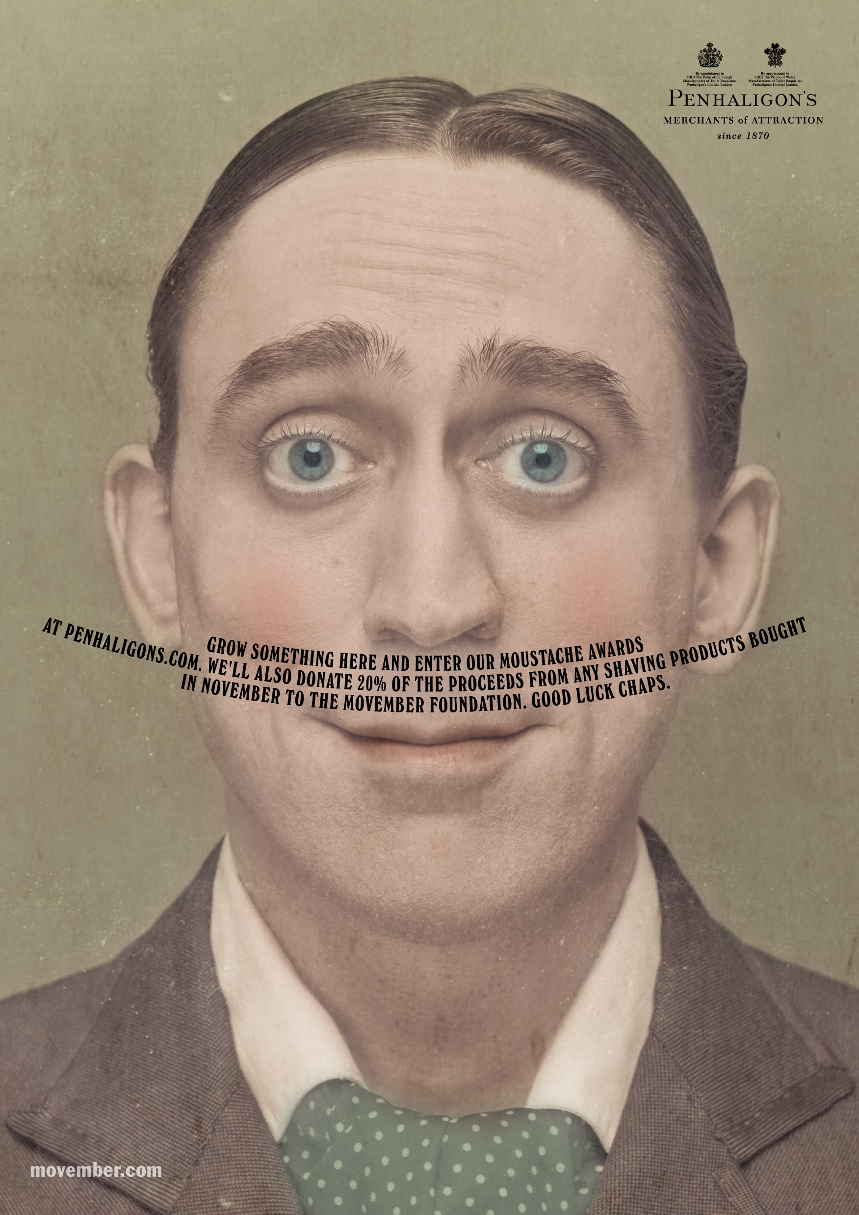
MOVEMBER.
Every year we’d collaborate with the Movember guys and produce a poster.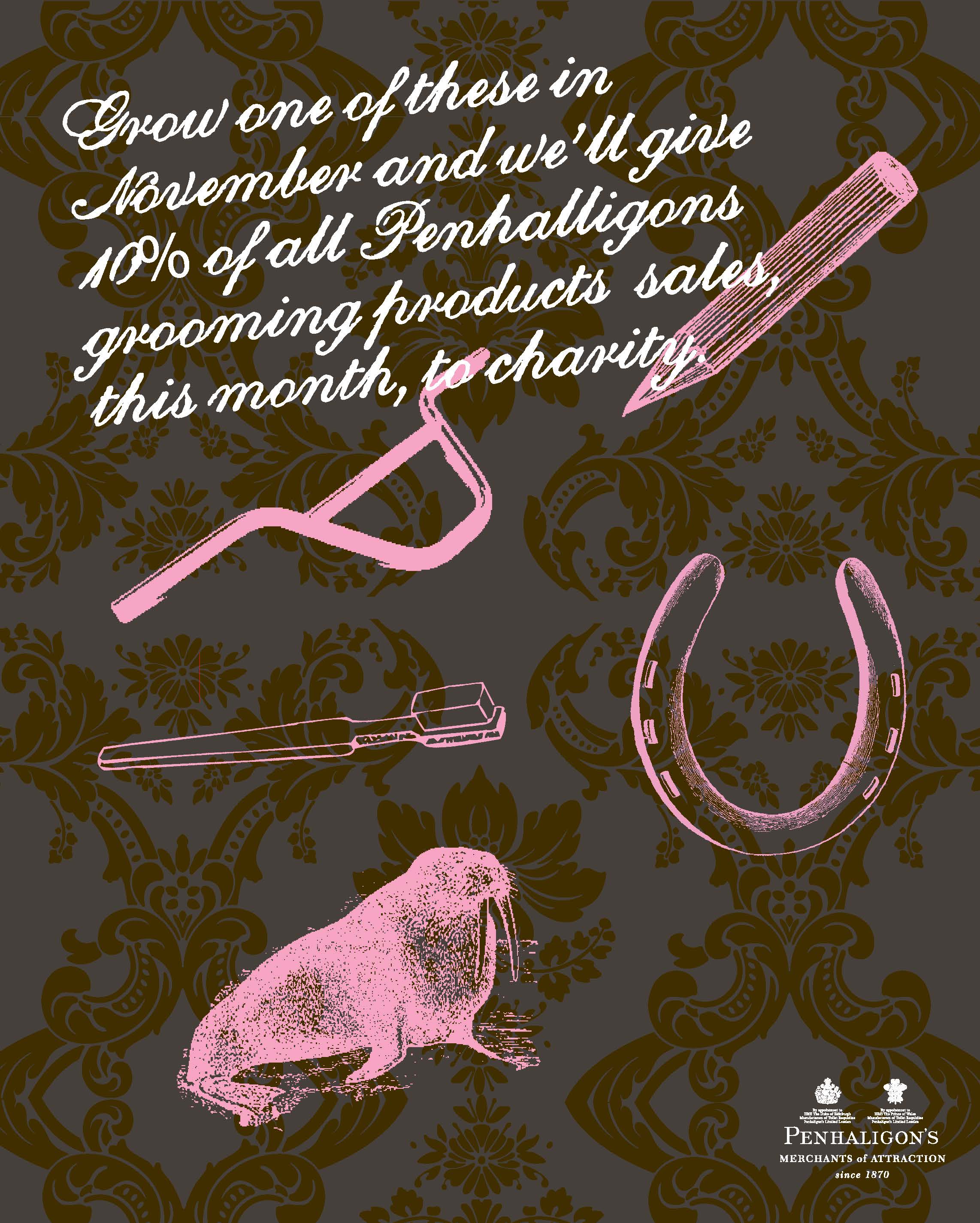
 Weirdly, the last starred that film director I mentioned earlier, Mark Denton.
1. A rough to show the client.
2. Photography test for Mark’s position.
3. Photography test to check the background.
4. The final ad.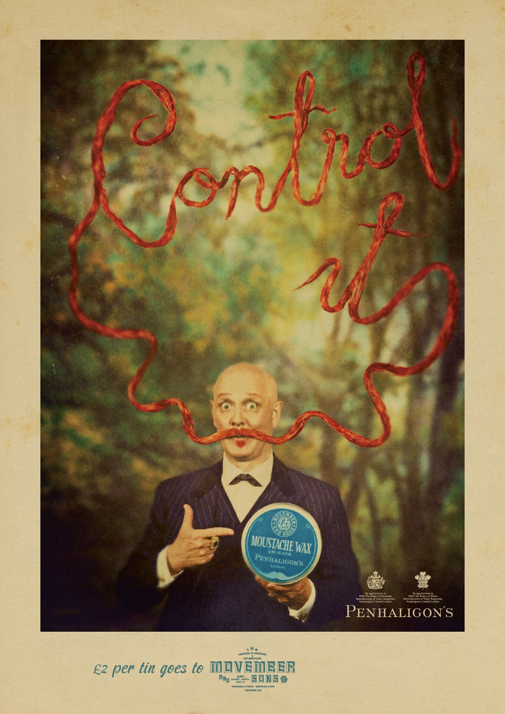
Gradually, the briefs started to move from brand to fragrance specific work.
Some of the executions were cool, but in describing the unique story of each fragrance the unique story of the brand gets lost.


I’m not sure how many points of reference I’ve mentioned on this one client, but I’m sure Neil Sedaka would be proud.
….I saw that Neil Sedaka documentary too….bloody good!
I won’t tell anyone. Promise.
…tell who you like. The man wrote Amarillo.