I used to walk past this poster every week for about a year.
I was fifteen, my Art teacher had got hold of a life size billboard poster, a 48 sheet, or I should say 48 sheets.
It was twenty or thirty foot long, and papered the entire corridor that lead to our classroom.
We were all bemused by it at first, just a close-up of an electric circuit board? weird? Was it even an ad?
Then we found the gold pack-shot.
Who knew adverts could be so cool, sophisticated and playful?
I walked past it every week for about a year, it made a lasting impression.
1965: The Government banned cigarette companies from advertising on T.V.
Press and posters become crucial to Tobacco companies.
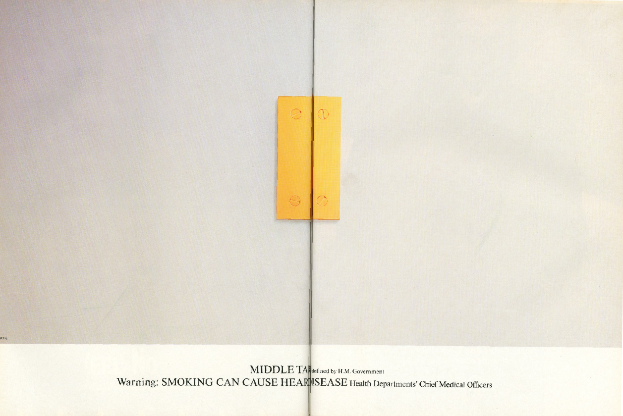
1971: The Government declares that cigarettes must carry a health warning, and that press and poster advertising must donate a strip at the bottom of their advertising to print the message ‘Every pack carries a Government Health Warning.’
In retrospect, that’s the least they could’ve done, but at the time it must’ve caused outrage in agencies with cigarette accounts; ‘You mean we need to take a piece of OUR pages and posters, space that WE’VE paid for, to say bad things about our product?’
So you’d have all the creative bods in an agency trying to say good things about their brand of tobacco in the top bit of the ad, and effectively, at the bottom it would say ‘Yeah, whatever, we think it’s RUBBISH. signed THE GOVERNMENT.‘
1976: The Government come up with some more rules for the Advertising industry: ‘If you’re advertising Tobacco DON’T feature people using the product, in fact, DON’T feature people at all. DON’T say anything about the product, don’t even mention it, DON’T even write it’s name on the ad, DON’T even think about its name when you are creating these ads.
Come to think of it, the only words we want to see, and we want them in black on white, clearly legible, nice and big, saying “This product gives you lung cancer or can kill you”. Capiche?’
1977: Benson & Hedges agency, Collett Dickenson Pearce, are increasingly irritated by the number of companies aping their original Gold Box campaign.
It meant that B&H advertising was starting to get lost in the crowd.
The account guy on the business, John Ritchie, made a big call; ‘Forget all we’ve done! we need something completely new!’
It was a big ask; the ‘Gold Box’ campaign was famous, award-winning and had turned a niche product into the brand leader.
As if that wasn’t pressure enough, the new Government rules meant you couldn’t show or say anything about the product.
So not only have you got your hands tied behind your back, you have one leg tied too.
Art Director Alan Waldie and Copywriter Mike Cozens were one of the teams given the task.
WALDIE: ‘Days drifted into weeks and Ritchie, who was forever chasing me, said “What have you got?”
I said “we’ve got something, but it’s probably not quite ready, it’s a bit different.
It’s dare I say, a bit advanced. I’ll need to explain it”.
“You won’t need to explain” said Ritchie “Let‘s have a look”.
Silence descended on the room as they gazed at some totally incomprehensible layouts of birdcages, mouse-holes, eggs, sardines.
No messages.
No words at all.
Unified only by a solitary gold pack.
A rival team had also created a campaign, unsure of which to go for, CDP M.D. Frank Lowe takes both to his mentor, former CDP Creative Director Colin Millward, for his view.
‘One will let you sleep at night, the other will make you famous’ was Millward’s verdict.
Sleep wasn’t a priority for Frank Lowe or CDP, so the famous campaign was presented to the B&H Chairman Stuart Cameron and Marketing Director Peter Wilson.
They loved it, telling the agency to spare no expense in photographing the ads.
When money was no object Brian Duffy was the guy, he was promptly called upon to turn Waldie’s drawings into photographs.

An arty choice.
He wasn’t the consummate commercial photographer.
He was opinionated, experimental and very creative.
Brian Duffy was one of the trio of famous cockney snappers, (the others being David Bailey and Terrence Donovan), probably the least known, arguably the most talented.
Duffy went to work and had the sets built in his Primrose Hill studio.
DUFFY: ‘I changed the colour and scale of everything, which looks pretty weird today.
I played with optical illusions, since I know enough about what lenses can do and plate cameras and changing perspective.
They’re real photographs and it’s quite complex to do things like that, which look like trick photography.
They’re not phoned in from the coast, it’s all done in the camera.’
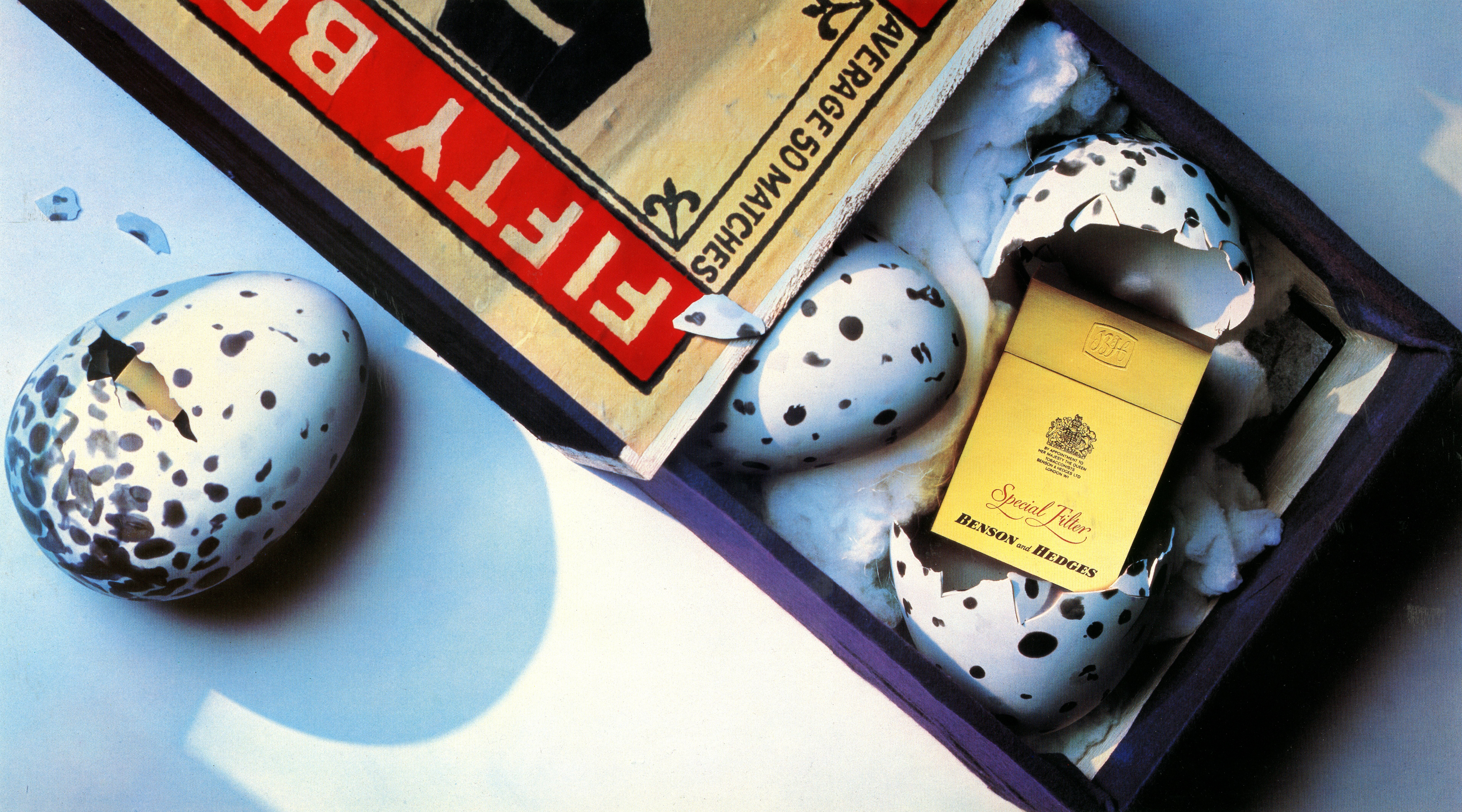
The first shot was ‘Mousetrap’, showing a pack replacing to lure to a presumably nicotine addicted mouse from its hole.
He tried five different lighting set-ups before settling on the final image.
It set the style for the campaign.


Duffy’s son and assistant Chris remembers that ‘Birdcage’ was a very simple set unusually lit, ‘We lit it with an old Rank projector light and through it we projected an image of a bird that we had reversed out on a negative’.


David Montgomery was then called in to shoot these two.

Adrian Flowers shot the last of the first years campaign.

The shots still look amazing.
They looked even better when blown up and put on billboards.
They were like nothing people had seen.
If they ran tomorrow they would still be like nothing most people had seen.
Here’s an from of one at Victoria Station in 1978.
The campaign became so famous even the Government spoofed it.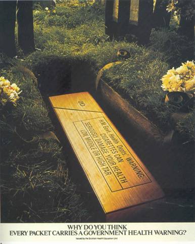
The brief was then opened up to the whole creative department.
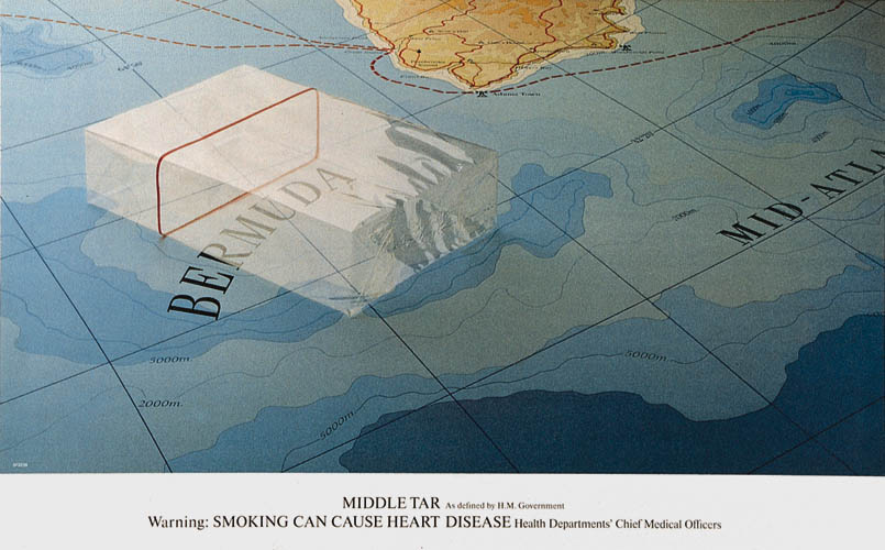
Here’s what Neil Godfrey and Tony Brignull made of it with photographer Jimmy Wormser.
Pre-CGI, pre-austerity, it was shot for real, this is how the shoot went:
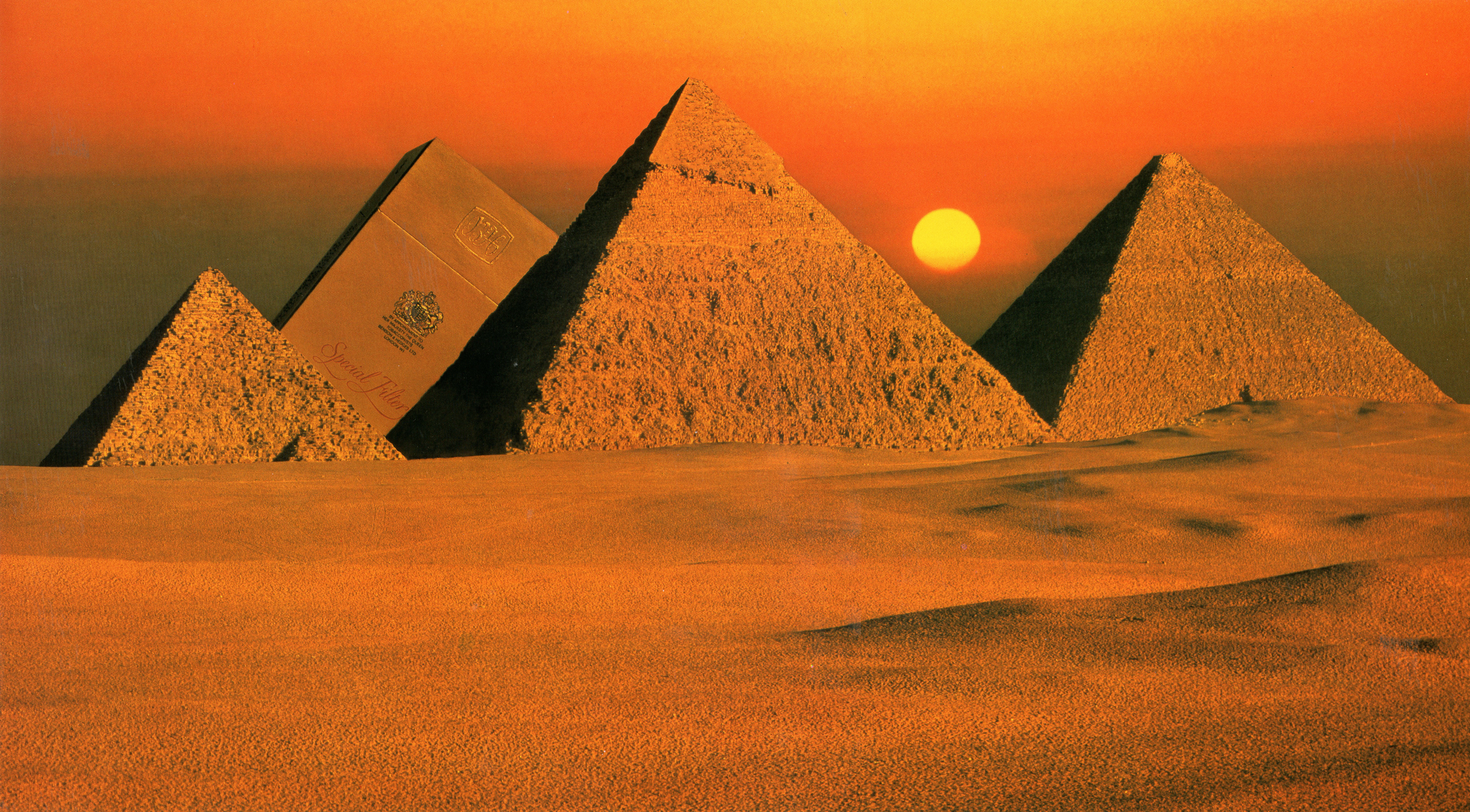
The agency and photographer turned up in Egypt on Sunday.
Scouted the location on Monday morning; perfect.
Turned up Tuesday to shoot; too hazy.
Turned up Wednesday; too hazy.
Thursday; too hazy.
Friday; too hazy.
Saturday; too hazy.
Sunday; too hazy.
Monday; perfect.
(It turned out the hazy effect was pollution from the local factories, only after a weekend of not pumping out crap was it shootable.)

This one was shot on the top floor of the National Liberal Club, the payment was the luxurious fitted carpet used for the shot.
Because the young people were in and out of each others rooms all night, photographer Adrian Flowers used a ‘20 – 30 minute exposure, so that they wouldn’t show up on the film’.
Again it took a week to get a result they were happy with.

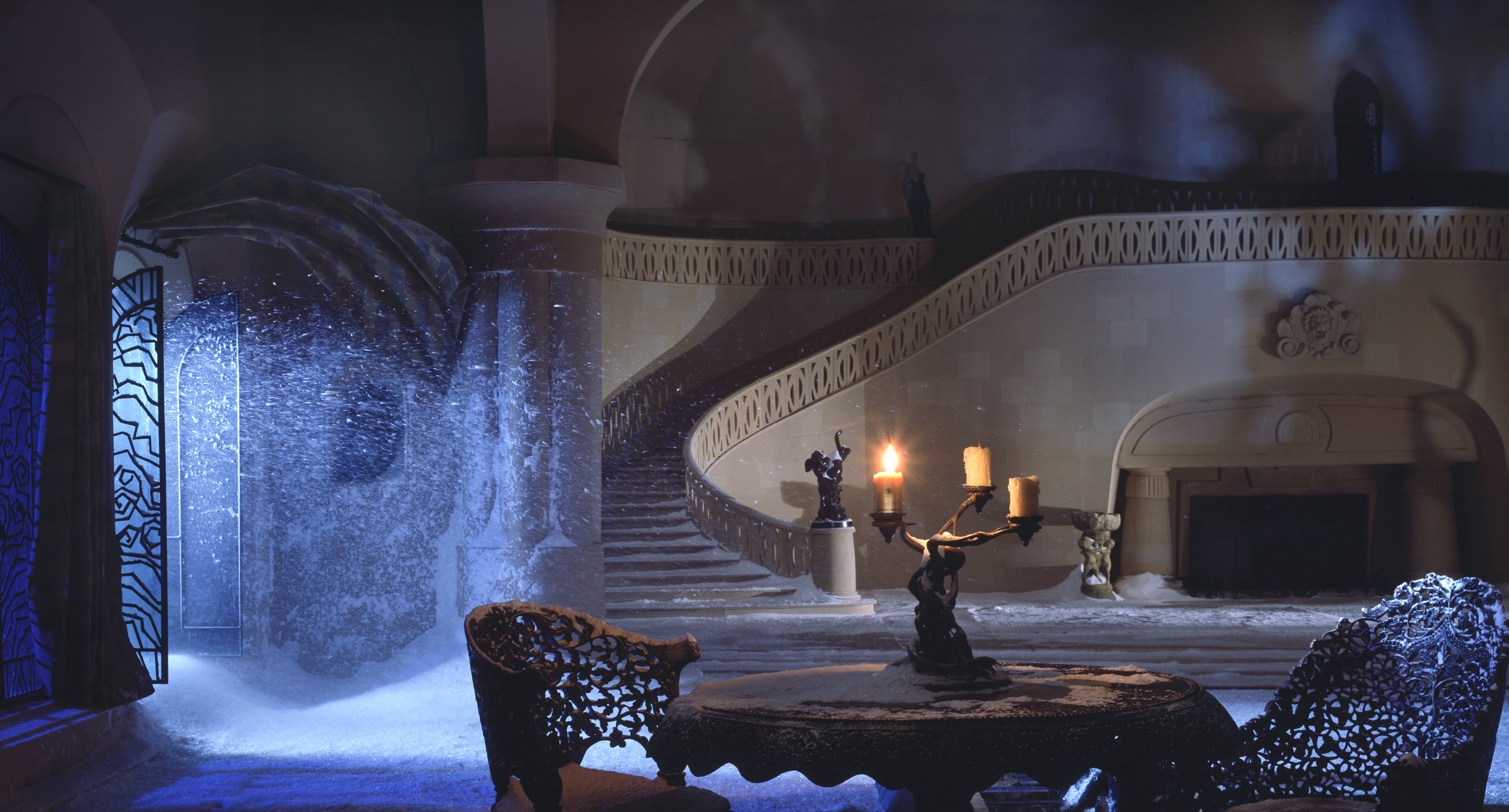
Two years in, the question was asked how would this new surreal B&H behave in film?
The answer, created by Waldie, and Mike Cozens was shot by Hugh Hudson.
It was also featured in the Guinness Book of Records every year until the mid-eighties as the most expensive commercial ever made.
Worth every penny.
This was followed by another Hugh Hudson epic, this time created by Johns O’Driscoll and Kelley, not as famous, equally mesmerising.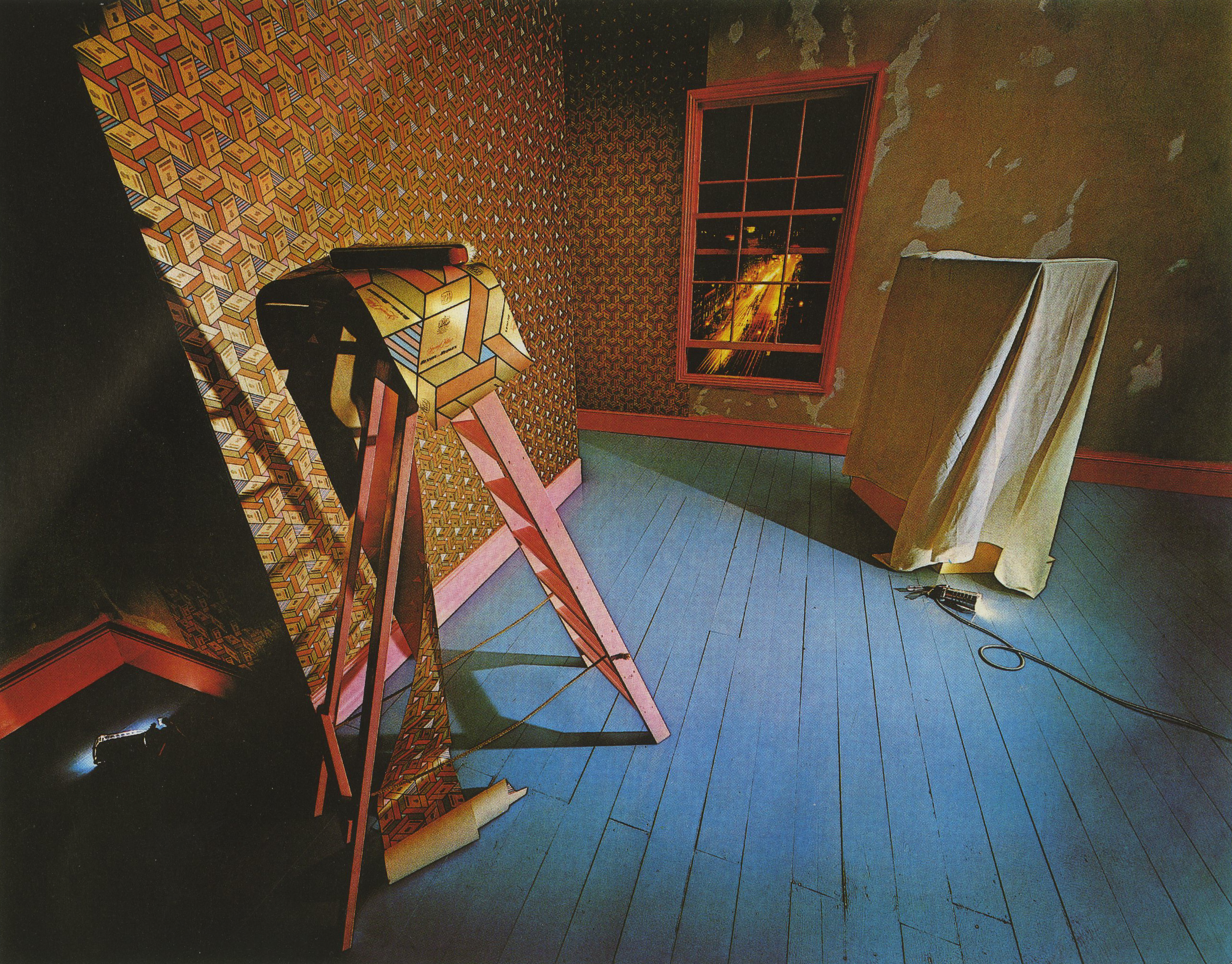


The photographer of this one; Max Forsythe recalled: “The finished shot looks very much like the original layout, but the struggle was how to light it. No conventional lighting seemed suitable.
After about two days of messing about I finally settled on sunlight coming through the studio window with a bit of BBQ grill to cast the shadows.
The Chameleon and the pack were both models, we did get a real one in the studio, but soon realised that it was not possible to work with it, it kept disappearing.
They were about five times actual size, which made it possible to shoot on 10×8.”


The writer of this one is unknown.
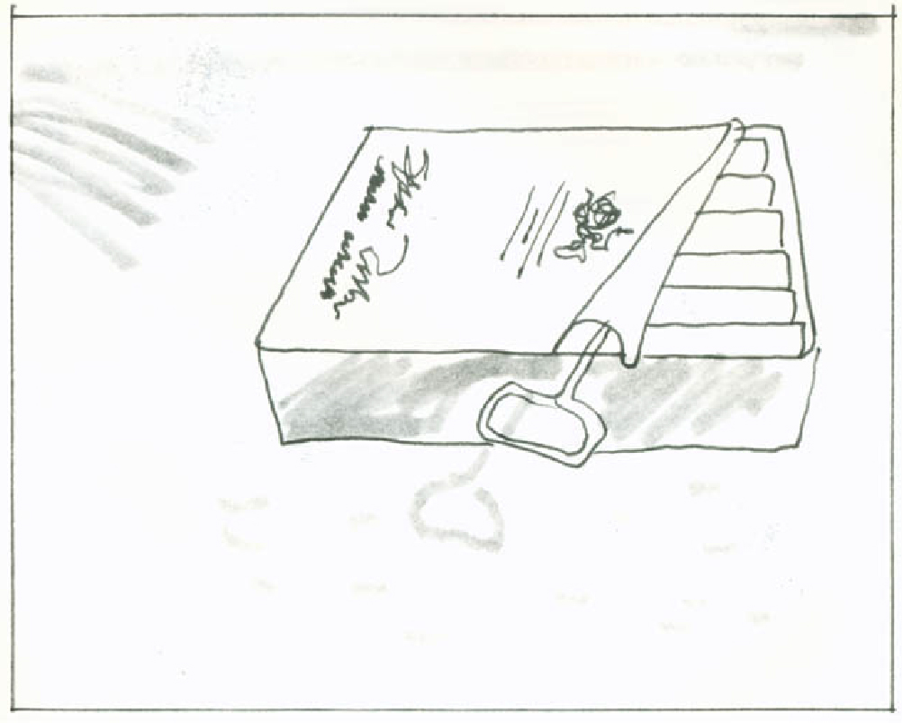
In the eighties, art director Nigel Rose takes the reins.

Here are some of Nigel’s fantastic roughs for ideas that didn’t get bought.


 Looking at back at these posters I can’t help wondering why people aren’t producing posters like this at the moment.
Instead of trying to shout a dull message across the street, why not create something that intrigues, makes people lean in, then rewards them by creating a smile in the mind?
Kind of interactive.


Haven’t seen most of these for ages. I’ve never been a smoker but I clearly remember almost all of them from my youth. The health warning took the place of a logo or headline. You’d see the warning strip, realise it must be a B&H ad, and study the image to solve the visual puzzle. As you say, they don’t seem to make them like this any more.
I think it’s possible to admire the work without wishing to return to the days of fag advertising.
I’m the same – I loved the B&H ads and relished every new one coming out (as I did the Hamlet TV commercials), despite having no interest in smoking.
So glad I came across this blog, as I’d been searching for a good online resource of pics of the old posters. The rejected ideas are fascinating too.
Hi Dave. I always admired the surreal quality and playfulness of the B&H posters. Thanks for gathering them together and for telling their story.
Sad to hear of his demise. https://www.theguardian.com/artanddesign/2016/may/30/adrian-flowers-obituary
Bloody genius. Forced to be radically different by Government. Disruption is something algorithms find hard to promote.
Do you know the source for the second article?
One source was an article by ex-copywriter Mike Everett. D.
Mike isn’t ex- he’s still writing.
Apologies Indra and Mike, it was meant as in ex-B&H copywriter, thanks for pointing it though. Dx
Hi Dave,
A very interesting article.I assisted Jimmy Wormser from July 1977 thru to May 1980.
I work with Neil Godfrey and Alan Waldie ( B&H’s 1978 “Iguana”) and many B&H ads of that period.
I you would like some true first hand information about that era.Including probably the only existing proof of the “Kites” Poster([never to be run).Please feel free to contact me.
Alastair Laidlaw
Hey Alastair, would love to get my hands on anything you’ve got, (never heard of the ‘Kites’ poster.
Also, I’d love to add any first hand stories, info or memories.
Best,
Dx. (dave@davedye.com)
p.s. Have I missed any?…Or probably more accurate; which ones have I missed?
I’d be very happy.I think we should celebrate 40th Anniversary of the B&H Pyramids Poster
Shot Nov 1977. I shall email you with more thoughts.
Best
Alastair
P.S. Maybe.I have many more interesting facts…..
Hi Dave,It’s 40 years ago to this month that I was out in Egypt at Giza shooting The Pyramid B&H Poster with Art Director Neil Godfrey and Photographer Jimmy Wormser.I also shot the pack for The Sardine can for the end frame of that commercial! I work on the Jigsaw Puzzle AD The Paint Box AD The Kites AD which got pull at the last moment.I was working at Graham Ford’s studio when he did the Ants AD.I knew Neil Godfrey very well over that period 1977-1980 and CDP.So if you need the real first hand inside story off someone who was there I shall be happy to share with images.I just love your blog Please see above comment. Alastair Laidlaw
Hey Alastair, yep, I’d love as much information and as many images you’ve got. Dx
Hi Dave,I’ll be happy to finally share the real inside info regarding B&H. I have not checked to see if Neil is still with us, but there a less and less people who can shed light on this chapter of AD history. Best Alastair Laidlaw.
Hi Alastair, do get in touch with Neil. He’d love to hear from you. Contact me if you need details.
Hi Indra,I would be very happy to chat with Neil anytime. How do we connect. I think it would only be right to do this out of the public eye. Email alastair@alastairlaidlaw.com I look forward to speaking to you. Warm regards Alastair
So lovely and interesting to read more on the B&H ads. I knew Jimmy Wormser: is there a full list of the pictures that he took for the B&H campaign, please, Dave (and Alastair Forbes)?
Hey Bridget, I’m not sure which are Jimmy’s, I know the Pyramids one is, beyond that I’m not sure (too young). Dx
Cool, look forward to it Alastair. Dx (p.s. Neil is still with us, spoke to him two weeks ago.)
Hi Dave,This is great news.I am taking up Indra’s offer and I hope to speak to Monday 20th.
I would be happy to speak to you too.I’ll drop you a line.Warm regards. Alastair
I was saddened photographer Tony May did not get a credit as he also shot some great gold box ads for the maestro A.W.
Firstly It’s a big Hello from me Alastair Laidlaw remember 1977 early summer.I have to agree Tony would have liked to have a few credits. Anyways All the best Alastair
Just randomly came across this site.I was one of two assistants on the circuit board shot. Alan Waldie – I have so many stories.
I believe it was my father Ed White, who shot the circuit board, Bees and Plug, amongst others.
It was Sue, he was a great photographer, always wanted to work with him, (could never afford him). Dx
My good friend the late Ian Kalinowski was apprenticed to Angus Forbes. He often sent me polaroids of some nice shots. One was a surreal Bensons advert (which wasn’t used) featuring a bonsai tree behind a venetian blind. I probably still have it somewhere.
Hey Chris, if you dig them out I’ll add them to the post. Dx
I will, but it’s a long time since I’ve seen them!
Hi Dave, please put me in touch with Daniel White, Ed was a dear friend of my Dad Stephen Coe!
I have a signed pic of Christmas on the roof by alan waldie & hedges
Let’s have a look Jane, attach a picture. Dx
Even “Not The Nine O’Clock News” parodied it. On the back of their book (published in 1980), it showed a 10-pack of B&H as a gravestone. The footer was: “H M Government Rumour: smoking is less dangerous than crossing the road”.
My ex husband Ed White was the photographer that took this iconic photographs. A Waldie was the art director
Yep, he did some of the great ones Penny. Dx
Hi Dave,
Nice article, I must find part 1!
I have a number of these posters (20-30) in a smaller size. They were given to my sister by a commercial artist whom she knew around the mid to late 70’s.
I wanted to get these seen and have approached the Tate and a couple of other institutions but no one is interested; anything to do with smoking still seems taboo, regardless of medium.
Unfortunately, they’re rolled; to avoid any additional damage, I don’t like to unroll them. They need professional conservation and love in a setting where they can be appreciated and enjoyed by the public.
Thoughts? I have images I can share of some.
Laurie
Hi Laurie
You could try HAT, the History of Advertising Trust.
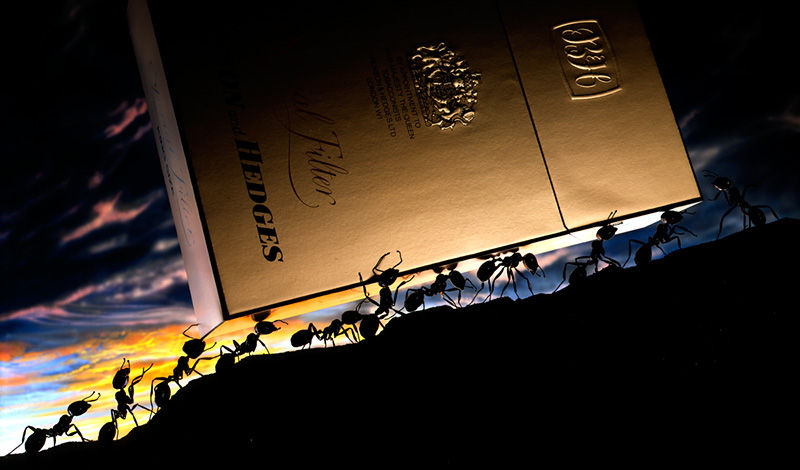
Graham ford
Hi Graham,I was work freelance for Billy when you where photographing The B&H ‘Ants’ AD I remember Fluck and Law were the model makes cannot think who was the art director……I hope all’s well. All the best Alastair Laidlaw
Finky? Rosie? Wasn’t Neil.
best,
Indra
Hi Indra, Good to hear from you. I hope all is good! In my post I meant to say to Graham it was Gerry Oak that I freelanced for. I think the ‘Ant’ AD came out in 1982?
I’ve made two Posters 100cm X 50cm from the proofs restore to their original colour of the ‘Kites’ 1978 never ran and one ‘Pyramids’ email me if you’d like to have a look. May be HAT would be interest……
Best
Alastair