Like most people I’m a fan of the likes of Cartier-Bresson, Don McCullin and Martin Parr, photographers who go out into the world and record it in a ways we may not have seen or imagined.
But I LOVE photographers who go out and create their own world using their own unique, idiosyncratic set of aesthetics.
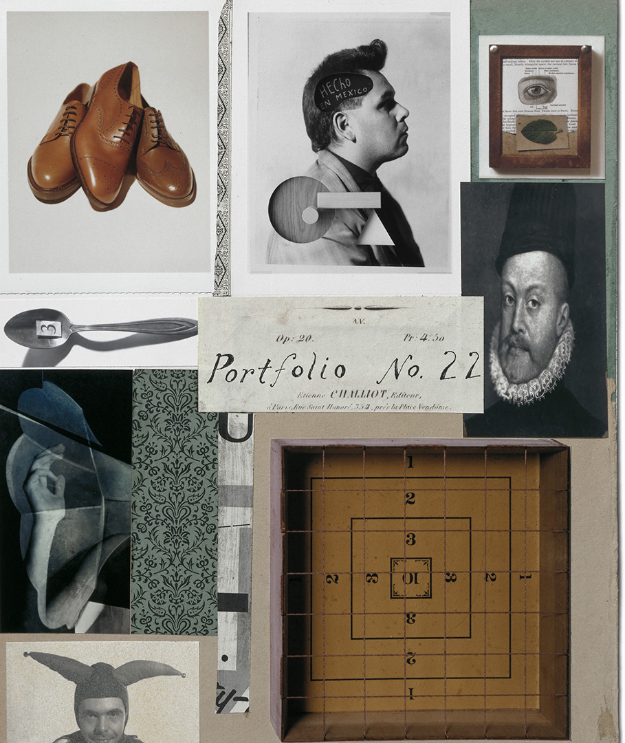
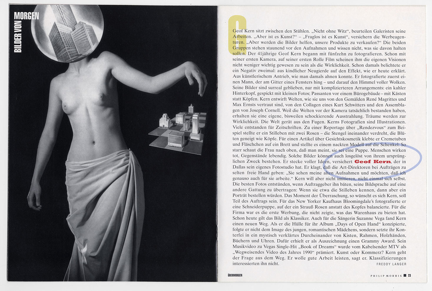
I recently posted lots of my old green scrap books and one name that kept coming up again and again; Geof Kern, one of the best and most idiosyncratic photographers I’ve encountered.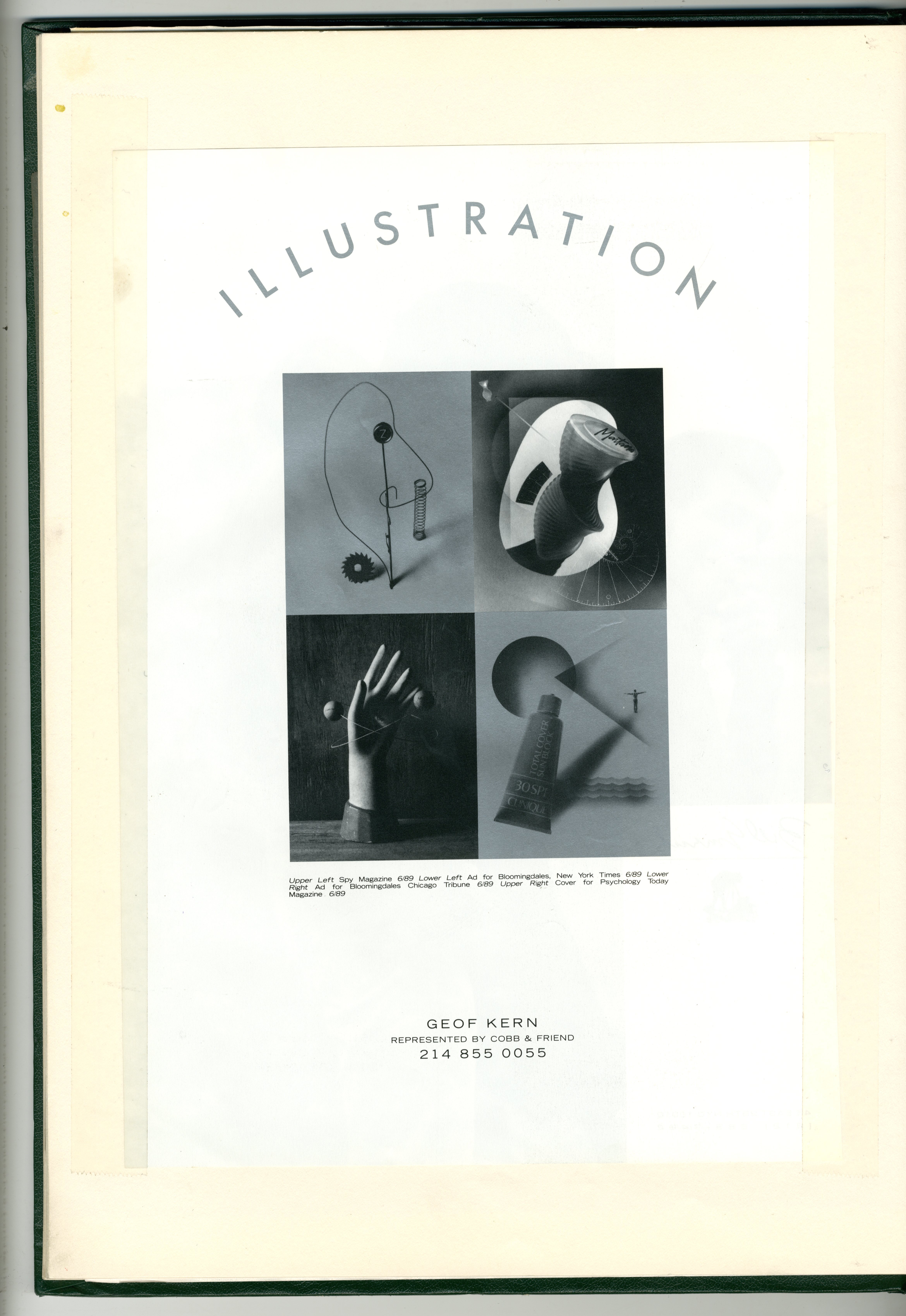

I was lucky enough to work with Geof on several campaigns back at BMP/DDB and AMV/BBDO.

The blog post lead to Geof getting in touch, which in turn lead to this post.
Where did you grow up Geof?
I was born in Brooklyn in 1950, lived in Queens until ’65, I then moved to Southern California to live with my father, I was fifteen.
A bit of a cultural shock, from Queens to Surf Country.
Can you remember the first image that caught your imagination?
Not photographs but scenes from movies: ‘Zabriskie Point’,

‘Closely Watched Trains’,

Cocteau’s ‘Beauty and the Beast’,

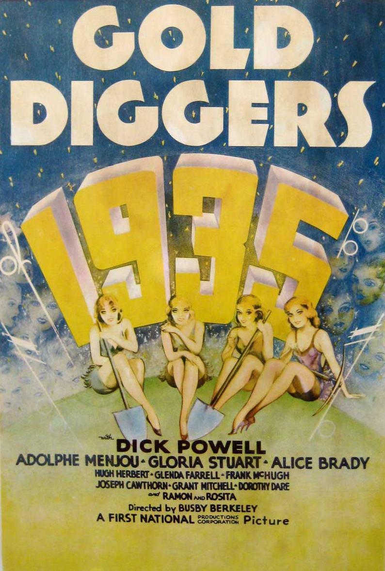
‘Gold Diggers 1935’ by Busby Berkeley,
Ingmar Bergman,

and ‘Sympathy For The Devil (One on One)’.

Were you interested in aesthetics growing up?
As a kid I liked to draw; portraits of people, imaginary scenes, that sort of thing.
I was kind of a shy, solitary kid.
What was your first job?
When I was twelve, in Queens, I was a delivery boy for The Long Island Press.
Each morning at 6am I would go to an alley behind a Chinese restaurant, it would be cold or snowing, and I’d pick up my stack of papers to fold and rubber band.
I made friends with the Chinese cooks who came outside to dump the steaming chicken blood and guts into the steel drum in the alley.
I loved the smell of freshly printed newspaper, but to this day I have a hard time eating chicken.
What about photography?
An evolution perhaps.
At the age of twelve, in 1962, I wanted to become a cartoonist for The New Yorker magazine, so I called them to try and make an appointment to show my portfolio, but they refused.
I went to Manhattan anyway.
Dressed in my best slacks, (which I tailored the legs skinnier), I bought a yellow tie, shined my shoes, put on my Sunday sports coat and rode the subway to Manhattan, under my arm was my folio of my “New Yorker” one-panel cartoons.
When I got there I called them again from a phone booth near their offices.
They refused again.
As I’d also found the addresses of Playboy, Sports Illustrated, and Esquire so I paid them a visit too. Only Sports Illustrated let me in past the receptionist.
I met two men in a small room, one guy smoking a cigarette with his foot up on the edge of a steel desk, the other standing by trying to look as serious as possible.
The man with his foot on the desk carefully looked at all of my boards, shook his head in a thoughtful and positive way and said “Nice work. Does your mother know where you are?”
So what lead you to reach for a camera?
In 1970, age twenty, I went to a book signing for the photographer Duane Michals at City Lights Bookstore in Pasadena, California, he was promoting ‘Sequences’, it’d just come out and I bought one for him to sign.


I still have that book, Duane tried to buy it back from me many years later.
His book inspired me, I didn’t realize that photography could be like that.
Here are some images from my first roll of film, photographed with a cheap used Contax camera I bought in a flea market, I made the sculpture with a plastic face, 1969.


Did you go to college?
Once I’d decided to become a photographer I enrolled at Pasadena City College and took a photography course.
This was only a city college, and the photography department was small.
Unfortunately, I was drafted into military service almost right away and never completed the course.
While in Vietnam, I mailed away for some brochures and decided to go to Brooks Institute of Photography in Santa Barbara California once out of the military.
It was either there or The Art Center in Pasadena.
I would have preferred The Art Center, but Brooks was cheaper for a guy like me who’d have to take out a loan and work while going to school, (even with financial help from the GI Bill).
When I got out of the service I attended and graduated from Brooks with a BFA specializing in photography, a technical school, I learned all sorts of things about film and printing that are useless now. My instructors were working photographers from the 1940’s to ’60’s.
Then assisted a photographer?
No. My best friend at Brooks was from Dallas and after graduating I was hired by his father-in-law who ran a commercial studio there, so I moved to Dallas to start working.
After a year photographing such things as trucks and computer boards, (from Texas Instruments), I left and opened my own studio in 1977.
I’ve never assisted a photographer.
Who was influencing your work in those days?
First movies, then later Penn

and anything by Bill Brandt.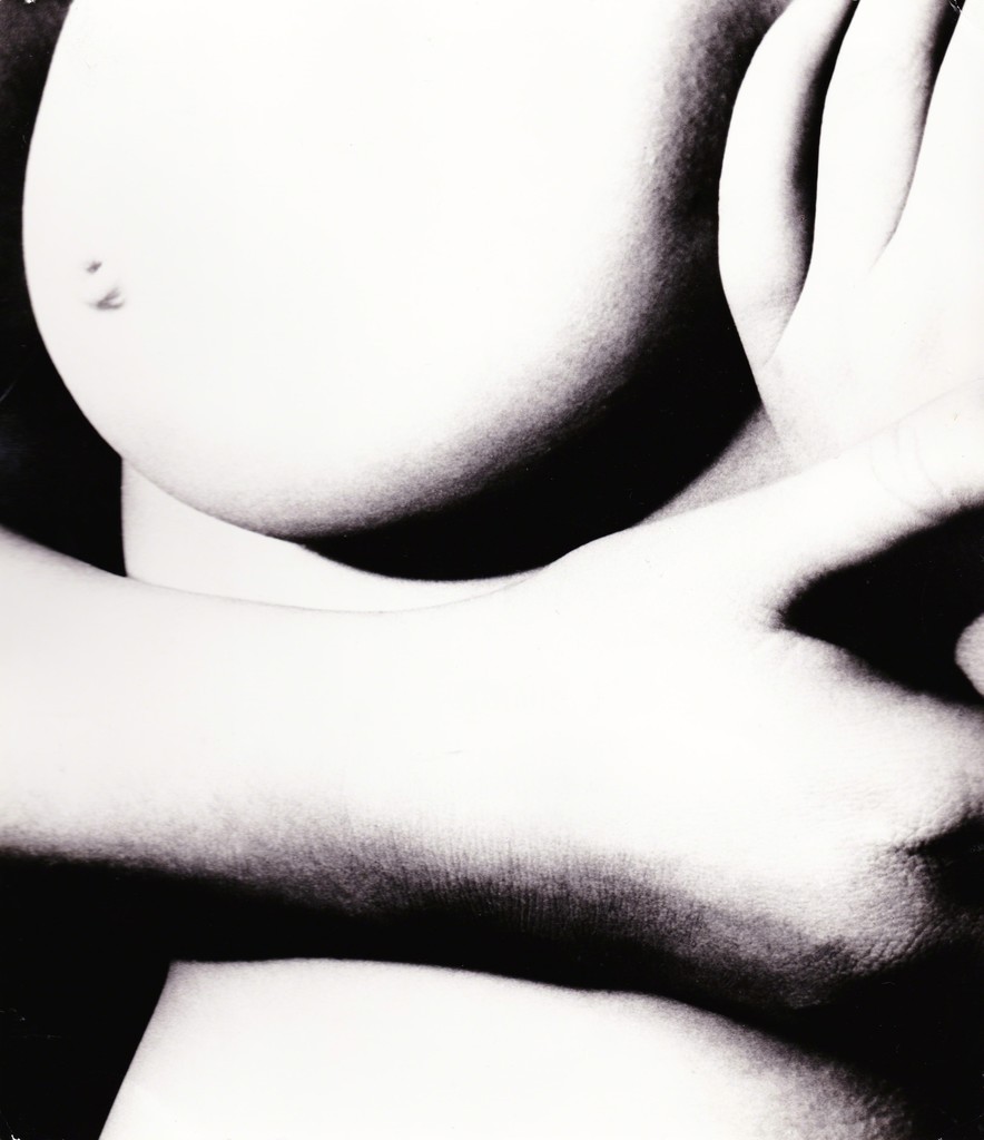

Also artists from the 70’s, 40’s.
What was the first picture you were paid for?
It was a fashion assignment for a new fashion section of The Dallas Morning News newspaper, I photographed fashion for them every week for a year.

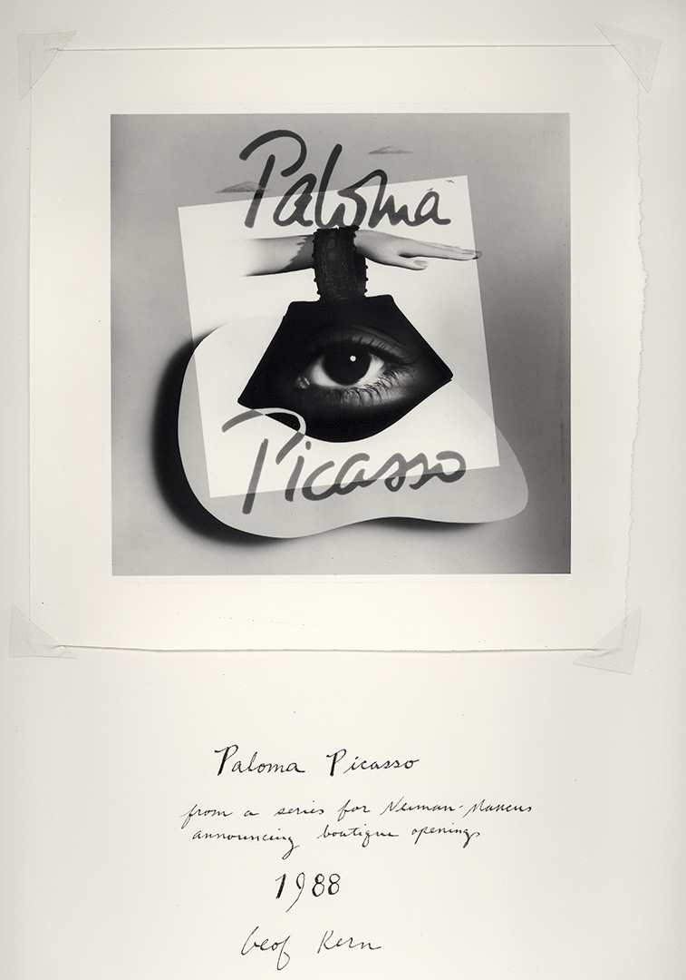
The Neiman-Marcus ad below appeared in Vogue and was my first national tear-sheet, that was in 1978.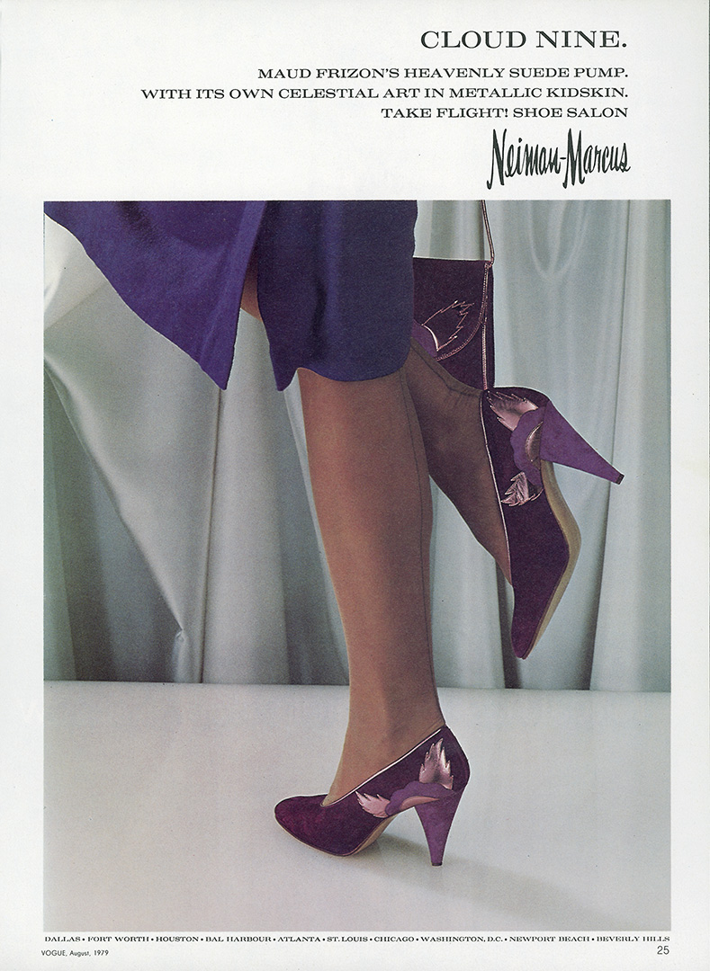
Did you do much non-editorial?
There was a building boom both in Texas in the early 1980’s, so I was photographing a lot of corporate brochures for the high-profile builders of Houston and Dallas.

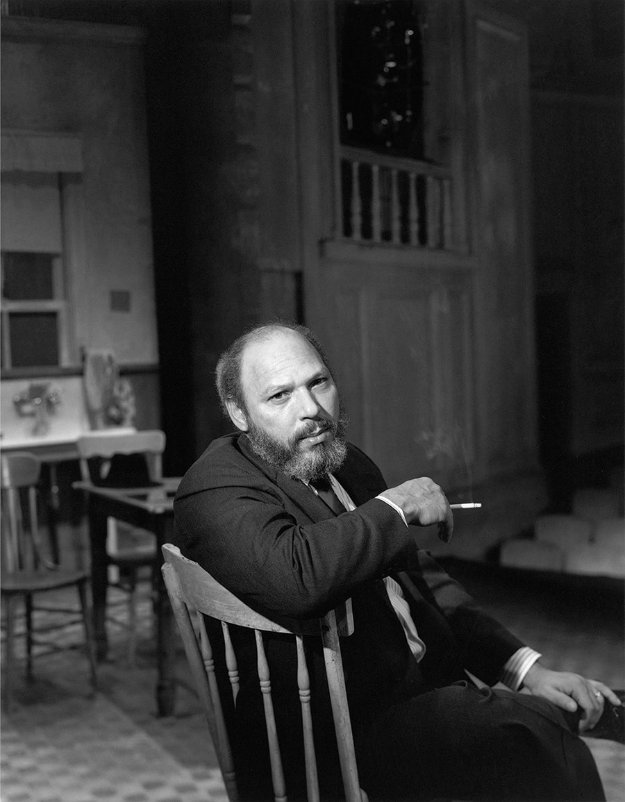
Above is a portrait of Trammel Crow with architectural models of his soon to be built Infomart and Trammel Crow Center. (1983)


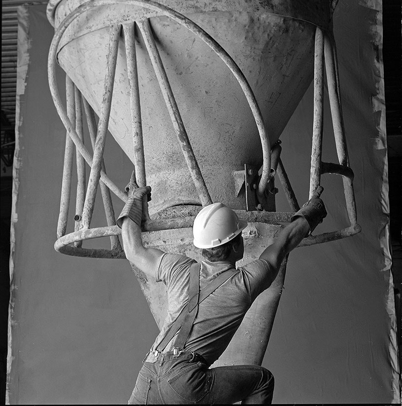 The construction workers were on a set I’d constructed with steel I-beams and concrete rebar forms, set up in a warehouse with a huge canvas backgrounds I painted myself. (1983.)

Above is an aerial picture I took of what they call the “tree ceremony” at the top of a nearly finished building.
Who gave you your early breaks?
I worked with FRED WOODWARD very early on, first when he was Art Director at the Dallas Times Herald Sunday Magazine, then D Magazine, then Texas Monthly magazine.
Later, I continued to work with him as he moved to Regardes, Rolling Stone, and at GQ. Fred was the first one who looked at my portfolio, which was all fashion at the time, and ask me to shoot editorially on subjects that weren’t about fashion.
DJ STOUT was an Art Director with the Robert A. Wilson Agency in Dallas. Robert Wilson’s wife is Laura Wilson, the photographer and producer of Avedon’s American West series they photographed around Texas. (Their children are Owen and Luke Wilson. I remember seeing them as kid running around Robert’s house.)
The agency had some very high-powered corporate accounts and DJ and I created some very nice, award-winning as they say, projects for Annual Reports and other corporate books.
When Fred left Texas Monthly for Regardes, DJ replaced him as Art Director and I continued working with there.
In the 1980’s JOHN C. JAY was the Creative Director of Bloomingdales New York.
One day he called me to photograph a fashion campaign Bloomingdales was thinking of running during the same time as a “fashion and surrealism” exhibit at the Fashion Institute of Technology in New York.
John wanted to call the Bloomingdale’s campaign “The Subject is Roses” and have it be a bit surreal.


He sent a model to Dallas where I photographed the series, and I think this was a very big break; first to work with him, and also because it was so visible in The New York Times and elsewhere.
I continued to work with John on other campaigns for a couple of years.
It was such a pleasure working with someone who encouraged experimentation and art.
YUKIO KOBAYASHI was Chief Designer of ‘Mons. Nicole’, the men’s fashion line of Matsuda Tokyo.
In the late 1980’s he began to hire photographers to photograph his seasonal collections, which were published in conceptually designed books.
These photographers included Bruce Weber, Jurgen Teller, Jan Saudek, Nadir, Nan Goldin and so can be called an artist series.
I photographed three of Kobayashi’s collections in 1992 and 1993.
For this work I was given an award from The International Center of Photography in New York.
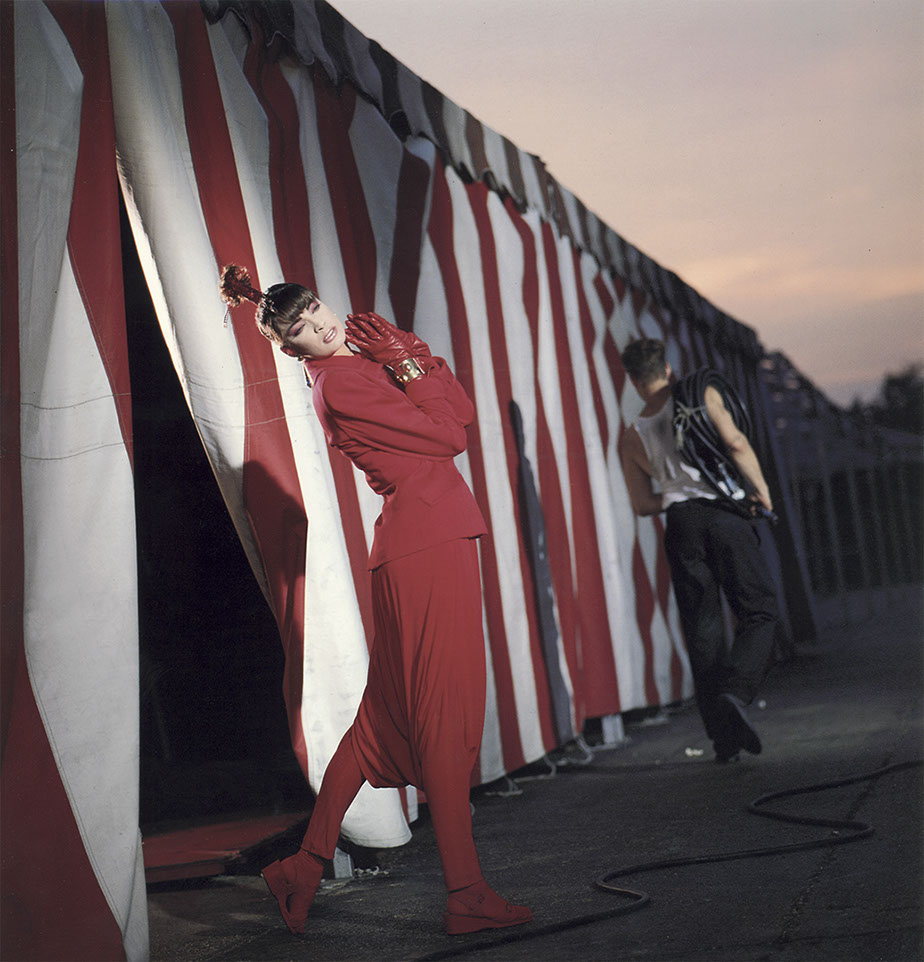
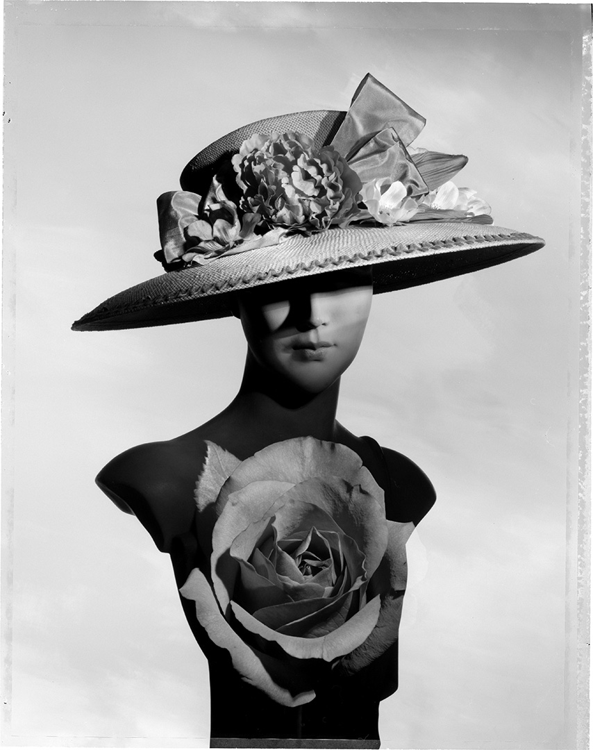
A quirky, almost ‘surreal’ edge starts to turn up in your fashion shots?
In 1979 I did a beauty shot for hair and makeup for a client that was a disembodied model’s head in a birdcage.
I was labeled a “surrealist” all through the 80’s by writers writing about me.
A term that has a vague broad meaning. 

When did the stories start to emerge?
I naturally tend to think in terms of a story, even if it’s for one image.
When I started to photograph series for magazines, the story aspect became more evident.


Around the mid-eighties out goes colour in comes a whole new aesthetic, what lead to that?
I was interested in exploring the actual medium of photography.
Multiple negative printing, multiple in-camera exposure, print constructions, collage, xerography, combinations, you name it.
Black & white was easier for me because I had a black & white darkroom and I could do it all by myself.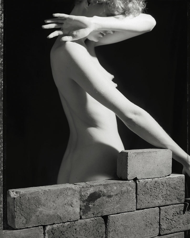


Did the ‘No Decade’ series above get you the Bloomingdales job?
Possibly, I never thought to ask.
Also, by then I was photographing for other magazines.
There are some close similarities between the Texas Monthly shoot and Bloomingdales, such as photographic masks and feel of decayed romanticism, because they were so close together in shooting.
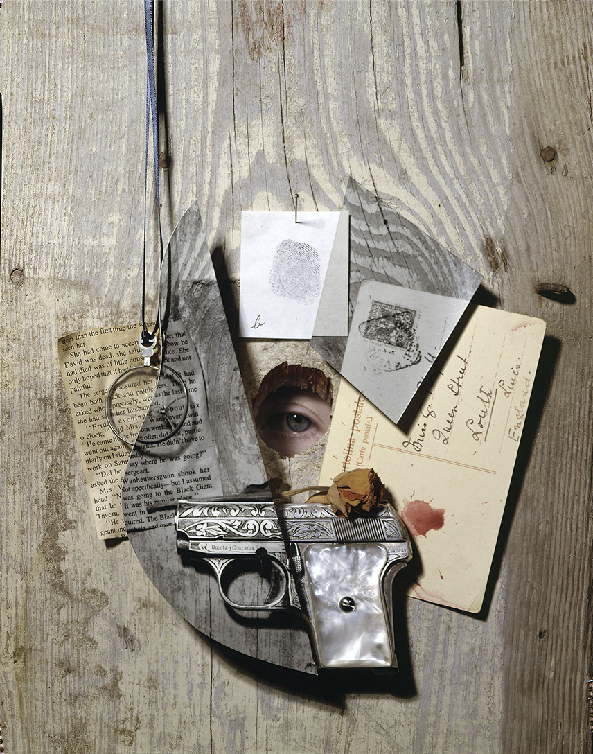
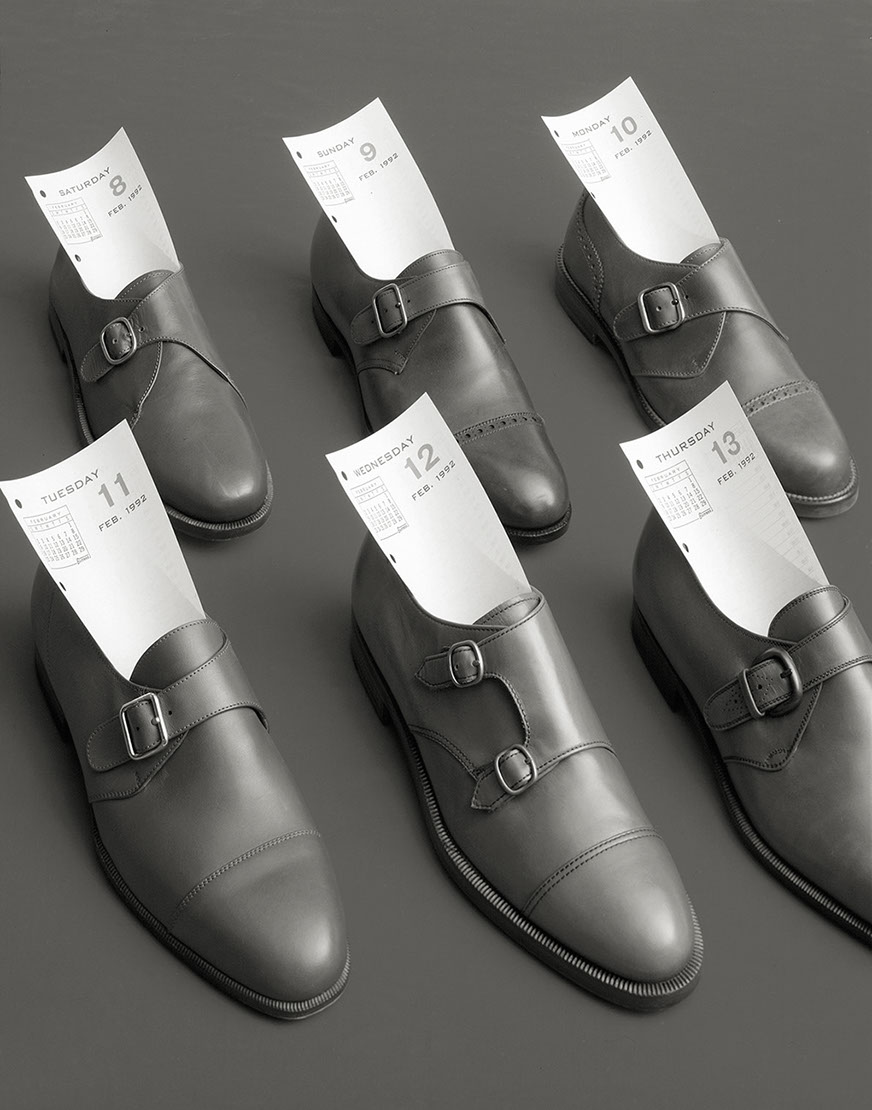
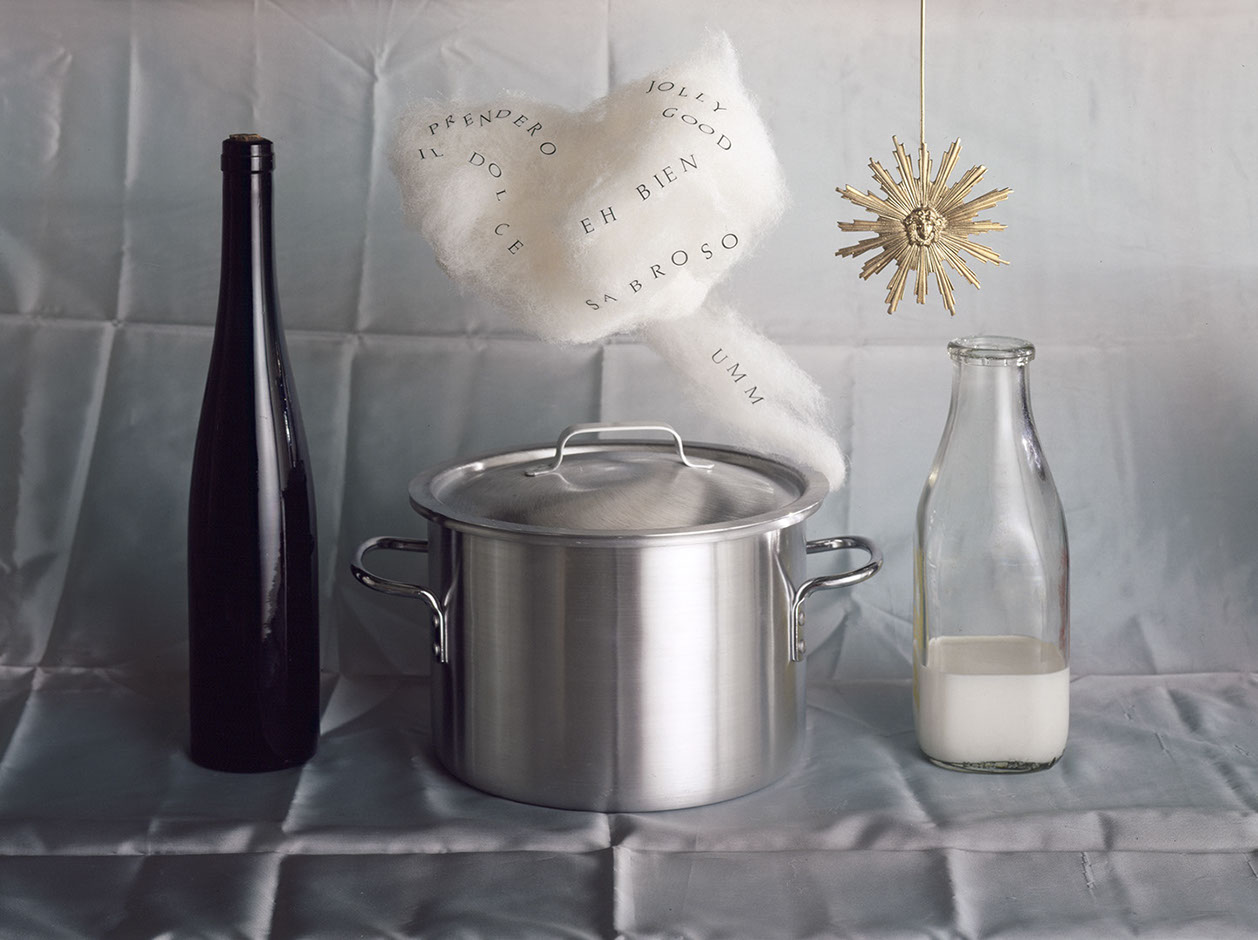
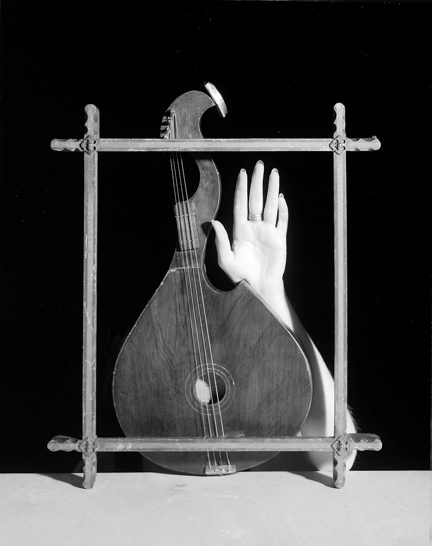
When did you begin creating your very idiosyncratic still lives?
Around ’87 or ’88.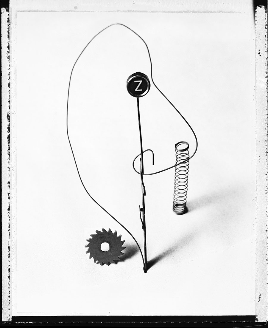


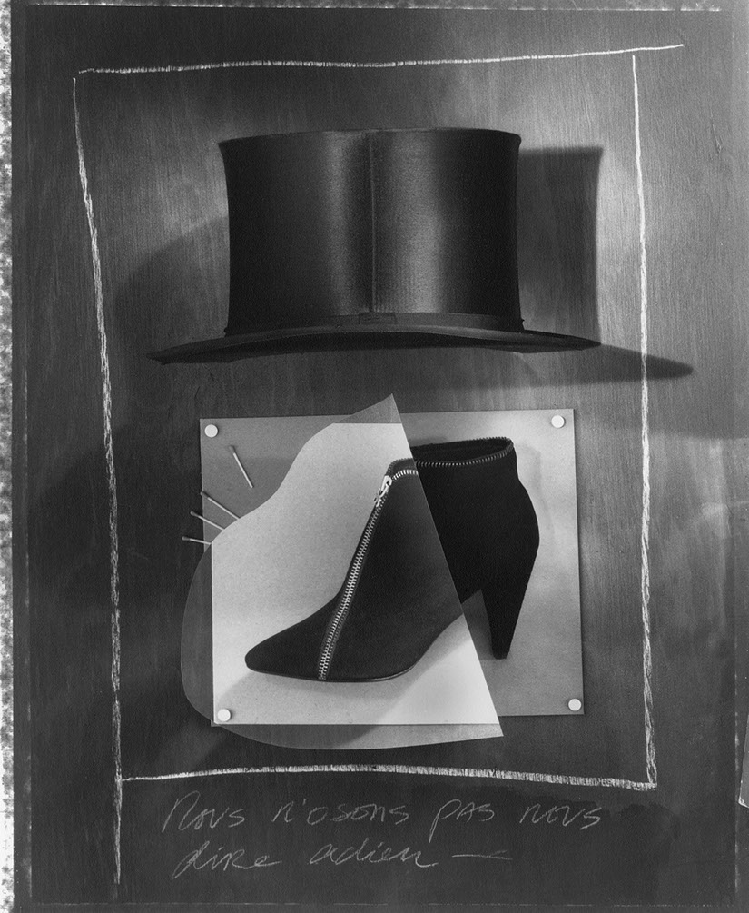

Your unbelievable attention to detail and incredible focus makes me wonder whether you have some minor psychological disorder?
I can be obsessive, but I’m usually fast and decisive.
I have shot one roll of film or a few sheets of film, and said ‘done’.
There were crossed wires over my next question.
It was supposed to be one question with a very long lead in, like a bunch of possible client comments.
It should’ve been:
Should the box be smaller?
Should the chalk be easier to read?
Should we see a little more of her face?
Should we use a more modern font?
Are the paper folds too noticeable?
Would a letter ‘Q’ look better than the letter ‘C’?
Isn’t that black top too black, too funereal?
Is the background too empty?
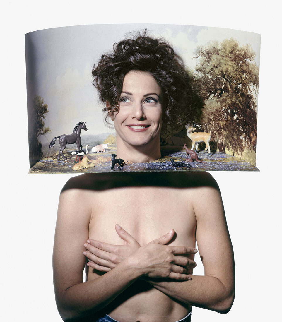
Compositions like these live or die on the subjectivity of the person making the choices.
They aren’t logic based, they are for the person commissioning; trust based. Do you feel clients less willing today to buy into a photographers vision or aesthetic?
But I think Geof thought I was criticising the shot.
Consequently it’s probably the most insightful answer here.
By accident.
Should the box be smaller?
Suits me fine.
Should the chalk be easier to read?
I think it’s just enough.
Should we see a little more of her face?
No, perfect.
It’s not about her.
Should we use a more modern font?
I liked the idea of older things contained in a modern visual basket so to speak.
Are the paper folds too noticeable?
I worked hard on getting that look.
Would a letter ‘Q’ look better than the letter ‘C’?
This photograph was from a series for an all woman design agency in Chicago, called Concrete. I used a “C” in each picture.
Isn’t that black top too black, too funereal?
I just wanted a graphic shape.
A silhouette figure.
Is the background too empty?
Not to me, I like the singular composition on white.
Compositions like these live or die on the subjectivity of the person making the choices. They aren’t logic based, they are for the person commissioning; trust based. Do you feel clients less willing today to buy into a photographers vision or aesthetic?
Sadly yes.
Photography is not as important anymore.
It’s lost a lot of its relevance.


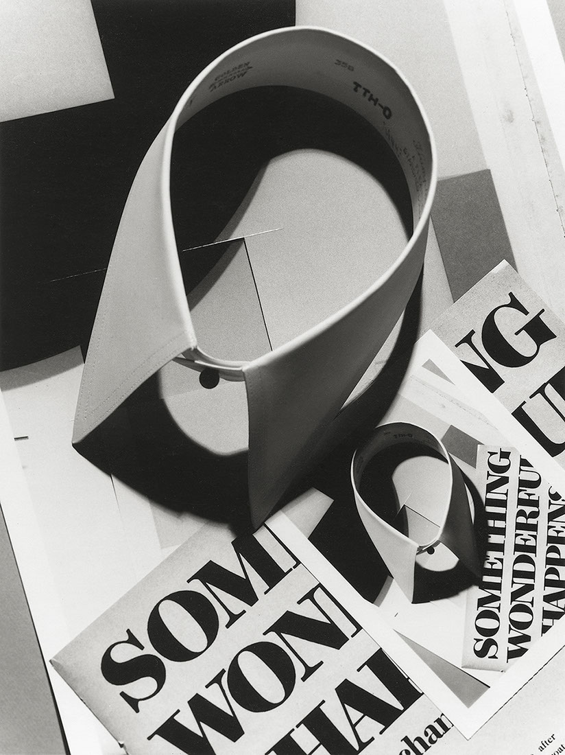
I can’t help but notice the role typography plays in your photography?
I brought typography into my images like anything else visual.
I was chastised for doing so by an Art Director of Esquire in the 80’s (“just isn’t done”). One of the better examples from the time I think is the cover I did for Beach Culture magazine where I wrote the word “water” with a pencil.
I think that cover is in the Cooper Hewitt Smithsonan Design Museum.
But it’s there only by extension of David Carson’s work of course.


Obviously that love of words, type and lettering also comes through on your various folios and journals, does handing over your pictures to art directors must make you anxious?
Not really, but I hope for the best.
I always have the picture I made, that’s the important thing.


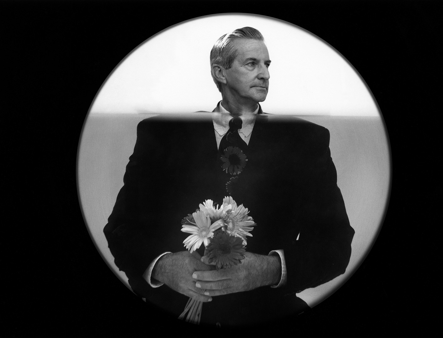
 Most of your work allows you to create your own world, how do you approach capturing other people’s world’s when you shoot someone’s portrait?
I wish I had been commissioned to shoot more portraits. I think I could be good at it, but I live in the middle of nowhere so it rarely came up.
I think I make people comfortable when I’m photographing them.
I respect people and I want to convey trust.
I explain what I have in mind first, I don’t believe in taking advantage of people.
It’s like “we’re working on this together.”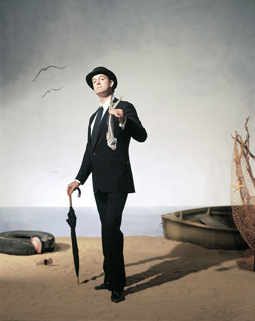

I thought you captured Suzanne Vega’s world really well “Days Of Open Hand’’ album, which I bought it when it came out, 1989.

Did you take inspiration from Suzanne Vega’s vibe or did she borrow yours?
I think Suzanne stepped into our world for that project.
I say ‘our’ because my wife, Debra, worked with me on the series.
Debra and I have worked together since 1987, when we were married.
This project, with all of the objects, that is all Debra.
In all the time we worked together she never wanted credit for her work, but she is a very, very, big reason, or I could just say tTHE reason, for why we are even talking now.
Debra and Suzanne kind of became friends.
A little later on Suzanne came back to Texas to spend some vacation time at our house. She set up on a lounger near the kitchen as our kids ran around and Debra cooked dinner, I think she liked hanging out in our normal boisterous suburban home.
The work we did won a Grammy for Album Art.
For the actual album cover the record company had another photographer shoot, in my opinion, a really bad portrait, they took my image of her out of the set and inserted the other image.
So disappointing.
And for that, the photographer, who shot just that one piece, got a Grammy too, although the project included so much more; more portraits, EP covers, CD books full of images related to hands, etc., which Debra and I did.


You directed a video for her too?
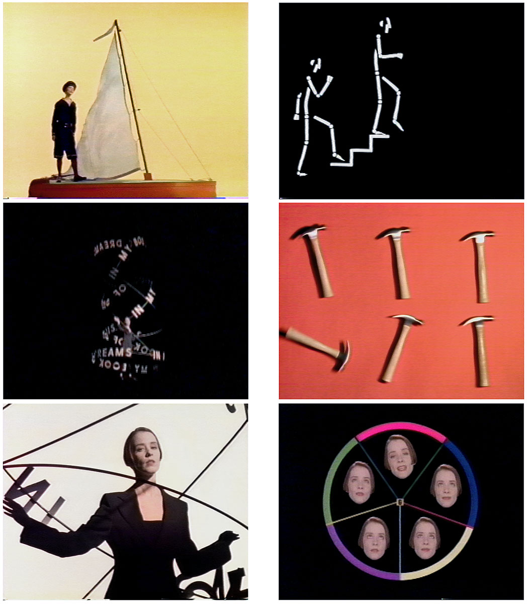

Yes, for a song from the album called “In My Book of Dreams”, with even more frustration.
Being a photographer and not an actual director, I was given a Director of Photography (DP), who, in the process began to insert his own ideas of scenes into the project.
Much of the video is mine, but there are scenes that are not.
And I did not like the editing, which may not have been his fault anyway.
So many hands in the pot.
It did win an award from MTV for Most Innovative Music Video and I was mailed a rather strange award of a wiry limbed figure with a TV head.
Close your eyes Geof, here it is:
I guess that put you off Directing?
Yes.
When did David Carson turn up?
First for a cover of Beach Culture Magazine. 
Then I photographed a big series for Eco Magazine, a magazine he was starting that never got off the ground.
Then a photo for his ‘The End of Print’.
How was it working in Dallas when the world is elsewhere?
Many people have commented on this, many have been surprised I don’t live in New York or London.
It’s because I started a family here a long time ago, and I didn’t want to move them.
I did the best I could from here and it worked out fine to me.
A writer, writing about me a while back for a photography magazine, titled the piece “The Outsider”.
I liked that title.


Did you ever come across the work of Angus McBean?
I know his work. I have one of his prints a model of his gave me.
Where does that fifties vibe come from in your shots from this period? (Don’t be a smart- arse and say ‘the fifties’.)
I think you might be referring to a ’60’s vibe.
Like Hitchcock.
For a good stretch I was liking anything early ’60s, fashion, hair and makeup, sets.
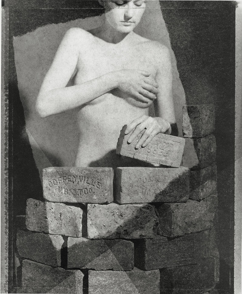
The Rolling Stone silent era inspired series seem to mark another shift? 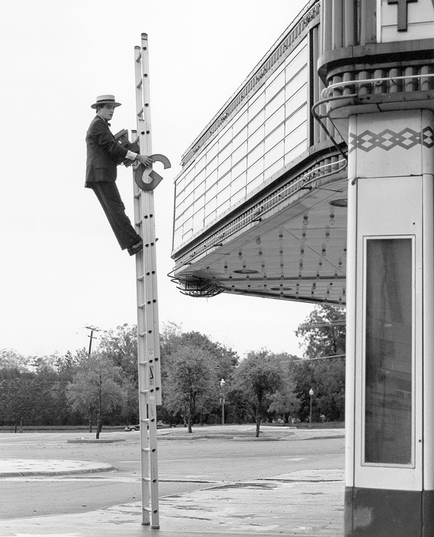


It was a turning point.
For the previous few years I’d mostly been working in the studio making collages, darkroom experiments, studio sets, still life, etc.
For the Rolling Stone assignment I decided to go outside and record what was before the camera.
So how did this project affect your work going forward?
Figures outside, the “inside” (furniture, television, etc) taken “outside.”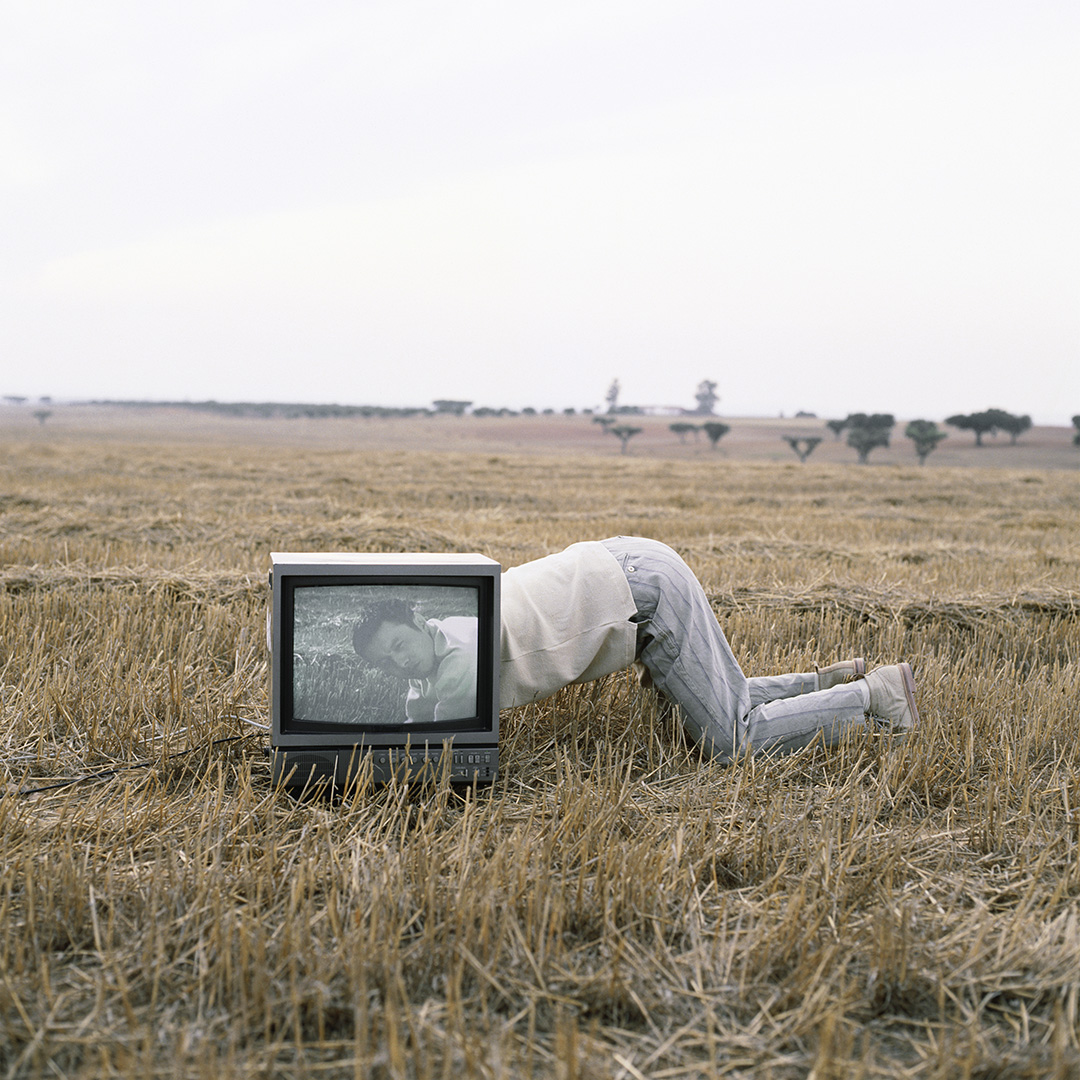

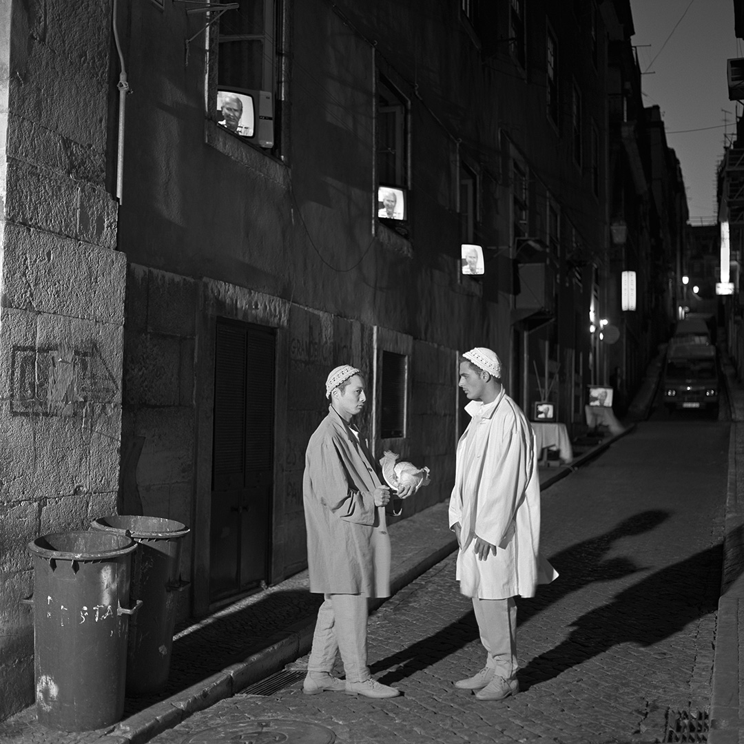
I was also leaving the studio, with all it’s manipulations, for performances outside.
I’d go back every now and then, but my focus was now creating a composition outside.
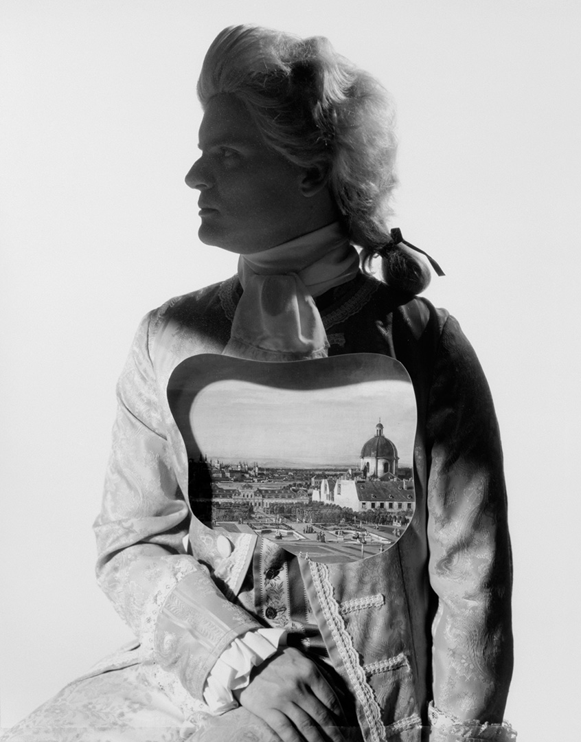
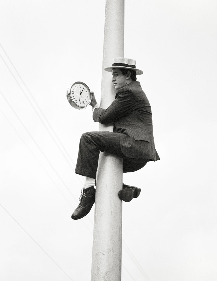
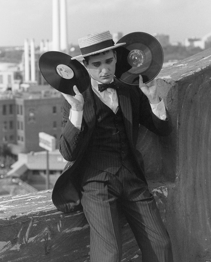
I also love the perspective tricks that you employed in the Matsuda Paris series.
Partly because such a simple, human, almost child-like idea, yet looks so cool. 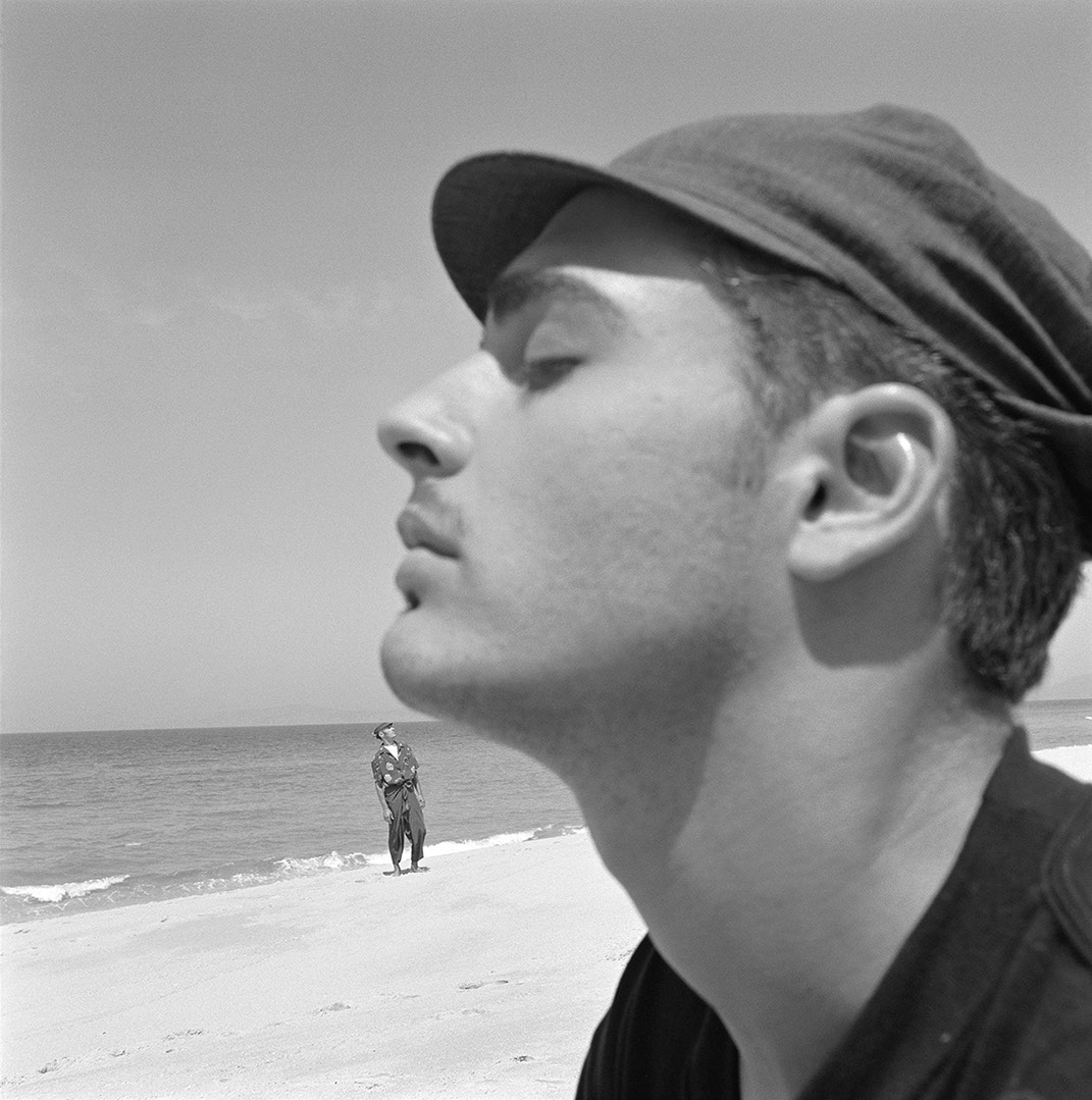


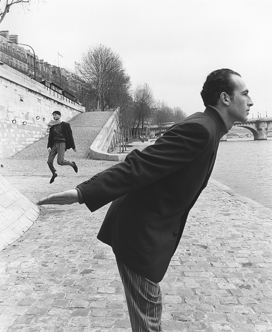
But also because it reminds me of the time I went to Paris with my then wife, about 20 years ago, it was pre-digital film, so I shot pictures of her all over Paris.
We got back a week later and she got the film developed.
In every single print she had an Eiffel Tower coming out of the top of her head.
It kept me amused, but they didn’t look stylish like yours?
I did it deliberately too.
In 1992 you didn’t see any of this, this idea of forced perspective.
I thought of it while reading an amateur photography book of what not to do, such as having a telephone pole stick out from behind your subject’s head.
My forced perspective photographs definitely started a trend.
It became such a cliché.
I have for many years not wanted to show these images to anyone.
But at the time it was not in the general vernacular, at all, anywhere.
No one was snapping their friends holding up the Leaning Tower of Pisa in 1992, or the other millions of images with this idea.
Well, it might have happened, who knows?
My work for Matsuda, which had these photographs in one series, was given an award from the International Center of Photography in New York.
Obviously it was unique. 


It’s interesting looking back at images like the ‘Water-Line’ series to think that they were created without photoshop, if they were shot today I can’t help thinking that a) They’d be created in photoshop, b) They’d be worse for it, more complicated?

I think you are correct.
They are very organic looking because they are.
I invented a way to do it with traditional methods.
Remember, in those days I explored many uses of the photographic process including prints in ways that surprise people even now.
Who’s the most creative person you’ve met?
The creative person who has had the most impact on me is my wife Debra.
We’ve worked together on photographs as a team for almost 30 years.
I learned a lot from her, I was also encouraged by her.
Which image has had the biggest effect on your career?
Yves Klein jumping off the roof ranks up there.
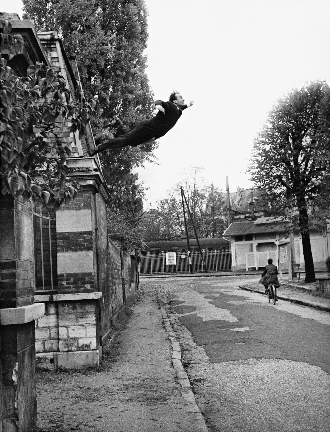
The photographer Harry Shunk sent us a print of it many years ago.
That picture made me think about putting people in the air, starting with that Rolling Stone series you brought up.
Bill Brandt. I’m always inspired when I look at his work.
Sometimes I just look at his photographs to get in the mood to think of ideas.
They just inspire me.
Has digital helped or hindered photography?
Destroyed it.
Is there more or less experimentation in photography today?
There is experimentation, some good young photographers, but I have to wonder to what end? These kids get attention for a year, maybe five, but I can’t imagine them having a career of forty years like I did.
They’re hardly paid at all now.
So it has to be for art only now.
And how long will that last?
Commercially, most of what is done now is very direct commercial work that just about anyone can do.
Print has disappeared, it seems I’m only shooting for the web or billboards, you see the problem?
Which photographers do you admire today?
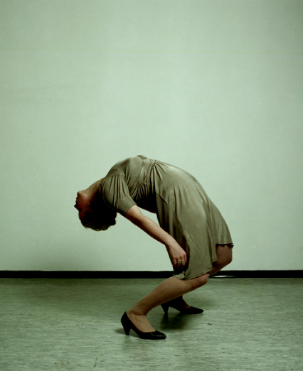
I like Isabelle Wenzel, she is very good, she is a real artist.


I come across people time to time.
I don’t know, I don’t pay a huge amount of attention to other photographers, never have, especially the contemporary ones.
How did a photographer in Dallas become known around the world without an internet?
Magazine work.
Having stories written about you in photography and graphic design magazines didn’t hurt.
One last question Geof, where and when did you lose the second ‘f’?
I took the second ‘f’ off in 1969 as a 19 year old in Southern California and never went back for it.
THIS TAKES US UP TO ABOUT 1992, PART 2 WILL FOLLOW COVERING GEOF’S WORK FROM THEN TO NOW.

In awe.
One of my all time favourites thanks Dave
To my eternal shame David I’d never heard of Geof Kern. Where have I been?
I can attest with great confidence that Geof Kern is a GENIUS!
Been a fan since I first encountered his work in the mid ’90s. He’s one of a kind.
What an amazing body of work. Fabulous.
And I like the exquisite way that you floated the ‘Are you ever so slightly bonkers?’ question into the conversation.
Hey Mike, I can’t believe you picked that up, I thought I was being so subtle. D.
Got to assist Geof as an intern in HS.
Dallas about 1979.
What a blast to see some of the Fashion! Dallas work here.
and shoes, shoes, shoes.
Walt McKay III
Fabulous Dave!! Love to see a retrospective of Geof’s work at Fotografiska. He will forever be my favourite photographer and I’m proud to have represented him in the 90’s when I met you.