Should Liverpool win the Carabao Cup this season I’m sure they’ll be happy.
But it’ll be a bonus.
Their goal is to win the Premier League.
Or maybe the European Cup.
Creatives used to view Creative Circle Awards in the same way; delighted to win one, but their eyes were fixed on D&AD.
Or BTAA.
Or Campaign Press.
Or Campaign Posters.
Or The One Show.
Or, a bit later, Cannes.
In fact, my first ever advertising award was a Creative Circle Gold for radio – great, but I’d happily have swapped it for an ‘in book’ at D&AD.
But, they did have one thing going for them – their annual.
It wasn’t like the other annuals.
The idiosyncratic way that they chose juries meant they featured an equally idiosyncratic batch of ads.
One year they decided a single person should judge a whole category. (The year I won my gold for radio, fortunately the judge was Derek Day, arguably the most astute judge of radio on the planet. Thanks Derek!)
Another year they decided that all judges had to be under thirty.
They managed to rid the juries of those pesky award winners and Creative Directors, but to be fair, it again guaranteed that annual had different work in it than those other annuals.
So it was worth a look.
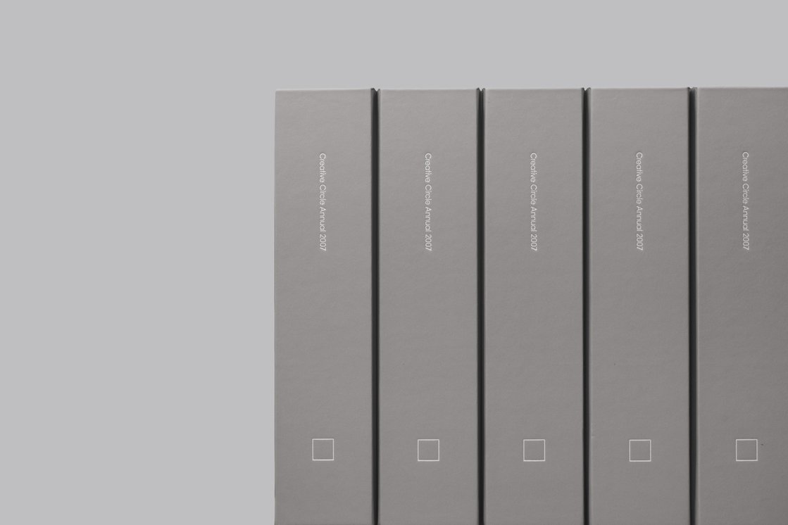
By 2006, with entries down, they could no longer afford to print an annual.
As a registered charity, they only exist is to shine a light on the best British advertising has to offer, without an annual that light is going to be significantly dimmed.
So why would agencies, who have finite awards budgets, continue to enter?
It was a difficult question.
What to do?
What to do?
A bald man with a twiddly moustache walks into frame ‘Ere, I’ll have a go…let me run it!’
What happens next is on the podcast below.
He didn’t hang around.
STEP 1: A NEW LOGO.
If you’re doing a brand overhaul, the first thing to tackle is the symbol of that brand; the logo.
Mark asks himself – ‘what would a creative circle look like?’
For a start, it wouldn’t be a circle – what’s creative about that?
Following this logic to it’s natural conclusion;Mark declares a creative circle is (drumroll)…a square!
![]()
STEP 2: A NEW IDENTITY.
Excited, Mark takes his scribble straight to the second best Art Director in London – Paul Belford.
Paul, surprising no-one, turns that scribble into a beautifully elegant logo, letterhead and identity.


STEP 3: A NEW MANIFESTO.
‘We’ve got to tell people the plot’s changed’.
With Mark’s thorough briefing over, he asks me to write up a new manifesto.
I do.
It ends up sounding like something Nigel Farage might have written.
I guess if you’re going to start shouting about why Britain’s better than everywhere else, xenophobia comes as standard.
(Note to geeks – I love the copy split between pages, I don’t know whether Paul made that happen or it was a happy accident, but it’s great.)

STEP 4: A NEW AWARD.
If your logo is square your award has to be too.
A normal person would have a nice metal square on a piece of marble.
Mark isn’t normal, many call him ‘special’, so he puts F.A. cup handles either side of a metal square.

Brilliant! I honestly cannot think of another person who come up with that solution.
Because it’s a silly idea, you’d figure just getting it realised was enough. As if you’ve been naughty and got away with it. that you come up with and ask your previous awards manufacturers to make.
But no, Mark being Mark, he takes this irreverent scribble to the finest, most established trophy manufacturers in the land – Purdey. (The guys who made the actual F.A. Cup. FFS!)

They also cast the medals, which were equally fine.

STEP 5: A PRINTED EMAIL.
Most awards shows only engage with you once a year – Call For Entries, we didn’t want to wait a year, we wanted to start telling people things were changing immediately.
But rather than have our newsletters and updates ignored or sent to spam, Mark suggests we print them on a long scroll of paper, a bit like the ones town cryers read from in Dickens novels.
It was to be called The Creative Circular (good name).
I mocked up a rough.

I gave all my scribbles to Adam Whittaker, a great designer, who developed it to this point (for free).

For some reason we didn’t end up printing any.
It could’ve been cashflow? Either way – thanks and sorry Adam!
STEP 6: THE FIRST AWARDS NIGHT UNDER THE NEW REGIME.
On the night, there were squares are everywhere.
(And I don’t just mean from the Smee’s creative department.)

There was a new, hilarious host.

A new award; The Hall of Heroes, which Mark gave to Paul Arden.


And, an all new ‘British’ menu.

STEP 7: THE FIRST ANNUAL.
Mark again goes to the second best art director in London.

Paul wastes no time in coming up with a scheme to quadruple his workload; place every ad in situ.
Posters were dropped onto billboards, commercials were dropped onto images, not just the winners either.
Every.
Single.
Entry.
It’s a Herculean task, but Paul and his elves complete it.
The result is magnificent.


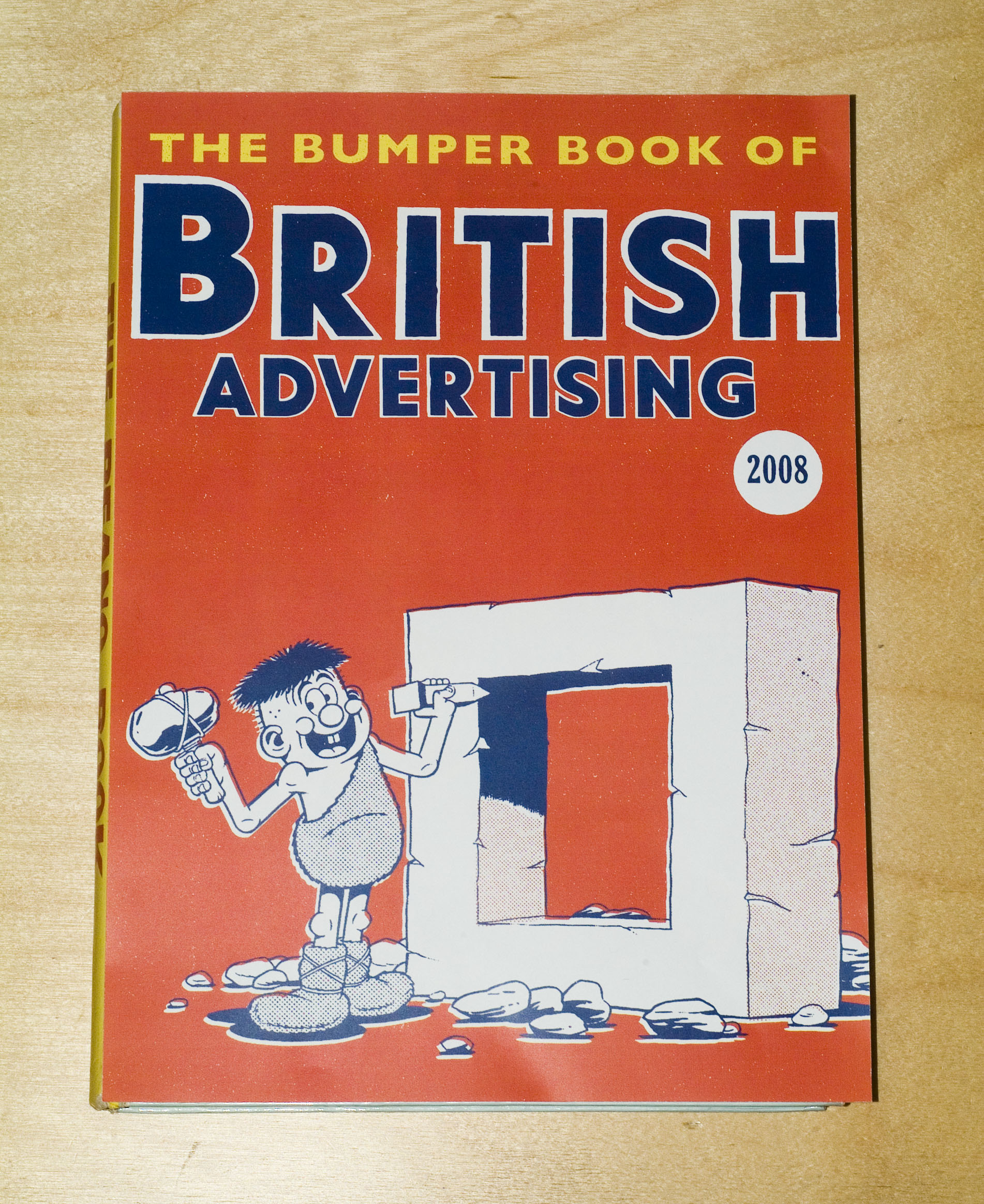
STEP 8: THE 2008 ANNUAL.
Mark begins developing a theme for the new annual based on the Masons.


STEP 9: THE 2008 CALL FOR ENTRIES AD.
I take Mark through a pile of ads I’ve rejected from my placement teams.
The minute Mark’s eyes fall on a drawing of a Bunty Annual, he kills his Masonic idea and announces – ‘The 2008 annual should be like a Beano Annual!’.
(At least, that’s my memory, his credits me with suggesting the idea. But I suspect he’s lying.)
If that’s going to be our style, our Call For Entries ad needs to reflect it.
I have a Beano-type thought.
 Mark likes the idea.
But, for possibly the first time in his life, he worries about appearing in the ad.
He doesn’t want the Creative Circle thing to be all about him.
I think he’s our No. 1 asset.
He relents.
Then finds a Beano reference he’s happy with.
Illustrator Steve Bright is chosen to mimic the style..
We send Steve a reference of Mark shouting for the ad.

Steve sends back his pencil rough.

Often, when you commission illustrators who don’t do ads to do ads, they change their style.
They try too hard, rather than doing what they normally do, what is the very reason we’ve chosen them.
We feed back: simpler, less lines and more cartoony.
Essentially, more Beano-ish.
We couldn’t make the headline work in one line, it was too small.
But the dot screen worked well, made it feel authentic.

STEP 10: NEW AWARDS CERTIFICATES.
Mark comes up with a great idea – use the same characters on each certificate, but make his head bigger the more prestigious the award.
The first rough comes in.

Somehow it didn’t seem to work.
It looked like a bigger head stuck onto each character, not like his head had grown bigger.
We decide to keep the features the same size.

Better.
Only one, teensy little problem – there’s no mention of who the certificates are from.
And they’re printed, foiled and embossed.

Cornered and desperate, Mark comes up with a great solution – a sticker that looks like a kind of wax seal.

It looks cooler than it it’d been printed on, more official.
The final set.

STEP 11: A PUSH FOR MEMBERSHIPS.
We set out to enlist an army of like-minded creatives.
To celebrate what’s great about British creativity and fight against the invasion of foreign scam.
The first thing that springs to mind is that old Lord Kitchener.

It’s British, it’s famous, maybe we could spoof it?
The problem is it’s a bit of an old cliché.
It’s been spoofed a million times.
Ah! But has it been spoofed Beano style? Featuring Mark Denton?
A quick bit of desk research tells us no.
Hurrah! We press on with our version.

STEP 12: SELLING TICKETS FOR THE 2008 AWARDS NIGHT.
Our friend, the late, great Paul Silburn, put his expensively compiled creative department on it.
This was what popped out. (Based on the award winning Skoda ad of the period.)

STEP 13: THE 2008 AWARDS NIGHT.
In true Beano style, it was rechristened the ‘Big Bash!’.


THE HALL OF HEROES AWARD.
In most annuals, this would be called The President’s Award, or the Lifetime Achievement Award.
Mark chose to give it to David Abbott.

Here’s me looking at him…lovingly.

To separate the awards categories during the presentation, Mark and I made a bunch of little films, each replacing circles with squares.

STEP 14: THE 2008 AWARDS ANNUAL.
I’ve designed a few annual before, D&AD 2004 & 2012, one of the problems you face is how to expand your idea, which is usually just an idea for a cover, into a whole annual.
Take the 2004 D&AD Annual; My idea for the cover was to spoof those low-rent compilation albums ‘Now That’s What I Call Music’.
But you only have a title and two sides of graphics to mimic – how do you expand that out into end papers, contents pages, divider sections, etc, etc?
The brilliant thing with the 2008 Creative Circle Annual was that our idea for a theme had produced annuals, so we could study exactly what they did.

There were a few tests for the cover.
This looked cool, but possibly a bit too vintage.
We settled on this one.

Which became this.

Open the book and you have what bibliophiles call endpapers, they’re the first and last spreads in books.
They’re often just a pattern, if you own a fancy old book, it may well look like marbling.
This seemed to be like the perfect opportunity to do a before and after, a start and end idea.
Mark took the Gold Jury and sketched a formal and chaotic version.
Each juror was done in a way to link to their personality or work, so Richard Flintham is pushing a wheel barrow full of awards, Tiger Savage is teetering on top of a pair of stiletto heels and Damon Collins is dressed in Karate gear.
The guy with the Hitler moustache is supposed to be me.
Campaign had recently published an article on nicknames and had suggested that at AMV mine was ‘Herr Dye’ – due to my strict regime. (It wasn’t true, I guess they think of the name then make up the story. I hope it’s not like that now Maisie?)
FRONT.
Mark’s rough.

Steve Bright’s first pencil.

Mark’s revises.

Final.

BACK.
The same image was the start point for the back endpapers, only this time the room has descended into chaos.

ANNUAL DESIGNERS PAGES.
This time I wasn’t depicted as Hitler. Which was nice.


THE PRESIDENT’S STATEMENT.
Mark lays out his philosophy, Mark-stylee.


THE CREATIVES.
Sean Doyle pitched in some comic strips.


THE HALL OF HEROES.
In sections like this, the pie theme really came into its own.

Steve’s pencil is great.
Not very David Abbott, but very Beano.
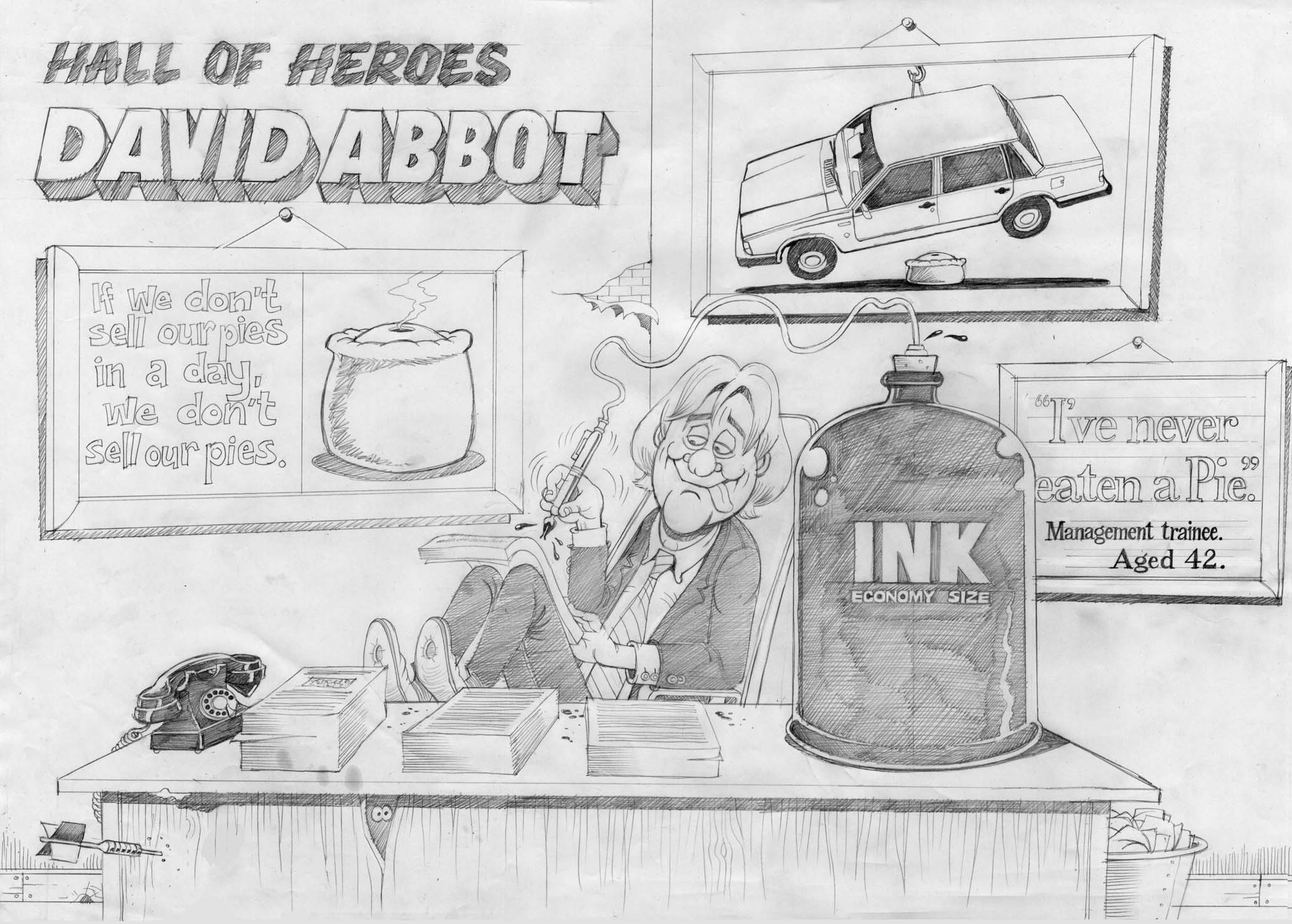

It’s done.
I thought.
But then Mark had an idea – ‘Let’s write a little rhyming line at the top of every page, like they do in real comics.’
We divide the pages in two and each start writing.
It’s tough, because theres no brief, not specific messages you need to get over, it’s a bit of fluff, just a few words that sound like the kind of silly rhymes you get in the Beano.
One of my 50% was David Abbott.
I wrote a bunch, my friend Billy Mead read through and laughed at one in particular, we put it in.
Again, not very David Abbott, but very Beano.
(What happens next is in the podcast. It’s squirmy.)

THE PRESIDENT’S AWARD.
Given to Juan Cabral, it captures him auditioning animal for his up-coming Cadbury’s ad. (Eventually he settled on a Gorilla. Playing drums.)

Steve went a bit too serious again.

He was dragged back and reminded that our reference was the Beano. Not Michelangelo.

Throughout the process Mark had a wall which showed of every page of the annual in progress.


Here’s Mark in action swapping out pages.
(The blur gives you some idea of the speed he’s travelling.)

THE FINISHED ANNUAL & DVD.*
*Remember them?

STEP 15: 2009 CALL FOR ENTRIES.
Stunts were were all the rage in 2008.
So rather than run a DPS in Campaign, we did a stunt that got picked up and reported in Campaign.
These signs were placed outside all of the big agencies in London.
(For all you Johnny Foreigners; They are styled like NCP car parking signs.)

AMV/BBDO.


Saatchi & Saatchi.
The famous, now demolished, Pregnant Man pub in the background.

STEP 15: THE 2009 AWARDS ANNUAL.
Mark asked AMV/BBDO to create the annual.
Mark Fairbanks lead the team with a neat idea; Adland.
Turning that phrase, which refers to our industry, into an actual location.


STEP 19: ADLAND! THE FILM.
Mark populates Adland with ad icons or characters from the last fifty or so years of British advertising.
Then persuades an animation company (A Large Evil Corporation) to donate their time and energy to it.
I could show a couple of pages of these, you’ll get the idea, but I think they’re great, so I’m showing them all.


FINISHED FILM.
STEP 17: MARK GETS FIRED.
THE END.
Brilliant Dave…. Like Mark Denton demonstrated you’ve showcased the forensic and frenetic detail the genius of Mark Denton and his love of great ads and the greater Adland we were once fortunate to inhabit. Fortunately I’d been President of the Creative Circle twice before, Mark and fortunately I didn’t have to follow his great acts. Gass…Malcolm Gaskin
Hey Gass, nice to hear from you.
Yeah, Mark’s a phenomenon (although he’s been called worse).
I bet you could tell your own tales about saving Creative Circle, you gave a lot of time.
Best,
Dx
Brilliant as ever Dave, remember picking up one or two Creative Circle Awards last century. Always a big deal especially plying my trade at a Regional Agency…trips t’t smoke were a big deal, like going to Hollywood!
As always great post Dave. Would like to connect with you to discuss a advertising project – how do I reach you? Not sure if you would necessarily be interested and if not I would be grateful if you could point me in the right direction as to who in your hall of fame (i.e. the posts of the great advertising men and women that are still around) would be the best person to speak to.