


A few years ago I needed an old beer poster for a presentation.
I knew the Art Director’s name – John Knight, so headed to Google – nothing!
I then searched the agency name, the year, the writer’s name, the photographer’s name – nope!
Desperate, I googled every every miss-spelling I could think of – diddly squat!
I eventually found it after trawling through a ton of old awards books.
While leafing through all those award winning ads from the 70s and 80s, I was struck but how few were John’s.
He was a huge influence on my generation of creatives, consistently coming up with new, fresh ways of making ads, how could he be so underrepresented?
“Truly groundbreaking work never does very well at the awards, it splits the juries and ends up not getting voted in. John suffered a lot from that.” John Hegarty told me (John was his old boss at TBWA).
The problem with looking at all the fresh work 30 years later is that things move on, what was innovative in 1985 is unlikely to feel so today.
Once a unique path is forged it’s then open to the public, any idiot can then follow it.
For a bit of context, here’s what most ads from the time looked like, it’s a very good ad, but it looks exactly like an ad.

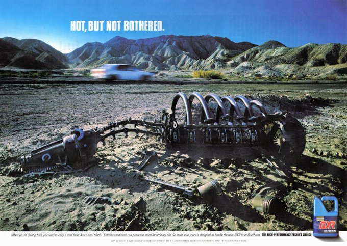
This is a 48 sheet poster from the same period of John’s.
It would’ve been about 20 foot long.
Coming across it on a street would’ve been startling.


No headline.
No logo (usually bottom right).
No end line.
No product shot.
No pun. (They were all the rage at the time.)
Just a single photograph.
In the photograph was hidden a headline, logo, end line and product picture, but they were all woven together in an image that evoked another era.
An era that probably brewed better beer.
It made me think an old brewery in the Midlands was cool.
Not an easy thing to do.
I found out it was produced by an Art Director called John Knight. (Bottom left.) 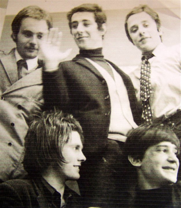


Known to friends as ‘JFK’.
Not because his middle name was Frank, Fred or, like the better known JFK, ‘Fitzgerald’, John’s ‘F’ was due to his habit of breaking up words with an ex-fuckin’-spletive.
“It shocked people, swearing wasn’t as common back then” John’s old writer Ken Mullen told me.

His ads weren’t like other people’s, here’s why:
1. The style of his ads are bespoke to each client.
E.g. The beer posters are made from bits of pubs, the Laura Ashley ads are made from fabric and the Duckham’s oil ads are made from car parts.
2. The art direction feels like a human being made it.
3. His ads don’t look like ads – so people look at them.
DDB.
Here’s the earliest ad I could find of John’s.
There are three creatives credited, an established team plus a junior – John, so I think it’s safe to assume it was John’s idea.
VOLSWAGEN.

J. WALTER THOMPSON.
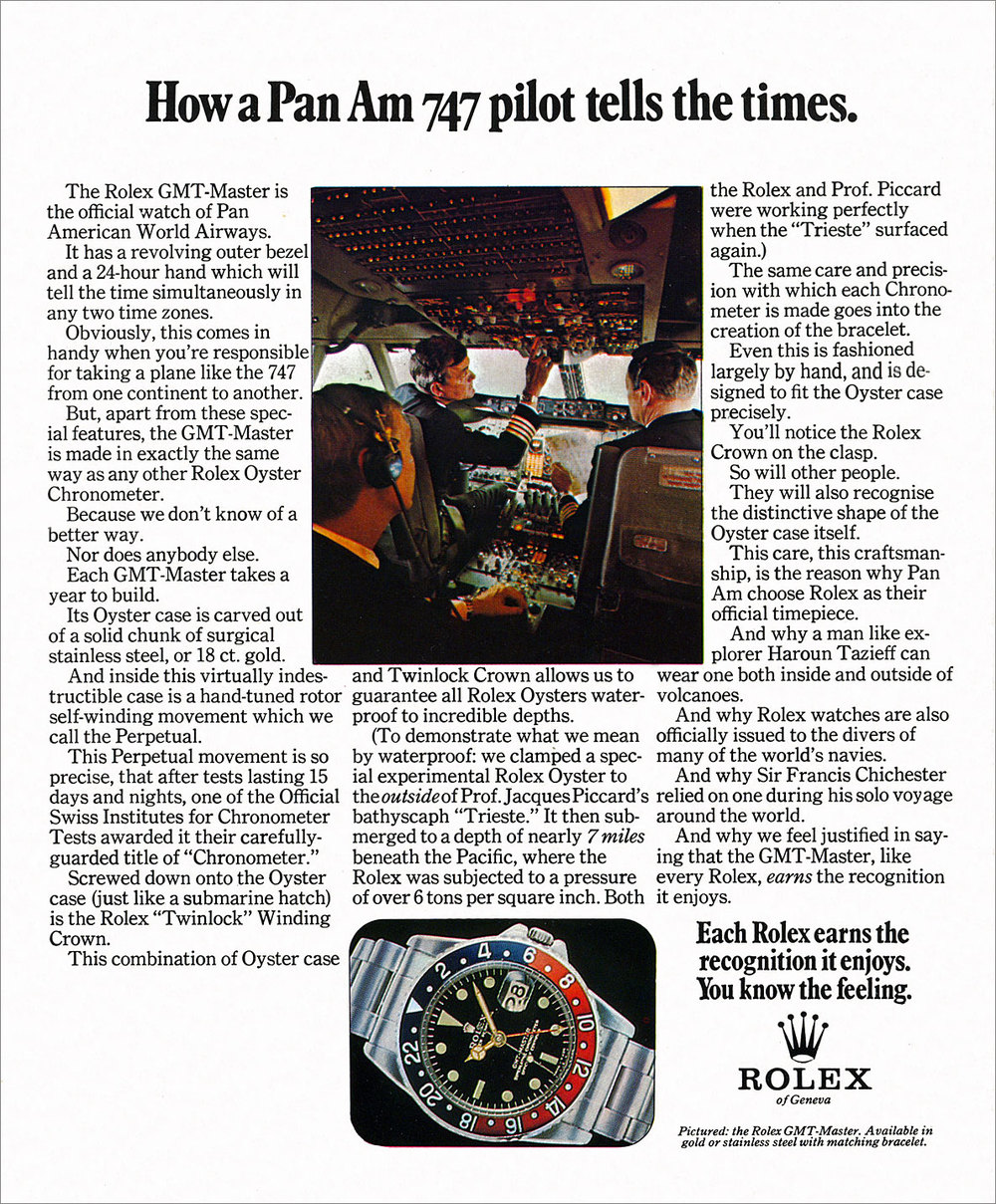
ROLEX.


GUINNESS.


Although a sweary, hard-drinking Millwall supporter, John also had a sensitive side; he was an expert on wild flowers, bred canaries and helped green charities before they were called green charities.
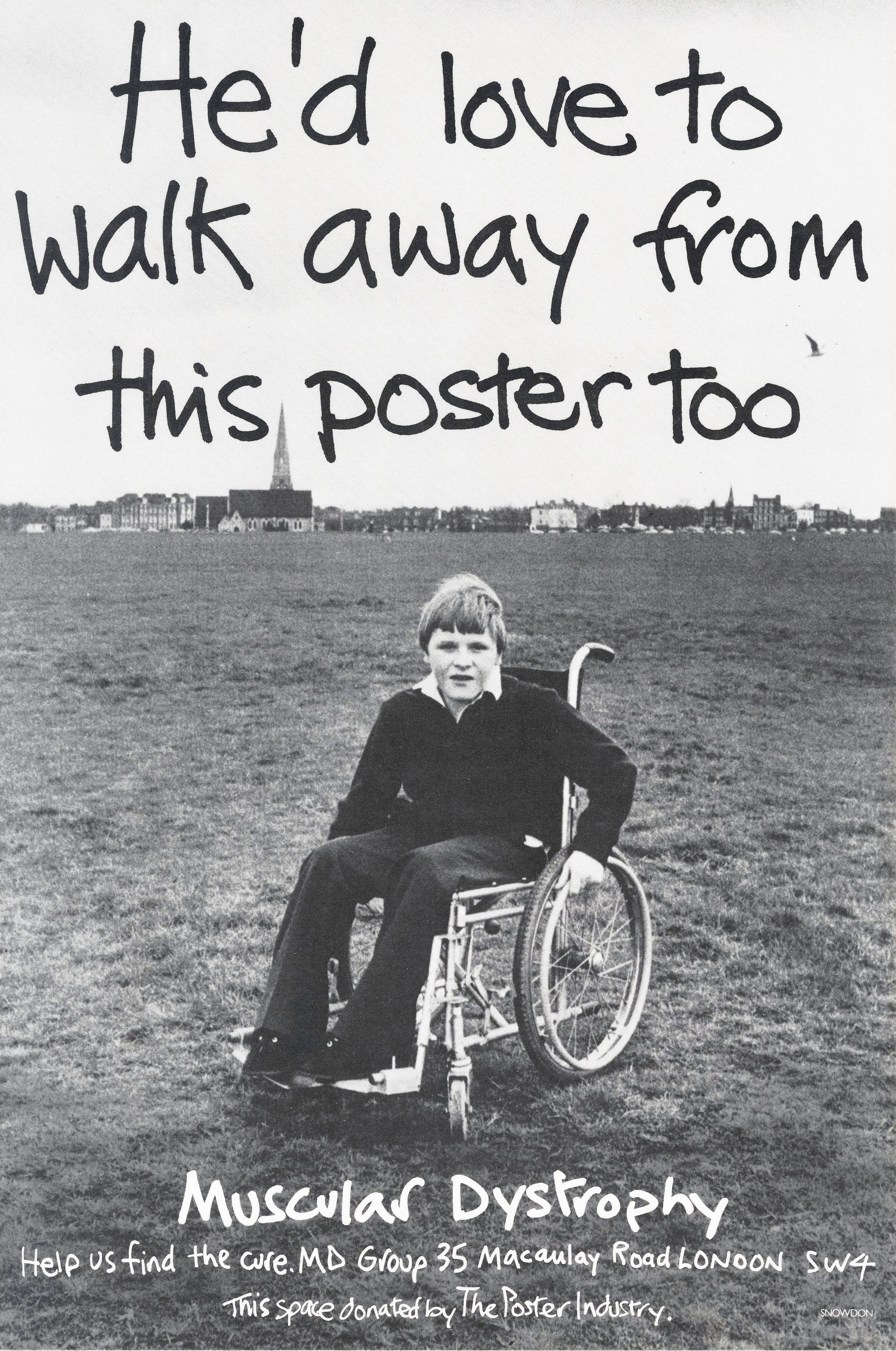
HELP THE AGED.


MUSCULAR DYSTROPHY.
John sweet-talked Lord Snowdon into shooting this poster.
For nothing.
“It ran for 14 years…every time it came down, fundraising fell” – Peers Carter (John’s writer on the poster.)


TBWA.
In the seventies you were either a Designer or advertising Art Director.
You didn’t skate between the two, weirdly, advertising art directors would consider it a diss to be called a ‘designer’.
John did both.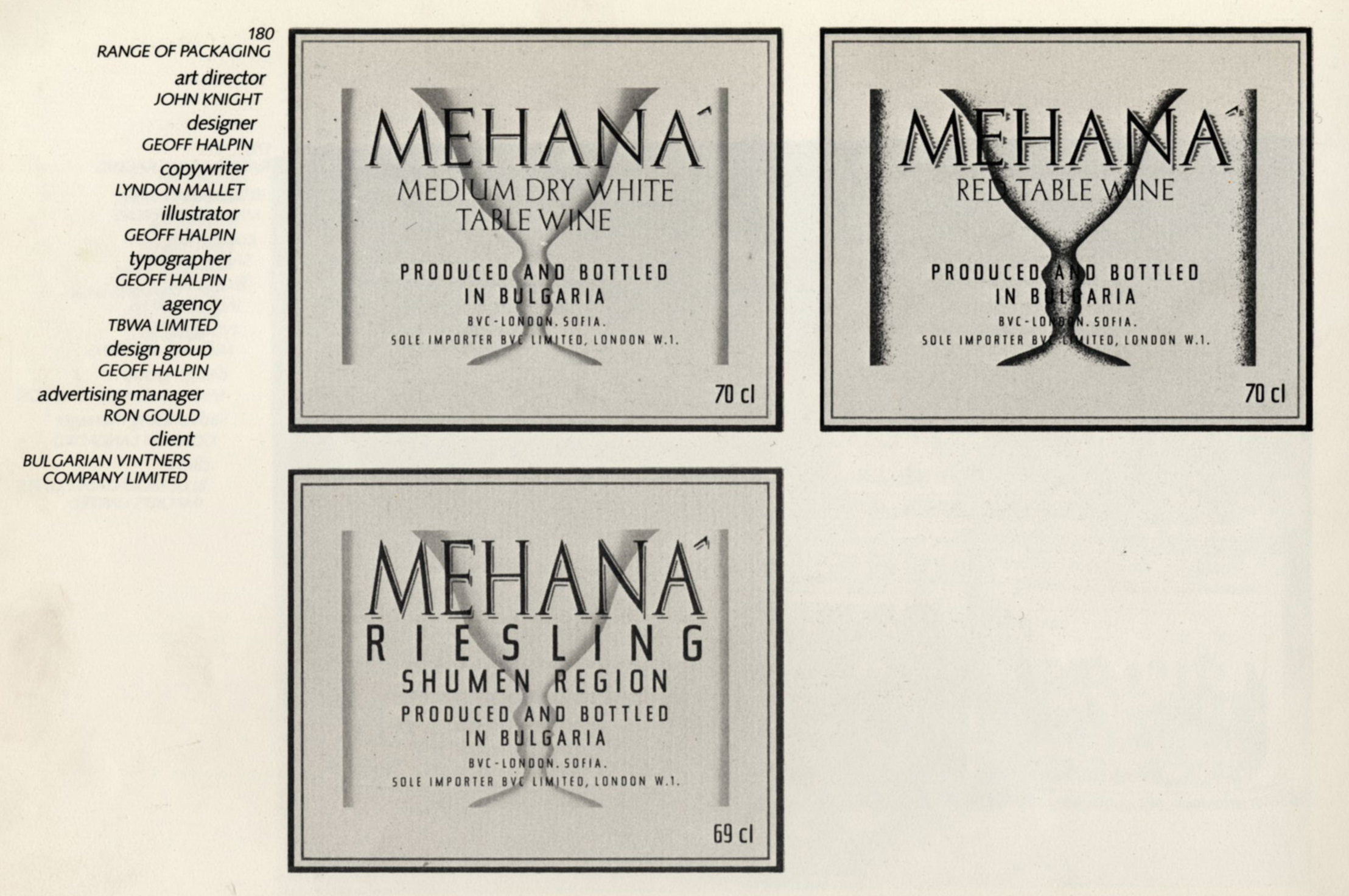

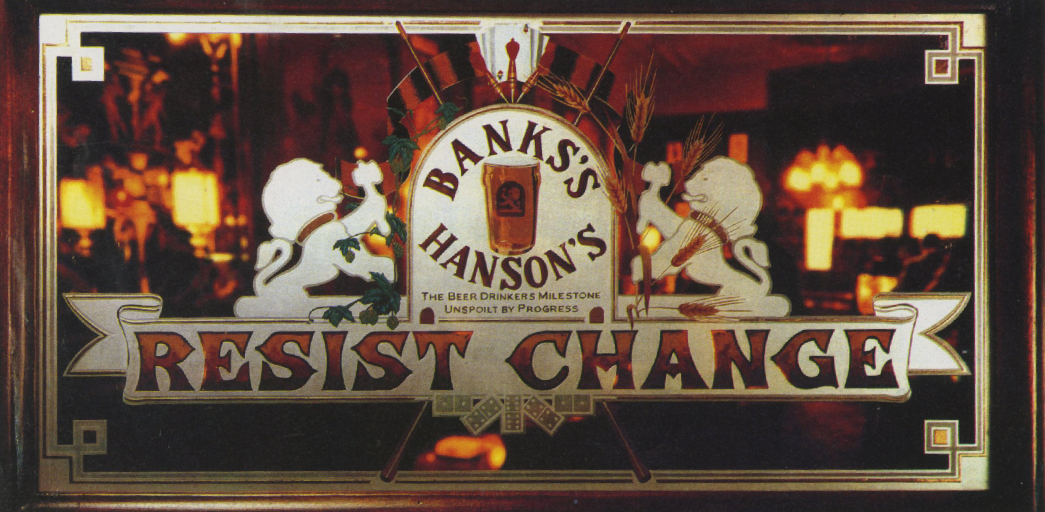
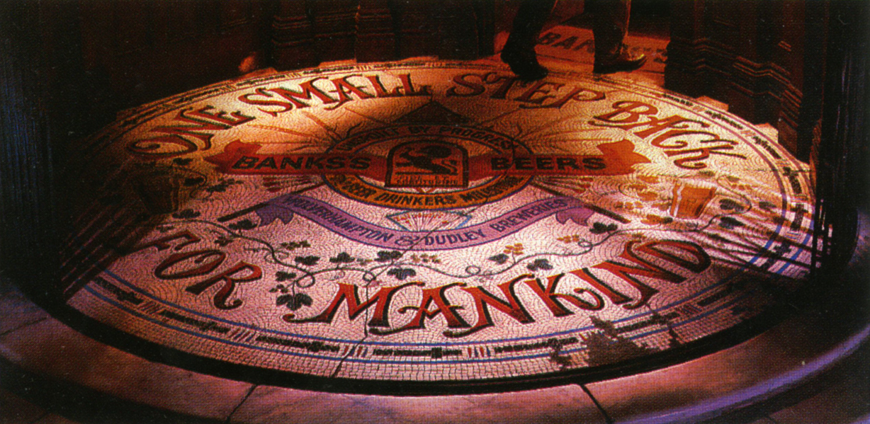
BANKS’S.
For me, this campaign is one of the best poster campaigns ever.


“He was no believer in deadlines.
I remember once on Banks’ weeks and weeks were going by without anything happening, I thought the only way to solve it would be to get everyone in the same room to find the culprit.
John came in last, looked around at assembled faces and said ‘looks like I’m gonna need fuckin’ legal representation’ “. – John Hegarty (his Creative Director at TBWA.)
VOLVO.
He managed to convince some of the least commercial artists of the day to grubby their hands with adverts; David Hockney, Eduardo Paolozzi and Dame Elizabeth Frink.
Convincing Volvo to pay their fees wouldn’t have been a walk in the park either.
But he made it happen.


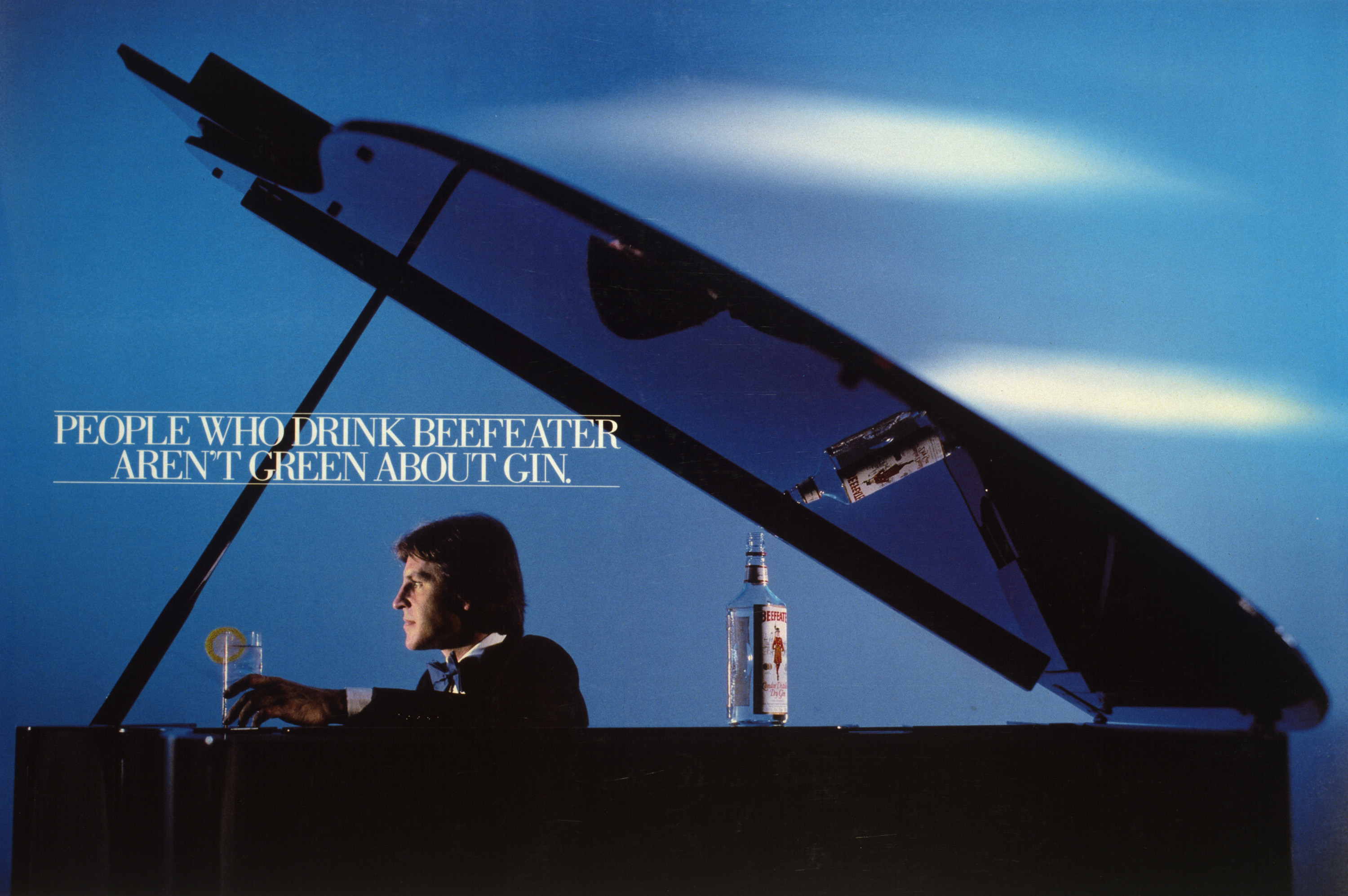
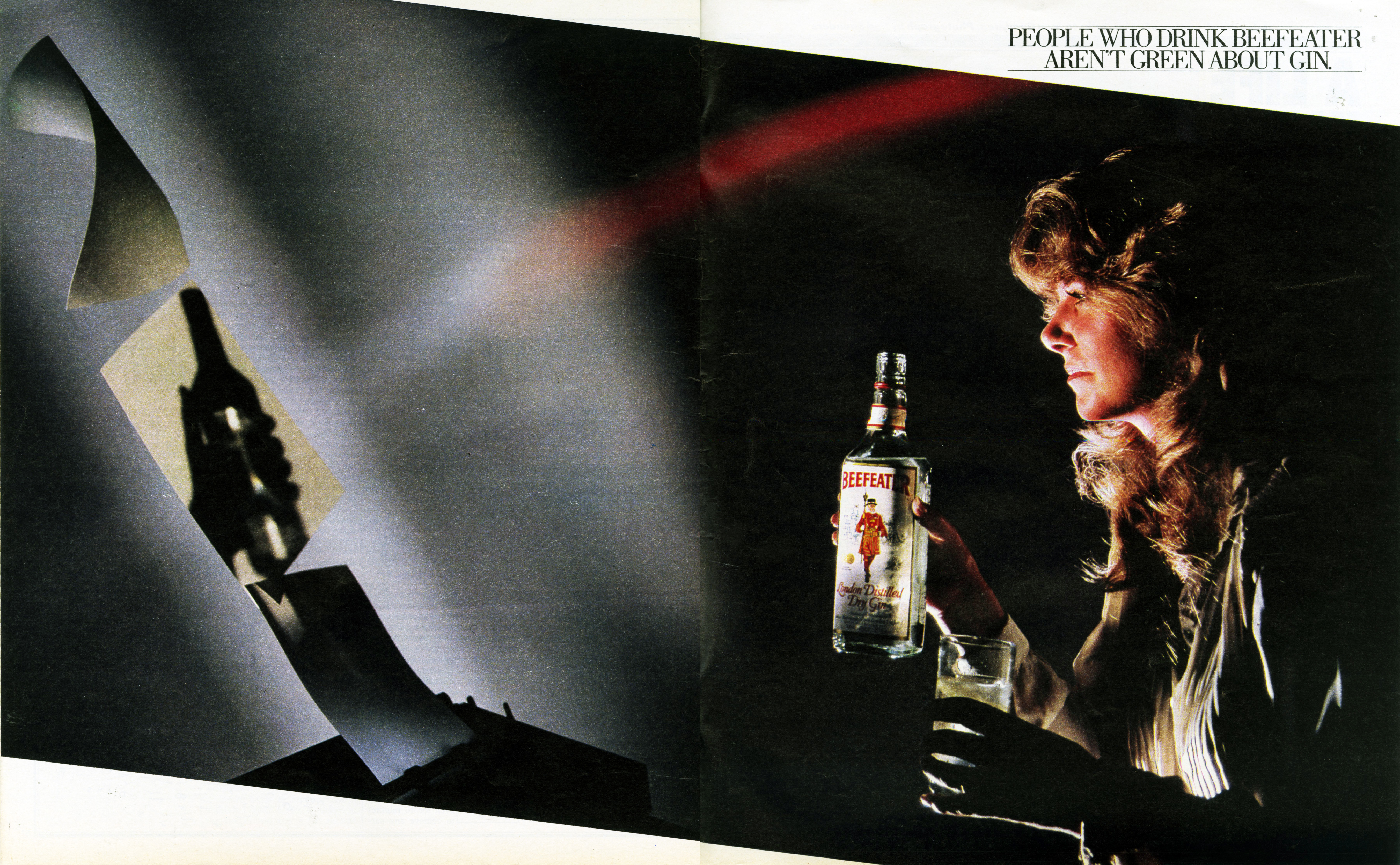
BEEFEATER GIN.
A campaign knocking Gordon’s, the gin in the green bottle.
(Great shots by Brian Griffin.)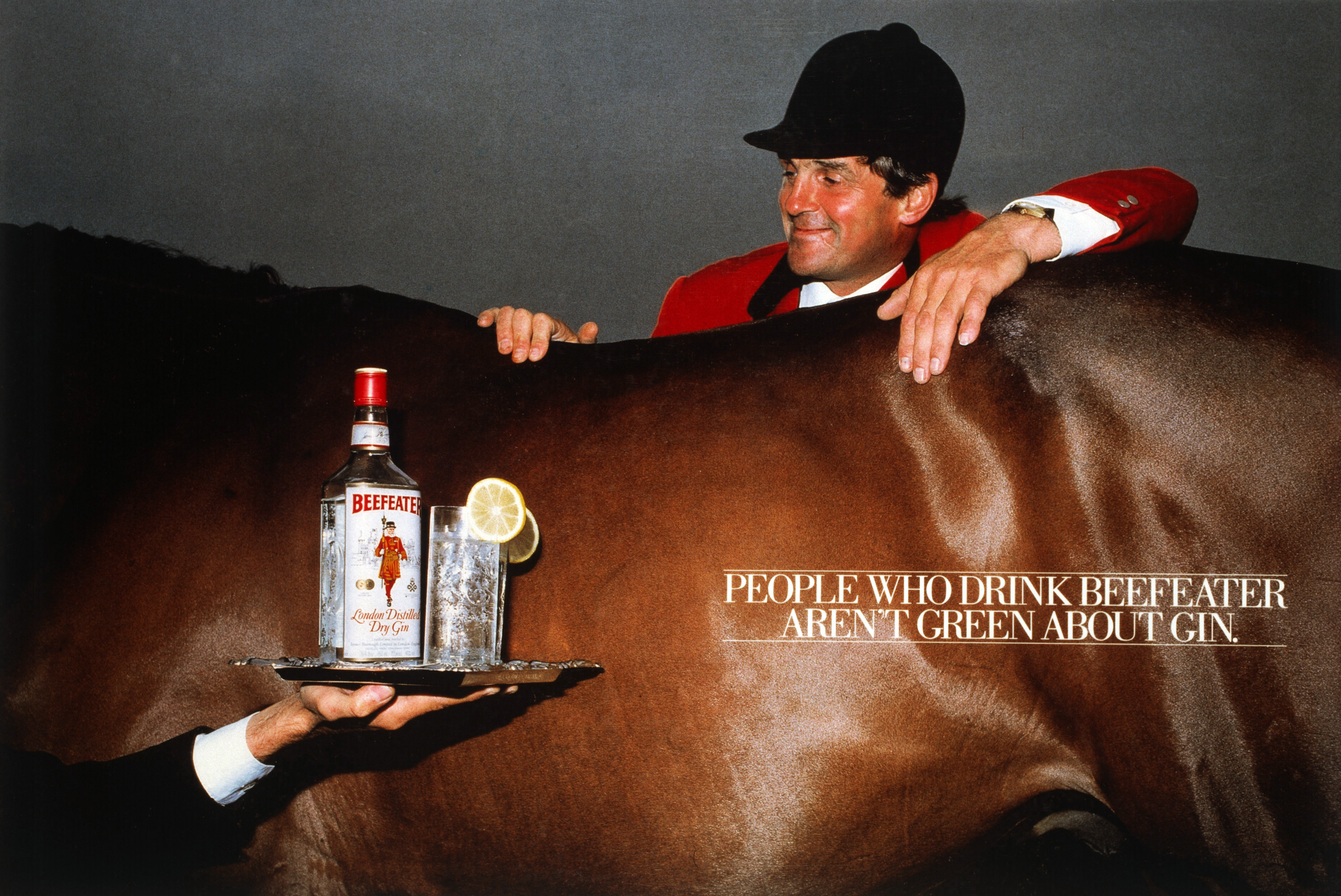


TVS.
He was doing illustration/photography mash-ups before the term ‘mash-up’ was released to the general public.

MURRAY MINTS.

VESPRE.
A great product placement idea, done with a real product.


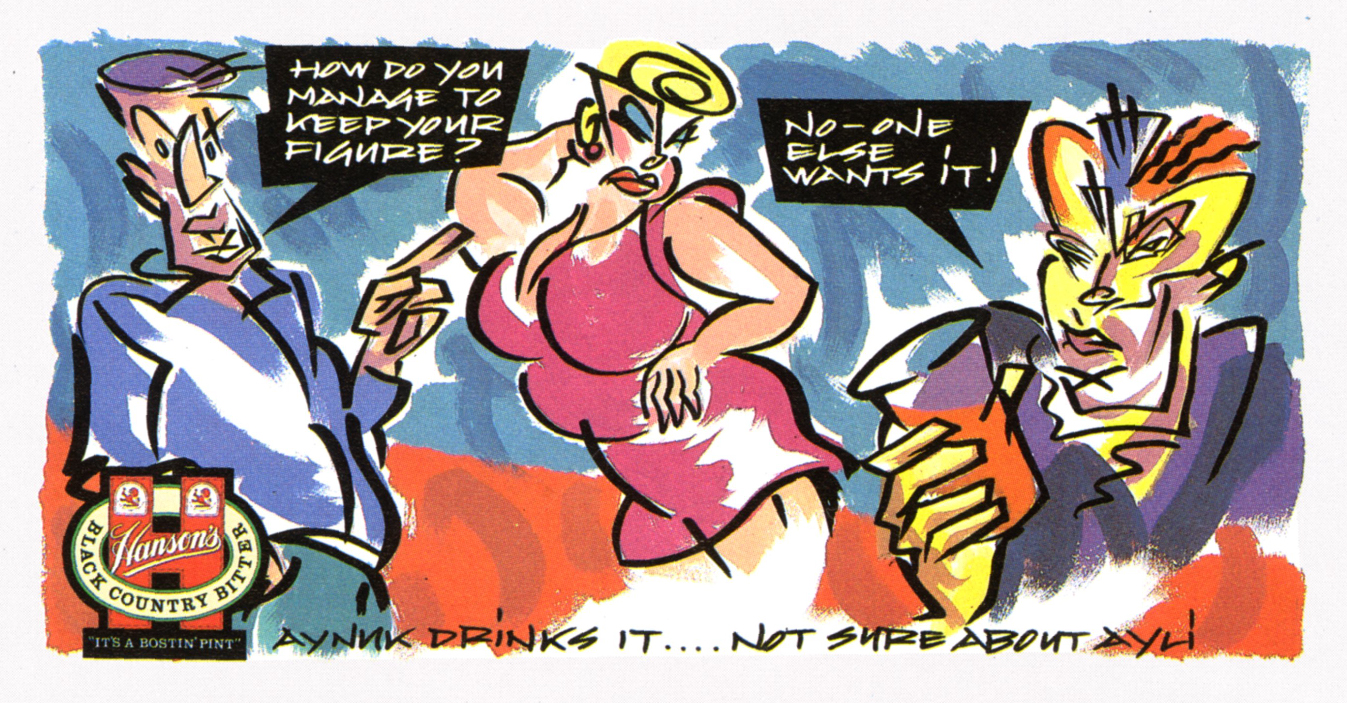
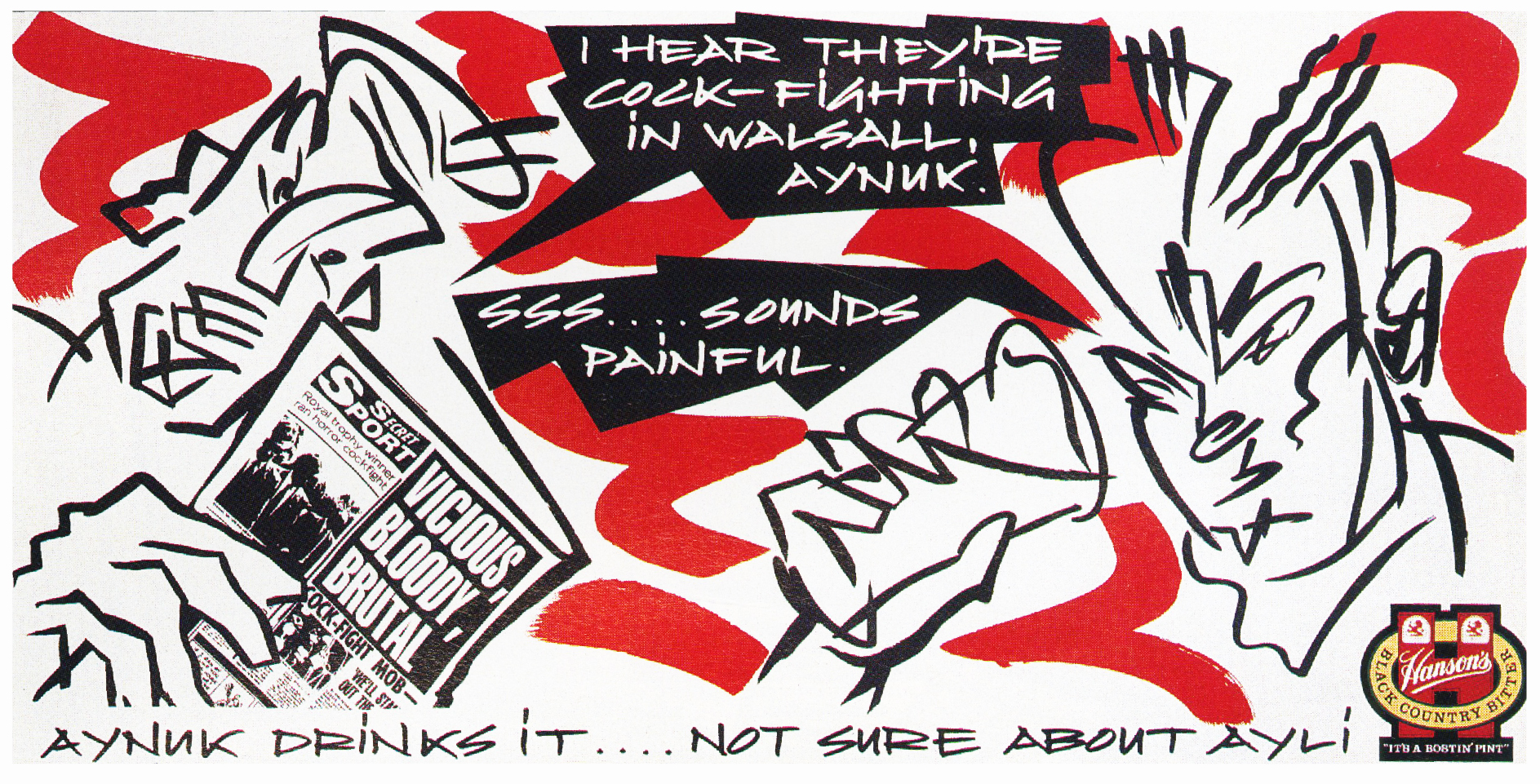
HANSON BREWERY.


KAWASAKI.
For the time, these layouts would’ve been considered very ‘out there’.


SINGAPORE AIRLINES.
A great shot by Bob Carlos Clarke. (That smudge above the guy’s head says ‘Sorry about Thursday’.)

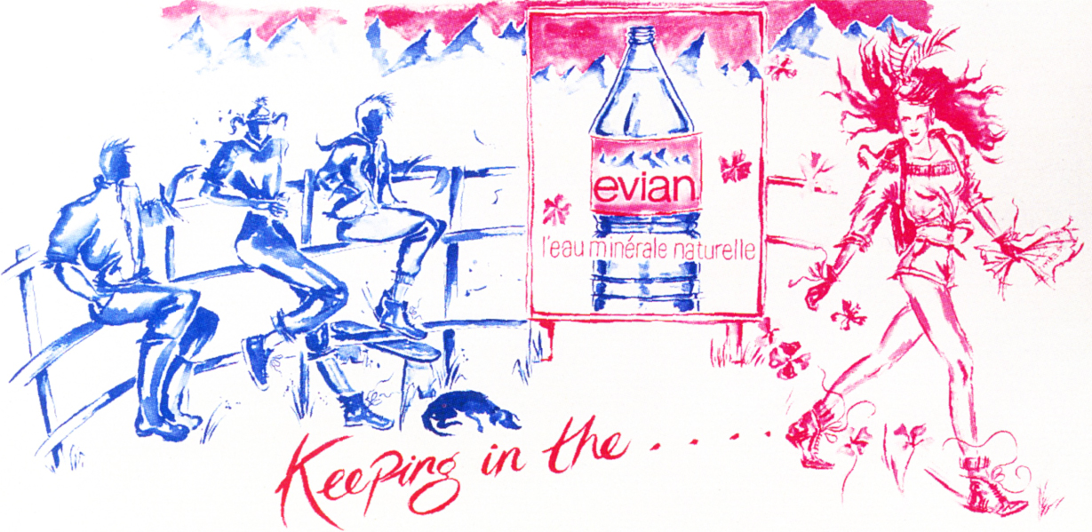
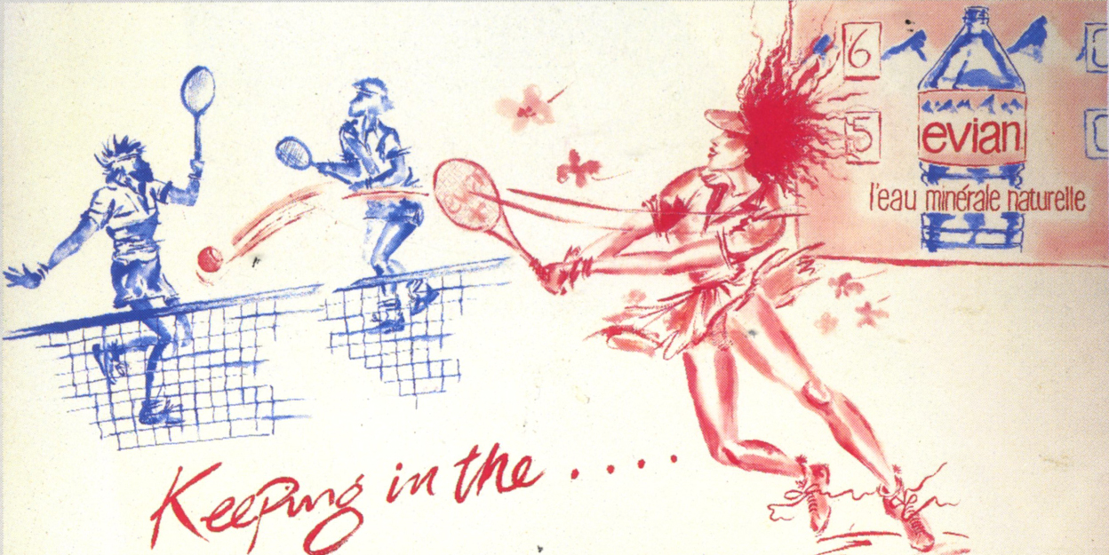
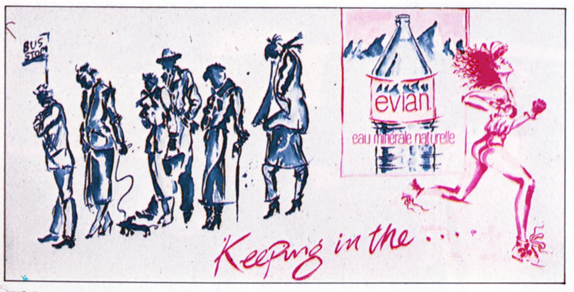
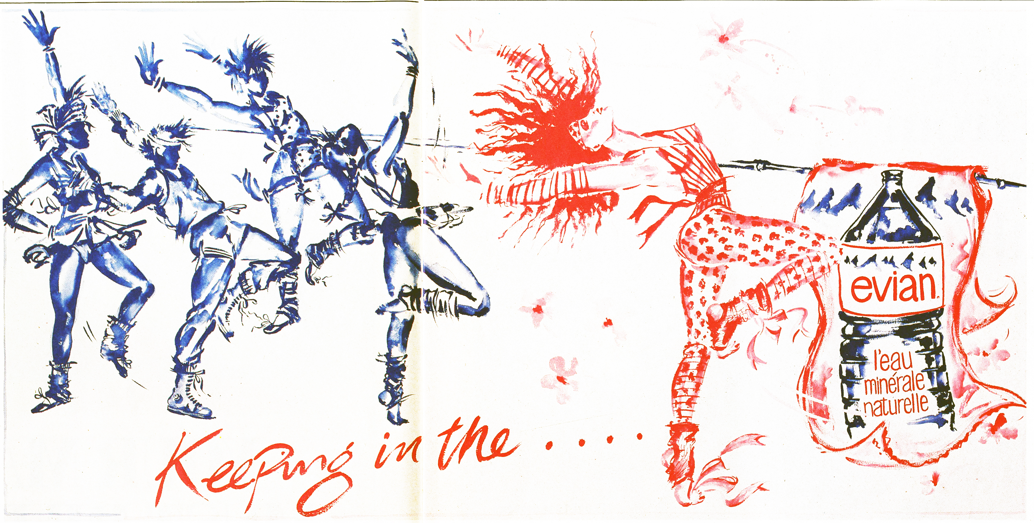
EVIAN.
Apparently John lined up artist Allen Jones to illustrate the Evian campaign, it was all ready to go when the client got cold feet, worried that the imagery may be too erotic.


In the end, illustrator Conny Jude stepped in and did a great job.


JOHNSON & JOHNSON.
WCRS.
Qantas.
“For a writer like me it was terrific working with John, he’d take your thoughts and ideas into surprising places.
On Qantas, for example, I’d written a long copy ad about the effects of jet lag, John went down to the studio and, to echo the effects of Jet lag distorted and distressed all the type, which was fine, and then, without telling me, swapped around the first four lines of copy.
It made no sense.
He then hid from me to try and avoid the possibility of me trying to change it.
When people, including me, saw what he’d done it seemed ridiculous, in retrospect it was brilliant.’’ – Giles Keeble.


“Before we worked together at WCRS, I nearly worked with John at AMV.
I was going to be to be paired with Brian Morrow, an art director from TBWA, at the last moment David Abbott informed me that Brian would be working with another writer instead, Brian contacted me and said ‘You should speak to John Knight, he’s the one I copy.” – Giles Keeble.
DULUX NATURAL WOODCARE.
Very simple, cool homemade font.


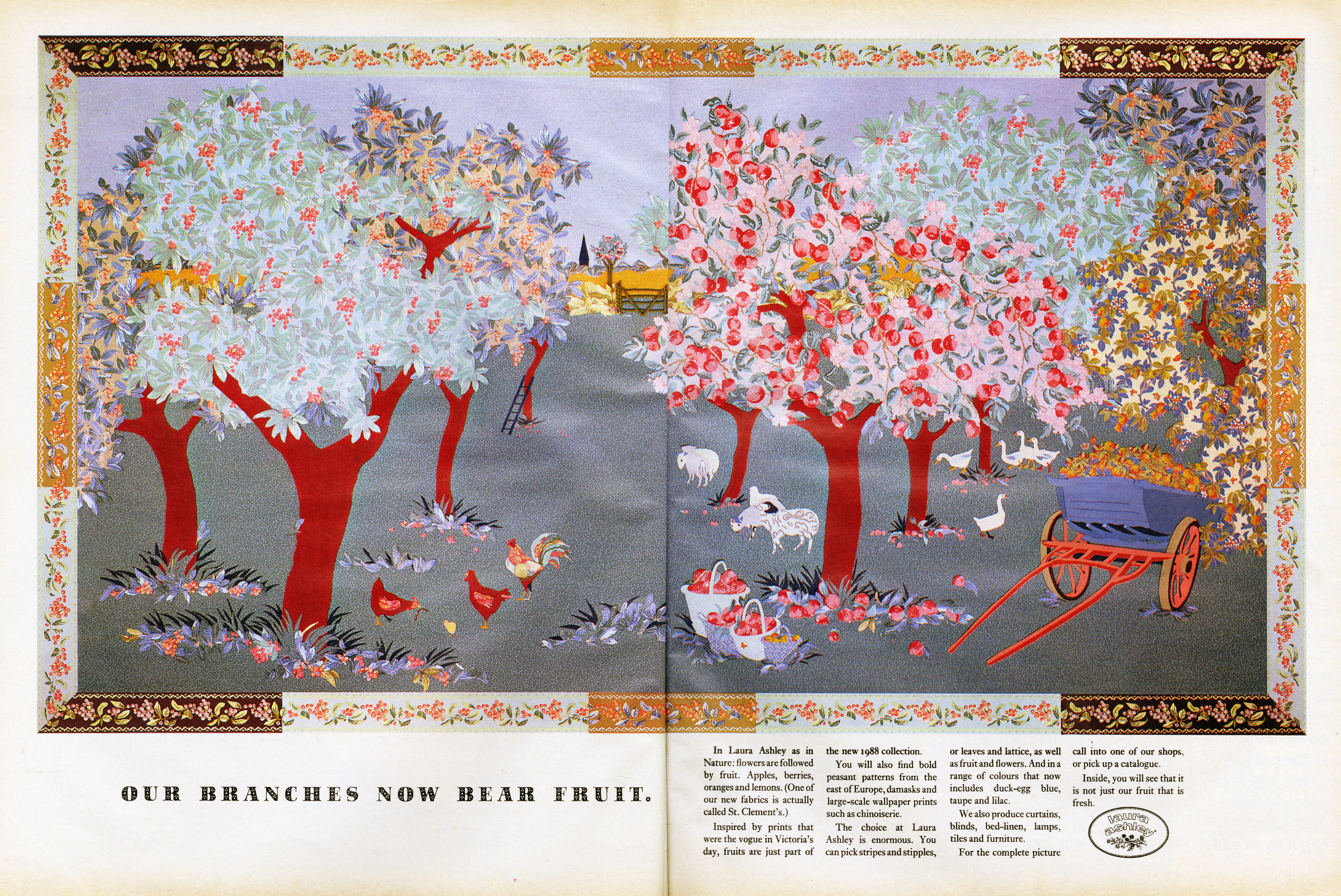
LAURA ASHLEY.
“The Laura Ashley ads we did with the illustrations made from their fabrics were blown up and put in the windows of all their shops, they used to stop people in the streets.” – Giles Keeble.


DUCKHAMS.


MCVITIES.
Shot by photographer Lucinda Lambton.


FCB.
LONDON TRANSPORT.
![]()

THE DAILY MAIL.
LEO BURNETT.
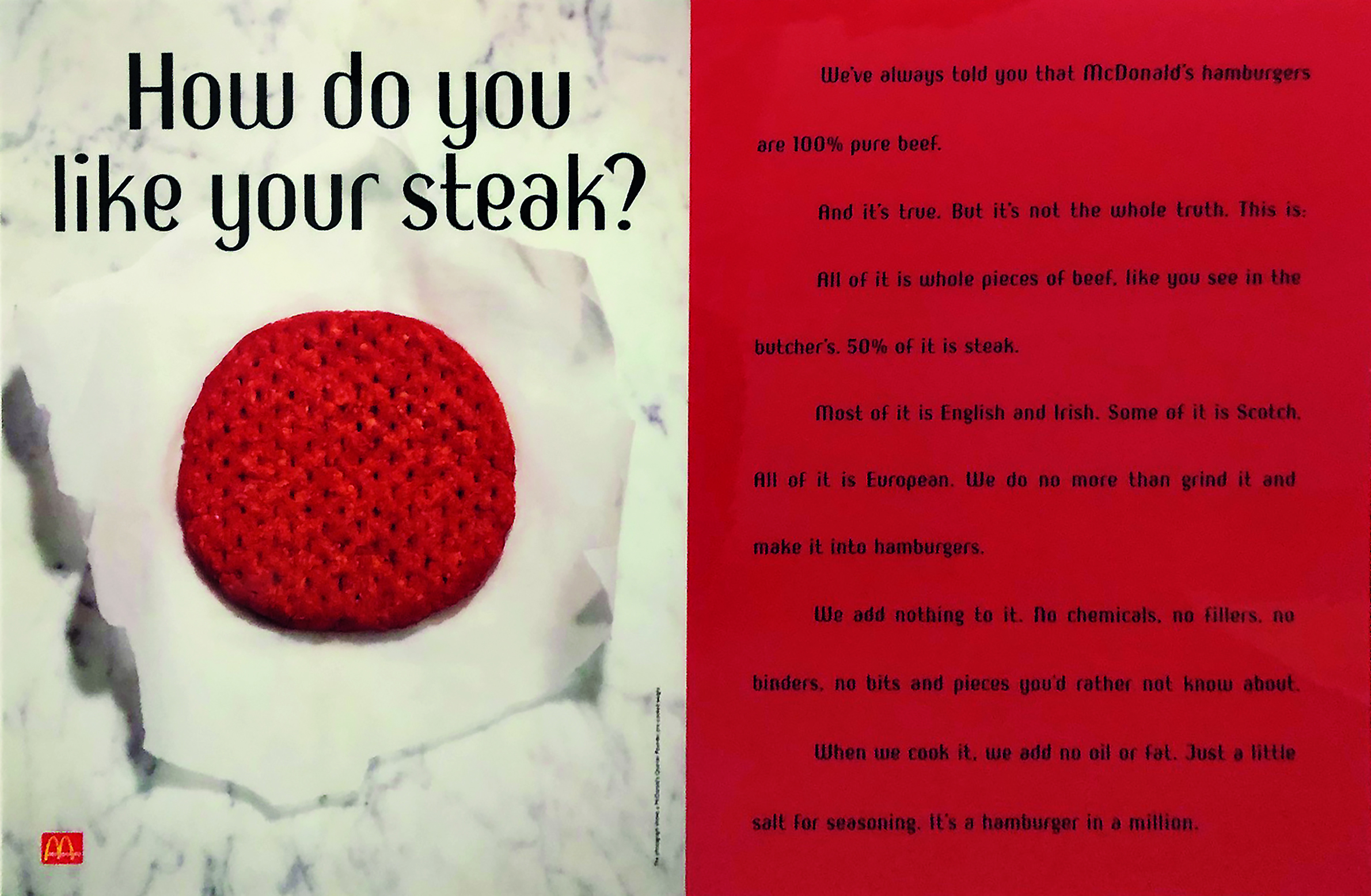
MCDONALD’S.
They look pretty straight forward now, but I remember seeing them at the time; they weren’t like any McDonald’s ads I’d ever seen before, they signalled that McDonald’s were changing.
Not just as a burger company, but an advertiser too.


Johnnie Walker (tests).


Atomic Energy Authority.


“Unfortunately John didn’t have the talent to handle his talent.
He was a good influence in the department, would have made a good lecturer. Inspirer.”
– John Hegarty.
Sadly, in October 1996, John lost an 18 month battle with cancer, aged just 50.


More JFK:
In the late eighties he goes head to head with the Art Director responsible for that Sainsbury’s ad I showed earlier – AMV’s Ron Brown.
John argues that most Art Directors pick up a phone to a photographer the minute an ad is approved, and that there’s a whole expressive, distinctive world of Illustration that is being ignored, Ron argues that real life beats interpretation.
Strangely, this debate is just as relevant today.

In the following issue, Gerry Farrell has a pop at him about the article, (on the plus side – good portrait).


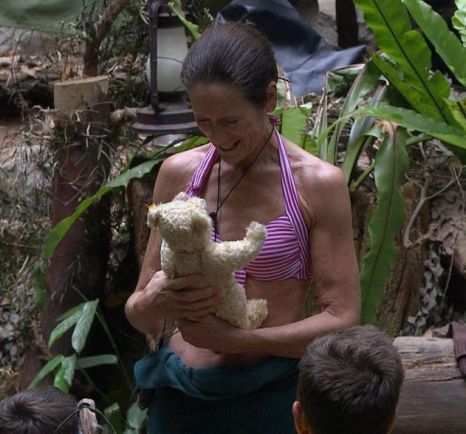
I knew Lorraine Chase had been John’s partner for twenty years, I’d heard she’d inspired the Campari script that made her a household name.
It’s writer, Terry Howard, sat next door to John at JWT and would often hear Lorraine through the walls, he could never quite reconcile the elegant face with the common voice.
When flicking around the internet looking for John’s work I found this headline about Lorraine’s time in I’m A Celebrity Get me Out Of Here! – ‘”Tedward was a reminder of Lorraine Chase’s former, deceased partner John Knight” says Emmerdale star.
