I hated this campaign.
It didn’t follow any of the rules we were supposed to follow at the time.
It didn’t focus on something uniquely Benetton. (History, products, ingredients, process, etc.)
It didn’t even attempt to persuade anyone their products were better than the competition.
And frankly, it didn’t seem very clever.
It felt like a generic solution that just happened to have a Benetton logo stuck to it.
In retrospect, I was wrong.
It wasn’t generic, it shone a light on something uniquely Benetton; their attitude.
Name another client who’d have the cojones to run this campaign?
Then or now.
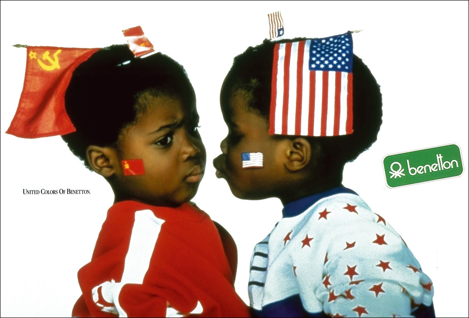
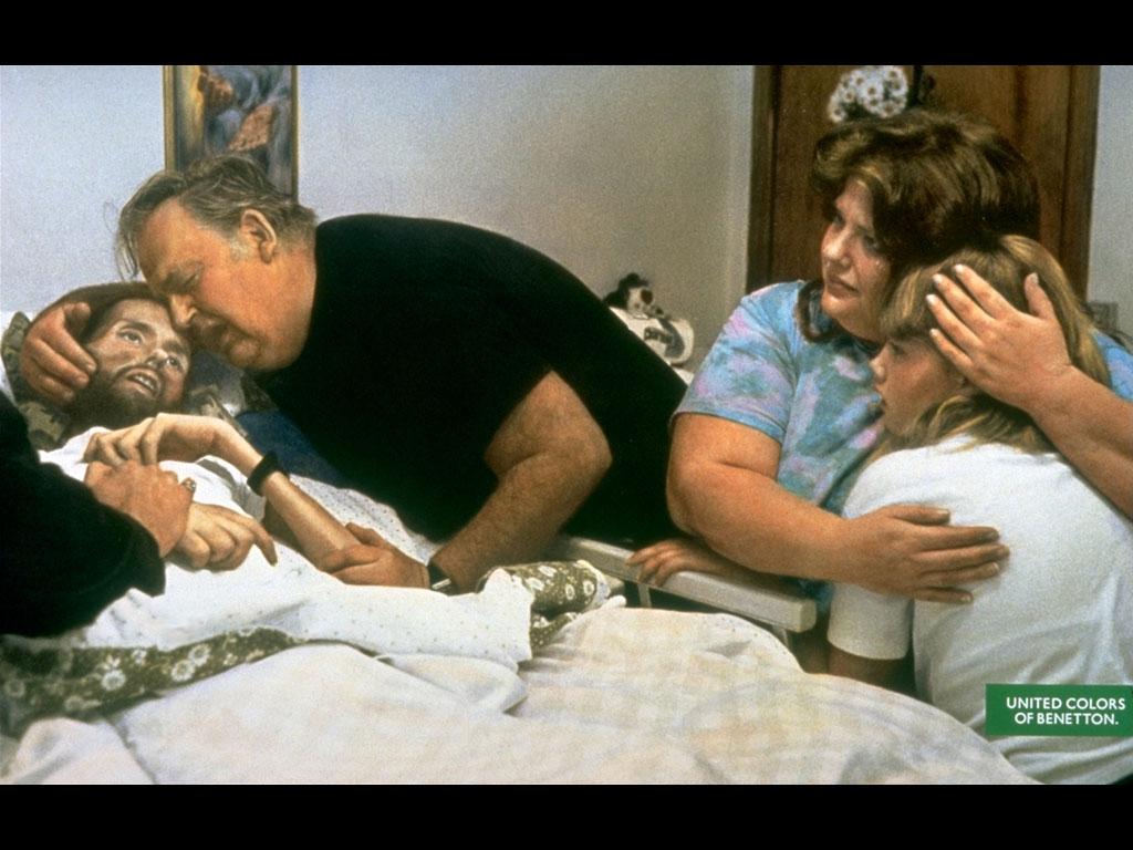
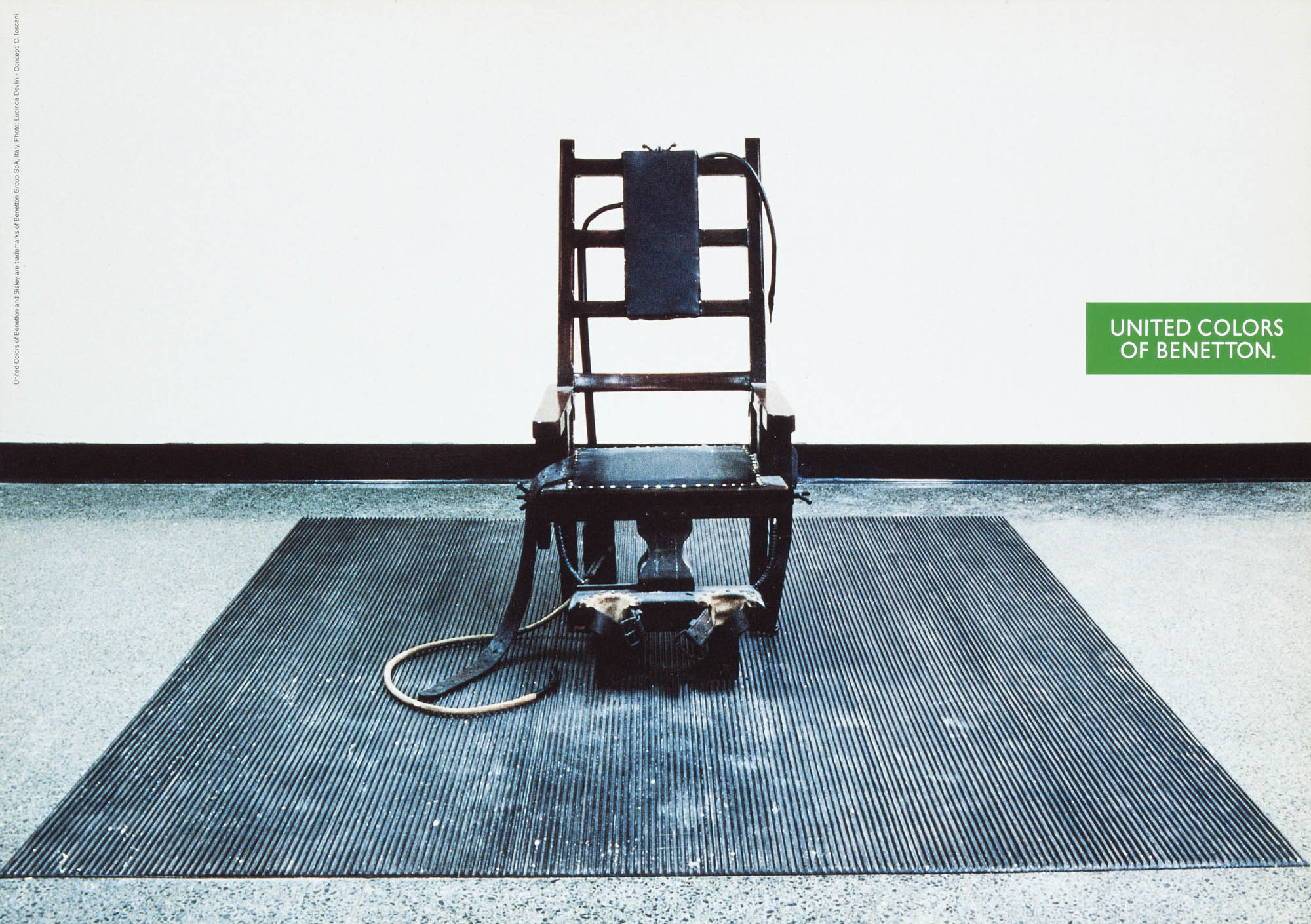
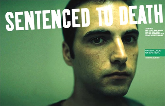
Few run advertising that breaks from the norms of their category, but how many are willing to thrust their companies into the middle of issues like racism, religion and capital punishment?
You can count them on one finger.
Backed by owner Luciano Benetton, Creative Director and photographer Oliviero Toscani (below) created a campaign that made Benetton, within a handful of years, one of the most famous brands on the planet.

With the benefit of time we can lay it out chronologically and see it evolve.
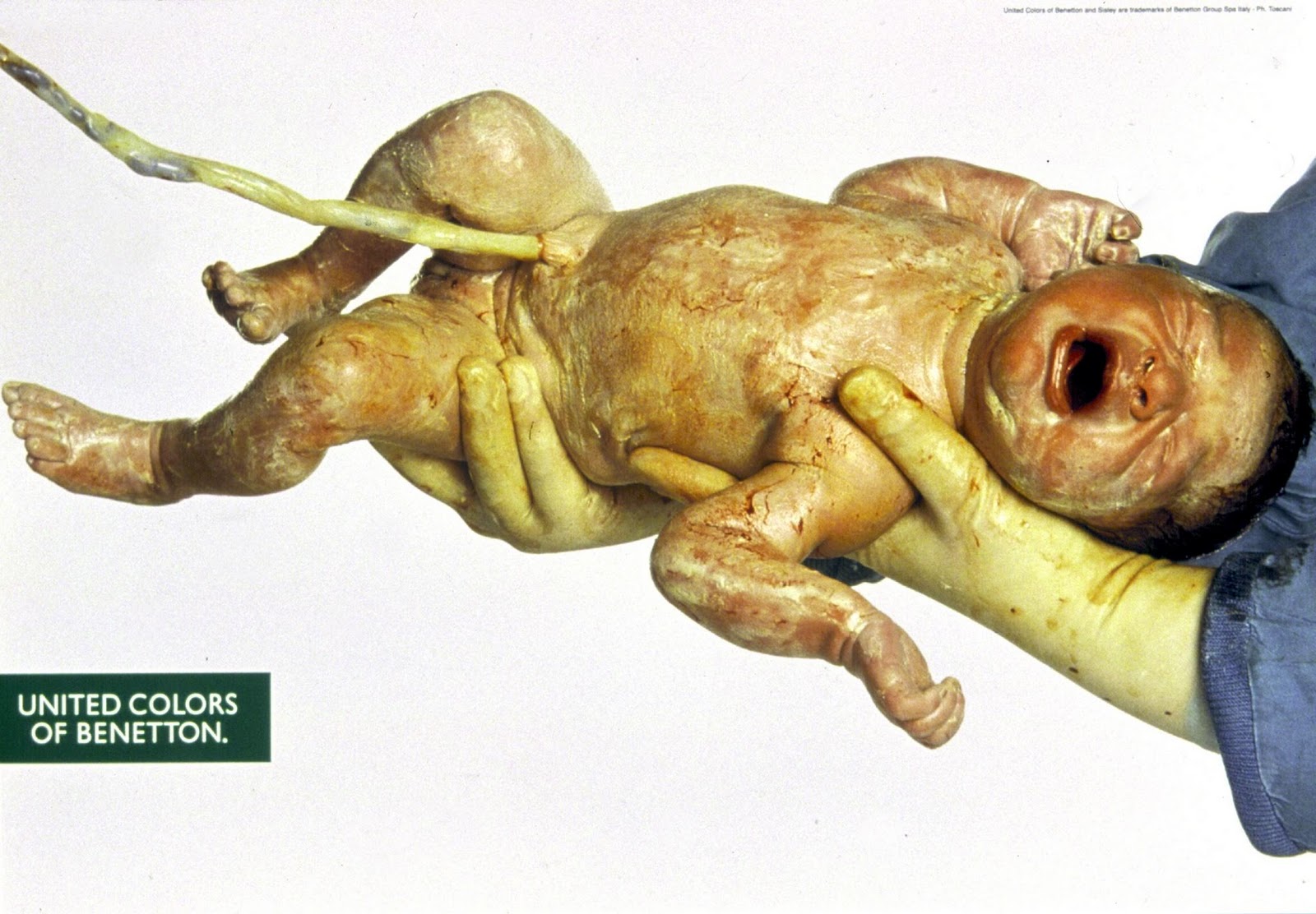
Each year, Toscani pushed the envelope further and further, until, arguably, he pushes it off the edge of the…table? (Is the envelope on the table in that analogy? I can’t remember.)
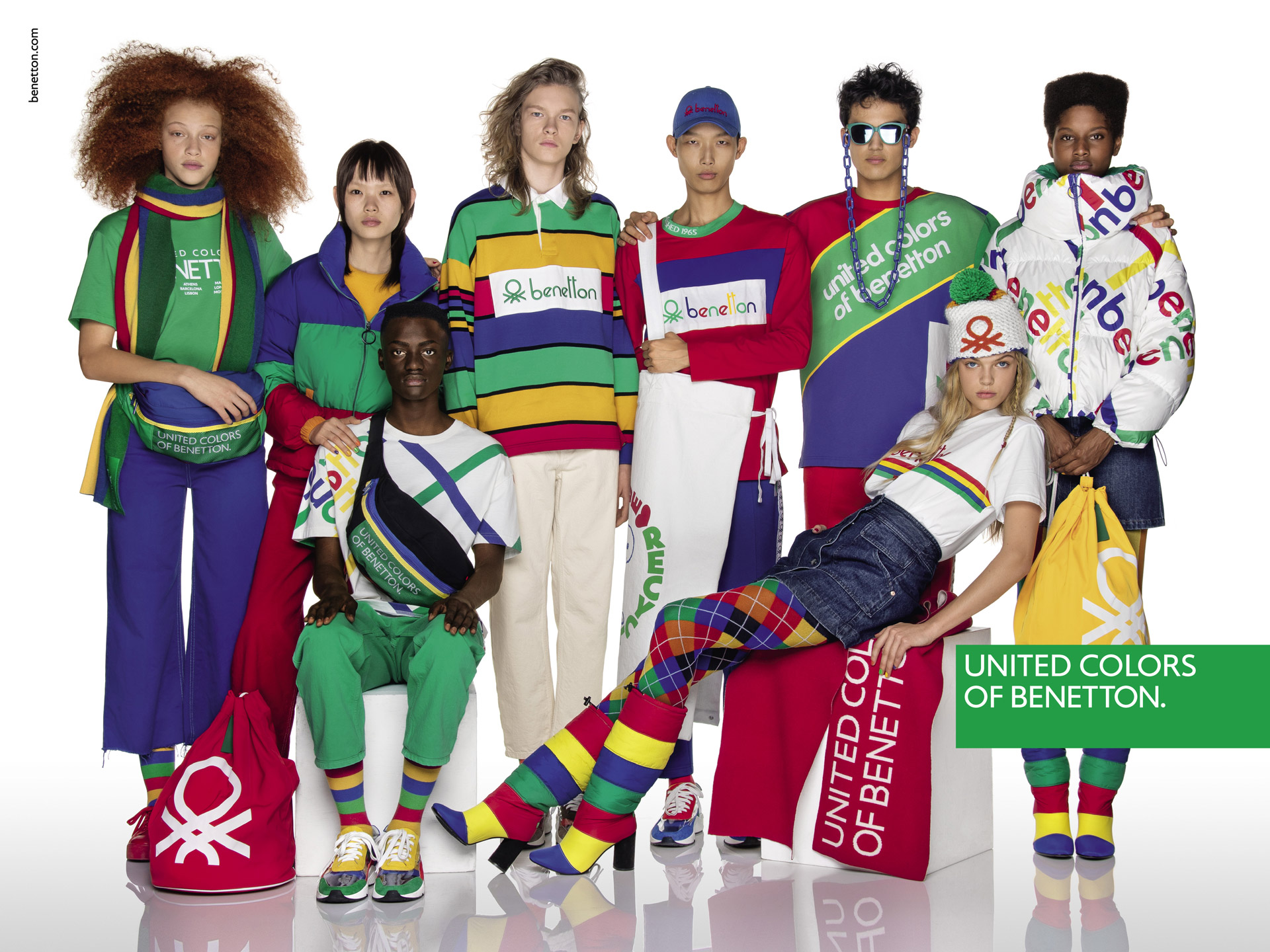
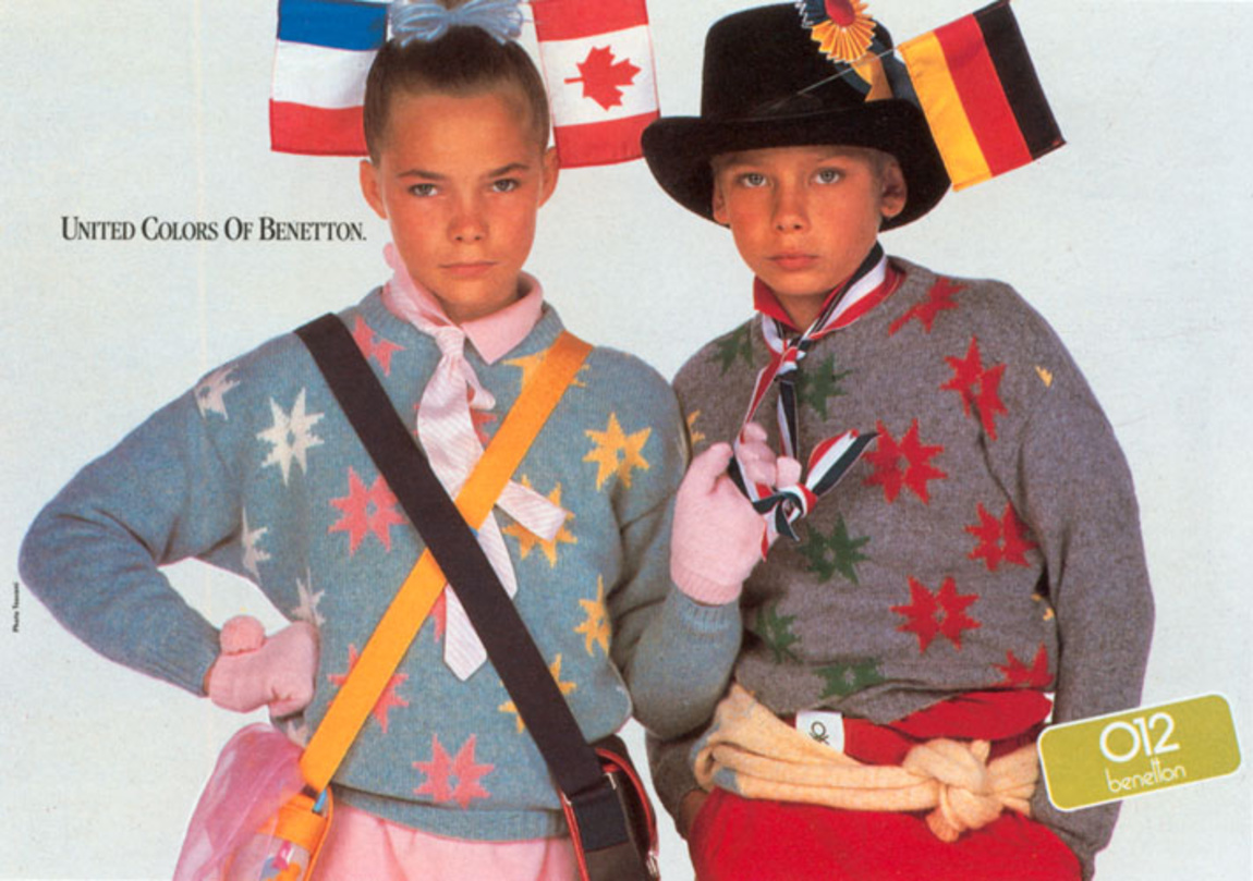
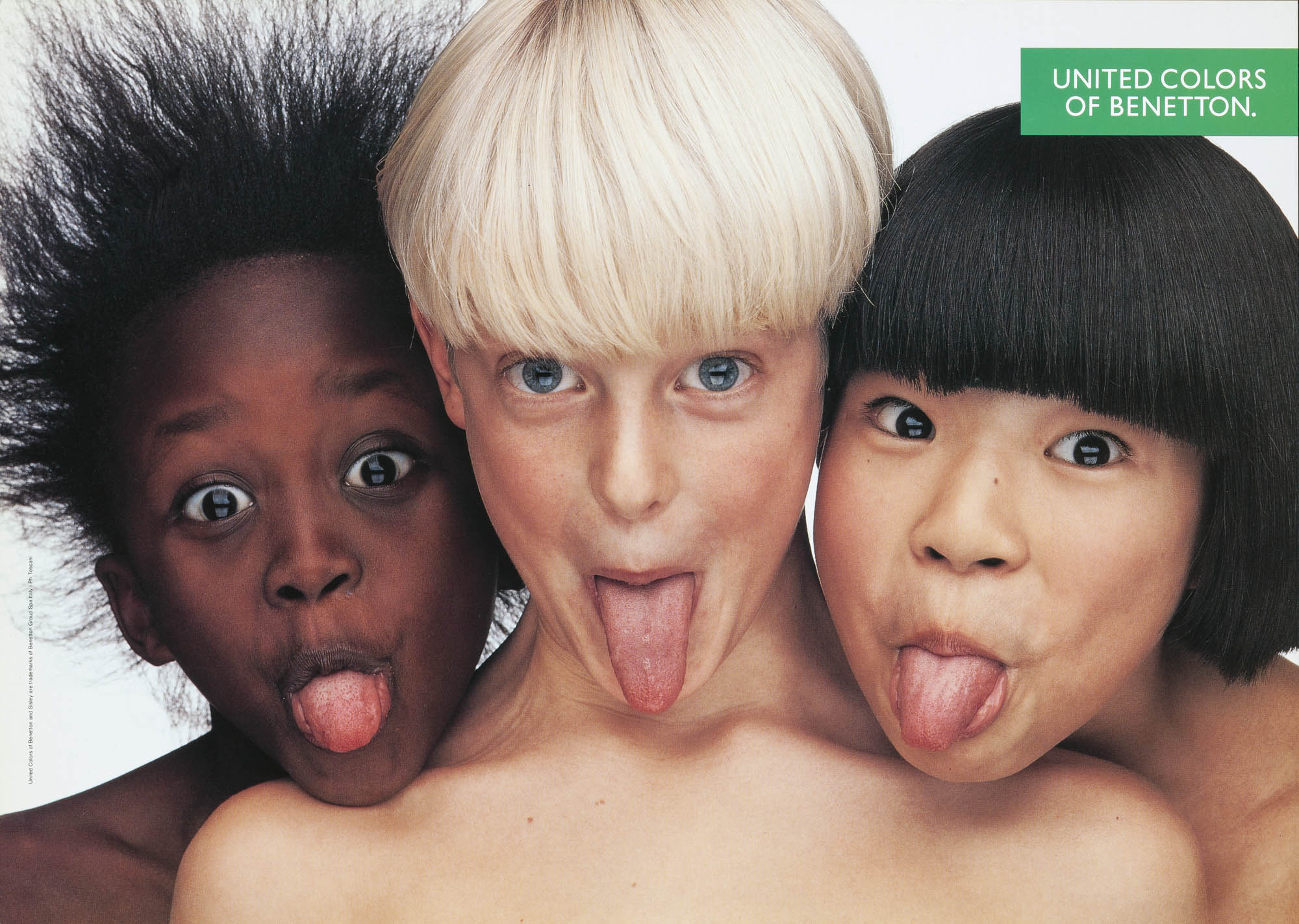
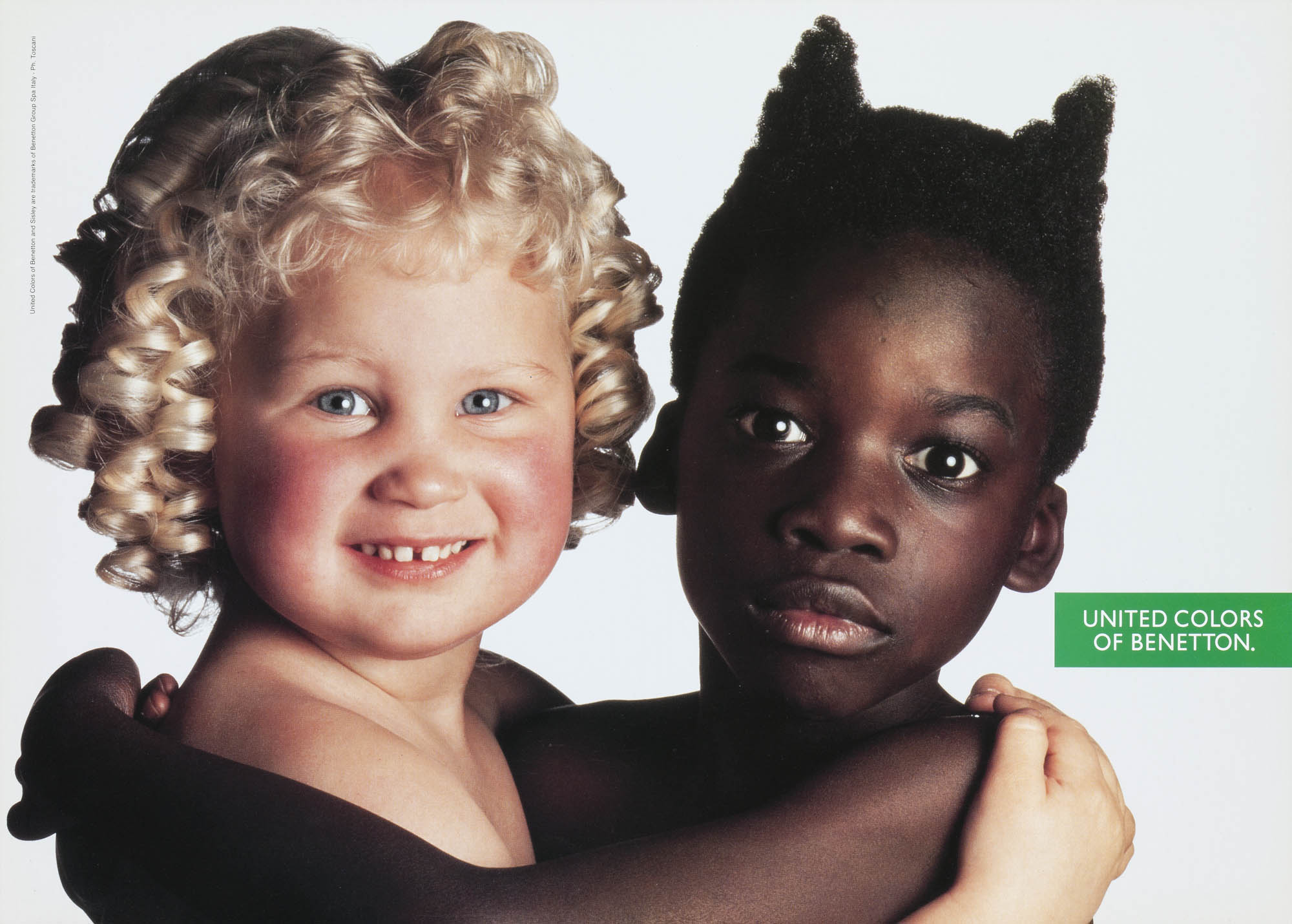
In the beginning, they start by linking the wide variety of colours they offer to the wide variety of humans mooching about the planet.
‘The United Colours of Benetton’.
Gentle.
Ish.
Using multi-cultural models would’ve been unusual at the time, but probably didn’t present itself as a brand idea.
I’ve always found it odd when presenting ‘big’ brand ideas, that we’ll show how they’ll roll out in years 2, 3, 4, to give the client confidence that the idea ‘has legs’.
But I’ve never, ever seen all those years 2, 3 and 4 get used.
Most campaigns evolve as they go, shedding the bits that don’t work, building on the bits that do.
I’d be willing to bet that there was no long-term plan, no year 2, 3 and 4.
My guess is that the plan was whatever Toscani felt like at the time.
The plan is him.
Socially and culturally aware.
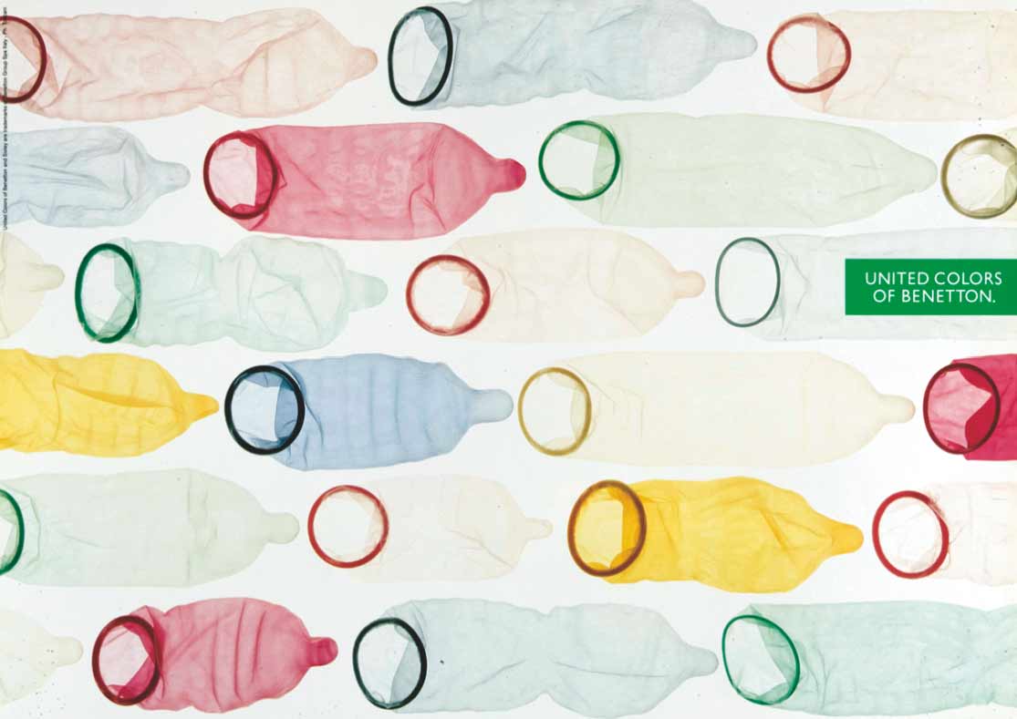
Provocative.
Graphic.
(They look simple, but being able to capture social issues in such simple images is a rare skill.)
He shot and oversaw all of them.
From cute model shots to grim death row ads.
From gentle to provocative to…well, whatever word is for provocative turned up to 11.
Or, to put it another way; from unknown to world-famous.
Handy if you’ve got a lot of coloured jumpers to sell.


![]()


you are spot on Dave ! there was no plan. no advance planning. just a daring brilliant idea and a duo willing to take the risk. I love your ‘idea with legs’ … it made me laugh so much it is true this silly comfort pampering …. make up your mind
So good to be reminded of great press advertising and breaking the rules and to have so much impact at the time. Great article as usual.