When I started out, lunch with my old writer Sean would end with ‘Right, let’s shift some product’.
It was irony, of course. It’s rare for creatives talk like that.
If you’d have asked me at that time about the performance of one of my ads, I’d have given you a ton of awards data, but nothing on sales.
To be fair, awards won are what creatives are salaried on, not units sold.
And if you’ve ever sat on an awards jury you’ll know that it’s not exactly a scientific process – do the assembled bunch of people like your ad or not?
Having won a few awards I started being given more responsibility, meeting the people who paid for the work I was entering; clients.
Consequently (if you’re a human being) you find you don’t want to let your new friends down and, to quote our Prime Minister, ‘Spaff all their money up the wall’.
So I became more interested in shifting product.
Also, as time moves on you become more aware that it is your actual job.
It doesn’t mean you start doing dumb, hard-sell, uncreative work; the qualities awards juries look for in work are exactly the same as those needed to get your ads noticed by the public.
Simple is better than complicated.
Interesting is better than dull.
Beauty is better than ugly.
Funny is better than worthy.
But those are all executional, what does change is the strategy you adopt or the creative route you pick.
Because your criteria is to get the uninterested to notice and act.
And one thing you find if that’s your goal – you become more open to media choices.
Suddenly, the most unfashionable channels can appear exciting.
Direct Marketing was THE most unfashionable form of advertising.
‘The shit that folds’ is how Steve Harrison described the popular view at when he joined the business in ’85.
He went on to prove that it didn’t need to fold or be shit.
His DM came in the form of water-coolers, carpet tiles, even a barge on the Thames.
Trojan objects that made their way into places that an envelope could never dream of penetrating.
Some are like Banksy stunts.
Even the stuff that did fold was great. (See the Times Newspaper summons and Court Security pre-opened letter below.)
What they have in common is that they’re impossible to ignore and they persuade you the product is very good.
It sounds so basic, so simple.
But name the last ad that made you believe that?
I’ll wait.
One that made you consider, just for a moment, parting with your cash?
Still waiting.
In his new book ‘Can’t Sell, Won’t Sell’, Steve breaks down why.
From the social and economic backgrounds of the people populating agencies to the political beliefs of those awarding them, Steve prosecutes the case that
advertising has stopped selling.
You may look through the work below, much of it from the ‘90’s and noughties and feel that the media landscape is different today.
If you do, let me introduce you to Bill Bernbach ‘It took millions of years for man’s instincts to develop.
It will take millions more to vary.
It is fashionable to talk about changing man.
A communicator must be concerned with unchanging man, with his obsessive drive to survive, to be admired, to succeed, to love, to take care of his own’.
Cheers Bill.
(Oh, and next time Bill, it’s ‘changing person’, not ‘man’, it’s 2021 FFS!)
We had a great chat, hope you enjoy it.
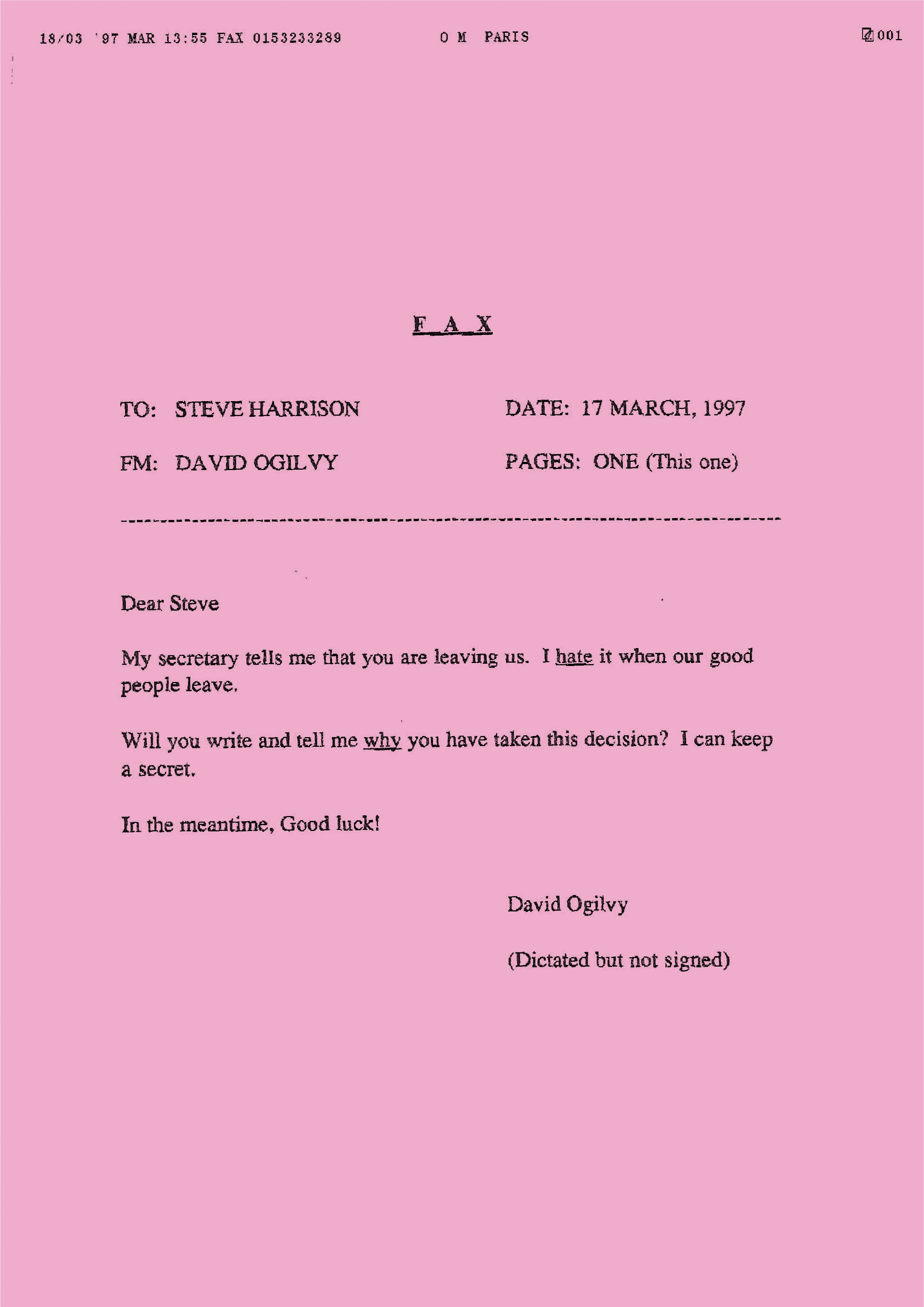
OGILVY & MATHER DIRECT.
This ad was vetoed by Steve’s M.D. (Miles Young) on grounds of it being disrespectful to the boss.
Steve ran it anyway with the first line of copy saying “Because our Managing Director couldn’t”.


American Express.
The aim was to get businesses to accept the Amex Card. Not easy when, unlike Visa, Amex took a % of every transaction. So the audience was hostile.
Mailing 1 was a copy of Jane Austen’s Pride and Prejudice – plus a bookmark which listed the reasons the target would be against accepting Amex.
Mailing 2 was Austen’s Sense and Sensibility – plus a bookmark listing counter arguments to the above.
Mailing 3 was Austen’s Persuasion – plus a bookmark listing all the good business reasons for accepting Amex.
Written by Rory Sutherland whilst still in short pants. (I’d put money on them being corduroy, probably a dusky pink?) 


Disneyland Paris was struggling because people in the UK associated Disneyland with Florida. So the agency’s above-the-line ads repositioned the park: “The Magic is Closer Than You Think”.
Then this mailing went to parents: “Make the family disappear” which arrived as a Magic Wand – and unrolled to become the letter.


Royal Mail Freepost Name was a new response service offered by Royal Mail aimed at making ads more effective
There’s a lot of talk today of “hyper personalisation”. They were doing it 25 years ago!
Everything from… press ads aimed at top creative directors and brand directors in Campaign and Marketing/Marketing Week… to personalised beer mats left on every table in the pubs where the top ad agency creative depts drank.
For PR, the stunt was covered by Campaign Diary.


At the château.


Harrison Patten Troughton.
This laminate was handed to every new account person hired, they were asked to pin it above their desk.
As Steve put it “We put great emphasis on good briefs. And we made sure that all our suits knew how to write one”.

World Gold Council wanted to draw attention to the govt selling off half the UK’s gold reserves – and get the issue raised in Parliament.
So the main target were Members of Parliament.
As you’ll see, national newspapers and TV picked up the story.


The National Phobic Society (Anxiety UK) was staging a conference at which new research was to be presented about Obsessive Compulsive Disorder.
They asked the agency to get as many journalists as possible to the conference.
Thirty journalists covering Health issues for the national press and magazines were sent a box mailing asking them to write an article about OCD.
Inside was a keyboard that had had all the keys re-arranged in alphabetical order (and all the number keys arranged in numerical order). Plus, on the inside lid, information about OCD and the Conference – but again all arranged in alphabetical order.
Result: a double page spread in the Daily Mail and a feature article in the Telegraph. And radio coverage on LBC.


Cannon Health Clubs asked the agency to promote their Fitness Courses for Pregnant Women.
Instead of posters, flyers or emails, the agency recommended putting these plates on all the doors in the Cannon Health Club network.
Fitness First Gymnasiums asked the agency for a flyer that could be put through letterboxes in the vicinity of their gyms.
The agency came up with three executions – all of which looked like typical flyers for local fast food restaurants.
An Italian Menu to drop on Wednesday.An Indian Menu to drop on Thursday.
A Turkish Menu to drop on Friday.
Inside was a menu were a list of typical dishes but with a suggested Fitness First exercise class and the minutes it would take to work off the calories at the Fitness First Gym.

Court Security are specialists in anti-burglary security equipment.
This mailing was aimed at generating leads.
The worst thing about being burgled is the sense having your home violated.
“Stop some bastard getting his hands on your most private things”
The mailing arrived with the envelope already torn open.


Cannes Stalker.
One of HTW’s junior teams wanted to get interviews with top ad agencies (and Steve wanted to get rid of the team).
So Steve targeted 21 of London’s top ECDs and began this campaign the week after the Cannes Festival.
Day 1 the ECDs were sent a match book from the Cannes hotel at which they’d stayed – with a handwritten message from Emily.

Day 2 they got a blurred photo taken in the early hours of the crowd at the Gutter Bar. On the back was another message from Emily.

Day 3 the ECD’s got a message on fax paper from the Cannes hotel they’d been staying at.

The team got interviews with 19 out of the 21 CDs targeted.
IBM Management Consultants wanted an introduction to the C-Suite at the UK’s top banks.
The agency knew that C-Level bankers all read the FT first thing each morning.
It is their village newspaper. They read it to see if they or their bank is in it.
So the agency bought six copies of the FT at 5.00am that morning and then inserted four new pages into each edition.
Then they biked these versions of the FT round to the targeted bank with instructions to Reception to hand them to the individual each copy was addressed to.

So when, for example, the CEO got into work, he/she got their FT, took it up to their office and had a read.
On page 3 was a full page ad for IBM Management Consultancy. With the Business Card of the IBM Management Consultant tipped on to the page.

The CEO may or may not have paid much attention to this. But he/she certainly would have noticed the full page ad on page 5.
It had his/her business card tipped onto it.
So for a while, the CEO thought he/she had a full page ad dedicated to them in that day’s FT.
Meanwhile, the same gag was being played on his/her colleagues – because they’d all got a copy of the FT with their business cards tipped on to page 5.

It is highly likely they would then look back at page 3 to read the ad and then to page 5 to read that ad.
So the message about IBM Management consultancy was landed.
To create the insert with the ads on page 3 and 5, the agency had to add four new pages. But that left them with pages 4 and 6. So they used these to write detailed advertorial case studies of how IBM Management Consultancy had helped others in the Banking Sector.
The guy from IBM Management Consultancy whose name appeared on the business card on page 3, then started ringing the C-Suite from 9.30 onwards asking he could visit to go through his credentials.
The agency did this on Monday to Standard Chartered. Then repeated the process on Tuesday with HSBC … Weds with Barclays … Thursday with JP Morgan … Friday with Lloyds and so on until we’d hit every major bank in the City.
And IBM had got the leads they wanted.
The Times newspaper was promoting its legal pages to London’s leading law firms.
Most of these firms are located in the Inns of Court in The City.And the flyer inside looked and read like a Court Summons.
And the flyer inside looked and read like a Court Summons.
[The agency got a bit of flack from po-faced lawyers who didn’t like the idea of colleagues seeing they’d been Summonsed].


Microsoft.
The target audience was IT managers.
They spent most of their working day in the Server Room fixing colleagues’ problems.
So their visits to the Server Room would now be few and far between.


Virgin Books.
Inserts are those bits of paper that drop out of magazines.
They usually go straight in the bin. Making ’em interesting is tough.
In this case, the brief was to tell prospects that if they signed up for a Virgin Credit Card, they could get free books.
So the insert was made to look like a page torn from a novel, with the offer weaved into the story being told on the page.

NABS (the UK Ad industry Charity)
Xmas Card 1.
NABS asked the agency to create a card to send to its most generous donors – thanking them and nudging them to give more.

Xmas Card 2.
The envelope was an old one that was recycled. The cards were all made from used cardboard packaging.


Foetal Alcohol Aware.
Proposition: If you drink when you’re pregnant, your baby drinks, too
As well as press ads and radio, the agency also generated a lot of press coverage.
Here’s the Press Release mailing they sent to 34 journalists covering Mother/Child issues and Womens’ Health
for national newspapers and magazines.


Thresher Off licence Doordrop.
The client just wanted to stick money-off vouchers through people’s doors.
The agency created Mrs Dunferly – the busybody neighbour who is warning against wild parties fuelled by Thresher’s cut price booze
If anyone wanted to phone their “neighbour”, they got through to Mr Dunferly.

Bloomberg Television.
This letter accompanied a label-less bottle of champagne that went to 23 top media buyers who were responsible for big spending airline budgets; 22 called straight back and one immediately moved £500,000 of Virgin Atlantic’s spend.
What’s more, after making the association with Dom Perignon, all were left with the desired image of Bloomberg TV as a brand synonymous with great wealth.

M&G Investments.
The target audience were over 55year olds (they have all the money).
The aim was to reassure existing customers and get new ones by explaining/demystifying the stock market
The long copy posters ran as crosstracks on the underground – and at all London’s main railway stations.
When the markets are up, no one bothers. But during the Dotcom crash when the markets went into freefall everyone panicked and wanted to know what they’d bought.
Other brands were not helping.
They always relied upon heavy ad spends to simply implant a name/visual mnemonic in the prospect’s head.
For example, Jupiter:

Or Scottish Widows:

They made no attempt to explain the investment product or how it worked.
HTW saw a gap in this market, and repositioned M&G to fill it.
They were very clear about their target: middle England – and its wealthy middle-aged and elderly residents (they had 76% of the UK’s disposable income).
HTW knew these people didn’t buy on impulse – especially investments, and HTW knew they would read long copy.The agency also knew that all other advertisers were ignoring these middle aged/elderlies.
So they chose type-faces (Mrs Eaves and Fournier) and layouts that made the ads look old fashioned enough to say “This ad is for you”.
Then they wrote headlines and tested them on the market.

A bit “smartarse”.

It also got advertising in its rightful place – ie something you read when you had nothing else to do.
Can you guess?

Again, this was a way of saying “Hey you, oldster, this ad’s for you”.

And Tommy Cooper headed up the full page ad that launched the campaign in the main section of the Telegraph and the Mail.


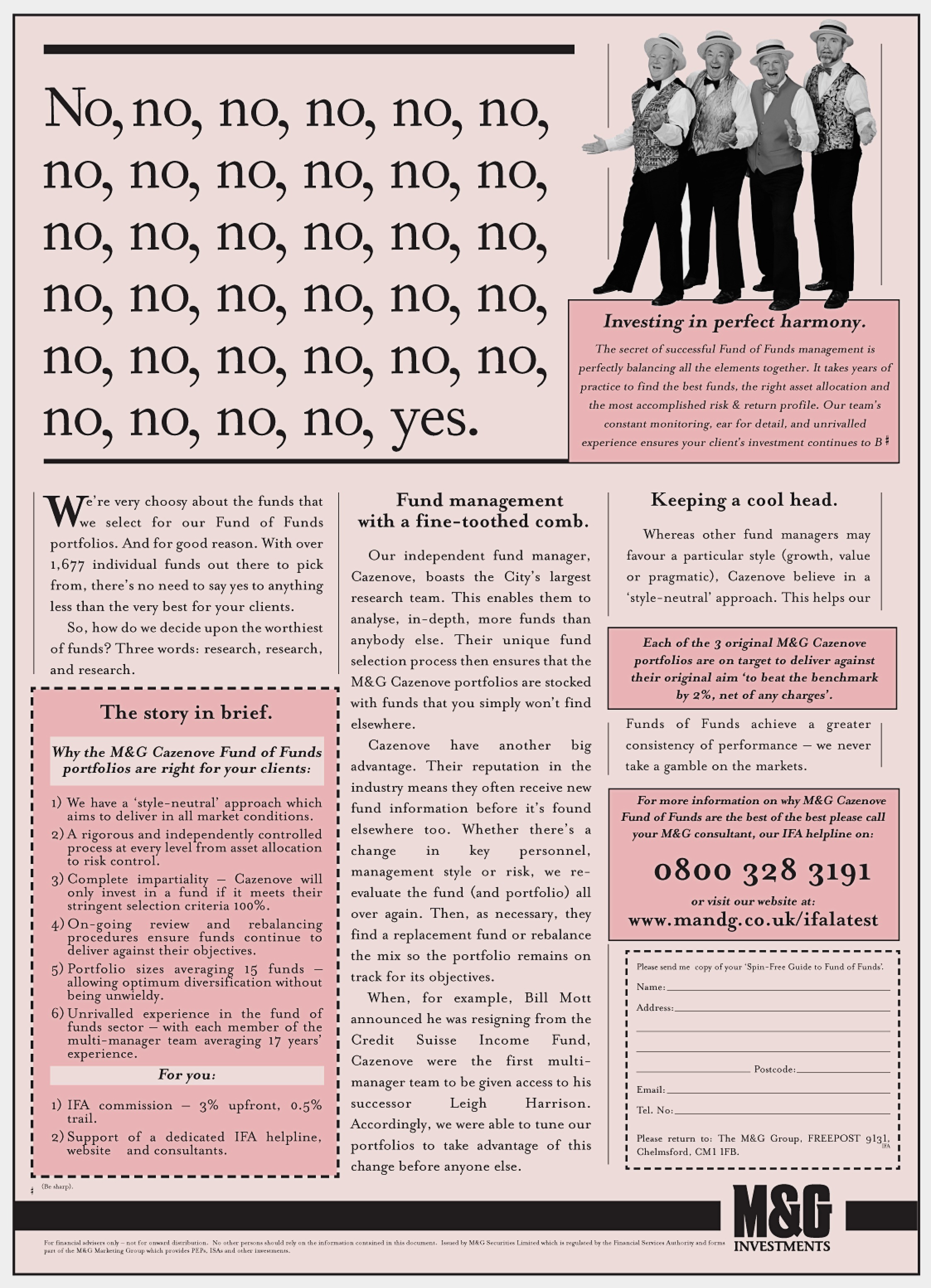
M&G partnered with the Queen’s fund manager Cazenove.
Previously you’d needed at least £1 million to become a Cazenove customer.

Part of the agency’s brief was to prepare the Call Centre workers for the launch.
Amongst the tactics was to fill water coolers with Champagne.


Harrison Troughton Wunderman Christmas card.
The Card was embedded with conifer tree seeds. So the recipient could plant the Card and grow their own Christmas Tree.

Xerox launching a new copier that did great quality colour copies for just 10p each.
To demonstrate this, the agency got a well known Young British Artist, Gavin Turk to create an art work on A4 paper.
Then, one lunchtime, he appeared at the Tate Art Gallery with the Xerox copier and used it to make copies of his artwork – which he then signed and sold for 10p.
There were queues 150 yards long.
Plus journalists not only from the copier/printer trade press but also from The Times, The Independent, the FT and Guardian.
The target was Office Managers who spent too much of their time fixing faulty photocopiers
The Proposition: The new Xerox WorkCentre Pro diagnoses it’s own problems and fixes them for you.
The opening to the letter asked: “If the carpet round your photocopier looks like this, it’s time for the new Xerox WorkCentre Pro”.


The AA wanted to send a postcard to members who had lapsed – telling them that if they didn’t renew now, they were on their own if they ever broke down.


Rolls Royce was about to introduce a new version of the Phantom and needed to shift the old stock.
So they planned to offer a $20,000 discount off the $650,000 asking price.
The target audience were ultra rich bond dealers/hedge fund managers in Greenwich Connecticut and other of the USA’s most affluent neighbourhoods.
The agency said that $20,000 was nothing to these people. But they might enjoy spending that $20,000 on redesigning this most iconic of cars.
So the agency invited them to become “Head of Rolls-Royce Design”.
The mailing sold 33 cars at $650,000. That’s sales worth over $21 million.


The prospect received a 4′ long white canvas with a thin red “Coachline” painted on it.
A Coachline is the perfect straight line that runs the length of a Rolls-Royce.
It’s hand-painted by a craftsman whose sole job it is to add this finishing touch to the car.
The canvas came with a Certificate of Authenticity. And a 7 page letter describing the craftsmanship that went into building a car worth £600,000.
The mailing generated 34 leads, 11 of which were converted (ie sales worth £6.6 million).


Vodafone Voicemail.
Aimed at Vodafone customers who had not yet turned on their voicemail.
The proposition: Make sure you never miss another great day/night out again.
For males aged 18-30 – a ticket for the England v France game – which arrived a day late 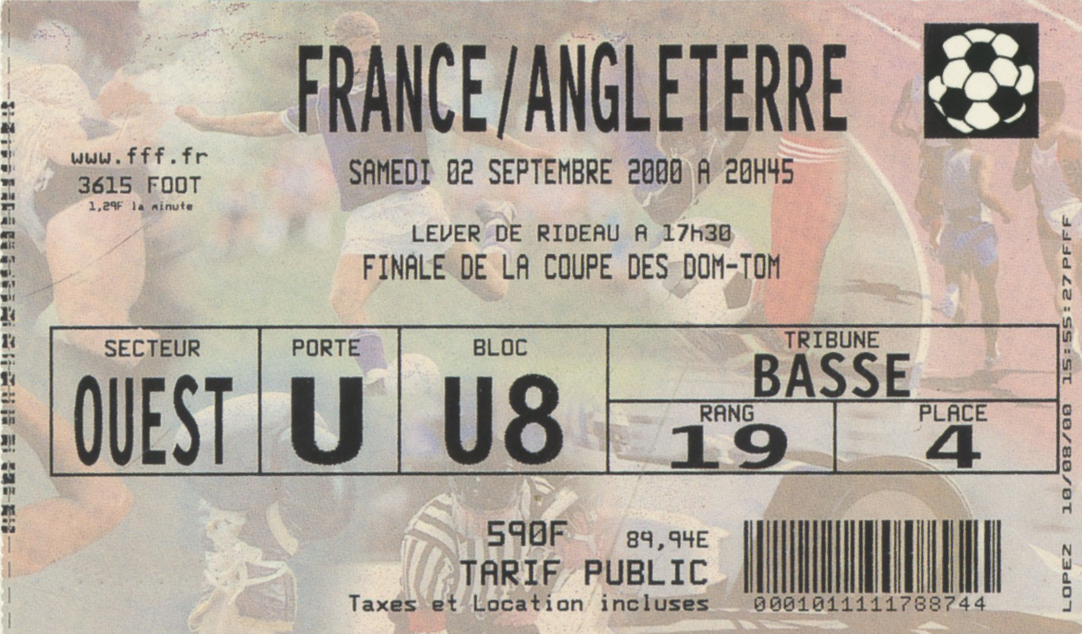

For females aged 18-30 – a wedding souvenir.

For all aged 18-30 – a till receipt for £682 of last night’s party booze.

Here are some of the other ideas originally presented.
St Patrick’s Day:


Notting Hill Carnival:

The Ivy:

 Vodafone Visitor’s Pass.
The target were businessmen/women who spent time visiting clients.
The Proposition: when it might be difficult/compromising to talk on your mobile, send a text.
The “envelope” looked like the Visitors Pass that the prospect would receive upon signing-in to visit their client.

And inside the laminated cover was the letter that delivered the sales pitch.


MORE STEVE…
Harrison Patten Troughton Launch Plan:


Internal HTW Memo:


On creating.


You Think You Know Everything Vs. You Know You Don’t.


Awards Table:
Legacy.


Persuasion at work. Another essential post. Thank you.
Fascinating insights by one of the great advertising minds of a generation. Listen, apply, thrive. Steve Harrison is a top man.
I had the pleasure of listening to this podcast on a lovely 2 and a half hour walk in the Northumbrian countryside. By the end my note pad file on my phone was filled with ideas, names, tips and insights. Absolutely brilliant. I hope someone one day writes a bio of Steve like he has for the great Gossage.