Is there another industry with a bigger disconnect between supply and demand?
One side continually supplying what the other side won’t buy.
“We serve them smoked salmon, they ask for fish paste.” was how copywriter Malcolm Gluck described the situation.
Marketing Directors may describe it as ‘We ask for smoked salmon, they serve us fish paste’.
Regardless of who’s right or wrong, why the disconnect?
Why are their criteria for judging creative work so different?
Put clients and agencies in the same room to agree on what makes good advertising and they’ll be agreeing and high-fiving in no time.
Lob a piece of creative work and you’ll see the two sides separate like oil and water.
It’s not just the subjective nature of the business, if it was it would be harder to predict which side of the table will be pushing for what.
It’s like one side are shopping for apples, the other oranges.
I’ve spent the first half of my career arguing the case for apples and the second half trying to understand this addiction to oranges whilst explaining the benefits of apples.
It’s lead to all kinds of tests and experiments to bridge that gap.
Like a co-creation away day I tried with Nestle, back at an agency called JWT (remember them?).
Not long after joining the MD popped in to ask if I could help with Nestle problem ‘They think we don’t get outdoor, nothing’s getting approved’.
Odd, together they’d produced great in the 80s and 90s.
I thought remind them of this, so booked a train to York to give a talk.
I gathered a bunch of my favourites.


They loved all their old work, as did I.
I pointed out that a lot of their recent work was very basic and functional and copy-led, whereas the work that they loved that I’d just presented was witty, stylish, visual.
Interesting.
I pointed out that, particularly in their category, products aren’t always bought for rational reasons – “Let me see – chocolate bar A has 56% cocoa, chocolate bar B has 62%, so it’s chocolate bar B for me please shopkeeper.”
How people feel about it is important.
I quoted the peerless Binet & Field ‘Emotional campaigns are 30% more likely than rational campaigns to show large profit effects’ and ‘Fame campaigns, those that set out to achieve fame, (awareness, buzz, talk-ability) are 80% more likely than rational campaigns to achieve large profits.’
My point was that advertising isn’t just a place to update the public on your production process.
I ended with a slide on what would help us.

It was well received.
Two weeks later we get a brief: ‘Milkybar’s No.1 ingredient is milk.’
That’s more like it.
But, having previously worked with Britain’s No.1 property company, I remembered all the debates about the term ‘No.1’.
Rightmove would’ve preferred to say biggest, best or something tangible, concrete, but the only thing they could get approved was ‘No.1’.
Because it was a bit vague.
With this in mind, I asked what No.1 meant.
‘There’s more milk it than any other ingredient.’
Great! Sounds better than ‘No.1’.
They agree.
It’s a great fact, it’s changed my perception of these sickly little chocolate bars, maybe it’ll change others?
Simply printing that fact on posters would be an improvement on their last campaign.
But how do we make it better?
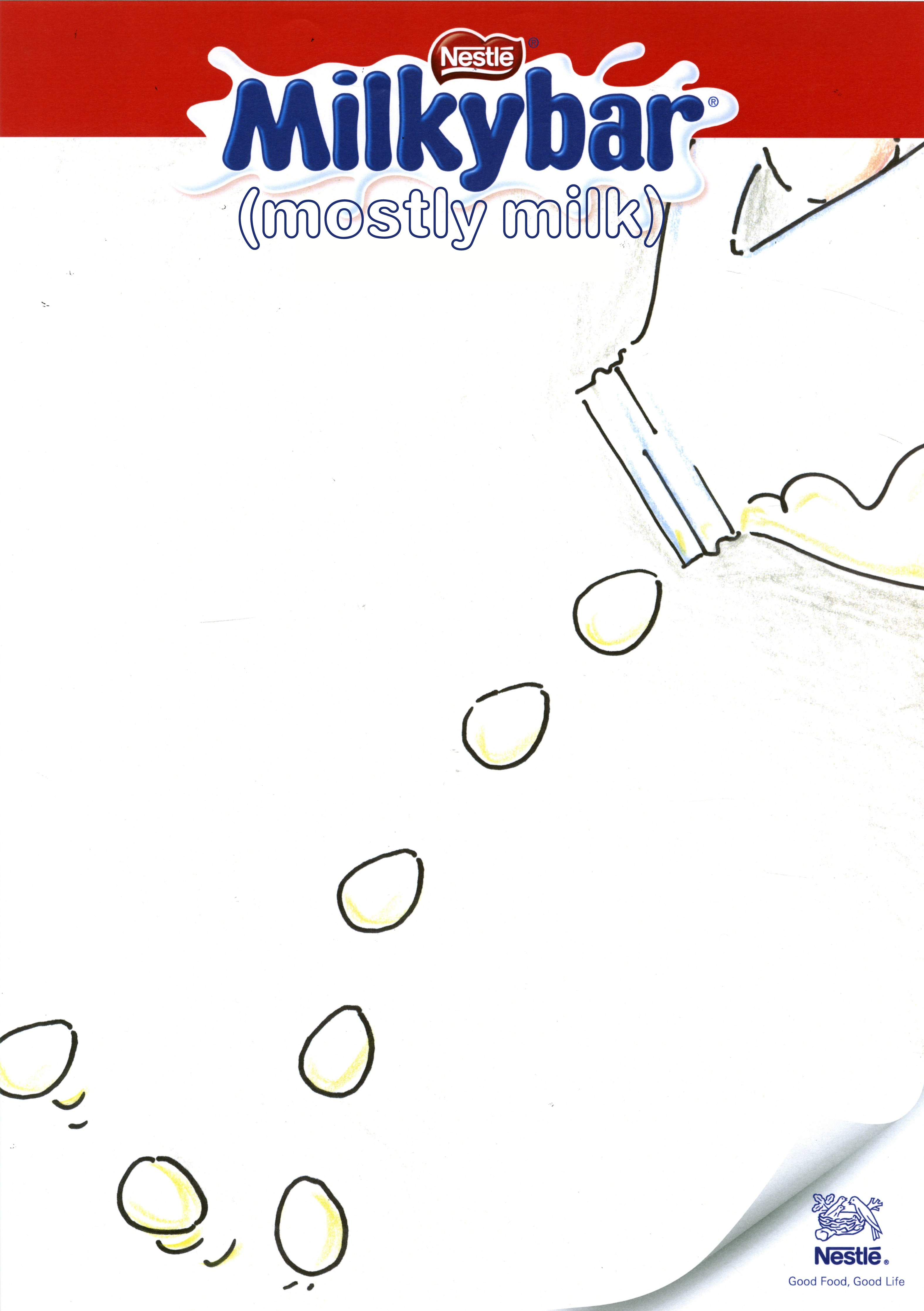
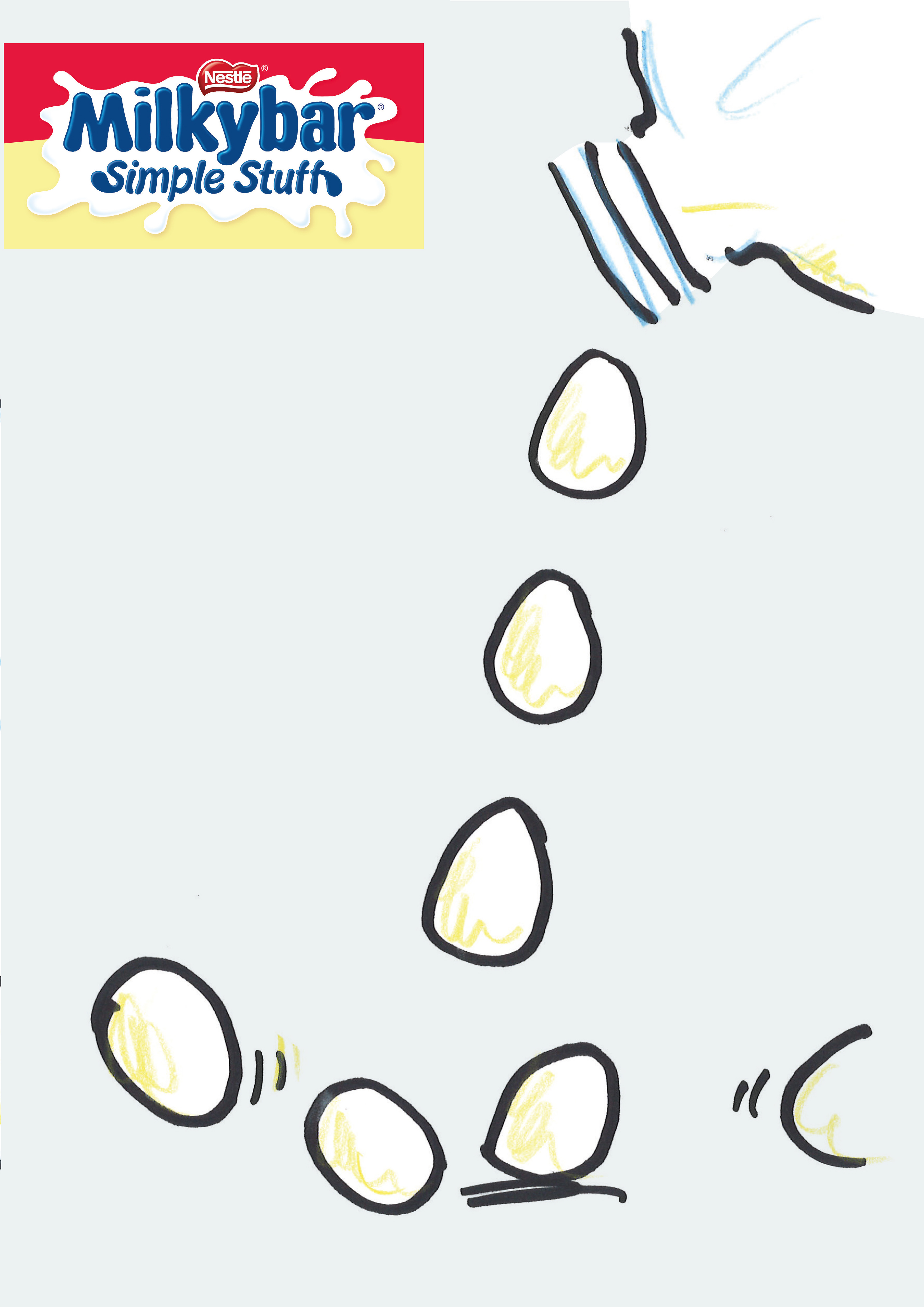
Using milk as a visual.
It’s a positive thing to look at, wholesome, goodness, pure-looking, graphic and white.
I love words, but some messages are more powerful when turned into pictures.
E.g.
CAMPAIGN 1.
Milkybars are no longer just bars, they’re now buttons and eggs too, we need to show them all as related to milk.
‘There’s more milk it than any other ingredient’ is condensed into ‘Mostly Milk’, only two words and alliterative, but it bugs me it’s not as clear as ‘There’s more milk it than any other ingredient.’
We’ll revisit it down the line.


They love it.
Wow! This is easy, like shooting fish in a barrel.
Their only concern is that there’s not enough red – ‘the pack is almost 50% red’.
I also have a concern ‘mostly milk’ looks more like a bit of design than an actual message.
It’s a good message, so it should be more prominent.


I like the brackets, it feels less like a brand line and more like a descriptor of Milkybars, like Milkybar =.
We show the client.
‘Bad news; legal says we can’t claim Milkybars are mostly milk’.
Bloody legal, so over-cautious, what’s their reasoning this time?
‘It’s not true.’
Oh…ok, fair enough.
A range of possible claims from the marketing department is rustled up to run by legal.

Yeah, but maybe it only had 0.5% milk in the first place?
 Same as above.
 Not bad, if we can say it.
 Damn, that again?
In worrying about what we’re going to be allowed to claim, so I come up with one of my own.
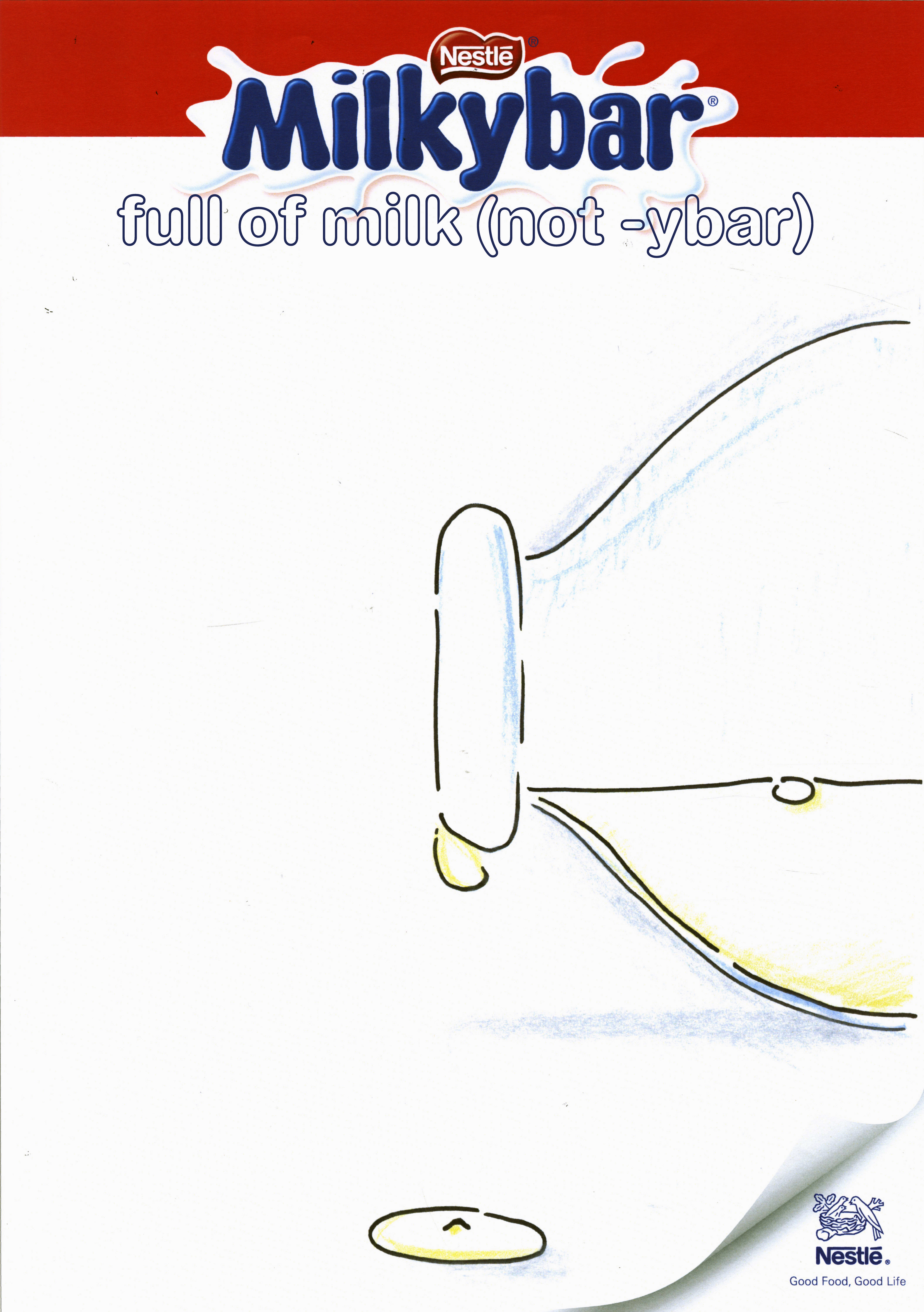
Silly, but quite like it.
Probably not going to be able to say ‘full of’, but even ‘Made with’ might work.
Starting off with such strong milk claim about seems to have spooked the Nestle legal department; now mentioning milk off the table, ‘But we can still use the images, we love them.’
Weird? The pictures imply it’s made from milk, it’s called Milkybar, what can we say about milk that isn’t milk-based?
What can I say about milk? It’s simple, honest food, not a complex mix of chemicals.
(I put a tint on the non-milk elements of the roughs to make the white milk pop.)


We’re informed that they do ice-creams too.

‘Legal have told us we can’t show those images; they’re implying it’s made from milk.’
I thought we wanted to do that?
‘We’d love to do that, we just can’t with its current formulation, maybe next year.
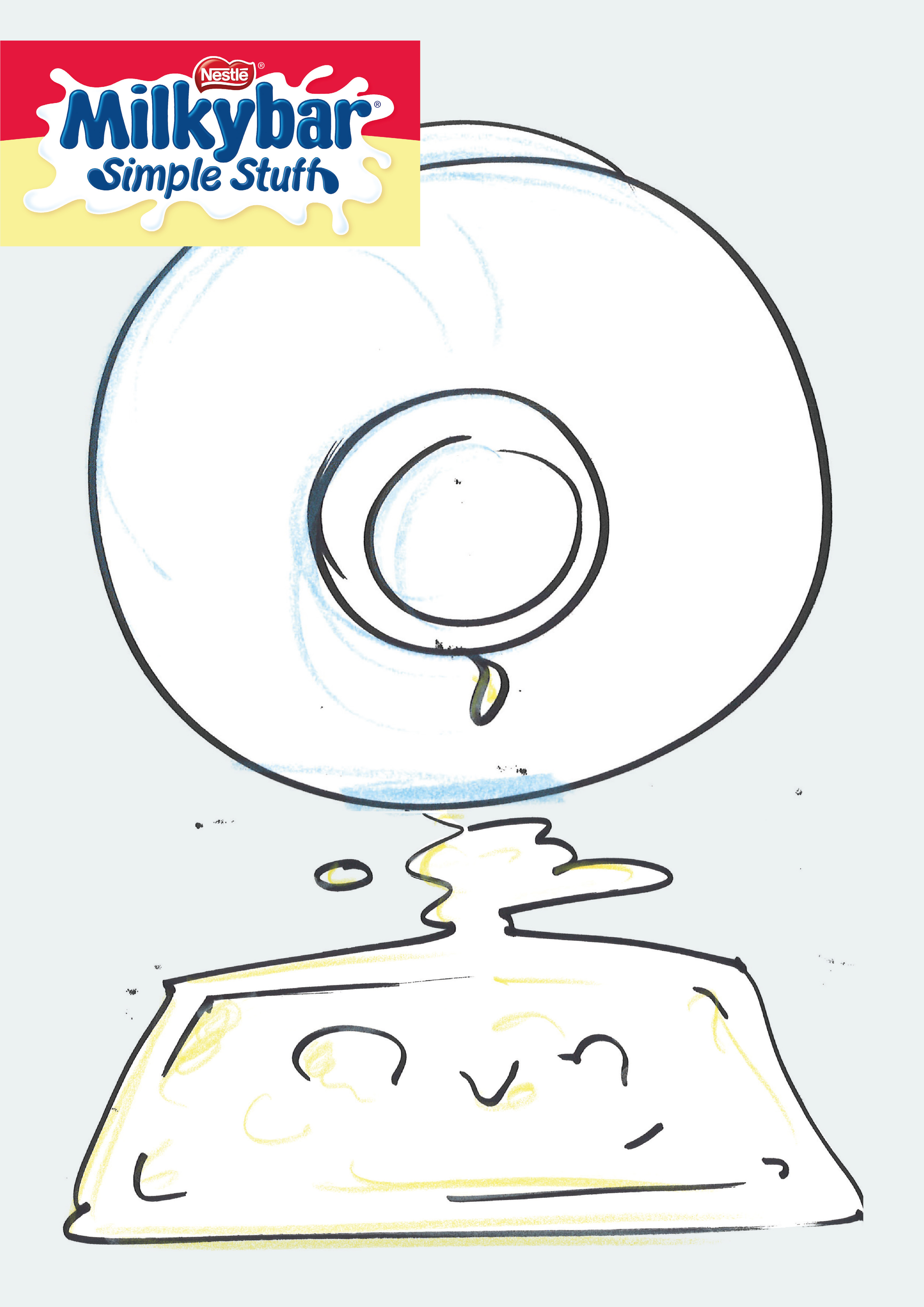
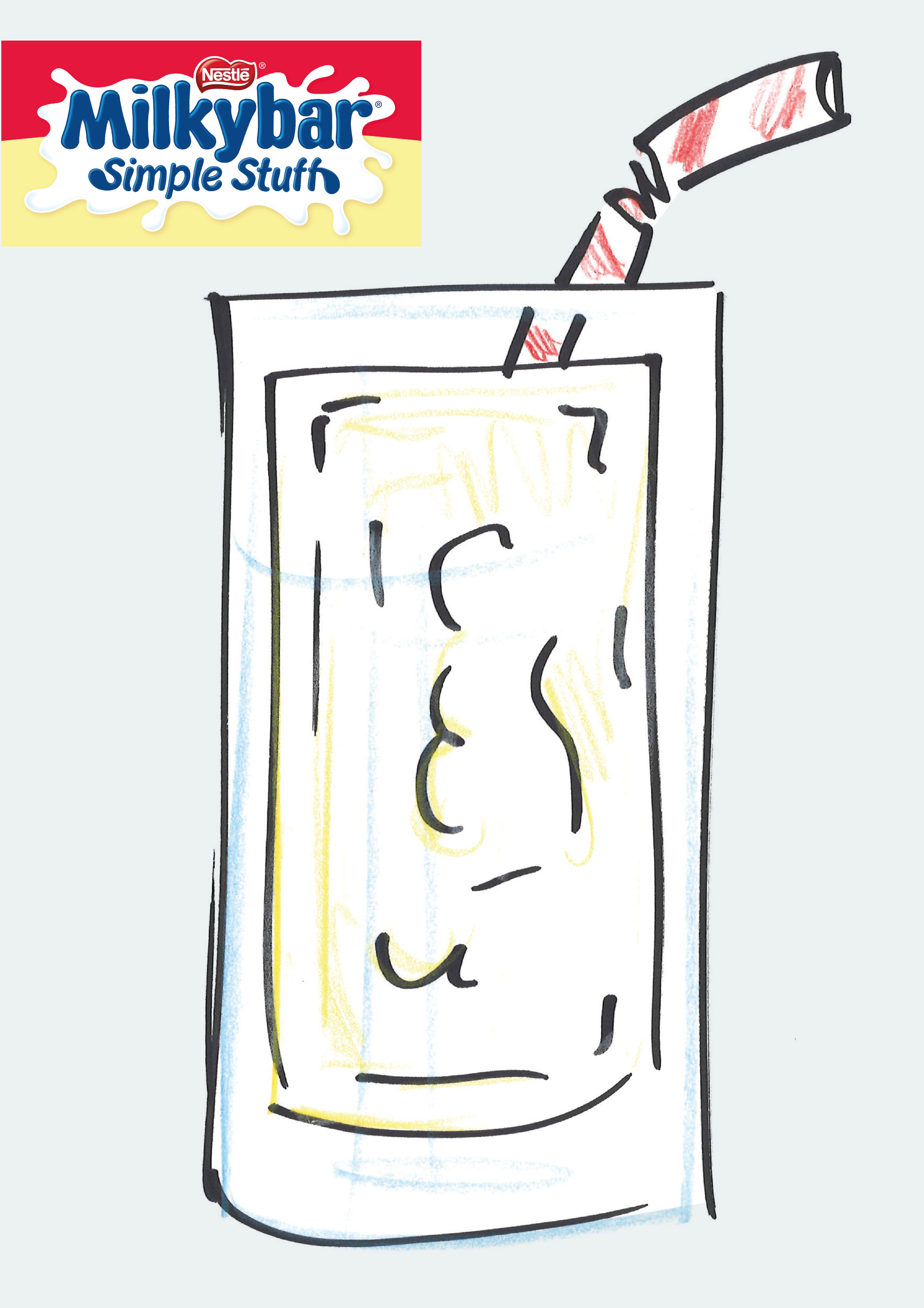
Love ‘Simple stuff’, can we build on that?’
CAMPAIGN 3.
Simple Stuff?
Confectionary brands usually shout from the rooftops about added this or extra that, maybe we make fun of that whole genre of marketing by celebrating Milkybar’s lack of that stuff?
If we do, we need to be ludicrously bombastic – ‘Guaranteed no nougat bits’.
Like it’s some kind of breakthrough in confectionary manufacturing.
‘Seems a bit complicated.
Shouldn’t we celebrate simplicity rather than bang on about what it’s not.’
CAMPAIGN 4.
Ok, we want to own simple, what does it mean?…Minimal?…Elegant?…Dumb? Calling someone ‘simple’ means they’re thick or dumb.
At least it does in the U.K.
Is that still allowed or is it now offensive? It’s probably ok if it’s referring to a chocolate bar.
We’ll call the Milkybar ‘simple stuff’ and show it as a character being dumb.
It’ll be fun.
Could work in any channel.
It’ll be charming.
Although I know it’s going to lead to a conversation about logos and branding, I can’t help but want to do a super-stripped back layout; to look simple.
Besides, who wouldn’t understand what a Milkybar was by
a) Seeing a picture of one
b) With the words ‘Milkybar’ underneath
and
c) The words in the brand colours.
No one on planet Earth.


‘Should we be criticising our own products?’
Er, it’s not a criticism, it’s a chocolate bar, even the competition couldn’t claim their bars are intelligent – they’d get done by the ASA, it’s being playful.
‘I don’t think so.’
The MD pops into my office after the meeting ‘Do you want us to get you out of this?’
‘No, I went up there and said, a bit like Donald Trump ‘I alone can fix it, I’m not bailing out now.’
But it’s tricky, it feels like we’re starting to divide, we need to break down some barriers.
I decide we should co-create in the beginning and move forward together rather than just get together at the end, in a formal boardroom, for final judgement.
A workshop day is arranged.
I take two creative teams and a designer up to a hotel in York.
I start the day by telling the assembled group that we aren’t here to create an amazing campaign, we’re here to find a way forward, a route or way of interpreting ‘simple stuff’ we can all agree on.
Then we’ll go back and create and refine.
We divide into groups and proceed to jot down anything that pops into our heads, this is a trusting, nothing’s wrong day, let’s just get it all out there.
At the end of the day we start sifting.
There’s a surprising amount of nuggets on the wall, good nuggets.
The clients fall head over heels in love with one.
CAMPAIGN 5.

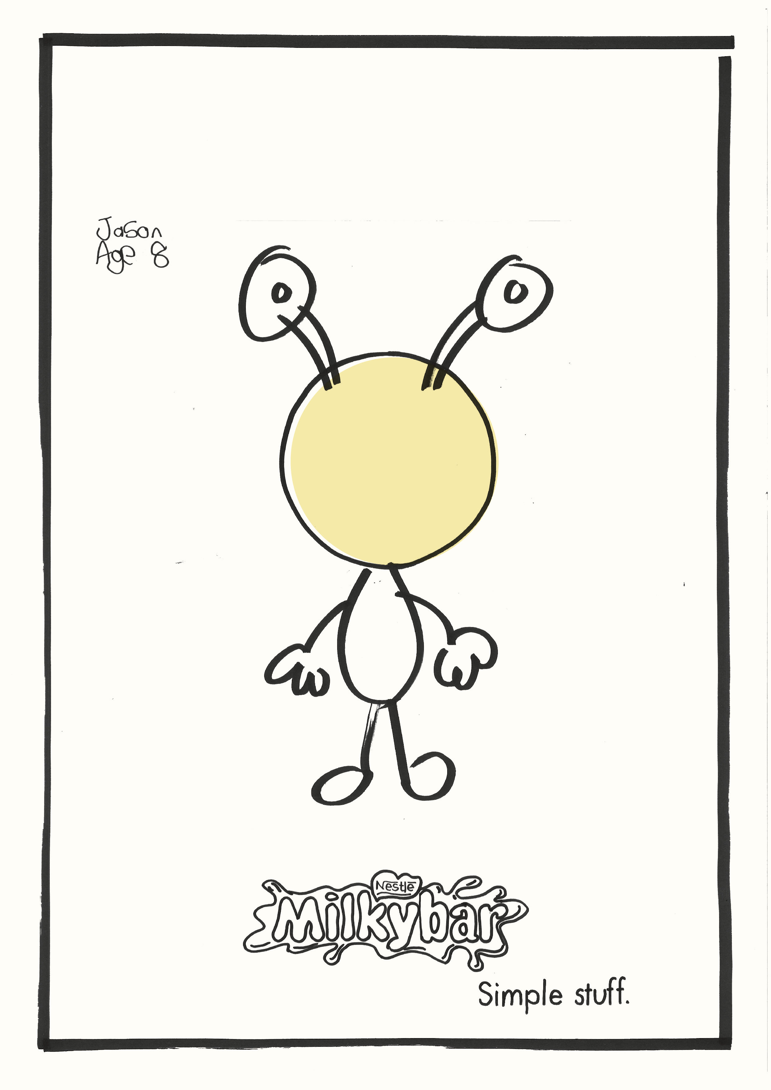


The next day back at the agency, I try to figure out how we’re going to engage kids, do we speak to schools? Is it better to give the kids an idea to draw or let them come up with the ideas? The latter is preferable, but there’s no guarantee we’ll get anything useable back.
As I’m turning over these questions, Nestle inform us that legal has told them we can’t use or be seen to be using kids.
Is the idea dependent on kids?
Maybe not, the name and age say kids, the simple idea of a Milkybar with something drawn around it isn’t and that’s the ‘Simple stuff’ bit.
Maybe the kids thing is corny anyway? And calling their drawings ‘simple stuff’ is a bit of a diss isn’t it?
A potentially un-PC diss at that.
Maybe this is good news, I can get a bunch of good illustrators to create things around the chocolate.
Who can draw and think?
Paul Bower, Paul Davis and Simon Spillsbury.
I brief them, they send in their ideas.
Here’s some of Paul D’s:


Some of Paul B’s:


Ans some of Simon S’s:


I rustle up some layouts, starting with the simplest, most basic.
Initially the layouts don’t work, it’s only when I keep the product exactly the same size and in the same position does it feel like someone has grafittied on or around it.


In the time it’s taken to get it together the clients have fallen out of love with the campaign – ‘Maybe it’s that it’s not kids drawings?’.
CAMPAIGN 6.
‘We need a large pack, not a little one in the corner’.
Rather than end up with an ad with two focal points, I decide that the image will be the pack, so I’ll have to come up with an idea that works around a pack-shot.
So what can we do with the pack?
Quite like it.
But it feels a bit like an ‘in-joke’, also, what’s the next one in the campaign?…’Eat’…and then er?
Maybe a bit too basic.
Maybe there’s locations that we could place it, related to simplicity?
A Snakes and Ladders board,
Maybe the bar is attached to the poster with one simple thing; a bit of Sellotape, a drawing pin, paperclip?
BINGO!


BINGO!
Impossible not to buy, basically big pack shots but still with an idea, elegantly presented.
It couldn’t be simpler.
Which seems appropriate.
Rejected – ‘too cool, too Soho.’.
With the deadline looming, we’re asked to focus on a one off execution to buy us more time.
That feels like a polite way to say ‘let’s forget it and move on’.
We seemed to have gone from having a great message to simply showing the pack.
If branding is everything, maybe we visually brand it?


‘Mmm… where’s big pack?’
Kind of defeats the purpose.
Ok, forget everything we’ve done – what are they known for?
The Milkybar kid.
We can’t use children.
Let’s remind them of the Milkybar kid without showing or saying kid?

Quite like it, now what others can we do?
The Milkybar…Arachnid? Do Primary School kids know what arachnids are?
Orchid? Yep, that would make for some very exciting commercials – The adventures of the Milkybar Orchid.
Ok, it’s a one off.
I bin it and decide to ask the client where we are and what exactly they want.
Irritated, they reply ‘a poster with “Milk is our No.1 ingredient” written on it’.
What?
I bow out.
Shortly after, this runs…

How did that happen?
How did we drift apart?
No one is happy.
Actually, that’s not true, WPP shareholders are happy.
We may not have produced a great campaign, but we produced a mountain of time-sheets.
Exasperating, insightful and entertaining. Probably why creatives are closet masochists. Great read as ever Dave.
Too soon.
5 years Jono? Dx
Hi Dave, I absolutely LOVE these posts. So useful. And entertaining! And I think the presentation you gave this client on ‘why aren’t posters as good as they used to be’ was masterful. If anyone has the answer, I too would love to know…
Thanks Simon, nice to hear from you.
Obviously you blazed the trail for these kind of posts exploring the issues around advertising.
The divide is stark, and weird. (I don’t mean Nestle, I could’ve written a post like this on hundreds of other brands.)
Dx
Amazing post, as usual. You should teach this at d&ad seminars, let alone ad schools. A personal story about the dissonance btw clients and creatives. HBO came to see us. They needed billboards. ‘We come to you because we want impact’, the client said. Exact words. Great brief. We worked hard. Came back with two campaigns we thought were very impactful. He said it wasn’t what they were expecting. ‘We want our logo as big as the billboard’ he said, spanning his hand through the air as if covering the full length of the poster. ‘Impact’.
Hey Seba, w
Weird, it’s like they want you to endorse their thinking, not come up with your own.
I wonder what radical new ways of engaging we could come up with that would break down this ongoing situation?
We’re creative – we must be able to dream up a solution?
Hope you’re well.
Dx
It happens so often. The top drawers of “save for later” ideas around the world would likely beat the vast majority of real ads out there.
So, what’s your view on portfolios being filled with all these scamps, the journey, the problem solving, the story… instead of what ran.
As a CD, would you rather see what they COULD bring than what actually ran?
Hey Jack,
When I started out I was desperately trying appear more senior than I was – I wanted better briefs and a bigger salary.
So I used to put a lot of finished work in it, to look experienced.
Everybody does it.
But Creative Directors see finished ads 24/7, and although it’s useful to show how you craft an idea, they are far more likely to be turned on by thinking.
So I’d put in your best thinking, whether its finished or rough.
Otherwise you’re representing the limitations of the clients you’ve worked on.
But that’s just me, I wouldn’t assume it’s the right answer.
Dx
Wonderful work! Except for that last one. Dreadful 😉
Would love to hear more about how you structured the offsite co-creation day. Anything you can share re: exercises, activities, etc?
Possibly… for hard cash Elliot. Dx
Fascinating Dave, I often forget how vital a trusting client is in the process.
Bloody hell, mate. Great story, as ever, but stamina, or what? Hats off! We’ve all had process-driven clients, but I have to say, Nestle are right up there. Don’t you just love the legal bozos?
One thing, though, I definitely wouldn’t deliver this as a talk to students. It would put the little lambs off completely.
Btw, Seba Wilhelm’s HBO story brings to mind the Fendi ‘ads’ in Times Square. https://www.thedrum.com/news/2021/11/29/does-fendi-s-times-square-takeover-prove-creativity-doesn-t-matter Perhaps the clients are related.
too late for that I’m afraid Rob. This experience is almost identical to one we had within weeks of starting our first ever placement…
Maybe better to prepare the little lambs for the realities of the slaughterhouse.
A real live Milky Bar Kid lived near me when I were a lad.
Been dying to tell someone that for ages.
Love this sad story.
Reminded me of the one time I worked on a Nestles brand. Sam Rothenstein (bless her) called Tim Braybrooks & I with, she said, an odd request. “Tim can I borrow your art director?” She needed someone to work on Bounty, presumably because all her art directors were suffering nervous exhaustion.
I think that was probably the most ludicrous experience of a long career.
The thing that finally topped it for me was the demand for storyboards showing one frame for every second. So a piece of action crucial to a film but taking less than a second might not feature at all but a three second pack shot would get three identical frames. (I think we know where they were coming from.)
Quite clearly the brand was in the hands of idiots. Presumably at a quite high level. It was clear that any attempt to carry the brands advertising positives forward in any way was doomed to failure.
Sad to think that in some areas the madness continues. However, always you have to laugh!
Fabulous stuff. We’ve all been there, time and time and time again.
The first placement I did was at The Creative Business (they weren’t very, and didn’t have much). However, they did have the Milky Bar account.
One day while looking for pens, I opened the stockroom door and hung up on the back of it was the Milky Bar Kid cowboy outfit.
Sadly I could not get into it.
Loved this one! Had I been the client I would have gone with the kids drawings but used adult’s doodles with the childish scrawl ‘James – 46’ so we’re not using kids, we’re using nostalgia, and we keep simple stuff and the integrity of the idea – that tweak would have made a positive difference to me.
I hate that kind of circularity with ideas – such a waste of energy and the result is kinda painful too.
This was such a funny read, Dave. What’s even funnier is that I love Milky bar, but cant stand milk! haha!
Reminds me that there’s a difference between making great ads and getting great ads made. That difference is mainly the unglamorous work that goes on around the creative – the brief that legal won’t shoot later; the clients with the confidence to make; the agency with the bullishness to push… The Nigel Bogle work…
Very true….Mmm…I wonder whether he’d do a podcast about that stuff? Dx
Working in health, I couldn’t agree more. People think the issue is FDA regulations. It isn’t.
It’s entirely client culture and the barriers they (unknowingly) put in place to getting great work made. Attitudes around perceived risk, work is “good”, types of buy-in needed and who from, etc.
The best should always be understood as the best work that was able to be sold/was bought.
Hello Dave. Brilliant. Only just read this and I’m exhausted. I feel your pain. I still blame myself in these situations. Even though I know I shouldn’t. Hope you’re well. Andy
Hi Dave,
Great write up.
The illustrations by Paul Bower, Paul Davis and Simon Spillsbury were good. I would have built the campaign around that and just added the copy “There’s an adventure in every bar” or “Joy in every bar”. Shame about the dummies in legal 😉
I would have, in the earlier pitches, maybe just put Milkybar without any other words – if they were fussed up about the “milk” bit. I guess it is a bit redundant to even mention “milk” given the product is actually called “MILKbar” FFS. It could have just read with the illustration – “Milkbar” and at the bottom “Enough said”.
Oh well…