A year or so into Leagas Delaney, I found myself writer-less, Tim threw me together with another loose end; writer Dave Hieatt.
Here are a few of the things we did.

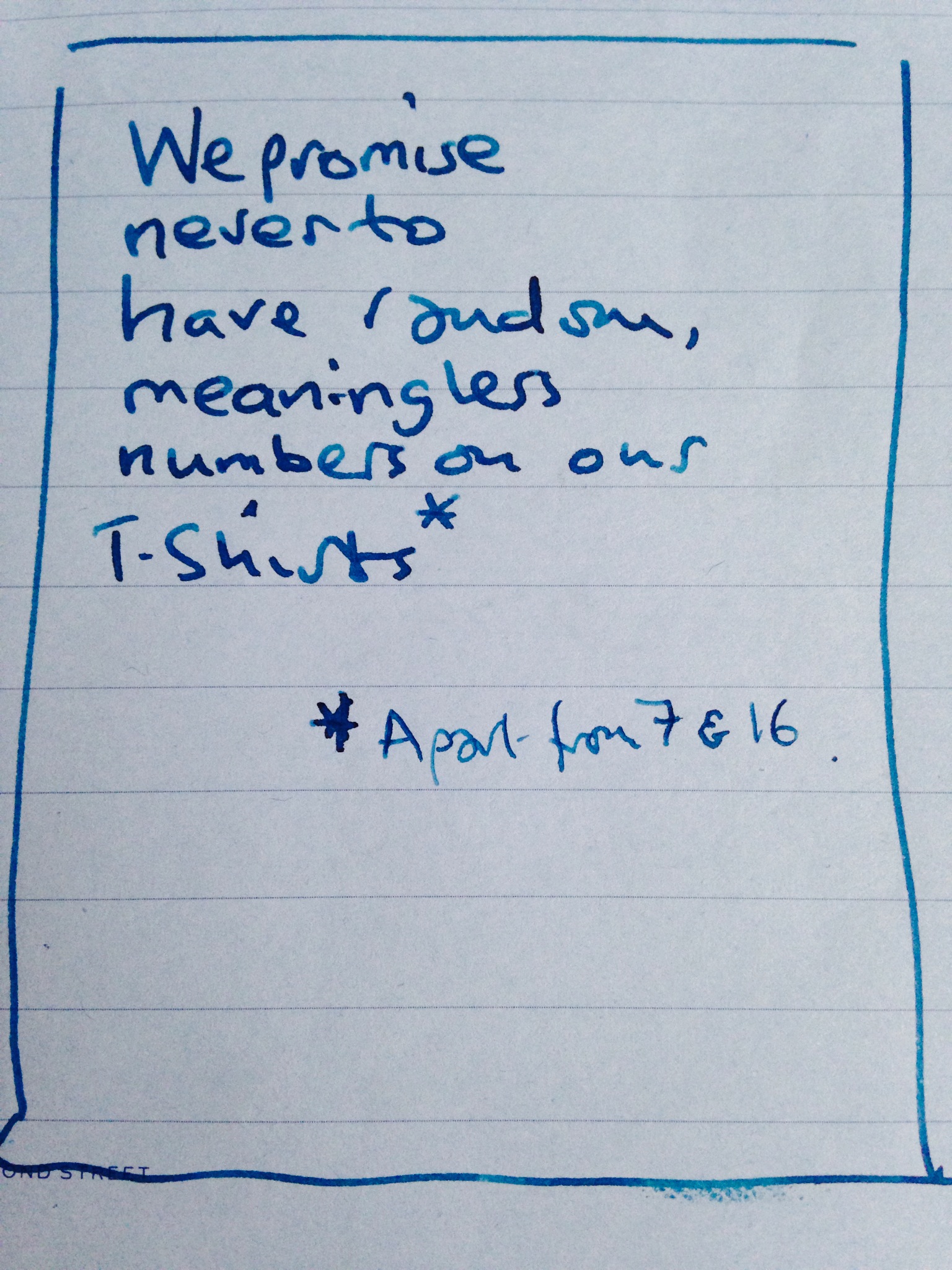
 In between writing Adidas ads, Dave asked me if I wanted to make some T-Shirts with him.
I would be the third partner, aside from Dave, there was a City-boy, business type, (I can’t remember his name only his goal; to own a house with a drive in drive out drive way).
Dave had a very clear vision: To make very ecologically sound, ethically decent, high quality, ie, expensive, T-Shirts aimed at the niche sports like BMX-ing, Surfing and Skateboarding.
Dave had a name; Howies.
He liked it because it sounded genuinely American.
I didn’t like it because it sounded genuinely American. (He’s from the valleys in South Wales?)
Howies it was.
We designed a few T-Shirts over a couple of weekends, this is the first one that got made.
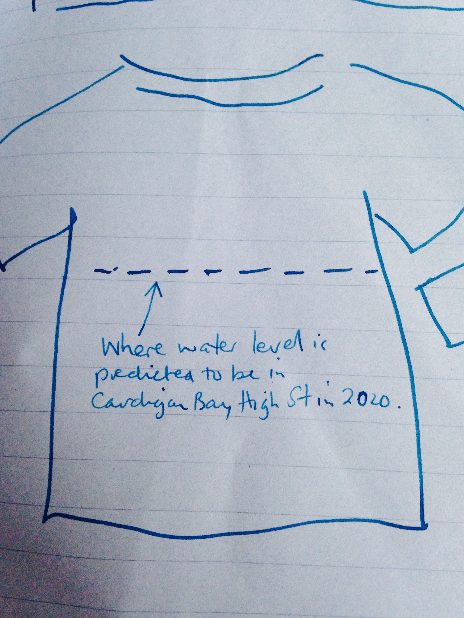
 This one was based on this ad, I could never get Adidas to buy it.
 But within weeks it became apparent that Dave REALLY wanted to do this, whereas I was happy to knock-up the odd T-Shirt, but didn’t want to go to BMX meets, meet various cotton mills, T-Shirt manufacturers, look into the ethical use and disposal of dyes, etc.
So I concentrated on my day job, while Dave did his day job AND built Howies into cool brand admired globally.
Cut to a decade later.
Dave calls up asking for some advice on advertising.
I tell him I’m weeks away from setting up a new agency, ‘Cool, Howies can be your founding client.’
Excellent, finally some payback for that ‘Life*’ T-Shirt they’ve been selling for the last ten years.
He tells me that Timberland have bought into Howies and want to help them expand abroad, which means significantly increasing their marketing budget.
‘But we don’t want to look like we’re selling out’ he added.
There’s an old BBH line they used in their AAR reel that I’ve always loved; ‘Don’t sell, make people want to buy’.
I thought let’s not do ads, let’s produce bits of content about Howies view of the world, like their brochure, but put it in ad spaces.


HOW SHOULD THEY LOOK?
Not like advertising or marketing, we do’t want to look like we’re selling, because we may come over a selling out.
So, goodbye logos, end-lines, cookie-cutter identical layouts, brand colours and bits of graphics in general.
Also, if we make the headline and brand name the same size font it won’t feel like advertising.
Coming across a piece of Howies marketing should be like a break from being bombarded by ads.
TONE: Not full of superheroes, we want normal people doing the right thing, self-effacing, offering small personal insights rather than global ones.
Overall, we need to show positivity and humanity.
1st ROUGHS.
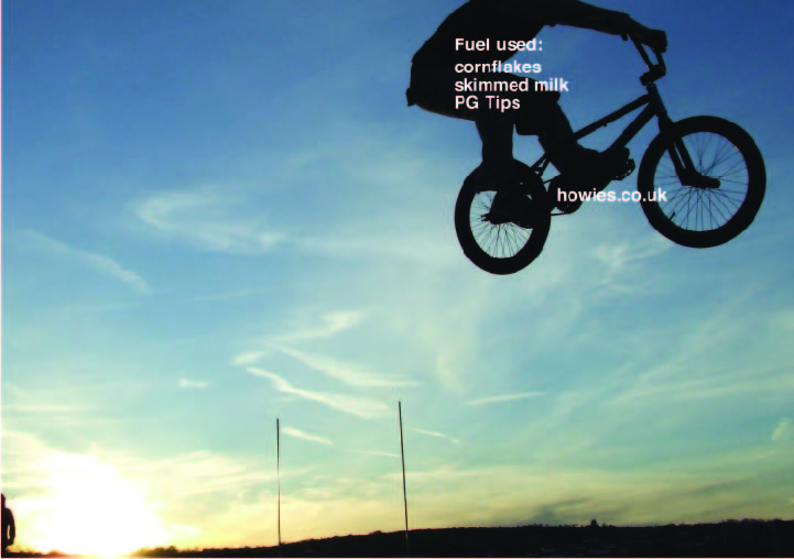
We wanted thoughts and observations on BMXing.
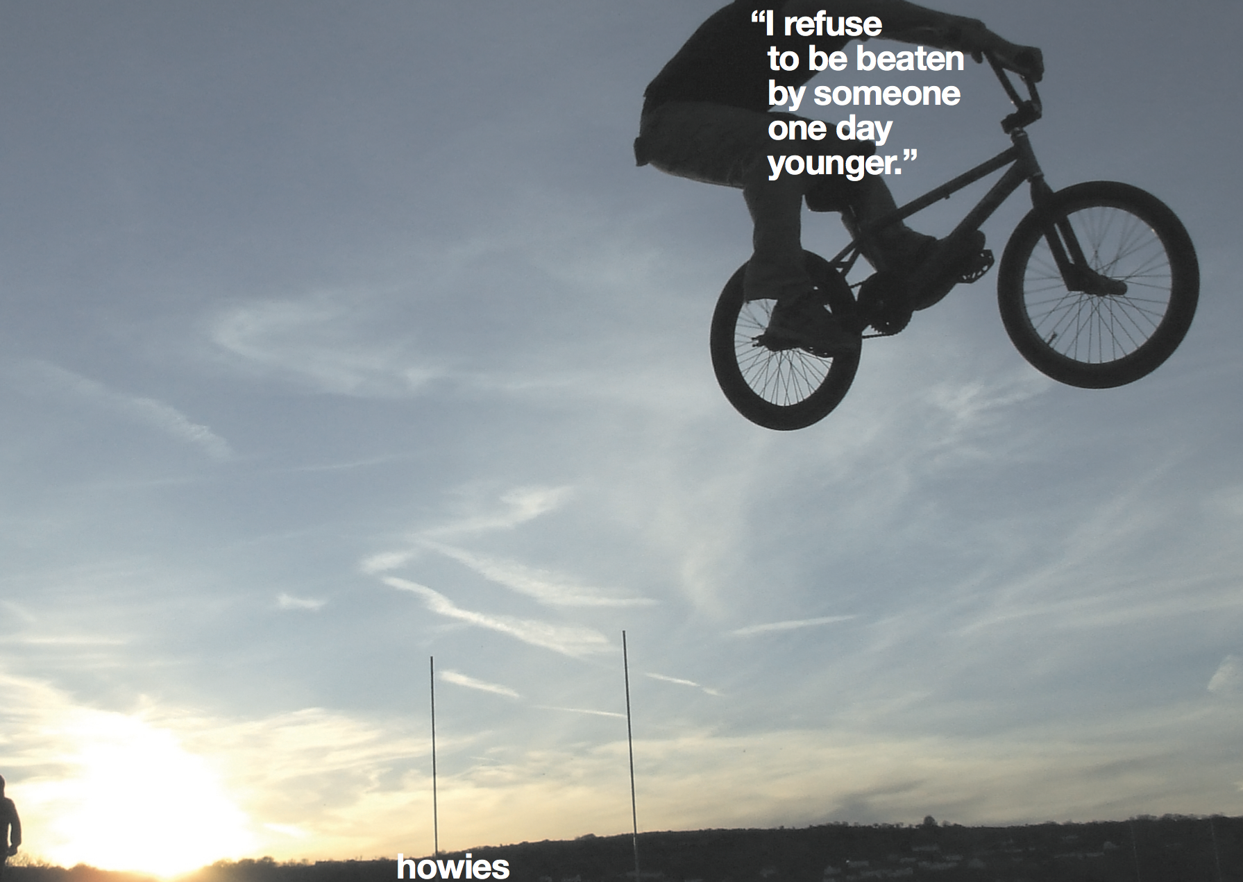


 These got chosen to run as our first ads.


FILMS:
The opportunity came up to make a couple of films for the web and cinema.
Instead of showing amazing surfers or skateboarders, why not show terrible ones?
Maybe the films would be more empathetic if they were based on people trying.
Also, rather than show a group having fun, let’s show an individual ‘in the zone’, enjoying the solitude.
We had a working line that summed it up; ‘Get better, fail more’.
(Photographer Charlie Crane shot them, they were first bits of moving film that ever passed through his camera.)
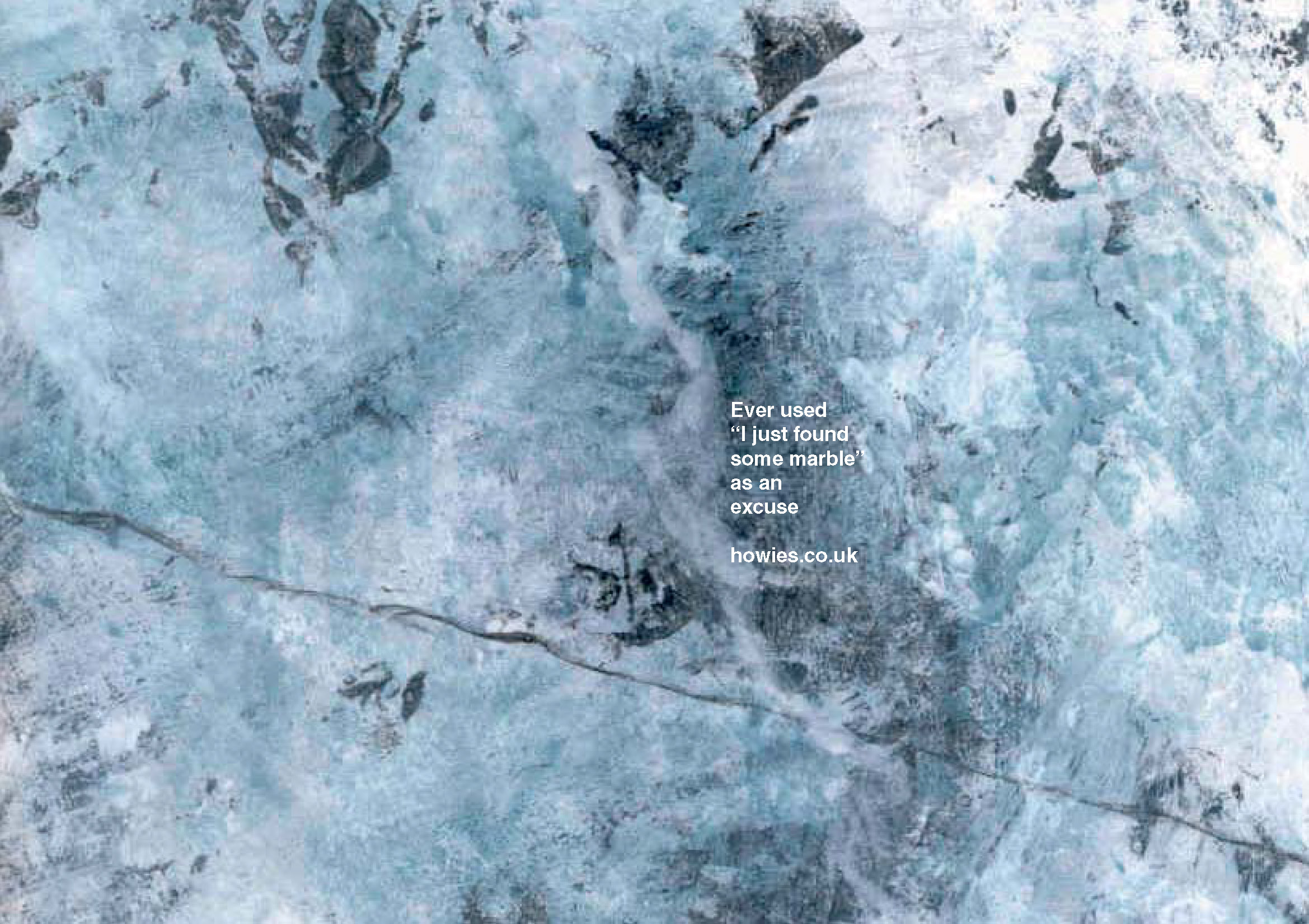
MERINO WOOL:
Dave briefed us to tell people about the amazing properties of Merino wool.
We had a go.
Dave: ‘They’re a bit similar to the first batch, let’s do something completely different, let’s keep moving’.
Luckily, my old writer Tony Barry was bored, having swapped creating for directing he hadn’t yet adjusted to those periods when your diary is all windows.
We worked on the brief and frankly just had a laugh.
A few days in we went through the pile of scribbles we’d amassed, every few bits of paper seemed to feature a drawing of a sheep.


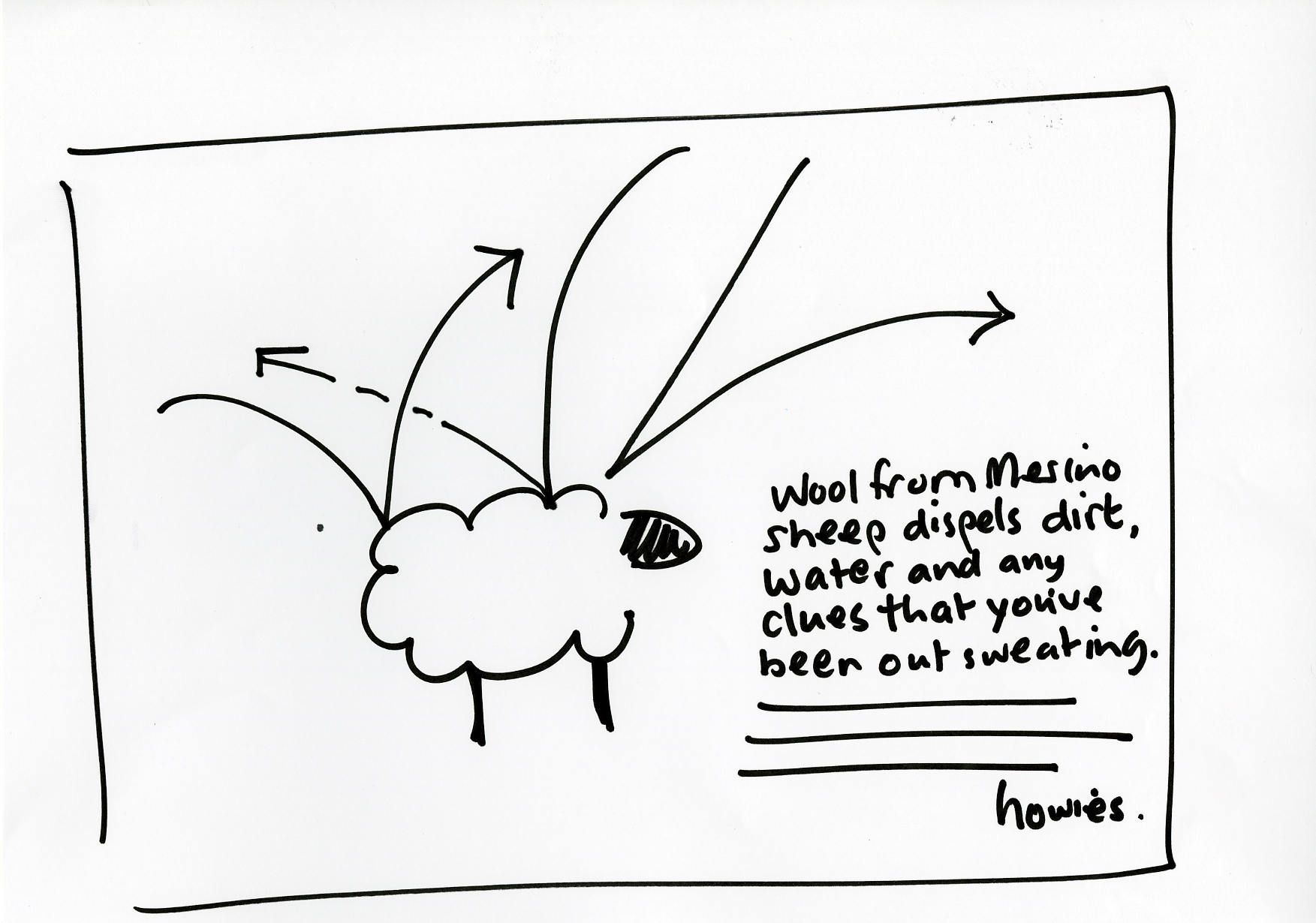

 We rounded up our sheep ads and presented them to Dave and Claire.
 They loved them.
I now had to find a way to make them relate to each other, stand out and look cool.
I chanced upon a fantastic Japanese illustrator called Kin Pro.
Unfortunately she didn’t speak English, so everything went via her friend who had a vocabulary of 23 English words. (I’m not knocking her, my Japanese is sketchy too.)
But trying to explain things like why the sheep was wearing a very brightly coloured hat was tough, it took a lot of patience.
FIRST AD. ILLUSTRATOR’S 1st ROUGH: 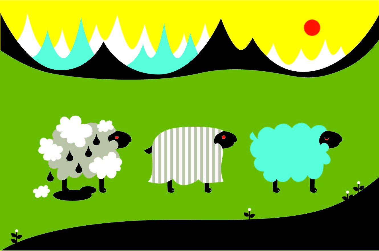 It looked great, but the red eyes were a bit freaky.
Oh, and that black bit at the bottom looks a like an oil slick, and might get in the way of the type.
FIRST AD. ILLUSTRATOR’S 2nd ROUGH: 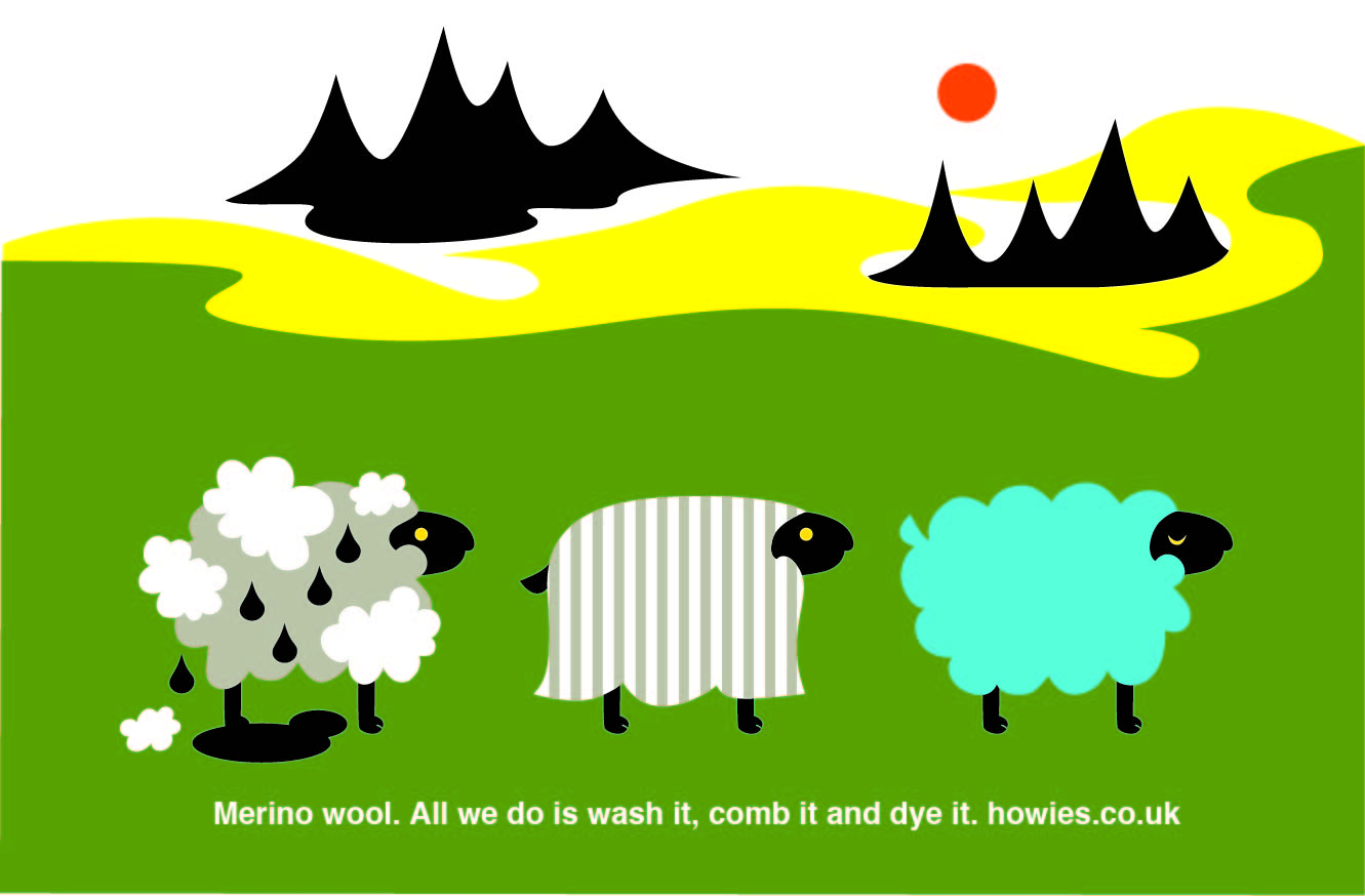
Better. Although I preferred the yellow sky from the first version, it looked like dusk.
Also, the mountains jump out too much now, the yellow helped flatten them out.
FIRST AD. FINAL: 
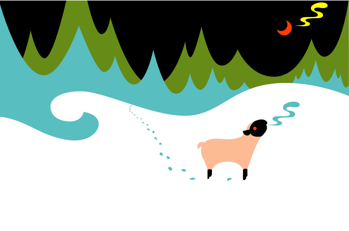
SECOND AD. ILLUSTRATOR’S 1st ROUGH:
The mountains look like they’re melting.
SECOND AD. FINAL:
THIRD AD. ILLUSTRATOR’S 1st ROUGH:
 Nice looking, but doesn’t look cold enough.
THIRD AD. ILLUSTRATOR’S 2nd ROUGH:
Cool, although he doesn’t look like he’s been shaved, he just looks pink, what about those little dots you have in cartoons, like ‘Tom & Jerry’, to suggest having been shaved?
THIRD AD. FINAL:
FOURTH AD. ILLUSTRATOR’S 1st ROUGH:

Looks a bit Christmassy, should it look harsher, and maybe we need a less sensible sounding line?
FOURTH AD. FINAL:

They worked well on the stores too.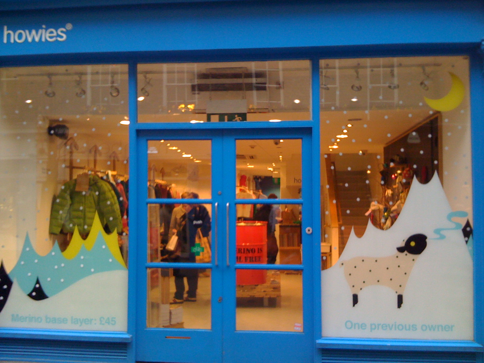
A SLIGHT HICCUP.
My younger brother, BMX legend John Dye, get’s interviewed by a leading BMX magazine and says ‘Soul-less businessmen are moving in on sports like ours trying to make a quick buck selling cheesy T-Shirts, companies like Howies, it’s run by an Adman!’
Awkward.
Dave mentions it in passing, I say ‘Yeaaaah…not ideal.’
It’s never mentioned again, we crack on.
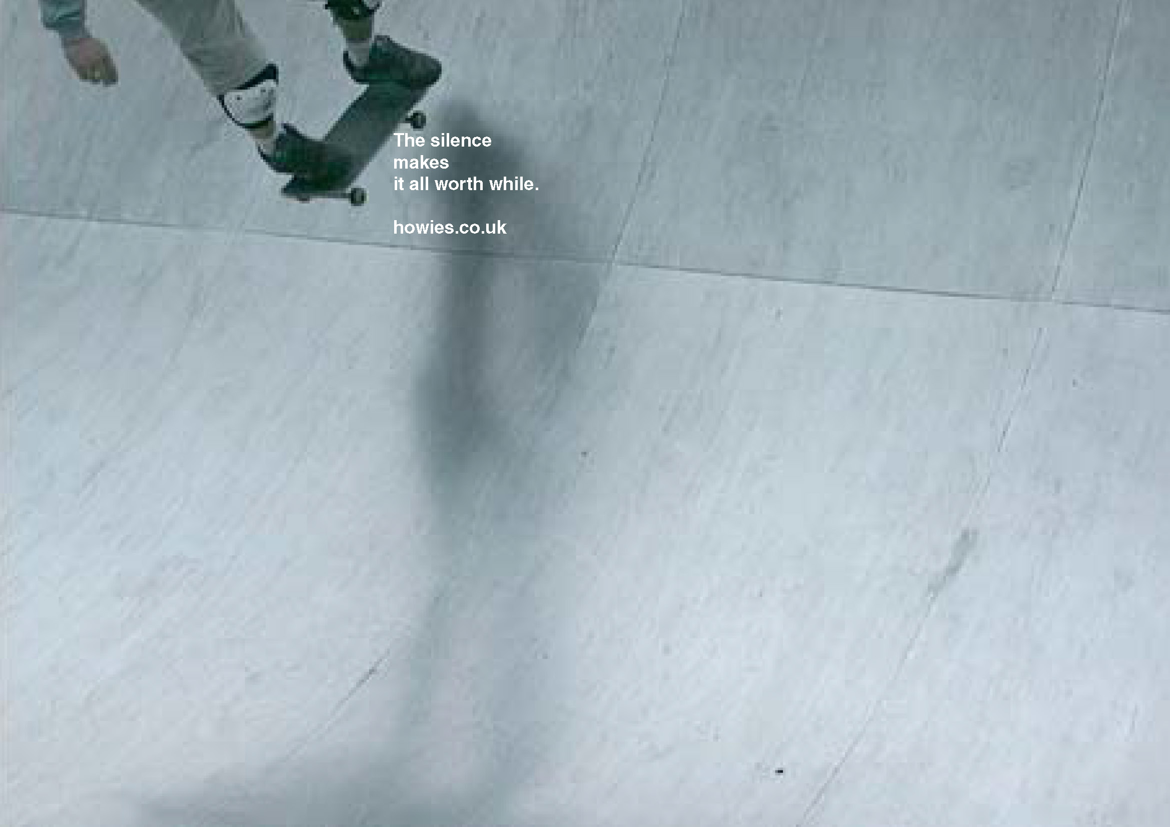
SKATEBOARDING:
David and Ollie, both ex-skateboarders, came back with a large pile of ideas.
I quickly googled ‘ollies’, ‘pipes’ and ‘kickfilps’ and the rest
It turns out they are real words, I now not only understood the ads and liked the fact that non-skateboarders wouldn’t.


RUNNING:


I liked this one but it didn’t run, I worried that people wouldn’t get it, (it’s the theme from ‘Rocky’, the fact that I’ve written this explanation means I still didn’t think people would get it).
T-SHIRTS.
It was an ongoing brief, for T-Shirt ideas. we’d produce a batch of lines like this. Some then had a visual element added, like this.


 The chosen ones were then finished up:


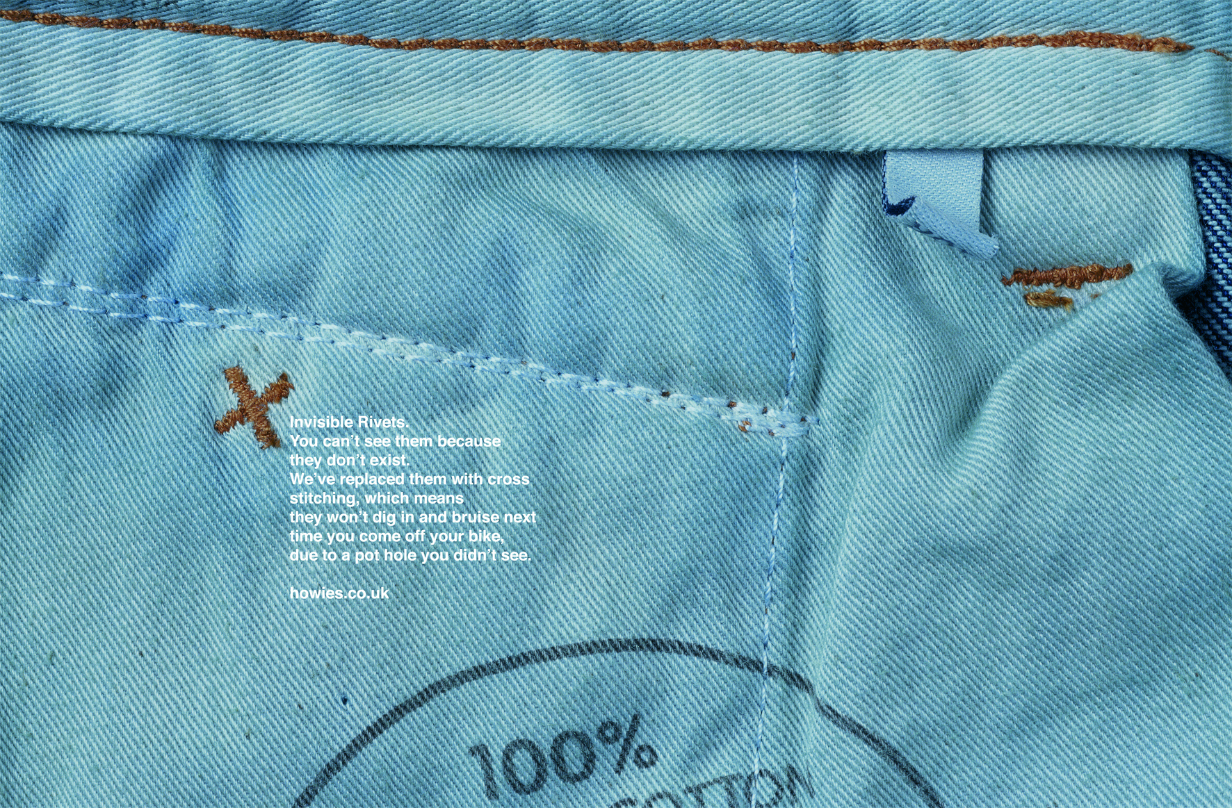
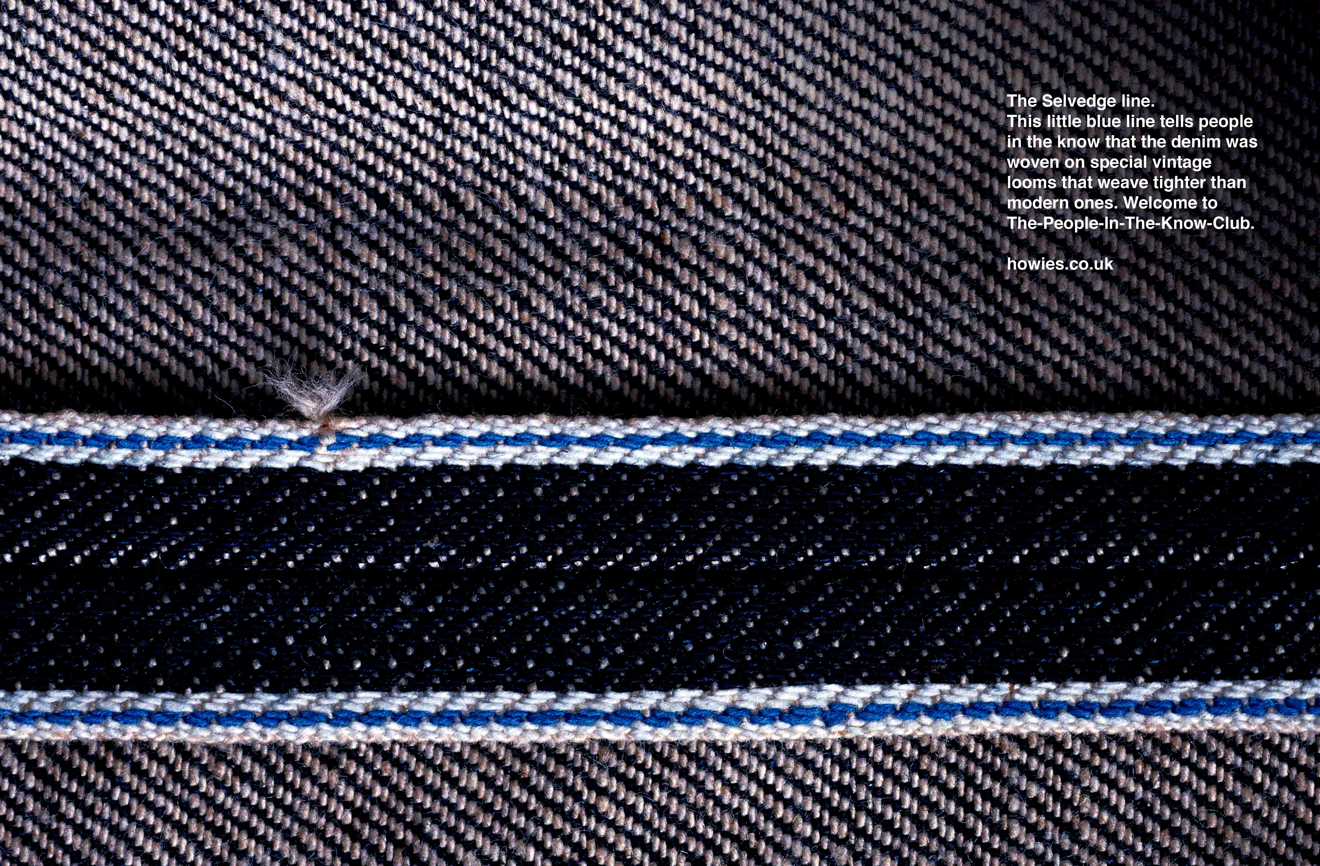
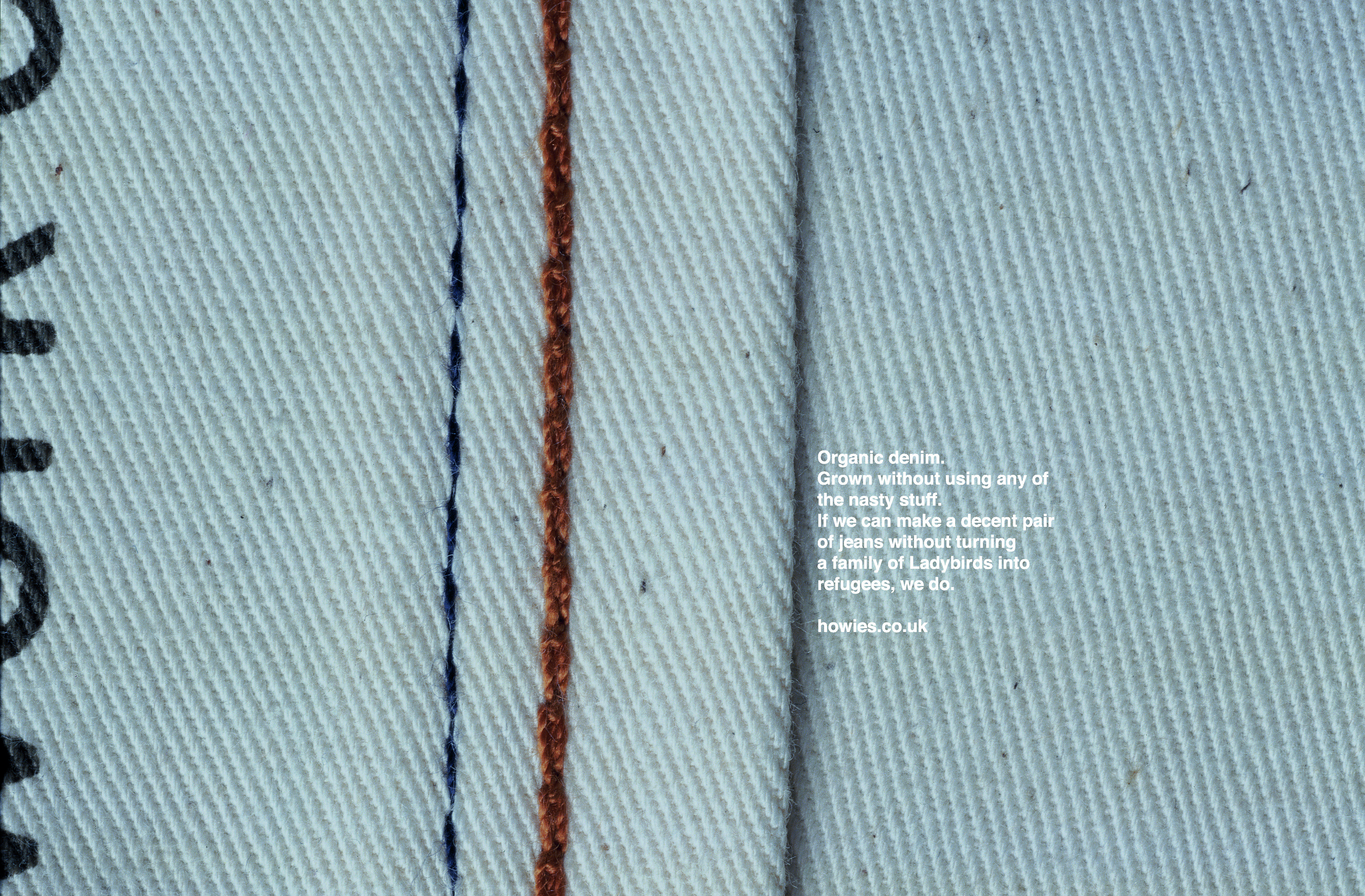
DENIM.
One of the things that made Howies great was the quality of their ingredients.
Take denim, Dave would seek out the top denim guy on the planet, then sweet-talk him into working taking on an account smaller than any he’d previously agreed to.
Howies denim was the highest quality, what other brands would sell for £300 a pair would be £100 from Howies.
We were tasked with an education job, explain why their jeans were so good.
REJECTED:
 It sounded a bit too serious, almost hard sell.
Plus, shouldn’t we show the thing we’re talking about?

A bit too odd.

Initially, we liked the idea of fessing up about the fact that it wasn’t just BMX-ers and Skateboarders who Howies mailed their gear out to, a lot went to The City,Goldman Sachs in particular.
But we came to our senses, a BMX brand may appeal to a City Boy, a City Boy brand won’t appeal to a BMX-er
 Liked it, but a little worthy.
APPROVED:

Unfortunately, Timberland didn’t deliver, their sales started to go through the floor and they got consumed with putting out the big fires, ignoring their small, perfectly formed brand in Blighty*.
A huge shame for Howies, but not to Dave, he’s banked the lessons and has since set up the Do Lectures, (http://www.dolectures.com/), and more recently Hiut Denim, (http://hiutdenim.co.uk/)
*NOTE TO EDITOR: Does Wales count as Blighty?
Thank you for putting this all together Dave. I loved howies growing up and loved their ads/catalogues.
Breathtaking work.
Wow.
Love
Bob
Thanks Bob,
You couldn’t sneak that envelope full of David’s work and Hiut & Howies & Do stuff out of the factory and send it to me could you?
Dx