In the late 80s, I discovered a discount bookshop on Shaftesbury Avenue, amongst the junk, ‘Knitting For The Whole Family’ and ‘Fun With Chives’ were piles American advertising books I’d never heard of; One Show Annuals.
They were dirt cheap – £4.99.
For the cost of one D&AD Annual I could buy six One Shows.
So I bought six One Shows.
The work was a revelation.
Bolder, funnier and less genteel than the stuff in the D&AD.
One agency stood out; Fallon McElligott Rice.
Partly because they seemed to have at least on ad on every page, but mainly because their ads were so damned vibrant.
As if they went direct from the creative floor to the various newspapers and magazines.
Skipping the internal and client meetings that sometimes extract to humour and intelligence (and sometimes the idea).
One or two of you out there, the super-serious ones, may think that sounds indulgent, that it’s not all about doing funny, clever ads, it’s about selling.
Which is obviously true, but unless you grab people, engage them and stick in their mind, they won’t have a clue what you’re selling or who you are.
By the end of this post you’ll like most of these clients.
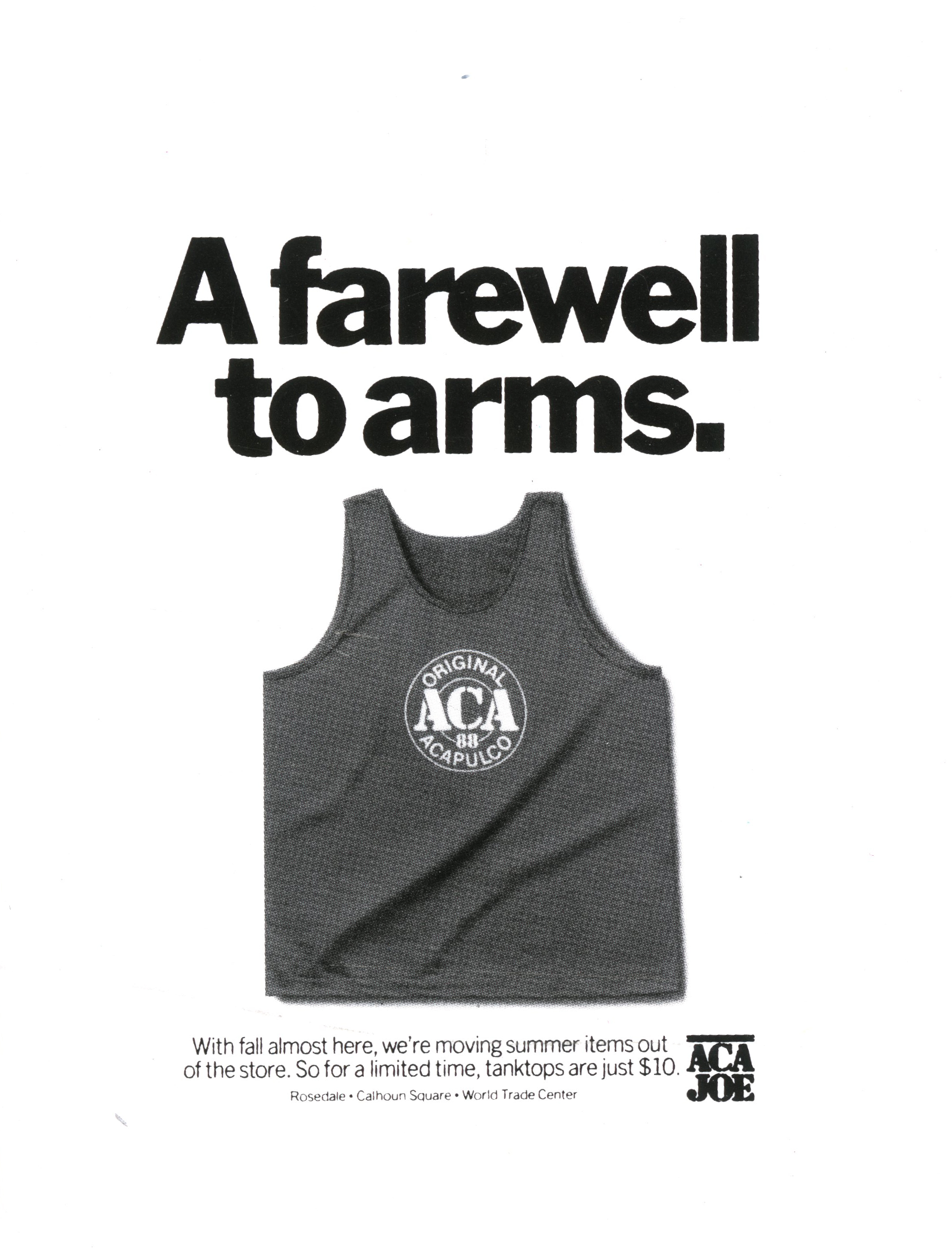
You’ll feel Wall Street Journal is shrewd, Porsche is incredibly desirable and may even be open to buying an ACA Joe T-shirt, whoever the hell ACA Joe are? (In fairness, you may not rush to commission Bob Lambert, but it was 30 years ago, a different time.)
Fallon McElligott talked on behalf of brands in ways that made you like, respect and sometimes even love the companies who paid them.
Art director on disproportionately large amount of those One Show ads was Tom Lichtenheld, so it was a pleasure to catch up with him to pick his brain.
Where did you grow up?
Rockford, Illinois, the home of Cheap Trick and one of the best Japanese gardens in the country. A good place to be from.
Were you a creative kid?
As a kid, all I wanted to do was draw and make up stories. I was a terrible student, but my parents encouraged my creativity. One of my best childhood memories was when my mom enrolled me in a summer school class called “Creative Dramatics,” which involved making up stories and acting them out; what we would now call improv. In retrospect, it’s remarkable that such a thing was even offered in a midwestern small town in the 1950s.
What was the first ad you remember liking?
I’m embarrassed to admit that this ad for the Buick Riviera spoke to me when I was ten years old.
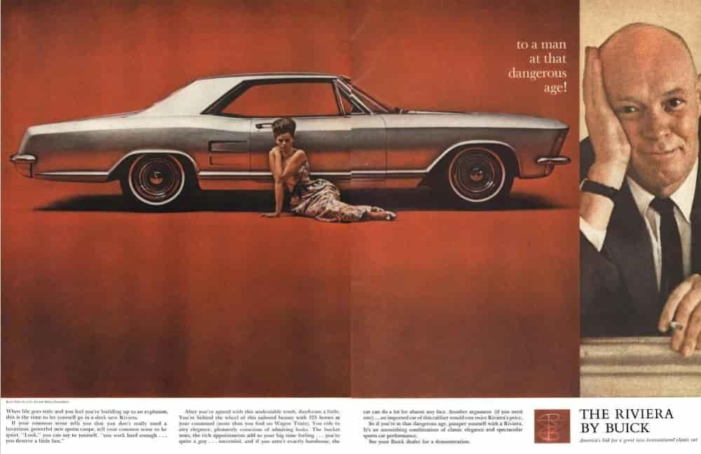
It’s misogynistic and pandering but I was probably attracted to the car as much as anything. (In retrospect, it’s a beautiful car, and the spread design is strong. It also might be one of the first car ads to focus on the mindset of the buyer, though it’s a shame about that exclamation mark.)
Did you go to college?
I graduated with a degree in fine art from the University of Wisconsin, Madison. This was in the 1970s, when getting naked and rolling around on a canvas full of paint qualified as fine art. Afterwards, we’d sit around and endlessly discuss the deeper meaning while smoking French cigarettes.
The best advice I got from a painting professor was “You’re not a very good painter, so use a lot of red.”
But I also studied typography and letterpress printing with a world-class bookmaker (Walter Hamady) which fed my love of design, type and – as Walter said – “love of the fiddly bits.”
How did you get into advertising?
I always knew I wouldn’t make it as a fine artist (see “use a lot of red” advice, above) and I loved design anyway, so I took an early path in that direction.
I worked as a sign painter in high school, which I loved because I was earning money with a paint brush in my hand and then, penniless after two years at the local community college (see “terrible student” above), I got a job at that college, designing brochures and posters. Like the sign painting job, I was in heaven because I was earning money doing something I loved.
After a few years of that, I worked my way through the rest of college by doing mechanicals (dental supply catalogues, ads for prison toilets, etc.) at a small ad agency in Madison. When one of the art directors quit unexpectedly, someone pointed at me and said “Him! he can draw! Let’s make him an art director!” So, I was.
I did that for a few years then my wife and I moved to Minneapolis where I paid my dues at lesser agencies before weaselling my way into Fallon McElligott Rice.
Your LinkedIn job history starts at Fallon McElligott in 1989, the best one on the planet at its best moment.
Surely you must’ve worked at some terrible agencies before that?
My first job in Minneapolis was at an agency that specialized in agricultural products. The worst part of the job wasn’t the accounts (who wouldn’t love doing ads for cow ear tags?) but the owner, an alcoholic who would come back from lunch and berate everyone in his path. This motivated me to find a better job, so I built up my book and hit the streets in a city then full of small, creative shops.
I got a job at a decent little agency called DBK&O, where the clients and people were good enough to help me hone my chops.
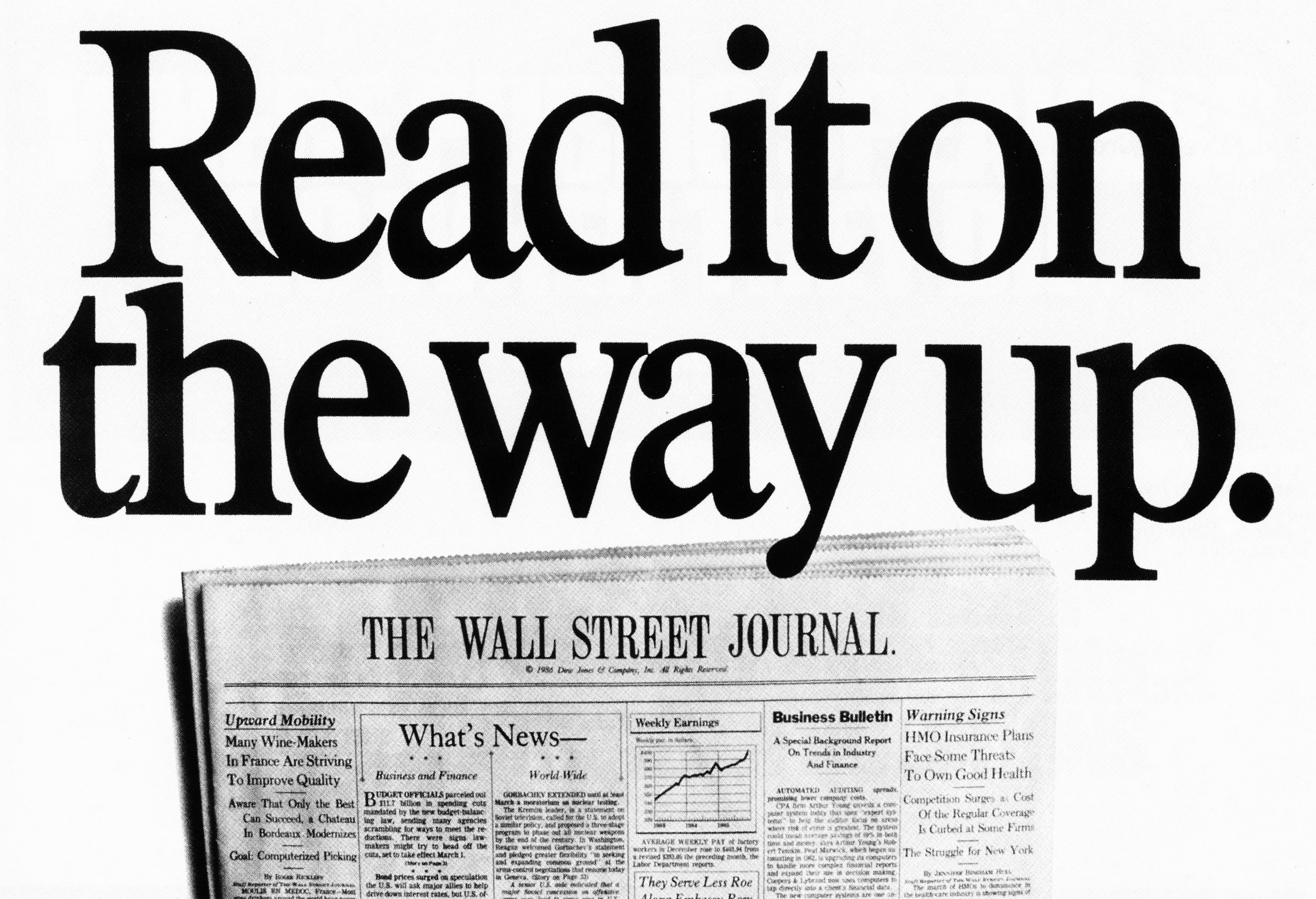
I met an art director from Fallon, McElligott, Rice and they hired me to work nights and weekends on a new business pitch for The Wall Street Journal.
I figured it was a trial run so, despite being frozen with fear in the presence of geniuses like Tom McElligott, Bob Barrie, and Dean Hanson, I worked my tail off and was hired when they got the account.


What was day one like? Nervous? Scared?
Both. Tom McElligott hired me on the recommendation of an art director he respected, John Morrison, but both were introverts, so they just put me in an office and left. Finally, an account guy, Steve Sjoblad, gave me a tour of the place and introduced me to everyone. I’ve never been so indebted to an account person.


Did you have to start out on small ads?
There was no such thing as a small ad at Fallon because every ad was a potential One Show winner. The first ad I did was for a medical group, with an old anatomical engraving of a hand accompanied by the headline “We know the back or your hand like the back of our hand.” The writer was Sam Avery.


What was the ad that got you noticed by Tom?
When you showed Tom a completed piece that he loved, he would grab you and parade it around the office, celebrating your work like a proud parent. This procession was made more ceremonial by the floor plan of the office – a large octagon – so Tom and his entourage would end where they began. The first time it happened to me was a poster for a small business consultant. It was a collection of photos of oddly shaped buildings (coffee shop in the shape of a coffee pot, Randy’s Donuts, etc.), with the headline; “We can help your business no matter what shape it’s in.” The writer was Jarl Olsen.
 Were you taken under the wing of a senior art director?
Fallon was a collegial, collaborative place so we all mentored each other. There was an unwritten rule that you could stop by anyone’s office at any time, look at what they were working on, and suggest improvements. So, my mentors were all the other creative people there, though I have to say that Bob Barrie was especially helpful and inspiring to me.
What was Tom like to work for?
Tom was a quiet introvert with the idealistic passion of an artist.
He would either love the work or hate it, and he wasn’t the kind of creative director who would massage the work for you; that was your job.
When he didn’t like something, he’d rub the back of his neck and grimace, so you knew it was over. To avoid offending you, he might ask “Who are you working with?” as if it wasn’t your shortcoming but that of your partner.
His standards were high, and the output of that agency shows it.
How open were the WFLD briefs?
They look like a great client – just get attention for our programme and make it entertaining. (A bit like LWT over here.)
My favourite is the young Clint Eastward ad.


Other than “make an award-winning ad,” we didn’t get briefs. We got the name of the program and a deadline, which was usually in two days. By the way, Jarl Olsen wrote the Clint Eastwood ad.
Fleetham’s doesn’t sound like the kind of brief creative teams fight over – small, local ads for a furniture shop.
The results prove that any brief can be turned into great work. (And awards.)
There was no fighting over the account because it was, like a few Fallon “accounts,” not an official account. Rather, it was the result of the copywriter, Rod Kilpatrick, walking into a furniture store and offering to do some free ads in exchange for a couch and the cost of running the ads in the local free weekly entertainment paper. But I did get a nice lamp out of the deal.


I presume Wieden’s were Fallon’s biggest competition?
The difference between the two agencies is perfectly encapsulated in this ad. (Got that out of our system.)
Wieden & Kennedy’s goals were like ours but, in retrospect, they were thinking bigger than us.
Our creative was headline-and copy-driven, whereas Wieden’s was equal parts copy, design, and mystique, so they were quicker to realize the power of emotional branding. I think this is partly because they had more consumer accounts, like Nike, and partly because, as west coasters, they were more culturally savvy than we insulated Midwesterners.
The “out of our system” ad was me trying to fight back against the trend of grunge typography or, as I called it “beer truck type” meaning you’d have your type set then put it in the street until a beer truck ran over it.
The tone of the Murray’s work seems gentler than a lot of the Fallon’s campaigns at the time, and the look is more elegant – how did that come about?


 That’s astute of you to notice. The tone came directly from the product; an old-school steak house with maroon velvet curtains, candles on the tables, waitresses with doily hats, and a pianist tickling the ivories.
We recognized this as an opportunity to do ads that were Fallon-smart but with a little more class. I enjoyed getting away from our house font, Futura Extra Bold, and crafting some classical type. The superb writing was done by Greg Beaupre and Rod Kilpatrick. The typography was finessed by Bob Blewett, who hand-kerned every letter of every headline that came out of Fallon for many years. Bob was not only a superb typographer but a true intellectual; the kind of guy who would read Kierkegaard for fun.
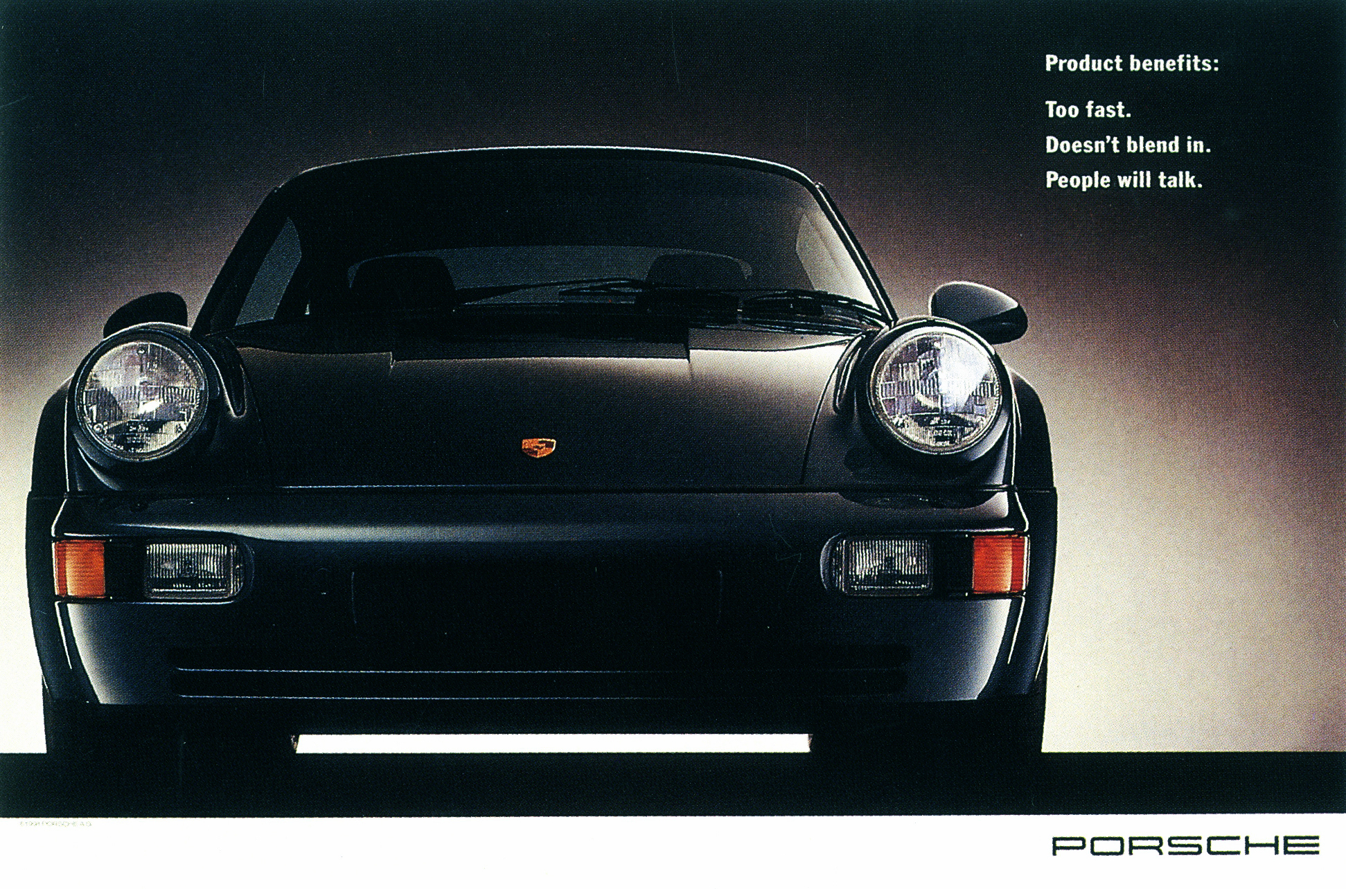
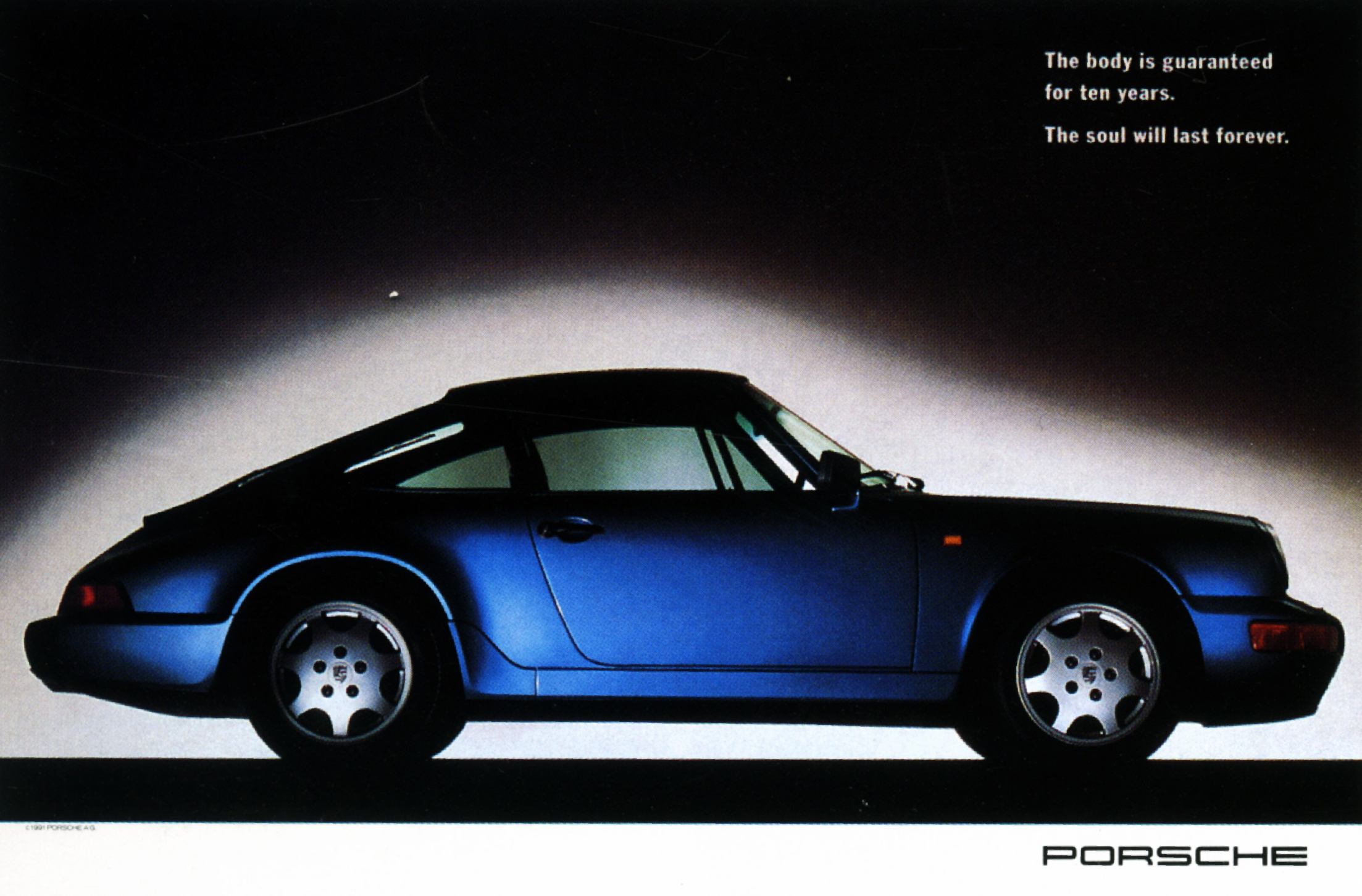
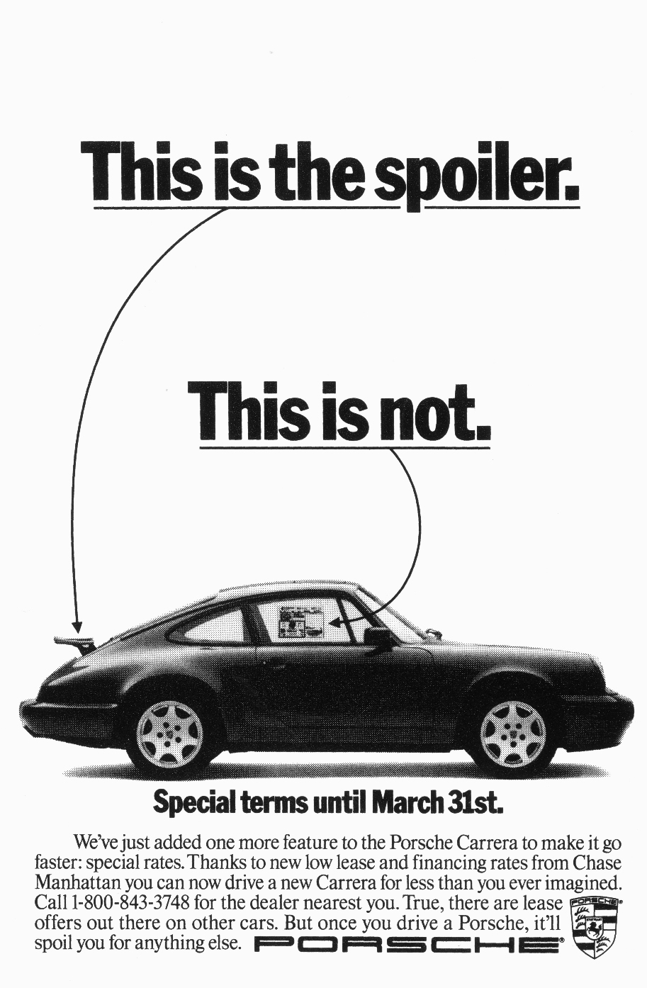
I don’t think the Fallon campaign been bettered by Porsche before or since. Anywhere.
The majority of the ads are about the thrill of the drive, but you also did a great campaign that’s the opposite – it’s still, calm, presenting the car is like a work of art. Why the change?
The change was practical and strategic. Practically speaking, this was a one-off campaign without much of a budget so, for the most part, we used existing photography from Porsche’s British and German agencies.
Strategically, the ads were for an international audience, so we needed to avoid the cumbersomeness of long copy and instead, make simple, powerful ads that tapped into the equity and emotions of the brand.
The copywriter, Bruce Bildsten, and I had worked together for quite a while at that point, and I like to think these ads were also a result of our shared aesthetic and natural chemistry.


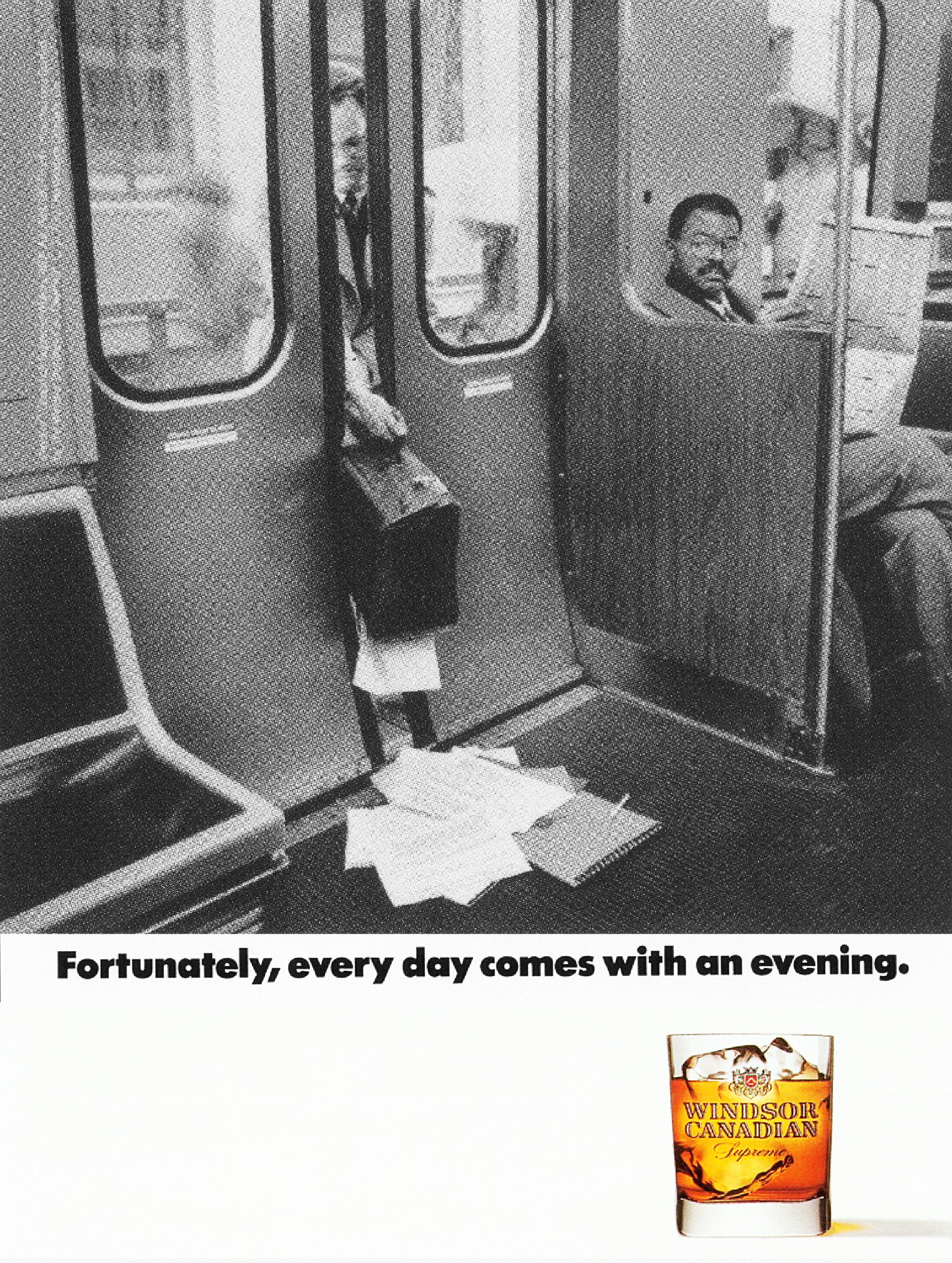
I’ve refer to the Windsor Canadian campaign on a regular basis – it just makes me like them, their vibe, the cut of their jib.
But essentially it’s just a bunch of stock shots with the same line, any whisky brand could run it; what kind of sorcery is going on there?
The line “Fortunately, every day comes with an evening,” came from listening to the client talk about how their consumer saw their product as a reward for a hard day’s work.
The campaign was inspired by a postcard I had on my wall, with a photo of a guy pushing an endless line of shopping carts. It represented the Sisyphean struggle of an ordinary workday, so we gathered a few more similar “tough day at the office” pictures and the copywriter, John Stingley, wrote the line. From there, it was an easy sell and a successful campaign.


Bruce Bildsten, George Gier, John Stingley, Rod Kilpatrick, Jamie Barrett, Sam Avery, Mike Lescarbeau, I could go on.
Why so many writers?
Gosh, it never occurred to me before that no one liked me enough to be my full-time creative partner!
I’d rather think this was normal at Fallon; where there were no set pairings, so I had the good fortune to collaborate up with all these great writers.


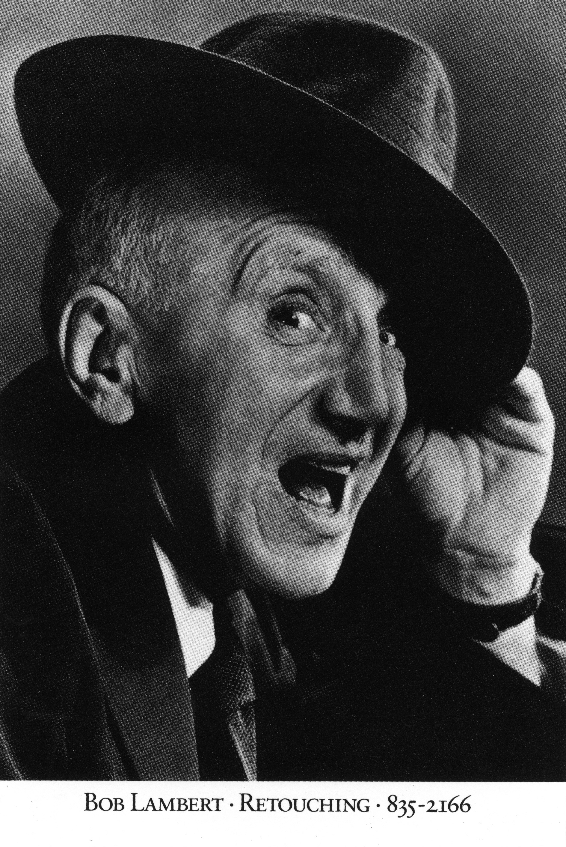
In 1989, the Bob Lambert campaign won everything, everywhere.
Every creative I knew loved them, because 95% of our goal at the time was – make people look at your ad.
If that’s your goal you try to create images people haven’t seen before.
But now, like another of my favourite ads of the time, the Timberland ‘We Went Back For Their Shoes’, but 30 years later they feel different, you’d end up in jail if you ran them today.
How did you get Bob to buy them?

 I just went back and re-read the “…back for their shoes” ad and, wow, what a bold bit of writing. It’s either the most offensive piece of marketing exploitation ever written or the most searing list of injustices against Native Americans ever articulated. I’ll let the reader look it up and decide.
The Bob Lambert ads were a fun one-off done to amuse ourselves and win awards. Bob was more than happy with them because they got his work into award books, where it was seen by his customers (art directors) around the world. A pretty sneaky media buy. (Writer – Mike Lescarbeau.)
I kept noticing one name on the credits you worked with on a regular basis; before; the illustrator ‘Tom Lichtenheld’.
You kept recommissioning yourself?

Sometimes, the only illustrator we could afford was me.
This is one of the many things I learned from Bob Barrie; if you can draw, use it to your advantage.

 This may sound daft, but most art directors today struggle to draw stick men, did being able to draw help you as an art director?
Not daft at all. Yes, being able to draw helped me immensely and, back then, it was more necessary than it is today. It’s great that creativity is bigger than just being able to draw, and it’s great that art directors can now cobble together images digitally, but toward the end of my advertising career, I noticed an interesting downside to the reliance on the use of existing images to present new ideas. During a presentation, a client complained that my sketches weren’t as tight as comps made with photos. I pointed out that they were paying us for originality, creating something that has never been seen before. But an idea can’t be very original if I can find existing images to represent it. What they should be sceptical about is ideas that can visualized by recycled images.
I also found a treasure trove of your drawings (in a variety of styles) of colleagues, were they ever used or were you just killing time?


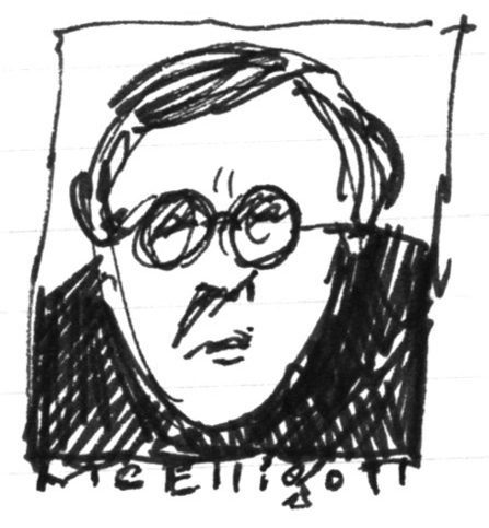


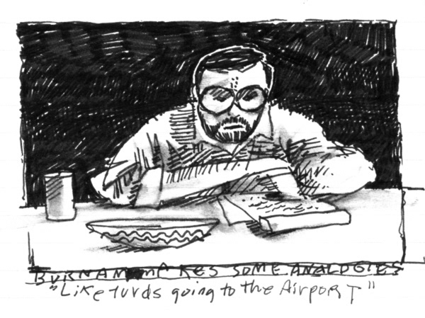

I’m an irrepressible doodler and meetings are a great opportunity for mindless drawing. One of my favorites is a drawing of me, done by Bob Barrie, while I was drawing other people entitled “Tom alienating all his friends.  (I recently collected a bunch of my doodles, which you can see here: https://tlichtenheld.myportfolio.com).
So how did you make the leap from advertising to illustration?
I created my first children’s book, “Everything I Know About Pirates,” while still at Fallon.
The agency was extremely supportive of my new venture. They threw a book launch party and bought copies for everyone at the agency.
After that, I kept doing books on the side until finally mustering up the guts to leave advertising and make it a full-time job.


Looks like you made the right decision?
Leaving the security of a steady paycheck was terrifying but, with some luck and the support of my wife, it’s worked out well.
Making children’s books is a lot like advertising because it uses words and pictures to communicate ideas. The difference is that, with advertising, you’re communicating at the level of a 3rd grader whereas with children’s books, you actually are communicating with 3rd graders.
I was fortunate to transition out of advertising when I did. The media was changing and, with a strong background in print, my book was like having a million dollars in an obsolete currency.
The work in this thread looks different from the work around us today, not the design, haircuts or fashions, but the vibe, the spirit – the work feels mischievous and smart, like it was fun to do.
Was it and is it today?
It’s been over ten years since I worked in the business so I can’t tell you if advertising is still “the most fun you can have with your clothes on” (Jerry Della Femina), but I know that my niece, a copywriter, seems to be having a ball.
Name an ad you’ve liked recently (Not a trick question.)
The Oatly campaign.
It’s a lot like the work we did at Fallon; copy-driven, self-deprecating and more full of attitude than product benefits.

What advice would you give young Tommy Lichtenheld, starting out on a creative career today?
- Remember that creativity has real, marketable value. Don’t listen to anyone who tells you otherwise.
- Any job that lets you use your creativity to pay the rent and buy groceries is a win. It may not be your ideal job, but it won’t be your last job, so work hard and set your sights on the next step up.
- Don’t waste time looking at crappy work.
- Study great advertising the way painting students create Master Studies; not to become a mimic but to understand the decisions that led to the work.
- Learn to write. Better writers are better speakers, better speakers are better presenters, and better presenters have a better chance of becoming the boss.
- Present your own work. No one else will represent it as well as you and clients will be less likely to reject it for invalid reasons.
- If you’re not confident in presentations, take an improv class.
- Develop relationships with clients.
- Don’t take criticism of your work personally but do ask that criticism be thoughtful and well-articulated so you can improve the work.
- Be nice to everyone.
Thanks Tom.
Yet more Tom…
BMW.
(Copywriter; Rob McPherson)
(Copywriter; Dave Pullar)


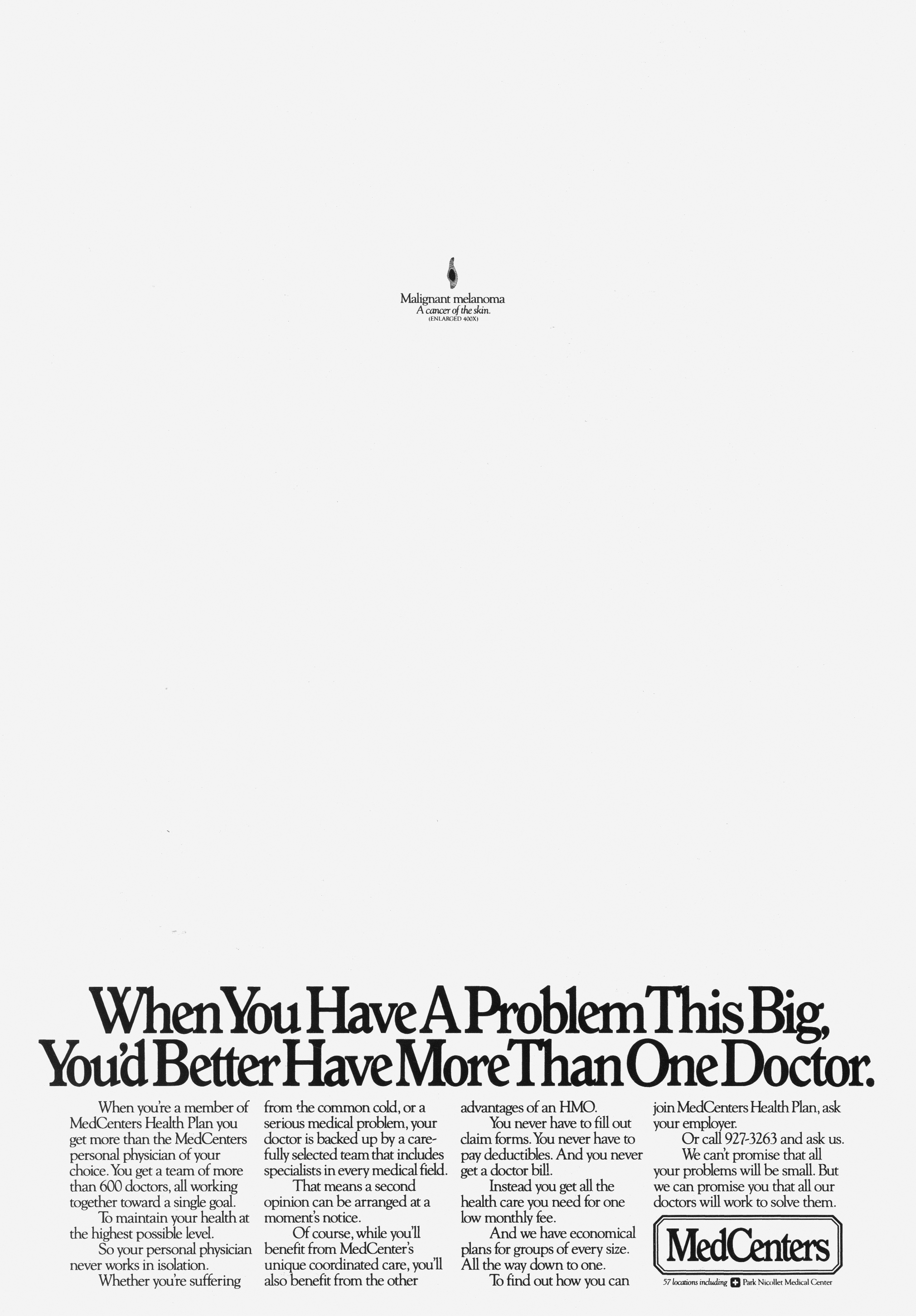
MedCentres (writer – Jamie Barrett).


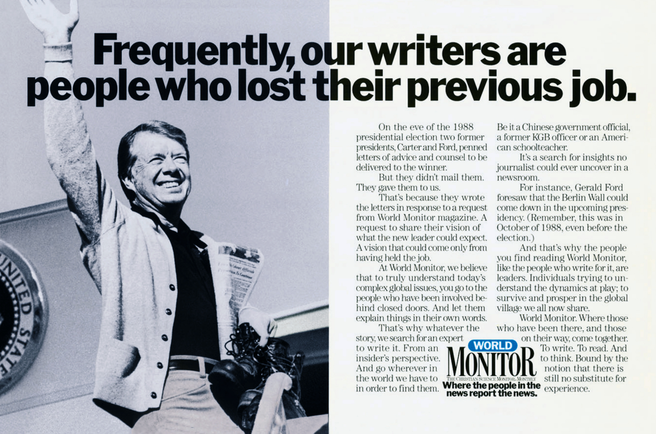
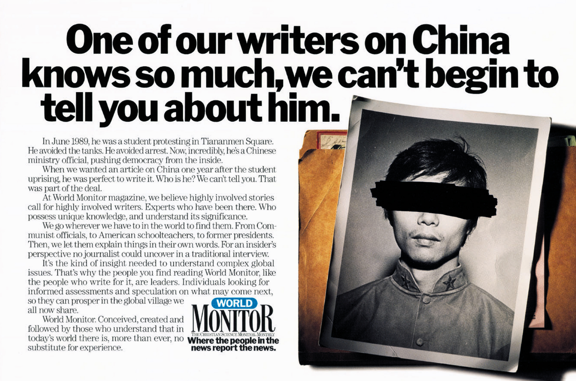
Monitor Magazine (writer – John Stingley).

Bringers (writer – Luke Sullivan).


ACA Joe (Jamie Barrett).


Azur (writer – Bruce Bildsten).


Scotts (writer – Bruce Bildsten).


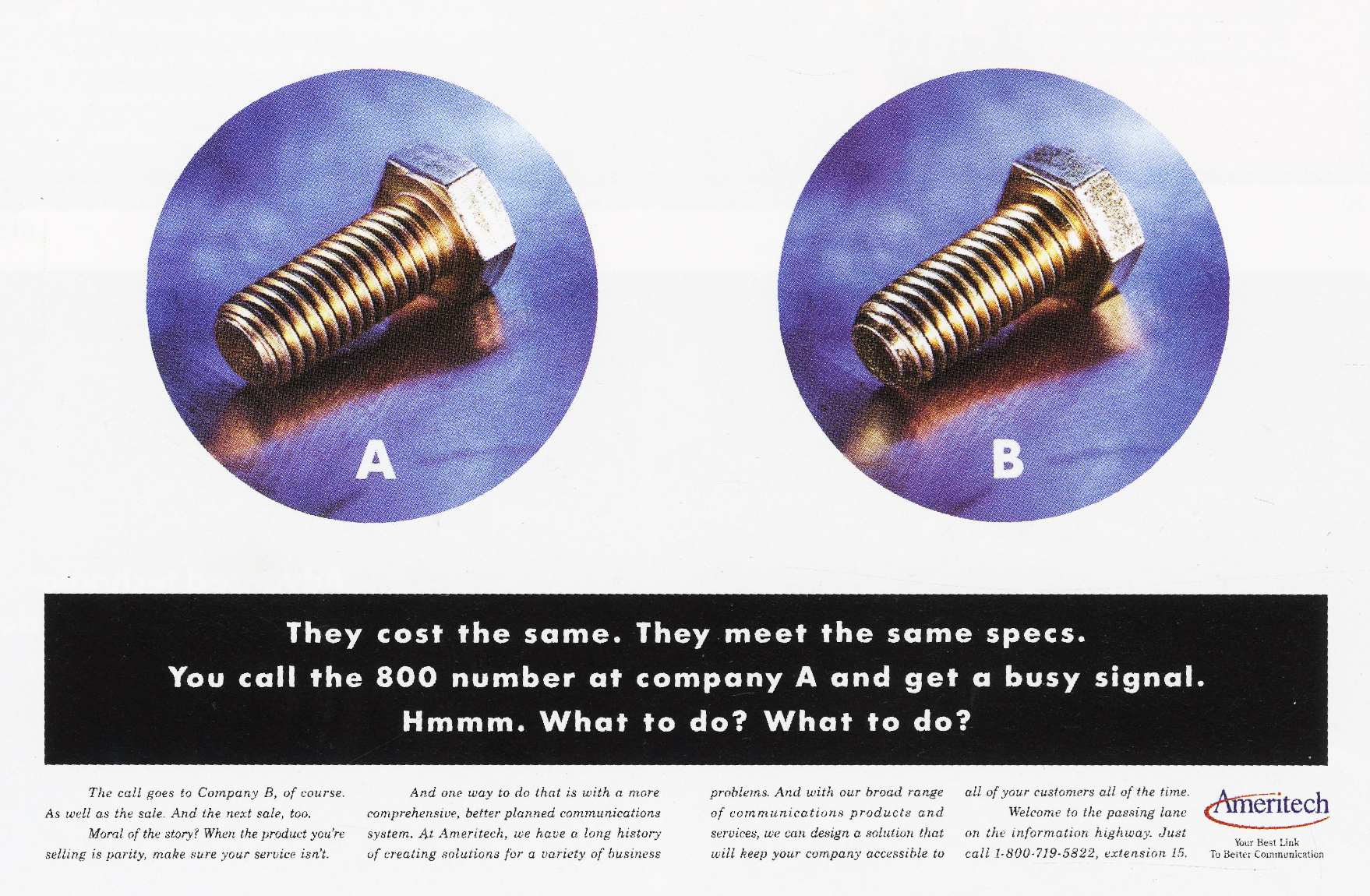
Ameritech (writer – Luke Sullivan).


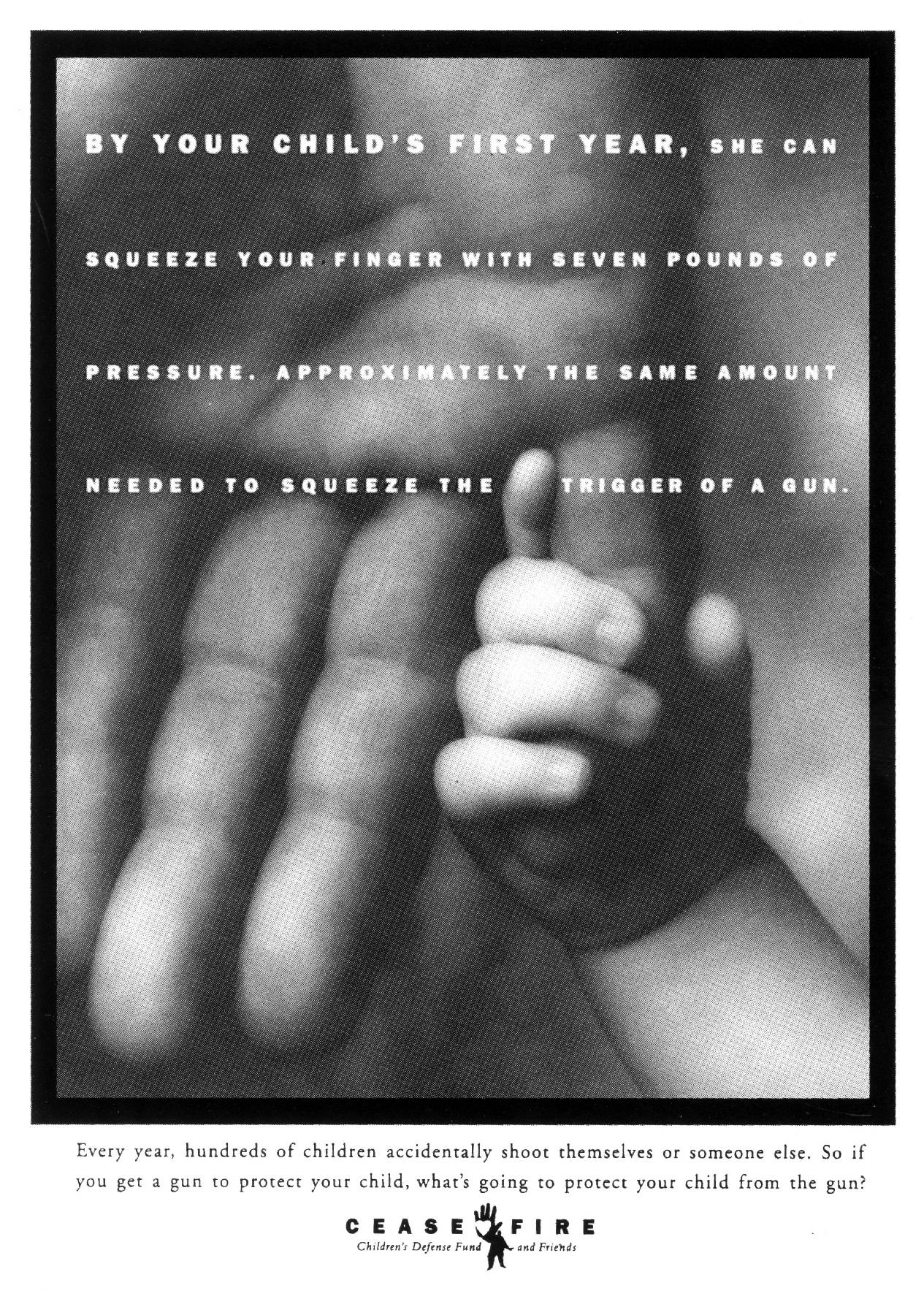
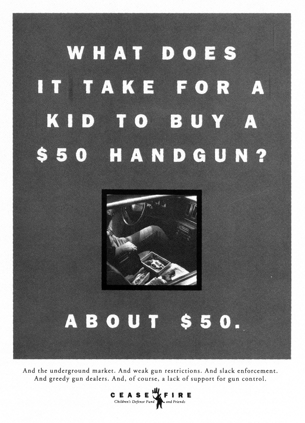
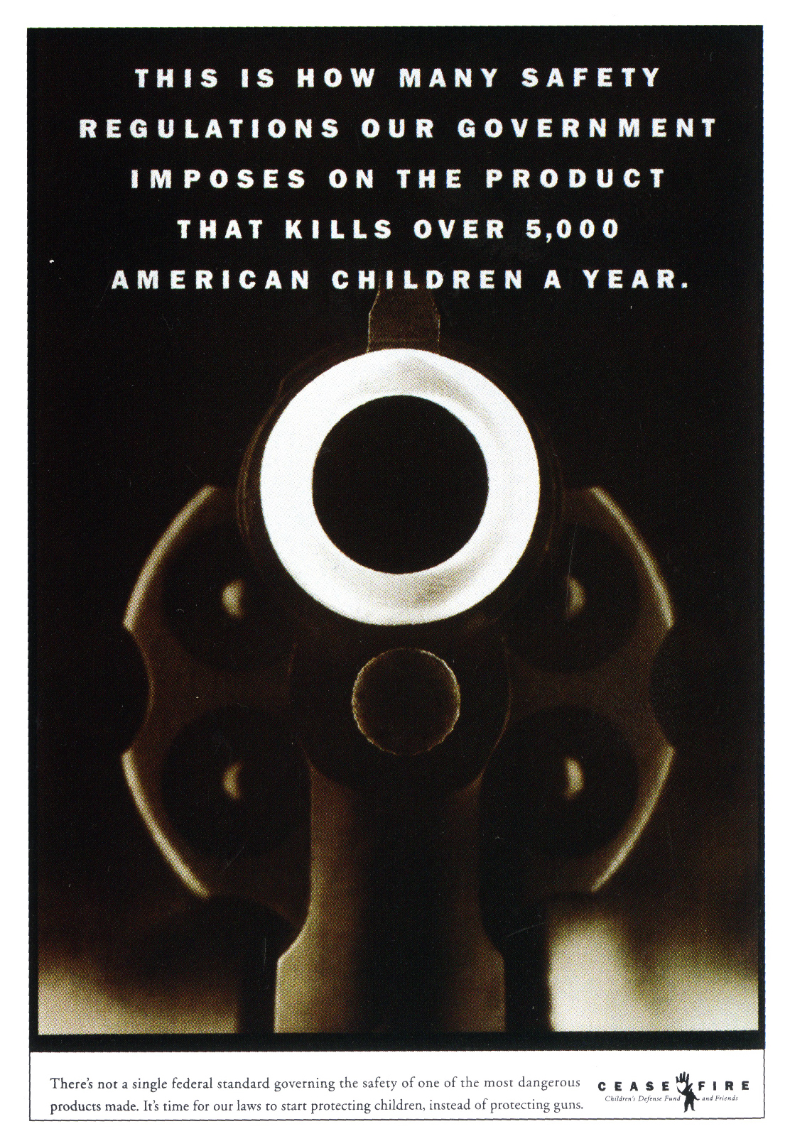
Cease Fire (writer – Sally Hogshead).


 Atrium (writer Bruce Bildsten).


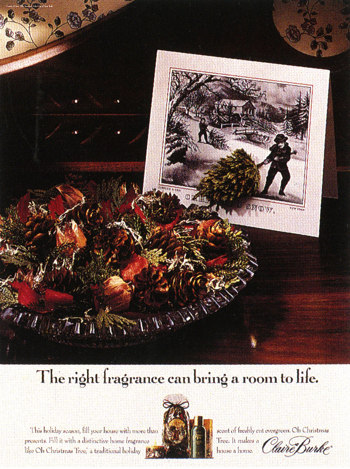
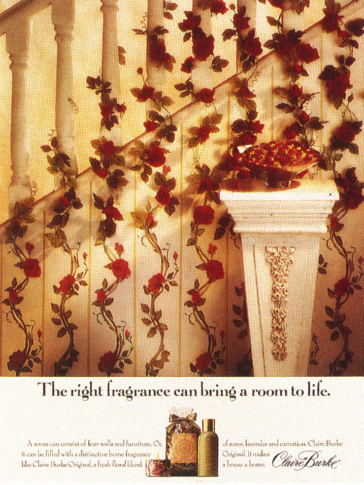
Claire Burke (writer – Jamie Barrett).

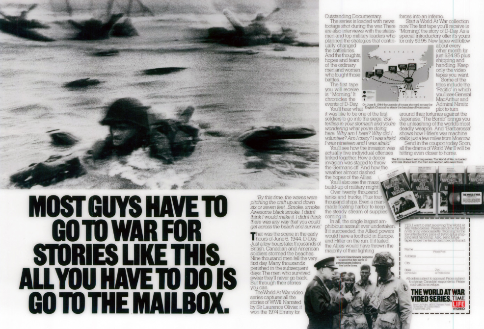
Time/Life (writer – George Gier).


The best damn thing I’ve read all year so far.
‘Go ahead mom, make my lunch.’ Genius
Fantastic read.
Thanks Dave and ‘hi’ Tom, miss you.
Thank you, Dave, for another great profile of an unsung hero. Every minute of working with Tom was time well spent. His level of craft was amazing. He only touches briefly on his TV, but he was damn good at it. As an ECD I kept dragging him back to do a BMW spot or two.
Wow. This was so good.
Absolutely inspiring advertising. Thanks for this profile.
My pleasure Jim.
(Thanks for your book.)
Dx
thanks for the post
https://minnambalam.com/
Pleasure Prabs. Dx
As someone who worked with Tom for years, I can say this almost captures his remarkable talents and humanity. Thank you for this celebration. Well done.
Thanks Marshall, good to hear. Dx