I’ve written previous posts on ‘turning stories into ads’, The Guardian, the BBC’s Panorama and GQ.
I wrote them because it struck me that although the brands were very different, what they wanted was exactly the same; An appropriate visual style to hold ideas about any subject under the sun.
Take The Guardian, the ads I worked on ranged from the trial of mass murderer Fred West to the fact that footballer Jurgen Klinsmann couldn’t stay upright if their was another footballer within a circumference of ten feet.
It now seems to be the way media does media.
You rarely see media owners talking about what they stand for, like The Economist, now it’s more likely to be ‘we have this bit of content on Tuesday’.
When chatting to Dave Trott recently, it occurred to me that they could probably all be traced back to GGT’s LWT poster campaign.
I don’t know if it was the first, but it’s certainly the best example of turning stories into advertising.
He mentioned they had produced seventy or eighty posters, so I couldn’t resist trying to track them all down and check what he remembered much about them.
I got to about 65 before the trail ran dry, thanks to Axel Chaldecott, Dave Waters and Paul Grubb. (Paul in particular had a ton of info, so I’ve included that too.)

DAVE TROTT: We never actually had the LWT account.
An agency called The Creative Business had it.
The man who ran the agency, David Bernstein, was a good friend of the LWT client, Ron Miller.
Both were good blokes, so the account wouldn’t move.
But one day Mike Gold had an idea.
He said to Ron Miller, don’t move the account, but just let us do the trade ads for you.
If you really want to get agency media departments to shift their money onto LWT you need to do something exciting.
Get their attention, create a bit of a stir.
At that time there were two commercial TV channels in London, both competing for ad agencies’ media money.
Thames TV ran Monday to Thursday.
LWT ran Friday to Sunday.
So the job was to get agencies to shift money out of Thames and onto LWT.
LWT tried to do this with a DPS in Campaign each week, running the same old media graphs.
Mike Gold said, if you let us run ads that get ad agencies talking about the ads, LWT will be much higher profile than Thames and you’ll look more attractive.
So Ron Miller said we could do his trade ads.
Mike Gold said the trade ads should be programme ads, as high profile as we could make them.
Leagas Delaney, who did the Thames TV advertising, did the sensible thing.
They ran half page ads in the Evening Standard.
But Mike said he had a much more exciting idea than that.
Mike had just seen a TV programme about communist China.
There were no newspapers, so each week they pasted a government press release onto the wall of every village.
In each village people would stand around waiting for it to change.
Mike said we could do that with posters.
If we changed the poster in the same place each week, people would be watching for the new one.
We’d only put the posters outside ad agencies, but no one would know that, they’d think the posters were everywhere.
The problem was, with a poster each week we could only print one plate, but LWT wanted their logo in 3 colours.
So Gordon Smith, the art director, had an idea.
He said each set of posters would run for 13 weeks at one poster a week.
Why didn’t we print 13 week’s-worth of colour logos and borders and keep them in a warehouse.
Then pull off a week as we needed and print the single plate.
That way we got full-colour posters printed in the same time as single-colour posters.
And that’s what we did.
When they ran, Mike Gold went round checking each poster site and having some moved to the other side of the road.
Why did he do that?
The posters ran in winter: it was light in the morning and dark at night.
People would see them coming in to work, but not going home.
You won’t find many media blokes that thorough.
When we did the ads, it wasn’t fair to give them to a particular team.
So we let everyone have a go but not in working hours.
If you wanted to do a poster you had to do it on your own time.
This meant, every Saturday, the agency was full of young creatives wanting to get an LWT poster in the D&AD annual.
DAVE: Paul Grubb and Sam Hurford showed me a rough with the picture of a snooker table with the pockets broken out, no headline.
It made sense because the biggest snooker draw at the time was Alex “Hurricane” Higgins.
But, good as the picture was, I thought the picture on its own was too subtle for a poster.
It would have made a good press ad, but posters have to work faster, from further away, in bad weather.
So I made Grubby put “Hurricane Warning” across the top.
He didn’t like it, he wasn’t happy.

REJECTED. DAVE: The client thought this would upset Russ Abbott, John DeLorean and anyone who invested in the company (like the Government).

THIS WAS THE AD THAT RAN. PAUL GRUBB: We used whomever, whatever was available. The Art Director Dave Waters wore a skirt for this.

DAVE: I tried to get the client (Ron Miller) to buy two ads before this one.

Same visual but different headlines.
One said ‘WHAT WAS THE LAST THING TO PASS THROUGH KENNEDY’S MIND’.
The other said: ‘I NEED ANOTHER PARADE LIKE A HOLE IN THE HEAD’.
Ron turned them both down so I thought we’d better go back with something serious.


PAUL: As you know, Mike Gold came up with the idea of preprinting the coloured border so we only had to print a black plate inside, allowing us the quick (at the time) turnaround of a poster a week.
And our clients were so good they allowed us to experiment, and here’s one such.
We thought it would be great to mix the sheets up, but in more than a couple of locations, the contractors posted them up in the normally correct sequence with the border aligned around the periphery (against specific instructions) so in those places it was just a poster that read ‘EVER HAD ONE OF THOSE WEEKS?’, leaving people who cared wondering what the hell was going on. The irony….

DAVE: I was always disappointed that no one got this one.
The picture was meant to be both of them putting their fingers in their ears to avoid the sound of all the H bombs going off.
But everyone thought it meant they didn’t want to listen to each other.
I think we over-thought it.
REJECTED. DAVE:The client thought this would have upset Michael Parkinson, the BBC and anyone with Parkinson’s Disease.

PAUL: This was one of my favourites. Everyone was genuinely nervous about what the reaction would be.

PAUL: We had to get Tarby’s approval for this and when he agreed, we thought he didn’t understand the idea, thinking it was just a picture of him.
Also, he wanted to actually be photographed rather than us using a stock shot.
On the shoot, he said ‘‘you guys think I don’t understand the concept don’t you? I’m not thick, I know you’re implying I have no friends’’.
We were young we didn’t know how to respond.


PAUL: We were masters of the concrete idiom, leading some people to call us the concrete idiots.
We bent the rules on this one, or the border at least – we didn’t have a preprinted folded and creased corner so we had to pressure the printers to work through and whack this particular one out in a week.
Nice result though.
PAUL: Always prodding the establishment, trying to provoke and annoy.

DAVE: Paul Grubb had a picture of the Ayatollah with blood dripping from his hands.
I changed it to have a shadow on the wall, then added the headline.
I think we got bomb threats after this ran, which we were all pleased with.


DAVE: Nick Wray did this one.
White out red but still just one plate to print.
As a Man Utd fan, Nick hated Arsenal and they had a reputation for drawing or winning one nil.
I think Terry Neil was the manager when this ran.
After it ran he got the sack and threatened to sue us.
So Nick was happy.


REJECTED. DAVE: The client turned this idea down because it didn’t accurately reflect the storyline, or how much LWT had spent on it.

REJECTED. DAVE: This one was turned down as well. Even though it reflected the storyline, he thought it might upset the people who were selling it to him.
REJECTED. DAVE: This one was turned down as well. Even though it reflected the storyline, he thought it might upset the people who were selling it to him.
PAUL: Along with The Fugitive, this was the only other time we strayed from the black plate only template.


REJECTED. This was pulled at the eleventh hour, because the client worried it may be seen as disrespectful.

THIS ONE RAN.

DAVE: All these legs belonged to people who worked at the agency.
One pair belonged to a very senior account man who said he subsequently got very aroused every time he went past the TV producer (on the right) and thought of her panties round her ankles.
Fair enough.


PAUL: A very good, well known creative, whom I won’t name, at the time accused Gordon of art directing with a knife and fork based on this poster.
He may well have had a point, but he really missed the point – these were literally thrown together, some worked brilliantly and some didn’t work at all.
But we had fantastic clients like Michael Grade, Ron Miller and John Birt who stuck by us through the good and bad times.
REJECTED. DAVE: The client thought this would upset Janet Street-Porter, women, and anyone with big teeth.


PAUL: This was a time when there were many news stories about gay spies. We never won any pc awards, there was no PC in GGT.

PAUL: This one raised a few hackles – typically ‘offensive’ GGT style.

DAVE: Not a great poster but the one that got us into most trouble.
We ran it a few days after someone had broken into the Queen’s bedroom and sat chatting to her on the end of her bed.
Daily Mail readers were outraged that we could take the piss out of such a scandalous thing. How dare we?
DAVE: We didn’t know much about this programme except the detective was a Vietnam veteran.
When it ran, the client (Ron Miller) said he had a problem with his boss, who thought it looked like a black man’s hand.
And that we were implying all gun crime was down to black men.
We kept pointing out it was a white man’s hand, but it he didn’t believe us.


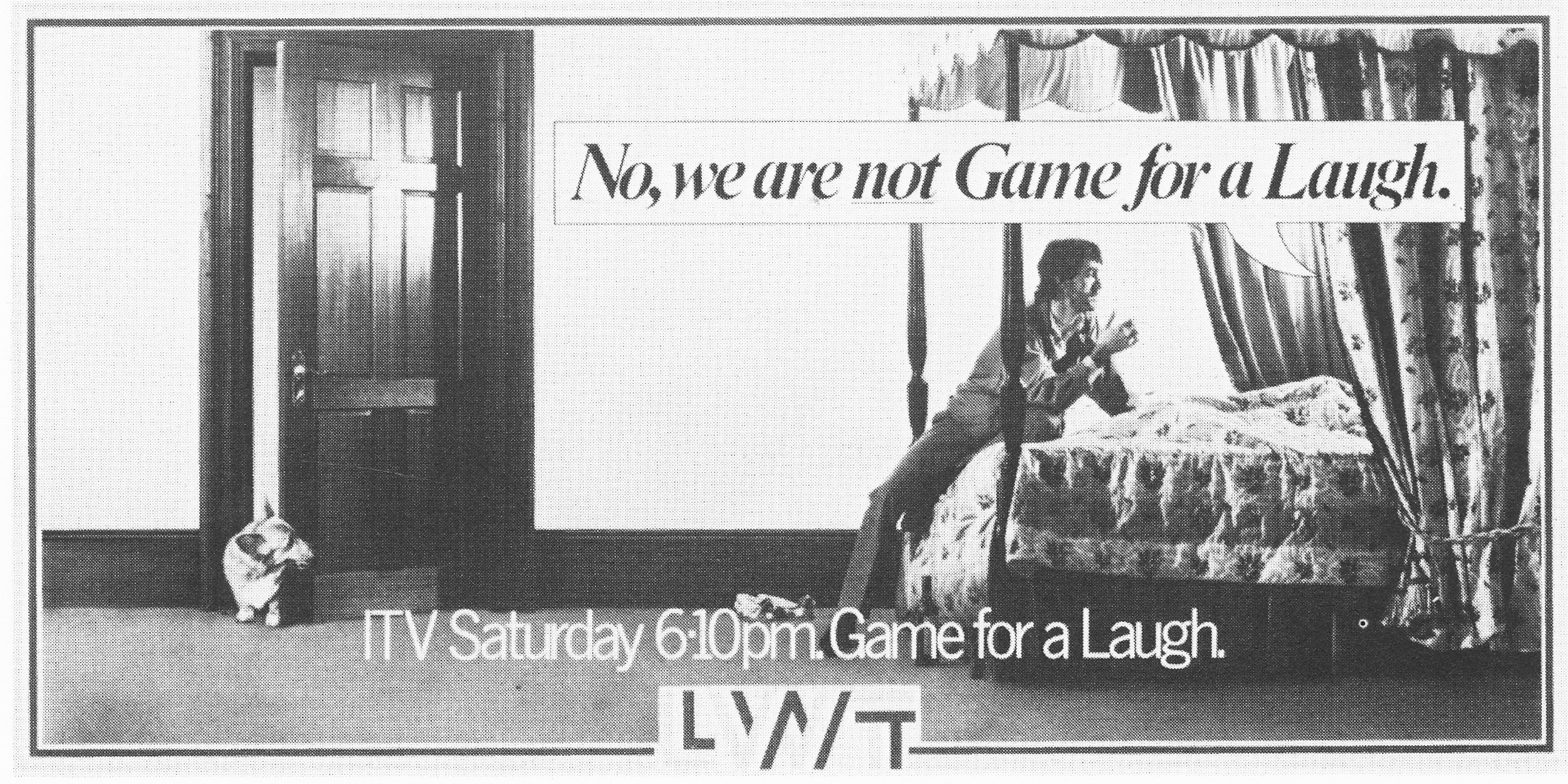
REJECTED. DAVE: This was turned down by the client for not reflecting the gravity of the occasion. THIS IS THE AD THAT RAN.


 DAVE: Those were all rejected in favour of this one.


REJECTED. DAVE: It was felt to be to be somewhat unpatriotic towards British Leyland.

REJECTED. DAVE: This was turned down because the client felt it might upset Arthur Scargill. 
THIS IS THE AD THAT RAN.


REJECTED. DAVE: The client turned it down because it would have upset Steve Ovett, Sebastian Coe and anyone with premature ejaculation.

PAUL: One of two posters we did with Linda Lusardi, who was a very popular page 3 girl during that period (I can’t believe they still do that!).
This is the original artwork.

Trotty, unbeknownst to Micky Finn, who was the account director at the time, made us retouch her boobs to be twice as big, because he didn’t think they were noticeable enough.
So Brian Harvey (remember actual art retouchers?) did a magnificent job of giving her Dolly Parton-esque prominence.
Micky didn’t see the artwork until he got it out of the bag at the client.
He came back and stormed into Trotty’s office and went ballistic, I thought he was going to attack him!
We ran with this un-retouched version, much to Trotty’s disgust.


REJECTED. DAVE: The client turned it down because the advertising for E.T. hadn’t started yet.
REJECTED. DAVE: The client apparently turned this down because he had relatives at the BBC.

THIS IS THE ONE THAT RAN.


Thanks for sharing. I particularly like the implication that moving to the coast in retirement might be considered the ultimate failure.
I’m always amazed by how thorough you are Dave, I’ve only got about 6 of these.
Fucking well done
Sorry this is dave trott, somehow I keep getting signed in as Dave Dye.
I’m an analogue man in a digital world
Weird but even some of the posters that didn’t run I could have sworn I’ve seen before.
Maybe it was the pilfering of discarded scamps from The GGT dustbins I took part in at night that’s etched in them in the memory.
Hey Anton,
You have seen them before, they were featured in a Creative Review article many moons ago.
Best,
D
Reblogged this on CB1ndustri's Blog and commented:
A treasure trove of stuff about how great ads got made. Inspiring stuff. Have a read when you have some time.
Excellent stuff Dave, but where’s the candle burning at both ends? They really were something to look forward to on the tube.
That was for Time Out Newy, (it’s in the post about Dave Trott.) D.
Course it was. Early Alzheimer’s. Next I’ll be thinking Griff Rhys Jones was in commercials for the London Docklands.
The LWT posters were my inspiration. I spent two decades trying to emulate their brilliant simplicity. I got close-ish once or twice. No more than that. And I was trying very, very hard.
I’ve never seen the LWT ads before. Great to see the ones that got away as well as those that ran. Coincidentally, rereading Creative Mischief at the moment. The Exorcist story makes me howl.