I’ve been sitting on this interview for a while now.
To be precise, it was done at the same time as the Kit Kat poster we did together; ‘Washout’.
That was created for the festival season, so what’s that? Six months ago?
I haven’t posted it because Dave has been ill, very ill.
I’ve been waiting to tell I’m posting it, it seems impolite not to.
So I’ve been waiting.
I checked on Dave today, unfortunately, he’s had another set back.
It occurred to me that putting it out this post can only lead to a lot of people thinking good things about Dave, and without sounding like some old hippy; sending out some good vibes can only help, they certainly won’t harm.
So here it is.
Where did you grow up?
I was born in Beckenham Kent, before it became part of the Greater London sprawl.
Hard on the outskirt of Penge where I developed a strong working-class sensibility.

You’re hanging out with a young David Bowie and becoming part of the Beckenham music scene? What made you opt out for pushing letters around?
I was very serious about typography and music at that time – I guess typography won, I’m pleased to say.
How did you get into advertising?
Like many students who had shown an aptitude in art at school, it was inevitable that a career would be sought in that direction.
I had taken an art course in my final year, which on reflection now, did show a strong preference for drawn lettering.
I had considered cartography for a career, but my leaning was in commercial art (as it was called at the time) and I’d heard that to be in an advertising agency was the fulfilment of a commercial artist.
I was to find out just how difficult it was to progress, from the bottom, to the position I aspired to, without a qualification.
What was your first paid job?
I answered an ad in the Evening Standard in 1963 for a messenger in an advertising agency – Ripley Preston in Cheapside – £4.10s per week.
It was here that I acquired an inspirational book ‘Printing Design & Layout’ by Vincent Steer, which became the touchstone for my later developed style of producing finished drawn specifications.
I’d already bought the third edition of the ‘Encyclopaedia of Typefaces’ with a school book token. The die was cast, but the reality was still in tramping the streets of London.
What does the word Gorringes mean?

The design office of a large department store in Victoria. It was my first opportunity to break into typography without any formal qualification.
Brian Grimwood was already there, designing and illustrating, and as we were already musically joined at the hip it seemed the ideal position in which to combine our passions.
It wasn’t to last long – I was fired on Christmas Eve – last in first out, in a cost-cutting exercise – not a lot’s changed over the years.
The room shared with Brian can be seen behind the first-floor window on the end of the right-hand side before the building follows the aspect of the side street.
We were eager to produce good work but at the same time heavily into music and our band – I can distinctly remember anxiously awaiting the first recording from Cream – their single ‘Wrapping Paper’ which I’d ordered from the music department, it took weeks of delay before it was finally released.
United Kingdom Advertising Co Ltd?
UK was part of the National Advertising Corporation which also had connections with Ripley Preston, so I managed to get back into the business without too much difficulty.
I used it to plan my next move into serious typography.
Then to R F White, the lemonade maker?
Not quite the lemonade maker, but one of the oldest advertising agencies to have ever existed.
I was lucky to secure a position as a typographer in White’s outside studio Art Centre, just off Fleet Street, which handled recruitment advertising.
It was a baptism of fire – all the work was copy driven and produced from metal typesetting.
Fitting all sorts of type into fresh creative solutions, in every conceivable media size – each one trying to be better and more effective than the last.
I was not only trying to master the technical requirements but I was expected to show some creative flair at the same time.
Which typographers did you admire when you first became one?
That’s an interesting question.
Later in my career I became more focussed in who fired my adulation – Tschichold for one.

But from the very start it was American designers who excited me the most, and Robert Brownjohn in particular – I not only visited the cinema to see a film but for the added reward from one of Brownjohn’s Midland Bank commercials.
They struck a chord. I was in awe. I subscribed to the American magazine ‘Art Direction’ and found my early influences in Herb Lubalin,

Aaron Burns,

and Gene Federico.
Naturally, Lubalin’s gradual exposure gained a huge momentum, exploding into a commercial success story within a couple of decades.
It’s only later, after reading Adrian Shaughnessy’s superb book on Lubalin, that I’ve come to realise just how close those influences resonate in my work, influences, to paraphrase Shaughnessy, ‘… expressing an idea, telling a story, amplifying the meaning of a word or a phrase, (and) to elicit an emotional response from the viewer …’.
You ran your own company for a while?
Yes, Mushroom, an advertising service studio in 1973.
It brought together some of the elite personalities from competitor companies like Face and AdMakeup; forming a new collective which captured interest and support from leading art directors and writers at the time.
We offered creative typography, finely-crafted artwork, and introduced many successful typefaces, some of which can still be found today.
Which ones?
Worcester, an old Monotype face, withdrawn by them almost as fast as it was introduced, I’ll never know why? It was our most successful face and it continued through to the digital era.
Before Monotype updated their business, we were supplying some of the best of their founts on headline, and cut variations to the standard weights of Ehrhardt, Baskerville, and Horley – this was 1973, and way in front at the time.
It was impossible even to get the regular cuts through the commercial suppliers, so we put them on. Faces like Grotesque 215 and 216, Sabon, Joanna, and Imprint.
Of course, this all seems rather unexceptional, now that digitisation gives us everything, and more.
But it’s surprising to think how undeveloped the market was some forty or so years ago.
Who else worked with you at Mushroom?
Mushroom was formed by Brian Hall, Alan Barlow, and myself from AdMakeup, and Mick White from Face.
Some of the art directors and writers who supported us in the early days would’ve been Derrick Hass, Alan Brignull, Robin Wight, David Holmes, Alan Midgley, Chris Wilkins, Peter Ward, John Brimacombe, Delwyn Mallet, Chris Hudson, Terry Comer, and others.
We did a lot of promotional material, an A1 poster, a ‘Mushroom’ scarf, machine knitted and unusual at that early time, ‘Mushroom’ badges too, I remember handing them out from a basket on our table at a D&AD dinner, 1973 I think?

Why close Mushroom?
We’d become fairly successful in our first building in Tottenham Court Road which prompted some expansion. Little did we know that the ‘3-day week’ was just around the corner.
In fact, we’d hardly got settled in our new building in St Martin’s Lane when it all kicked off. We were running clandestine generators on the roof on our off days, but inspections were commonplace and it made things very difficult.
Coupled with the fact that our ‘Mr 51%’ partner had joined the fairies and couldn’t be found until he’d swapped his ‘e-type’ for a hospital bed. It finally gave us the reasons to wind things up.
So much for running a business.
What next?
The antidote – freelance. In a particularly difficult time.
My champion was a certain John Brimacombe who ran his own successful company, J B Packaging in Maddox Street.
I felt like the artist with a sponsor – he got me to handle the whole typographic aspect of design for Fisons Agrochemical packaging. Some 86 hand-rendered type layouts which I put on the Diatype system and progressed to mechanical artwork.
He paid me upfront a substantial fee to support my new start.
A benevolent action surely unheard of today?
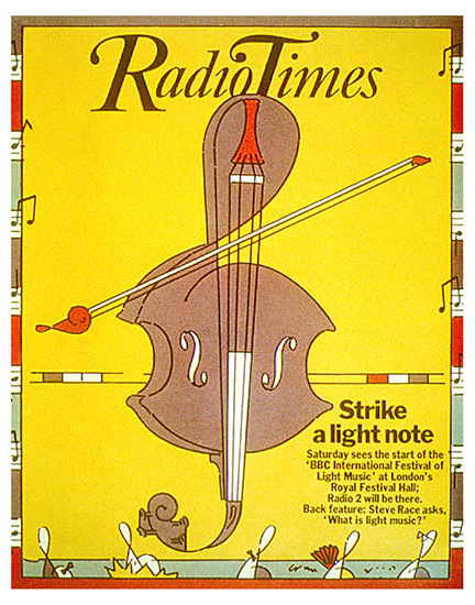
Work piled in – minute typographic design solutions for programme headers in the Radio Times – weekly problems to solve, like town names to highlight where the Radio One Roadshow visited each day of the week . And then, the same problem through Easter. And so on.
I’d moved in to my friend Brian Grimwood’s studio space
with illustrator Lynda Gray

in the old soon-to-be-refurbished Covent Garden; then promptly moved into the just-refurbished room that Brian’s CIA still uses today.
They were prolific days, happy and extremely busy – working through the night and weekends on many occasions.
It was during this time that I’d built up a relationship with some major agencies – Saatchi being one.
With Alan Midgley’s dedicated support, and much annoyance to the in-house typographers, I tackled some heavy British Leyland work for the Triumph Dolomite and Ital models.
Producing completely hand-rendered layouts with the freedom to make my own creative judgements. It was a relatively bold process but it supplied a finished product that could be instantly judged before setting and artwork had even begun.
The level of expectancy to see completely finished traces on commissioned jobs ran high and kept me constantly busy.

 Is that saying the Dolomite goes 120mph? Illegal surely?
That’s correct. One of several ads flaunting its speed capability.
What was Saatchi’s like to an outsider bang in the middle of the seventies?
There was an obvious sense of extreme competition on the creative floor.
Arrogance, perhaps. But with an envious recognition when instinct says ‘that’ll get in the book’.
It’s what drove the power at the time.
There were extremes. I remember one instance, when Midgley threatened to throw a suit out of the window.
And times of utmost silliness – Mike Shafron roller-skating round the building all day in sunglasses. Midgley asking for, and wearing, everybody’s coat, when the heating broke down.
I just observed that world amid the serious responsibility I was called in for. 
Every advance in technology leads to people being desperate to use it quickly, to make themselves look modern and cool.
I presume that’s what happened with all this squashed together type in the seventies?
The squashing together was the style of the day. Some squashed it together very badly, but we thought we squashed it together with a great deal of craft?
It was the direct result of two major factors.
One. The unbridled freedom of the new technology – photosetting. Where type could be set with minus spacing, overlapped, distorted, and so on – releasing (on reflection, sacred) constrictions of the built-in visual boundaries inherent in metal type founding.
And two. Everyone’s super hero, Herb Lubalin. The absolute master of tailored typography – what he didn’t overlap wasn’t worth overlapping.
It can’t be stated more succinctly, that the influences imparted on us at that time did result in a whole mess of work, some of which can be seen in these immediate examples.
The saddest outcome to me is the way in which these influences shaped the type design standard that followed.
Specifically, the stubbornness to perpetuate the absurd notion that the market wouldn’t accept any new typeface unless it was drawn to a particular ratio of reduced proportion (the x-height drawn ever more closer to the cap-height).
The ITC has a lot to answer for. Today, new type is released on a daily basis which, despite its overall appeal, doesn’t deviate from that entrenched standard driven in the beginning by market forces, but sadly has now become the accepted norm.
Very occasionally, a new face of rare beauty unveils itself which proudly resists this bastardisation but stands perilously naked in the new world.
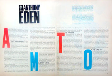
What was your first award?
D&AD first credited the typographer to a piece of work in 1977.
A breakthrough at the time.
I remember being a part in the award-winning ad for Hayfield Superblend wool which received a silver in 1978, along with four ‘in book’ contributions.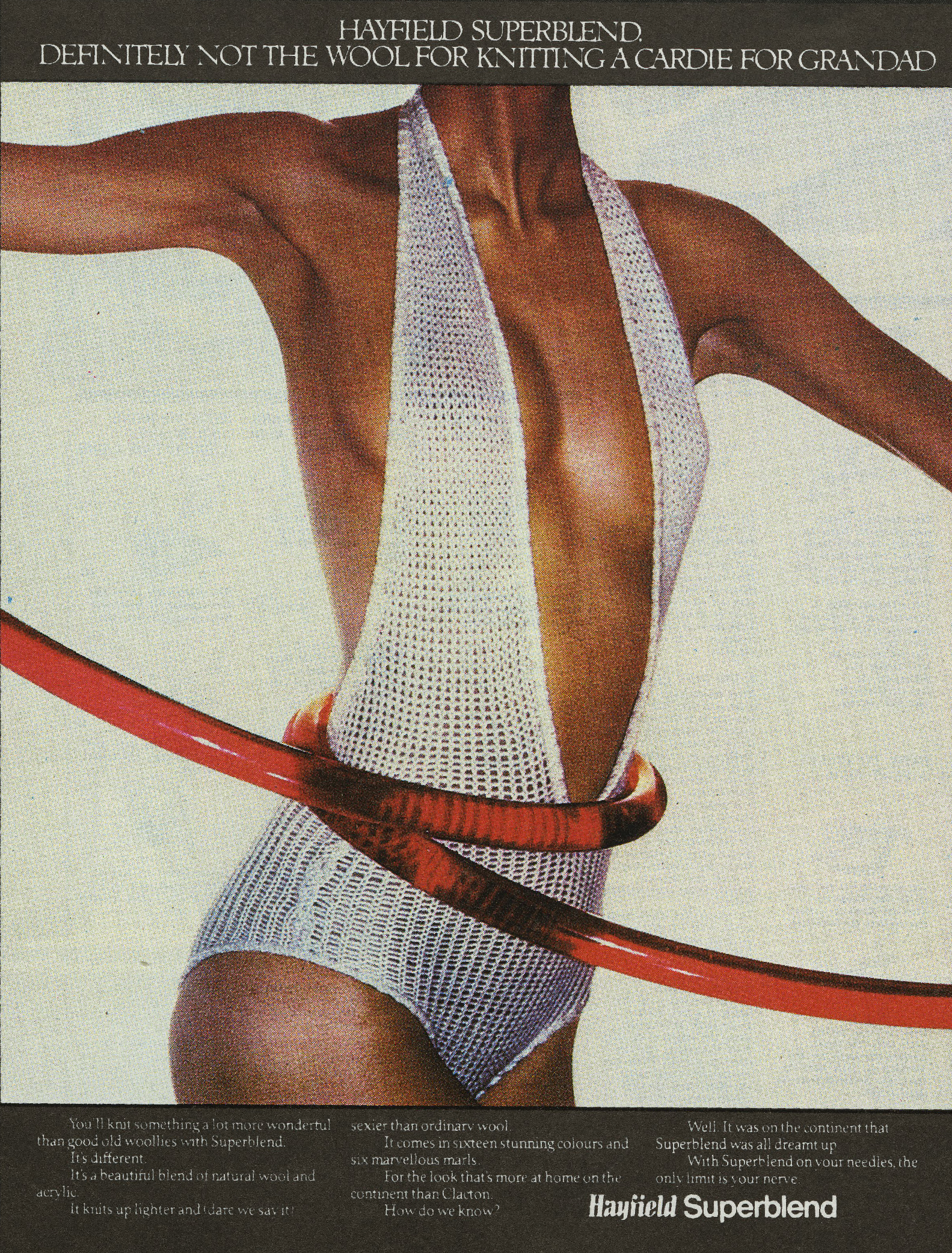
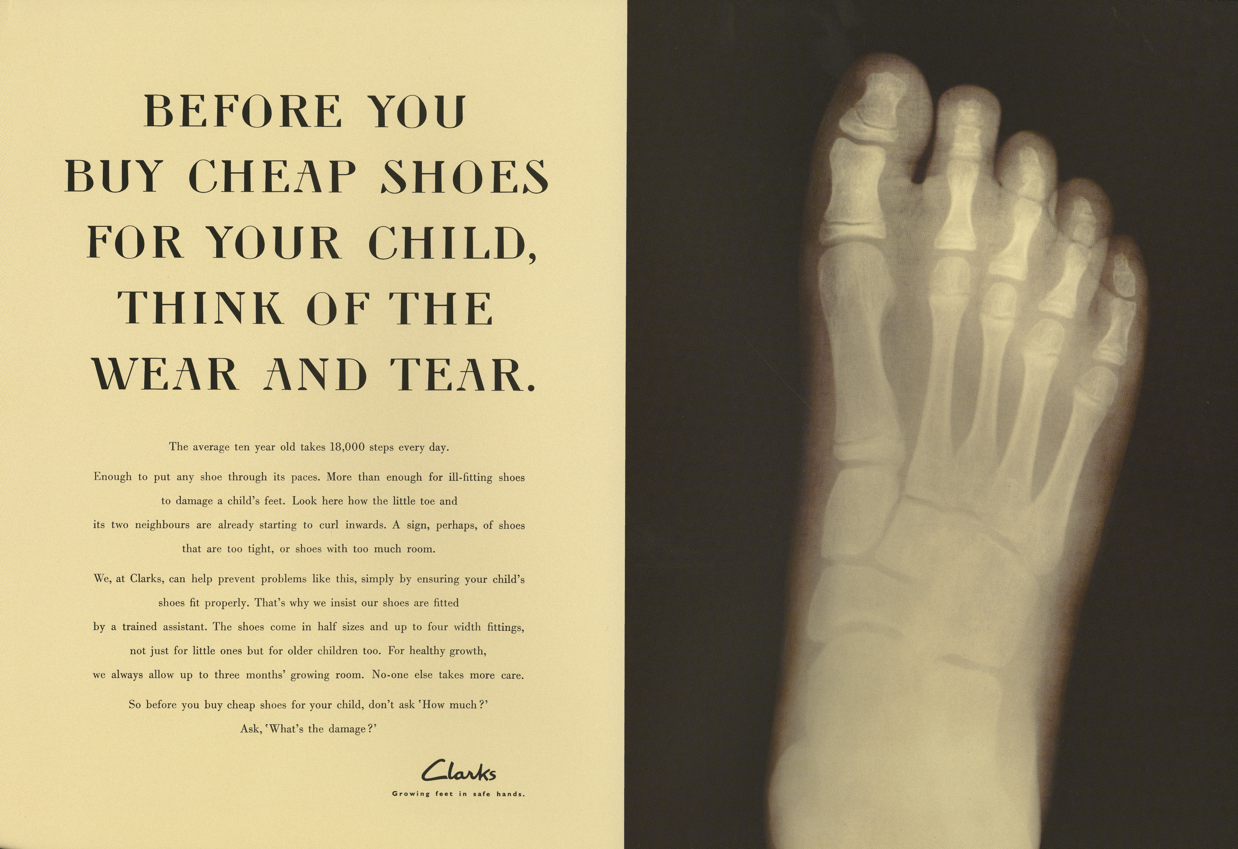
Why the hell do these Typhoo ads look so good; The deep red? The wavy lines? The lack of fiddley small print and logos in the corners?
I guess it’s just the simplicity of the execution. The brand was so strong that even separating the elements did no harm at all.
We now live in a world where everything is over branded; colours are almost mandatory, and dare anyone use the corporate stamp in any way other than how the design manual says it should.
The black type appeared straight on the roughs.
I drew up the lettering on curves to mimic the namestyle and commissioned Dave Lodwick to cut the finished type and namestyle elements in ulano film.
Illustrator would’ve been a blessing then.

 This IBM ad shows the extremes of Lubalin-influenced tailoring to the headline – overlapped slab serifs, touching ascender/descender relationships, and cropped characters (lowercase p and t), all done by hand – which extended to completely cutting closer every character in the original monospaced golf ball setting of the text.
Today, we’d show the honesty of the product regardless of its ugliness.
Always rather liked that split headline in its negative/positive positioning – visually draws the reader to the white and pays off with an answer in the later-seen black.
Why switch to agency life at Boase Massimi Pollitt?
I’d survived the fall of Mushroom through national industrial action and an irresponsible partner who’d held all the power.
Now, freelance was progressively spiralling out of control, forcing the formation of a new company with staff, just to cope with the production.
It reminded me of Dr Feelgood’s Wilko Johnson, who said, ‘I slept for 2 days in the 70s’.
With mechanical artwork, photographic requirements, and retouching needed, again it seemed that everything was essential in maintaining control of the highest standards. 90% of our work was now coming from one agency as the first very serious recession began to bite.
For a second time, outside influences were at work.
Saatchi wanted discounts, held up payment (for six months at a time), and squeezed the life out of us until it wasn’t worth carrying on.
After the very day I left, I walked into BMP with a vow never to be involved in running another business again.
Who interviewed you?
John Webster. He was in control of the creative department, and my remit through David Batterbee, the MD who saw me afterwards, was to be the new Head of Typography and Manager of FGDS, their in-house studio.
FGDS: Fucking Good Design Studio?
Yes, the name penned, I think, by Ed Church during his tour of duty previous to mine. It became slightly awkward when clients asked what the letters stood for.
Can you remember the first ad you put together at BMP?
The first few months were troublesome. I’d inherited a difficult culture with a two-man studio who were clearly there for a cushy ride.
One work shy with a drink problem, the other accommodating but some years behind in terms of the standard I was used to.
I was immediately thrown into a pitch situation for Paper-Mate, some 12 boards wanted overnight, with marker visuals coming at me non-stop.
I made a decision to style them with Times Semi-Bold headlines constructed with overdrawn lines as if they were wristed with a pen. The text drawn in a script. All in blue. It was hand-rendered typography again, but as visuals this time.
I worked over a light box at break-neck speed from the afternoon until around 10.00 the following morning when the boards were hastily made up. It was my first encounter with Chris Powell who was presenting the work.
And my first win for the agency.
You struck up a good partnership with Paul Leeves, what was he like to work with?
As the months progressed I realised that press was not achieving the status it had previously enjoyed through the likes of Dave Christiensen, Gordon Smith, and others, who had all left before I’d got there. It was like treading treacle, trying to rebuild that standard alongside the successful, and more favoured TV culture championed by Webster.
There was now a definite need to redress the balance.
A need for a talented senior creative to make the change, who not only believed in press, but who also had the clout to effect that change.
I remember the apprehension when Paul first walked in to the studio – straight faced, with a loud interjection ‘who’s the typographer around here?’.
I knew he was going to be hard to impress, but something also told me that perhaps we were now on the verge of that change.
It was one of the busiest, most fertile, periods of my career.
He knew how to get the best from people. Mainly through fear. But I never really experienced that fear once we’d found common ground through working together on countless pitches and on the need to produce the best looking press work possible.
There could be up to 2 pitches and several styling exercises in a single week.
It was relentless and full on. So full on, that at one point of sheer exhaustion he sent me and my family on a fortnight’s fully-paid holiday to Kefalonia.
It was there that I received his telegram (and champagne) that Hellmann’s had received a silver for ‘best typography’.
He finally reached his peak after five years of facing difficult clients and a difficult management structure, but his achievement, partnered with Alan Tilby, was possibly one of the finest in the agency’s chequered history.


Here’s a step by step guide to creating the Hellmann’s look.
1. The art director’s roughs, (Paul Leeves.)

2. Dave chooses a font.

3. Dave carefully traces out how he wants the text to be set.
4. The setting comes back.
5. Dave traces out how the ad.
He uses a grant projector, (Google it kids), to trace everything out; text, photos, proportions, etc.
6. The finished article.
7. Style set, it can be rolled out across the campaign.


The Knorr ads are amongst the best looking ads ever, yet didn’t win a sausage?
But they did win a weenie – a Pegasus award for typography.
You’re right though, it’s difficult to understand why they weren’t ever considered eligible for mention during the major awards at the time.
I can only suspect political intervention here.
The disciplines that came together were explosive, but on judgement day turned out a dud.


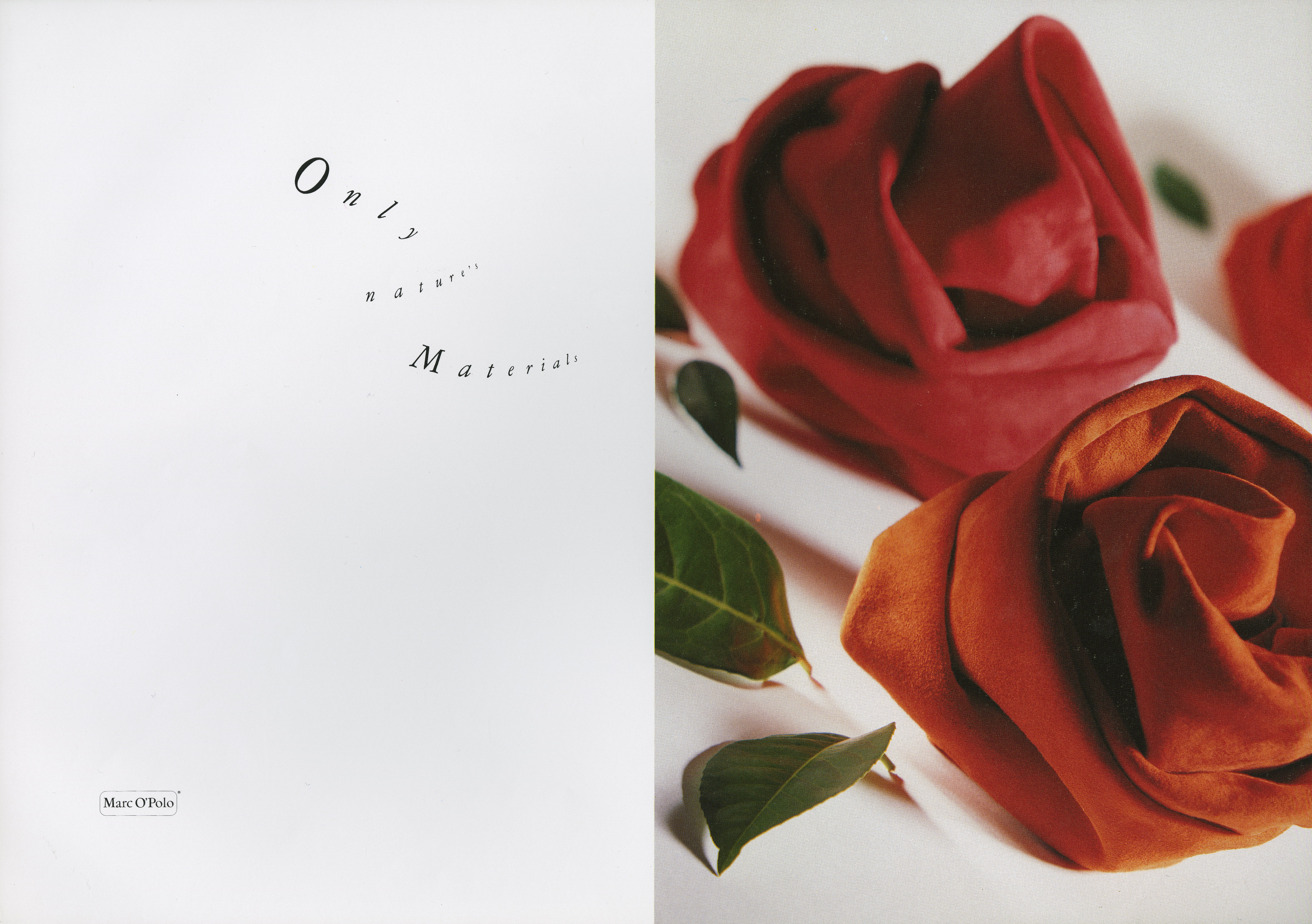
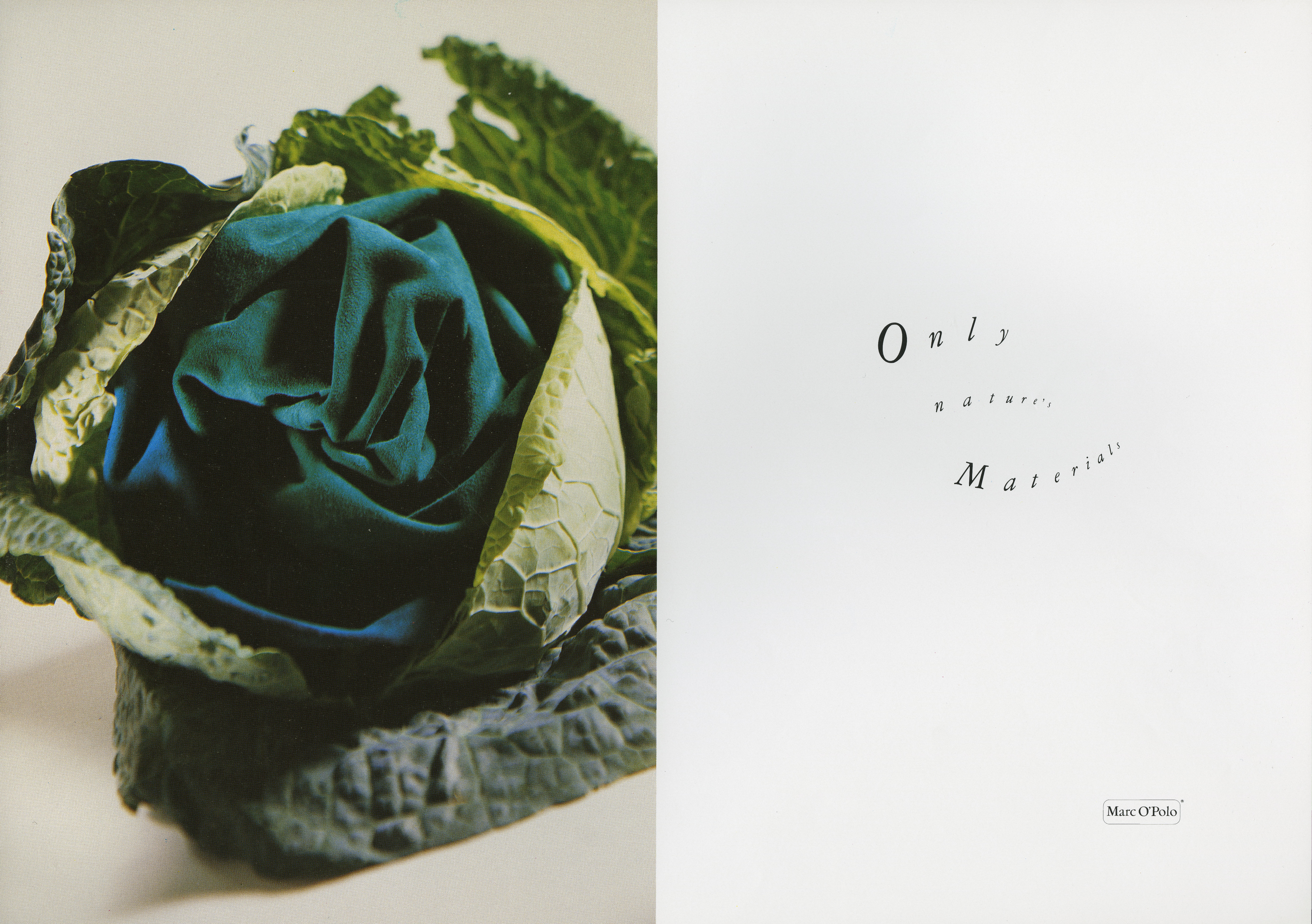
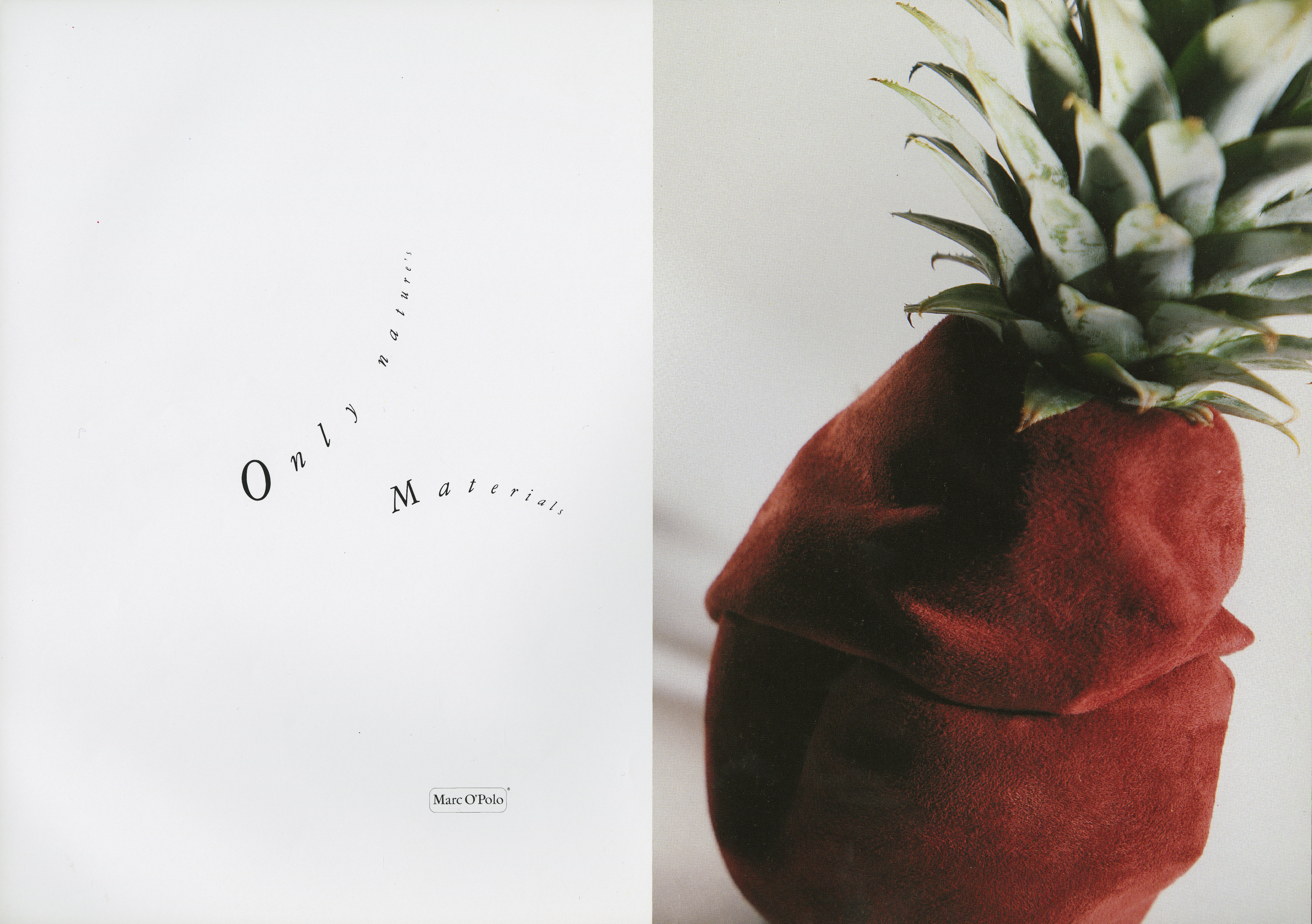
Paul Belford phoned me last year to ask if I had copies of the Marc O’Polo ads from 25 years ago for his Creative Review column. I hadn’t seen them at the time, but I can see why they made an impression on him.
Why does the type keep changing shape?
It was to echo the shapes in each of the plants we shot.
Why did you resist Macs for such a long time?
This has root in the previous question on the difference of disciplines.
I’ll explain. Technology has now completely transformed our industry and its working methods.
In my career I had embraced all the earlier technological changes, from the constraints of metal through to the freedoms of photosetting’s relatively short life.
I was probably one of the very first typographers to work with the Diatronic system when it was introduced. A clear understanding of its capability but not an operator of the machine.
It superseded the Diatype machine, and I remember then feeling slightly compromised by the inferiority of this successor.
But all these changes occurred in the hands of the specialist typesetter, who got the very best product from a highly-trained workforce.
Within my own working environments I built teams of specialists picked from some of the best in the industry – typographers and artworkers – who knew their craft and who were expected to maintain the highest standard.
There was considerable resistance from agency typographers during the early introduction of the Mac and it was some time before it could produce the quality and level of expectation provided by the outside typesetter.
I somewhat misread the direction it was taking.
Regardless of the failings in its earlier output, the notion of in-house typesetting as an immediate profit centre for the agency came at the very time that accountability became entangled with creative freedoms.
The freedom and luxury to buy outside (overnight) typesetting was now no longer an option. Requiring the typographer to create and produce the complete job that previously had been handled by two separate specialists.
It was stealing a great deal of time better spent (to me) on the creative thinking I was then expected to deliver.


Do you think computers have helped or hindered typography?
The computer is a tool. It is in the hands of the operator. Whether or not that operator is qualified will determine the professionalism of its output.
Because the computer is in the hands of everyone there is far more ill-conceived typography than ever before.
Which ad has given you most pleasure?
A lot of work has given me a buzz over the years. I guess the more involved I get producing a solution to reinforce an idea, on brief, is central to my satisfaction.
The English Heritage campaign gave me a great challenge and immense pleasure.
I seem to equate satisfaction with the sheer weight of hours put in.
Great choice!
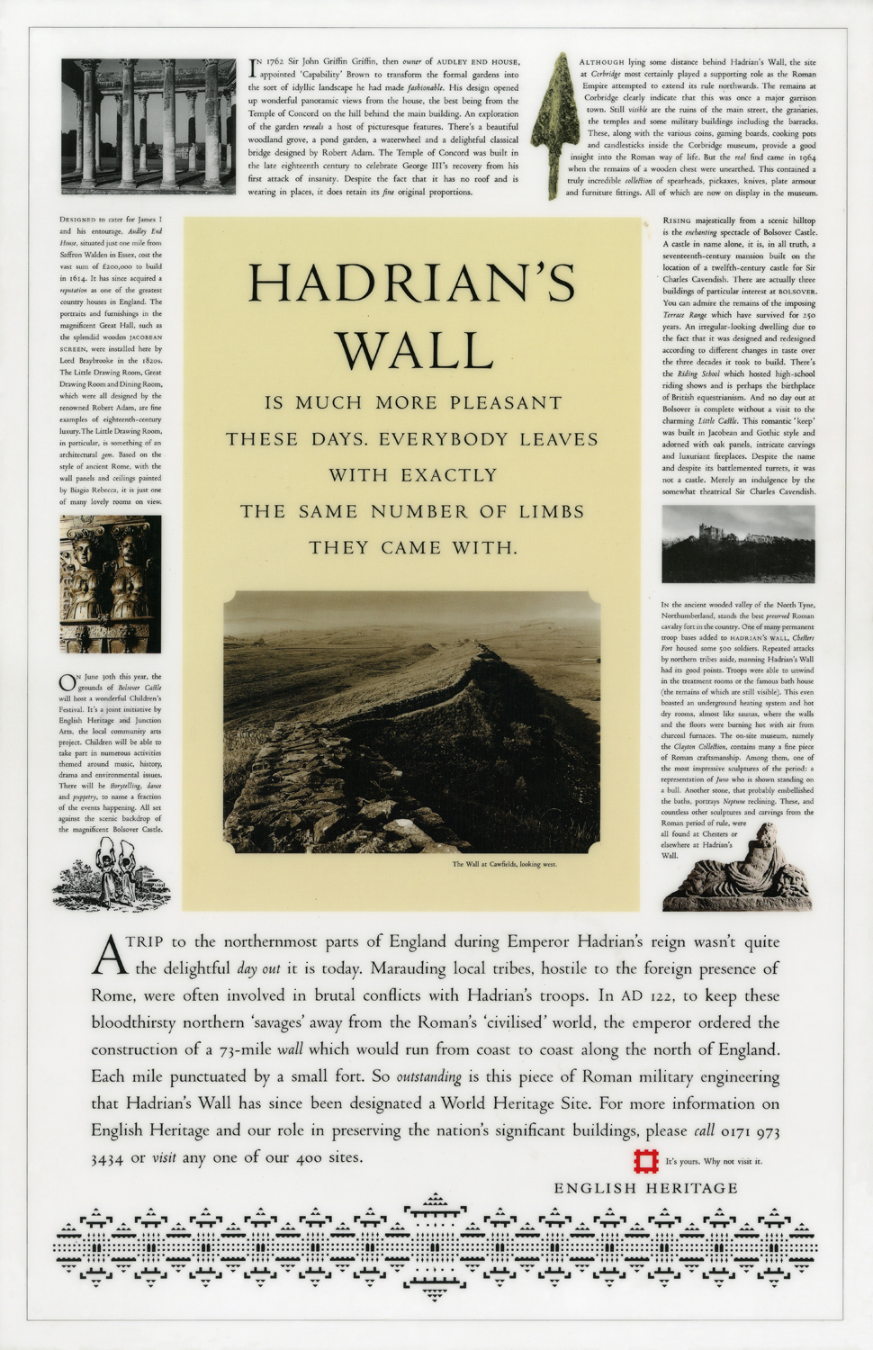
When we did the English Heritage ads Mark Reddy saw one of those ads and phoned me to find out if you’d done the type.
I asked him why he thought it was you, he replied ‘the letter spacing.’
How can someone spot your work by the space between the letters?
Well, we’re not just talking about anyone spotting micro-typographic niceties here.
Mark fully understands what it is that gives a piece of work individuality.
Of course, the spacing could be the giveaway, but more than likely there were several reasons in making that assumption.
At BMP, you were more of an art director than a typographer weren’t you?
I’ve always been a typographer who analyses content and uses that content in finding the appropriate solution. It is a responsible reaction.
At BMP, historically a TV agency, press art direction fell low in priority.
Art directors would rely on my input to get their press work on an equal with the best of their TV.
A fair proportion admitted that press was their weaker skill and left me to take a lead.
Do you prefer Art Directors to give you a tight or open brief?
I would say it didn’t matter. As long as the brief felt right I could perform either by originating or embellishing. It’s more about getting the best and appropriate result.
Why go through the hell of hot metal setting when you could knock it out on a Mac in seconds?
It’s not about ease of operation. The choice should be a question of suitability.
But today, it’s all down to cost and a loss of understanding of any difference between either. And it will probably continue that way until the option is no longer an option at all.
It was part of my concern when the Mac was introduced – the loss of any considered choice through cost and profit implications, target figures, and industry requirement.
We were more concerned once, with the look and feel of our work through the choice of different mediums, but now, the accepted industry standard is worked in an environment that isn’t particularly interested in delivering any difference at all.
You’re probably the only typographer I’ve ever worked with who I could give a verbal brief then print the results, like American Airlines? 
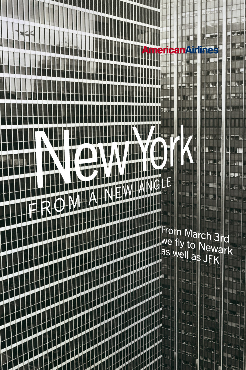
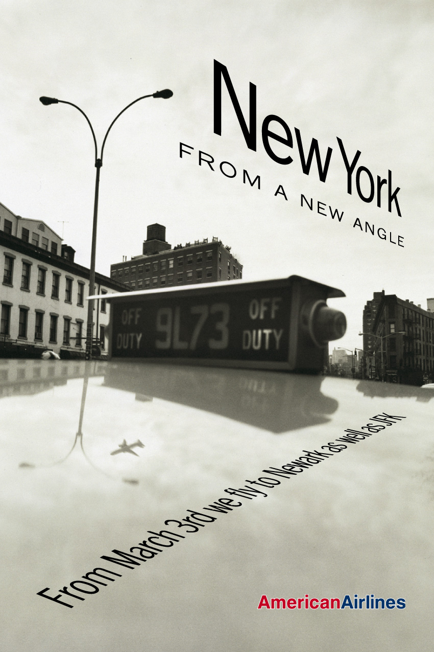

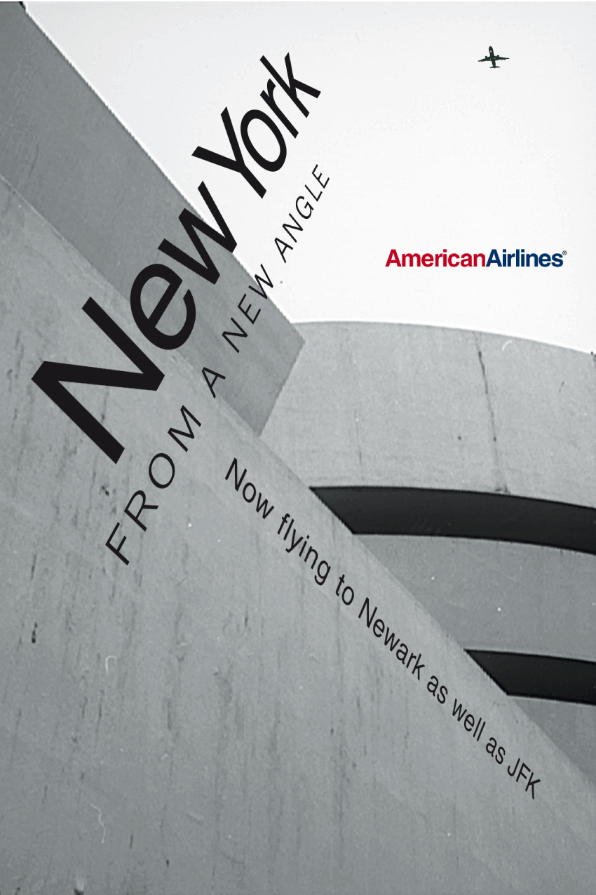

AA personifies the brief that arrives time on time again – beautiful photography, a line, some peripherals, and no clear direction of how it is to be put together.
My approach is with the same guarded commitment each time.
Respect the photography, integrate the type without suffocation, and above all strengthen the core idea.
At the eleventh hour a small plane had to be included on each execution, which hauntingly preceded 911.
The Mac was the obvious, and only choice this time round.
Hang on…I just said you’re the only typographer in the world I’d trust with this brief, and you say ‘yeah, it’s the sort of crap brief I’d get all the time?
I was trying to say that that specific open brief formula – main shot/headline/logo – is not unique and is probably the most difficult one to answer and to serve with something different and pertinent both at the same time.
It was a commonplace situation.
The verbal brief is usually ‘here’s the bits, do something with them’.
At AMV/BBDO with me, you changed the setting on the Economist posters?
For most creative teams, to work on the Economist posters at AMV was perhaps their reason to be there.
I’d always thought that if they fell under my responsibility as a typographer, I would update that appalling and tired 70s inter-character spacing in their special Baskerville – a difficult typeface to kern correctly – which years back was known as ‘close-not-touching’ where every character sat very close to its neighbour regardless of the overall visual appearance of the word unit.
Serifs had never been seen so intimately close (well, not since the 70s).
I undertook the task by setting up a kerning table of character pairs within the software of the Mac.
I can recall the aggravation it caused in the studio where they weren’t used to such disruption.
By the time I’d left, the type was looking the best I’d ever seen it.
My successor either wanted to put his marker down or preferred the way it looked before? Anyway, there was a brief airing of posters wearing a more classically spaced Baskerville. 


How do you pick a font?
There are as many typefaces as there are reasons for choosing them.
Question everything before making the choice.
What am I saying?
How am I saying it?
What am I saying it about?
Will I be saying different things?
What do I represent?
Are there any historical affiliations?
And so on.
The practical issues of size, reproduction, need for colour, readability, etc.
Then draw on a reservoir of knowledge on what is available and how it performs to what is required.
A font isn’t a font, is it? (Ie; the way you space it, the size, colour etc can make it feel very different.)
A font is a font.
All the rest is typography.
Admittedly, the nuances in typography can enhance a particular typeface.
Weaken or strengthen it, render it more readable, or make it say something.
What’s the difference between;
1. An artworker,
2. A typographer
3. A designer?
(They seem to have got a bit jumbled up at the moment.)
Before digital, not so long ago, there were specialists.
A specialist designer, a specialist typographer, a specialist typesetter, and a specialist artworker.
Each one trained in their specialism. Trained in many cases to be the best. Continually learning and perfecting their skill.
In the case of the graphic designer, he/she would embrace the other skills to a greater or lesser extent, but not necessarily to perform or to excel in all disciplines.
The origination, thought process, and the directing of others to complete a piece of work, was the criteria of a practising designer.
The typographer was the specialist in handling the choice, detail, and placement of typesetting within a piece of design.
The outsourced typesetting house produced the setting and supplied it back to the typographer as reproduction proofs or photographic prints for pasted artwork origination. And the artworker was the specialist mechanic who constructed the final physical piece fit for print.
They were separate disciplines worked in isolation and brought together for the completed job.
It is because the computer has incorporated all the disciplines into one operating arena, worked in the main by one operator, not necessarily an expert in each discipline, that has eradicated the specialist position.
The designer has highjacked the typographer’s contribution and in many cases has not attained an ability to do so.
Only the artworker has maintained a position in some areas, but merely through expedience and perhaps laziness on the part of the higher-rated designer.
Kerning.
What is it?
Why is it worth doing?
Why have people stopped doing it?
Kerning is a digital misnomer.
Derived from ‘kern’ which means the part of a metal type projecting beyond the body or shank, as the curled head of f and tail of j.
A projection that would enable it to fit closer by overhanging into the space above or below the following character.
Kerning in digital parlance means the lateral movement of space between letters, better described as lateral spatial adjustment.
As skills of any craft are learnt and acted upon to produce an end result of the highest quality, so the correct spatial adjustment of letters into the formation of readable words is a learnt skill, which requires a discerning eye and some degree of costed time.
But as technology improves, fonts and spacing presets also improve, allowing for a relatively even and better basic set, which for the standard operated today now seem (to the lesser discerning) adequate enough to disregard kerning as a manual skill altogether.

What’s the difference between a typeface and a font?
A typeface is a drawn alphabet of sympathetically-styled letterforms.
It takes that name from the printing ‘face’ of a cast-metal ‘type’.
A fount – the correct spelling (from ‘fund’) – represents the complete collection of characters making up a particular typeface.
The misnomer ‘font’ is the optionally spelt, now commonplace substitution, for typeface.
What’s your top five fonts?
I’m not sure my selection could be reduced to an exact number.
To me, there is merit and mileage in a great deal of typefaces, from the metal cuts of
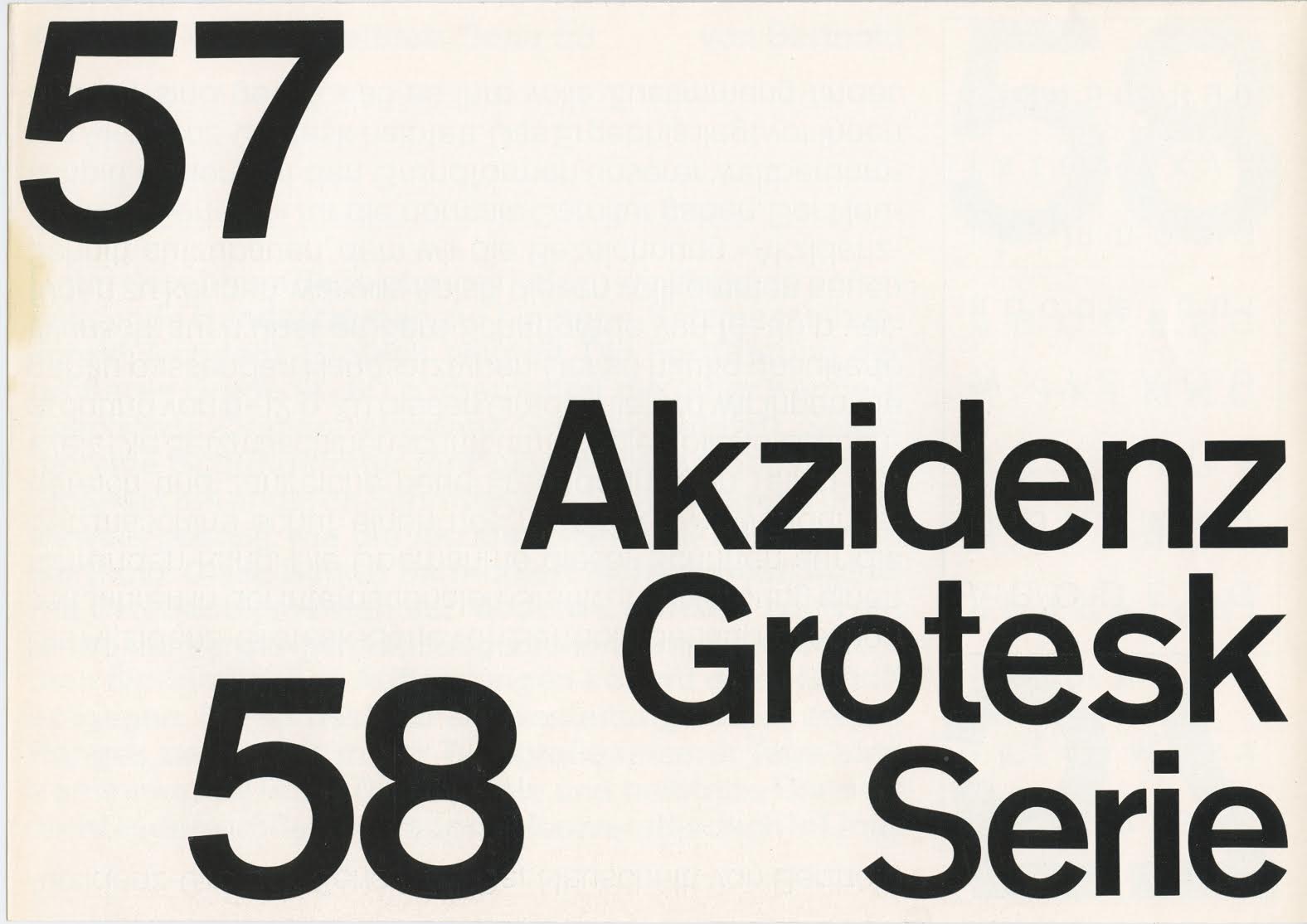
Akzidenz-Grotesk Medium 58 (Standard Medium),
Grotesque No 6,

Gill Sans (Regular),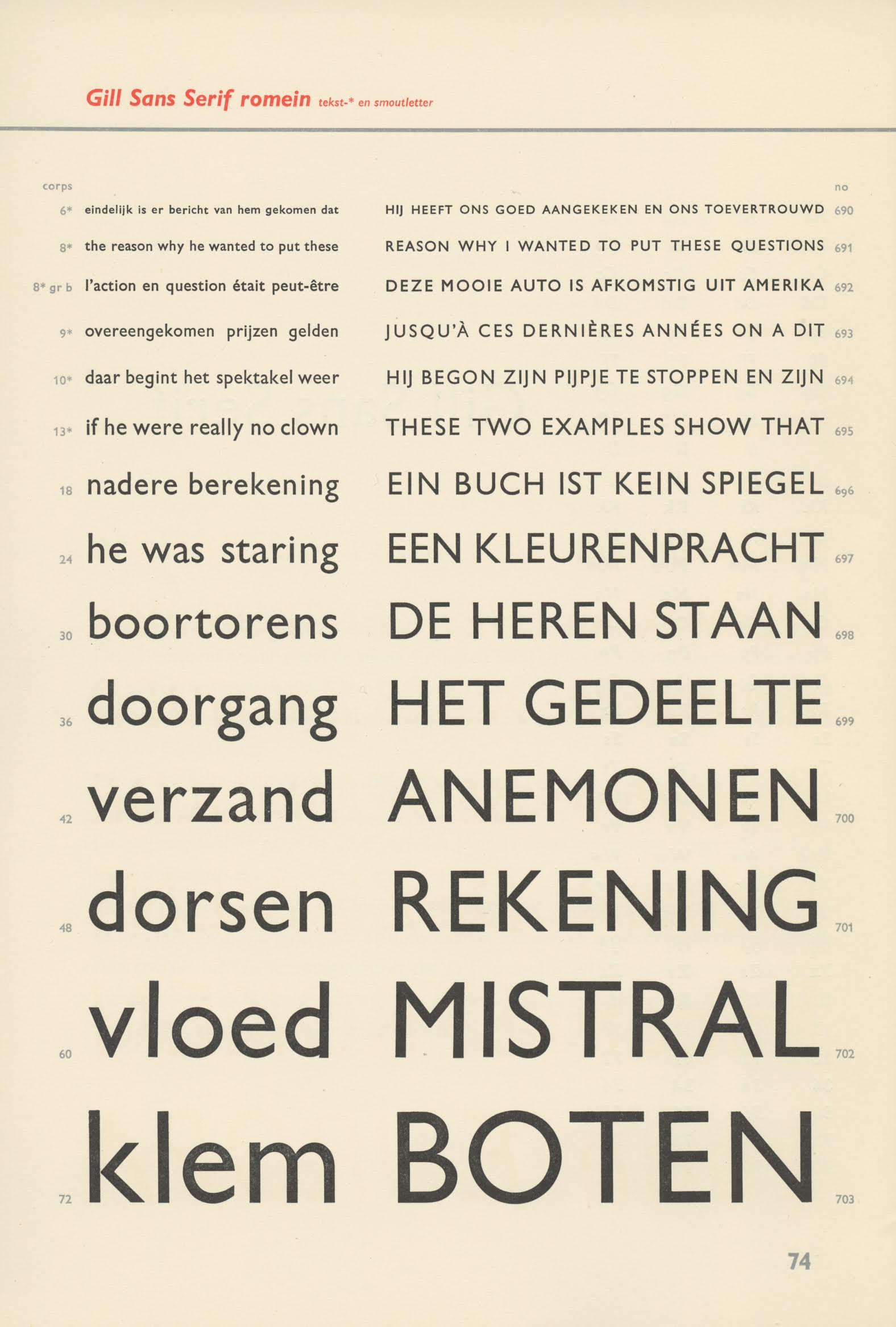
Perpetua,

Ehrhardt,
and Romanee,

(my particular favourites), to filmset Neuzeit Buch S Bold (not the Grotesk) an obsession of mine at the time, to the newer digital manifestations from Fred Smeijers, namely Quadraat Regular and Renard, to Matthew Carter’s Miller.
Which ads do you wish you’d done?
None really.
My wish list strays firmly into reasoned typographic design.
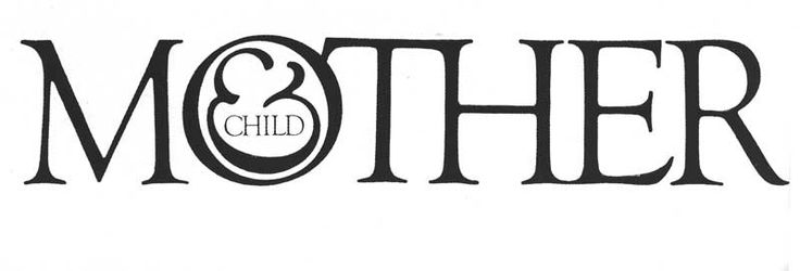
It doesn’t get much purer than Lubalin’s ‘Mother & Child’ creation..
And more beautifully enigmatic than Karel Martens’ standard telephone cards for PTT Telecom.
Thanks for your time Dave, great to catch up.

Nb. I found a couple of bits of ephemera that show just how good Dave is.
1: A rough of a letterhead/ identity I was doing for my new agency.
I pinged it to Dave to see if he had any advice.
He was busy, but sent back this.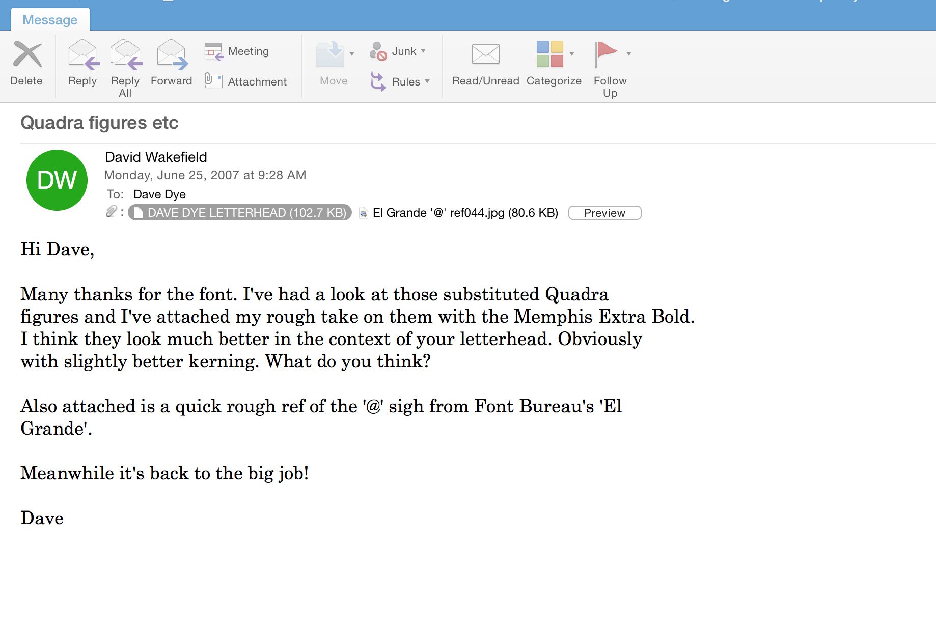
After Dave’s suggestions, we had this.
Compare the figures and ‘@’ sign from the alternative fonts Dave suggested, not only do they look better, they blend right in.
2: Dave’s feedback on a poster we were about to produce for The History of Advertising Trust.
Further Wakefield reading…


Surely this has to become a book.
Great interview Dave, and a real joy to see the work. Particularly enjoyed the evolution of the Hellman’s Mayo ads.
Thanks Ed, hope you’re well. Best, Dx
Dave, lovely read, hope your feeling better – Matthew
Crikey and oh crikey. Dave this is one of the most interesting interviews I have ever read. Absolutely amazing what you have written and more to the point how wonderful this man Dave is. An incredible tribute
Top top marks. Best. Duncan
Brilliant
Real craft. A real joy to read.
Thanks for posting this Dave, the family really appreciates it, there’s stuff in here that I didn’t even know about! I’ll be seeing dad a bit later and will forward your best wishes.
All the best, James
An education…simply remarkable.
This is amazing to see it all collated together in one place. Unbelievably talented as well as being a lovely bloke.
Great post—fascinating. Brilliant work.
So good, thanks!
So good! thanks.
Dave taught me all I know about type. He is a genius and a top bloke I’ve known for over 40 years. I worked on quite a few of the above ads with him. Thanks for posting this DD, brought back a lot of memories. Get well soon Dave I’ll see you shortly
Hi Mick, just seen this site. Thought of catching up on my past lifes history. How you doing?.
Allways enjoyed your company and humor. A beer over the pub and a game of darts. If you see yhis give me a message.
Tom Watson
Just re-read your interview Dave, always great to visit good work and DW excels at this every time. What a joy and interesting too. Best to both Daves, G
Thanks Graham.
Hope you’re well.
Dx