I used to work with a very smart writer called Alastair Wood.
One thing he said left a lasting impression on me; ‘None of my proofs are as good as the roughs’.
I realised it was a common complaint amongst writers.
Ideas, when first expressed have an energy, vitality and humanity, because people only write or draw the key elements.
There’s no fat.
The process of bringing ideas to life often kills them.
Firstly, because it’s easy to get seduced by hot photographers, passionate illustrators, belligerent designers etc.
Secondly, the concepts lose their individuality.
The charm and energy of the scribble often replaced by tired looking fonts and clichéd or over complicated imagery.
It’s to stay focused and simply service the idea.
Possibly because of Al, I like comparing the scribble, where the idea is was first expressed, to the finished ad, to see the journey an idea has been on.
If I’ve been thorough, I should know why I chose every mark on the page.
Here’s a before and after to illustrate what I mean.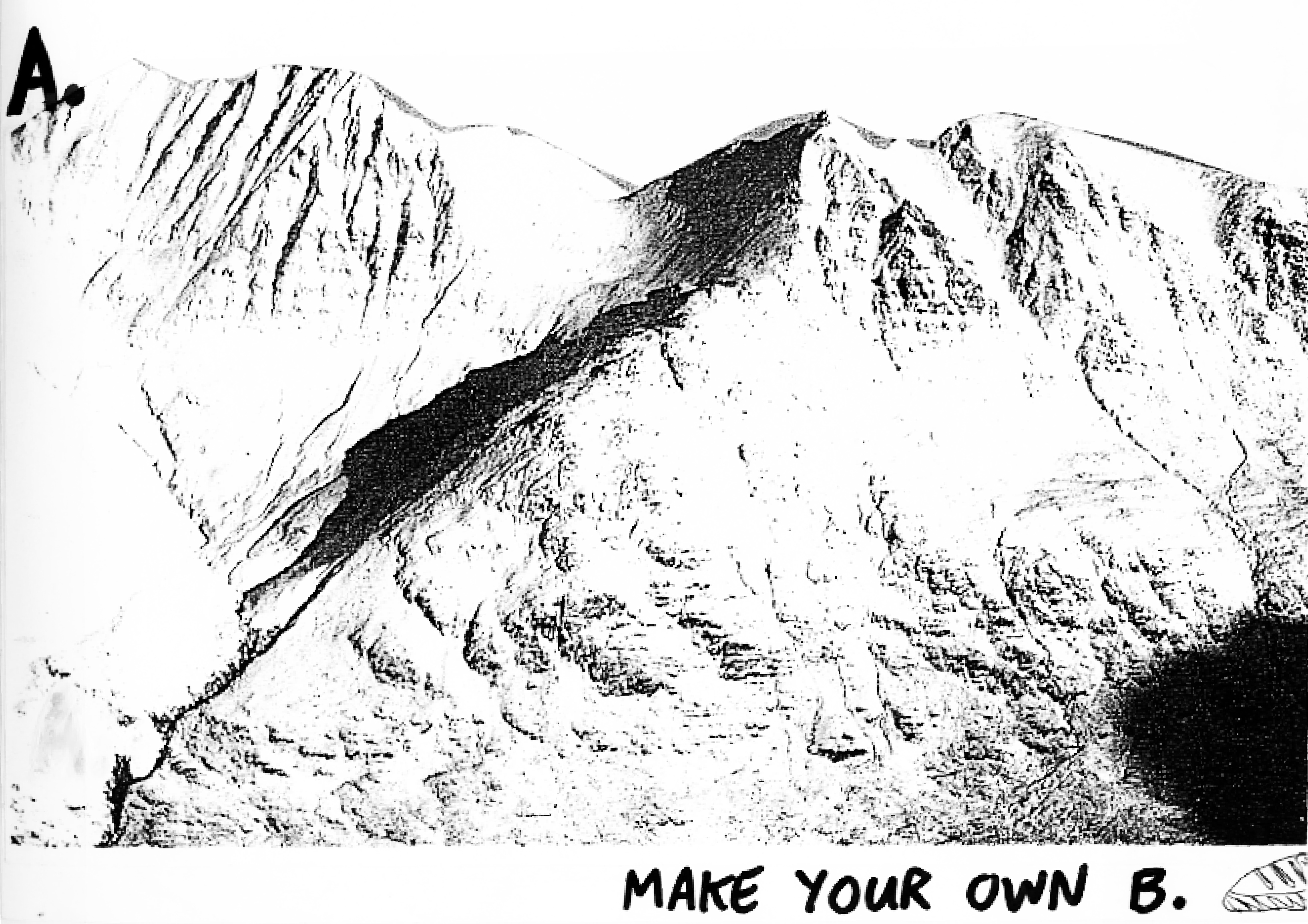
It’s a rough put together by my old writer Sean Doyle.
It’s not very refined to say the least, but it’s dead clear, human and has a certain charm.
So, what to do?
Making a picture you wanted to inhabit seemed key.
But what style?
As the ad was about getting lost in nature, black and white seemed good, it felt more natural than colour.
Logically of course this makes no sense, but perhaps in a overly brightly coloured world of magazines it felt more neutral, which nearly spells natural.
Fine Art photographer Sally Gall was chosen to shoot the campaign, just edging out Joel Meyerowitz, who’s amazing, but I just felt she captured very evocative moods.
Again, as the idea was about getting back to nature, fonts could feel a bit formal, something handmade felt more appropriate.
Eventually, the font was some chopped up handwriting that I found in the studio, it belonged to top designer Graham Woods, (except the ‘A’, which was a font, then run through a photocopier a few times then flipped the wrong way around).
The logo looked a bit sharp and shiny, so we traced over it by hand. Badly.
It hasn’t dated much because it was never fashionable.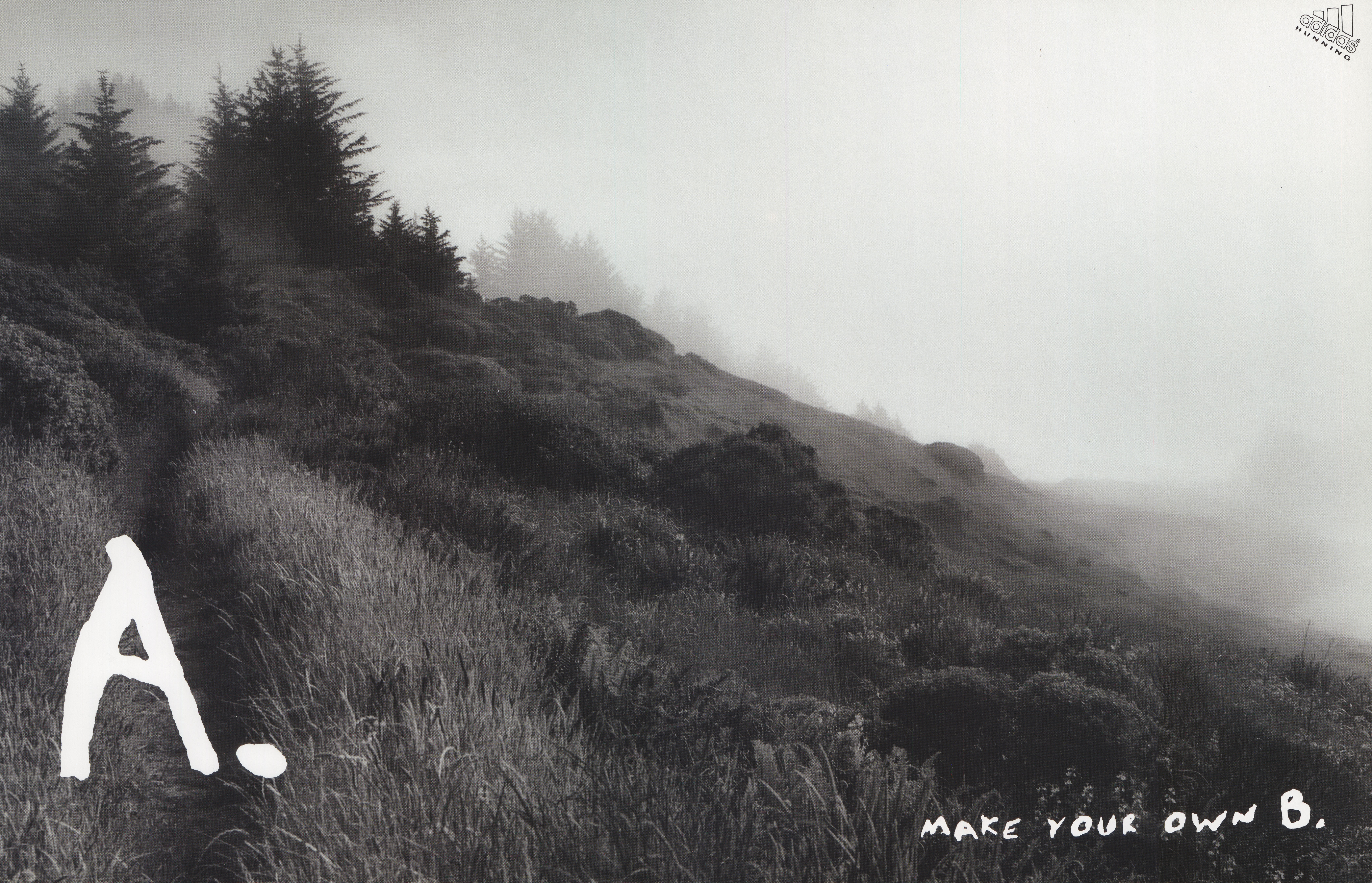
Nb. Here are the other two.

4 responses to ADIDAS: Rough Vs Polished?
Leave a Reply
Pingbacks & Trackbacks
-
[…] Art Director extraordinaire Dave Dye has just started imparting his colossal advertising wisdom on a blog. […]
Great ad. I remember this from years ago. I think I might have been at art school, or just starting out when it came out. I’m the same, in that I often compare the first rough to the finished product to see what was added or even possibly lost in the process. Sometimes I think there’s an almost visceral honesty, or freshness, or immediacy in the rough that is somehow lost in execution. I think it’s a real tendency amongst some current art directors to over art direct. I like Dieter Rams’ assertion that the best design is as little design as possible.
Thanks Sell!Sell!,
(Can I call you Sell!)
Great to know you were in short pants when I did that, it makes me feel Victorian.
I love Dieter Rams too.
Best,
D.
Cheers Ben,
Appreciate the plug and kind words.
You haven’t got 10 minutes to show me how to operate the thing do you?
Best,
D.
WordPress? I can try, but you’re asking advice from someone who’s just spent two years unable to add pictures to his blog.