Most graphic identities are a better representation of the people who created them than the companies that paid for them.
Consequently they are very ‘of the moment’, because their creators want to look cool.
The process will start with a quick trawl through the coolest sites, magazines and blogs, checking out what the cool kids are up to.
Gradually, patterns emerge; certain colours, photography styles, fonts, etc.
If you’re in that process today, you’ll get something that’s very 2018.
Great in 2018, less great in 2020, worse in 2022.
Two or three years down the line someone’s going to say ‘our marketing is looking a bit tired, we need to refresh it’.
You can refresh a point of view, but if there isn’t one, if it’s just whatever felt good a few years back, it’s hard to refresh.
If you stand for something you can interpret it a thousand ways, if you don’t you can’t.
So the process will start again; a quick trawl through the coolest sites, magazines and blogs to check out what the cool kids are doing.
Over time, the impression is that of a brand has no sense of self, a bit schizophrenic.
Also, and probably worse, the most basic of marketing requirements is that people know who’s doing the marketing, so making it more difficult to recognise is unhelpful.
Take Apple, they evolve their look and feel about once a decade, maybe a slightly different sans-serif will turn up, or maybe new logo treatment.
They don’t reinvent the wheel, they refine it.
It means you always know Apple are talking to you.
So when creating a personality for a brand, rather than looking out for what’s hot, look into who it’s for.
Last year the good folks at Anomaly asked me to help out on a task like this for Virgin Trains.
Some work had been done where the graphic identity was based on speed, lots of Virgin Train lines had been electrified, so were quicker, so it made sense.

The problem was, it was very ‘trainy’.
whether they were quicker or not, lot’s of train companies talked about speed and therefore used the graphic language of speed.
So there were two options
a) Find a distinctive, Virgin Trains way of doing speed.
b) Don’t do speed.
So rather than base my thinking on the second word from the Virgin Trains logo, I began looking into the first.
I was lucky, if it’d been Southeastern or Arriva Trains it might have been tough, but Virgin? They have an incredibly rich history.
1: THE SHOP.
In 1972 record shops were formal places, often selling radiograms and other electrical devices.
Virgin offered listeners free vegetarian food and bean bags.

2: THE MAIL ORDER BUSINESS.
An ad was placed in music magazines offering albums at ‘10-40% ’discount’.
The orders came flooding in.
But no agreement had been made with record companies and when approached they didn’t like the idea of Virgin selling their records at a discount via mail order, so refused to do business with them.
Undeterred, Virgin negotiated with record retailers to buy in bulk at a discount.
Eventually the record companies caved.
3: THE RECORD LABEL.
A shy, 19-year-old hippy called Mike sent Richard Branson a tape of some music he’d made.
Richard liked it, thinking other people would like it too he sent it to record companies, suggesting they release it. They didn’t like it.
Richard set up a record label himself and released it.
So far, over 20m people have liked it enough to pay for that ‘tape’.
4: THE AIRLINE.
Virgin Atlantic took on the behemoth British Airways.
British Airways tried to squash this newbie airline.
Virgin sued them for their dirty tricks. And won.
Virgin opposed a British Airways/American Airways merger by painting ‘No way B.A/A.A.’
When British Airways foolishly discarded their Union Jack tail fins Virgin grabbed them.

5: THE TRAINS.
Why can’t trains have onboard entertainment like planes?
Why can’t passengers have snacks any time of day?
Why not send out early bird boarding texts?
Trains were forever changed.
So what kind of personality does this behaviour suggest?
a) Challenging.
b) Loud.
c) Maverick.
d) Unconventional.
e) Innovative.
f) Fighter.
g) Bold.
h) Energetic.
i) Irreverent.
Weirdly, they’re the polar opposite of the words most people would use to describe a train company.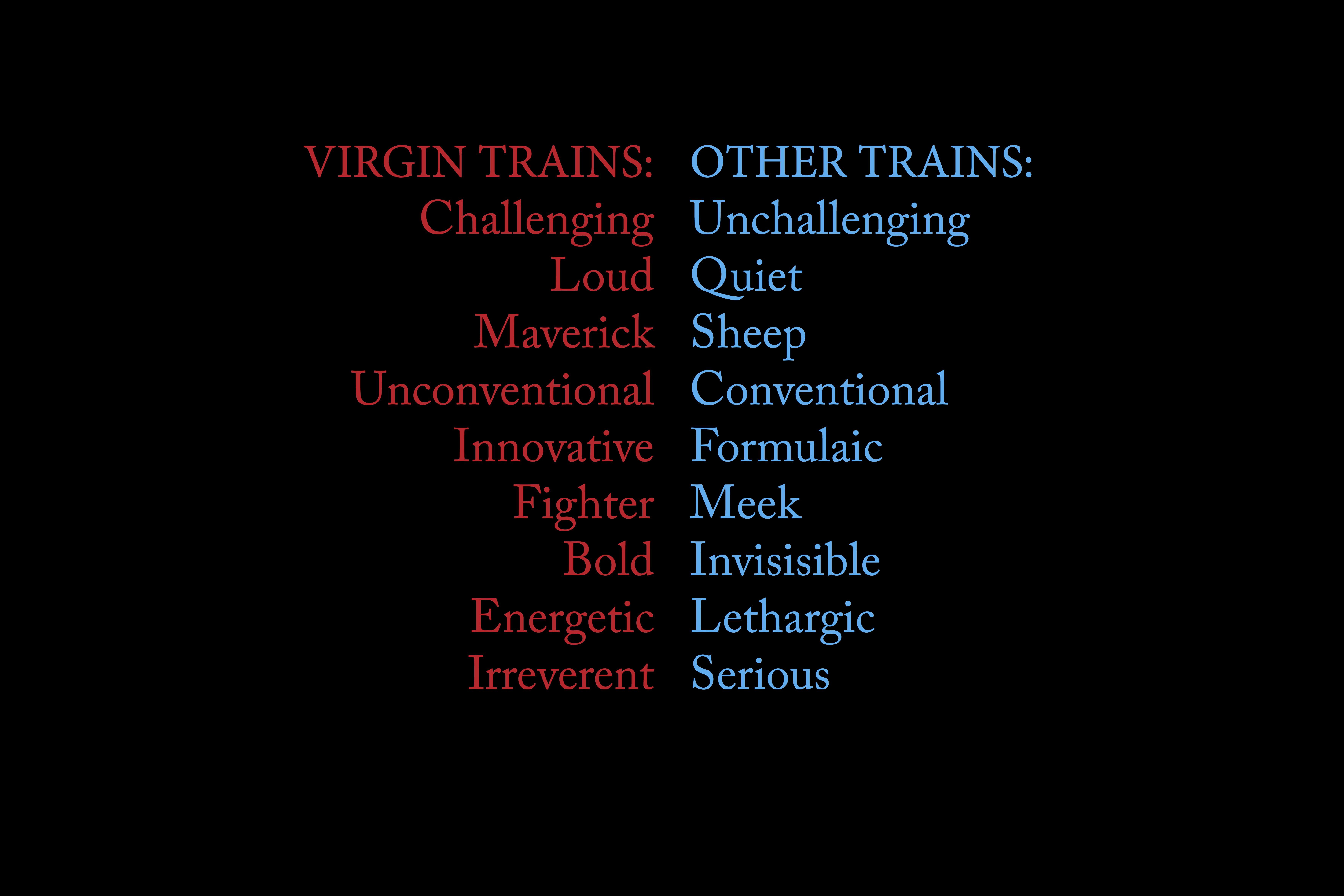 What does that mean visually?
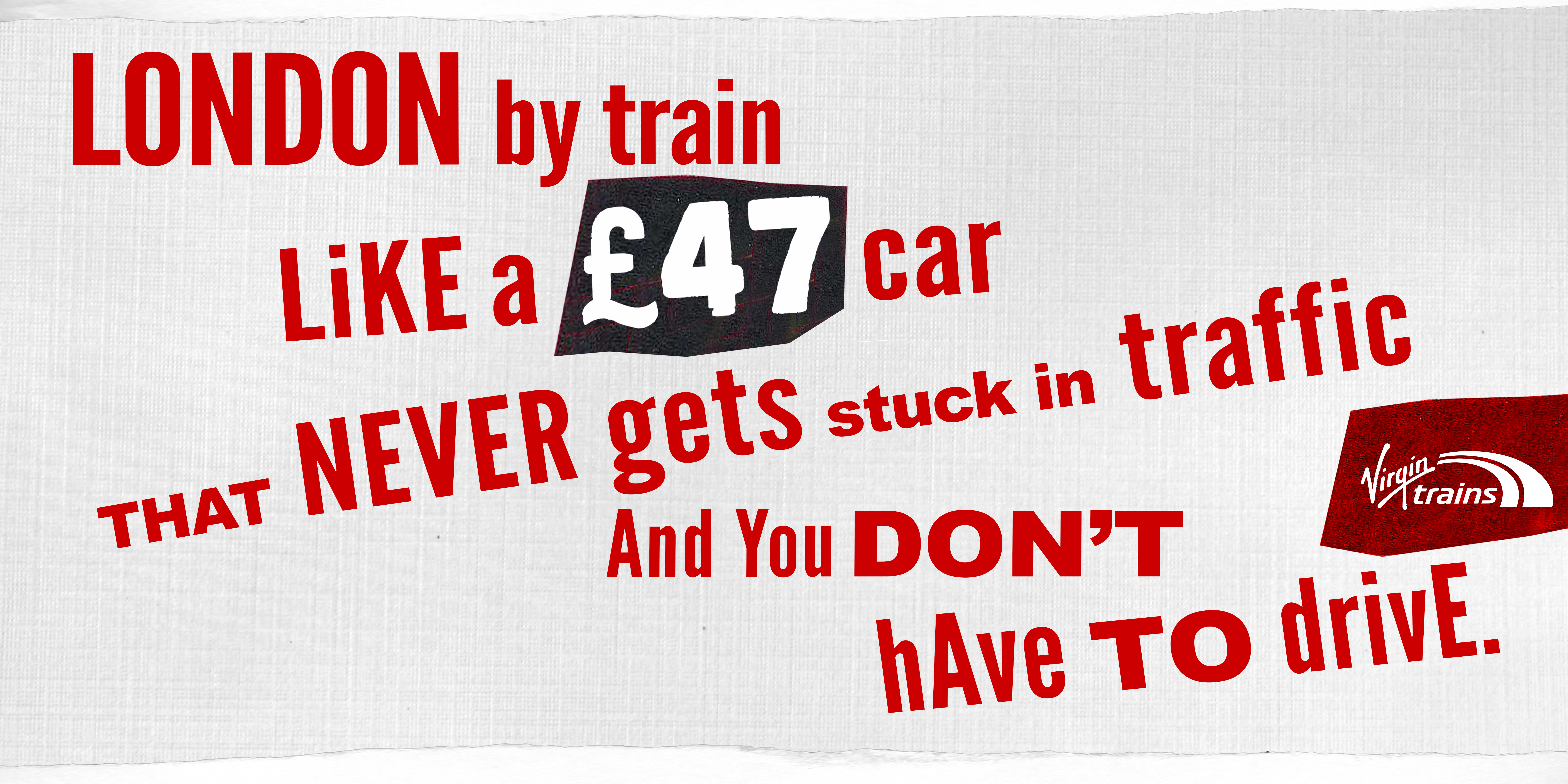
Don’t FFS look like a train company.
Virgin are the opposition.
Out go landscapes, sunsets, smiling passengers and whooshes, and all the other paraphernalia that would make Virgin look like every other train company.
Instead we need to signal the Virgin values above.
We need to look aggressive and anti-corporate.
If I was in the market for a colour to represent aggression I couldn’t do better than red, which is handy, as that is the Virgin Trains colour.
Research:
Where can we find use of graphic language that’s aggressive and anti-corporate?
1: GRAFFITI.
Human, cheeky, naughty, unrefined, it’s the opposite of ‘corporate speak.

Maybe we pick up on the textures, roughness and imperfection?
Maybe if the words move in from left to right it’d look like movement and less like a static headline?

 It’s ok, but still feels too corporate.
2: PROPAGANDA.
Generally produced by people who have a vision and passion for the way life should be, so it’s bold and challenging.

We have red, maybe the type is angled, to feel less conventional?
And maybe it obliterates the imagery, the opposite of what one of those genteel train companies would do?
Red against black and white imagery would look very confrontational.

 It cool, distinctive, but ironically a bit too slick. (And very Barbara Krugery.)
3: PUNK.
Virgin Records got behind Punk early on, ‘Never Mind The Bollocks’ by the Sex Pistols being the most famous result
Maybe that whole Punk, D.I.Y. aesthetic would be appropriate?
It’s certainly feels very challenger, anti-corporate and energetic.
Plus, I can’t think of any ads in that vein?
 The first attempt:
 Jesus! It just looks like a scruffy, conventional ad.
And a boring one at that.
Maybe I need to be less literal, rather than mimic the style maybe I need to embrace the idea behind it; Do-It-Yourself Design.
Start again, this time creating the messages as if you have no technical equipment, skills or cash.
It’s getting there, but it’s still too professional looking, we should never centre headlines.
Mistakes are essential. So we need to resist the temptation to follow our instincts to make things look simple, balanced and attractive.
 Great! That looks genuinely unprofessional.
We will need a device to pull out key information, like prices, times and destinations.

 Better. They certainly feel fresher and more hand-made, but maybe too scruffy.
Also, that great amateurish looking font isn’t available for commercial use, DAMN! (It turns out that somebody made it from David Shrigley’s handwriting, presumably without asking?)
Maybe a single font isn’t the answer anyway, uniformity can feel corporate. We now have a very set of ingredients to create each piece of communication from, whatever the media.
 Here’s what those element look like when mixed together.
Maybe we should make the coloured paper and text within it print slightly out-of-register, to make it look a bit more hand-made?


Creative work that is very simple, unusual or both rarely looks great in the office when viewed on run-outs or computer screens.
It either looks too basic or too odd.
It’s when it goes out into the world it really comes into its own, because its job is to get attention and have a distinctive, relevant personality.

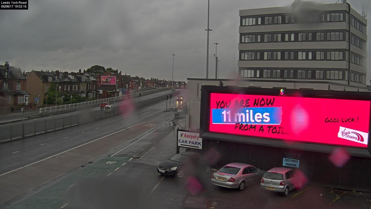


Great work and a great way to present it.
Loved this one, loads of great tips