I read this psychologist’s theory once; everything we say we say to impress others.
Everything.
Like that, me starting this blog by quoting some psychologist’s theory in an effort to come across all intelligent.
If it’s true, it could explain why asking people to name their favourite ads becomes an exercise in creating a cool, intelligent persona.
You’ll can watch this live if you’re on an awards jury.
This year there will be a lot of jurors positioning themselves as hip, tech-minded and caring to their peers by arguing for the hip, tech-minded work for caring companies.
Either consciously or sub-consciously.
Even if you try to be honest it’s hard.
Ask me to pick my favourite ad I’d probably say ‘Points Of View’ for the Guardian.
Ask why and I’ll and I’ll say ‘it distils a very complex argument into a simple 30” film that didn’t feel like any ad I’d seen before, it was like a clip from a documentary.
Also, it made me want to be part of that Guardian gang, thinking about things, not just jumping to conclusions.’
That’s why I’d like to think I chose it, but maybe other factors influenced my choice.
It was the big award winner when I was at my most impressionable – my first year in advertising.
Maybe it was because it I knew it’d been done by the best telly agency in town? (BMP)
Maybe someone told me it was done by the best tv guy in the business? (John Webster)
Maybe it was because, as a Guardian reader, it made me feel smart?
Maybe it was a combination of these?
My point is, judging work objectively is hard.
We react instinctively, emotionally, then try to turn our feelings into logic.
Nobody in advertising admits they like an ad because it has a nice song, was funny or looked cool.
But that’s why people not in advertising like ads.
The more we know about advertising the further our view is from those we’re making them for.
This got me wondering about what advertising people liked before their opinion was tainted with inside knowledge.
Basically, before they became indoctrinated.
I’ve asked a few people to put together lists in the hope it’ll throw up a few surprises, maybe even a jingle or two?
I thought I’d get the ball rolling, so here goes.
Nimble.
I loved this ad.
The internet tells me that it ran for ten years (’68 – ’78) ‘catching the public’s imagination in a way that rival firm Slimcea’s own balloon based bread commercial singularly failed to do.’
I don’t know their balloon-based rivals ad, but I’d wager the difference is the music, I loved that song, it turns out it’s ‘I Can’t Let Maggie Go’ by Honeybus.
I guess the ballooning helped too, if she’d been eating sandwiches in her kitchen it may not have caught my Primary School imagination in the same way.
Hai Karate Aftershave.
As an 8-year-old, I just couldn’t wait to until I was old enough to use Hai Karate aftershave.
As far as I was concerned, the sooner I could meet Valerie Leon the better.
‘Be careful how you use it’. No chance.
The campaign ran for seven years, it was most successful fragrance launch of the sixties and is still selling today (it’s now a bargain; only £1.99 a bottle, that’s cheaper than Meths).
Given its effect, it seems a small price to pay? (https://www.fragrancedirect.co.uk/hai-karate-aftershave-lotion-100ml-0073885.html)
Looking at these ads now, they seem like very early Lynx/Axe effects ads?
Health Education Council – Cramer Saatchi.

This will be familiar to most of you reading this.
It’s in awards books, Top Tens and in numerous articles about great advertising.
50 years ago it was in Doctor’s Surgeries.
That was its media*, just like ‘Pregnant Man’ and a ton of other great Cramer Saatchi COI ads, I don’t think it ever ran as a press ad.
It was famous amongst young kids at the time, not because of the idea, the unusual white out of black art direction or the genius ending – ‘Now it’s your turn’.
But because it was terrifying.
From then on, if a fly was in the neighbourhood of my food, I thought of this ad.
For years and years.
Now that’s bang for your buck.
*

Milk Tray – Leo Burnett.
He may look like a pound shop Bond now, but fifty years ago The Milk Tray Man was the height of glamour.
This wasn’t like other ads of the time with their creaky sets and dodgy dialogue, this looked like a clip from a big budget movie.
It still looks good today and the 157 foot dive was executed by Sean Connery’s double in Goldfinger – Alf Joint.
But what a weird idea?
A bloke risks his life to give to get to an unknown woman’s house, breaks in/trespasses, leaves a box of garage-level chocolates, then disappears before she can thank him (or identify him in a police line-up?). He leaves a little card with only his silhouette on, not much use to anyone, then the line ‘And all because the lady loves Milk Tray’.
W The actual F?
But, people, including me, loved it, it was a super exciting, million dollar escape break from the slow moving, low budget programmes either side of it.
An example of how much this campaign became part of our culture were the endless comedy show spoofs.
Birds Eye – Collett Dickenson Pearce.
My Mum used to laugh at these.
I used to laugh at these.
Seeing adults on tv bare-faced lying is funny when you’re a kid.
Actually it’s very funny now; June Whitfield is amazing.
It occurs to me that this campaign, like the other ads I’ve picked everything ran for years, they all had a theme and they stuck to it.
Maybe that’s why I remember it.
Surely that would still work today? Our brains haven’t changed, and to quote Paul Feldwick ‘The best search engine is our brain.’
Corona – DDB.
This was a big hit when I was 12.
Was it the Phil Silvers/Bilko-style voiceover?
The idea that bubbles had characters?
Or just the funny, out-of-shape bubbles?
Can’t remember, but today I like the competitive concept: Our bubbles are fizzier than theirs.
Dunlop – Saatchi & Saatchi.
Funny.
Yet ruthlessly proves how the Dunlop Group is absolutely essential to our daily lives, presumably to boost the share price?
The speeded up Benny Hill style dates it.
But on the other hand, they roll through 15 different product divisions in 60”.
Also, a quick shout out for the cheque writer – beautiful.
Clark’s Children’s Shoes – Collett Dickenson Pearce.
I remember my Mum laughing at this.
I bet if I showed it to her tomorrow she’d have no recollection of ever seeing it, let alone her response to it.
So why do I, 40 years later? (Paging Doctor Freud!’)
What parent could resist liking Clark’s after watching this ad?
(It turns out it was written by super-duo Ron Collins and Barbara Nokes whilst at CDP.)
Heinz Salad Cream – DDB.

(I couldn’t find this ad anywhere, so drew this from memory, 40 years later.)
‘It’s why celery has a groove, why Tomatoes have dimples, it’s why lettuce has crinkles, etc, Heinz Salad Cream. It’s what salads were made for’.
Even as a kid this just struck me as clever.
I’d never considered that Mother Nature had made all salad ingredients with a built-in place to put your salad cream.
Still clever, could work today.
Health Education Council – Saatchi & Saatchi.
Some clients view tv adverting in the same way that the Queen views her yearly speech.
I’ve got the nation watching so I must cover everything.
So they try not to waste a second.
Jokes and humour feel a bit indulgent; Why waste time making Britain laugh when you could relay information about your company?
It one way it totally makes sense, but in another it’s madness: The nation isn’t watching.
The last thing they want to do is watch your ad, you have to make them watch.
Take this one, men staving off heart attacks might not seem like an obvious subject for humour, but my whole family looked forward to this ad coming on.
It was fun to watch.
So we’d willingly sit there while my Dad would be advised to get more exercise.
My Mum would be reminded that my Dad needed to exercise.
All of us kids were made aware that our Dad needed exercise.
If it wasn’t funny and frivolous, we wouldn’t have sat through it, so we wouldn’t have known.
For the COI, that’s a massive success.
Clark’s – Collett Dickenson Pearce.
A bit like Heinz; I remember thinking this was so clever, so clear, so simple.
By the end of it you’re reaching for your wallet.
Even as a fashion conscious teen I thought ‘It makes sense to wear those Clark’s shoes’.
I didn’t wear them, the deal breaker was that the shoes looked too square, some looked like Cornish pasties.
I traded the health of my feet for a cooler look.
But I’d guarantee it made thousands of parents foist these ugly Clark’s onto their disappointed children, probably causing arguments, fall-outs and strops.
But hey, what a beautifully simple, persuasive ad.
Brutus – Saatchi & Saatchi.
What a track.
David Dundas put it out as a single and it went to No1.
(A few years later he did he scored ‘Withnail & I’, one of my favourite films…that’s it, I’m out of Dundas trivia.)
Barely anything happens in this ad, people do, as the song says, pull their Brutus jeans on.
But Director Adrian Lyne makes them do it in a very bright, very white room with very white props, so it all looks very cool.
In a kind of 70s, Guy Bourdain way.
But the track is 95%, just makes you feel good.
A bit like Droga 5’s new Diet Coke ad, a similarly intoxicating, feel-good vibe is created by Thundercat. The music alone makes me want to drink Diet Coke, ideally with my Brutus jeans on.
Levi’s – McCann Erickson.
Adrian Lyne again.
Only a few months after telling everyone to put their Brutus on, we’ve now got to put our Levi’s jeans on.
I can’t help notice his camera bouncing all over the place, flame flare is flooding in, both unusual at the time.
If you were watching this in 1976, in a grey city with grey skies; this was where you wanted to be – Sunny, exotic California.
Pure escapism.
Levi’s were a little bit of that California.
Accurist – Lonsdale.
‘Accur-elbow’.
Cinema audiences laughed in the aisles at this one.
But what’s it saying about Accurist?
What’s their strategy?
What’s the reason to buy Accurist over the competition?
Also, simply getting one of Britain’s funniest men to just be funny for 30” – bit easy isn’t it?
Yes, so why don’t we do it more?
The people we’re making these things for love it.
‘I liked that funny John Cleese ‘Accur-elbow’ ad..it must have been for…Accurist’
Sometimes I wonder whether we overcomplicate this business?
Martini – McCann Erickson.
By the time I got into advertising no creative would admit to liking this Martini campaign –
‘Syrupy, schlocky nonsense…where your U.S.P?’
But people like to dream.
It’s why Downton, the Crown and Succession are so successful – escapism.
If that’s what people want why not give it to them?
The cinematography and music in this campaign are superb.
(I’d never noticed before because I’d been told it wasn’t good.)
Parker Pens – Collett Dickenson Pearce.
I clearly remember seeing this ad at the cinema.
It was so unusual – a documentary based on a true story.
It’s intriguing, you stay with it, wondering where it’s going.
By the end you’re left thinking ‘Those Parker Pens seem good’.
Gordon’s – Foote Cone Belding.
Another one from the cinema.
I remembered it as being incredibly modern and exotic, almost futuristic.
It now looks a bit disappointing, a bit rough around the edges, why did I ever think it was so futuristic?
Well, the universe works in weird ways.
Whilst pondering this question, a friend mentioned a podcast he thought I’d like; ‘Electronically Yours with Martyn Ware’.
I listened to a couple, one with Jeff Wayne, who turned out to be the composer of this ad (as well as 3,000 others and The War Of The World’s soundtrack).
In the podcast they talk about this ad. What are the chances?
Before Heaven 17, Martyn was in an early version of Human League, David Bowie once commented upon leaving one of their gigs ‘I’ve just seen the future of music’.
That synth-based, future-facing Human League loved this ‘jingle’, so much so that they put an expanded 3- minute cover of it on their album Travelogue.
So I was right, this ad was futuristic.
EMI – Collett Dickenson Pearce.
This used to make me laugh.
Based on a simple observation: Boys pretend to be guitar gods with cricket bats when alone in their bedrooms.
The tracks (product) play throughout, they get in as well as showing clips of the group.
So it’s doing a lot of work.
It helps if you get Alan Parker to shoot it.
Benson & Hedges – Collett Dickenson Pearce.

I turned up for my Art at school one day to find the corridor was dark.
Someone had pasted a giant mural type thing from floor to ceiling on one side, it was about 20 foot long.
The corridor was only narrow so we’d queue inches away unable to stand back to take it all in.
It looked like some odd, abstract, fine art thing.
Looking closer you realised it was some sort of electrical thing.
Then someone said ‘There’s a box of fags down there!’,
Everyone looked to the floor expectantly – nothing.
But just above the floor was printed a little box of cigarettes, Benson & Hedges, disguised as a bit of circuit board.
Jesus – It’s an ad!
It was THE coolest ad we’d ever seen.
I didn’t even know ads were allowed to be that cool?
It’s amazing I didn’t take up smoking.
I’m sure it was done for artistic reasons, but posting a giant ad for cigarette outside a kids classroom seems, in retrospect, a bit weird?
Ambre Solaire – Boase Massimi Pollitt.
I could’ve easily filled this up with John Webster’s work.
From Cresta, Smash, Humphrey’s straws, Tic Tac, Prize Guys Yoghurts, Honey Monster, Sony & John Smith’s and the rest, they followed me and my generation through the seventies – from toddler to teenager.
And we loved them all.
But they get a lot of press, not many people know this one.
When I was wracking my brains trying to exclude awards and think back to what I can remember liking, this one popped up.
Why? It’s nice to watch.
Great track, looks nice, quite cool.
Sometimes I wonder whether we overcomplicate this business?
After Eights – J. Walter Thompson.
 Another clever one.
Even though they weren’t terribly expensive, After Eight’s ads always showed posh people eating them, so this is bang on brief – all the posh London squares represented by an After Eight, one’s missing; Eaton Square.
I’m not a big fan of puns, but this seems like a clever one, but the impression you’re left with is that After Eight’s are eaten in all the poshest parts of London, almost like an endorsement.
with implying these are eaten there.
I also love that it doesn’t look like an ad – no logo bottom right, they had to make do with the other 11.
Maxell – BBDO.
100% cool.
Famous.
Spoofed a million times.
It made me buy Maxell tapes.
I’ve since discovered that this was an exact remake of a Scali McCabe Sloves ad from the States, with Bauhaus’s Pete Murphy replacing the American lead.
Possibly his finest role.
Triumph – Saatchi & Saatchi.
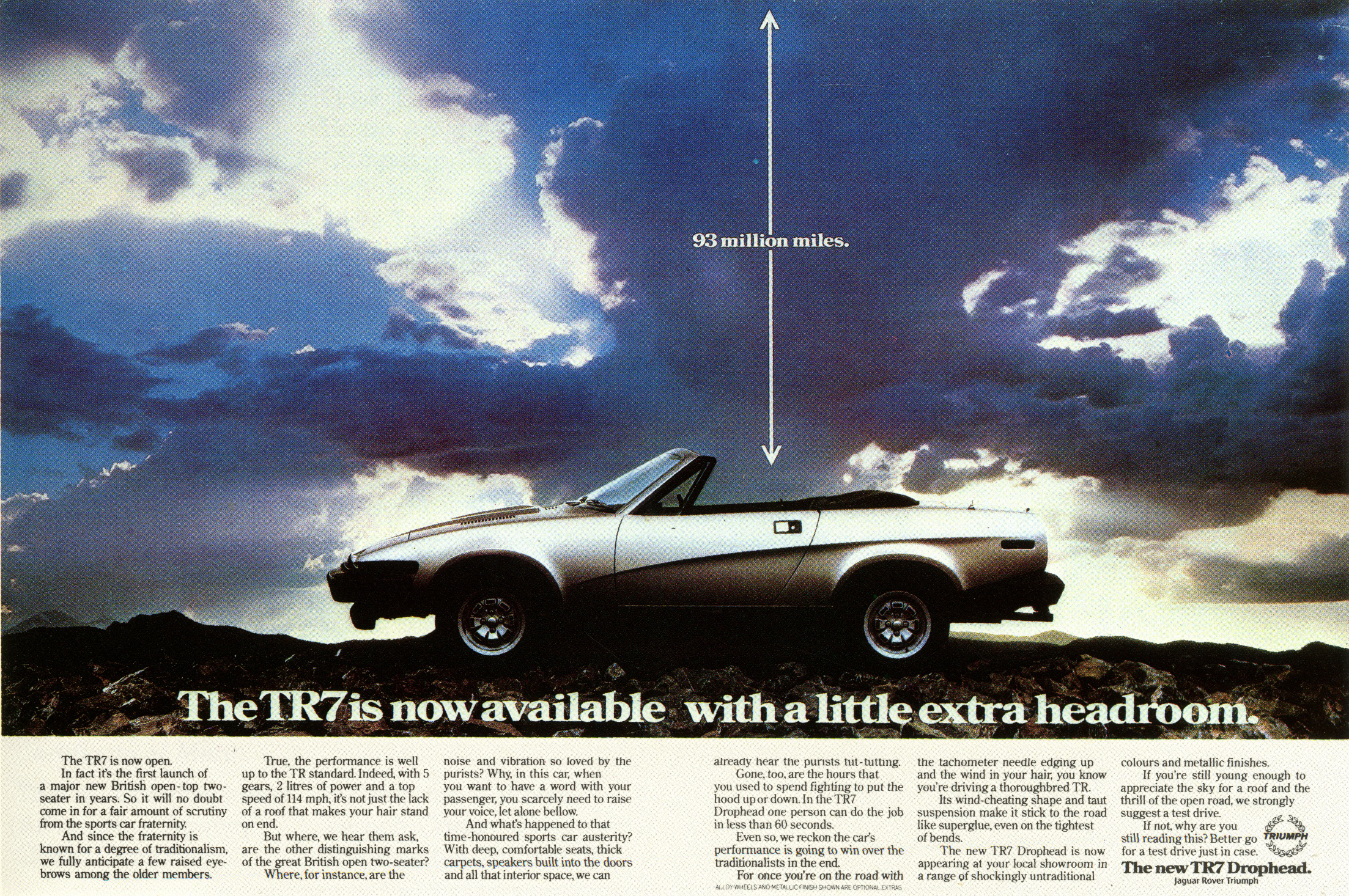
It’s interesting in retrospect how many of these ads I liked because I thought they were clever.
An extraordinary way of saying something ordinary.
I think it was BBH who used to talk about ads being products of the client, in the same way they make cars, cakes and computers.
Normal people don’t see ads and think of ad agencies, if they see a stylish, clever and cool ad made by Triumph they are more likely to think that the cars they make are stylish, clever and cool too.
This is a great example, I could not have been more aware that a convertible version of the TR7 was now available.
I loved this ad.
(Even though I’d have been too poor to buy one and too young to drive it.)
Chanel – Ayer Barker.
The best way to judge an ad is in context.
I prefer looking at posters on the street to a computer, you get a sense of how in works in its surroundings, does it vanish? Jump out? Contrast with its surroundings?
It’s the same with commercials, this looks nice here, sandwich it between an ad for Aldi and Paddy Power and it becomes an exotic ocean of calm.
I love its vibe.
Shot by Lester Bookbinder.
Wrangler – What’s Going On.
This felt like special effects from another planet.
What indeed, was going on, and how the hell was it done?
The writer Mike Everett told me once how he and Paul Smith did it, they were stuck on the brief, someone happened to come in with Godley & Crème’s early showreel, that was full of pop videos, and bingo ‘Let’s get them to do something like that’.
They shot it, created the weird music and made Wrangler cool again, (at least in my school.)
That can sound like a lazy of the creative team, but it’s the opposite, their antennae were up, they were looking to replace Wrangler’s old cowboy image with something more contemporary and cool.
It made Wrangler cool. At least, it did in my school.
Foster Grants – Kirkwoods.
I still think is cool.
What else is like it?
Nothing, it’s got its own vibe.
But imagine it on paper?
Or trying to sell it?
But Director Nick Lewin did a great job, particularly with the styling.
To a teen me, this this felt exotic, foreign, naughty and hip.
I longed for a pair.
EMI – Collett Dickenson Pearce.
‘Lend us yer Barclycard John’.
Hilarious.
Kids were quoting that line at school for weeks after the ad ran.
I don’t know what they paid Dudley Moore, but he was worth every penny.
The money they paid Alan Parker wasn’t wasted either.
Paco Rabanne – Ogilvy & Mather (New York).


As a teenage boy in Essex, this was the dream.
Waking up in some huge loft in New York, flirting on the phone with some pesky one night stand.
It seemed like the height of sophistication.
A kind of New Yorker/Woody Allen sophistication.
And the shots are great (Deborah Turberville).
What strikes me most about these ads today is how unlike today’s fragrance they are.
Some of the dialogue would be problematic, but that aside, they feel quite grown up.
I used to wear Paco Rabanne.
At the time of writing I’ve never owned a yacht.
New Man – Aspect.


I liked that they didn’t appear to be trying to flog me something.
They came across like ‘We’ve been given some space in a magazine, what can we fill it with that would look lovely?’
I liked them for that, for not trying to convince me their trousers were AMAZING!
Maybe it was because their trousers weren’t amazing?
Their clothes always seemed a bit square to me, so maybe getting people to draw them was a creative solution?
Who knows? But one thing that was amazing was their logo- it works upside down too!
It seemed like some kind of black magic at the time.
Philips – Leagas Delaney.
This isn’t here because it’s famously ‘the best radio ad ever’ (at least here in the U.K.)
It’s because when I was at college EVERYONE loved, talked about and quoted this ad continuously.
Pick your quote:
‘Morning Squire, I’d like to buy a Videocaster’,
‘I must have one with functions’,
‘My friend mentioned the HariKiri-Kabooki-cassooni-k-m-whajamacallt?’
‘I’m very technically-minded you see, so I want one with all the bits on it, all the Japanese bits.’
‘MAN 1: It’s a Philips. MAN 2: Doesn’t sound very Japanese? MAN 1: Er…A Firips’.
‘Mmm…No, no, hasn’t got enough knobs on’.
‘What’s that one over there?’ MAN 1: ‘It’s a washing machine sir’.
Many good radio ads lead to one funny punchline, this is funny throughout the 60″, the reason is because
Tim Delaney brought in two professional funny people to help him write and record it: Mel Smith & Griff Rhys Jones.
The public loved it because it made them laugh.
Sometimes I wonder whether we over complicate this business?
Sony – Milton Glazer.
 A classic by Milton Glaser.
Not that I’d have known it at the time, I wouldn’t have known Milton Glaser from Milton Keynes.
But I loved his ad.
I also loved music and the idea representing its different sounds with colours.
‘Full colour sound’ makes no sense, but you totally understand it.
Could run tomorrow. (If tapes were still a thing.)
Vivitar – FCO.

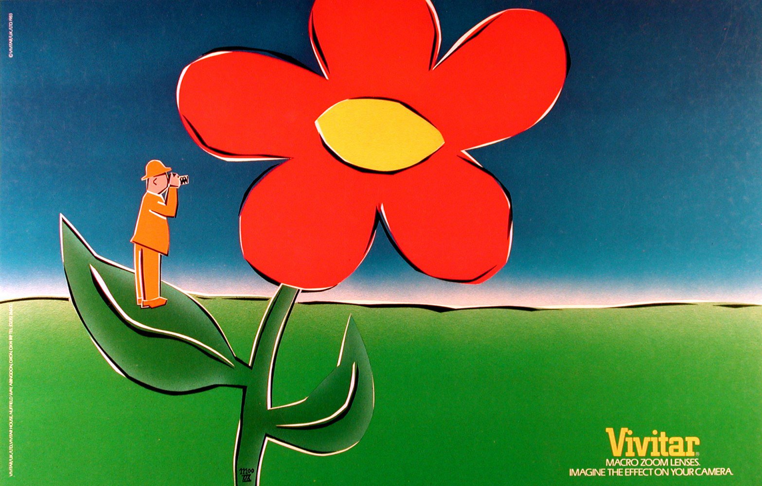 I used to work in a design studio, making tea and operating the PMT machine (Photo Mechanical Transfer).
An odd, bouncy Asian guy used to pop in from time to time with briefs, his name was Ian Moo Young, his face was 50% grin, 50% glasses.
One day he popped in with these.
I guess in retrospect they didn’t tell you too much about the camera, but they did it in such a delightful way you couldn’t help loving the brand.
Winston Cigarettes – J. Walter Thompson.

These felt very subversive, like they were sticking it to the man.
Taking his (The Government’s) petty rules and throwing them right back in his/her face.
Publicly.
Ironically, they were created by the least subversive agency on earth.
Cadbury’s Chocolate Fingers – FCB.
Loved the kid’s performance.
Like a pint-sized De Niro.
Looking at it now; it’s the kind of brief that leads to bland, forgettable advertising.
This popped into my head 35 years later.
Nat West.
I’d have been slap-bang in the middle of the target audience for this.
It’s like it was designed for me.
‘Let’s get someone from his absolute favourite tv show to be in our ad, he might like us more?’
I did.
Sometimes I wonder whether we over complicate this business?
This was an interesting exercise for me.
In a way, I’m disappointed there wasn’t more rubbish, I could’ve then tried to figure out what had appealed to me.
It was also interesting to find so many of the ads were cool, escapist or just feel good.
A lot of my choices weren’t one-offs, they were part of long running campaigns.
Meaning the ads had a theme or property that would be refreshed and reinvented year after year, that repetition of thought is probably why I can still remember them?
(Maybe we should try that again?)
Quite a few stand up well today, but nearly all feel a little naïve, from a simpler time.
All but three would’ve been aired on ITV when it was the only commercial channel the U.K.
So the only competition they had was the kettle, loo or indifference.
Not mobile phones, computers and indifference.
So maybe it was easier back then?
In a way it was.
I always find it weird to hear a contemporaries of mine say that advertising is better today, I can’t help wondering what they didn’t like about advertising back then?
The seat at the top table
.
All that extra salary?
The bigger production budgets?
More time on briefs?
Fewer meetings?
Offices?
Company cars?
The lack of tissue meetings?
Not creating your own presentation decks?
The endless black-tie awards dos at the Grosvenor House?
The lack competition for the public’s attention?
The tens of millions of people who’d see your ad in one ad break?
Too many funny ads?
Some may read that list and think I’m criticising advertising today, I’m not, it’s just reality; things change.
It doesn’t mean I feel bad about or towards advertising.
It’s a similar situation with Arsenal, the current team aren’t as good as the 2004/5 team (‘The Invincibles’), they are no longer considered an important team.
Not acknowledging that fact would be nuts.
And it wouldn’t change the situation.
If everyone is honest about how Arsenal have regressed, there will be more focus put on rectifying the situation.
I still support them.
I’ll still renew my season tickets.
And I hope things will improvement next season.
Same with advertising.
They’re my team.
NEXT WEEK: Mark Denton reveals his selection.
Love this series! Ads like this are like records I grew up listening to. All surrounded by the sights, sounds and feelings I had at that stage of my life. What a great excursion.
Hope it’s chips, unipart, the colour blind Tango bloke, there’s a Humphrey about, Maxell, Fosters, then four x, Seiko, plus a local menswear shop in the cinema that reckoned it was “real cool and trendy”.
I bet none of these were presented after 150 slides filled with charts.
He’s a Lord. Y’ third bit of David Dunas trivia.
I’m mean’t to be working, but im watching 30 year old ads, and I had to watch them to the end!
God I loved that! thanks Dave. Those ads were so much more than ads and I remember quoting them in the playground, “Hhhi’d like to hhhopen a bank account!” (Although we always misattributed the Nimble ad and talked about ‘the Slimcea girl’.) They were so embedded in the culture that they’re almost a secret code for the over-50s these days.(I say to a mate, “‘Arry the Spider’s coming’ out party” and the young uns have no idea.) These and your list of what’s different at the end of the post make me sad for a lost age. So many of these ads were the creative team’s ticket to a fabulous foreign trip. These days we’d all settle for an escape to their normal agency life.
Sorry to make you sad Graham. Dx
Really enjoyed this Dave, thanks.
And a gooner to boot…
Thanks for posting those Paco Rabanne ads. I’ve never seen a couple of them. I have several framed and hanging above my fragrance counter. I wanted those ads to be my life! I grew up outside of Boston. Some things are universal I guess. Actually, I still want them to be my life! Cheers!
I’m very positive that the ‘Marc and Biffy’ Paco Rabanne ad was inspired by a 1931 Cecil Beaton photo of Gary Cooper. Very chic.
Love the post, Dave. We have similar tastes.