Before we start, full disclosure: I’m not anti old ads.
I quite like them.
But weirdly, a surprising number of creatives leaders don’t.
At least, they say they don’t in public, I’m sure in private they must have a cheeky flip through the odd One Show annual now and again?
They put out phrases next to their profiles like ‘All about the new’, ‘Future facing creative’, ‘Forwards, not backwards’ ‘I never look back’.
It sounds so cool.
Frankly, it makes me want to be part of their gang, just imagine how much ass they must be kicking?
As we speak they’re probably creating ideas, so fresh, so original, that exposure to them will have you questioning your very existence on this planet.
Who wants to look at old ideas?
For a start, they’ve been done.
Also, they were created for a different generation, what relevance would they have to people’s lives today? Afterall, we’re more woke, recycle more often and have better Uber ratings.
Why look at outdoor made up from printed sheets and a pot of glue when you work in pixels?
Or read print ads that looks like a pages from books when you have a global brief?
Why watch a cigarette ad made for cinema screens when your brief is for phone screens?
In April 2010, this wasn’t just a philosophical question, it was a brief.
Barry Cox had written it, I’d known Barry from my time at Publicis, he was Head of Account Management and therefore my partner Jorian Murray’s boss.
He was now C.E.O. of The History of Advertising Trust, who had a problem.
They’d been gifted thousands of old U-Matic tapes by The British Television Awards Association, who’d found in lock-up in Lewisham, that they didn’t know they owned.
They were the tapes entered by agencies to the annual BTAA awards since 1977, not just the winners of every category, but all the near misses, long-shots and no hopers too.
Basically, the last forty odd years of anything ad agencies and film companies thought was half-decent or better.
What a treasure trove.
And U-Matics too, so very high quality.
The U-Mat mountain took up a lot of space and wasn’t exactly user-friendly.
So they’d got together with a digital asset company, Chillibean, who turned their tape mountain into a bunch of gigabytes, then into a website; Arrows Archive. (As Pencils are given out at D&AD, Arrows are handed out at the BTAA.)

Having got this far, Barry called us at Dye Holloway Murray to ask us to promote the site.
His big question was ‘Is anyone interested in this old stuff?’
It was a good question, at the time, 2009, the industry was split into ‘traditional’ and ‘digital’ agencies.
The feeling at the time was that the traditional ones would probably die out in a few years, once clients had been weened off archaic things like tv ads.
It meant our potential audience were viewed as either ‘digital natives’ or dinosaurs, the latter desperately trying to avoid the axe by pretending to be excited by ads the size of credit cards, QR codes and the term ‘rich media’.
What better way to speed up their own demise than get caught watching old tv ads?
Not the ideal time to launch this site.
But, as a creative, you don’t get to pick and choose your problems, so we got to work trying to solve this one.
Our top team, David & Phoebe set to work, producing cool campaign after cool campaign.
But as cool as they were, they seemed to simply announce the existence of this archive.
They didn’t give a reason why any of today’s ad people might want to go there to look at yesterday’s ads.
Why should they?
What’s in it for them?
The process was different.
The techniques were different.
The audiences were different.
Even the shape of the tv ads was different; square not oblong.
They went away to figure out what link this old stuff to today’s shiny, new creatives.
Are these new creatives different from their ancestors?
Do they have different goals?
David and Phoebe, being barely out of their teens, were ideally situated to shed light on what creatives aspired to today.
They confirmed that they still stared at blank pads.
They still wanted to win awards, be Creative Directors, earn more money and be famous.
(It seemed only the haircuts were different.)
Out of this came a thought ‘Find out what the best creatives were inspired by’.
That’s a reason.
Maybe if you find out what’s in their head and it’ll be in yours, which might help?
The numbers worked out perfectly; an ECD is about 40-ish, so would definitely have been influenced by our U-mat mountain.
It’s the stuff they use as shorthand, a benchmark and to annoy younger creatives when giving feedback.
We decide to get influential ECDs to appear in our ads
saying our mountain had influenced them, so, y’know, visit it.
How do we make them go from the ad to the site?
Phoebe and David suggest we create some content for Arrows Archive, excited, I replied ‘Great, that would be very cool…What’s content?’.
The explain that we could ask the ECD’s to pick their favourite ads from our mountain, then post them up on the site.
Excellent, people love seeing favourites lists and Top 10s, let’s intrigue the fuckers into visiting.
SO WHAT ARE WE GOING TO SAY?
‘Find out what the best creatives were inspired by’ sounded more like an end-line than a headline.
But not a good end-line.
It was refined into ‘Find out what influenced those who influenced you’.
Should we have headlines, endorsements, a bit like Tim Delaney’s Punch ads?


Or maybe these ads should feel more like content (which people like) than ads (which they don’t).
So what should it look like?
David found an interesting reference in an old D&AD annual.
, maybe we base our layouts on this?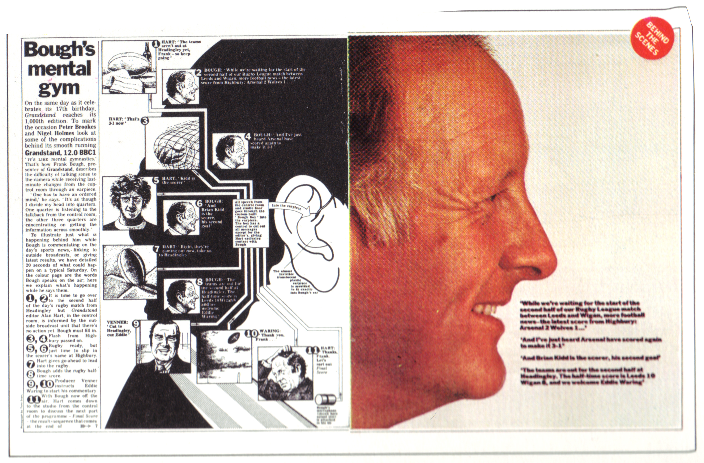 Yes it was old.
Yes it featured renowned square Frank Bough.
But I liked the technical, semi-scientific look, it didn’t look like an ad.
And the two completely contrasting pages either side of the gutter looked almost like a mistake, in a good way.
First layouts.

 Maybe a black & white portrait would simplify the ads a little? It may throw out the coloured column of ads?


Great, full of potential.
Had second thoughts on Alan Parker, he’d influenced my generation, but probably not this new, digital generation.
Can’t remember why Richard Flintham didn’t do it.
Paul Silburn said yes.
Maybe we need to call out exactly what we’re talking about, make it clearer?

It’s clearer, but feels a little dry.
Maybe we could show other stuff in these ECDs heads, hopefully funny stuff.
I remembered an old ad I’d done for The Guardian whilst at Leagas.

David & Phoebe got their pens out.


Yep, could be interesting.
I lined up a photographer who’d deliver six portraits on our minuscule budget, then started phoning around for our six.
Robert Saville said ‘No, I don’t do that sort of thing.’
Juan Cabral was about to disappear on a long shoot.
John Hegarty was in New York.
David Abbott had retired.
Can’t remember what happened with Trevor Beattie.
Tony Davidson said yes.
So did Nick Gill.
David worked up the layout once more. It’s a bit busy, little pictures and words all over the place.
Should we lose the little words we’d added inside the brain, maybe they’re just complicating matters?
Or maybe we lose the little pictures?
Maybe ‘Watch Tony Davidson’s chosen 10 from 25,000 commercials online at arrowsarchive.tv/tony’ is more intriguing?
Also, having received Nick, Tony and Paul’s top Tens, there was a lot of overlap and the ads, not surprisingly were very well known, there’s a risk that people look at the ads, take in the selection then don’t go to the site because they’ve seen the ads.
In some cases, hundreds of times.
We decide to drop the images of ads, the line is more intriguing.
Still can’t decide whether we crop horizontally or vertically.
Also, I’m not convinced that the extra words we’re putting into the heads are paying their way, they’re not adding enough humour and insight to offset the extra complication they bring with them.
In fairness to David & Phoebe, they’d been in advertising about two years at this point, so they didn’t have a tremendous amount of knowledge or insight on the individuals to draw on.
I tried to explain that the words didn’t feel true, they just felt a little contrived, not believable enough.
David, or Phoebe, said it was difficult to know what might or might not be in their heads, as they didn’t know them.
Fair point.
Then, David, or Phoebe, suggested we get them to write what’s in their own heads, as they’d know for sure.
Perfect.
Not only would it be accurate, they are all highly creative, so would make it work.
Dave Trott says yes.
Ringan Ledwidge says yes.
Mark Denton says yes.
We have our six.
We ask them to write down what’s in their heads and post it to the agency.
One night a friend of mine (Brian Stewart) asks if I want to be his plus one at the opening of Brian Griffin’s exhibition.
I love Brian Griffin, we go.


Looking at how interesting, clever and cool Brian’s portraits are, I can’t help reflect on how staid our side on portraits are.
I tell Brian this, he suggests I ask Brian to shoot them, he’s not busy, I spoke to him earlier.
I tell him our budget wouldn’t cover his lunch bill.
‘Brian’s not like that, if he likes the layouts he’ll shoot them’ Brian assures me.
The next day I send Brian the layouts and an apology for the tiny budget.
He agrees to shoot them.
I stand our previous photographer down.
V. excited.
Panic.
Having got Brian Griffin, I now feel guilty that we’re wasting his talent; admen looking sideways? Big wow!
We could give him free reign, but then we’re asking him to do even more work for that tiny budget.
Maybe we give him a different option for each shot AND the freedom to build or evolve them?
David starts coming up with a different ways to shoot each person combined with a different picture crop.
Harder than it sounds.
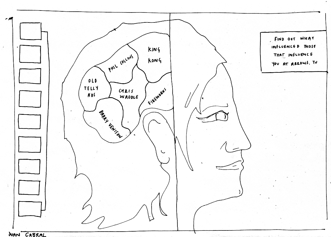
Nick Gill.
Nick sends us a map of what’s in his head besides old telly ads.
It confirms that we made the right decision in getting the individuals to do our work for us.
The thoughts are more bespoke, are more surprising and feel more human.
Plus, Nick being creative, plays with the construct.
(See the question mark, the doubling up of coffee and the non-specific ‘Too many films to mention’.)

Seeing Nick’s thoughts in his own hand makes us think we should ditch fonts and scan in each persons scrawls, to make it more bespoke, a bit like Martin Galton did with his Levi’s ads back in the day.

They still look amazing today.
Having worked with Nick at BMP, I knew him to be decent, talented and own a pair of sticky out ears.
Consequently, I thought we should shoot him from behind, he’d still be recognisable and it would make a more unusual shot.
Nick turned up with an Echo & The Bunnymen album for Brian to sign, (he’d shot the cover).
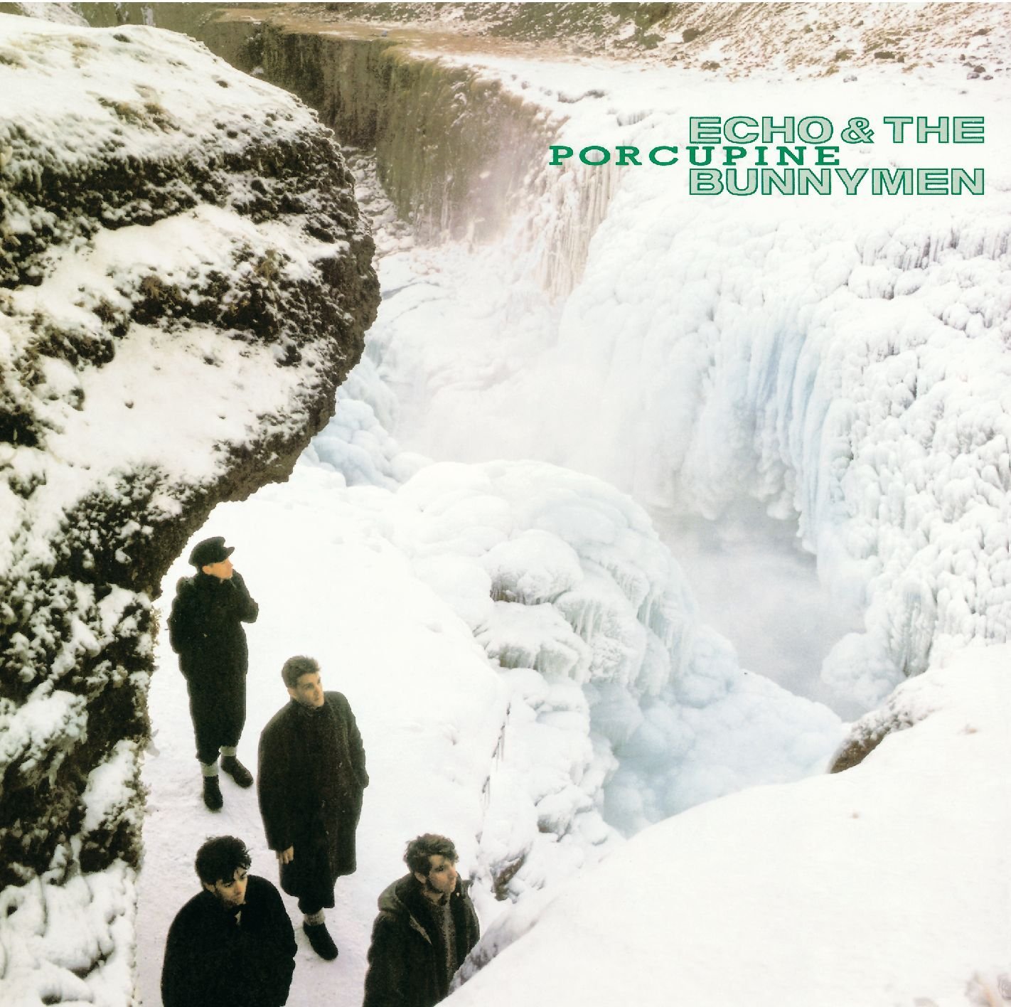
Nick stood on his mark, Brian asked him to turn around, back to camera.
‘What? This isn’t about my ears is it?’.
DAMN! He was onto us.
We all studied our shoes.
He didn’t want to do it.
No amount of reason, creative bullshit and emotional blackmail could shift him.
It was awkward.
So Brian shot him front on.


They shots were fine, they were just from the wrong side.
Wrapping up, Brian asked him again.
Nick relented.

We mocked up our ad.

Having a mistake, something crossed out, seemed to loosen the layout up, and mistakes are a big part of creativity, so it seemed appropriate.
But the words were too small, floating in too much space.
Plus, the outline of the head looked too cartoony and wasn’t needed.

Tony Davidson.
We received Tony’s words, like Tony, they radiated energy, looking like they’d been written fast and excitedly.

It’s decided that the layout would show exploding out of his head.
It seemed appropriate, as anybody who’s worked with him will verify.
So the main question was how will he be reacting to that?
Recognising it as a regular occurrence?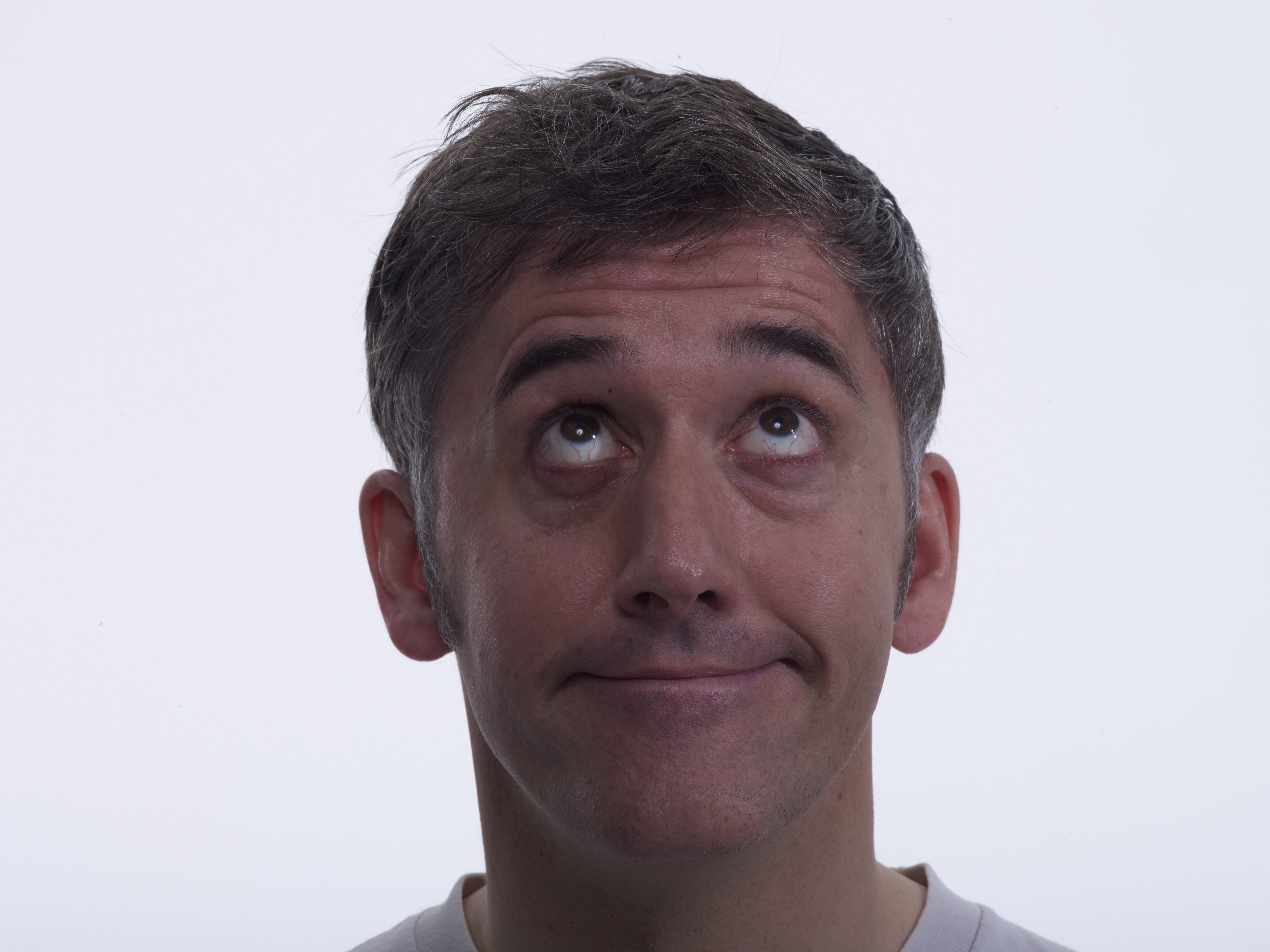
Happy it’s happening? 
Straining them out?

We decided on him reacting to this phenomenon as if he has no control.

Mark Denton.
Mark, being an art director himself, and knowing it will be really helpful, offers us lots of options.


Although handwritten, he even offers up different weights of font.
What a gent.
David zoned in on Mark’s two distinctive assets; that curly moustache and his bald head.

Brian loved it.
Mark was shot and dismissed very quickly.
His distinctive silhouette was a gift, a neat use of negative space.

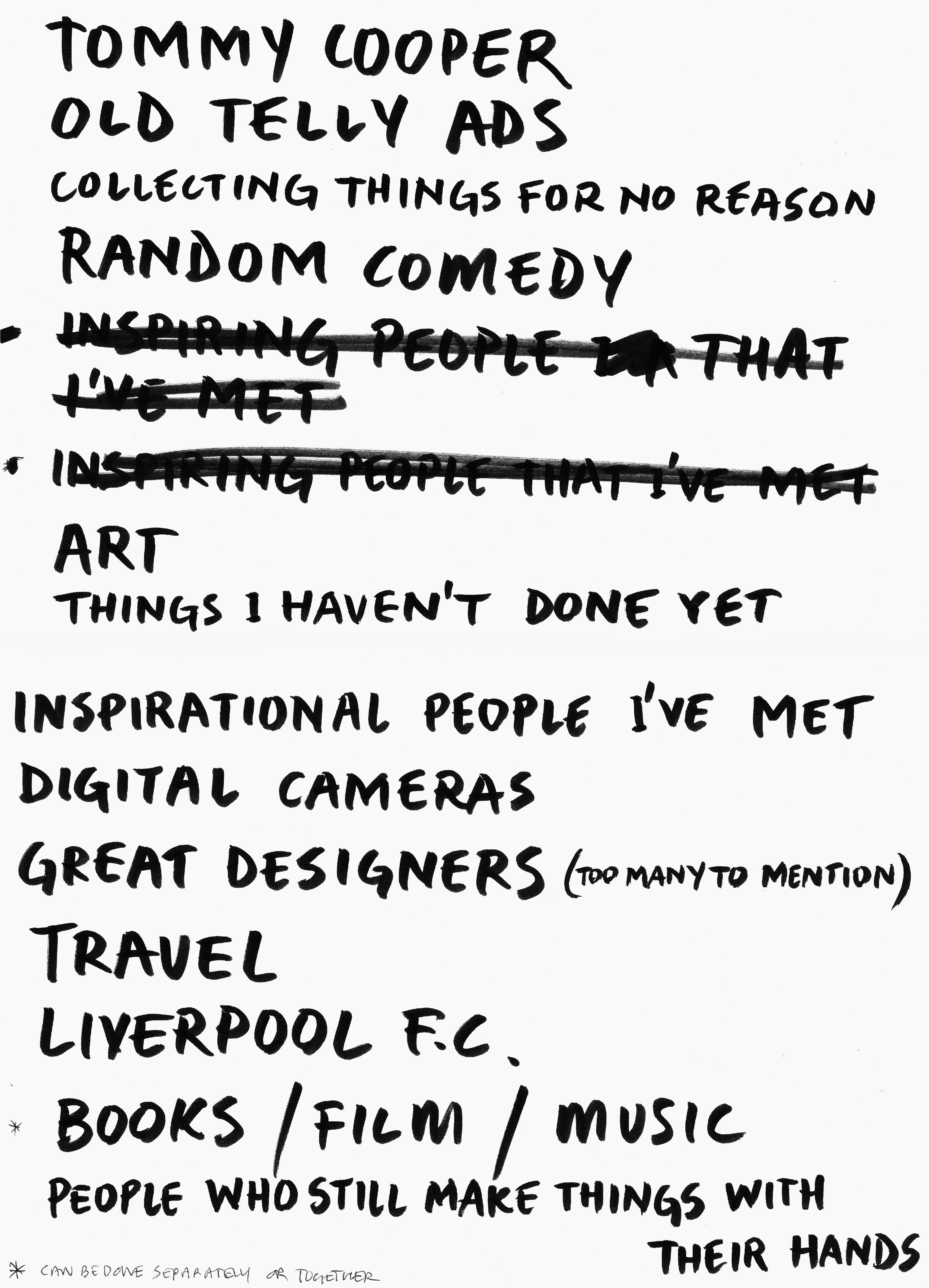
Ringan Ledwidge.
A mind map comes back (predictably, Kenny Dalglish is in the dead centre).
Tommy Cooper pops up again.
We like the mind map, but feel it’s a bit complicated for our layout, so we strip out the words.
 We’d shot from the front, back and a three quarter angle, so decide to shoot side on.

(Let the record show that Brian talked Ringan out of his shirt.)


Probably due to Ringan being a handsome devil and having no top on, the shots have a perfumey vibe, so we pick one where he looks like he’s thinking and crop out his naked body.

Dave Trott.
I notice that Dave’s words were scribbled onto a Dye Holloway Murray notepad, so he must’ve popped by the office to give use his thoughts live.
Interesting to see that The Marx Brothers and Brian Clough get a shout out (Clough being at the top with possibly the biggest bubble too).
As a piece of ephemera now, they look great, in terms of what we needed graphically back then, they were a problem;
he’s scribbled them onto a lined pad, in pencil with lots of rubbing out.
Writer!

The studio traced, cleaned and buffed up Dave’s handiwork.

I could’ve been imagining this, but when Dave walked in the studio he and Brian seemed to know each other, but not in a good way.
It felt chilly, but as I say, I may have imagined it.
Anyway, the awkward vibe carried over into the shoot, it was difficult with Brian not quite knowing what to do with Dave.
He tried this way…

and that way…

and this way…

and that way…

Nothing seemed to please Brian.

Then he started trying props, in this case black leather gloves.

Then, inspiration struck Brian ‘Wheres the nearest sports shop?’
‘Dalston High Street’ his assistant Johnnie replied.
‘Great, right Johnnie, pop on down there and buy a box of ping pong balls, we’ll pop ’em on Dave’s mouth’.
‘Don’t do that Johnnie’ Dave said ‘That’s not happening.’
Once more, it was a time for us all to examine our shoes.
We tried to use Dave’s quirky bubbles.

That just looked weird, hanging out of the back of his head.

That made Dave look like one of those WW1 survivors who’d had their nose blown off.

Quite liked that one, but the gloves gave him a burglar vibe.
We settled on this one.

Paul Silburn.
Again, Paul being highly creative, funny and great at giving ideas humanity he plays with the construct.
E.g. 1: Take That crossed out.
E.g. 2: ‘Louvisa, Jacob, Esther and our mortgage’.
E.g. 3: The specificity of adding ‘On cold, wet, Tuesday nights’.

Again, we wanted to keep the quirky boxes that he’d drawn, so amended them to fit our layout.


We chose one of Paul looking into the middle-distance thinking. Very him.

You may have noticed that this post features a lot of old stuff.
Aside from the ads themselves (12 years old), there are references to 50 old tv commercials, there’s an old rough for The Guardian, an old press ad for Punch, an old Levi’s ad by BBH, an old tape format, old album cover, old pictures of pop stars and politicians, old comedians, old agencies, old people, I could go one.
But hopefully, if you’ve got this far, you’ll store all those bits in the back of your cranium, and some point in the future, one of those bits will pop up and help you create something fresh and new.
Because that’s how creativity works.
P.S.
The ads they chose to be featured on the site.


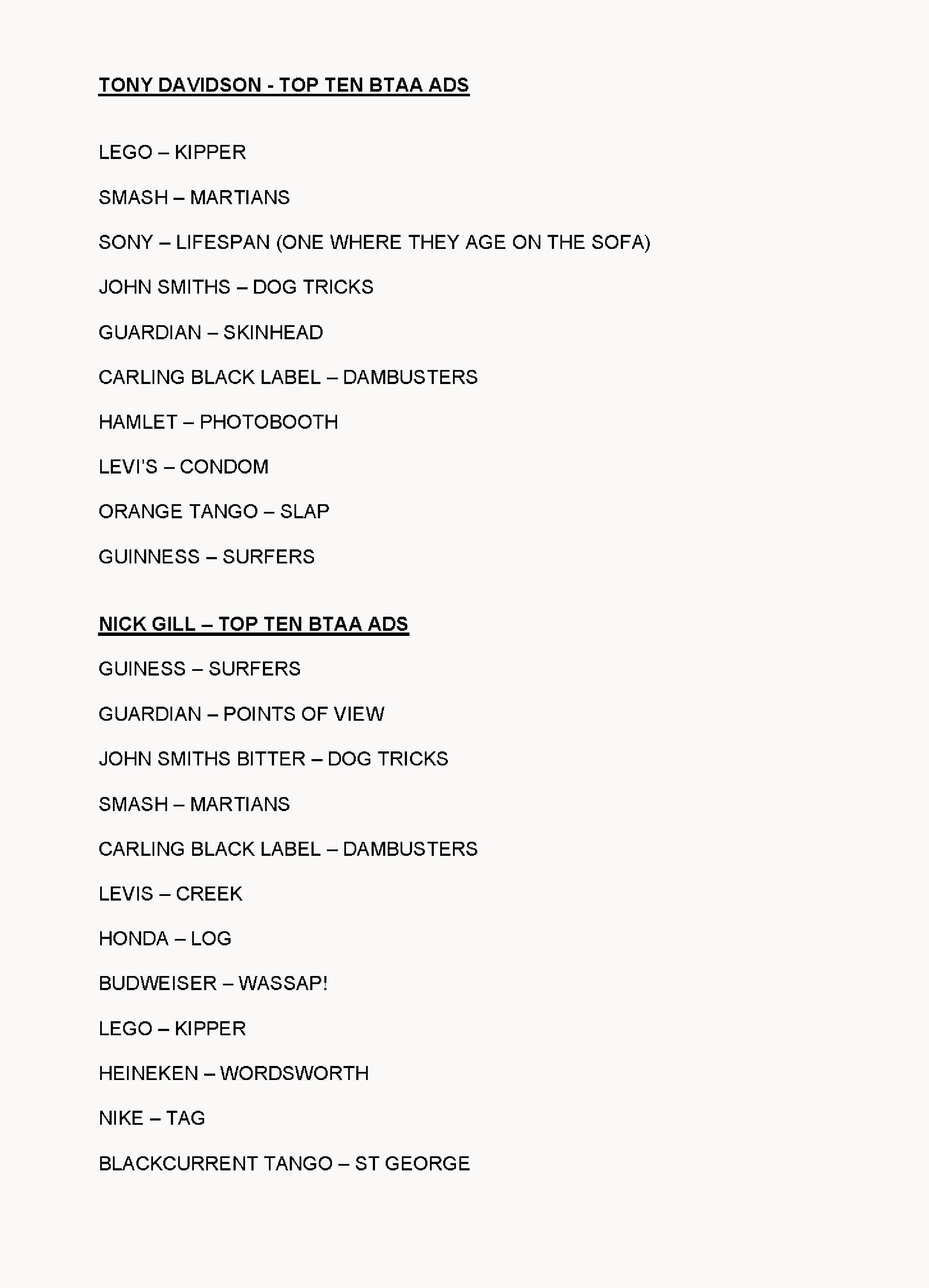
Most popular ad was BMP’s ads for The Guardian ‘Skinhead.
Most popular agency was BMP with 17 ads (16 written by John Webster.)
Most prolific creative was John Webster, (25% of the ads chosen were by John, across 8 different accounts).
Pps.
We used the idea in a competition.

P.P.P.S.
Some other History of Advertising Trust bits we did.
A printed poster offering students free access.
An ad for the D&AD Awards Night brochure.

Poster.

A talk.

Ad in the back of D&AD
![]()
Rough for possible ad.

Dave Wakefield pouring cold water on the notion of knocking it out quickly.

Great post dave, as usual. So interesting how you always document each step. I’m personally a sucker for old ads. Even the bad ones. And the ones that couldn’t possibly run right now because we’ve changed so much (for the better). They’re a window into society’s psyche at the time, much like modern progressive ads (and cliched ads as well) are a glimpse to current points of view. However, those great old ads that have somehow stood the test of time… those are unique. In the featured CD’s lists there are quite a few of them. Well done.
Dave – nothing short of brilliant! A masterclass in sitting and focussing on something important for a change using all the tools of the master craftsperson; brain, imagination, pencil, conversation, curiosity, determination and of course, time.
Great Dave, forensic as usual and really useful for youngsters who won’t learn this stuff anywhere else.
Just to be clear: I didn’t have an issue with Brian Griffin, I love his work.
IMHO he’s one of the best British photographers.
My problem was tipping up and no one had an idea what the shot was.
I’ve always worked – idea first, then execution.
I wasn’t comfortable with “Let’s just try lots of crazy stuff and see what works”.
When you’re shooting TV commercials you can waste a lot money that way when everyone’s on a daily rate. (Alan Parker taught me that)
Hey Dave, thank you.
First, I’m delighted that I wasn’t imagining a slightly frosty vibe.
Second, I’m glad you like Brian, he’s not only a genius, he’s a lovely bloke.
I don’t blame you for being a bit thrown at trying lots of odd stuff. (Do you remember the ping pong ball suggestion?).
But shooting portraits is a bit like that.
You only have a face and a blank background, so you’re waiting, provoking or improvising to capture a special moment.
Richard Avedon would have endless famous people turn up to his studio and present themselves how they wanted to be seen, they’d suck in their cheeks, raise their eyebrows, whatever. Avedon would eventually ask ‘What really frightens you?’, their fake expression would change in an instant, he’d press the shutter.
Hope you’re well.
Dx
p.s. In terms of cash, Brian shot six in a day and a half, pretty good going.
Totally understand, Dave.
But as you said, I’m a writer not an art director.
As Paul Arden once said to me “You see with your brain not with your eyes”
Top post Dave. Top ads too.
A cuppa, this, and a couple of Digestives. Perfect Sunday afternoon reading.
Utterly brilliant, thanks for putting it together Dave (then and now)
PS: “just imagine how much ass they must be kicking?”…. I’m thinking this might be a typo
‘Arse’? I was trying to make it sound cool, so Americanised it Jeremy. (Hope you’re well. And thanks.) Dx
Hi Dave – David of David & Phoebe here.
Fascinating journey down memory lane.
Especially seeing those hand drawn roughs and mockups.
(Phoebe’s drawings we’re always better than mine).
I can’t remember the last time I drew a ‘scamp’.
Or had time to look through old annuals for inspiration.
I’d struggle to locate an annual today.
Moving to New York a few years ago meant they’re all now in my Mum’s loft in Sunderland.
The house value I believe doubled immediately.
The Library at DHM was a goldmine.
Correct me if I’m wrong but I think you had every D&AD annual ever printed?
TDC. One Show. Creative Circle Annuals. Creative Review Magazines.
They were my bibles.
As well as a lot of other very expensive books that a 22 year old could not afford.
Tibor. Rand. Tomato. Even Carson snuck in there.
But they don’t seem to exist in today’s agencies, at least the ones I’ve spent the last few years at.
So the younger creatives aren’t learning from the past.
Looking back I remember being on placement at BBH many moons ago.
Mark Reddy had just started and he wanted to see every designers ‘scrapbook’.
Not sure if anyone keeps a scrapbook anymore.
I had folders and folders.
Then I moved everything to Pinterest.
I’m screwed if it goes down.
I remember this shoot vividly.
Terrifying is a soft way of describing it.
Art Directing my idols and trying not to screw up.
Thinking my career could be over before it even gets started.
I hold my hands up regarding Dave Trott, apologies Dave.
We had some thoughts going into the shoot but we didn’t have it locked down.
Nick, Tony, Mark and Paul; we pretty much knew what we were doing.
Yourself and Ringan were a little loose in hindsight.
Brian was terrific though, and made it work.
To this day he’s the best photographer I’ve had the pleasure of working with.
Later in life I was fortunate to go on to work for both Paul and Tony.
Very sorry to hear of Paul’s passing last year.
We lost Phoebe a few years ago sadly, both taken too soon.
/D
Fabulous post Dave, as ever. Hopefully the youngsters Mr Trott refers to are regular readers of your blog- otherwise, as he says, where else will they learn this stuff?
Probably me just being an old git, but I do yearn for times when putting this much effort and craft into ads was the norm, not the exception.
This post gave me a laugh and a knock on the head at the same time. Intriguing and inspirational. Thank you very much, Mr. Dye 😀
How have I only just seen this. Just brilliant.